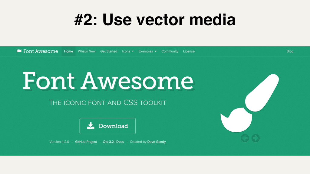
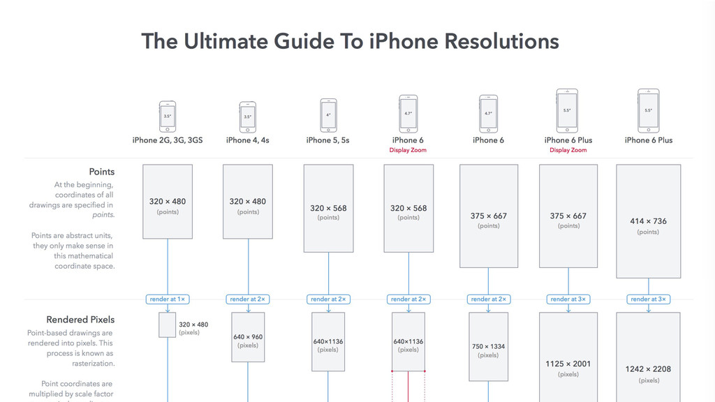
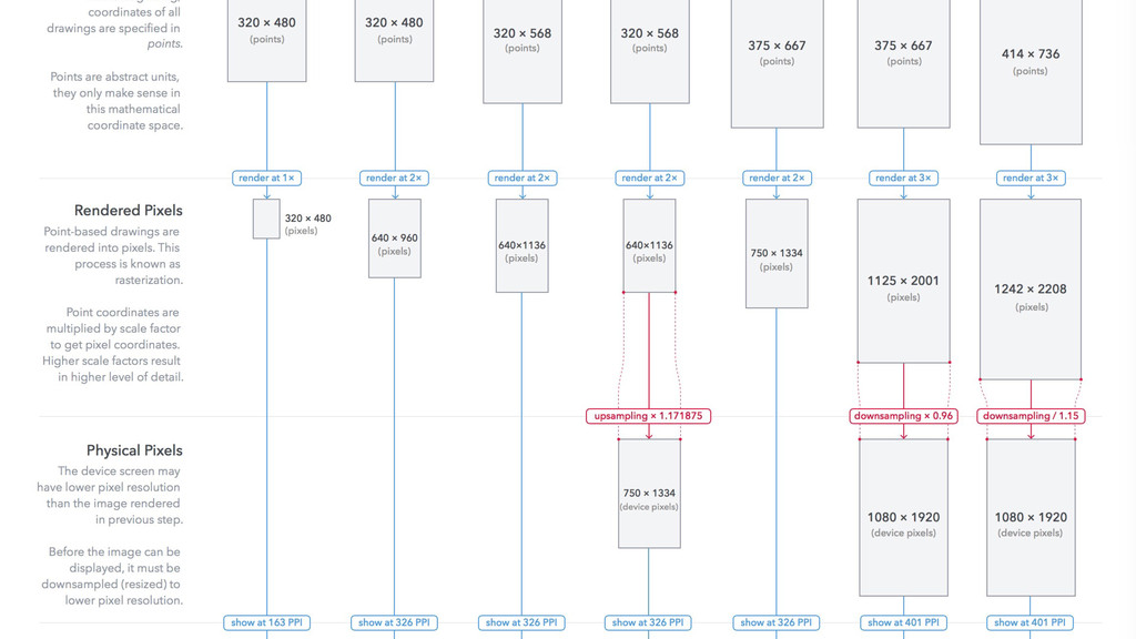
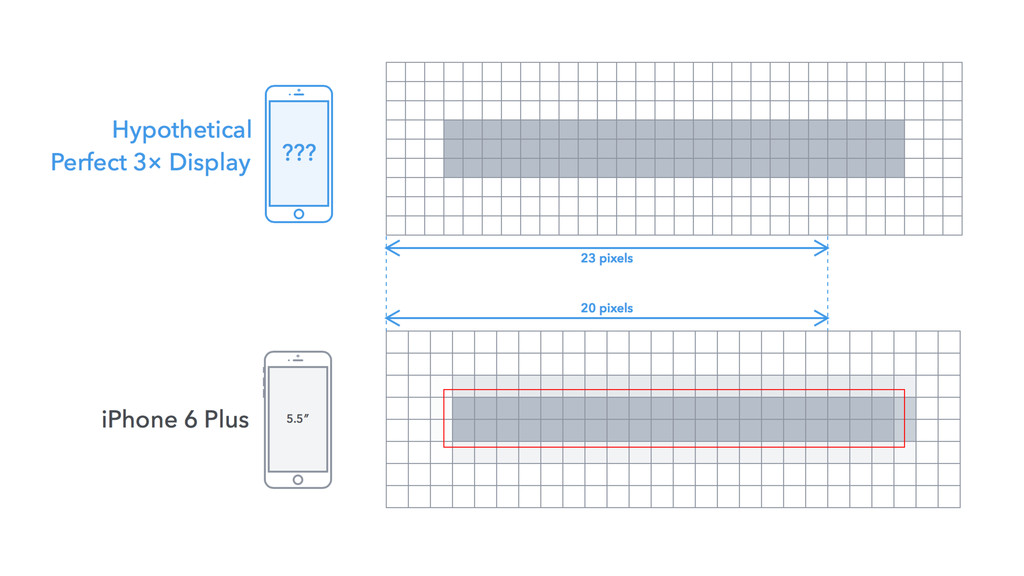
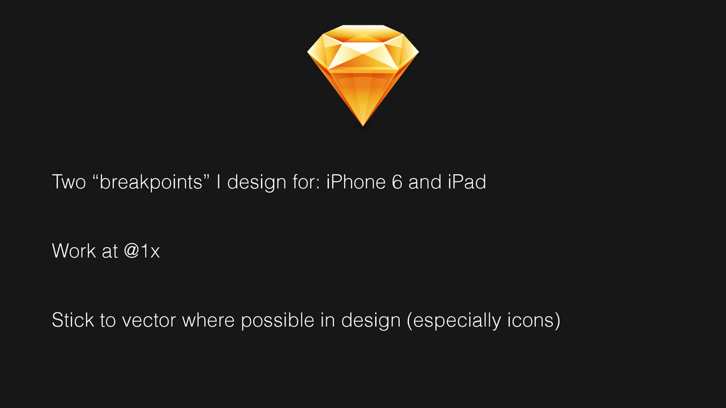
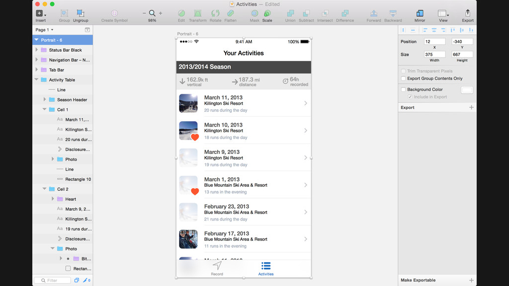
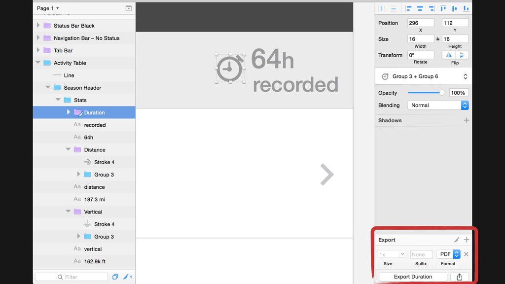
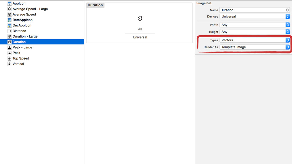
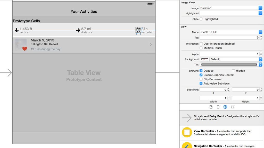
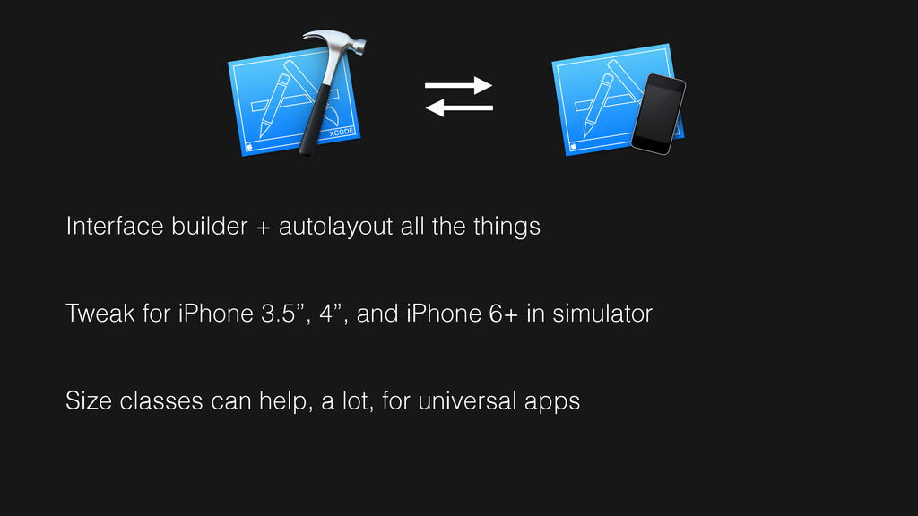
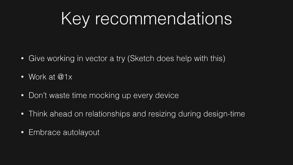
As iOS developers/designers there is a lot we can learn from the workflow changes of responsive web design. I'm sharing my current workflow that's made designing for @1x - @3x more manageable.
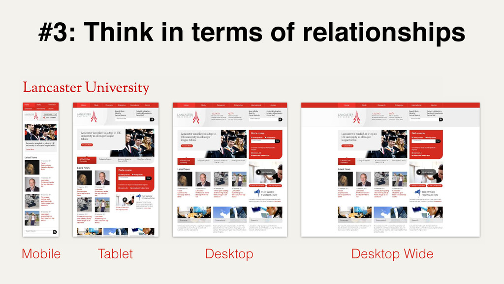
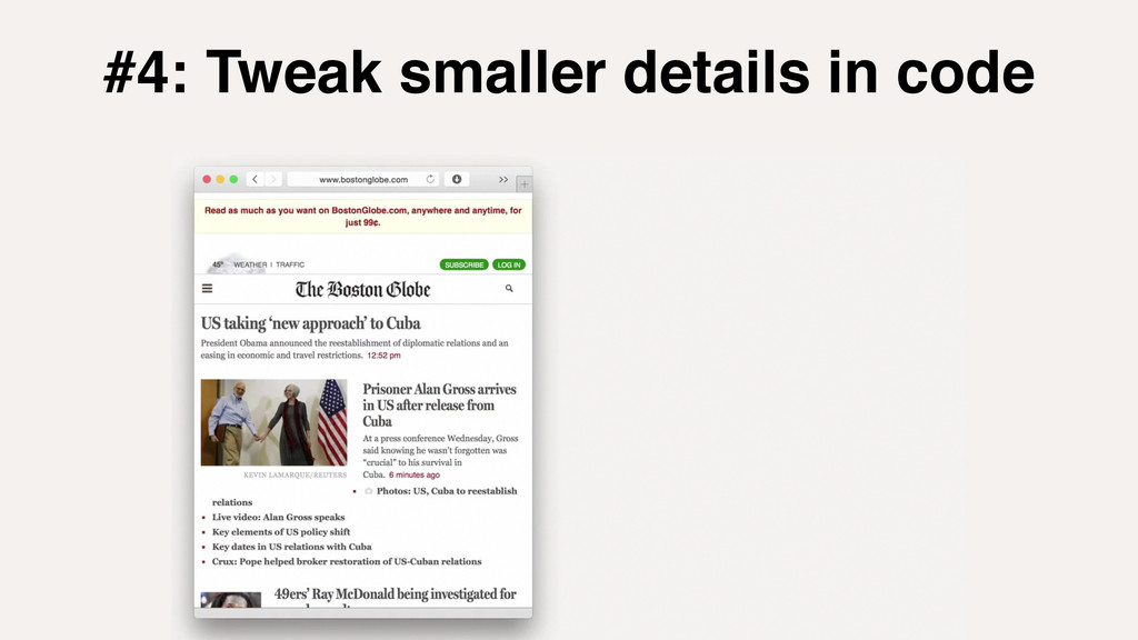
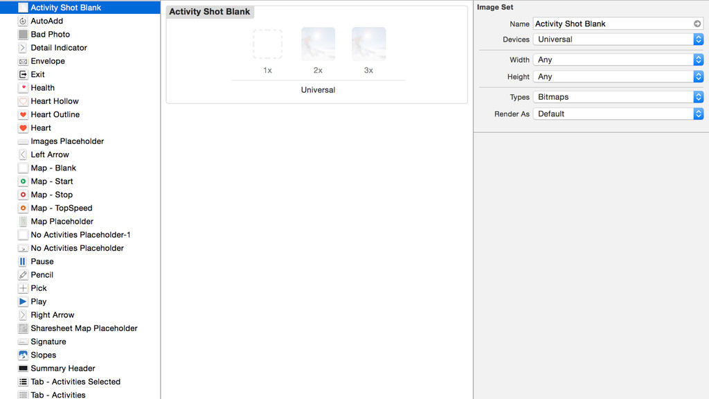
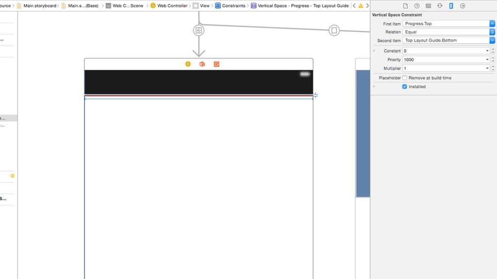
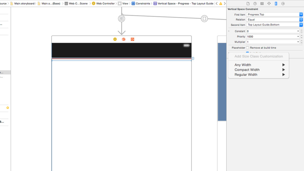
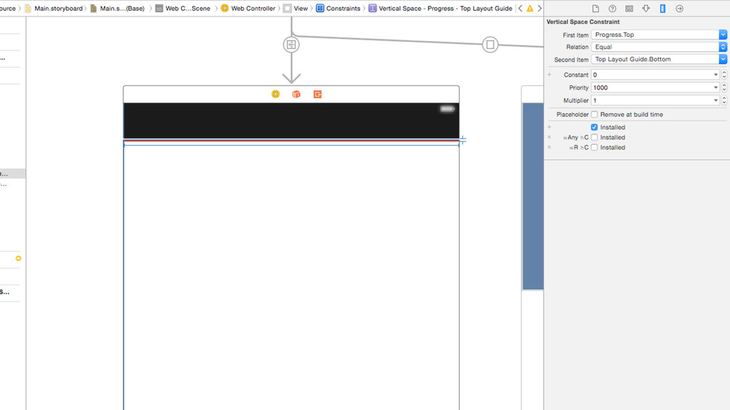
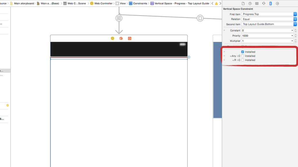
does help with this) • Work at @1x • Don’t waste time mocking up every device • Think ahead on relationships and resizing during design-time • Embrace autolayout
 parrots
 mizukibbb
 akkiesoft
 sms_tech
 yuobayashi
 k_adachi_01
 karad
karad
 tebiki
 takeda_h
 suzukij
 taku1418
 sahou909
 oikon48
 irinanazarova
 axbom
axbom
 keithpitt
 jdejongh
 leimatthew05
 uxyall
 carmenintech
 chrisshort
 shpigford
 maltzj
 codingconduct
 danielanewman