Upgrade to Pro — share decks privately, control downloads, hide ads and more …

淺談 RWD 與實做(用 Susy 1.0.9)

淺談 RWD 與實做(用 Susy 1.0.9)

已過時。現在我用 Susy 2 了...。

Patrick Wang

May 23, 2014
Tweet

More Decks by Patrick Wang

Other Decks in Programming

Transcript

  1. 優化的其他技巧 • 這⼜又是另⼀一個議題了... • 有關 Web 優化可參考: Web 效能優化⽇日誌 Volume

    2 - 歐萊禮 • Chrome DevTools 模擬器、iOS Simulator • 能⽤用 CSS 做的就別⽤用圖⽚片 • 例如圓⾓角、陰影、三⾓角形 (CSS Shapes) • 圖⽚片 • Retina... 肥⼤大的 @2x,iPhone 6、未來呢? • SVG 向量 (Leaving Pixels Behind: A vector workflow for designers) • icon font (fontawesome、IcoMoon) • 減少 http request • minify、CSS Sprites、CDN • Data URIs Base64 圖⽚片(慎⽤用) • jQuery 對⾏行動裝置來說太肥 • Zepto (jQuery ~80kb vs. jQuery 2 ~20kb vs. Zepto ~10kb)
  2. • 效能。想想看效能不佳的⼿手機上 load & render 跟桌⾯面版⼀一樣的 東⻄西(HTML DOM、Requests、JavaScripts、Images…) • 版⾯面配置、流程並無法做到真正的最佳化

    RESPONSIVE WEB DESIGN 優點 • ⼀一份網⾴頁全平台制霸 • 只要維護⼀一份 HTML 就好 • 開發成本較低(相較 App) • 相較 App 對使⽤用者的⾨門檻也較低 缺點
  3. A. MOBILE SITE B. NATIVE APP C. RESPONSIVE WEB DESIGN

    D. 混合版 RESPONSIVE WEB DESIGN
  4. • 仍維持 Responsive Web Design 中 MediaQuery 實做的部分。 • User

    Agent 做第⼀一層過濾,若是⼿手機版,就吐回⼿手機版專⽤用的 template。 • 這份 template 裡⾯面可以刪除不⽤用的 HTML DOM、CSS rules、JavaScript… • request 數: 從 150 減少⾄至 24 • 傳輸: 從 1.4MB 減少⾄至 195KB • 耗時: 從 5.94 s 減少⾄至 1.92 s • Render 效能忘記⽐比較了 orz
  5. 需求 • Susy 1.0.9 • Sass 3.2 (嗯,也要懂 Sass 的⽤用法)

    • Compass 0.12.2 註:Susy 2 需搭配 Sass 3.3 & Compass 1.0 版, 若想⽤用 Susy 1.0.9 版記得指定版本安裝。
  6. 安裝 • $ gem install susy -v 0.1.9 • Rails

    可以在 Gemfile 裡⾯面設定,再 bundle install • 不管後端,⽤用 bower 套件管理也可以
 $ bower install susy#1.0.9 • 再不然就去 Github(https://github.com/ericam/susy) 打包下載,解壓後把 sass ⺫⽬目錄的東⻄西取出利⽤用。
  7. 基本設定 先來做個⼿手機版...嗯...320  寬、4  欄。   ! $total-­‐columns  :  4;  

         //  幾欄   $column-­‐width    :  60px;  //  單欄的寬度   $gutter-­‐width    :  20px;  //  間格的寬度   $grid-­‐padding    :  10px;  //  兩邊的內距   ! //  hmm…  聽說  Susy  2  之後不⽤用算數字了 註:Viewport 裝置尺⼨寸列表、簡介1、簡介2
  8. 外圍主容器(Container) .container  {      @include  container;   }  

    ! //  若要開啟  GRID  柵欄參考線觀察   .container  {      @include  susy-­‐grid-­‐background;      @include  container;    }  
  9. 欄位設定 - 1/2 .content  {      //  佔  4

     欄中  3  欄      @include  span-­‐columns(3,  4);   }   ! .sidebar  {      //  佔  4  欄中  1  欄      @include  span-­‐columns(1  omega,  4);      //  omega  代表是該列最後⼀一欄(要放在最右邊)   }
  10. 欄位設定 - 2/2 .info  {      //  佔  12

     欄中  3  欄      @include  span-­‐columns(3,  12);      //  把這個玩意放在  12  欄中的第  2  欄      @include  isolate(2,  12);   }   ! .gallery-­‐photo  {      //  照⽚片列表中的單⼀一照⽚片寬  2  欄,每  2n+1  個⾃自動換⾏行      @include  isolate-­‐grid(2);   }
  11. 不同裝置要設定 breakpoint - 1/3    //  Tablet  breakpoint    

     @include  at-­‐breakpoint($tablet)  {   !        @include  susy-­‐grid-­‐background;          @include  container;   !    }   !    //  Desktop  breakpoint      @include  at-­‐breakpoint($desktop)  {          //  ...略
  12. $tablet-­‐columns  :  10;   $tablet-­‐width  :  768px;   //  Shorthand

     for  tablet  breakpoint   $tablet          :  $tablet-­‐width  $tablet-­‐columns;   ! $desktop-­‐columns:  12;   $desktop-­‐width    :  960px;   //  Shorthand  for  desktop  breakpoint   $desktop        :  $desktop-­‐width  $desktop-­‐columns  ie8;   不同裝置要設定 breakpoint - 2/3 IE fallback CSS Class name 透過「IE 的條件式註解」設定
  13. //  Use  12-­‐col  layout  at  matching  min-­‐width.   $media-­‐layout:  12;

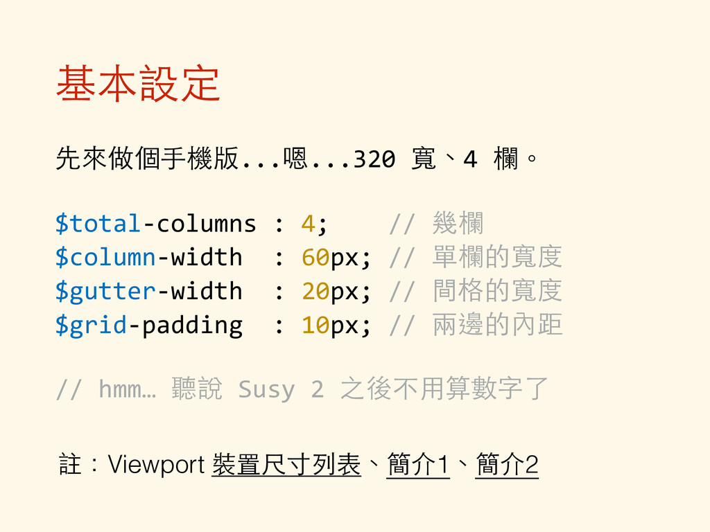
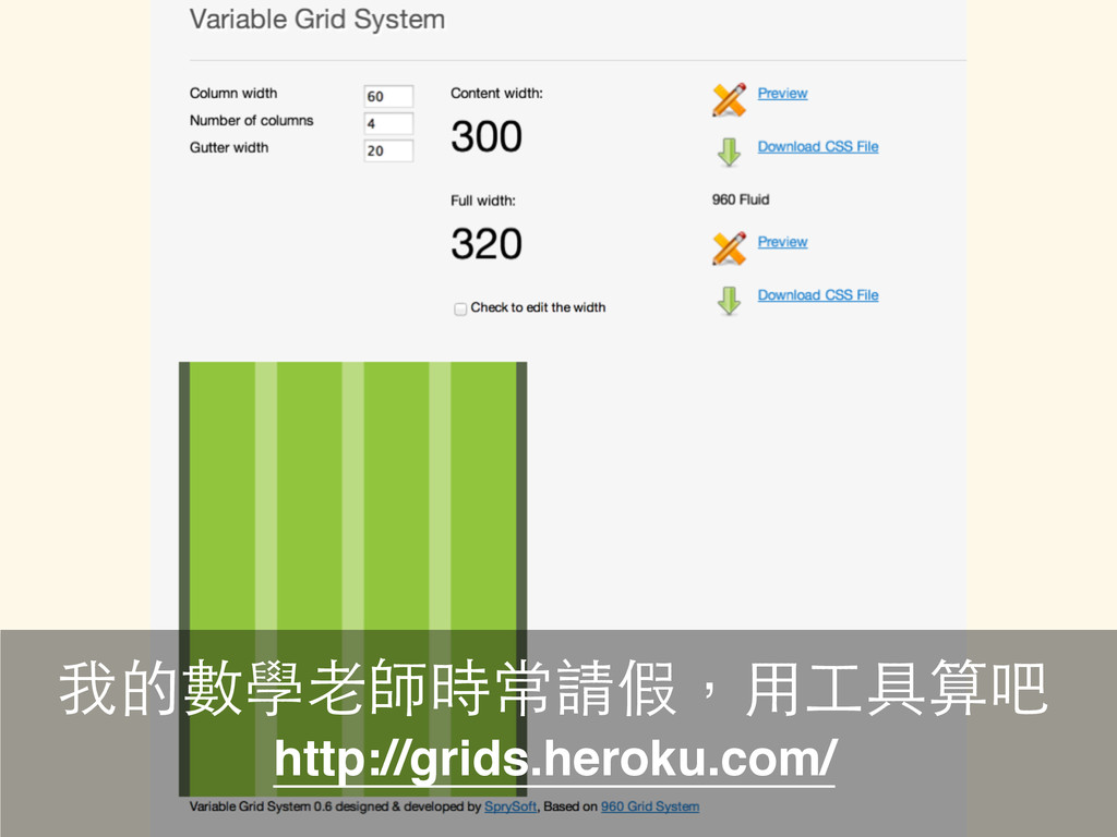
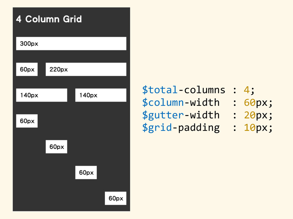
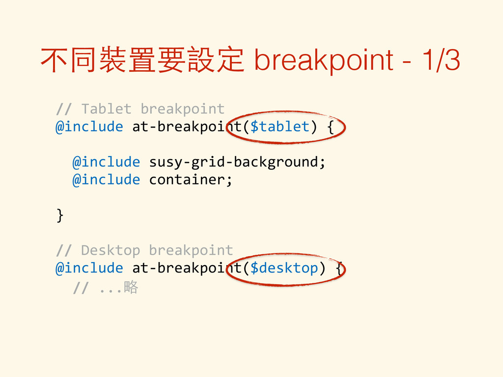
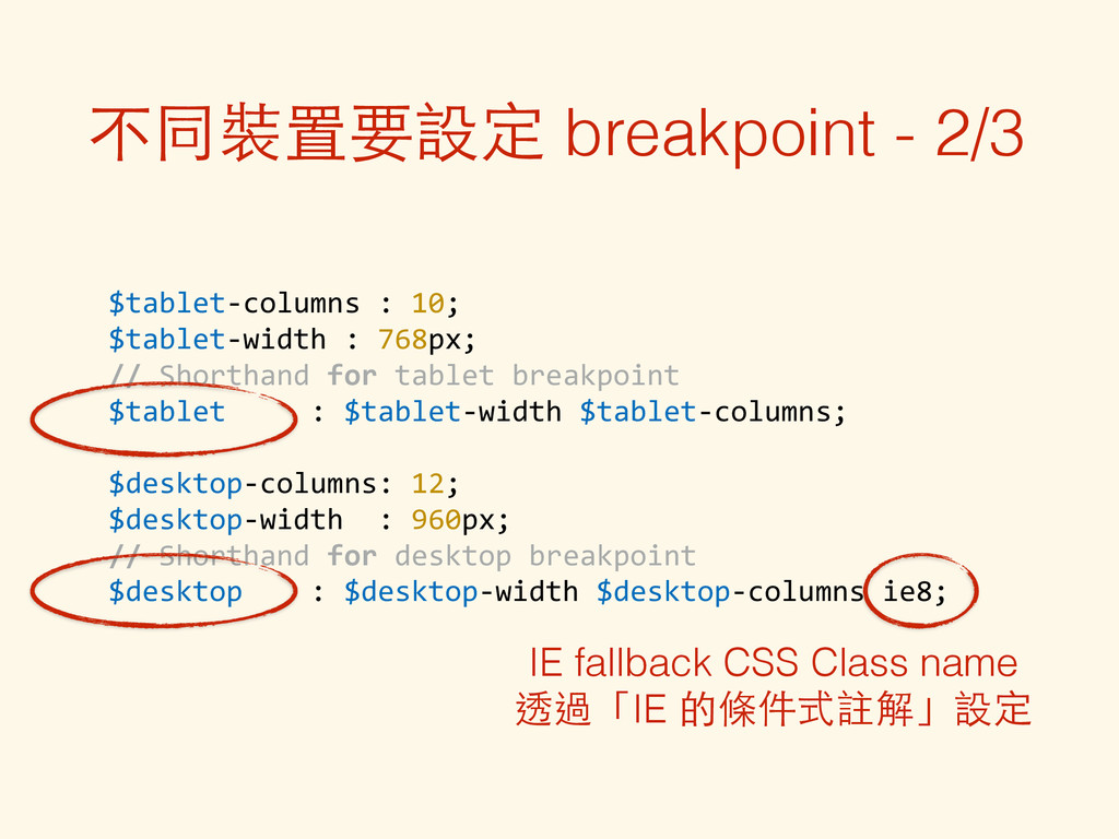
      //  At  min  30em,  use  closest  fitting  layout.
 $media-­‐layout:  30em;   //  At  min  30em,  use  12-­‐col  layout.   $media-­‐layout:  30em  12;           //  Use  12  cols  up  to  max  60em.   $media-­‐layout:  12  60em;           //  Between  min  30em  &  max  60em,  use  closest  layout.   $media-­‐layout:  30em  60em;       //  Use  12  cols  between  min  30em  &  max  60em.   $media-­‐layout:  30em  12  60em;   //  Same.  Larger  length  will  always  be  max-­‐width.   $media-­‐layout:  60em  12  30em;   $media-­‐layout  :  12  lt-­‐ie9;    //  Output  is  included  under  `.lt-­‐ie9`                                                                      //  class,  for  use  with  IE  
                                                        //  conditional  comments  on  the  <html>.   不同裝置要設定 breakpoint - 3/3
  14. 參考資料 • A Complete Tutorial to Susy
 http://www.zell-weekeat.com/a-complete-tutorial-to-susy/ • RWD

    ⼀一⼩小時就上⼿手 by evenwu
 https://speakerdeck.com/evenwu/rwd-xiao-shi-jiu-shang-shou • 好⽤用的 Responsive grids : SUSY 實作感想 by muki
 http://blog.mukispace.com/susy-responsive-grids-for-compass/ • Susy 簡單使⽤用經驗 by 莊喬
 http://bootleq.blogspot.tw/2013/05/susy.html