Slides to my talk at the Techettes Frankfurt Meetup:
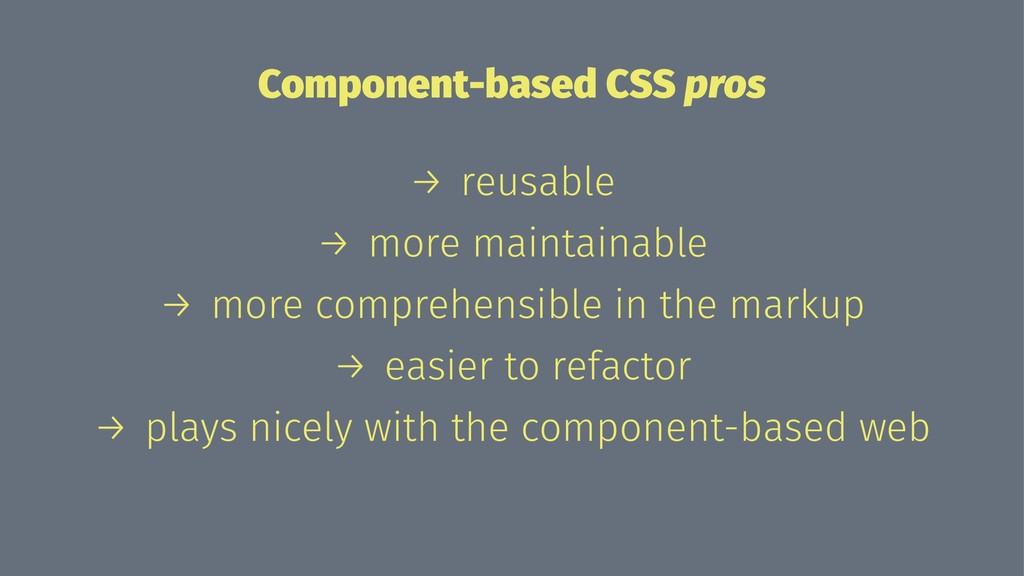
This is my approach to a component-based CSS architecture. I already realized a few project with it and it works really well! The CSS get's more more reusable and maintainable.
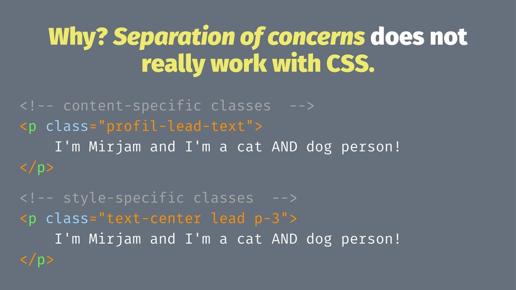
<!-- content-specific classes --> <p class="profil-lead-text"> I'm Mirjam and I'm a cat AND dog person! </p> <!-- style-specific classes --> <p class="text-center lead p-3"> I'm Mirjam and I'm a cat AND dog person! </p>
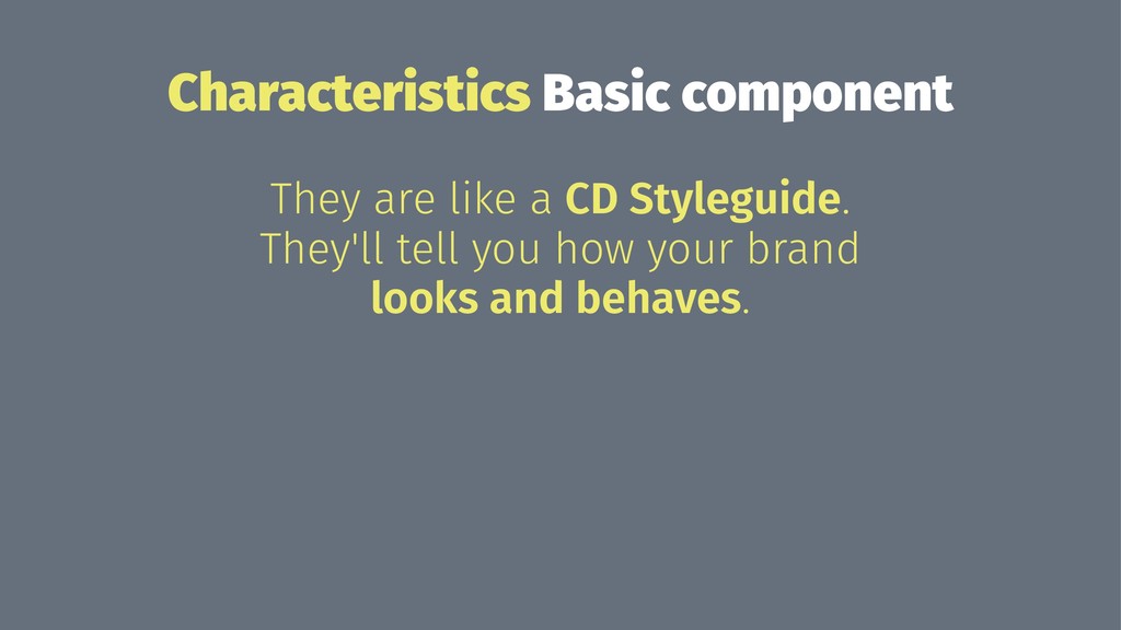
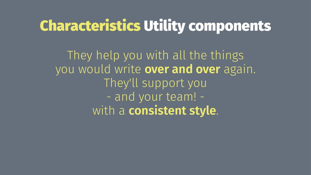
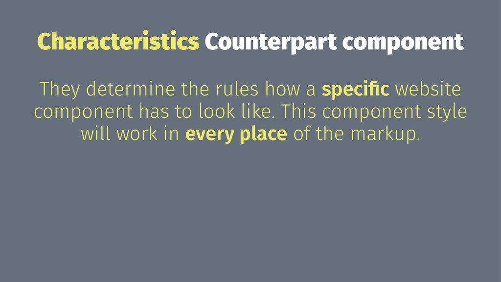
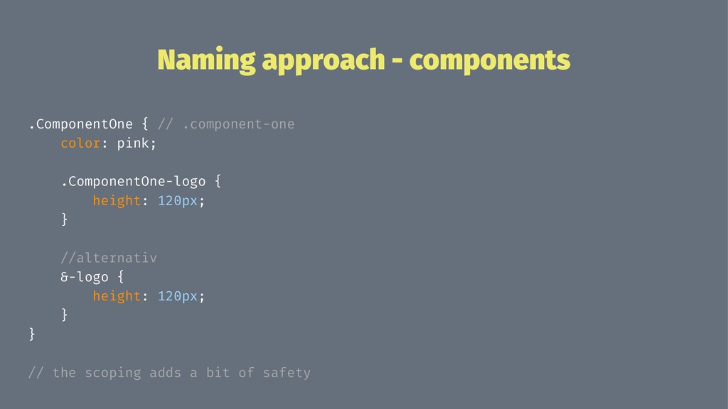
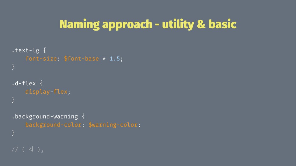
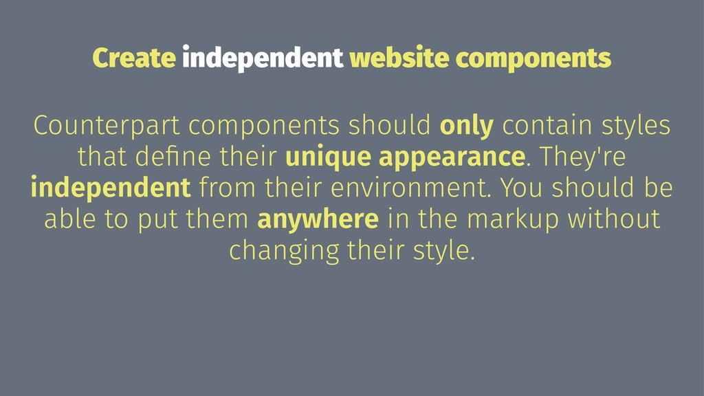
font styles, colors, variables Utility component repeating styles that can be used universally Counterpart component counterpart to our website component
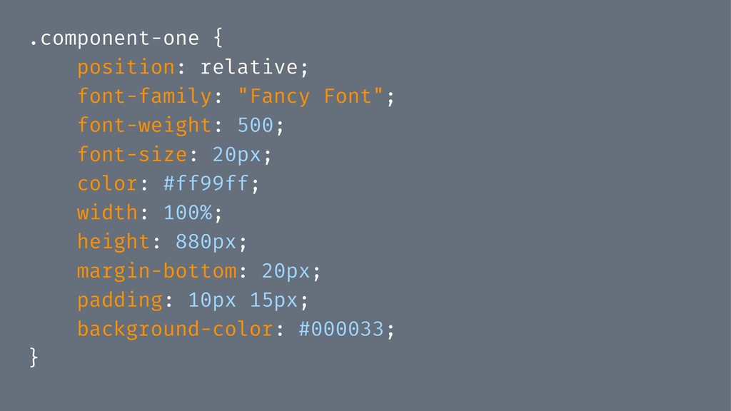
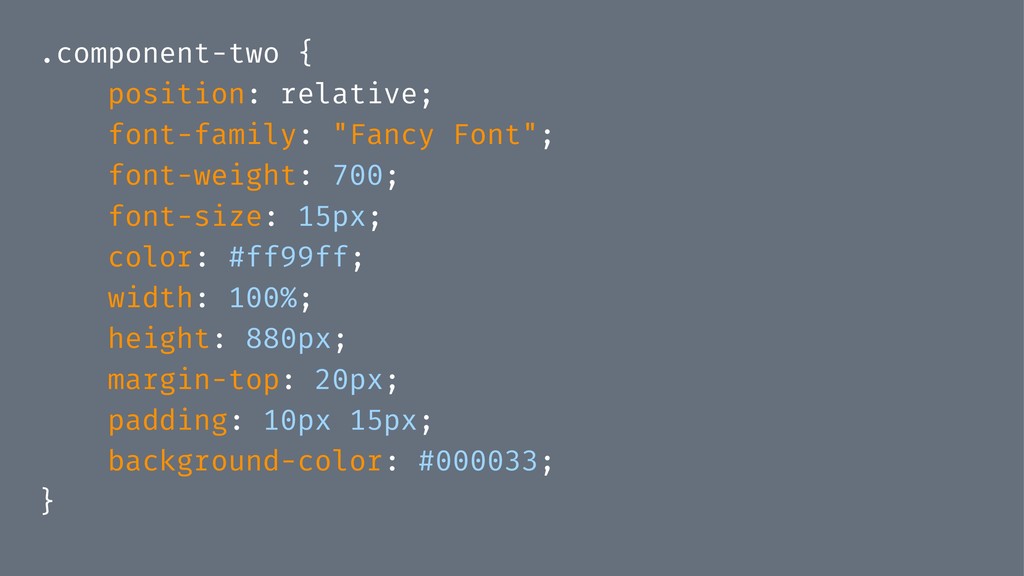
that define their unique appearance. They're independent from their environment. You should be able to put them anywhere in the markup without changing their style.
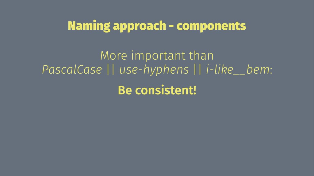
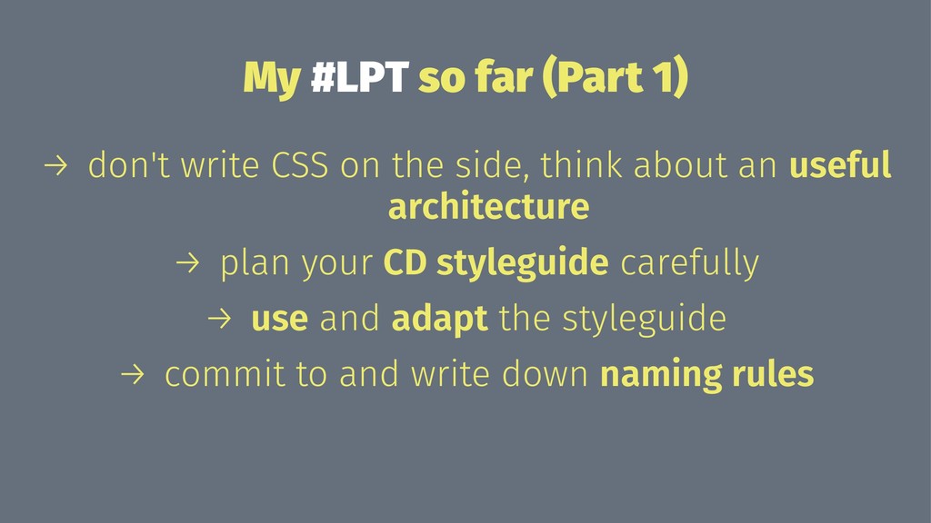
on the side, think about an useful architecture → plan your CD styleguide carefully → use and adapt the styleguide → commit to and write down naming rules
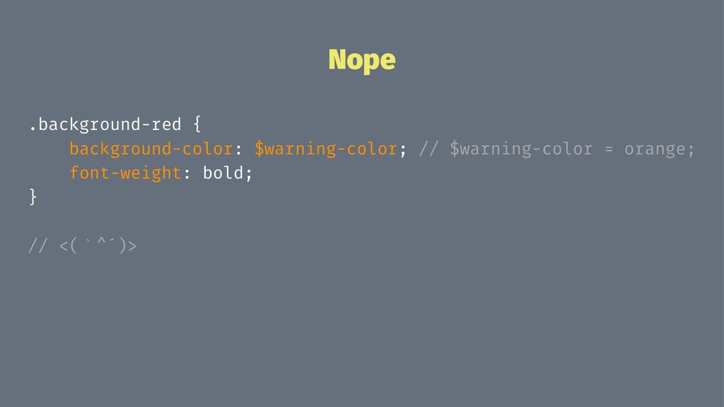
often - we all know CSS grows rampart if you don't look at it for, like, 5 minutes → use your basic and utility components generously → unify rules and styles when possible - there's seldom need for margin: 13px and margin: 14px in the same view → pls don't use pixel
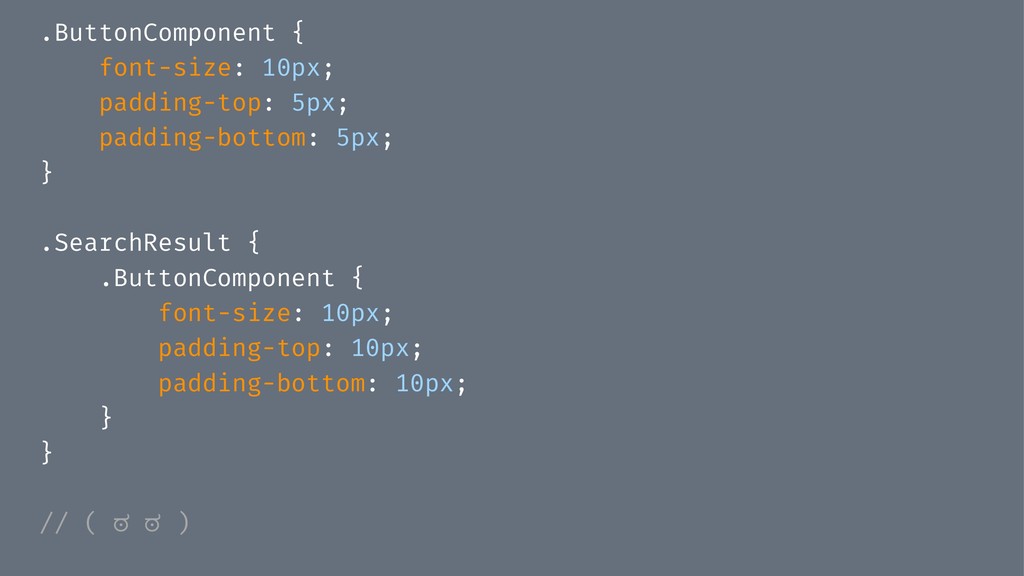
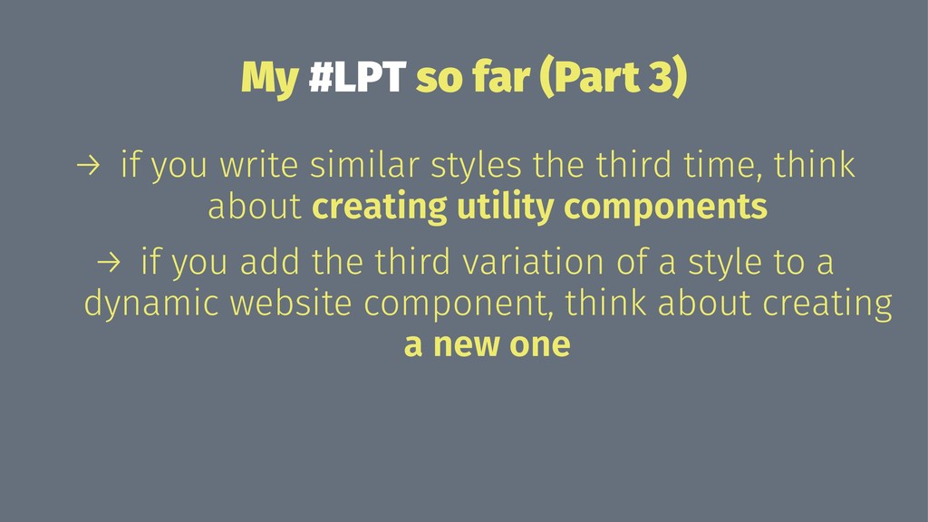
similar styles the third time, think about creating utility components → if you add the third variation of a style to a dynamic website component, think about creating a new one
 programmiri
 ryugen04
 tk3fftk
 kazumax55
 tatsuhiro
 handlename
 kotaminato
 77web
77web
 andpad
 _fhhmm
 16bitidol
 kishida
 ochtum
 apolaine
 tmiket
 keithpitt
 jonoalderson
 lauravandoore
 cassininazir
 aleyda
 skipperchong
 maltzj
 addyosmani
 eileencodes