Upgrade to Pro — share decks privately, control downloads, hide ads and more …

Use of Style Guides to Leverage Efforts Towards Inclusive Design - Radina Matic - CSUN18

Use of Style Guides to Leverage Efforts Towards Inclusive Design - Radina Matic - CSUN18

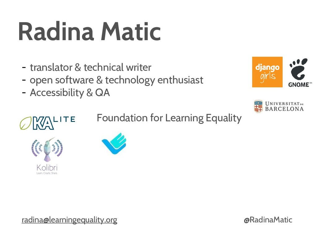
Slides from the CSUN conference presentation in March 2018.

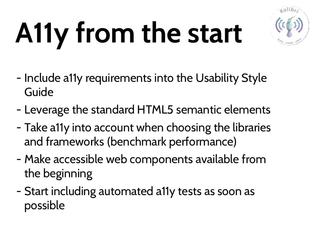
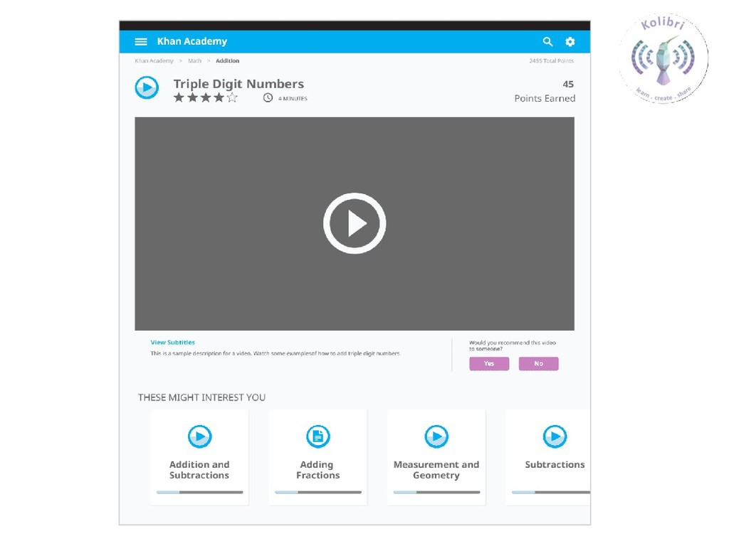
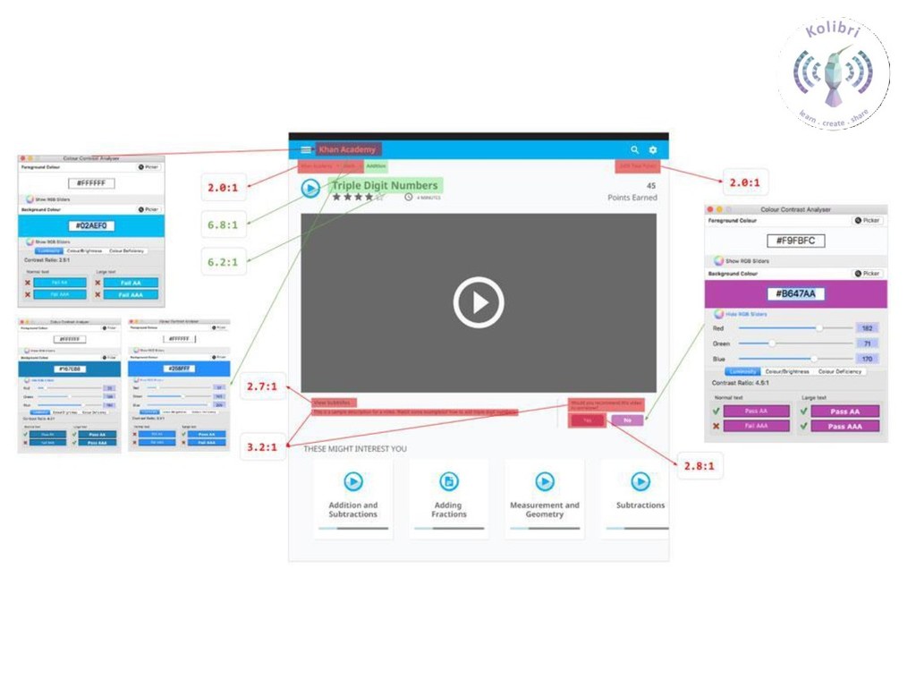
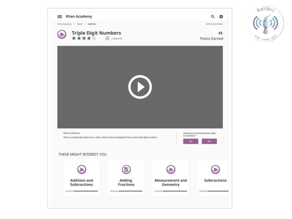
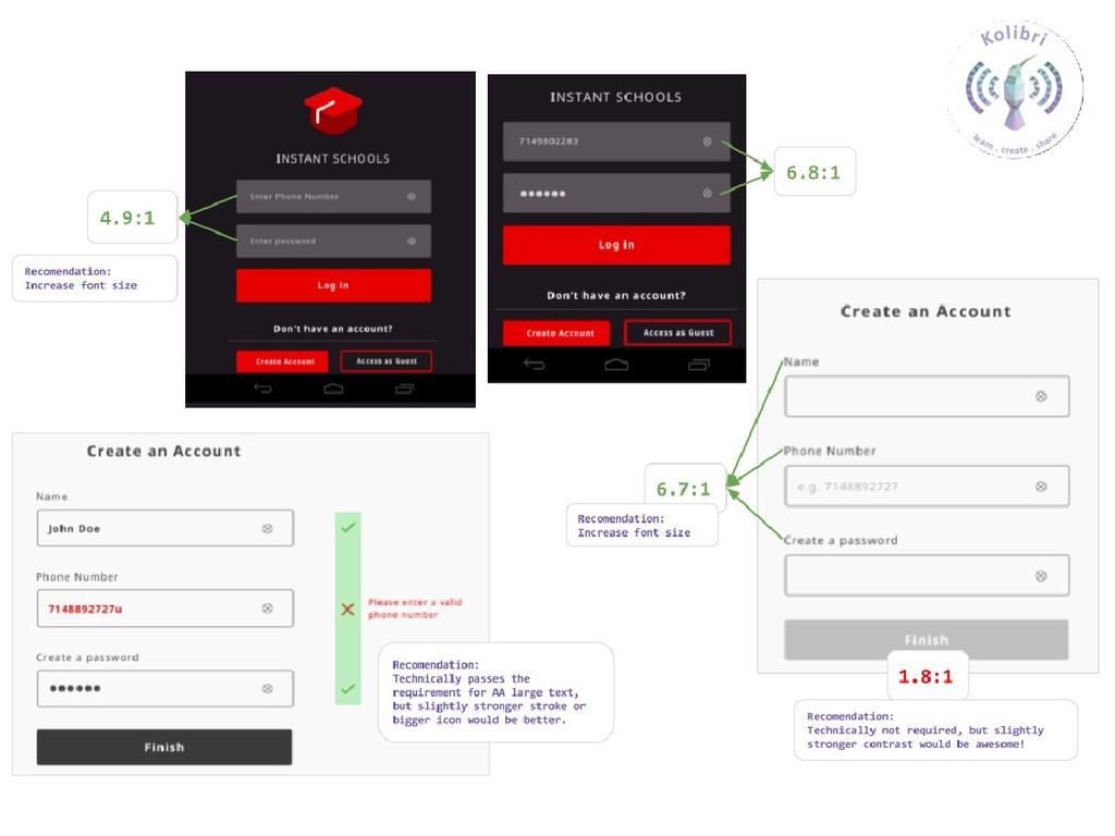
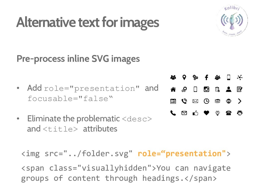
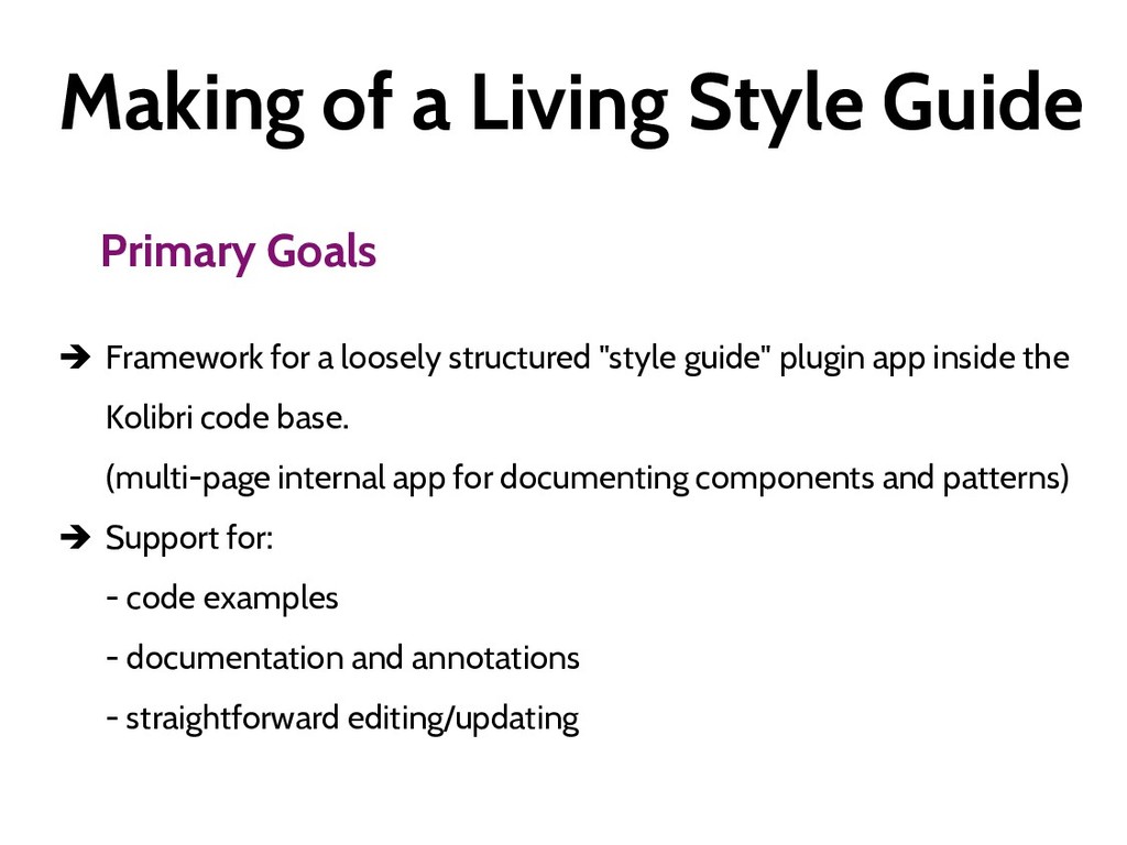
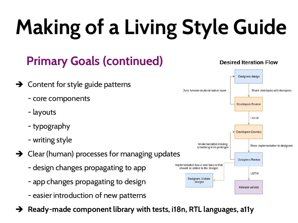
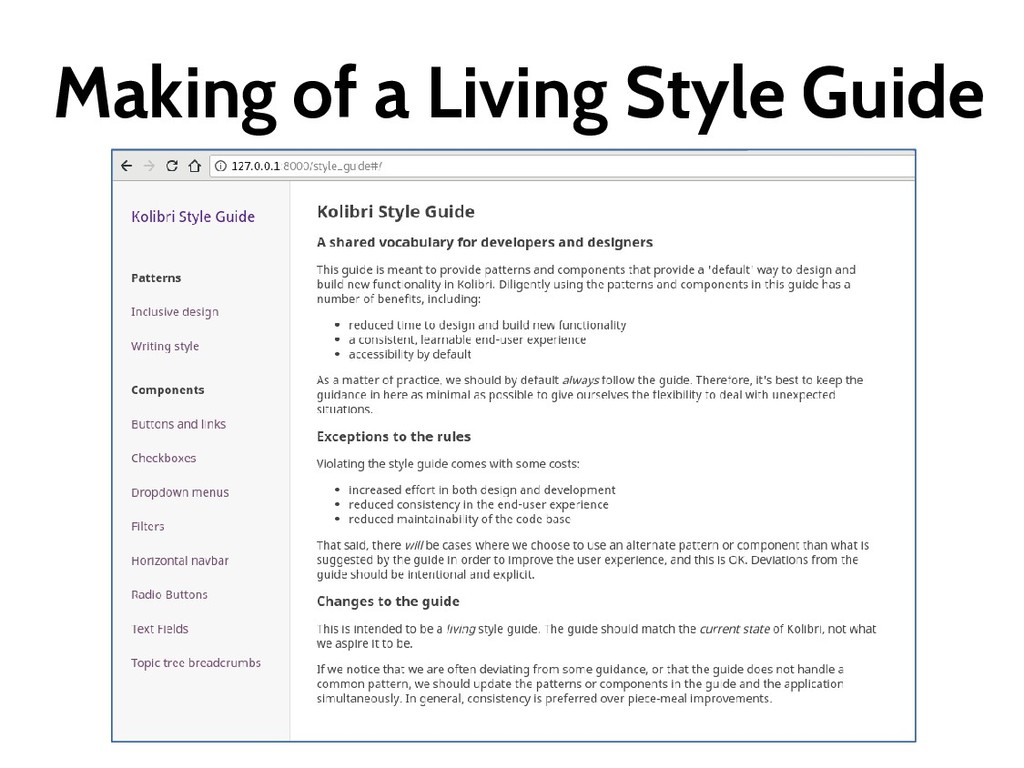
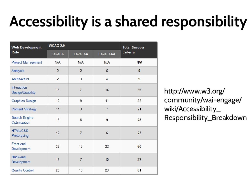
Style guide is a common reference that defines conventions and components for both designers and developers to use while building Kolibri. This “living” style guide is built into the Kolibri application, and can therefore change with the application from version to version.

Following the patterns in the Kolibri Style Guide ensures that our code is consistent, accessible and internationalizable. Finally, using the standard components documented in the Style Guide renders the development work faster as it benefits from built-in and thoroughly-tested accessibility, responsiveness, and cross-browser compatibility features.

Radina Matic

March 21, 2018
Tweet

More Decks by Radina Matic

Other Decks in Programming

Transcript

  1. Radina Matic - translator & technical writer - open software

    & technology enthusiast - Accessibility & QA Foundation for Learning Equality [email protected] @RadinaMatic
  2. Why do we care? World Health Organization fact sheet from

    2014 People with disability in the world (1000 millions) ≈ 15%
  3. Why do we care? World Health Organization fact sheet from

    2014 People with disability in the world (1000 millions) People living in developing countries (800 millions) ≈ 80%
  4. Why do we care? WHO – 10 Facts on Disability

    #2: Disability disproportionately affects vulnerable populations
  5. Why do we care? WHO – 10 Facts on Disability

    #2: Disability disproportionately affects vulnerable populations #4: Children with disabilities are less likely to attend school than non- disabled children.
  6. Images – The elusive ALT attribute {{#if content_urls.thumbnail }} <img

    src="{{content_urls.thumbnail}}" class="img-responsive" {{#if description }} aria-hidden="true" role="presentation" {{/if}}>
  7. Screenreaders only output 2 Heading level two clickable link What

    is addition? What is subtraction? two two hundred percent Heading level two clickable link Converting between fractions and decimals ten forty percent sixty percent Three hundred percent
  8. Screenreaders only output <div class="sr-only">{{_ "In this topic " }}</div>

    <div class="progress-indicator {{vid_status}}"> <span class="sr-only">{{_ "there are " }}</span> <div class="sidebar-icon"> <span class="progress-indicator content-counter"> <div class="sr-only">{{#unless n_pl_videos}}no{{/unless}}</div> {{#if n_pl_videos}}{{n_pl_videos}}{{/if}} </span> </div> <span class="sr-only">{{_ " videos." }}</span> </div> {{#ifcond vid_pct_started "<" 100}} <span class="sr-only">{{_ "You are still working on " }}</span> <span aria-hidden="true" role="presentation">{{ >{{vid_pct_started}}%</span> {{/ifcond}} {{#ifcond vid_pct_started "===" 100}} <span class="sr-only">{{_ "You are still working on all of them." }}</span> <span aria-hidden="true" role="presentation">{{vid_pct_started}}%</span> {{/ifcond}}
  9. Screenreaders only output Heading level two clickable link What is

    addition? What is subtraction? In this topic there are two videos. You haven't started to watch videos! There are two exercises. You are still working on all of them. Heading level two clickable link Converting between fractions and decimals In this topic there are ten videos. Of those you have completed forty percent. You are still working on sixty percent. There are three exercises. You are still working on all of them.
  10. A11y from the start - Include a11y requirements into the

    Usability Style Guide - Leverage the standard HTML5 semantic elements - Take a11y into account when choosing the libraries and frameworks (benchmark performance) - Make accessible web components available from the beginning - Start including automated a11y tests as soon as possible
  11. Alternative text for images Pre-process inline SVG images • Add

    role="presentation" and focusable="false“ • Eliminate the problematic <desc> and <title> attributes <img src="../folder.svg" role=“presentation"> <span class="visuallyhidden">You can navigate groups of content through headings.</span>
  12. Making of a Living Style Guide Primary Goals  Framework

    for a loosely structured "style guide" plugin app inside the Kolibri code base. (multi-page internal app for documenting components and patterns)  Support for: - code examples - documentation and annotations - straightforward editing/updating
  13. Making of a Living Style Guide Primary Goals (continued) 

    Content for style guide patterns - core components - layouts - typography - writing style  Clear (human) processes for managing updates - design changes propagating to app - app changes propagating to design - easier introduction of new patterns  Ready-made component library with tests, i18n, RTL languages, a11y
  14. Put A11y in your dev team life • A11y Pills

    & lots of passion • Make accessibility a SHARED responsibility • Start a Tools Repository • Don't rely exclusively on checklists and automated testing (involve the USERS!) • Re-test at every iteration • Document your wins!!!