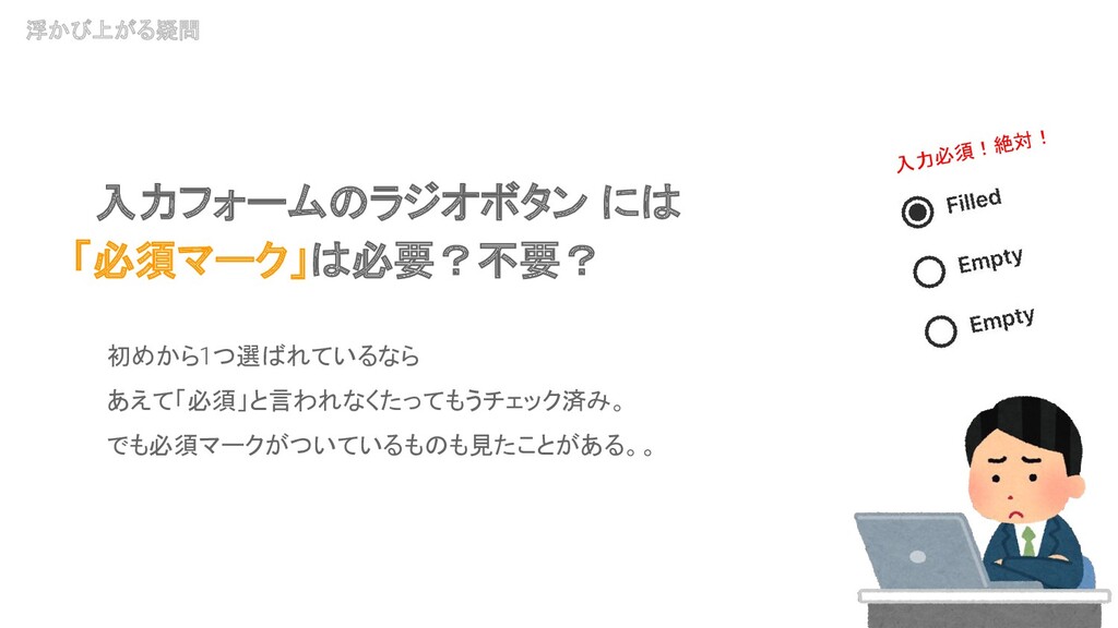
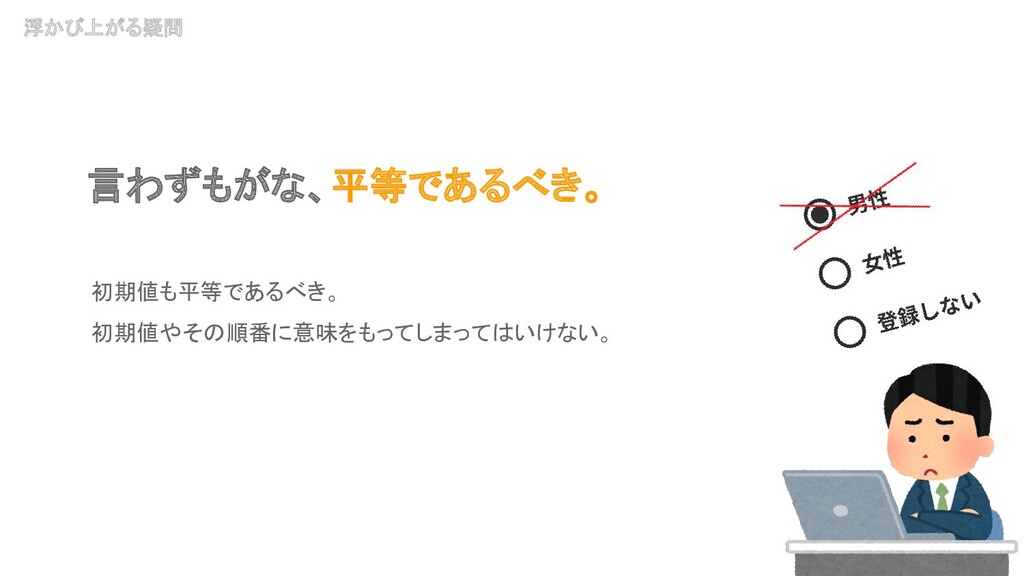
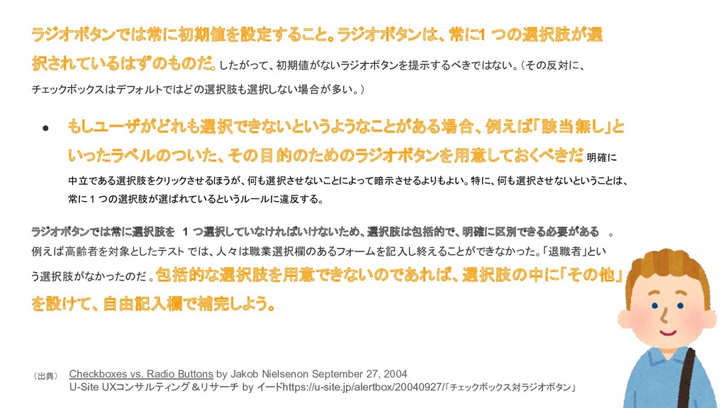
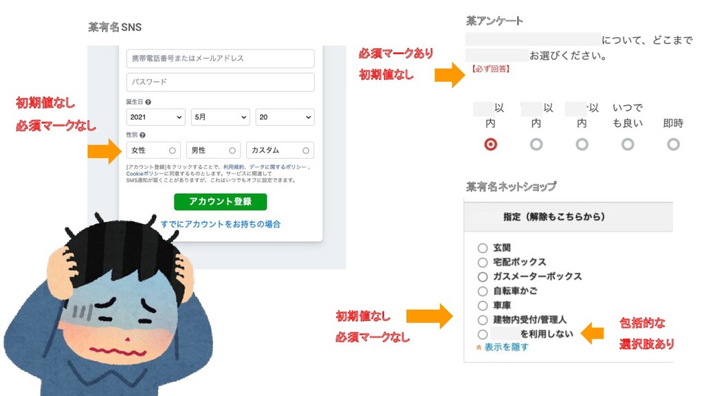
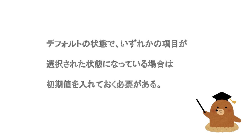
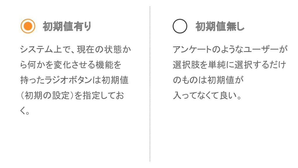
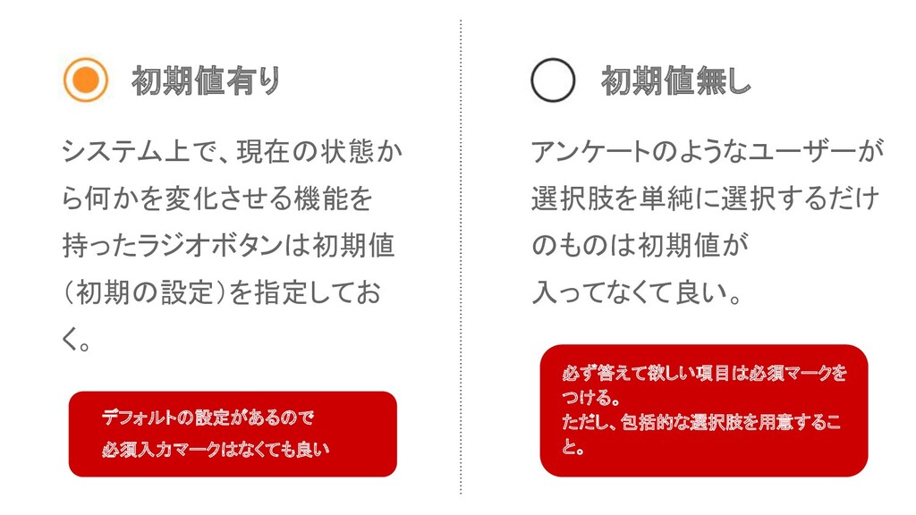
definition, radio buttons always have exactly one option selected, and you therefore shouldn't display them without a default selection. (Checkboxes, in contrast, often default to having none of the options selected.) • If users might need to refrain from making a selection, you should provide a radio button for this choice, such as one labeled "None." Offering users an explicit, neutral option to click is better than requiring the implicit act of not selecting from the list, especially because doing the latter violates the rule of always having exactly one option chosen. Because radio buttons require exactly one choice, make sure that the options are both comprehensive and clearly distinct. In tests with older users, for example, people couldn't complete a form that required them to select their job because it didn't offer "retired" as an option. If it's impossible to be comprehensive, offer a button labeled "Other," supplemented by a type-in field. Checkboxes vs. Radio Buttons by Jakob Nielsenon September 27, 2004 https://www.nngroup.com/articles/checkboxes-vs-radio-buttons/ (出典)
常に 1 つの選択肢が選ばれているというルールに違反する。 ラジオボタンでは常に選択肢を 1 つ選択していなければいけないため、選択肢は包括的で、明確に区別できる必要がある 。 例えば高齢者を対象としたテスト では、人々は職業選択欄のあるフォームを記入し終えることができなかった。「退職者」とい う選択肢がなかったのだ 。包括的な選択肢を用意できないのであれば、選択肢の中に「その他」 を設けて、自由記入欄で補完しよう。 Checkboxes vs. Radio Buttons by Jakob Nielsenon September 27, 2004 U-Site UXコンサルティング&リサーチ by イードhttps://u-site.jp/alertbox/20040927/「チェックボックス対ラジオボタン」 (出典)