Building components that can stand the test of time is tough! Frameworks change, new fads emerge, and often we're left with an aging codebase that needs to be rewritten if we want to stay current. Polymer and Web Components aim to change this cycle by building on new platform primitives which will allow us to finally create interoperable components that work in any environment. In this session we'll look at the current Web Component ecosystem, and I'll show you how to start to integrate these tools into your projects.
 robdodson
 ymhiroki
 lycorptech_jp
 bengo4com
 sbspsy
 ritou
ritou
 nealle
 ymty
ymty
 naokiakai
 yurufuwahealer
 cscengineer
 minorun365
 ekispert_api
 erikaheidi
 baasie
 schlessera
 aleyda
 codingconduct
 tmiket
 keithpitt
 michielstock
 uxyall
 denniskardys
 portentint
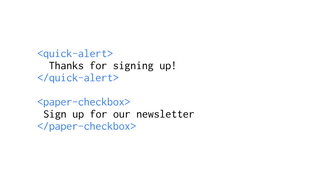
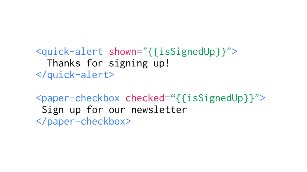
![<quick-alert [shown]=“isSignedUp”> Thanks for signing up! </quick-alert> <paper-checkbox [checked]=“isSignedUp”> Sign](https://files.speakerdeck.com/presentations/209ae44fbf614a70bce49238a373e263/slide_51.jpg)