 SiteGround - Reliable hosting with speed, security, and support you can count on.
From BADCamp (Bay Area Drupal Camp) 2014.
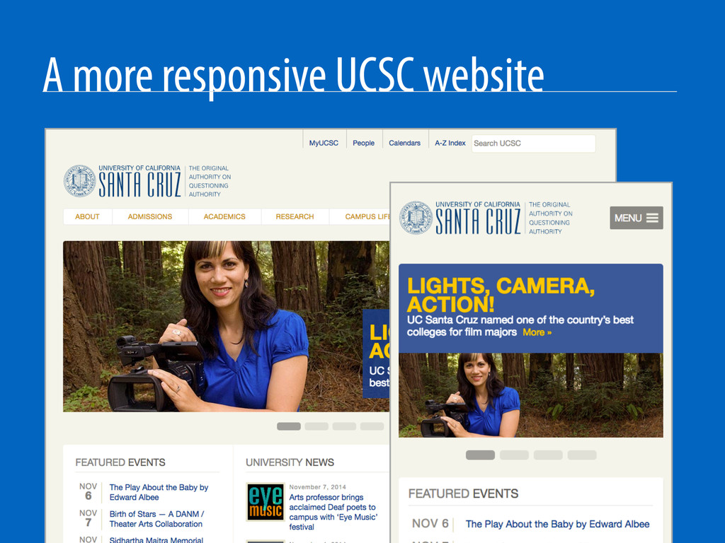
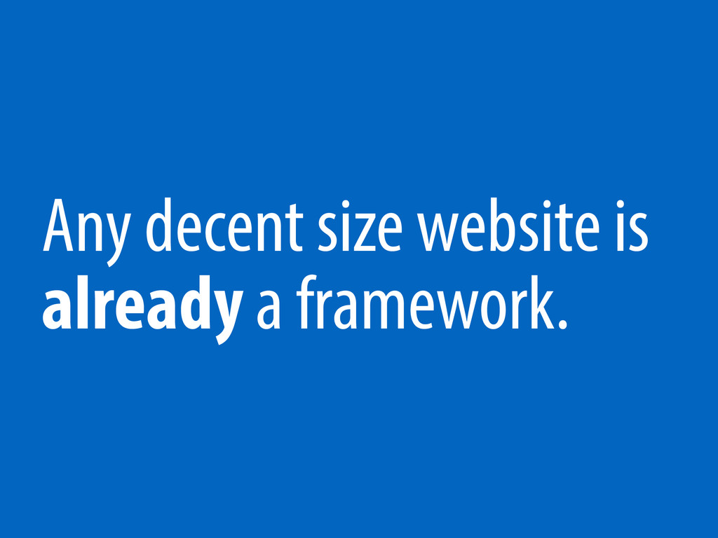
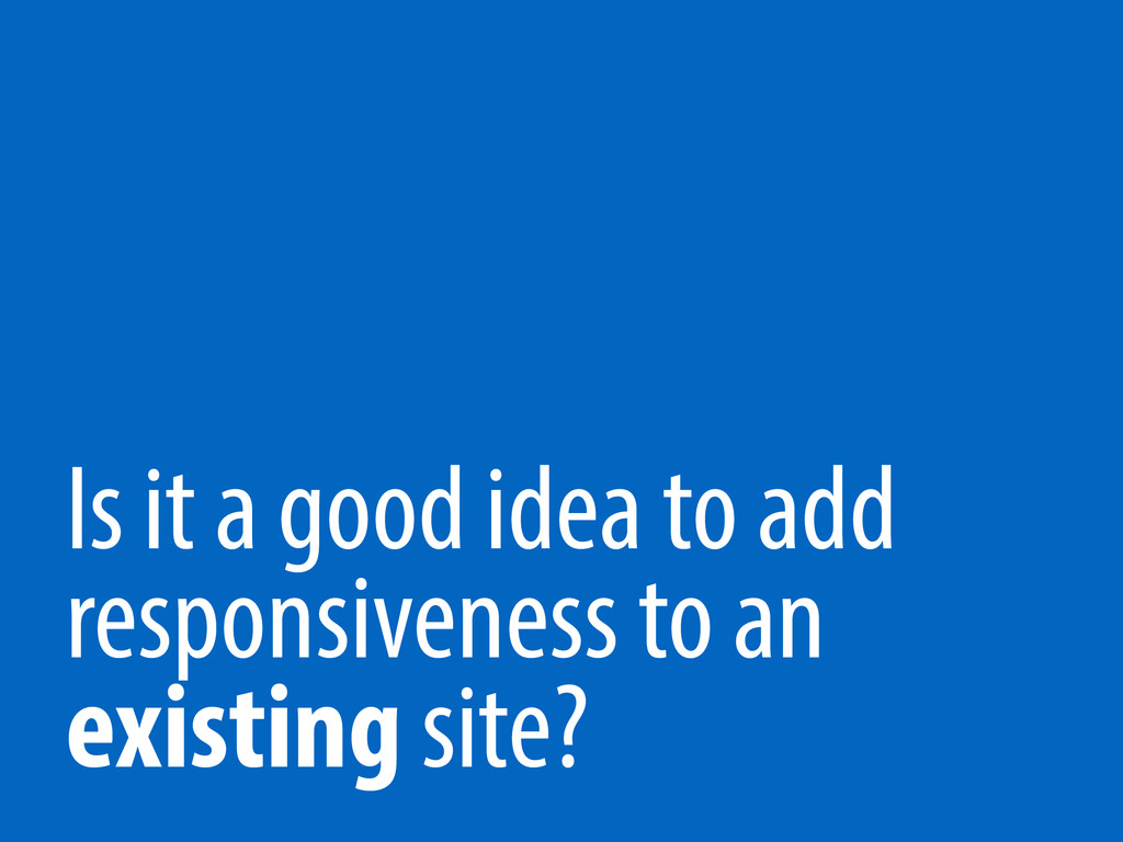
Responsive design is complicated enough when you're starting from scratch. What about *retrofitting* an existing design to make it responsive? How do you take a website design that predates Apple's iPad and update it to adapt to as many devices as possible? How do you do all of this without adversely affecting your web editors, site admins or site visitors?
 robknight
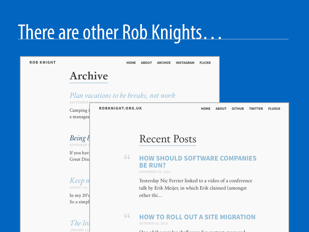
 shinyorke
 magavel
 nnaka2992
 javiergs
 gessy0129
 atani14
 oharu121
 ivargrimstad
 seitarof
 koic
koic
 bash0c7
 masuda220
 helmedeiros
 axbom
axbom
 baasie
 aleyda
 skoyamalab
 nikkihalliwell
 nonsquared
 katarinadahlin
 twada
twada
 reverentgeek
 mongodb
![Surviving a Responsive Retrofit Rob Knight, UC Santa Cruz [email protected]](https://files.speakerdeck.com/presentations/45ced8504e550132c7590efcccd0b8fe/slide_0.jpg)
![Thank you Rob Knight, UC Santa Cruz [email protected] @robknight @knice](https://files.speakerdeck.com/presentations/45ced8504e550132c7590efcccd0b8fe/slide_19.jpg)