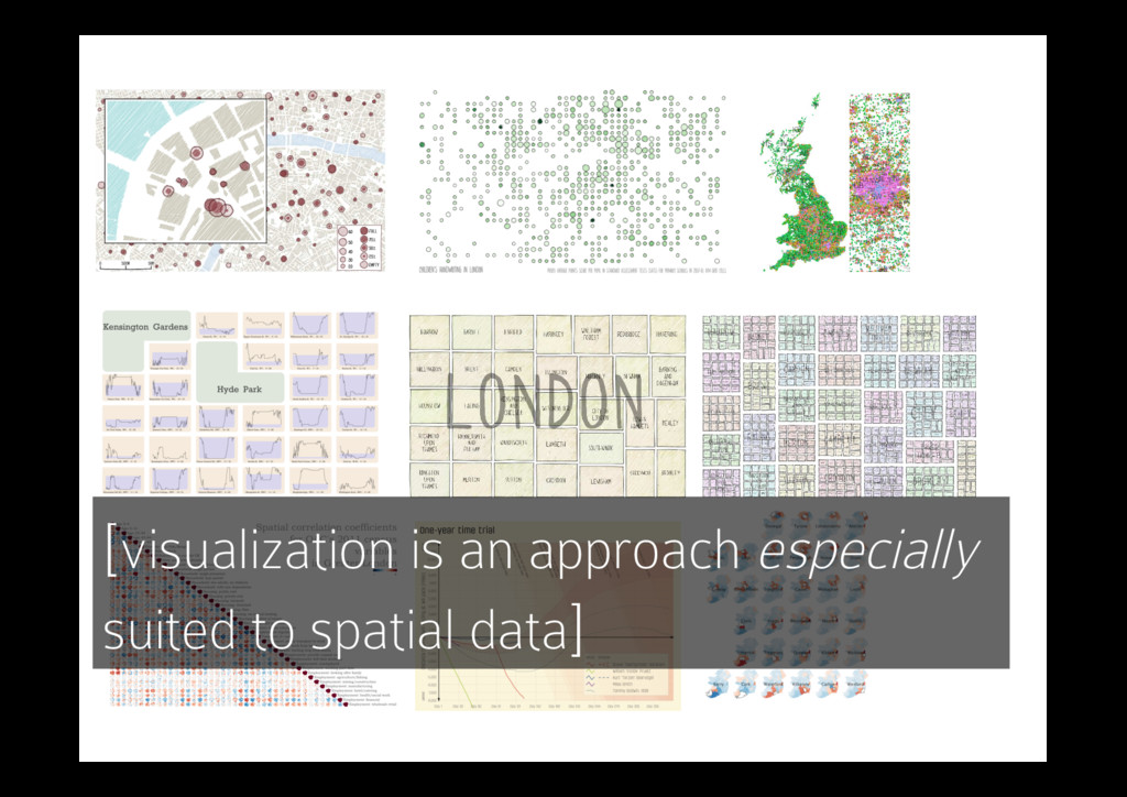
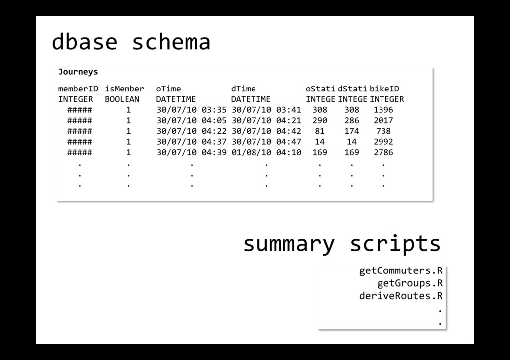
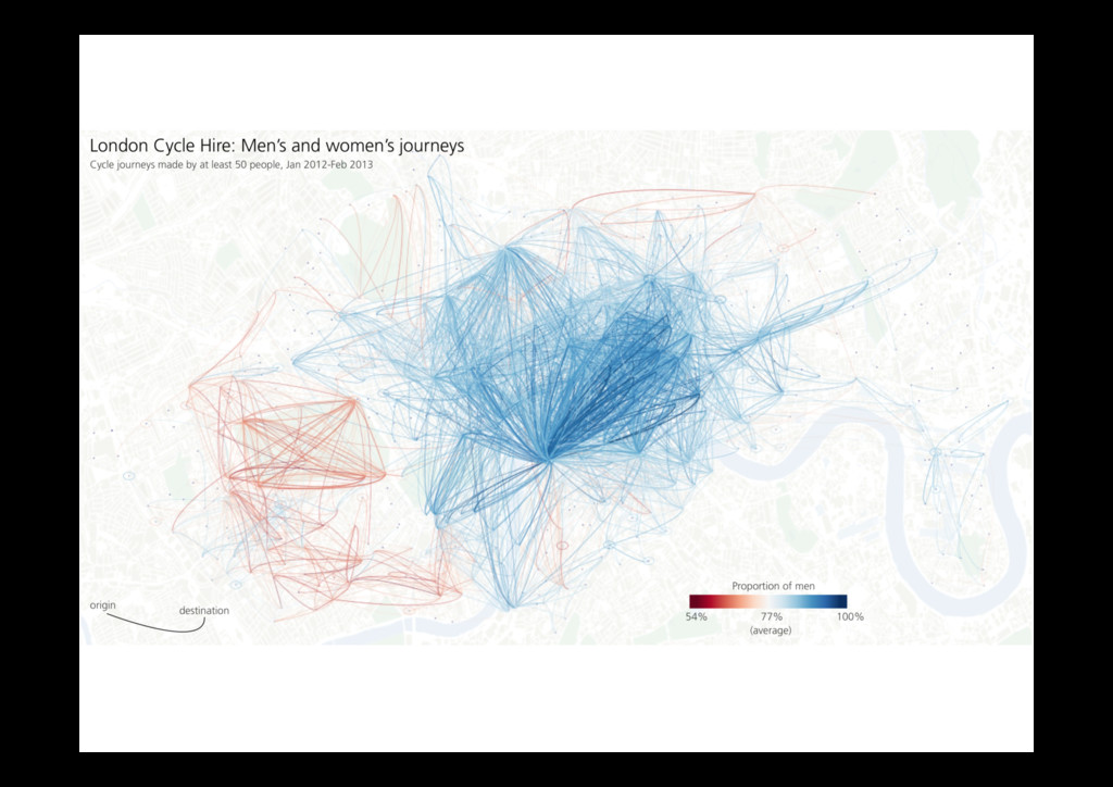
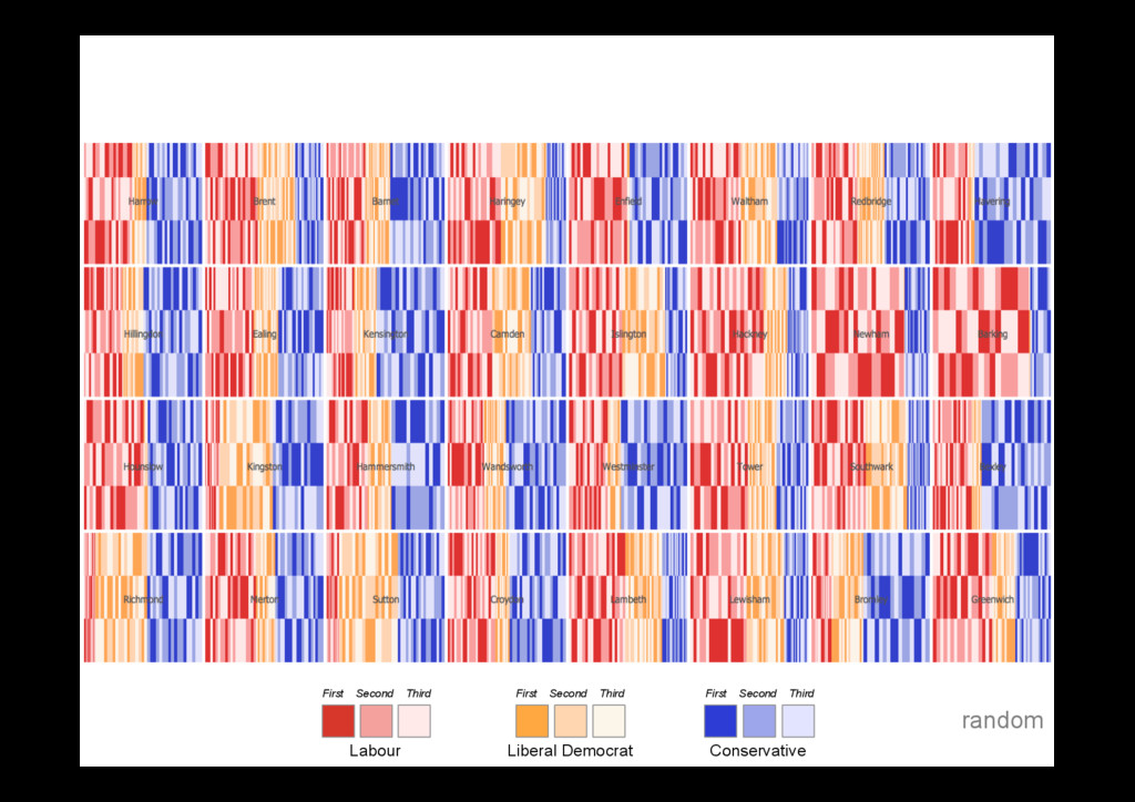
Sarah Goodwin, Jason Dykes, Sara Jones, Iain Dillingham, Graham Dove, Alison Duffy, Alexander Kachkaev, Aidan Slingsby, and Jo Wood, Member, IEEE CHANGE PROPORTION OF APPLIANCE CONSUMPTION SHIFTED FROM ‘SHRINK’ PERIODS TO ‘GROW’ PERIODS TOOLS FOR DATA SCULPTING CONSUMPTION WILL SHRINK DURING THIS PERIOD CONSUMPTION WILL GROW DURING THIS PERIOD CLICK AND DRAG ON TIMELINE TO SELECT PERIODS SHIFT TO HERE ... FROM HERE CLOTHES DRYER Fig. 1. Demand Horizons show modeled weekday energy demand over 24 hours amongst high consumption domestic appliances. Data Sculpting allows us to shift consumption interactively by ‘moulding’ the horizons to explore ‘what if?’ scenarios. For example, here fifty percent of ‘Clothes Dryer’ consumption is shifted from the evening peak to a period when overall demand is lower. Abstract—We enhance a user-centered design process with techniques that deliberately promote creativity to identify opportunities for the visualization of data generated by a major energy supplier. Visualization prototypes developed in this way prove effective in a situation whereby data sets are largely unknown and requirements open – enabling successful exploration of possibilities for visualization in Smart Home data analysis. The process gives rise to novel designs and design metaphors including data sculpting. It suggests: that the deliberate use of creativity techniques with data stakeholders is likely to contribute to successful, novel and effective solutions; that being explicit about creativity may contribute to designers developing creative solutions; that using creativity techniques early in the design process may result in a creative approach persisting throughout the process. The work constitutes the first systematic visualization design for a data rich source that will be increasingly important to energy suppliers and consumers as Smart Meter technology is widely deployed. It is novel in explicitly employing creativity techniques at the requirements stage of visualization design and development, paving the way for further use and study of creativity methods in visualization design. Index Terms—Creativity techniques, user-centered design, data visualization, smart home, energy consumption 1 INTRODUCTION These are exciting times for utility companies and their energy analysts – the energy domain is data rich and globally significant. Energy an- alysts and modelers are now striving to effectively use the volumes of data from emerging Smart Home technologies to understand consumer behavior, conserve energy and manage supply and demand. Data vi- sualization can offer great potential in this domain, but developing ap- propriate solutions presents considerable challenges, since the nature of the data are relatively unknown and the needs of energy data an- alysts and modelers are not yet well understood. The design brief is therefore essentially open-ended. • Sarah Goodwin, Jason Dykes, Iain Dillingham, Alexander Kachkaev, Aidan Slingsby, Jo Wood are with the giCentre, City University London. E-mail: {Sarah.Goodwin.1, J.Dykes, Iain.Dillingham.1, Alexander.Kachkaev.1, A.Slingsby, J.D.Wood}@city.ac.uk. • Sara Jones, Graham Dove and Alison Duffy are with the Centre for Creativity in Professional Practice, City University London. E-mail: {S.V.Jones, Graham.Dove.1}@city.ac.uk,
[email protected]. Manuscript received 31 March 2013; accepted 1 August 2013; posted online 13 October 2013; mailed on 4 October 2013. For information on obtaining reprints of this article, please send e-mail to:
[email protected]. Participatory approaches to user-centered design, in which users and other stakeholders are involved in co-creating requirements and designs for interactive systems can lead to solutions that are more use- ful and usable [35]. We have successfully used human-centered ap- proaches in the design of visualization solutions before and have doc- umented these in detail [27]. However, the role of creativity in these approaches has as yet been only implicit. Over the last decade some fields of interactive systems development have increasingly focussed on introducing elements of deliberate creativity into participatory user- centered design processes. The aim here is to enable all participants (users, designers and other stakeholders) to contribute to the explo- ration of new fields and the generation of requirements and design ideas for novel and useful systems [1, 6, 53]. Establishing require- ments can be considered a fundamentally creative process whereby requirements analysts and stakeholders work collaboratively to gener- ate ideas for software systems [29, 30, 32]. Indeed, Robertson [42] regards requirements analysts as inventors who bring about innovative change in designs to establish advantage. Techniques for deliberately introducing creativity into the process of user-centered design can be used effectively in this context. For example, Schmid [46] used cre- ativity triggers [42] to help workshop participants invent requirements, whilst co-creation [45] and creativity workshops [24, 31] have been shown to be effective in generating novel requirements. thanks to Jo Wood, Jason Dykes, Aidan Slingsby gicentre.net