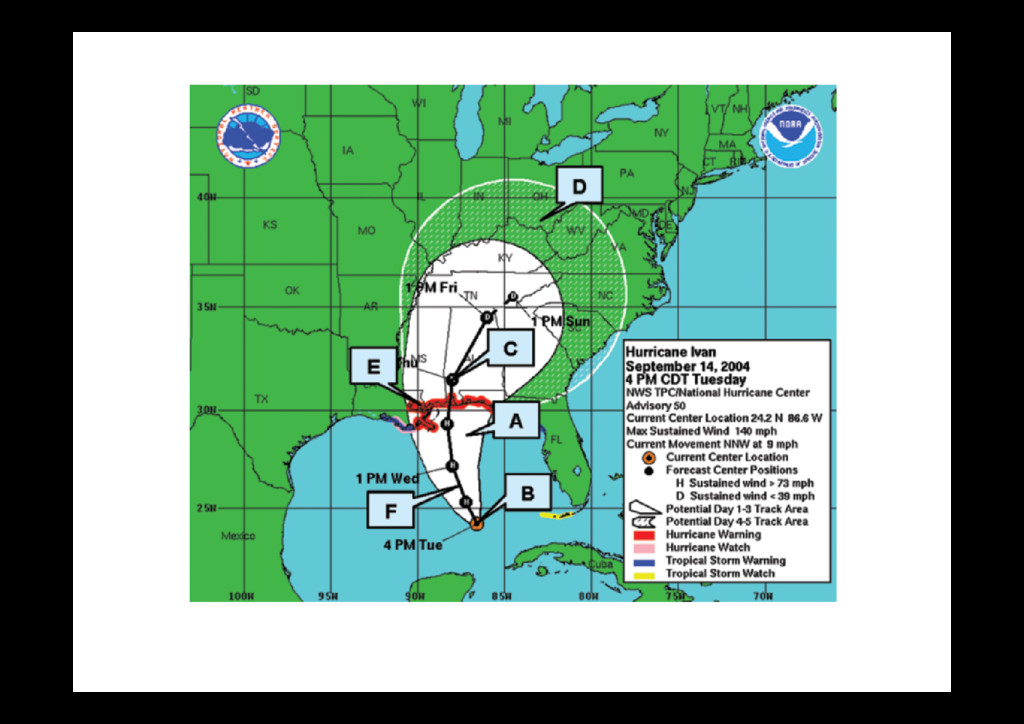
including s of hurricane be- media reports, and th interviews with ne forecasters, sug- hat many members public pay close on to this graphic, r it as part of their n-making process, times, misinterpret importance of this c was also identi- a comprehensive, gency study of be- l responses, includ- cuation actions, by ls and the general in Florida during 4 hurricane season, ted by the Federal ency Management y (FEMA), U.S. FIG. 1. “The cone of uncertainty.” A: Solid white area of cone indicates aver- age forecast error out to 3 days, B: present location of storm’s center, C: forecasted location and intensity (i.e., H = Hurricane, S = tropical storm, D = depression) at a given time, D: nonwhite area of cone indicates average fore- cast error for days 4 and 5, E: coastlines under a watch/warning indicated by
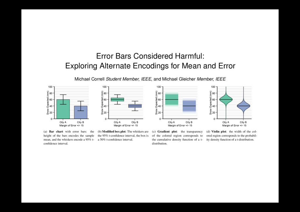
Error Michael Correll Student Member, IEEE , and Michael Gleicher Member, IEEE 0 20 40 60 80 100 Snow Expected (mm) City A City B Margin of Error +/- 15 (a) Bar chart with error bars: the height of the bars encodes the sample mean, and the whiskers encode a 95% t- confidence interval. 0 20 40 60 80 100 Snow Expected (mm) City A City B Margin of Error +/- 15 (b) Modified box plot: The whiskers are the 95% t-confidence interval, the box is a 50% t-confidence interval. 0 20 40 60 80 100 Snow Expected (mm) City A City B Margin of Error +/- 15 (c) Gradient plot: the transparency of the colored region corresponds to the cumulative density function of a t- distribution. 0 20 40 60 80 100 Snow Expected (mm) City A City B Margin of Error +/- 15 (d) Violin plot: the width of the col- ored region corresponds to the probabil- ity density function of a t-distribution. Fig. 1. Four encodings for mean and error evaluated in this work. Each prioritizes a different aspect of mean and uncertainty, and results in different patterns of judgment and comprehension for tasks requiring statistical inferences. Abstract— When making an inference or comparison with uncertain, noisy, or incomplete data, measurement error and confidence intervals can be as important for judgment as the actual mean values of different groups. These often misunderstood statistical quantities are frequently represented by bar charts with error bars. This paper investigates drawbacks with this standard encoding, and considers a set of alternatives designed to more effectively communicate the implications of mean and error data to a general audience, drawing from lessons learned from the use of visual statistics in the information visualization community. We present a series of crowd-sourced experiments that confirm that the encoding of mean and error significantly changes how viewers make decisions about uncertain data. Careful consideration of design tradeoffs in the visual presentation of data results in human reasoning that is more consistently aligned with statistical inferences. We suggest the use of gradient plots (which use transparency to encode uncertainty) and violin plots (which use width) as better alternatives for inferential tasks than bar charts with error bars. Index Terms—Visual statistics, information visualization, crowd-sourcing, empirical evaluation
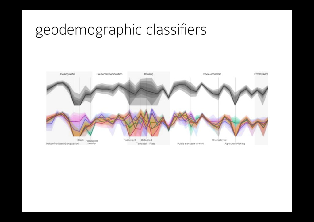
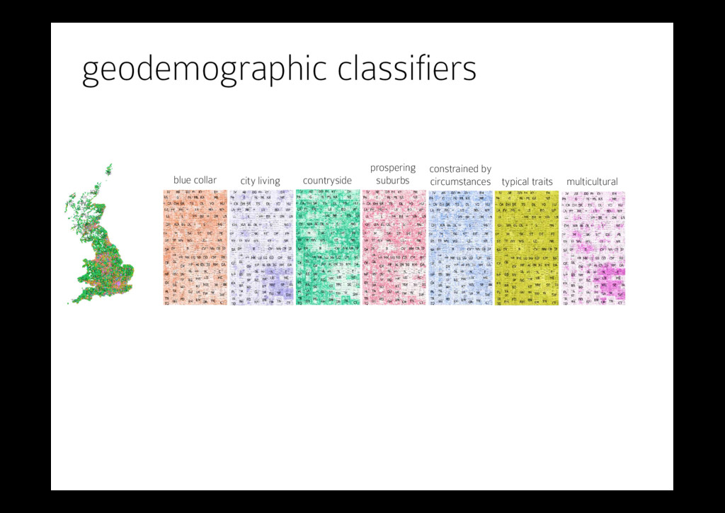
where lightness indicates the relative similarity of each OA to each super-group. been demonstrated to stark effect generally [9] and for OAC specifi- cally [50]. There are a variety of techniques for creating cartograms [48, 8] with different properties. In Fig. 5, we use a hierarchical rect- angular cartogram [42] (a treemap with spatial ordering [55]), where lightness indicates similarity to the OA’s geodemographic category (section 4.4). OAs are organised within three levels of the UK post- code hierarchy. Although the census geography is more appropri- ate for population studies [33], we use postcodes because of their widespread familiarly and their compact and familiar labelling. Post- codes provide 125 postcode areas (e.g. B), 3064 postcode districts (e.g. B12) and 11598 postcode sectors (e.g. B12 5). OAs themselves do not have names, but we provide the names of their LSOAs (a census geog- raphy coarser than OAs). Each rectangle represents an OA and these are geographically arranged within the postcode hierarchy. The result- ing non-occluding, space-filling, population-normalised cartogram has some advantages over the dot map. Coloured area is now proportional to the population of OAs classified as each super-group – notice how much less ‘Countryside’ (green) area there is in the cartogram than the Type Cartogram can be dot map Size Population Hue Most similar OAC category can be a specific OAC Lightness Classification uncertainty can be turned off Selection Spatial: All OAs can be any set of OAs and can be added to F Specific OA: 33UBQX0003 indicated by the mouse cursor B Overview map Highlight Postcode area of the specific OA in A C OAC Legend Type Super-group can be group Order Consistent Size Population of selected in A or F Selection [Display]: Countryside! & "Multicultural! shown in E can be set to be any number of categories [Baseline]: none, affects E can be set to be any category D Super-group similarity barchart Length Similarity to super-group Hue OAC super-group Order Consistent E Population profile Hue OAC category (grey for all) as selected in C Shading 1st-9th declines can be turned off Axes 41 census variables can be reordered Labels Off can be turned on or available on mouseover F Spatial selections List "None! and "all! as default can add more identified in A, illustrated with thumbnail image Selection [Display]: all OAs, affects A and E can be set to be any number of categories [Baseline]: none selected, affects E can be set to be any category at implements our design as described in section 4. Details listed on the right. Here, all OAs are selected (see R postcode (overview in B). Mouse cursor indicates a ‘Countryside’ OA that is also quite similar to two other le (41 census variables) is the black line in E shown alongside two national profiles indicated by [display] in C. on and chauffeuring well because n required; a fact positively com- pants in our evaluation. There is es can detract from the data being have a significant effect on user s have strongly influenced our de- f equal lightness [56, 53] depict nd used consistently across views. from their parents’ hues and are Although too indistinguishable for ty in adjacent areas to be detected. it is available to encode other in- riations in lightness represent the ory (section 4.4), such that light- ss hues [56]. As the similarity de- indicating that the allocated cate- e area. Lightness is considered an ind of information [31]. The result colour scheme [4] showing cate- te for encoding attribute accuracy es [47]. n d an OAC category. The dot map and area contains OAs classified this is a relatively small propor- in portion in Fig. 4 (right) reveals trating the difficulty of producing cartograms size geographic areas raphical space, the visual promi- ortional to population. This has Fig. 4. Centroids of OAs coloured by super-group. Labels indicate post- codes. Left: National map shows most of the land area is ‘Countryside’. Right: The zoomed-in portion centred on London shows marked geo- graphical differences in OA density and classification. multicultural typical traits constrained by circumstances prospering suburbs countryside city living blue collar
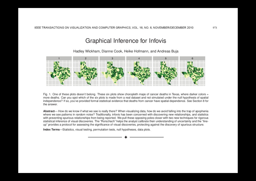
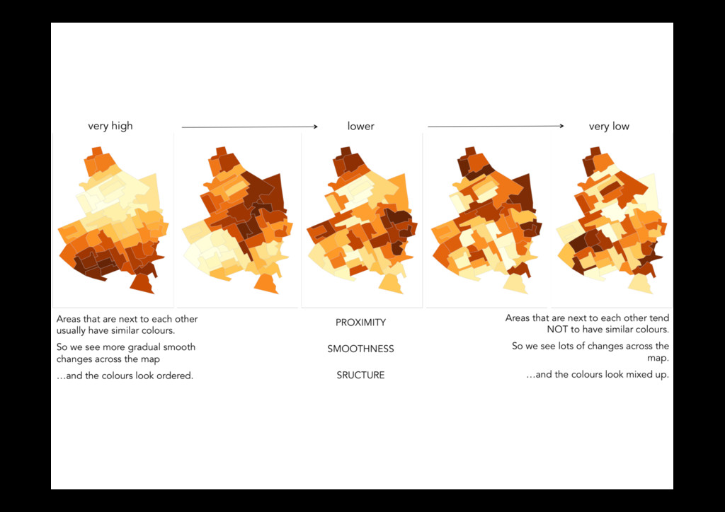
and Andreas Buja Fig. 1. One of these plots doesn’t belong. These six plots show choropleth maps of cancer deaths in Texas, where darker colors = more deaths. Can you spot which of the six plots is made from a real dataset and not simulated under the null hypothesis of spatial independence? If so, you’ve provided formal statistical evidence that deaths from cancer have spatial dependence. See Section 8 for the answer. Abstract— How do we know if what we see is really there? When visualizing data, how do we avoid falling into the trap of apophenia where we see patterns in random noise? Traditionally, infovis has been concerned with discovering new relationships, and statistics with preventing spurious relationships from being reported. We pull these opposing poles closer with two new techniques for rigorous statistical inference of visual discoveries. The “Rorschach” helps the analyst calibrate their understanding of uncertainty and the “line- up” provides a protocol for assessing the significance of visual discoveries, protecting against the discovery of spurious structure. Index Terms—Statistics, visual testing, permutation tests, null hypotheses, data plots. 1 INTRODUCTION What is the role of statistics in infovis? In this paper we try and an- swer that question by framing the answer as a compromise between curiosity and skepticism. Infovis provides tools to uncover new rela- tionships, tools of curiosity, and much research in infovis focuses on making the chance of finding relationships as high as possible. On the other hand, most statistical methods provide tools to check whether a relationship really exists: they are tools of skepticism. Most statistics research focuses on making sure to minimize the chance of finding a relationship that does not exist. Neither extreme is good: unfettered graphic plates of actual galaxies. This was a particularly impressive achievement for its time: models had to be simulated based on tables of random values and plots drawn by hand. As personal computers be- came available, such examples became more common.[3] compared computer generated Mondrian paintings with paintings by the true artist, [4] provides 40 pages of null plots, [5] cautions against over- interpreting random visual stimuli, and [6] recommends overlaying normal probability plots with lines generated from random samples of the data. The early visualization system Dataviewer [7] implemented 973 IEEE TRANSACTIONS ON VISUALIZATION AND COMPUTER GRAPHICS, VOL. 16, NO. 6, NOVEMBER/DECEMBER 2010