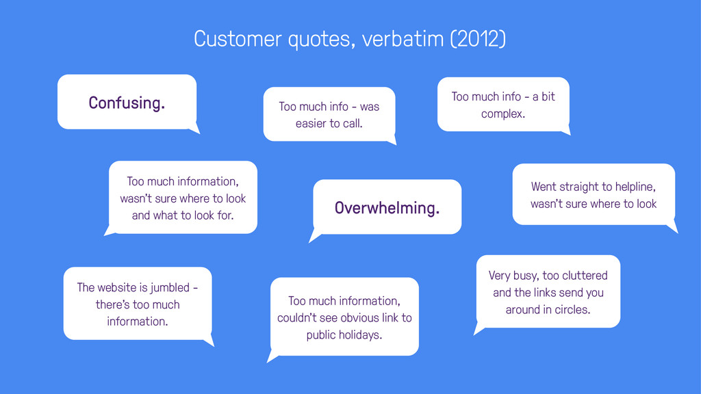
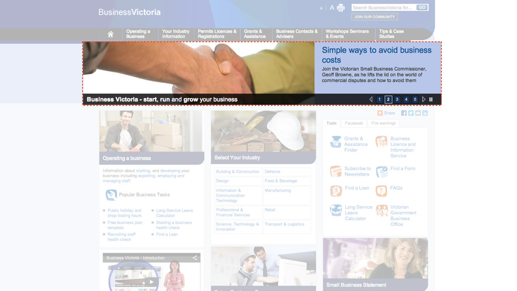
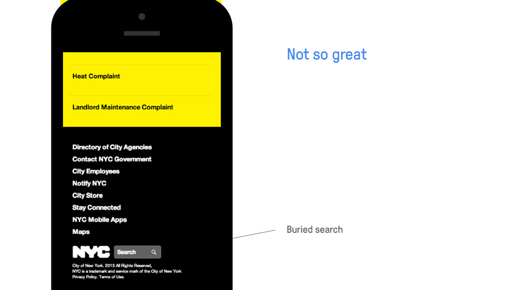
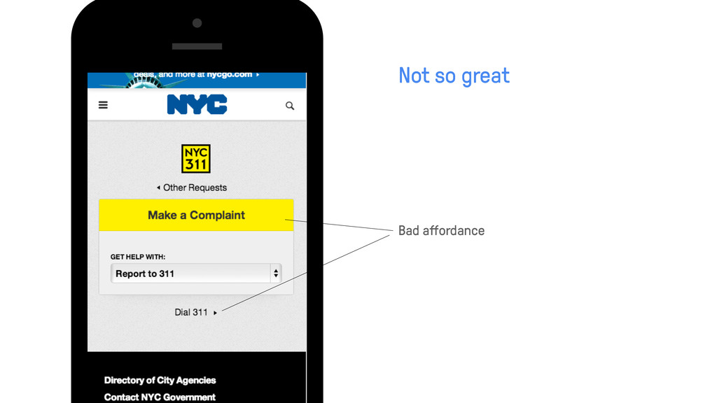
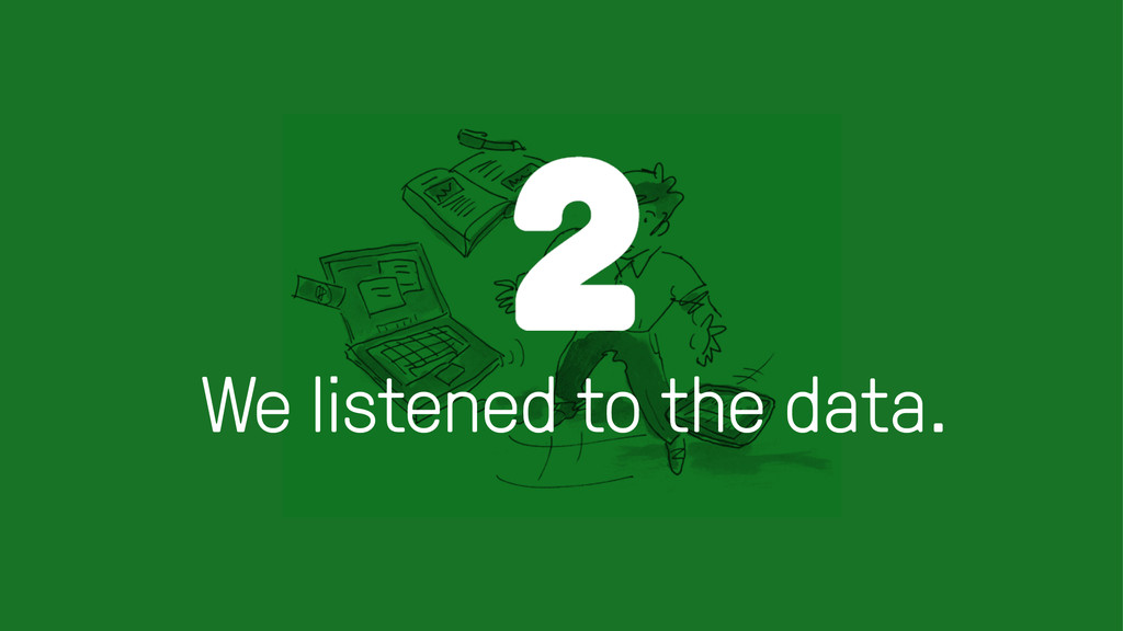
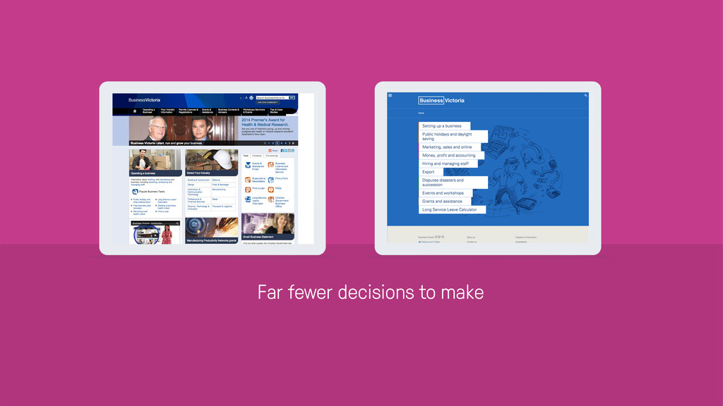
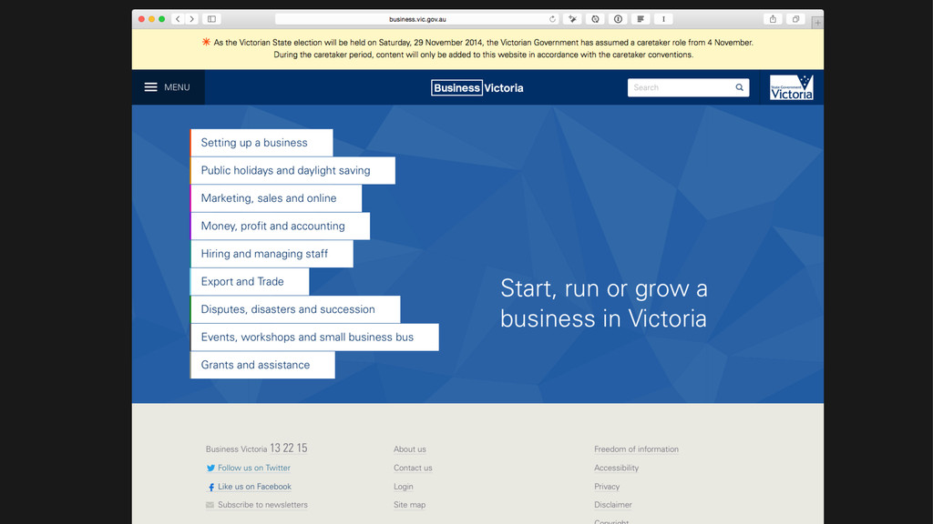
there’s too much information. Went straight to helpline, wasn’t sure where to look Too much information, wasn't sure where to look and what to look for. Too much info - was easier to call. Too much information, couldn’t see obvious link to public holidays. Too much info - a bit complex. Very busy, too cluttered and the links send you around in circles. Confusing.
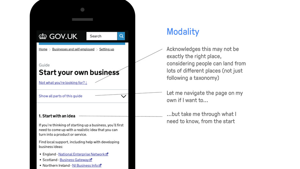
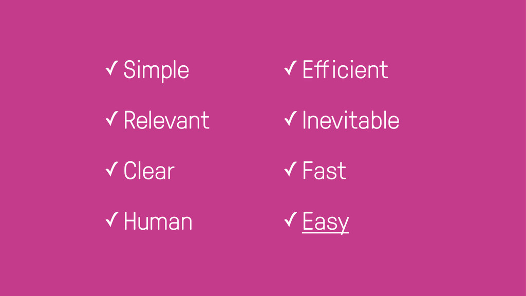
people can land from lots of different places (not just following a taxonomy) Modality Let me navigate the page on my own if I want to... ...but take me through what I need to know, from the start
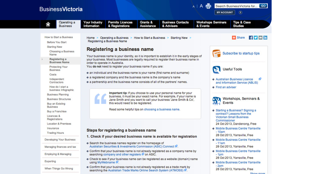
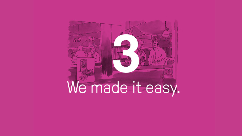
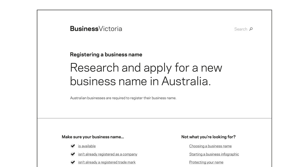
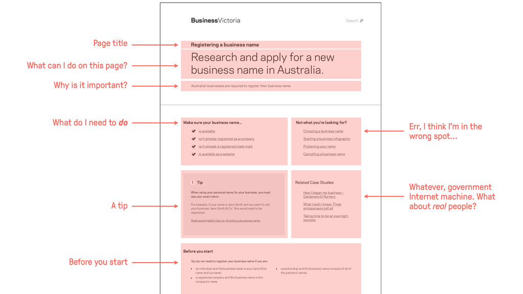
name Search Registering a business name BusinessVictoria Research and apply for a new business name in Australia. Australian businesses are required to register their business name. is available isn’t already registered as a company isn’t already a registered trade mark Make sure your business name... Not what you’re looking for?
name Cancelling a business name How I began my business – Gardenworld Nursery What I wish I knew: Three entrepeneurs tell all Taking time to be an overnight success Search Registering a business name BusinessVictoria Research and apply for a new business name in Australia. Australian businesses are required to register their business name. Before you start an individual and the business name is your name (first name and surname) a registered company and the business name is the company’s name a partnership and the business name consists of all of the partners’ names. You do not need to register your business name if you are: Related Case Studies Tip When using your personal name for your business, you must use your exact name . For example, if your name is Jane Smith and you want to call your business 'Jane Smith & Co', this would need to be registered. Read some helpful tips on choosing a business name. ! is available isn’t already registered as a company isn’t already a registered trade mark is available as a website Make sure your business name... Not what you’re looking for? Err, I think I’m in the wrong spot... Whatever, government Internet machine. What about real people? What can I do on this page? Why is it important? Page title What do I need to do A tip Before you start
![www.studiothick.com [email protected] twitter.com/studiothick facebook.com/studiothick www.studiothick.com [email protected] twitter.com/studiothick facebook.com/studiothick The UX](https://files.speakerdeck.com/presentations/d53d73504b8c01321016325c0601a345/slide_0.jpg)
![www.studiothick.com [email protected] twitter.com/studiothick facebook.com/studiothick www.studiothick.com [email protected] twitter.com/studiothick facebook.com/studiothick These slides:](https://files.speakerdeck.com/presentations/d53d73504b8c01321016325c0601a345/slide_73.jpg)