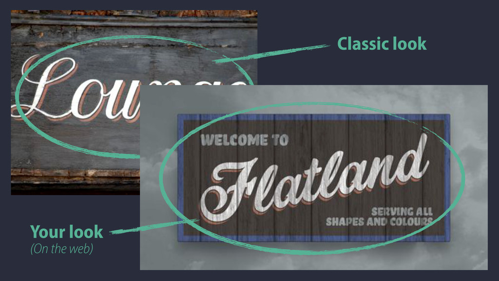
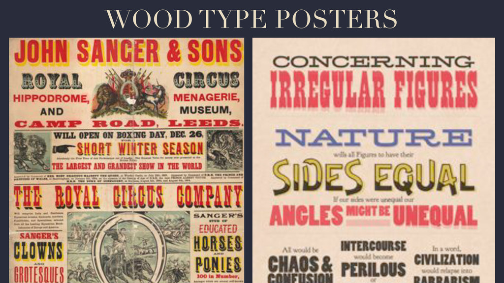
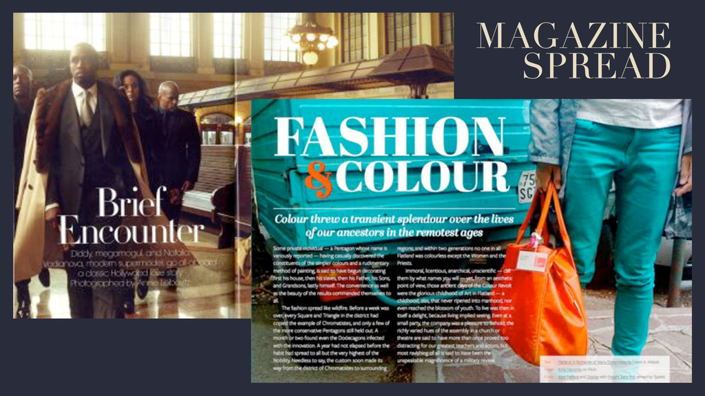
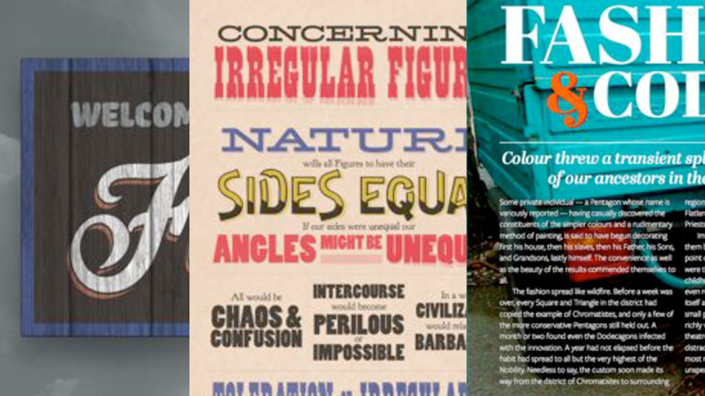
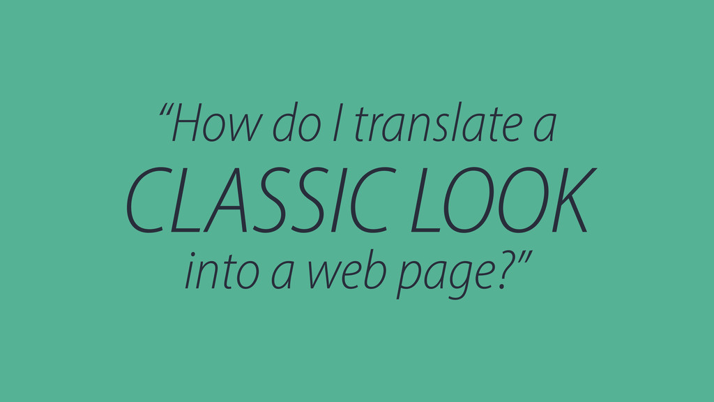
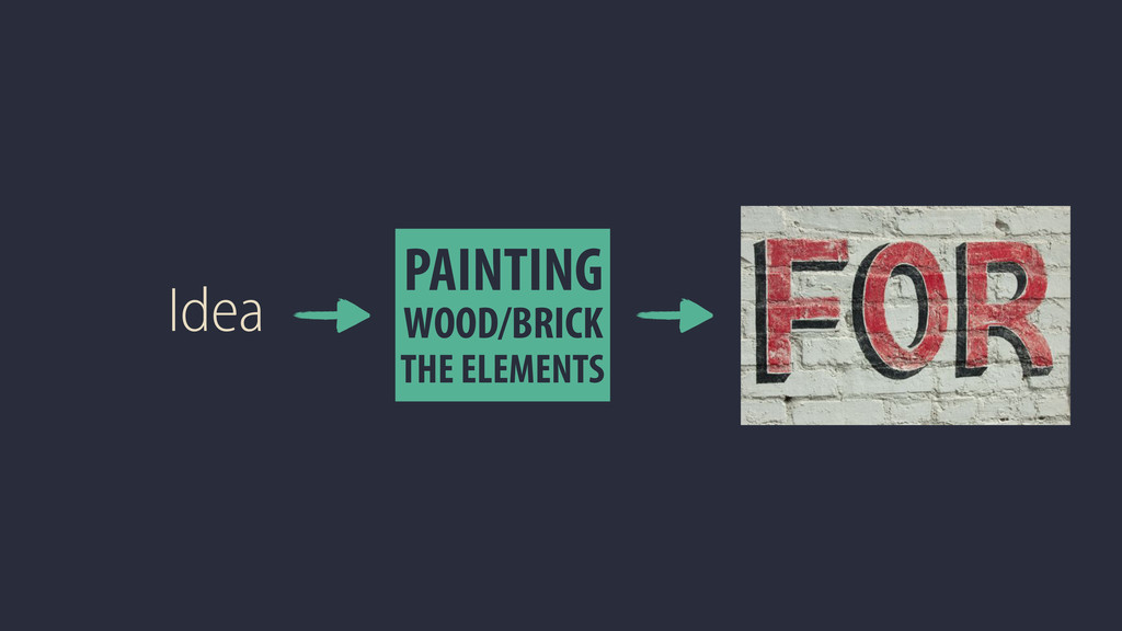
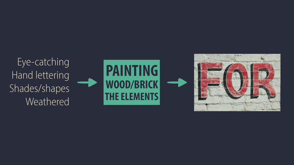
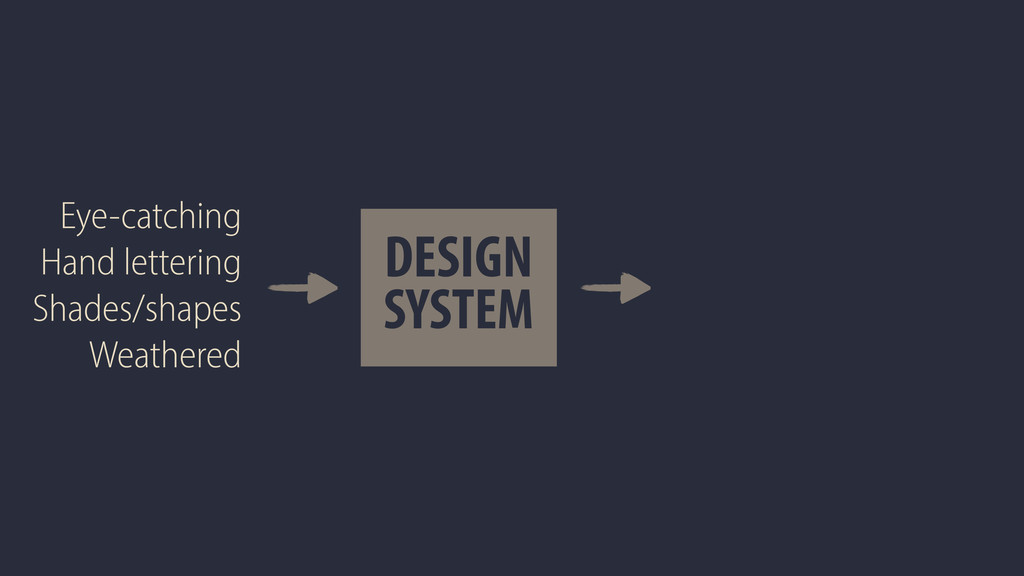
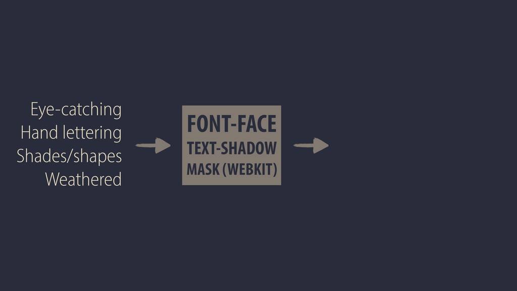
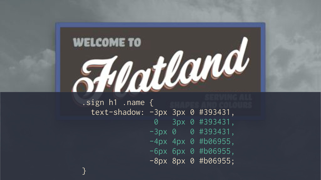
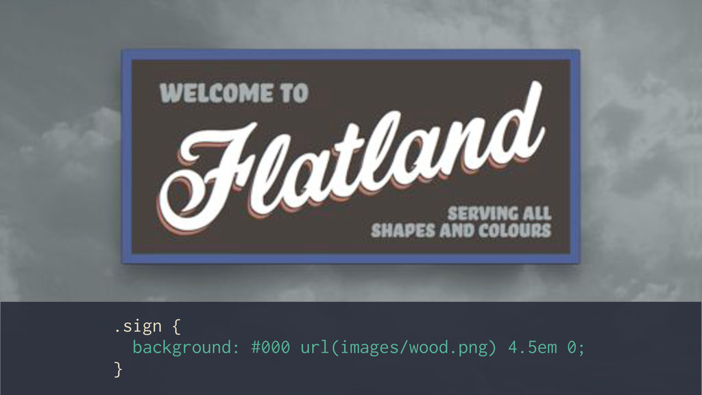
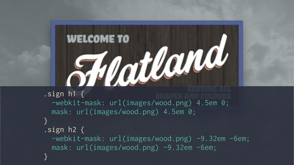
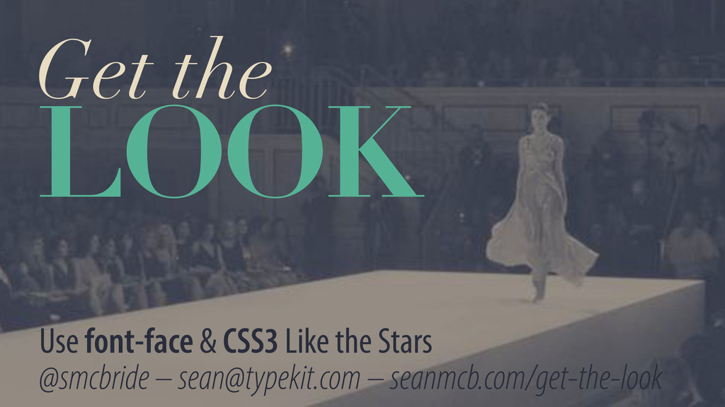
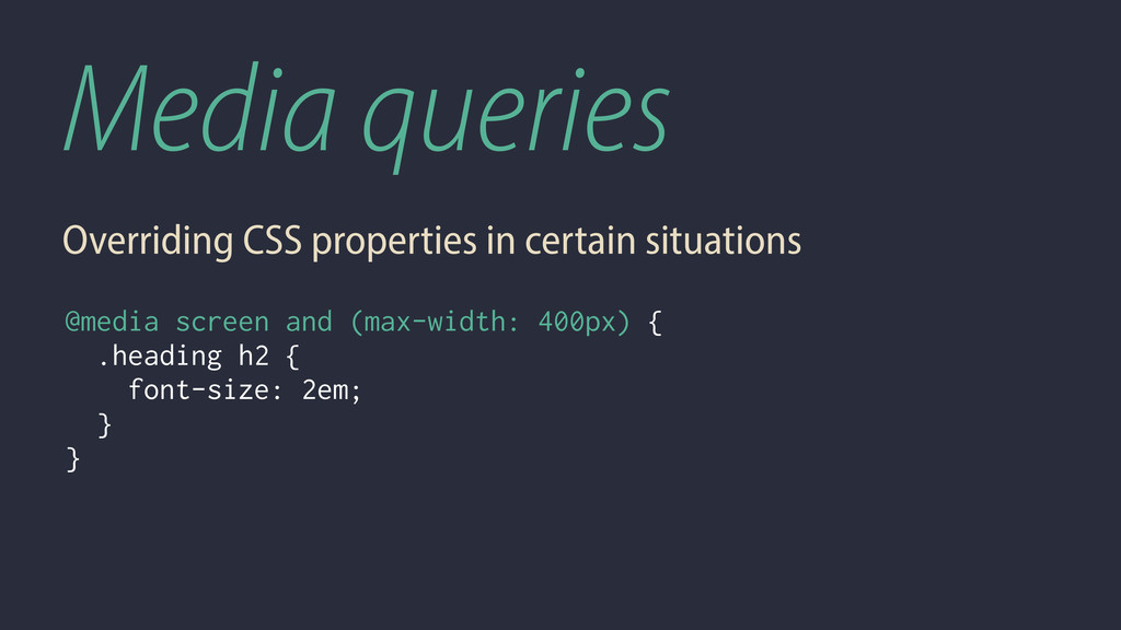
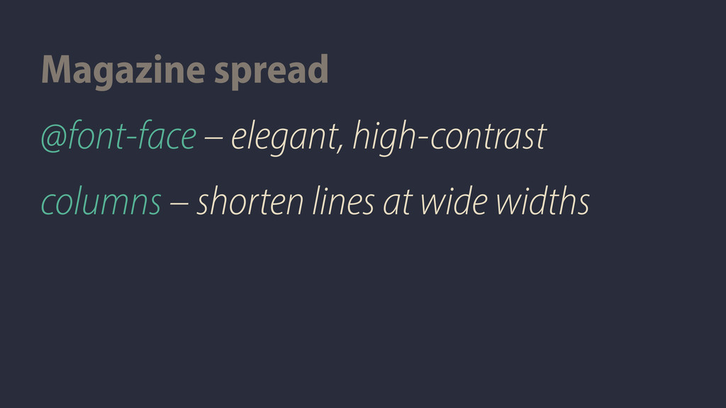
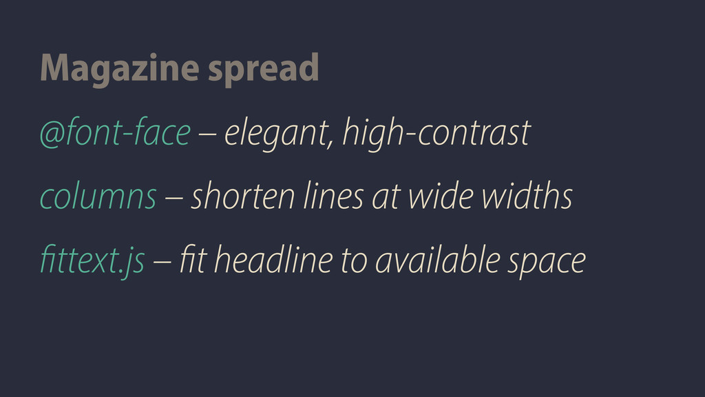
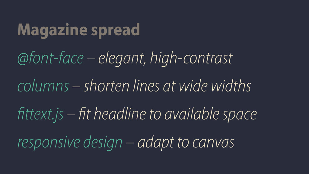
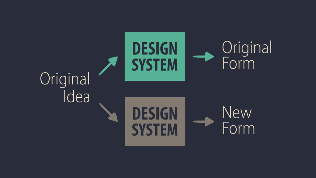
An expanded version of my Get the Look talk. The original version was given on Saturday, 10 March 2012 at SxSW. I take 3 real-life examples of iconic design styles and explore what it takes to translate the original design idea to the web. Along the way, I explore fun CSS3 properties and how they can be used for great typography online that respects our design roots. In the expanded version, I add more examples and CSS, and I also look at an example that didn't turn out so well.
 seanami
 moco1013
 nishame
 takanorip
 satosio
 hilokifigma
 keita_yoshikawa
 hiranotomoki
 kakukoki
 shotamatsuo
 calpin
 hiro0218
 chiemitaki
 mayunak
 kneath
 signer
 denniskardys
 konakalab
 frankvandijk
 jcasabona
 katarinadahlin
 swwweet
 inesmontani
 rocio
rocio
 addyosmani
![@smcbride [email protected]](https://files.speakerdeck.com/presentations/4fb74e0ed1170e0022015573/slide_4.jpg)
![Get the LOOK seanmcb.com/get-the-look [email protected] @smcbride](https://files.speakerdeck.com/presentations/4fb74e0ed1170e0022015573/slide_322.jpg)