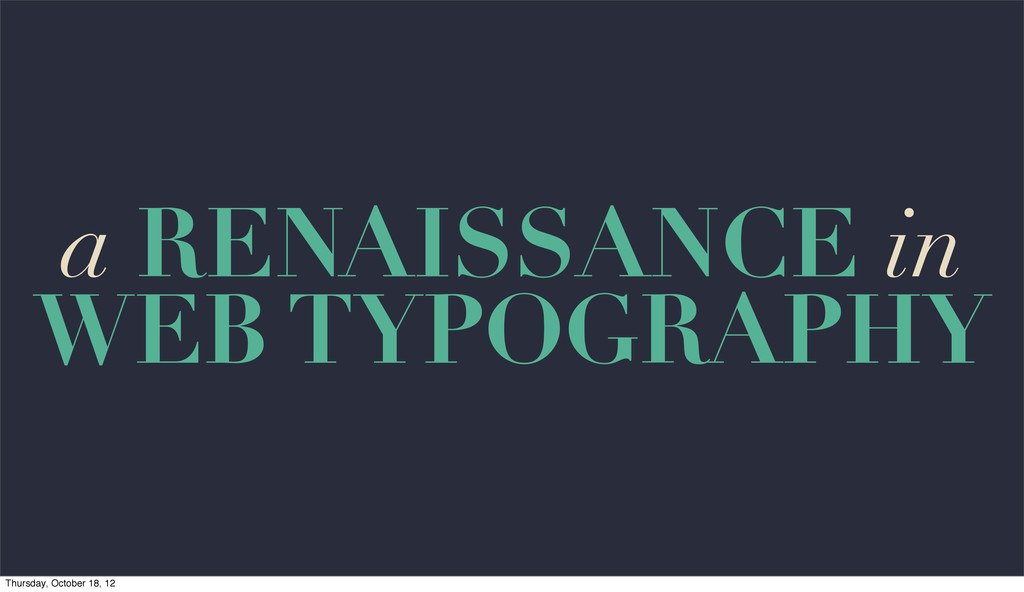
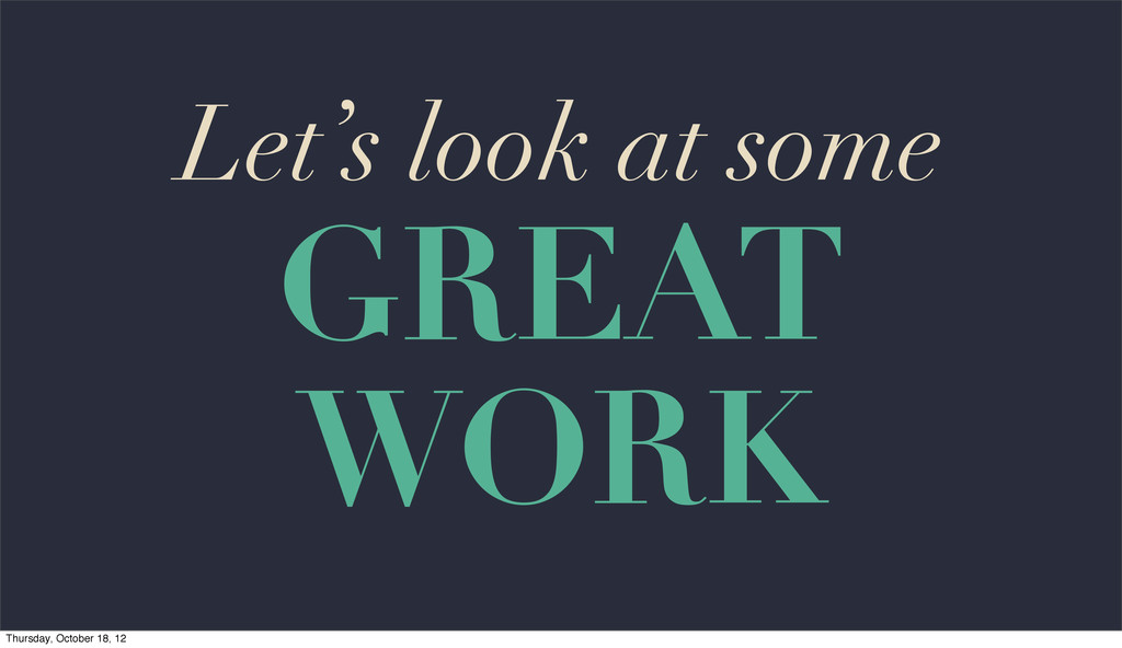
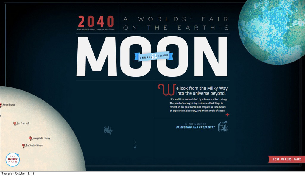
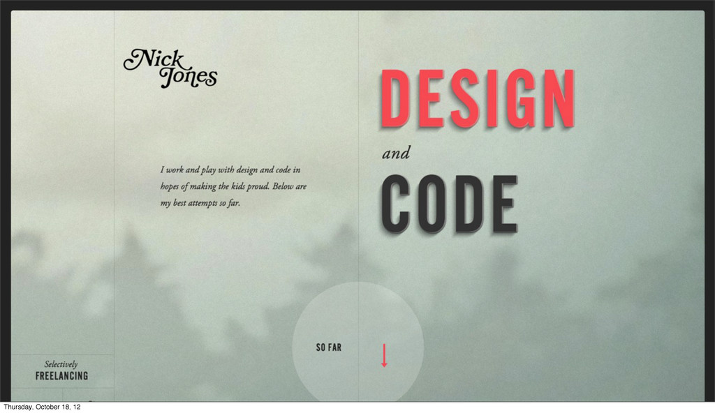
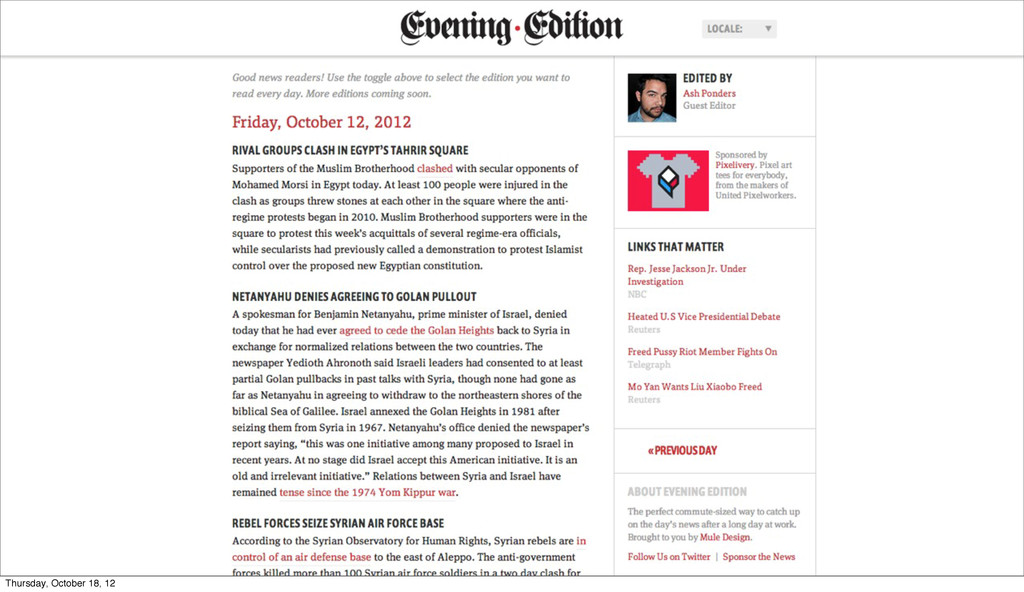
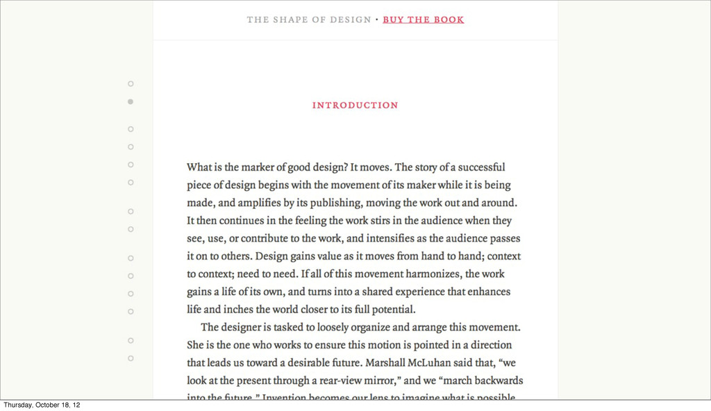
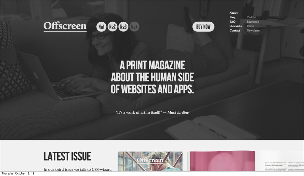
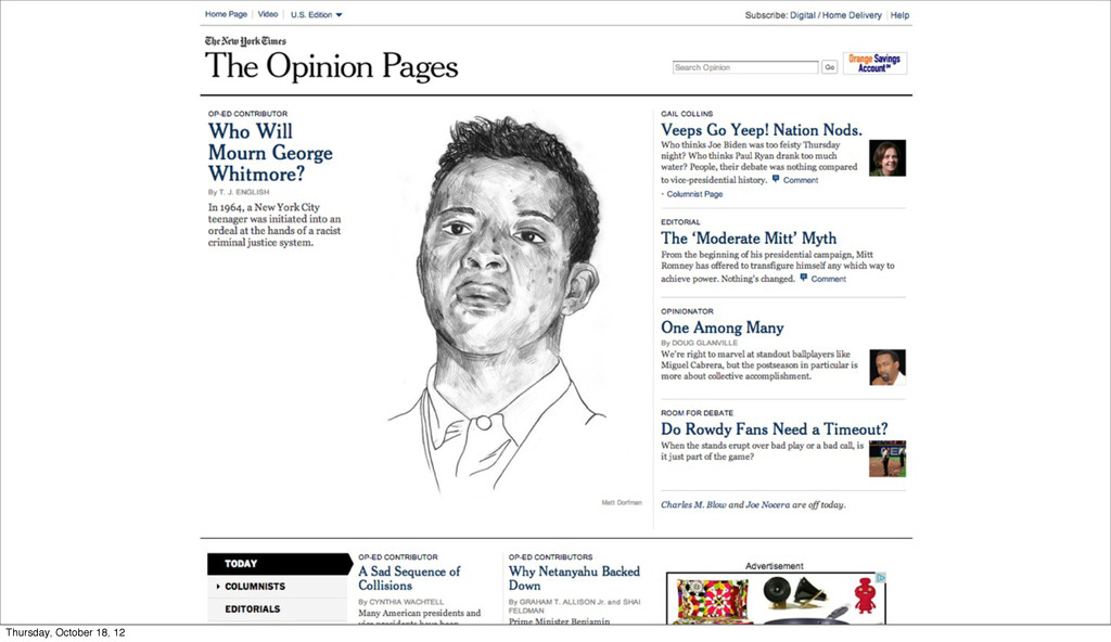
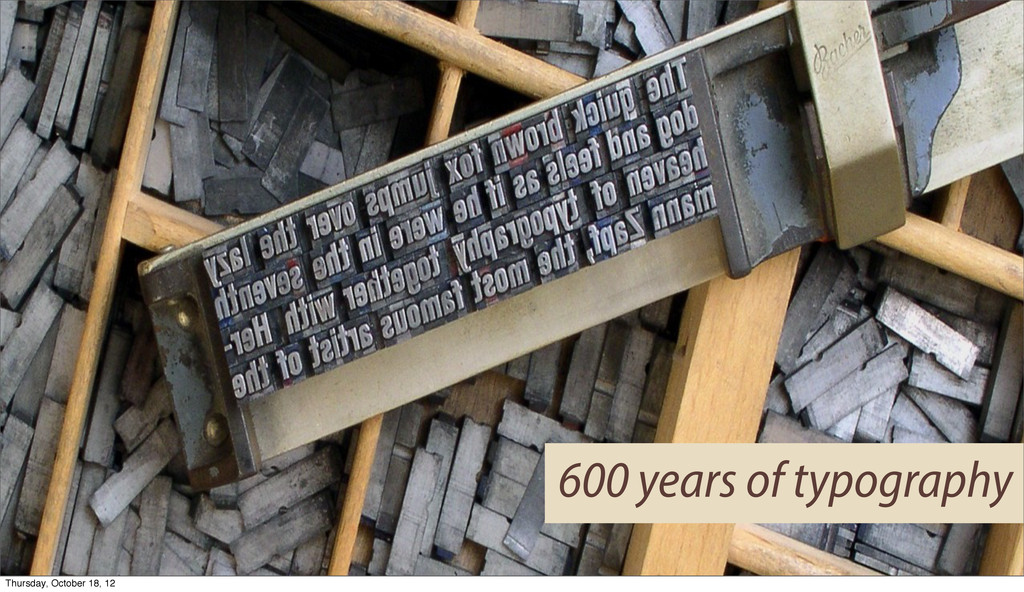
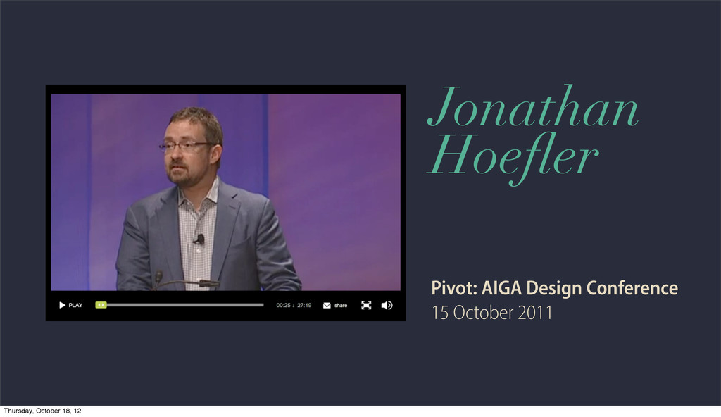
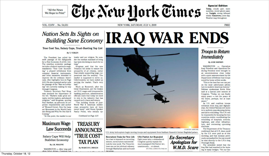
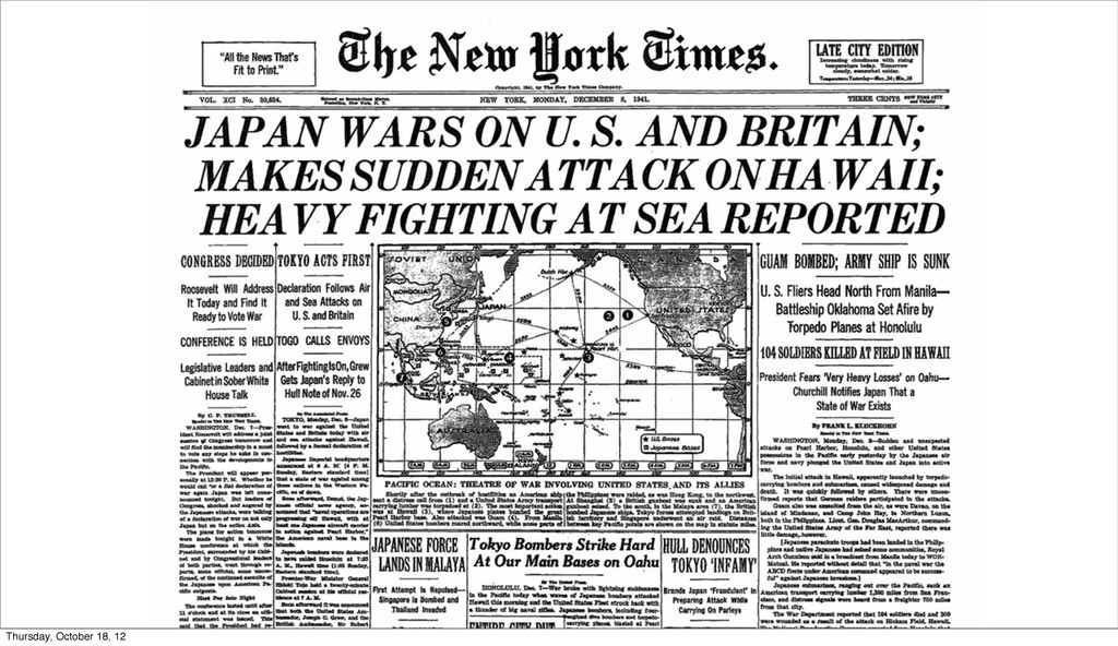
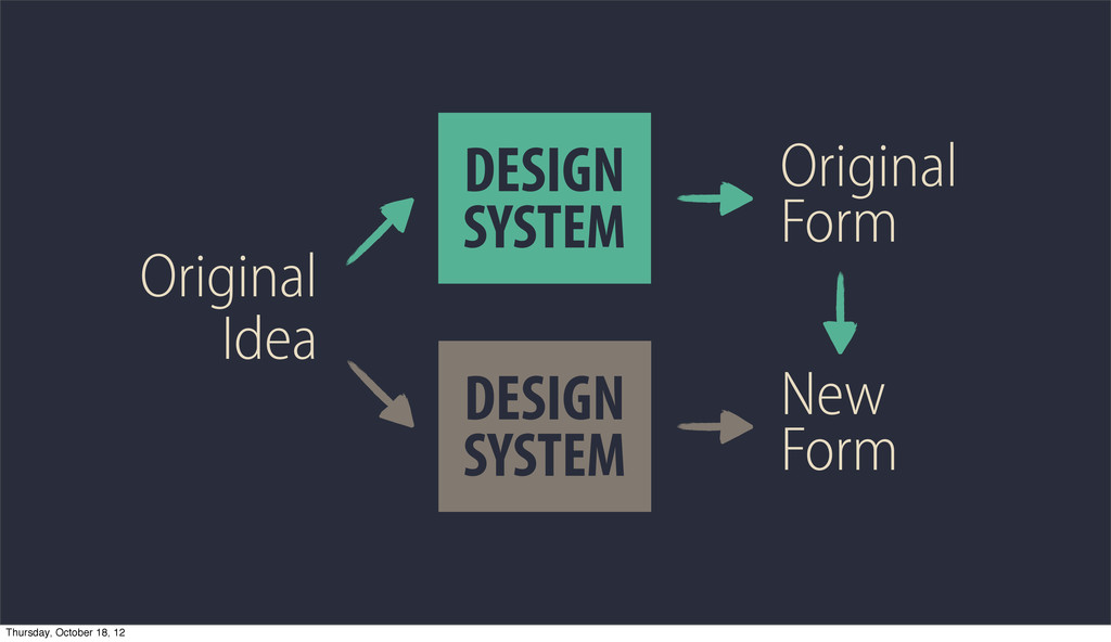
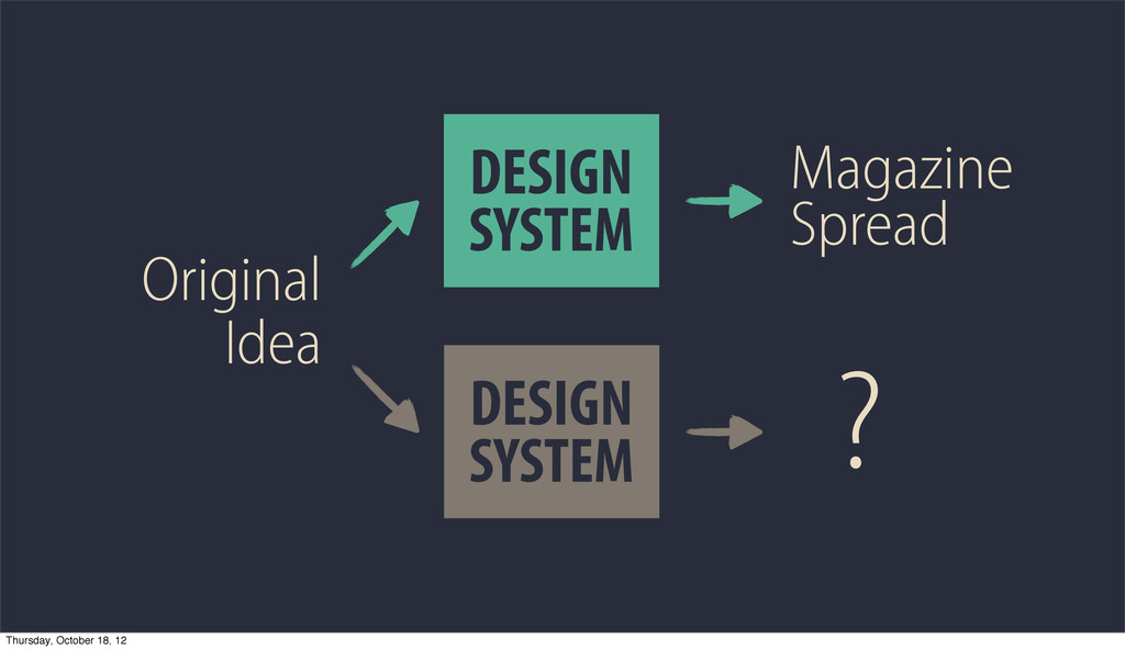
Web fonts are enabling incredible new design. In the last few years, we’ve seen an explosion of great work fueled by these new tools. Web fonts are improving the web by allowing a broader range of expressiveness. As designers, we can finally access the full spectrum of typographic emotion without sacrificing accessibility, maintainability, and performance. In this talk, we’ll look at examples of great work, explore the history of typography on the web, dig into @font-face and CSS, and discuss some of the unique constraints and challenges of using web fonts.
 seanami
 mhand01
 deadlinepoet
 moco1013
 a2k
a2k
 hiromimaeo
 klemens
 pkshadeck
 mottox2
 calpin
 shoko_seven11
 mukai_takeru
 akosma
 chrislema
 jacobian
 marketingsoph
 letsgokoyo
 morganepeng
 afnizarnur
 csswizardry
 inesmontani
 eileencodes
 gurzu
gurzu
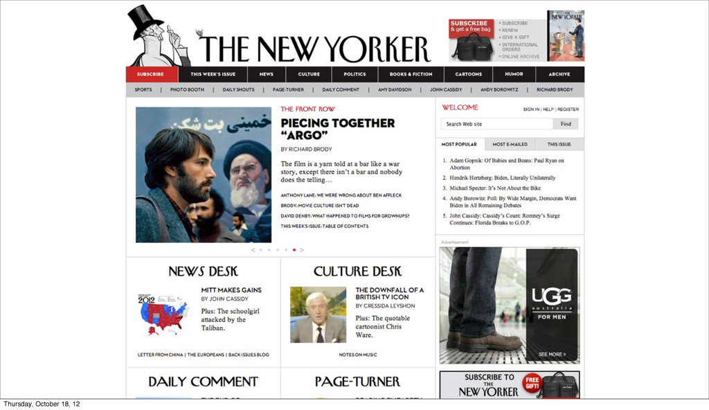
![@smcbride [email protected] bit.ly/typo12-webtype Thursday, October 18, 12](https://files.speakerdeck.com/presentations/50807d445b45fd0002001ee1/slide_89.jpg)