Upgrade to Pro — share decks privately, control downloads, hide ads and more …

CSS pra Gente Grande - CSS escalável, organizado, legível e reaproveitável

Shankar Cabus
September 25, 2014

CSS pra Gente Grande - CSS escalável, organizado, legível e reaproveitável

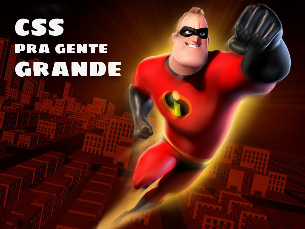
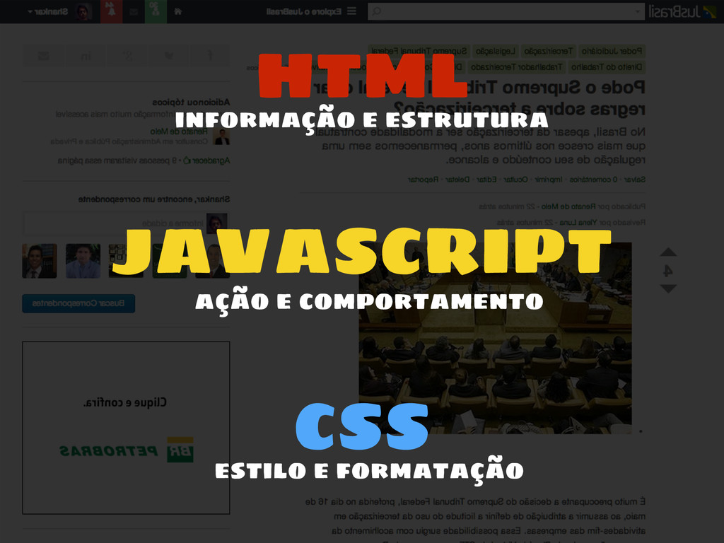
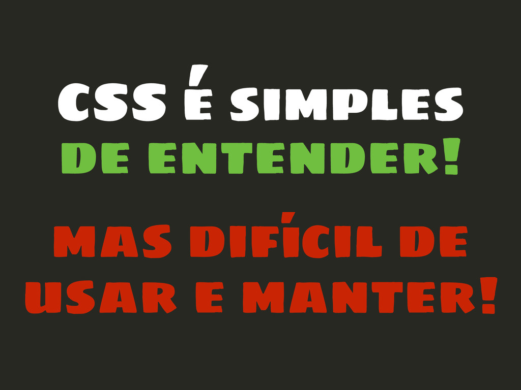
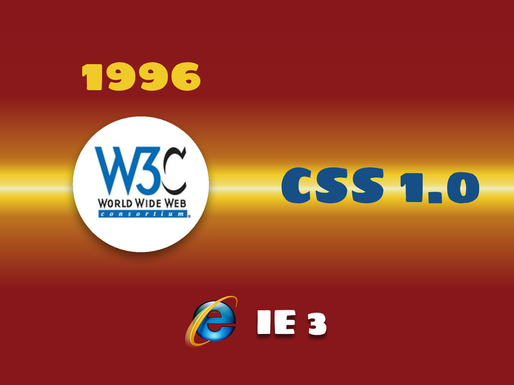
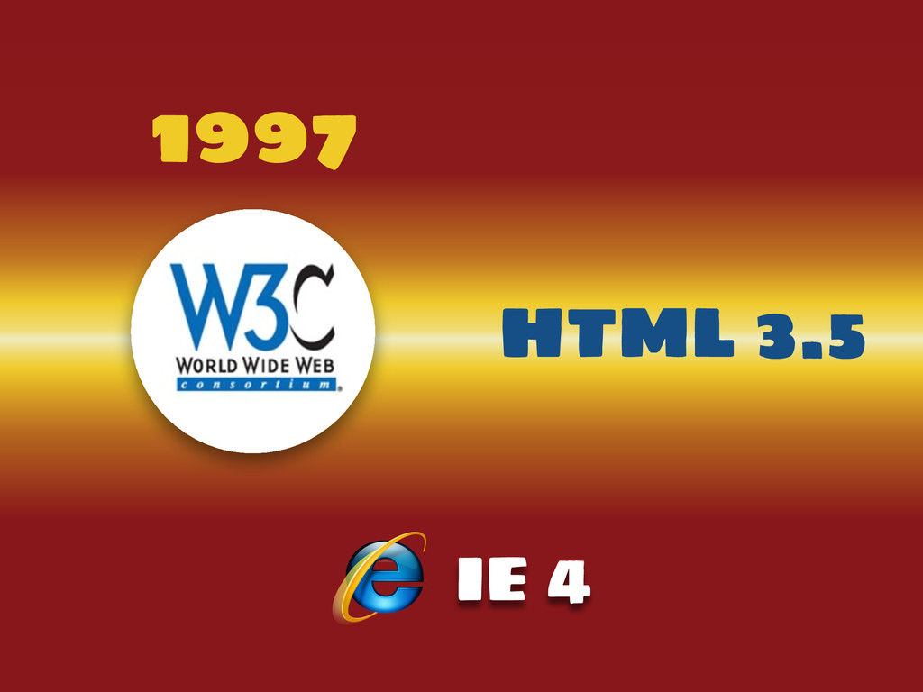
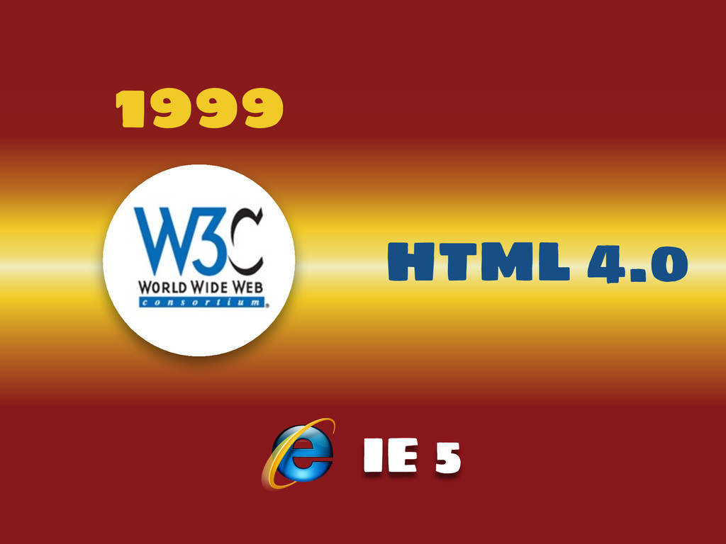
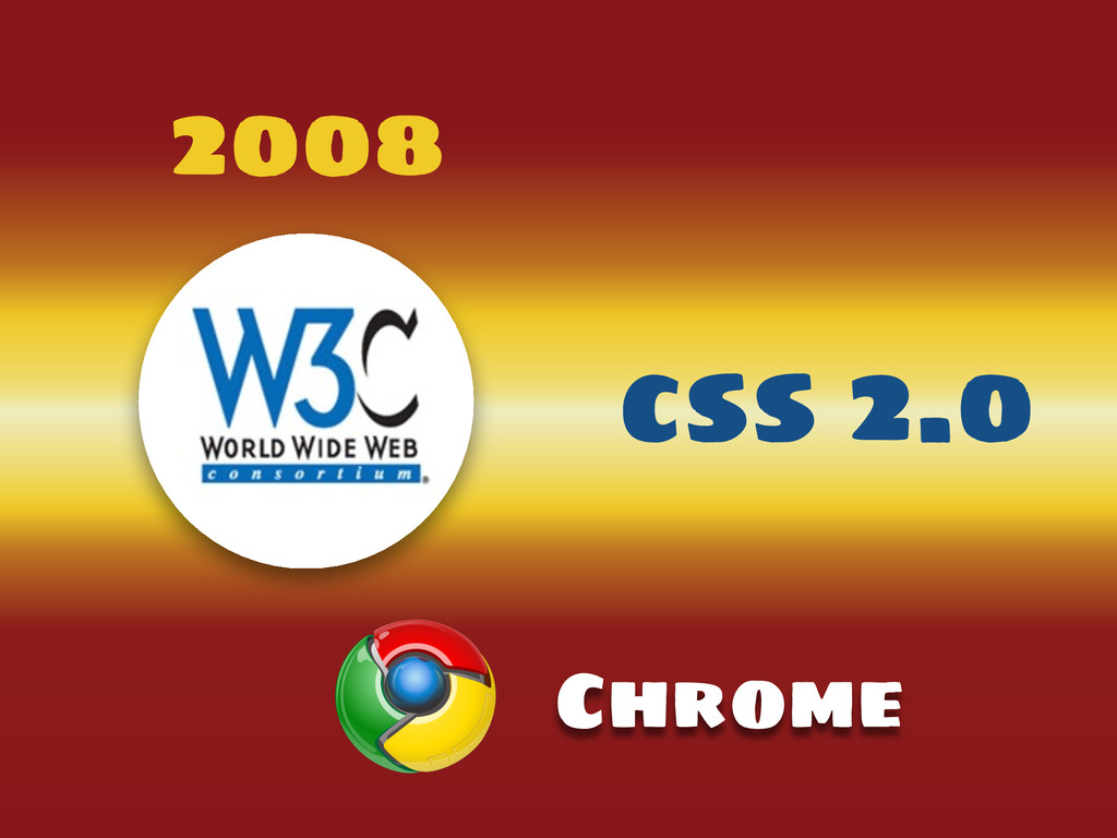
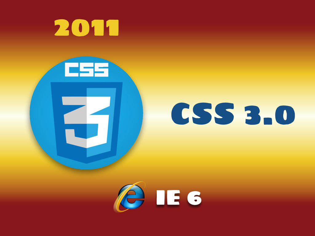
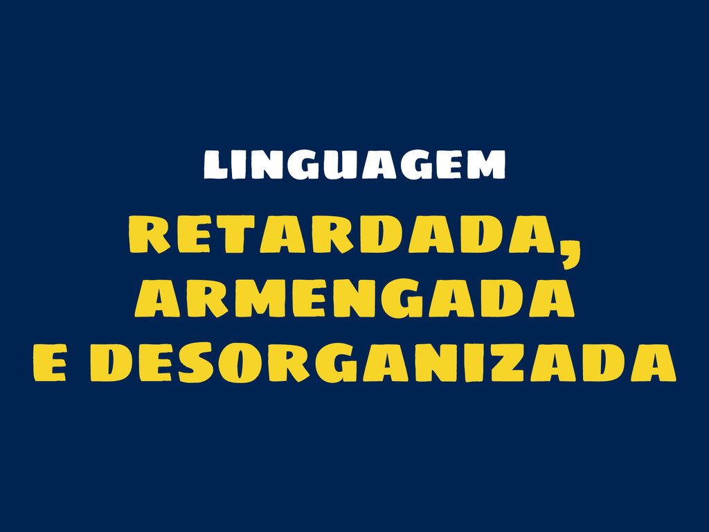
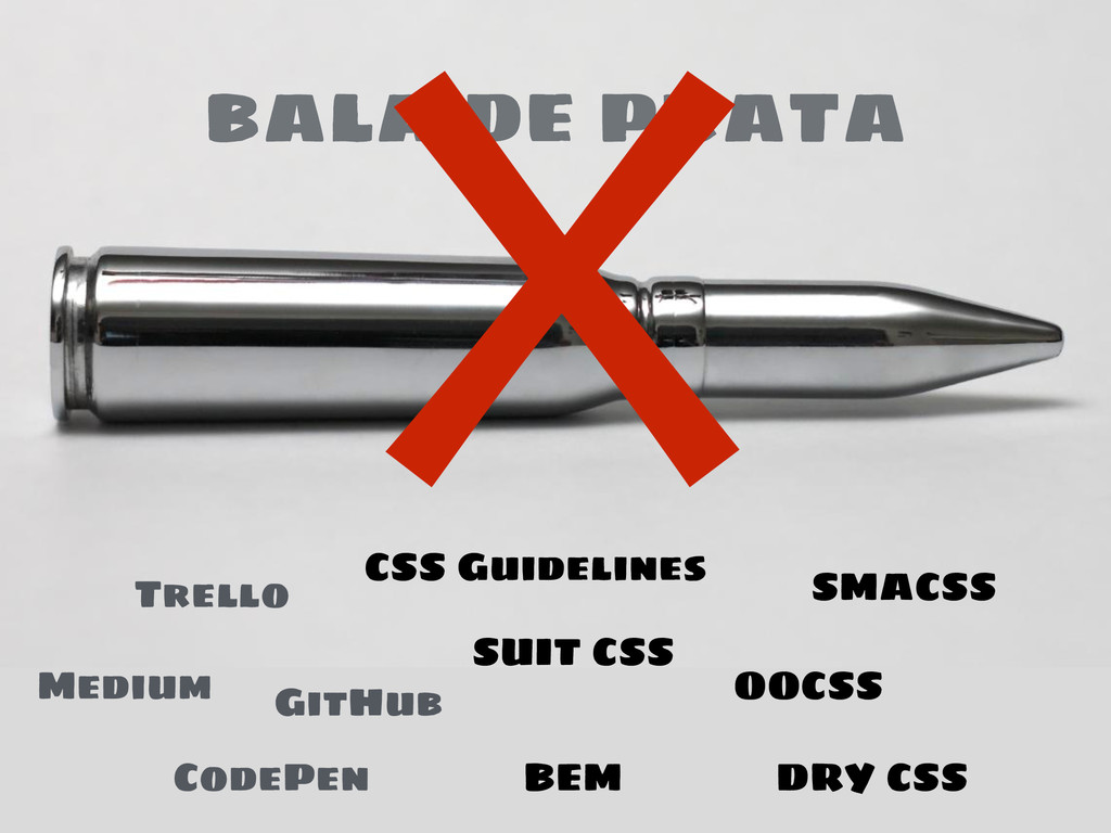
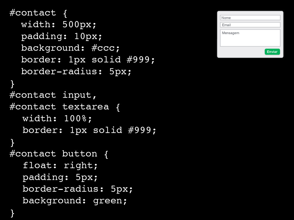
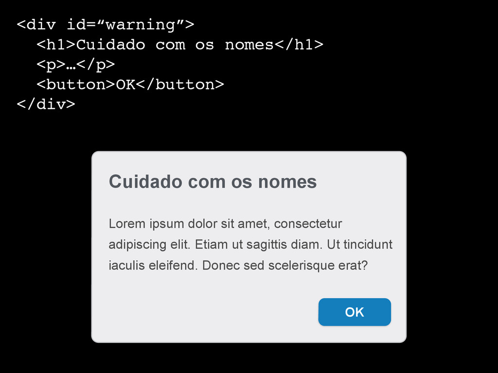
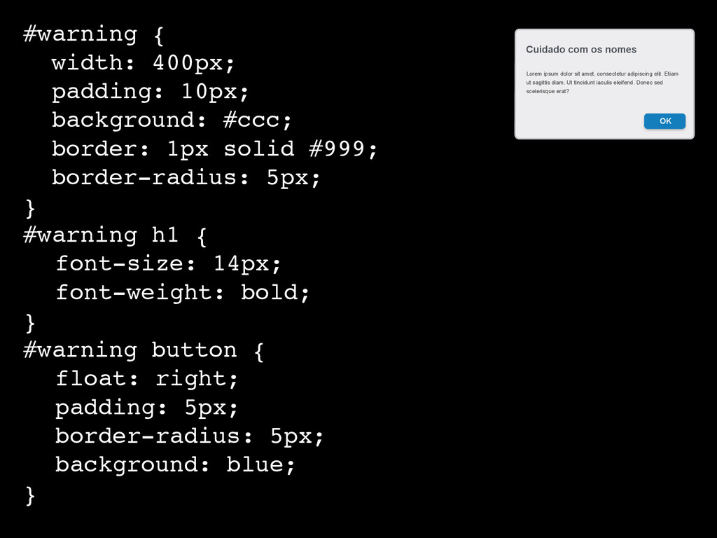
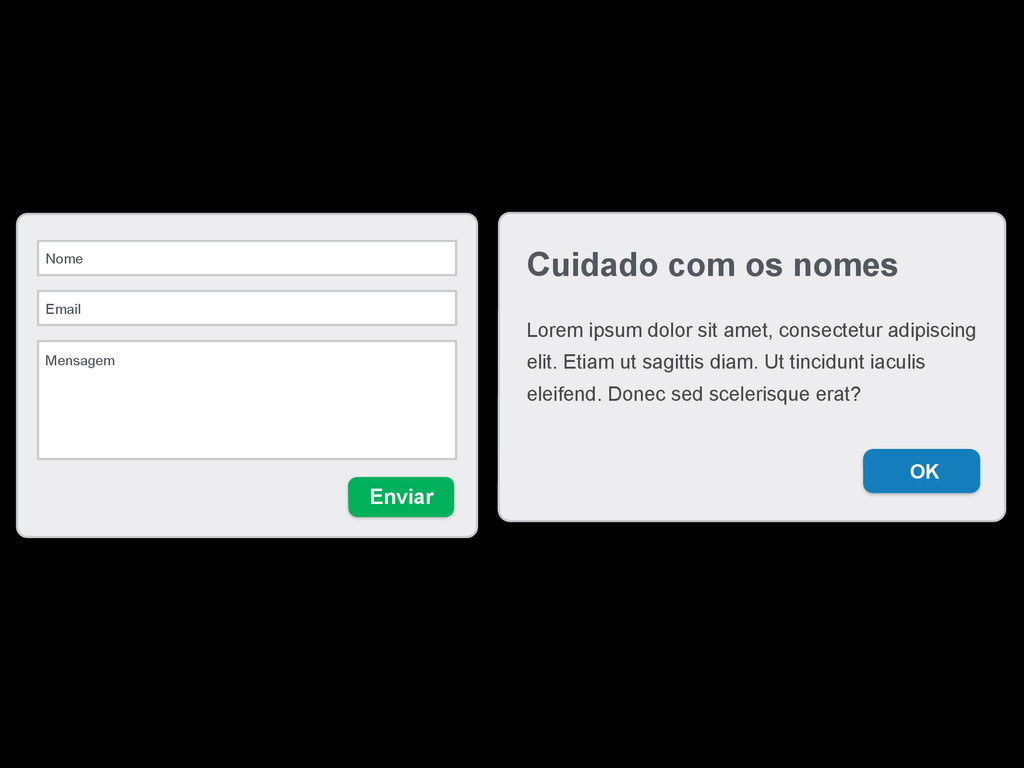
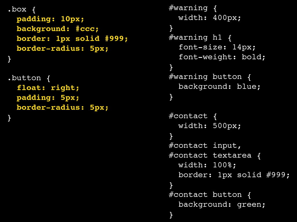
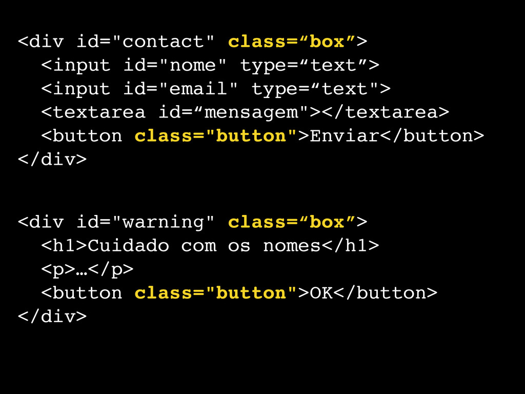
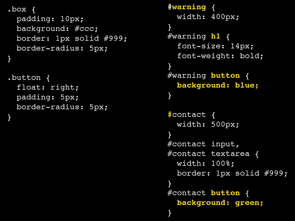
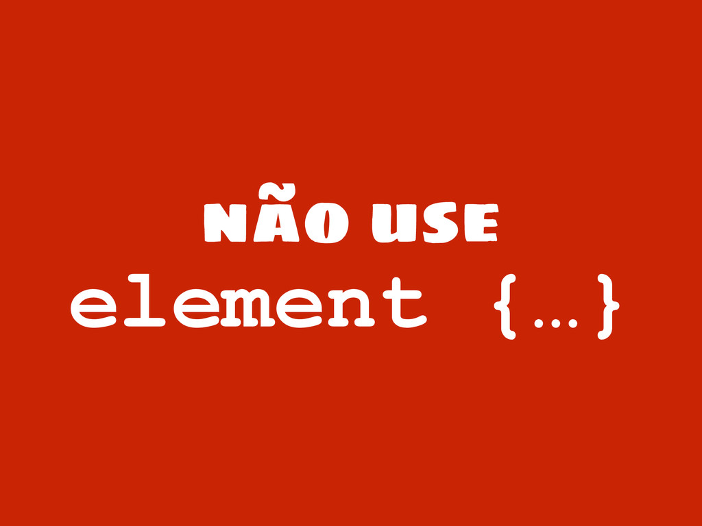
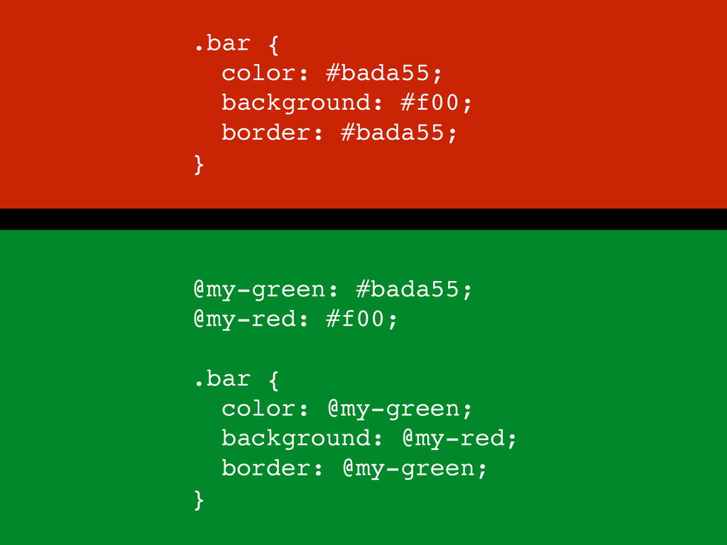
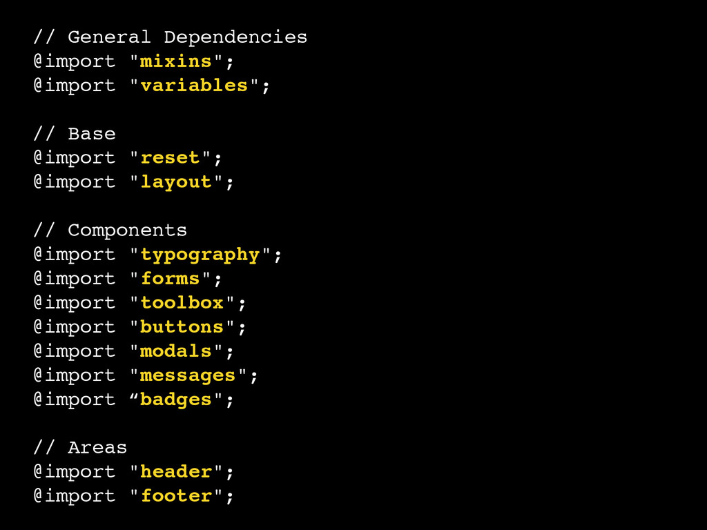
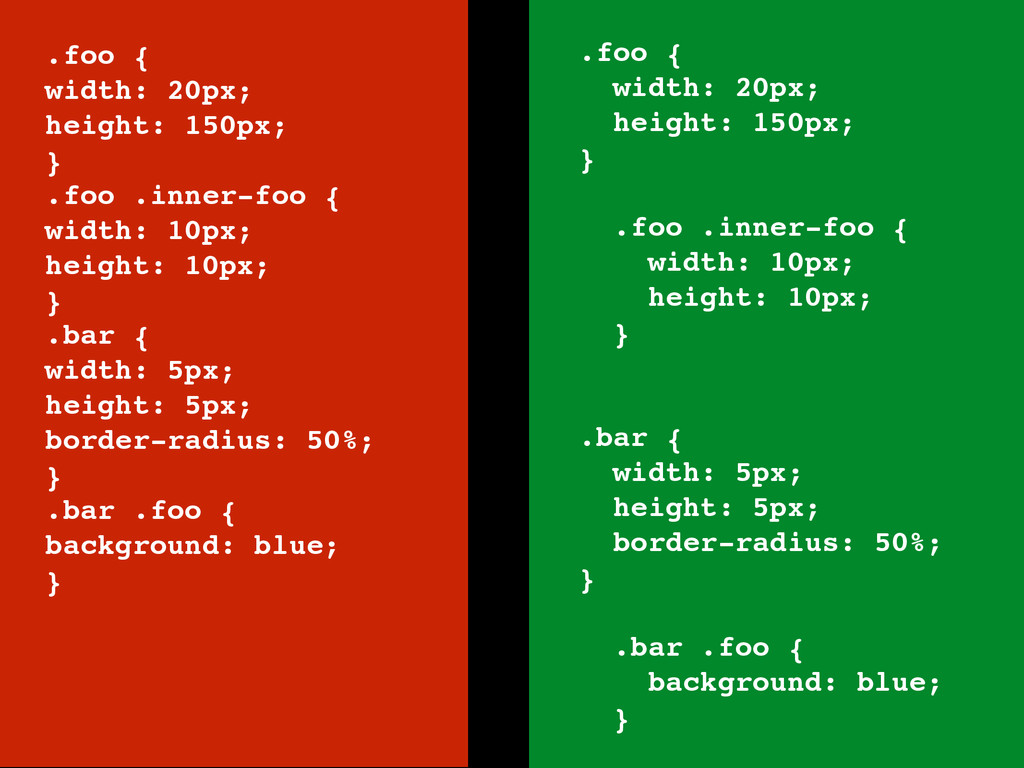
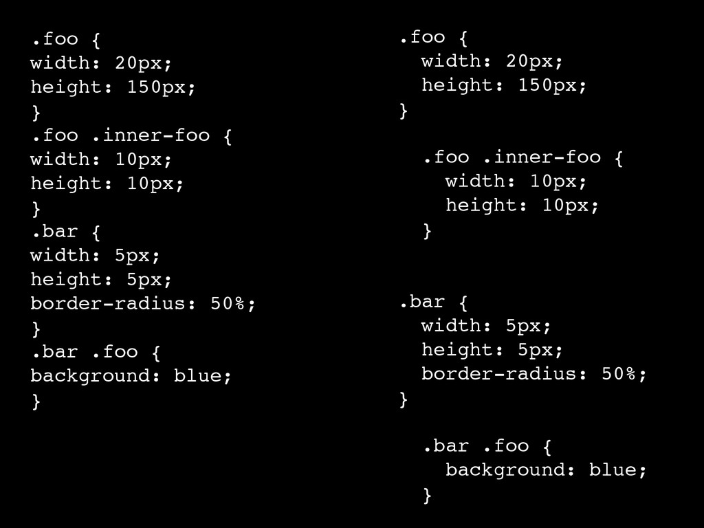
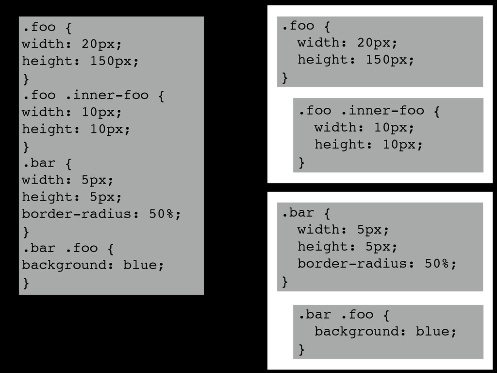
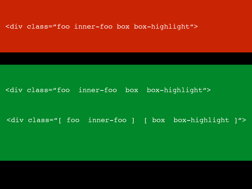
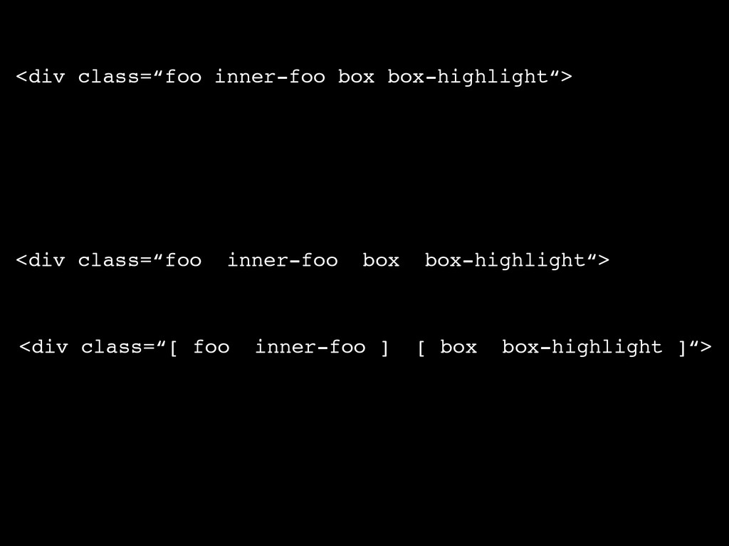
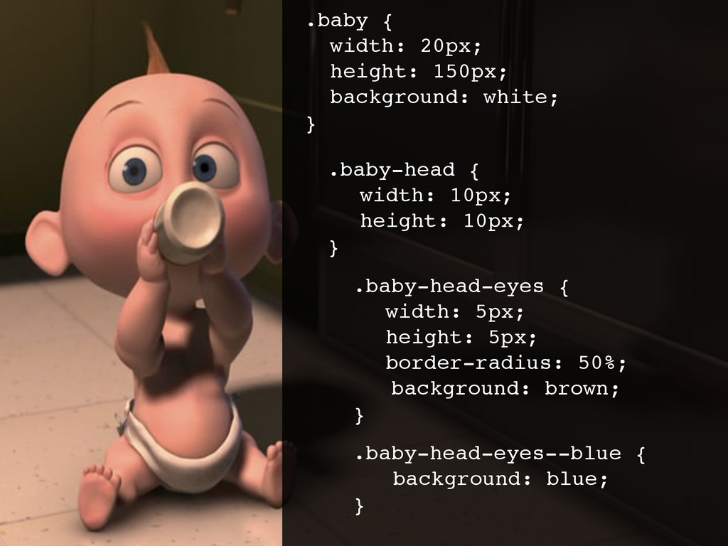
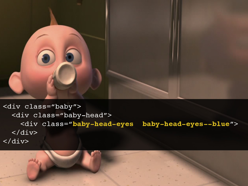
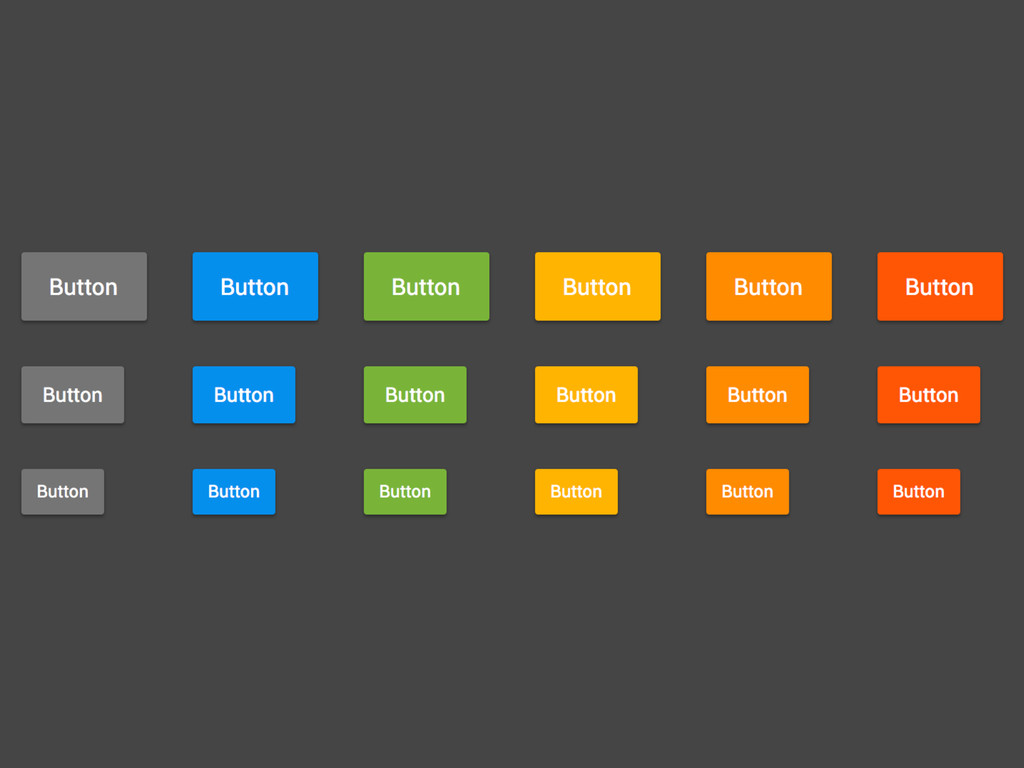
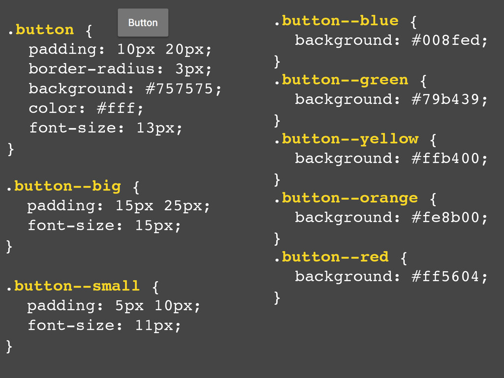
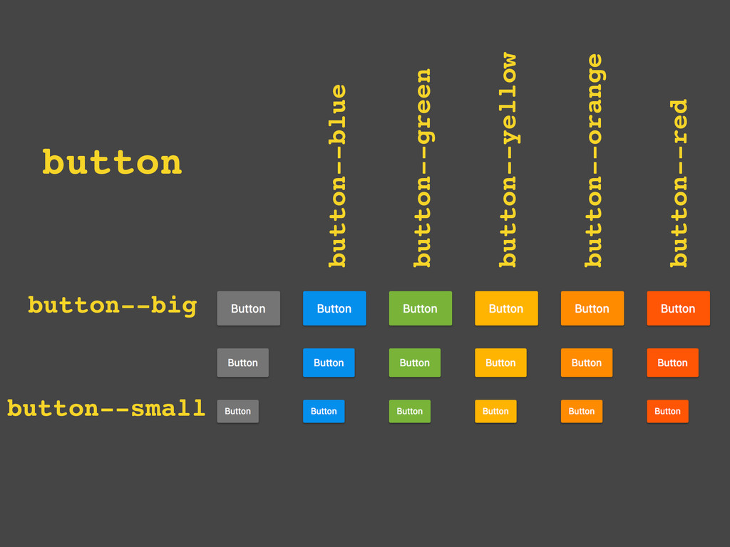
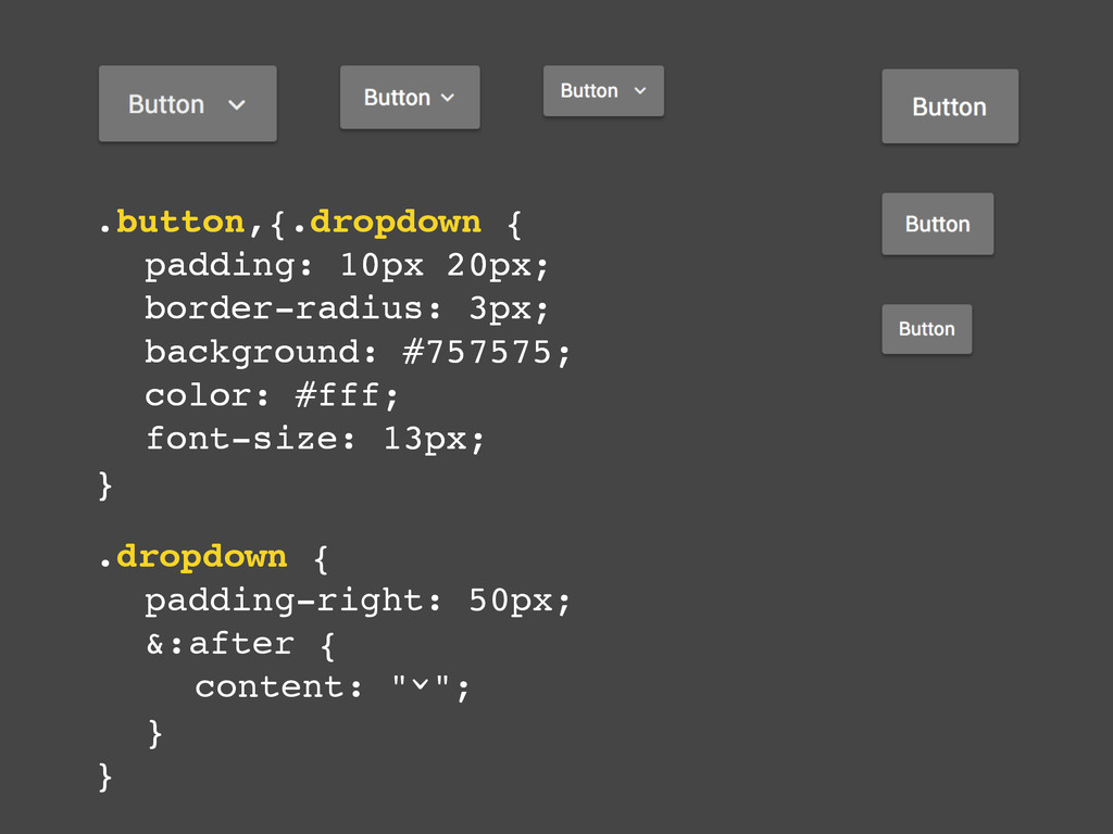
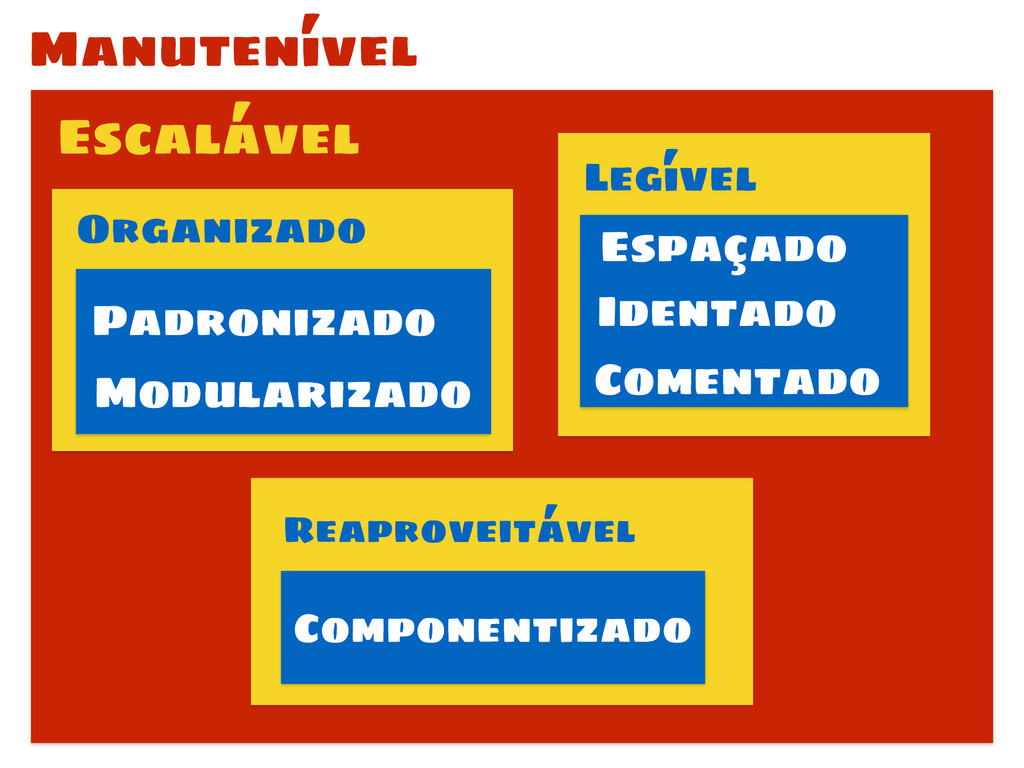
Sabemos que atualmente não é mais o sobrinho do tio da mãe do periquito azul que faz o CSS. E com projetos cada vez maiores e colaborativos, manter e escalar seu CSS é uma missão cada dia mais difícil. Mas não impossível! Aprenda com a experiência de quem já sofreu e tenha disciplina pra aprender e aplicar as melhores práticas pra organizar, reaproveitar e deixar seu CSS legível!

Shankar Cabus

September 25, 2014
Tweet

More Decks by Shankar Cabus

Other Decks in Technology

Transcript

  1. css

  2. bala de prata SMACSS OOCSS BEM DRY CSS CSS Guidelines

    GitHub CodePen Medium Trello SUIT CSS x
  3. Nome Email Mensagem Enviar <div id=“contato”>! ! <input id="nome" type=“text”>!

    <input id="email" type=“text">! <textarea id=“mensagem"></textarea>! <button>Enviar</button>! </div>
  4. Nome Email Mensagem Enviar #contact {! width: 500px;! padding: 10px;!

    background: #ccc;! border: 1px solid #999;! border-radius: 5px;! }! #contact input,! #contact textarea {! ! width: 100%;! ! border: 1px solid #999;! }! #contact button {! ! float: right;! ! padding: 5px;! ! border-radius: 5px;! ! background: green;! }
  5. OK Cuidado com os nomes Lorem ipsum dolor sit amet,

    consectetur adipiscing elit. Etiam ut sagittis diam. Ut tincidunt iaculis eleifend. Donec sed scelerisque erat? <div id=“warning”>! <h1>Cuidado com os nomes</h1>! <p>…</p>! <button>OK</button>! </div>
  6. #warning {! width: 400px;! padding: 10px;! background: #ccc;! border: 1px

    solid #999;! border-radius: 5px;! }! #warning h1 {! ! font-size: 14px;! ! font-weight: bold;! }! #warning button {! ! float: right;! ! padding: 5px;! ! border-radius: 5px;! ! background: blue;! } OK Cuidado com os nomes Lorem ipsum dolor sit amet, consectetur adipiscing elit. Etiam ut sagittis diam. Ut tincidunt iaculis eleifend. Donec sed scelerisque erat?
  7. Nome Email Mensagem Enviar OK Cuidado com os nomes Lorem

    ipsum dolor sit amet, consectetur adipiscing elit. Etiam ut sagittis diam. Ut tincidunt iaculis eleifend. Donec sed scelerisque erat?
  8. #contact {! width: 500px;! padding: 10px;! background: #ccc;! border: 1px

    solid #999;! border-radius: 5px;! }! #contact input, ! #contact textarea {! ! width: 100%;! ! border: 1px solid #999;! }! #contact button {! ! float: right;! ! padding: 5px;! ! border-radius: 5px;! ! background: green;! } #warning {! width: 400px;! padding: 10px;! background: #ccc;! border: 1px solid #999;! border-radius: 5px;! }! #warning h1 {! ! font-size: 14px;! ! font-weight: bold;! }! #warning button {! ! float: right;! ! padding: 5px;! ! border-radius: 5px;! ! background: blue;! }
  9. .box {! padding: 10px;! background: #ccc;! border: 1px solid #999;!

    border-radius: 5px;! }! ! .button {! float: right;! padding: 5px;! border-radius: 5px;! } #warning {! width: 400px;! }! #warning h1 {! font-size: 14px;! font-weight: bold;! }! #warning button {! background: blue;! }! ! #contact {! width: 500px;! }! #contact input, ! #contact textarea {! width: 100%;! border: 1px solid #999;! }! #contact button {! background: green;! }
  10. <div id="contact" class=“box”>! ! <input id="nome" type=“text”>! <input id="email" type=“text">!

    <textarea id=“mensagem"></textarea>! <button class="button">Enviar</button>! </div> <div id="warning" class=“box”>! <h1>Cuidado com os nomes</h1>! <p>…</p>! <button class="button">OK</button>! </div>
  11. .box {! padding: 10px;! background: #ccc;! border: 1px solid #999;!

    border-radius: 5px;! }! ! .button {! float: right;! padding: 5px;! border-radius: 5px;! } #warning {! width: 400px;! }! #warning h1 {! font-size: 14px;! font-weight: bold;! }! #warning button {! background: blue;! }! ! #contact {! width: 500px;! }! #contact input, ! #contact textarea {! width: 100%;! border: 1px solid #999;! }! #contact button {! background: green;! }
  12. .foo, .bar! {! padding:15px;! margin:0px 0px 15px;! box-shadow:0px 1px 2px

    #CCC;! background: #DDDDDD;! } .foo, ! .bar {! padding: 15px;! margin-bottom: 15px;! box-shadow: 0 1px 2px #ccc;! background: #ddd;! }
  13. .clear-float { clear: both; } <div class=“float-left"> <div style=“float: left”>

    .float-left { float: left; }! .mt-20 { margin-top: 20px; } .is-hide { display: none; }
  14. .bar {! color: #bada55;! background: #f00;! border: #bada55;! } @my-green:

    #bada55;! @my-red: #f00;! ! .bar {! color: @my-green;! background: @my-red;! border: @my-green;! }
  15. // General Dependencies! @import "mixins";! @import "variables";! ! // Base!

    @import "reset";! @import "layout";! ! // Components! @import "typography";! @import "forms";! @import "toolbox";! @import "buttons";! @import "modals";! @import "messages";! @import “badges";! ! // Areas! @import "header";! @import "footer";
  16. .foo {! width: 20px;! height: 150px;! } ! .foo .inner-foo

    {! width: 10px;! height: 10px;! } ! .bar {! width: 5px;! height: 5px;! border-radius: 50%;! } ! .bar .foo {! background: blue;! } .foo {! width: 20px;! height: 150px;! }! ! .foo .inner-foo {! width: 10px;! height: 10px;! }! ! ! .bar {! width: 5px;! height: 5px;! border-radius: 50%;! }! ! .bar .foo {! background: blue;! }
  17. .foo {! width: 20px;! height: 150px;! } ! .foo .inner-foo

    {! width: 10px;! height: 10px;! } ! .bar {! width: 5px;! height: 5px;! border-radius: 50%;! } ! .bar .foo {! background: blue;! } .foo {! width: 20px;! height: 150px;! }! ! .foo .inner-foo {! width: 10px;! height: 10px;! }! ! ! .bar {! width: 5px;! height: 5px;! border-radius: 50%;! }! ! .bar .foo {! background: blue;! }
  18. .foo {! width: 20px;! height: 150px;! } ! .foo .inner-foo

    {! width: 10px;! height: 10px;! } ! .bar {! width: 5px;! height: 5px;! border-radius: 50%;! } ! .bar .foo {! background: blue;! } .foo {! width: 20px;! height: 150px;! }! ! .foo .inner-foo {! width: 10px;! height: 10px;! }! ! ! .bar {! width: 5px;! height: 5px;! border-radius: 50%;! }! ! .bar .foo {! background: blue;! }
  19. /**! * The site’s main page-head can have two different

    states:! *! * 1) Regular page-head with no backgrounds or extra treatments; it just! * contains the logo and nav.! * 2) A masthead that has a fluid-height (becoming fixed after a certain point)! * which has a large background image, and some supporting text.! *! * The regular page-head is incredibly simple, but the masthead version has some! * slightly intermingled dependency with the wrapper that lives inside it.! */
  20. /**! * 1. Default icon size is 16px.! * 2.

    Squash down the retina sprite to display ! * at the correct size.! */! ! .sprite {! width: 16px; /* [@1x] */! height: 16px; /* [@1x] */! background-image: url(/img/sprites/main.png);! }
  21. .baby {! width: 20px;! height: 150px;! background: white;! } .baby-head

    {! ! width: 10px;! ! height: 10px;! } .baby-head-eyes {! ! width: 5px;! ! height: 5px;! ! border-radius: 50%;! background: brown;! } .baby-head-eyes--blue {! ! ! background: blue;! }
  22. .button {! ! padding: 10px 20px;! ! border-radius: 3px;! !

    background: #757575;! ! color: #fff;! ! font-size: 13px;! } .button--big {! ! padding: 15px 25px;! ! font-size: 15px;! } .button--small {! ! padding: 5px 10px;! ! font-size: 11px;! } .button--blue {! ! background: #008fed;! }! .button--green {! ! background: #79b439;! }! .button--yellow {! ! background: #ffb400;! }! .button--orange {! ! background: #fe8b00;! }! .button--red {! ! background: #ff5604;! }
  23. .button, .dropdown {! ! padding: 10px 20px;! ! border-radius: 3px;!

    ! background: #757575;! ! color: #fff;! ! font-size: 13px;! } .dropdown {! ! padding-right: 50px;! ! &:after {! ! ! content: " ";! ! }! } ^ .button {! ! padding: 10px 20px;! ! border-radius: 3px;! ! background: #757575;! ! color: #fff;! ! font-size: 13px;! }