Upgrade to Pro — share decks privately, control downloads, hide ads and more …

The life of CSS and it's future

The life of CSS and it's future

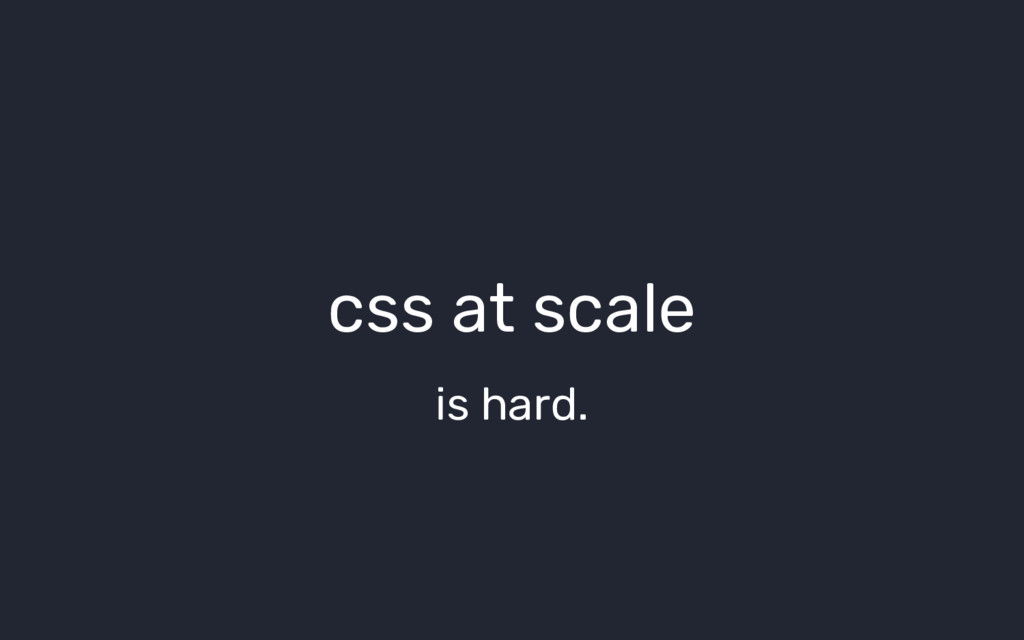
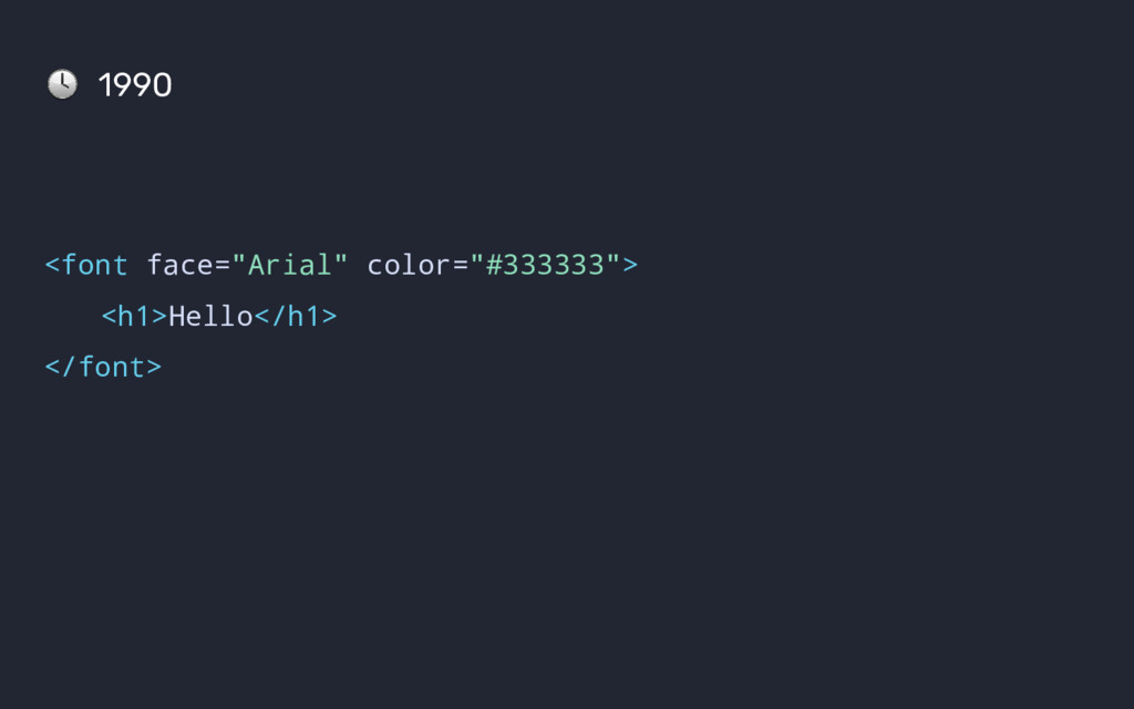
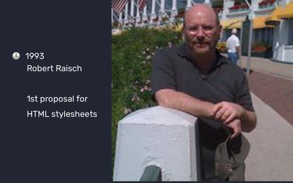
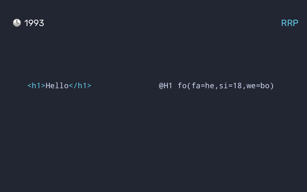
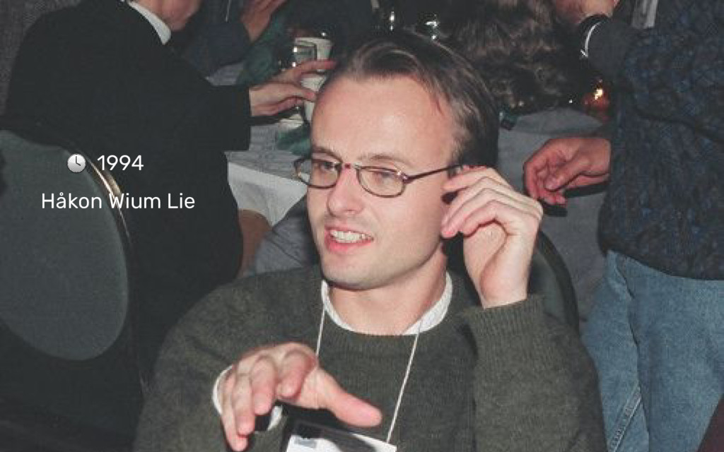
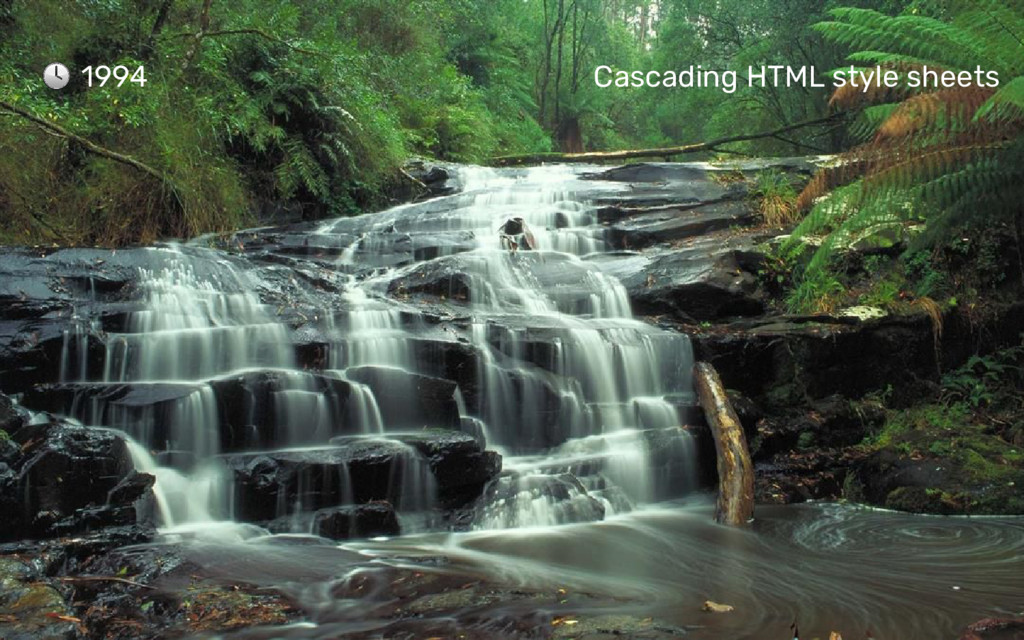
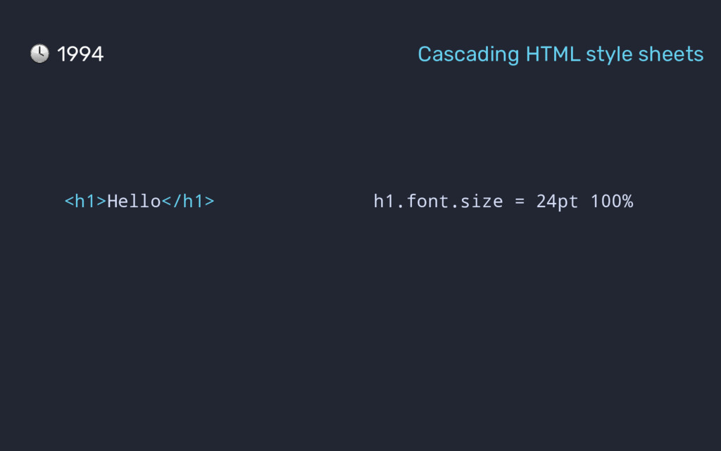
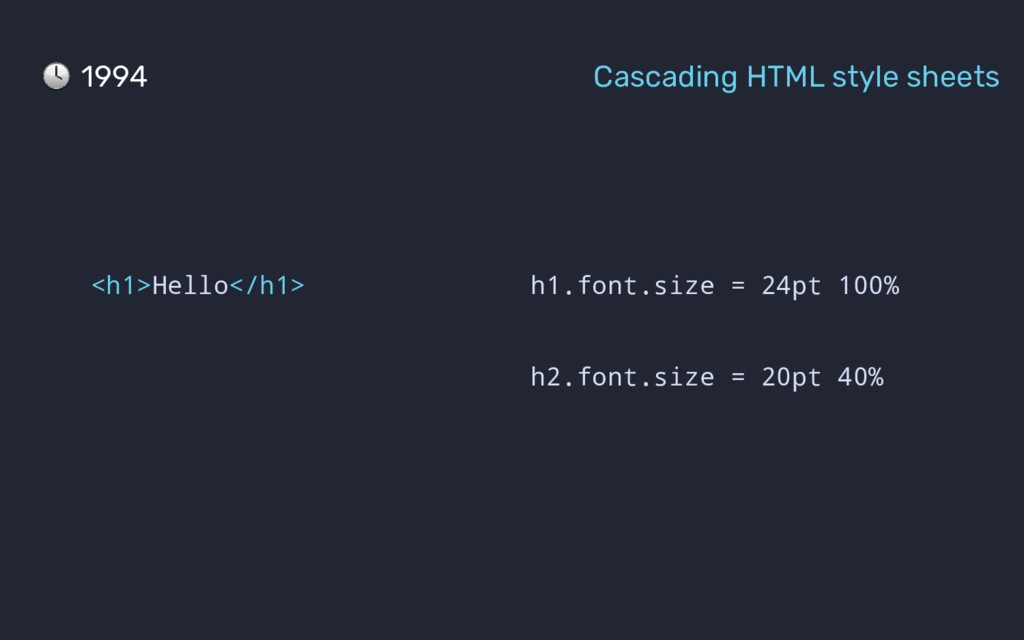
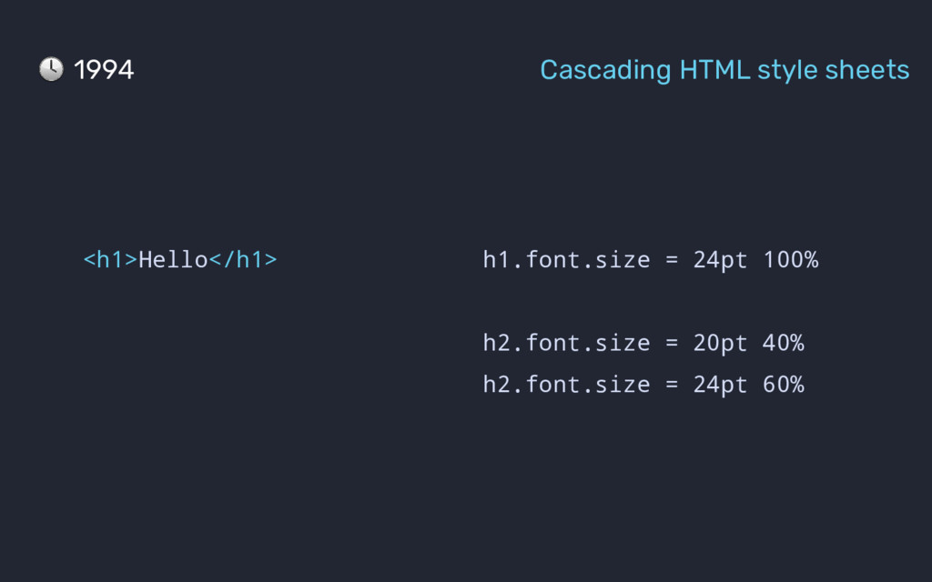
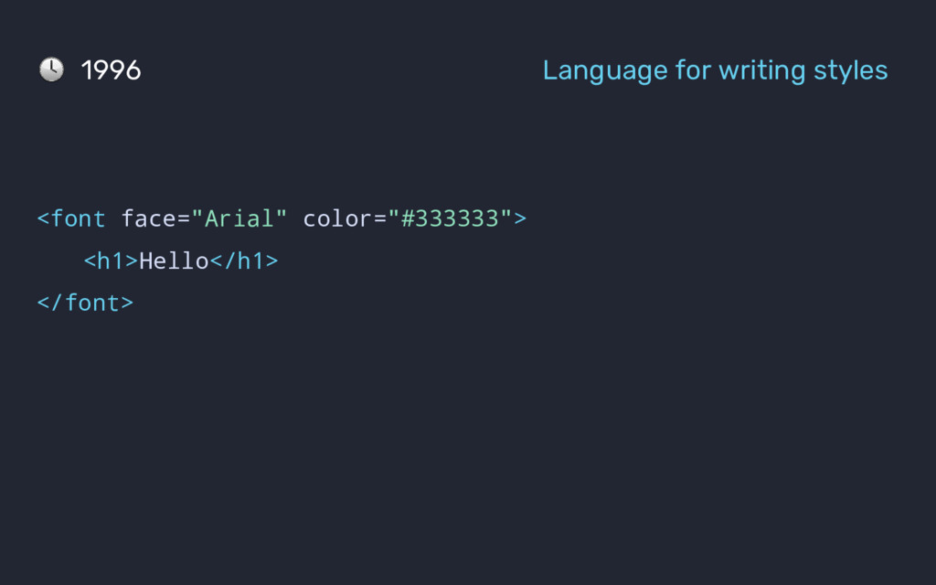
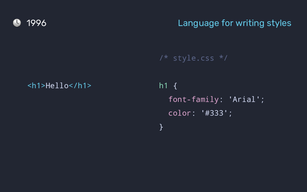
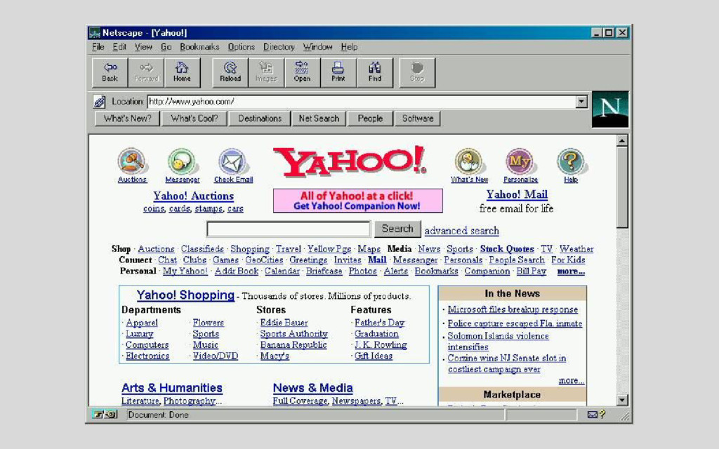
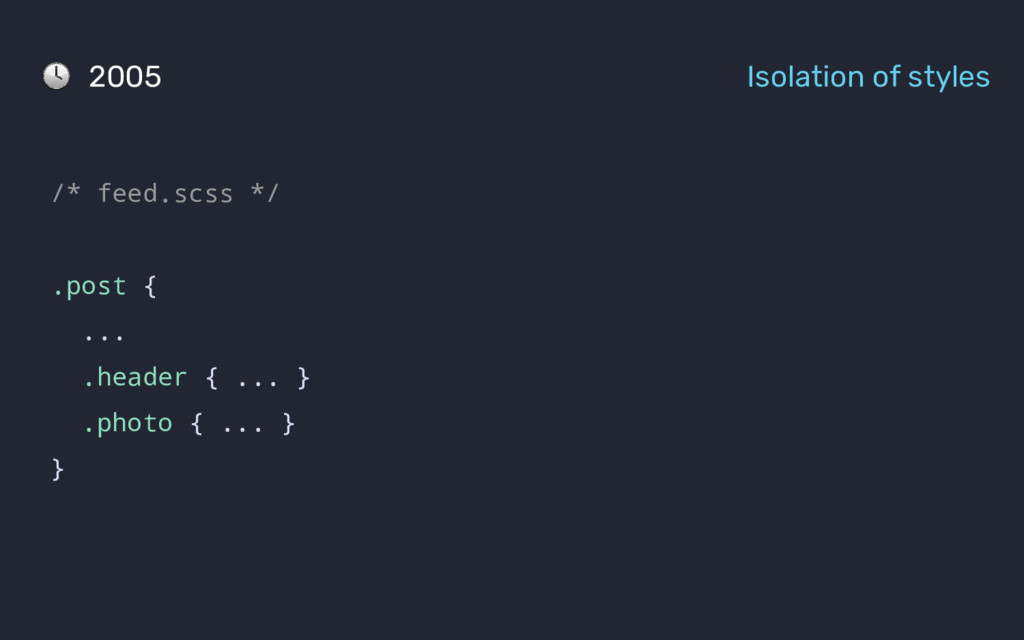
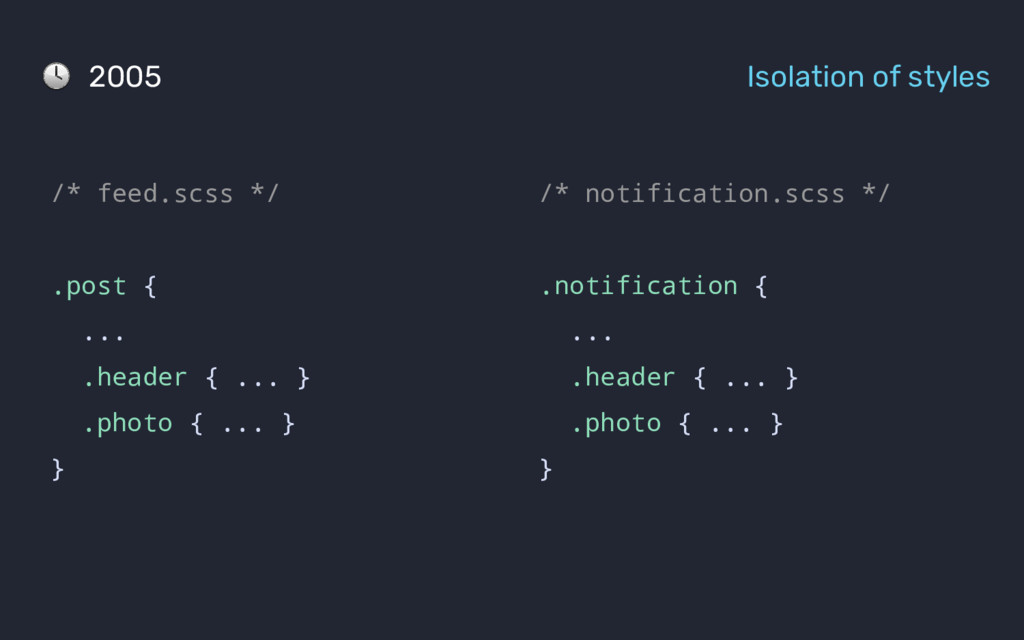
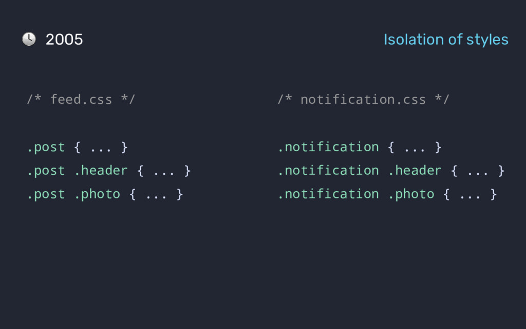
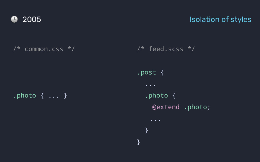
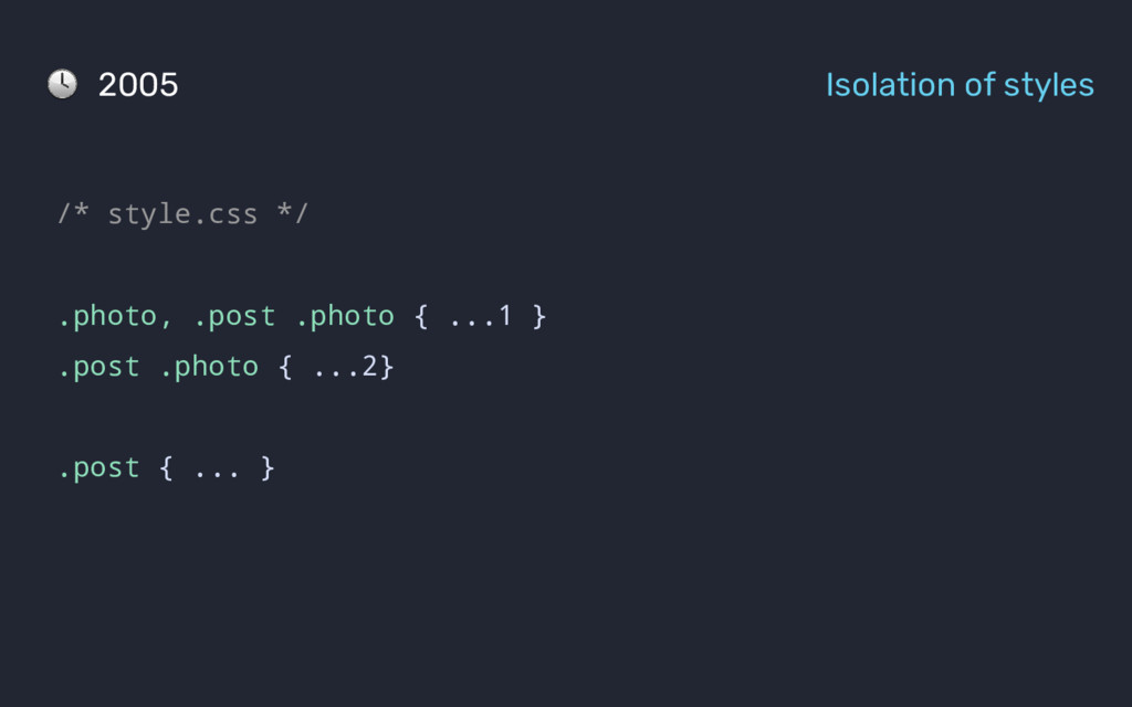
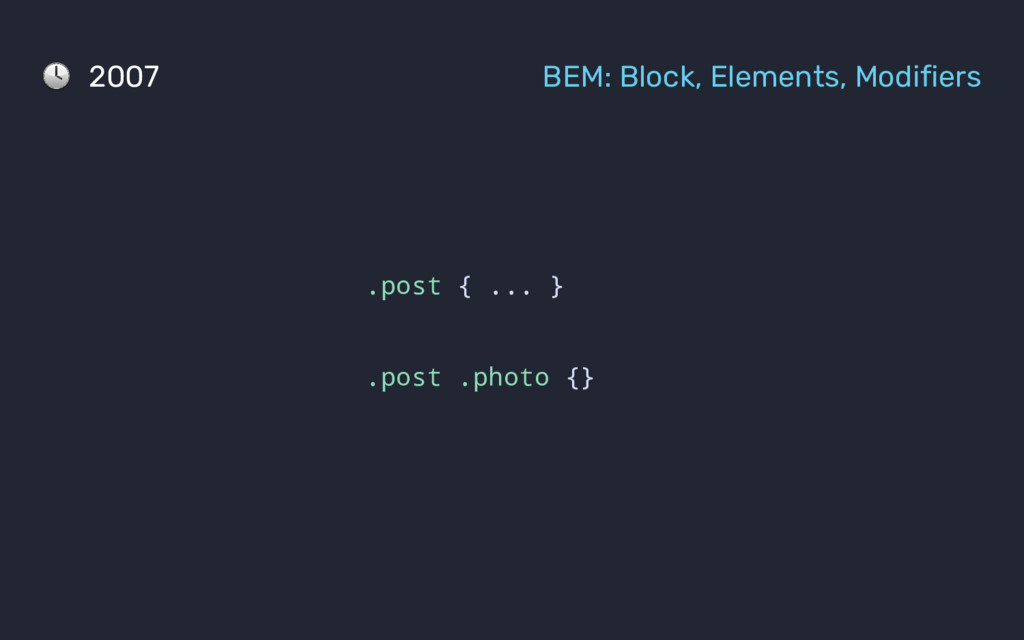
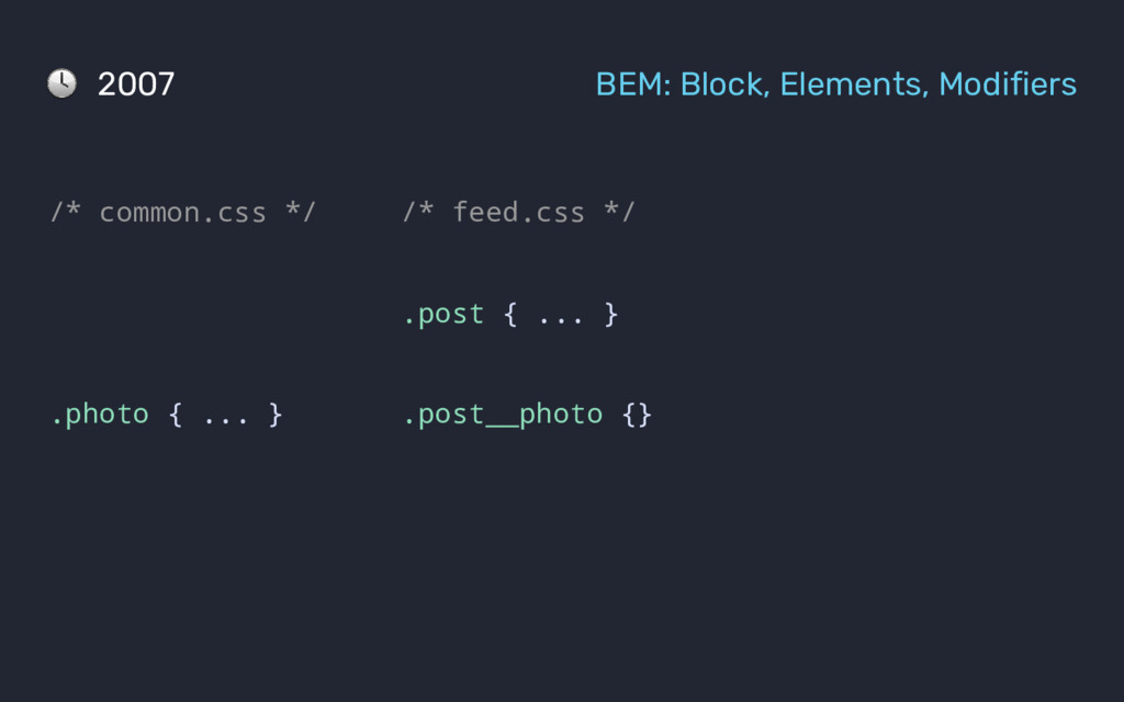
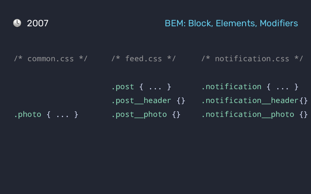
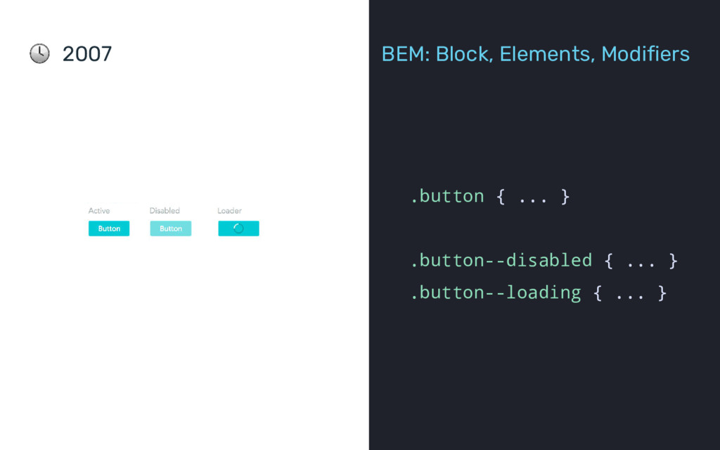
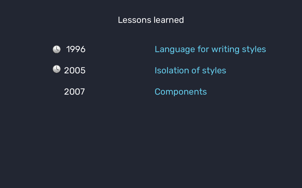
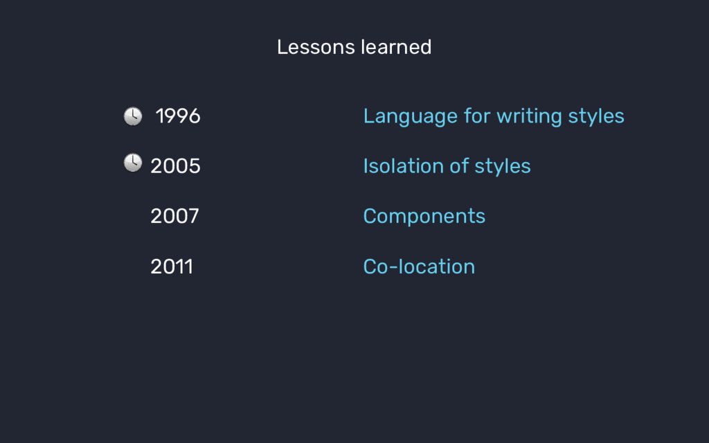
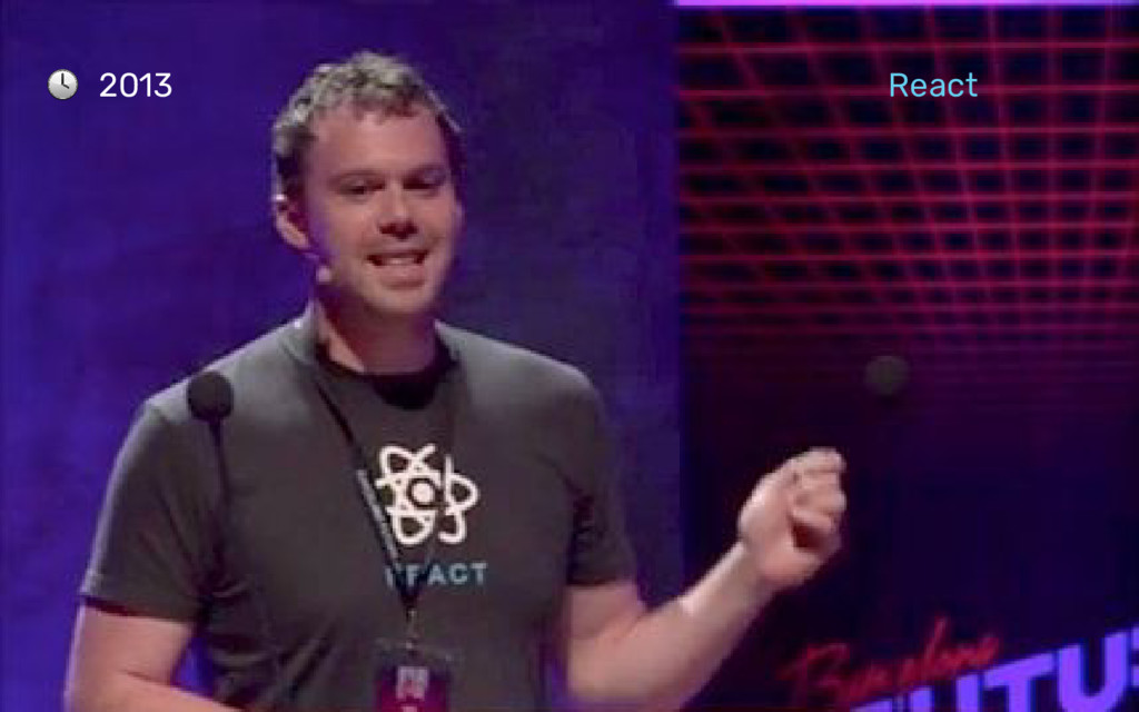
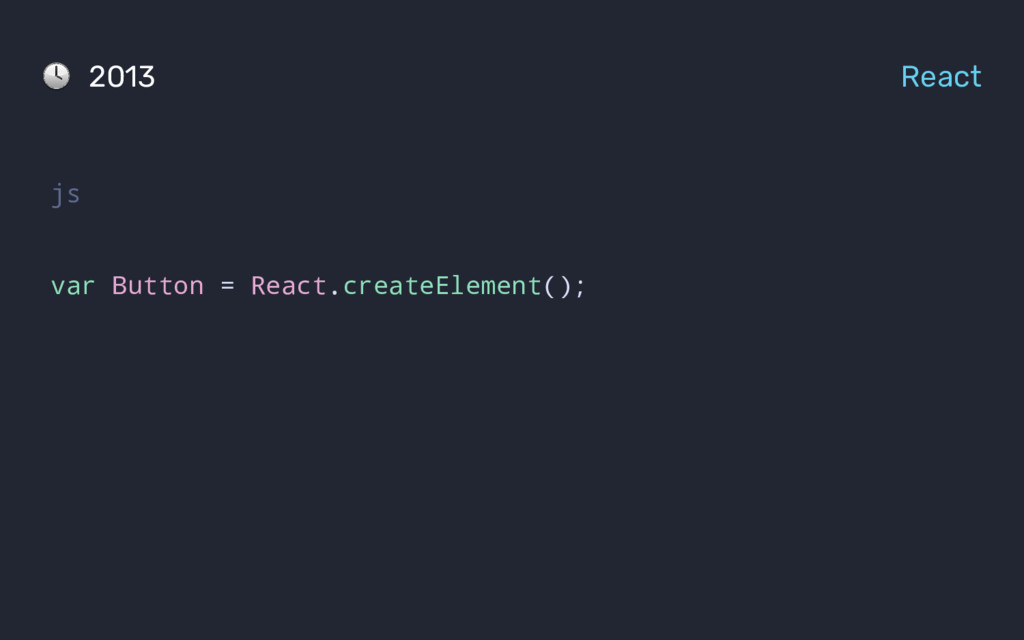
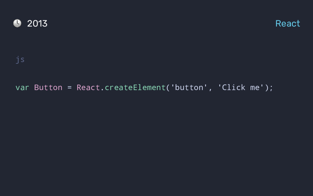
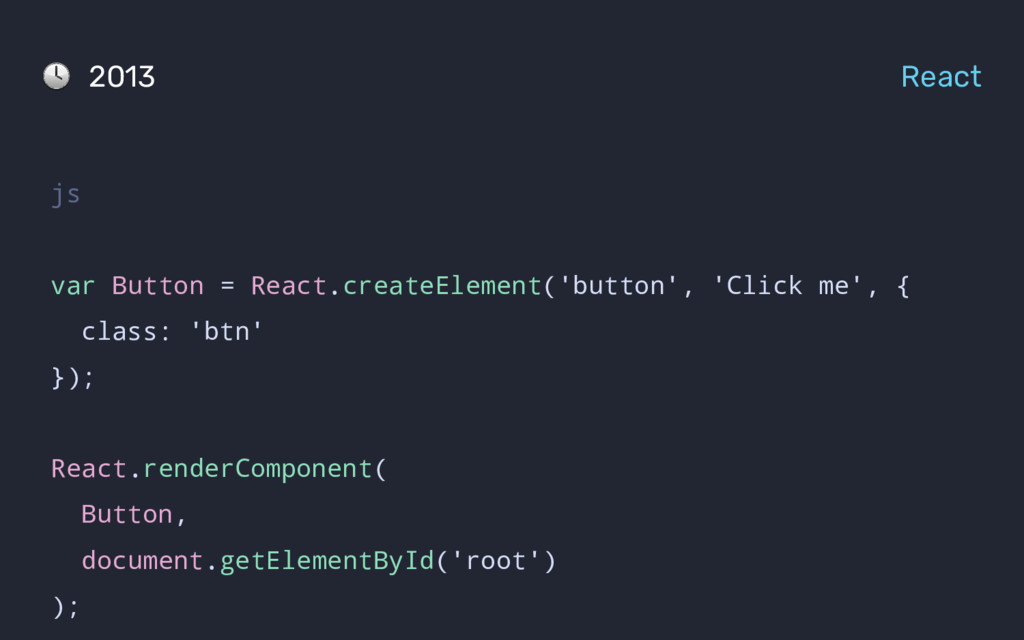
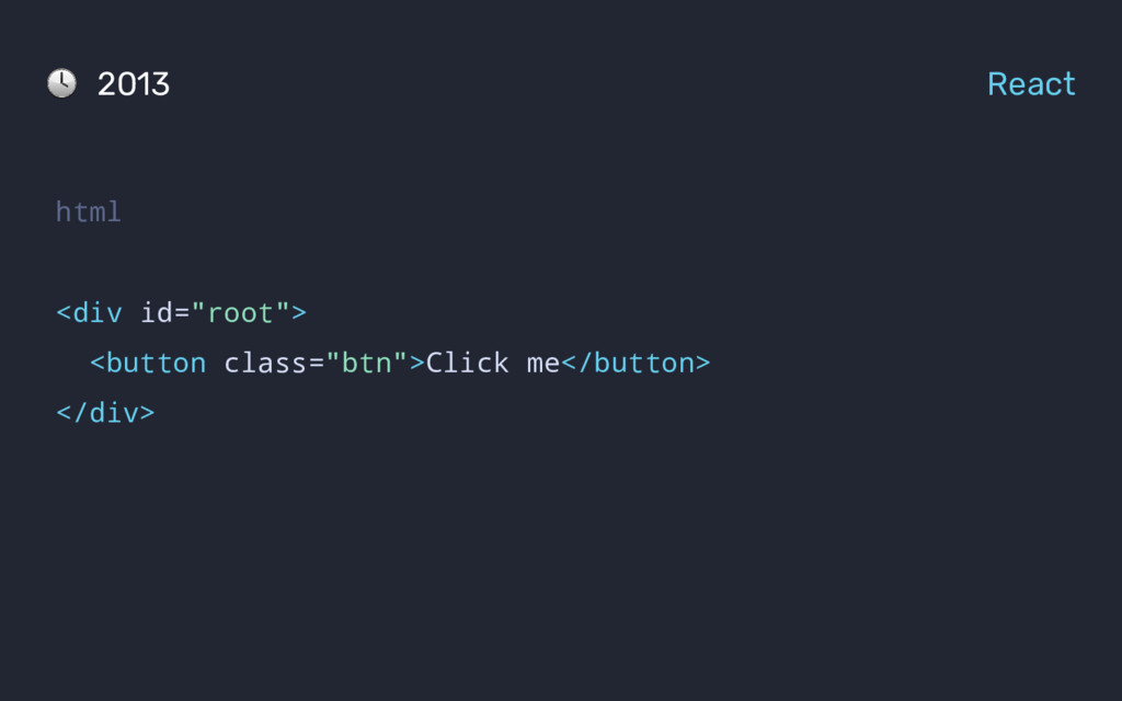
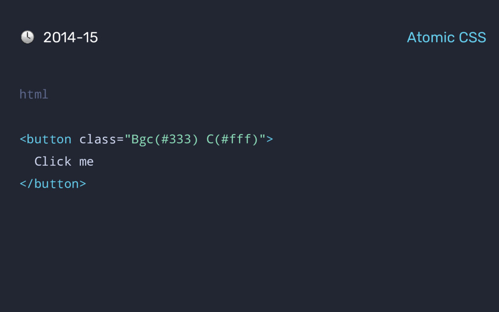
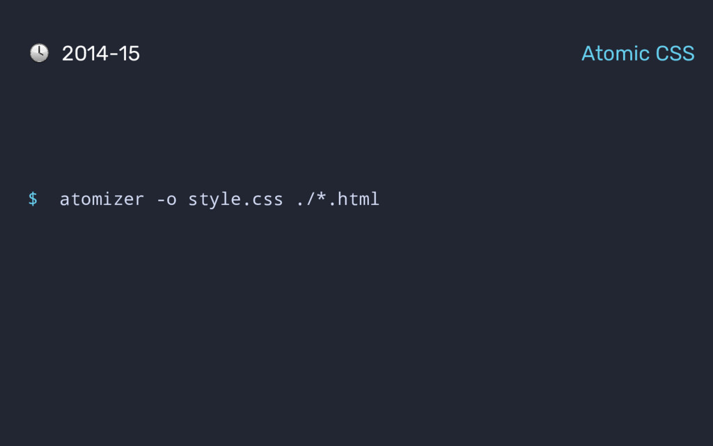
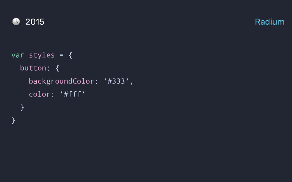
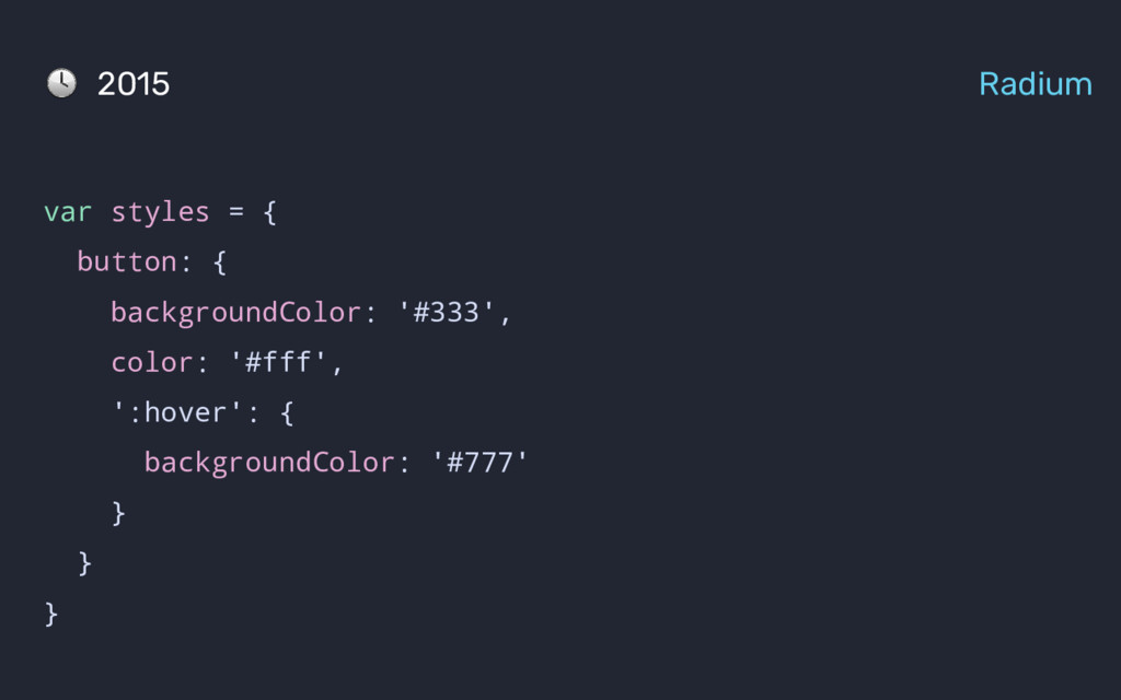
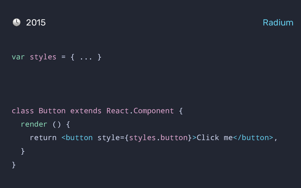
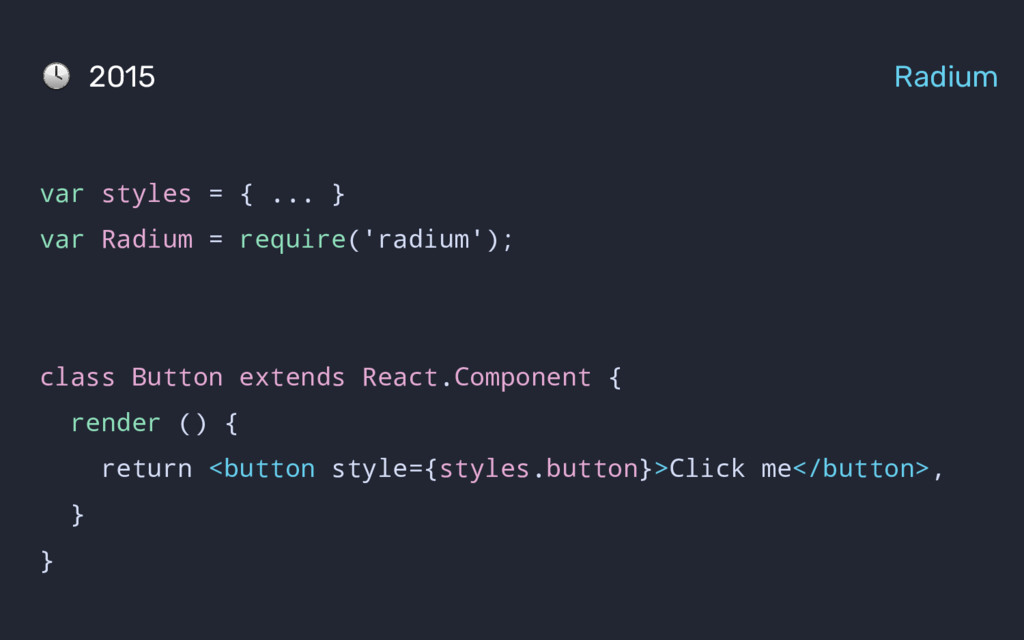
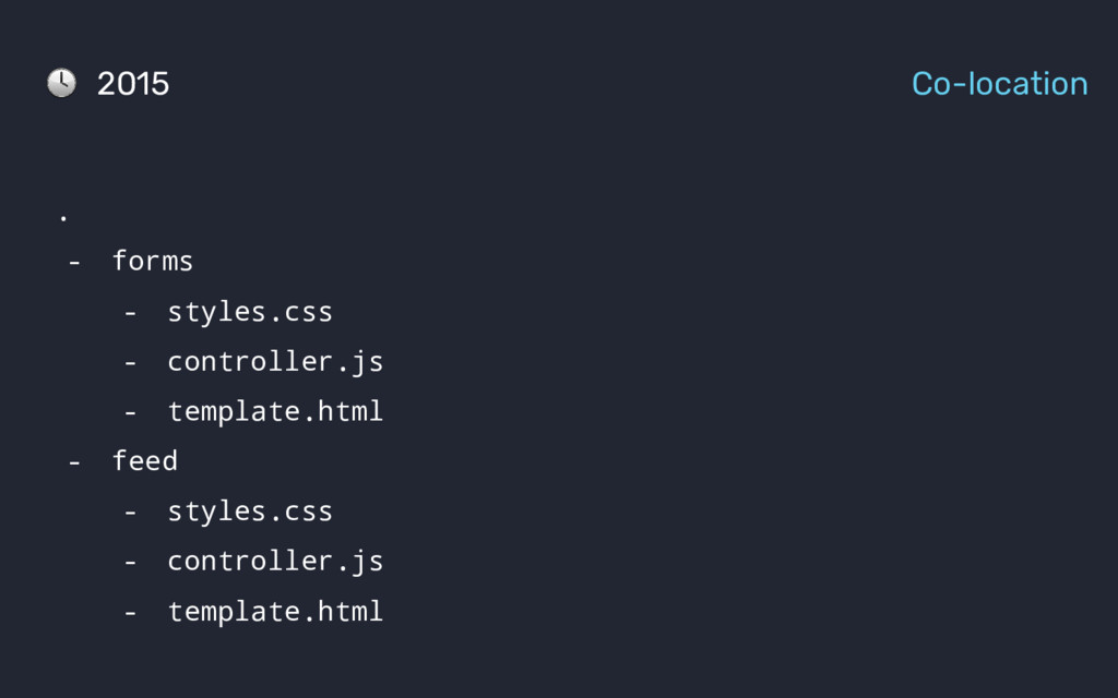
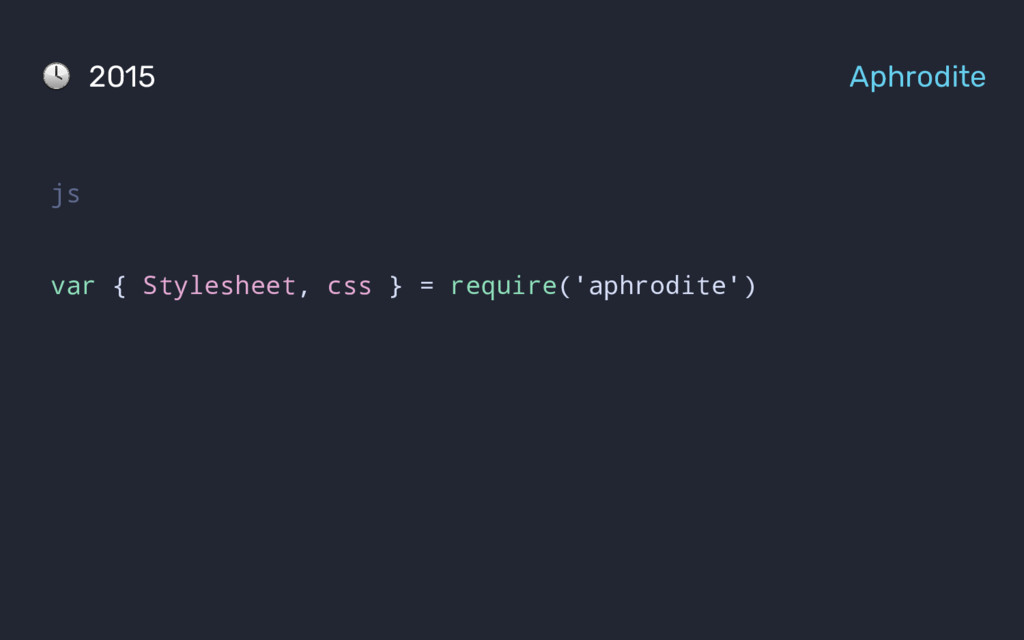
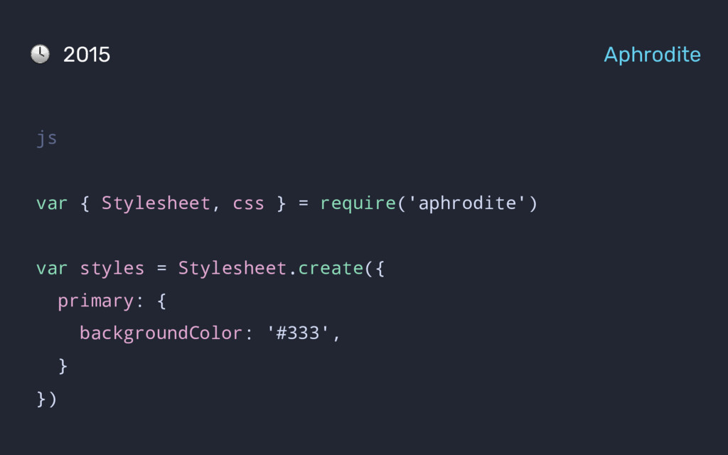
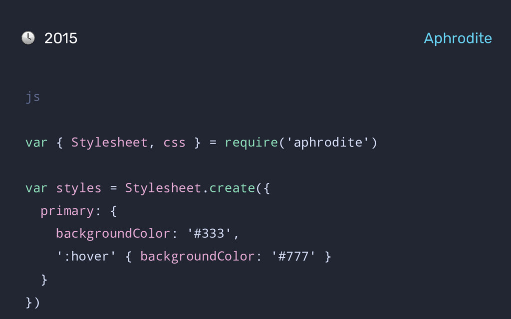
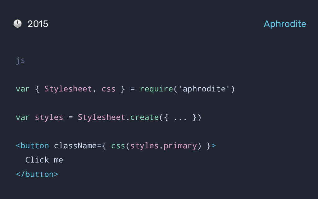
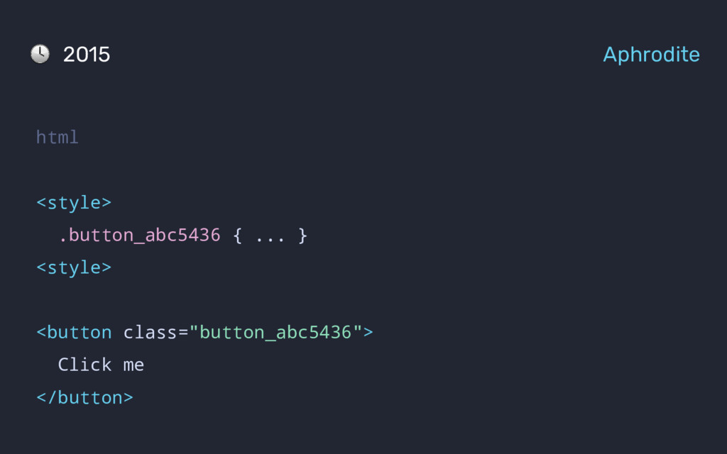
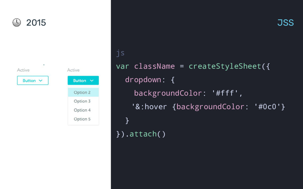
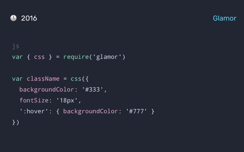
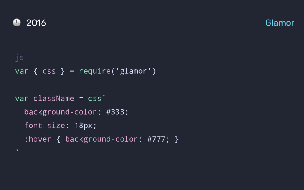
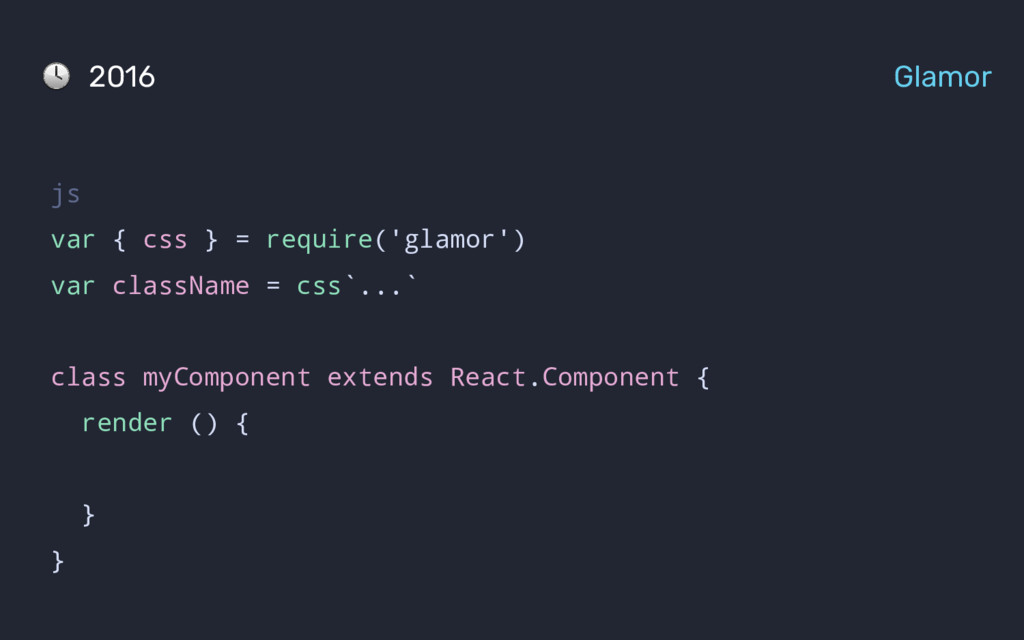
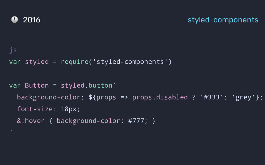
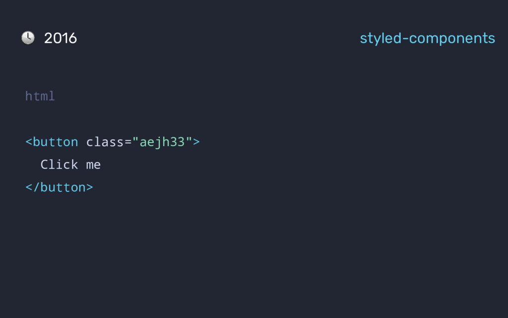
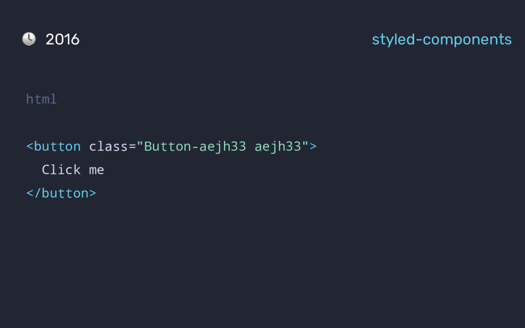
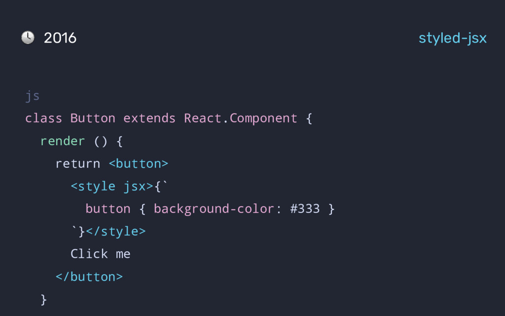
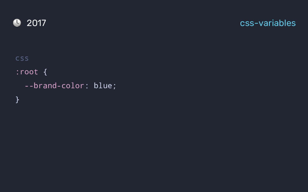
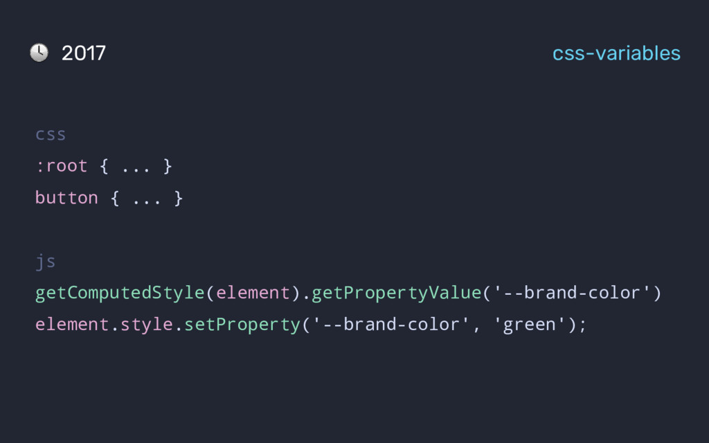
CSS is now 21 years old! The current shape of CSS(in JS) has been shaped by learnings all the way from 1994

Siddharth Kshetrapal

October 28, 2017
Tweet

More Decks by Siddharth Kshetrapal

Other Decks in Technology

Transcript

  1. 21

  2. h1.font.size = 24pt 100% h2.font.size = 20pt 40% h2.font.size =

    24pt 60% <h1>Hello</h1> 1994 Cascading HTML style sheets
  3. ?

  4. 1998 CSS 2 css h1 { position: absolute; z-index: 99999999;

    } @media screen and (min-width: 480px) { h1 { padding: 1rem 3rem; } }
  5. .post { ... } .header { ... } .photo {

    } .music { } 2005 Semantic HTML
  6. .post { ... } .header { ... } .photo {

    padding: 0; } .music { padding: 20px; } 2005 Semantic HTML
  7. .post { ... } .header { ... } .photo {

    ... } .music { ... } 2005 Semantic HTML
  8. .post { ... } .header { ... } .photo {

    ... } .music { ... } 2005 Semantic HTML
  9. /* feed.css */ .post { ... } .header { ...

    } .photo { ... } 2005 Isolation of styles
  10. /* feed.css */ .post { ... } .header { ...

    } .photo { ... } 2005 Isolation of styles /* notification.css */ .notification { ... } .photo { ... }
  11. /* feed.css */ .post { ... } .header { ...

    } .photo { ... } 2005 Isolation of styles /* notification.css */ .notification { ... } .photo { ... } /* common.css */ .photo { ... }
  12. /* feed.css */ .post { ... } .header { ...

    } .photo { ... } 2005 Isolation of styles /* notification.css */ .notification { ... } .photo { ... } /* common.css */ .photo { ... }
  13. /* feed.css */ .post { ... } .header { ...

    } .post .photo {} 2005 Isolation of styles /* notification.css */ .notification { ... } .notification .photo {} /* common.css */ .photo { ... }
  14. /* feed.css */ .post { ... } .header { ...

    } .post .photo {} 2005 Isolation of styles /* notification.css */ .notification { ... } .header { ... } .notification .photo {} /* common.css */ .photo { ... }
  15. /* feed.css */ .post { ... } .post .header {}

    .post .photo {} 2005 Isolation of styles /* notification.css */ .notification { ... } .notification .header{} .notification .photo {} /* common.css */ .photo { ... }
  16. /* feed.css */ .post { ... } .post .header {

    ... } .post .photo { ... } 2005 Isolation of styles
  17. /* feed.scss */ .post { ... .header { ... }

    .photo { ... } } 2005 Isolation of styles
  18. /* feed.scss */ .post { ... .header { ... }

    .photo { ... } } 2005 Isolation of styles /* notification.scss */ .notification { ... .header { ... } .photo { ... } }
  19. /* feed.css */ .post { ... } .post .header {

    ... } .post .photo { ... } 2005 Isolation of styles /* notification.css */ .notification { ... } .notification .header { ... } .notification .photo { ... }
  20. 2005 Isolation of styles /* feed.scss */ .post { ...

    .photo { ... } } /* common.css */ .photo { ... }
  21. /* common.css */ .photo { ... } 2005 Isolation of

    styles /* feed.scss */ .post { ... .photo { @extend .photo; ... } }
  22. /* common.css */ .photo { ...1 } 2005 Isolation of

    styles /* feed.scss */ .post { ... .photo { @extend .photo; ...2 } }
  23. /* style.css */ .photo, .post .photo { ...1 } .post

    .photo { ...2} 2005 Isolation of styles
  24. /* style.css */ .photo, .post .photo { ...1 } .post

    .photo { ...2} .post { ... } 2005 Isolation of styles
  25. /* feed.css */ .post { ... } .post__photo {} /*

    common.css */ .photo { ... } 2007 BEM: Block, Elements, Modifiers
  26. /* feed.css */ .post { ... } .post__header {} .post__photo

    {} /* notification.css */ .notification { ... } .notification__header{} .notification__photo {} /* common.css */ .photo { ... } 2007 BEM: Block, Elements, Modifiers
  27. /* feed.css */ .post { ... } .post__header {} .post__photo

    {} /* notification.css */ .notification { ... } .notification__header{} .notification__photo {} /* common.css */ .photo { ... } 2007 BEM: Block, Elements, Modifiers
  28. /* feed.css */ .post { ... } .post__header {} .post__photo

    {} /* notification.css */ .notification { ... } .notification__header{} .notification__photo {} /* common.css */ .photo { ... }
  29. /* feed.css */ #post { ... } #post__header {} #post__photo

    {} /* notification.css */ #notification { ... } #notification__header{} #notification__photo {} /* common.css */ #photo { ... }
  30. /* buttons.css */ .button { ... } .button.primary { ...

    } .button.danger { ... } 2009 OOCSS
  31. .photo { ... } .post .photo { ... } .post

    .notifications { ... } 2009 OOCSS
  32. 1996 Language for writing styles 2005 Isolation of styles 2007

    Components 2011 Co-location Lessons learned
  33. . - styles - buttons.css - forms.css - feed.css -

    scripts - form-validation.js - feed-interaction.js 2011 Co-location
  34. . - atoms - buttons.css - forms - styles.css -

    script.js - feed - styles.css - script.js 2011 Co-location
  35. SMACSS base, layout, module, theme ... Atomic design atoms, molecules,

    organisms ... SUITCSS utilities, components, descendents ... ITCSS settings, tools, elements, objects ... 2011 - 2014 Naming things
  36. 1996 Language for writing styles 2005 Isolation of styles 2007

    Components 2011 Co-location Lessons learned
  37. 2013 React js var Button = React.createElement('button', 'Click me', {

    class: 'btn' }); React.renderComponent( Button, document.getElementById('root') );
  38. css .Bgc(#333) { background-color: #333; } .C(#fff) { color: #fff;

    } 2014-15 Atomic CSS html <button class="Bgc(#333) C(#fff)"> Click me </button>
  39. var styles = { container: { ... }, button: {

    backgroundColor: '#333', color: '#fff' } } 2014-15 React
  40. var styles = { container: { ... }, button: {

    backgroundColor: props.disabled ? '#333' : 'grey', color: props.disabled ? '#fff' : 'light-grey' } } 2014-15 React
  41. var styles = { container: { ... }, button: {

    ... } } class Button extends React.Component { render () { return <button style={styles.button}>Click me</button>, } } 2014-15 React
  42. import Datepicker from 'datepicker' class Button extends React.Component { render

    () { return <Datepicker onChange={this.onChange}/> } } 2014-15 React
  43. var styles = { button: { backgroundColor: '#333', color: '#fff',

    ':hover': { backgroundColor: '#777' } } } 2015 Radium
  44. var styles = { ... } class Button extends React.Component

    { render () { return <button style={styles.button}>Click me</button>, } } 2015 Radium
  45. var styles = { ... } var Radium = require('radium');

    class Button extends React.Component { render () { return <button style={styles.button}>Click me</button>, } } 2015 Radium
  46. var styles = { ... } var Radium = require('radium');

    @Radium class Button extends React.Component { render () { return <button style={styles.button}>Click me</button>, } } 2015 Radium
  47. html <button style="background-color: '#333'; color: #fff"> Click me </button> js

    $('button').on('mouseover', function () { ... }) 2015 Radium
  48. We need to follow conventions to stop our styles from

    clashing. Computers are great at following instructions, humans not so much. - someone
  49. components/buttons.css .btn { padding: 10px; font-size: 14px; } .btn-primary {

    background: blue; color: white; } 2015 CSS-modules
  50. js: react <button className="btn btn-primary"> Click me </button> components/buttons.css .btn

    { padding: 10px; font-size: 14px; } .btn-primary { background: blue; color: white; } 2015 CSS-modules
  51. components/buttons.css .btn { ... } .btn-primary { ... } .btn-secondary

    { ... } .btn--disabled { ... } .btn--loading { ... } 2015 CSS-modules
  52. components/buttons.css .btn { ... } .primary { ... } .secondary

    { ... } .disabled { ... } .loading { ... } 2015 CSS-modules
  53. . - forms - styles.css - index.js - feed -

    styles.css - index.js 2015 Co-location
  54. . - forms - styles.css - controller.js - template.html -

    feed - styles.css - controller.js - template.html 2015 Co-location
  55. js var { Stylesheet, css } = require('aphrodite') var styles

    = Stylesheet.create({ primary: { backgroundColor: '#333', } }) 2015 Aphrodite
  56. js var { Stylesheet, css } = require('aphrodite') var styles

    = Stylesheet.create({ primary: { backgroundColor: '#333', ':hover' { backgroundColor: '#777' } } }) 2015 Aphrodite
  57. js var { Stylesheet, css } = require('aphrodite') var styles

    = Stylesheet.create({ ... }) 2015 Aphrodite
  58. js var { Stylesheet, css } = require('aphrodite') var styles

    = Stylesheet.create({ ... }) <button className={ css(styles.primary) }> Click me </button> 2015 Aphrodite
  59. 2015 JSS js var className = createStyleSheet({ dropdown: { backgroundColor:

    '#fff', '&:hover {backgroundColor: '#0c0'} } }).attach()
  60. 2015 JSS js var className = createStyleSheet({ dropdown: { backgroundColor:

    '#fff', '&:hover {backgroundColor: '#0c0'}, '& .toggle' {backgroundColor: '#0e0'} } }).attach()
  61. html <style> .dropdown_abc5436 { ... } .dropdown_abc5436 .toggle_uieu33{ ... }

    <style> <div class="dropdown_abc5436"> <div class="toggle_uieu33"></div> </div> 2015 JSS
  62. .vue <template> <button>Click me</button> </template> <script> module.exports = { ...

    } </script> <style scoped> button { ... } <style> 2015 vue
  63. 2016 Styletron js var Styletron = require('styletron') var className =

    injectStyle(new Styletron(), { backgroundColor: '#333', fontSize: '18px', ':hover' { backgroundColor: '#777' } })
  64. js var { css } = require('glamor') var className =

    css({ backgroundColor: '#333', fontSize: '18px', ':hover': { backgroundColor: '#777' } }) 2016 Glamor
  65. js var { css } = require('glamor') var className =

    css` background-color: #333; font-size: 18px; :hover { background-color: #777; } ` 2016 Glamor
  66. js var { css } = require('glamor') var className =

    css`...` class myComponent extends React.Component { render () { } } 2016 Glamor
  67. js var { css } = require('glamor') var className =

    css`...` class myComponent extends React.Component { render () { return <button className={className}>Click me</button> } } 2016 Glamor
  68. 2016 styled-components js var styled = require('styled-components') var Button =

    styled.button` background-color: #333; font-size: 18px; &:hover { background-color: #777; } `
  69. js var styled = require('styled-components') var Button = styled.button`...` class

    myComponent extends React.Component { render () { } } 2016 styled-components
  70. js var styled = require('styled-components') var Button = styled.button`...` class

    myComponent extends React.Component { render () { return <Button>Click me</Button> } } 2016 styled-components
  71. js var styled = require('styled-components') var Button = styled.button`...` class

    myComponent extends React.Component { render () { return <Button disabled>Click me</Button> } } 2016 styled-components
  72. js var styled = require('styled-components') var Button = styled.button` background-color:

    ${props => props.disabled ? '#333': 'grey'}; font-size: 18px; &:hover { background-color: #777; } ` 2016 styled-components
  73. js var css = require('css-constructor') class Button extends React.Component {

    @css` background-color: #333; font-size: 18px; &:hover { background-color: #777; } ` } 2016 css-constructor
  74. js var css = require('css-constructor') class Button extends React.Component {

    @css`...` render () { return <button>Click me</button> } } 2016 css-constructor
  75. 2016 styled-jsx js class Button extends React.Component { render ()

    { return <button> <style jsx>{` `}</style> Click me </button> }
  76. 2016 styled-jsx js class Button extends React.Component { render ()

    { return <button> <style jsx>{` button { background-color: #333 } `}</style> Click me </button> }
  77. css :root { ... } button { ... } js

    getComputedStyle(element).getPropertyValue('--brand-color') element.style.setProperty('--brand-color', 'green'); 2017 css-variables
  78. 2017 emotion js var { css } = require('react-emotion') var

    className = css`...` class myComponent extends React.Component { render () { return <button className={className}>Click me</button> } }
  79. .babelrc { "plugins": [ "babel-plugin-emotion" ] } 2017 emotion You

    shouldn’t have to sacrifice runtime performance for good developer experience when writing CSS. emotion minimizes the runtime cost of css-in-js dramatically by parsing your styles with babel and PostCSS.
  80. Future Web components js class Button extends HTMLElement { const

    shadow = this.attachShadow({ mode: 'open' }) const button = document.createElement('button') button.width = '150' shadow.appendChild(button) } customElements.define('x-button', Button)
  81. Future Scoped styles html <style> button { background-color: #333 }

    </style> <div> <button>Click me</button> </div> <button>Second button</button>
  82. Future Scoped styles html <div> <style> button { background-color: #333

    } </style> <button>Click me</button> </div> <button>Second button</button>
  83. Future Scoped styles html <div> <style scoped> button { background-color:

    #333 } </style> <button>Click me</button> </div> <button>Second button</button>