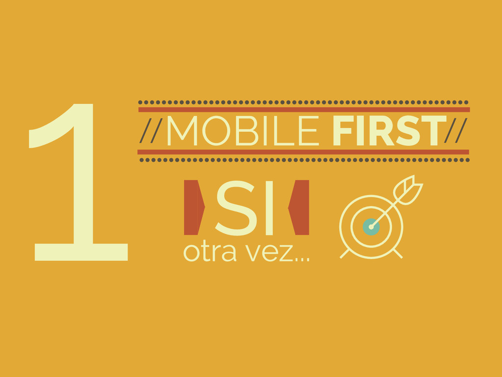
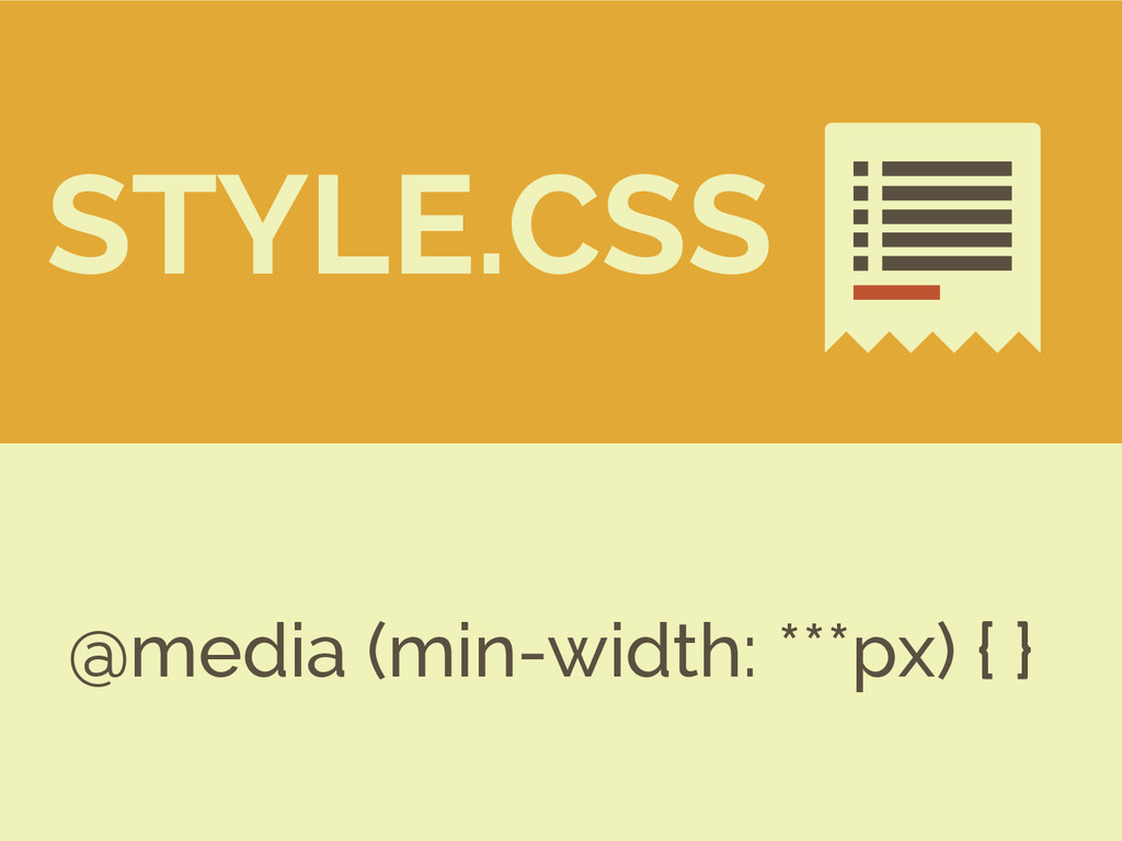
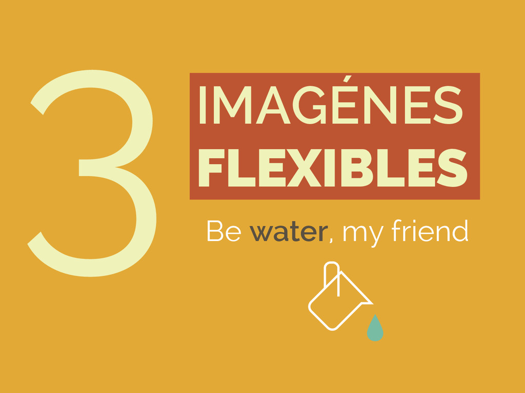
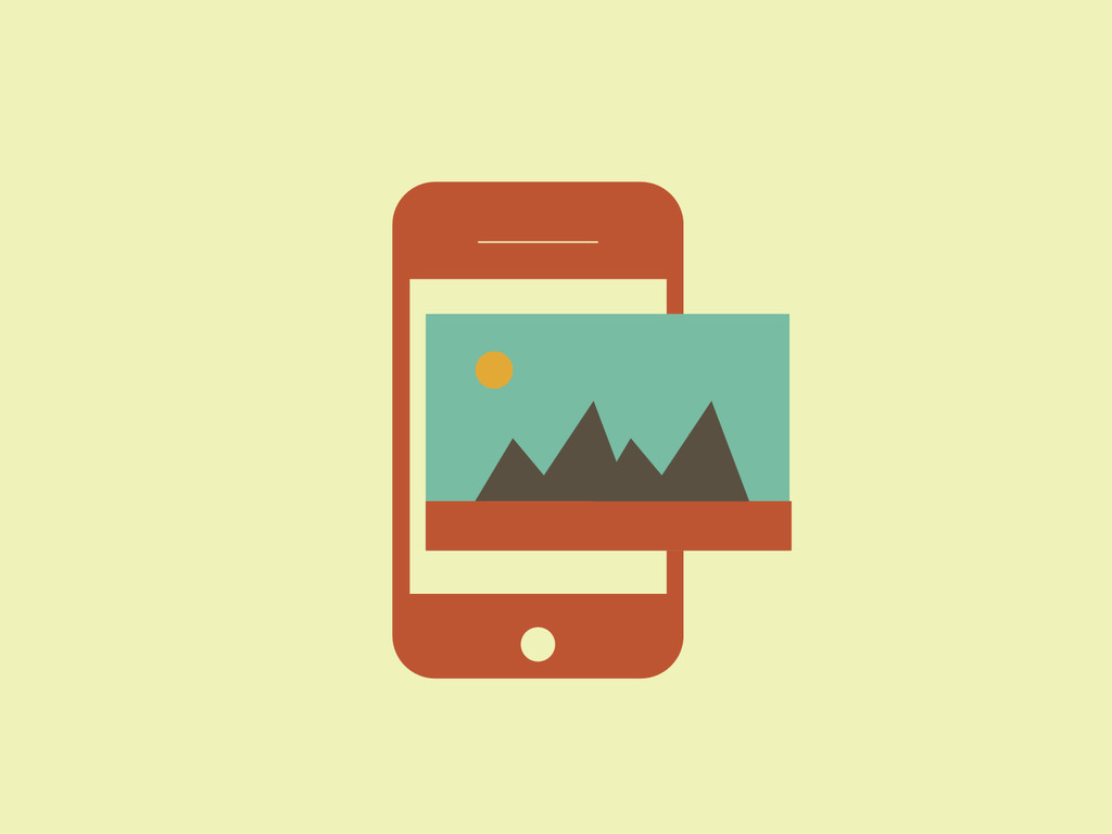
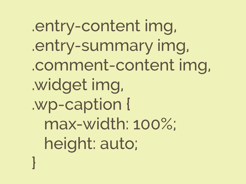
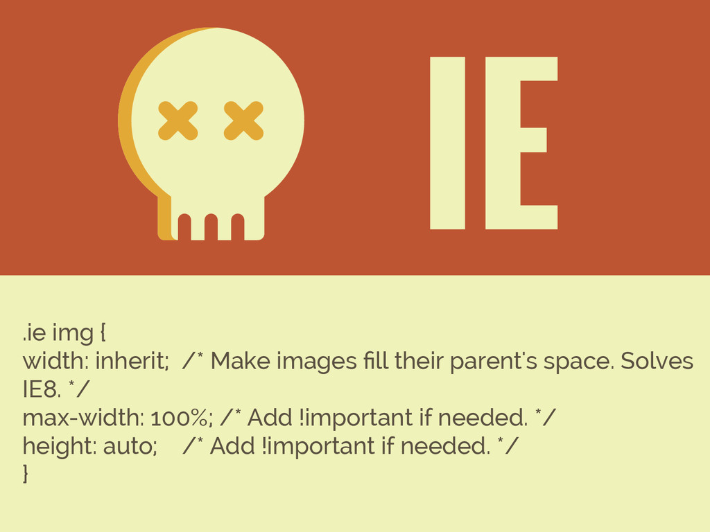
Buenas prácticas a la hora de diseñar temas en WordPress. Hablamos de diseño responsive mobile first, tipografías en unidades relativas, correcta gestión de imágenes fluidas y como trabajar correctamente con elementos de vídeo externo en pequeñas resoluciones, y no tan pequeñas! Que la disfrutes. ;)
 silocreativo
 bebe
bebe
 kspace
 mhand01
 lynteo
 tajima_kaho
 hjmkth
 csswizardry
 kenichiota0711
 ajstarks
 baasie
 videlvequio
 marktimemedia
 sabderemane
 joshbly
 nikkihalliwell
 portentint
 holman
 samlambert
 62gerente
 charlesmeaden
 soysaucechin
 emna__ayadi
.png) helenjbeal
helenjbeal