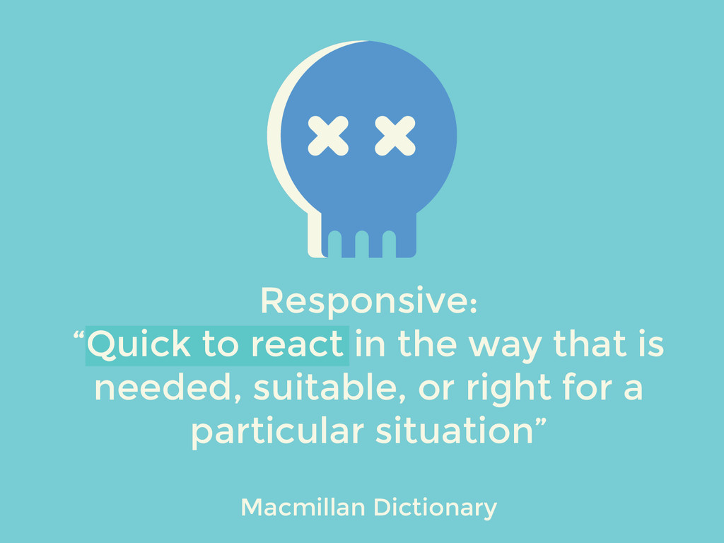
Partiendo de que entendemos el término responsive como una mejora en la adaptabilidad frente a diferentes dispositivos y entornos, es el momento de introducir una segunda variable asociada al mismo, hagamos diseño responsive “quick to react”.
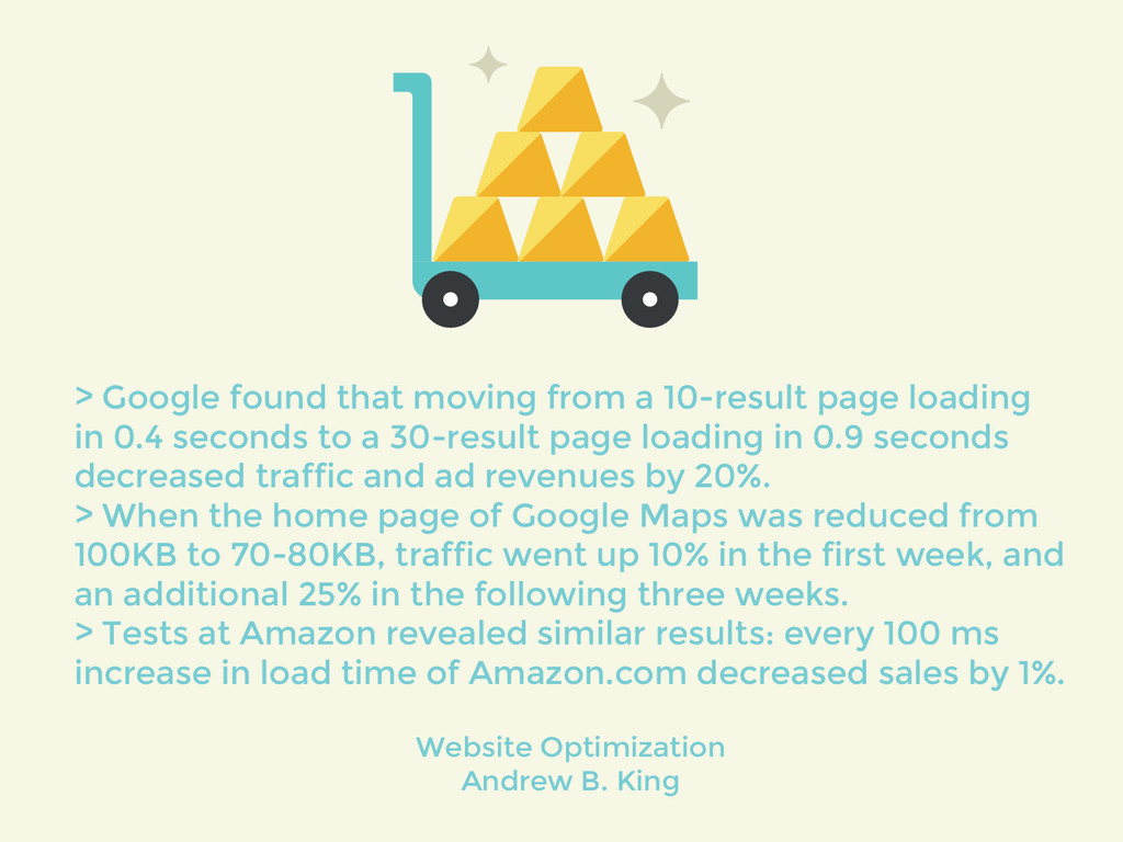
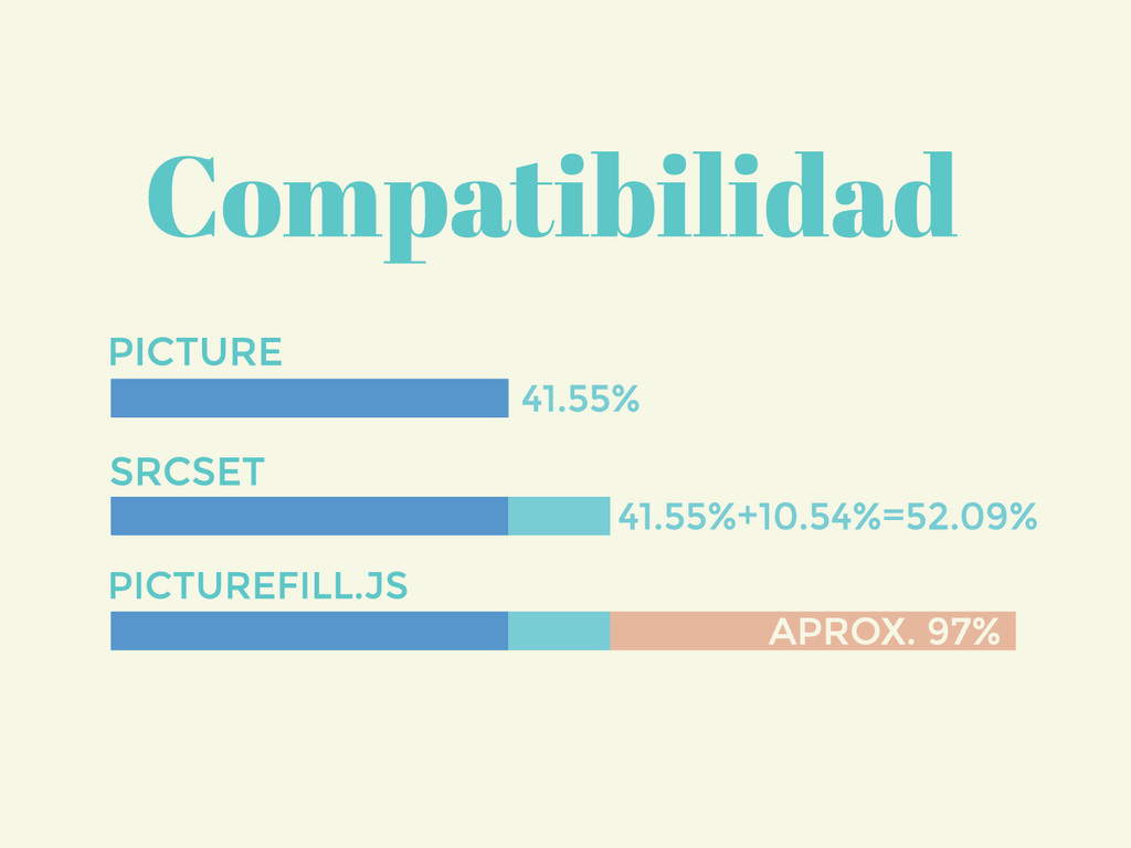
Con Mobile first se introducen mejoras relativa a la carga de CSS y los elementos declarados en el mismo, mejorando el tiempo de carga y por tanto la UX en mobile. Sin embargo, de media más del 60% del tamaño de una web reside en las imágenes, con lo que cualquier mejora queda eclipsada por el peso preponderante de las mismas.
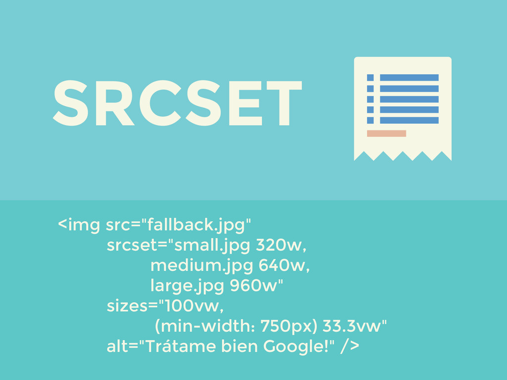
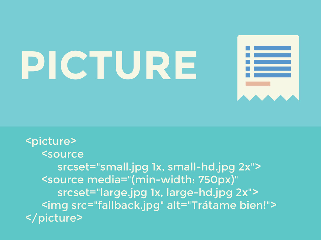
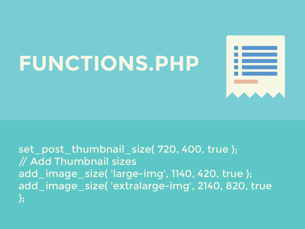
Pero ahora estamos en condiciones de implementar nuevos elementos y atributos (srcset) para mejorar el comportamiento de nuestras imágenes, en conjunción además con los ya conocidos thumbnails de WordPress, logrando un menor tiempo de carga, una experiencia para el visitante de la web y también para el usuario de WordPress.
 silocreativo
 abokadotyann
 baasie
 hikarutakase
 nagata03
 hiro93n
 centou
 kenichiota0711
 mottox2
 vivion
 happy_ferret153
 shoko_seven11
 ajstarks
 lauravandoore
 szymonslowik
 kneath
 addyosmani
 lara
lara
 tammyeverts
 honzajavorek
 rasagy
 katarinadahlin
 sferik
 nmsamuel
 shpigford