Upgrade to Pro — share decks privately, control downloads, hide ads and more …

Accessible Design: Designing for Humans

Accessible Design: Designing for Humans

I presented this as part of Triangle UXPA's lightning talk series on accessibility. (https://triuxpa.org/event-4264789)

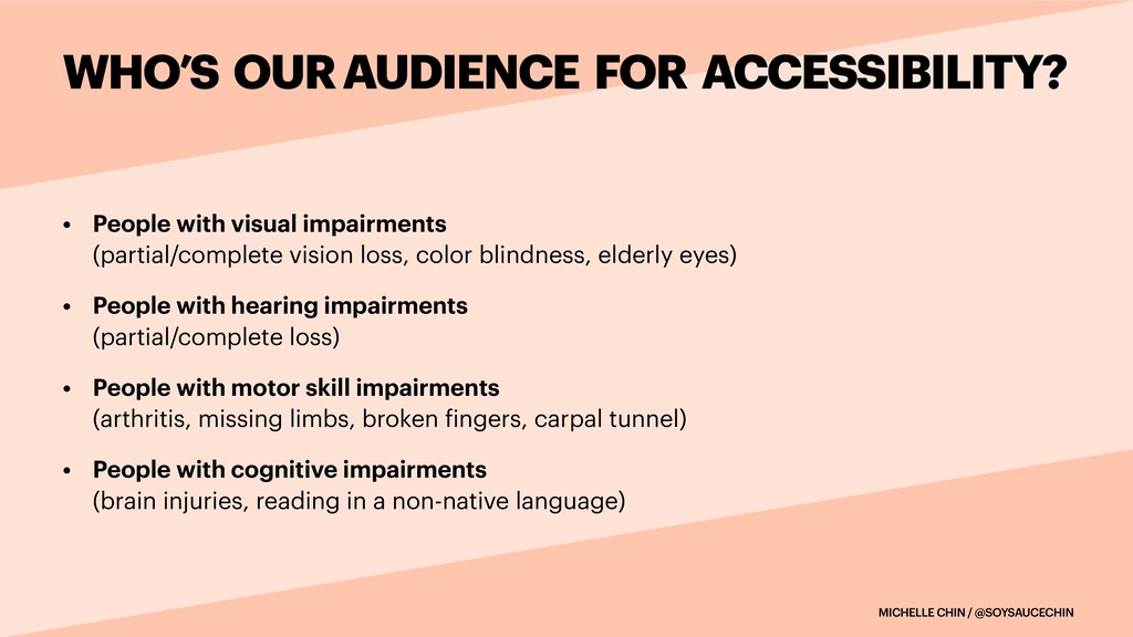
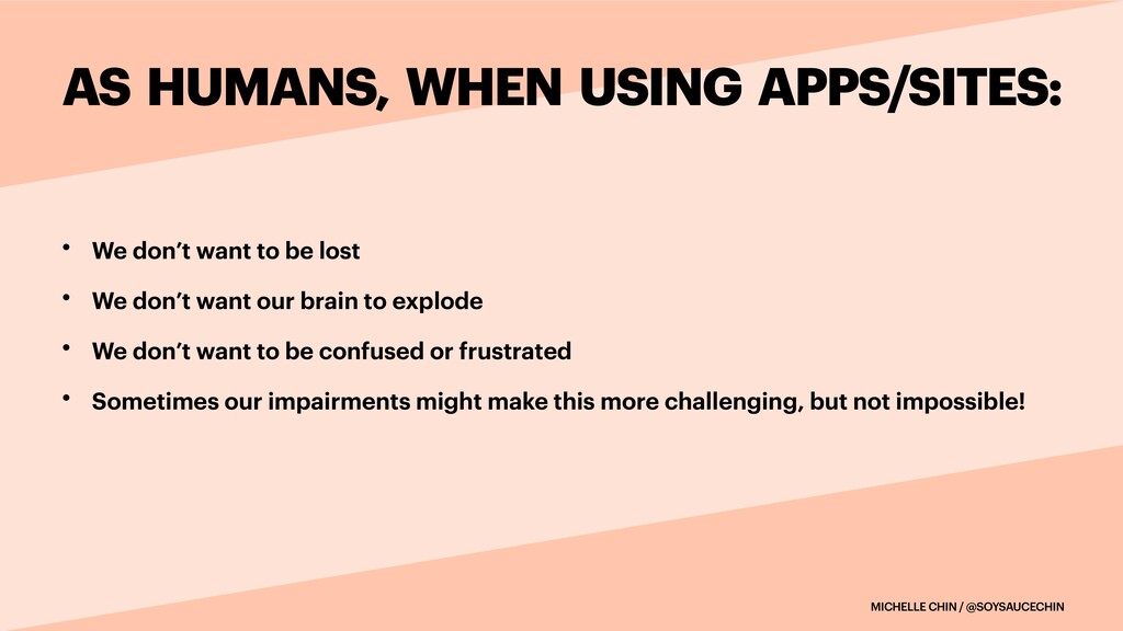
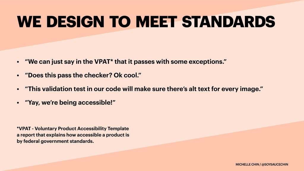
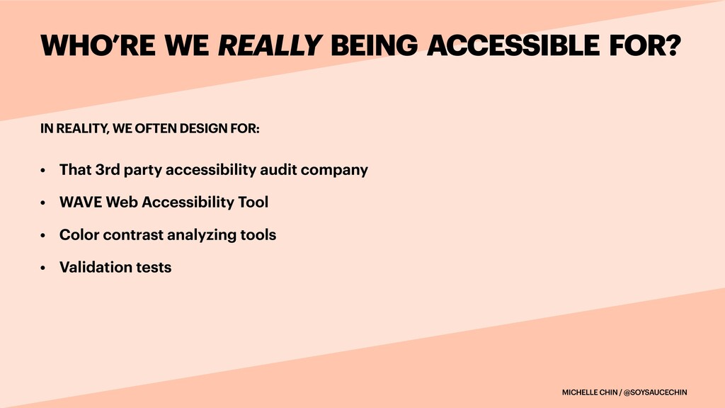
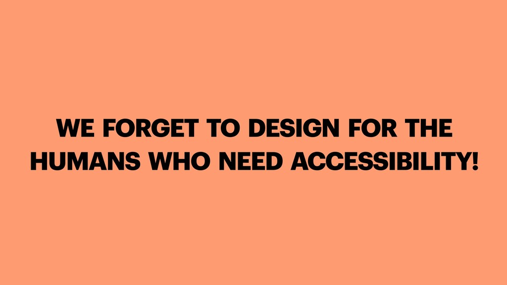
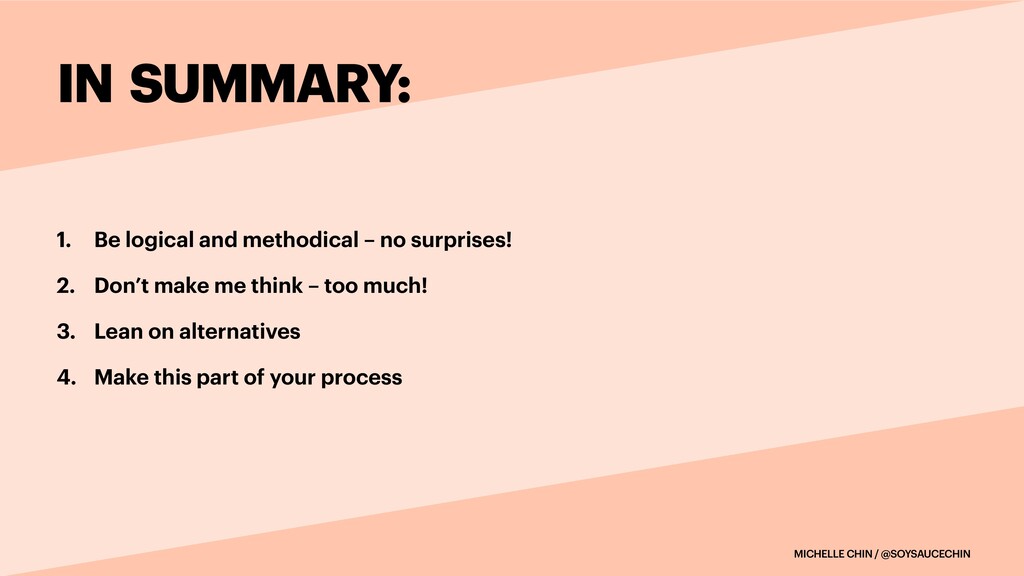
Designing for accessibility isn’t a matter of checking off boxes to meet the Web Content Accessibility Guidelines (WCAG). It’s about designing for all humans regardless of their impairments. We want everyone to have usable experiences with our sites or apps. In this talk, I cover top tips for accessible design for humans.

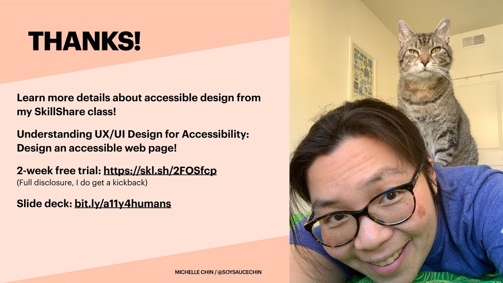
If you're interested in a deeper dive on accessibility, check out my SkillShare class: https://skl.sh/2FOSfcp

Michelle Chin

April 29, 2021
Tweet

More Decks by Michelle Chin

Other Decks in Design

Transcript

  1. ACCESSIBLE DESIGN:
    DESIGNING FOR HUMANS
    MICHELLE CHIN


    PRINCIPAL DESIGN OPS MANAGER


    CITRIX

    View Slide

  2. • Learned accessibility through QA testing


    • 10+ years on digital projects for federal agencies


    • Department of Homeland Security


    • Federal Aviation Administration


    • Export-Import Bank of the U.S.


    • Department of Labor


    • and… some I can’t mention
    MICHELLE CHIN / @SOYSAUCECHIN
    HELLO!
    ABOUT ME

    View Slide

  3. MICHELLE CHIN / @SOYSAUCECHIN
    WHO’S OUR AUDIENCE FOR ACCESSIBILITY?
    • People with visual impairments

    (partial/complete vision loss, color blindness, elderly eyes)


    • People with hearing impairments

    (partial/complete loss)


    • People with motor skill impairments

    (arthritis, missing limbs, broken
    f
    ingers, carpal tunnel)


    • People with cognitive impairments

    (brain injuries, reading in a non-native language)

    View Slide

  4. MICHELLE CHIN / @SOYSAUCECHIN
    AS HUMANS, WHEN USING APPS/SITES:
    • We don’t want to be lost


    • We don’t want our brain to explode


    • We don’t want to be confused or frustrated


    • Sometimes our impairments might make this more challenging, but not impossible!

    View Slide

  5. MICHELLE CHIN / @SOYSAUCECHIN
    WE DESIGN TO MEET STANDARDS
    • “We can just say in the VPAT* that it passes with some exceptions.”


    • “Does this pass the checker? Ok cool.”


    • “This validation test in our code will make sure there’s alt text for every image.”


    • “Yay, we’re being accessible!”


    *VPAT - Voluntary Product Accessibility Template

    a report that explains how accessible a product is

    by federal government standards.

    View Slide

  6. MICHELLE CHIN / @SOYSAUCECHIN
    IN REALITY, WE OFTEN DESIGN FOR:
    WHO’RE WE REALLY BEING ACCESSIBLE FOR?
    • That 3rd party accessibility audit company


    • WAVE Web Accessibility Tool


    • Color contrast analyzing tools


    • Validation tests

    View Slide

  7. WE FORGET TO DESIGN FOR THE
    HUMANS WHO NEED ACCESSIBILITY!

    View Slide

  8. DESIGNING FOR HUMANS:


    4 GUIDELINES

    View Slide

  9. MICHELLE CHIN / @SOYSAUCECHIN
    1. BE LOGICAL AND METHODICAL – NO SURPRISES
    People naturally try to form mental models to use a site/app quickly. Consistency
    and predictability allow us to focus on successfully navigating, comprehending
    content, and completing tasks.


    When the unexpected happens, we can become confused, disoriented, and
    frustrated with our experience.

    View Slide

  10. MICHELLE CHIN / @SOYSAUCECHIN
    ASK YOURSELF:
    1. BE LOGICAL AND METHODICAL – NO SURPRISES
    • Does my design include a logical information hierarchy and mental model that people
    can easily follow?


    • Are the developers coding with semantic elements (e.g., form, table, H1, etc.) and ARIA
    attributes to provide the right context to screen reader users?


    • Did I design a focus state that is conspicuous?

    View Slide

  11. MICHELLE CHIN / @SOYSAUCECHIN
    TOP TIPS:
    1. BE LOGICAL AND METHODICAL – NO SURPRISES
    • Annotate the navigation order of your designs to ensure logical navigation for screen
    reader or keyboard-only users


    • Usability test to con
    f
    irm:


    • There’s a clear mental model


    • Interactions don’t surprise, and


    • Successfully usage via keyboard-only or screen readers


    • If your product is more complex, consider keyboard shortcuts

    (Test them to con
    f
    irm their usability!)

    View Slide

  12. MICHELLE CHIN / @SOYSAUCECHIN
    2. DON’T MAKE ME THINK – TOO MUCH!
    Being informative is great, but there can be too much of a good
    thing. Too much information leads to cognitive overload.

    View Slide

  13. MICHELLE CHIN / @SOYSAUCECHIN
    ASK YOURSELF:
    2. DON’T MAKE ME THINK – TOO MUCH!
    • Did I provide enough color contrast with elements?


    • Am I providing just the right amount of context?


    • Can I reduce the writing (again)?


    • Did I use headings, numbered/bulleted lists, shorter sentences?


    • Did I write in plain language?

    View Slide

  14. MICHELLE CHIN / @SOYSAUCECHIN
    TOP TIPS:
    2. DON’T MAKE ME THINK – TOO MUCH!
    • Read your writing out loud.

    (Did it sound smooth; did you trip on your words?)


    • Use the Hemingway app or Grammarly to practice conciseness


    • Provide skip nav or skip to main content links


    • Make sure your copy and alt text compliment; rather than duplicate each other

    View Slide

  15. MICHELLE CHIN / @SOYSAUCECHIN
    EXAMPLE:
    2. DON’T MAKE ME THINK – TOO MUCH!
    Bad Example:


    Copy: The Belcher family
    includes Bob, Linda, and their
    three kids: Gene, Louise, and
    Tina.


    Alt text: A family portrait of
    the Belchers starting with the
    back row, left to right: Bob,
    Linda; front row left to right:
    Gene, Louise, and Tina.
    Good Example:


    Copy: The Belcher family
    includes Bob, Linda, and
    their three kids: Gene,
    Louise, and Tina.


    Alt text: The Belcher family

    View Slide

  16. MICHELLE CHIN / @SOYSAUCECHIN
    3. LEAN ON ALTERNATIVES
    Designing for accessibility isn’t about brute forcing accessibility into your app or
    site. It’s about providing equivalent alternatives.


    Equivalent alternatives are substitute options that allow people with impairments to
    obtain the same information or complete the same tasks successfully. These
    alternatives don’t have to equate to equivalent experiences.

    View Slide

  17. MICHELLE CHIN / @SOYSAUCECHIN
    ASK YOURSELF:
    3. LEAN ON ALTERNATIVES
    • Did I include alternatives so people can only use a keyboard?

    (Don’t forget keyboard-friendly options for hover interactions!)


    • For visual elements, do I provide another visual distinction beyond color?


    • Is my alt text meaningful and relevant? For complicated images, did I provide
    alternative descriptions?


    • For video and audio, did I provide captioning, transcripts, or visual descriptions?

    View Slide

  18. MICHELLE CHIN / @SOYSAUCECHIN
    TOP TIPS:
    3. LEAN ON ALTERNATIVES
    • If you’re feeling frustrated, take a step back. Reframe this challenge and get creative
    with alternatives. It might help to think about the initial goal.


    • Test with a screen reader to ensure your alternative is usable.


    • Leverage component libraries to scale some aspects


    • Document your approaches so you and others can bene
    f
    it

    View Slide

  19. MICHELLE CHIN / @SOYSAUCECHIN
    4. MAKE IT PART OF YOUR PROCESS
    Creating accessible solutions can be di
    ff
    icult, but you don’t have to be alone in the
    process.


    • Share your work in design reviews and critiques


    • Collaborate with engineers


    • Discuss with other designers in the community


    • Team up with a local organization

    View Slide

  20. MICHELLE CHIN / @SOYSAUCECHIN
    ASK YOURSELF:
    4. MAKE IT PART OF YOUR PROCESS
    • Who might be able to help me with this (interaction,
    f
    low, pattern, etc.)?


    • What have others done?

    (You can
    f
    ind so many answers via Google!)


    • Did I document this so others know how we’re approaching accessibility?


    View Slide

  21. MICHELLE CHIN / @SOYSAUCECHIN
    TOP TIPS:
    4. MAKE IT PART OF YOUR PROCESS
    • Include accessibility in your design system components and usage guidelines


    • Try using assistive tech - screen readers, accessibility settings on devices, etc.


    • Keep up with online resources


    • Use accessibility tools (WAVE tool, etc.) to gut check your work


    • Just because [insert big tech company name] didn’t make something accessible,
    doesn’t mean you should look the other way, too.

    View Slide

  22. MICHELLE CHIN / @SOYSAUCECHIN
    IN SUMMARY:
    1. Be logical and methodical – no surprises!


    2. Don’t make me think – too much!


    3. Lean on alternatives


    4. Make this part of your process

    View Slide

  23. WHEN DESIGNING FOR ACCESSIBILITY,


    DESIGN FOR HUMANS

    View Slide

  24. Learn more details about accessible design from
    my SkillShare class!


    Understanding UX/UI Design for Accessibility:
    Design an accessible web page!


    2-week free trial: https://skl.sh/2FOSfcp

    (Full disclosure, I do get a kickback)


    Slide deck: bit.ly/a11y4humans
    MICHELLE CHIN / @SOYSAUCECHIN
    THANKS!

    View Slide