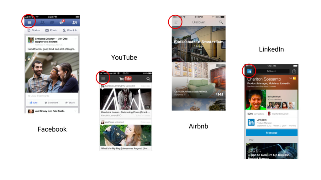
that we don’t offer to you guys… but I will say that their value is greatly over-stated, and they have huge usability downsides too. – Mike Stern, Apple UX Evangelist, WWDC 2014
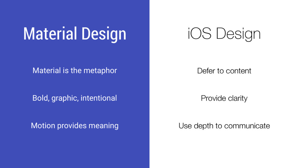
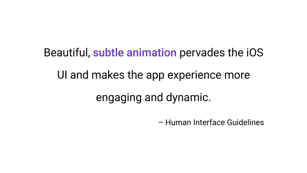
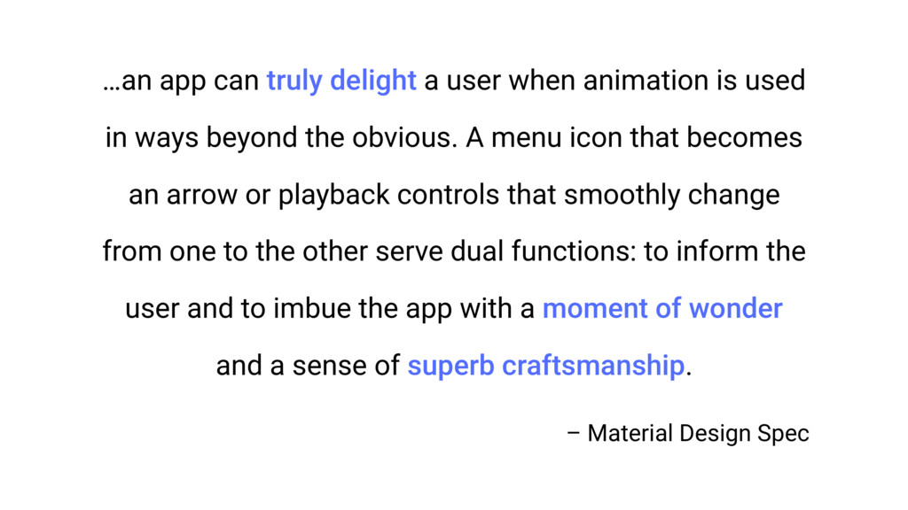
used in ways beyond the obvious. A menu icon that becomes an arrow or playback controls that smoothly change from one to the other serve dual functions: to inform the user and to imbue the app with a moment of wonder and a sense of superb craftsmanship. – Material Design Spec