$30 off During Our Annual Pro Sale. View Details »

Composing an Octopus

Composing an Octopus

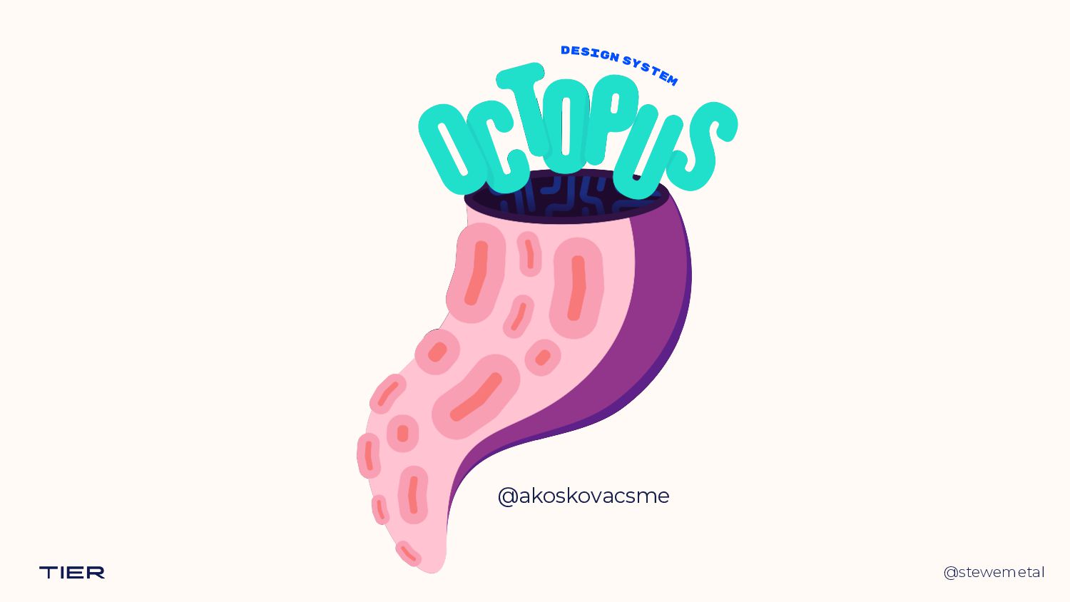
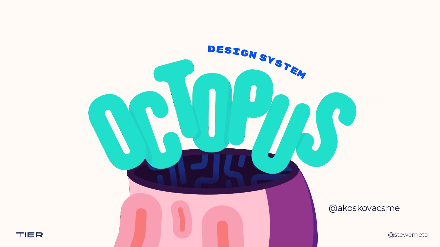
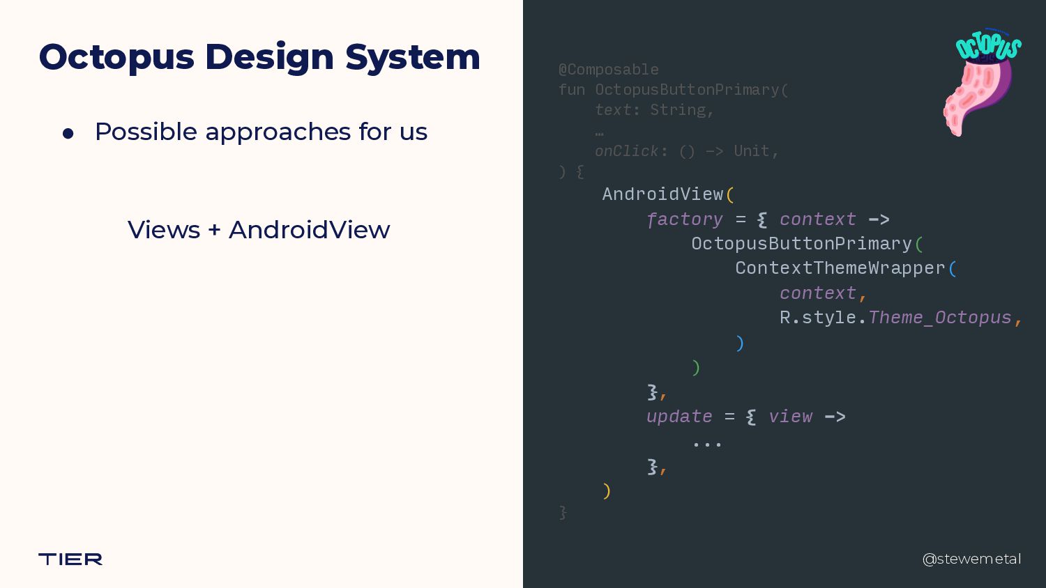
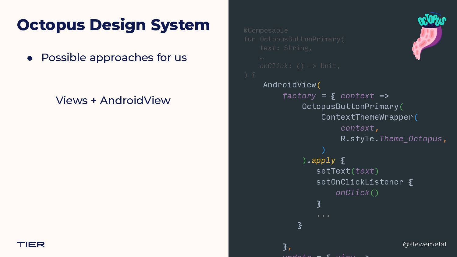
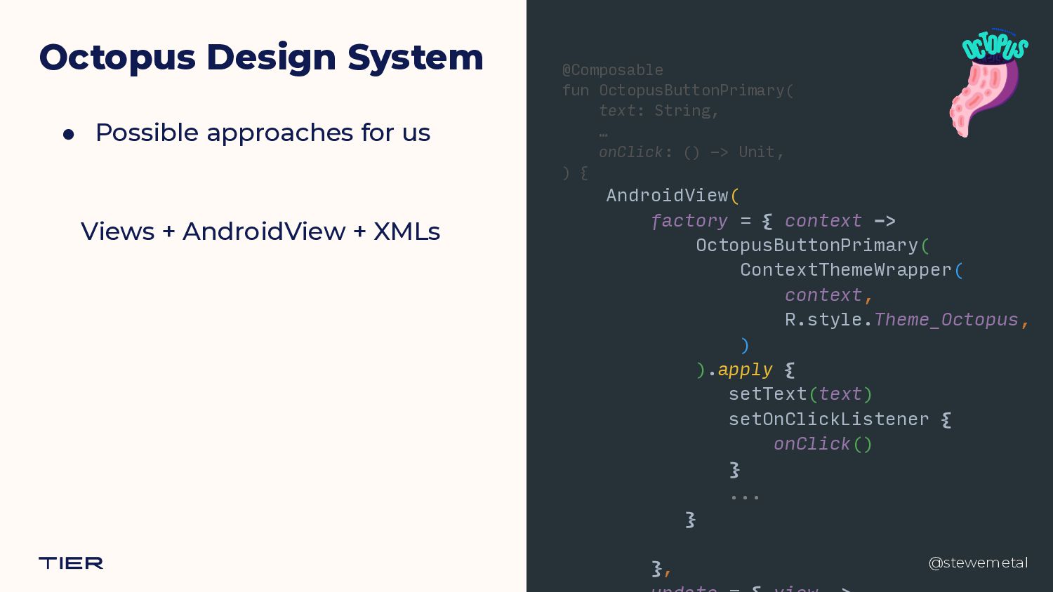
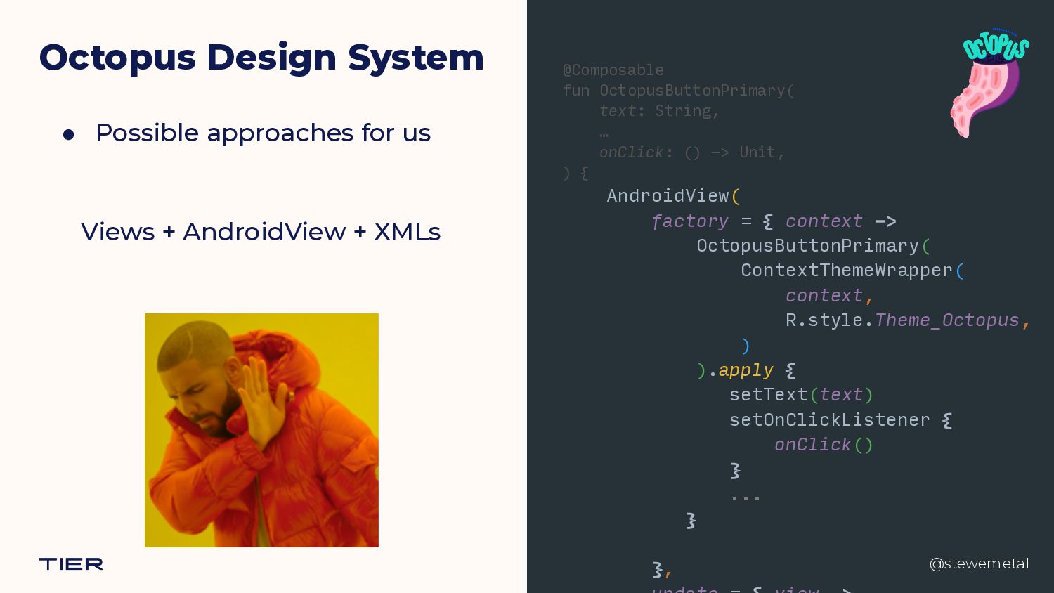
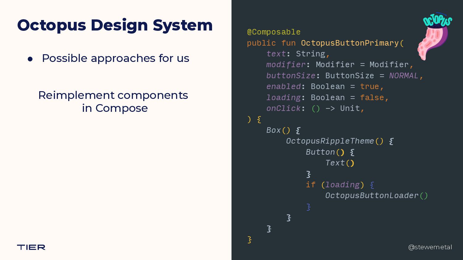
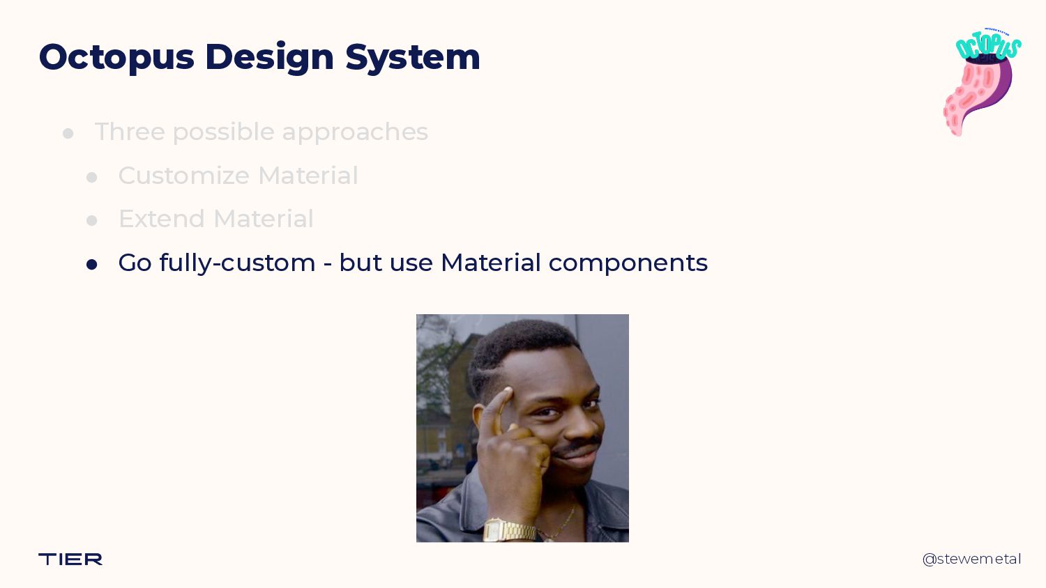
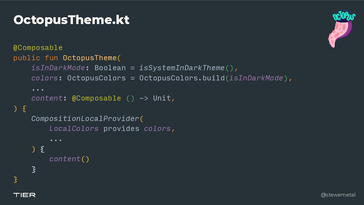
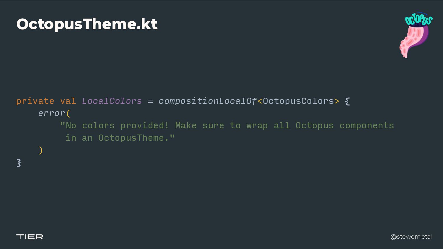
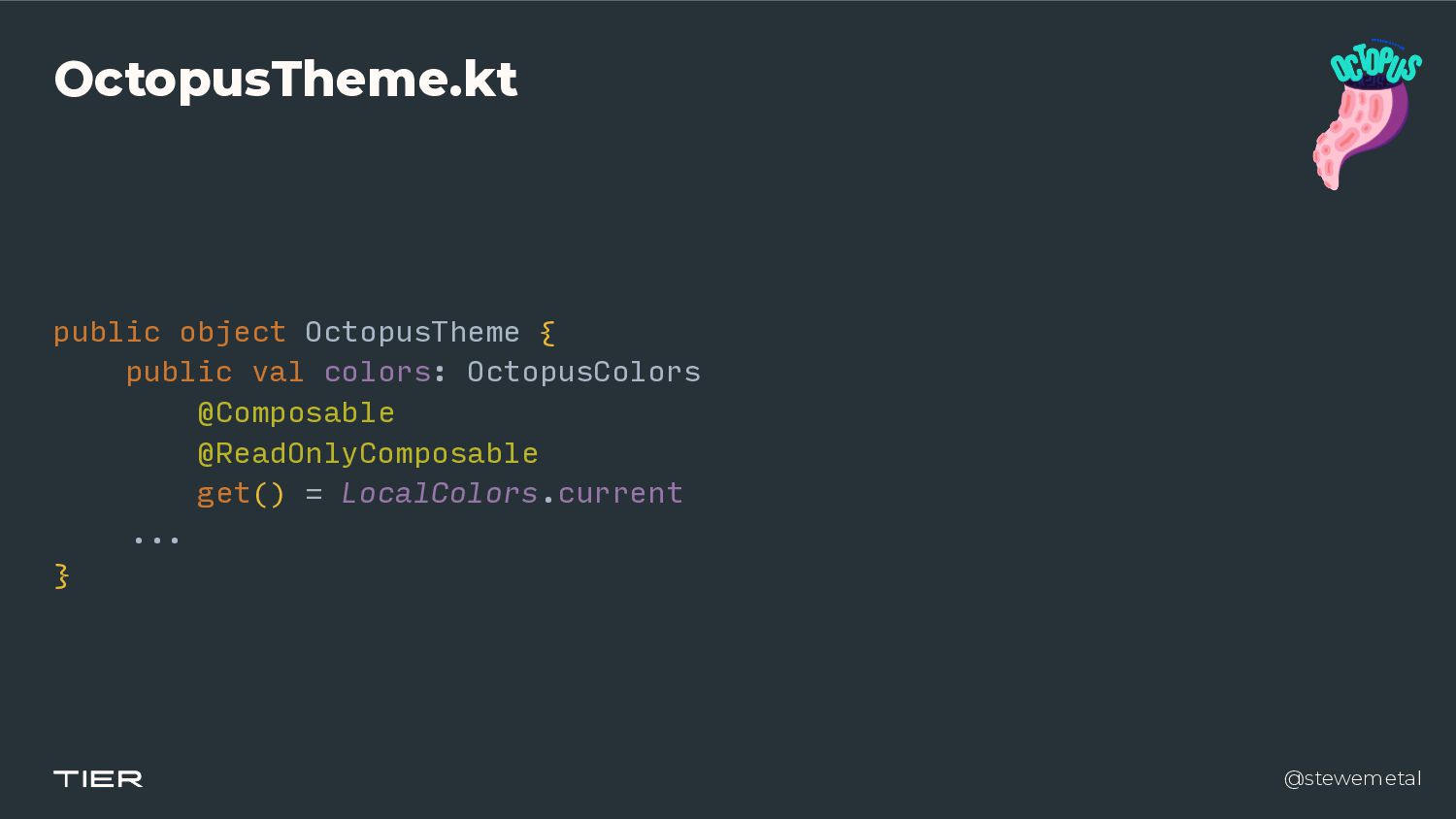
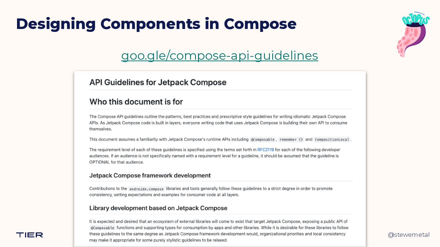
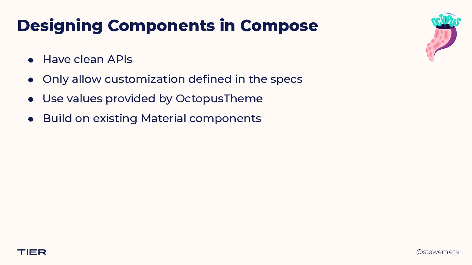
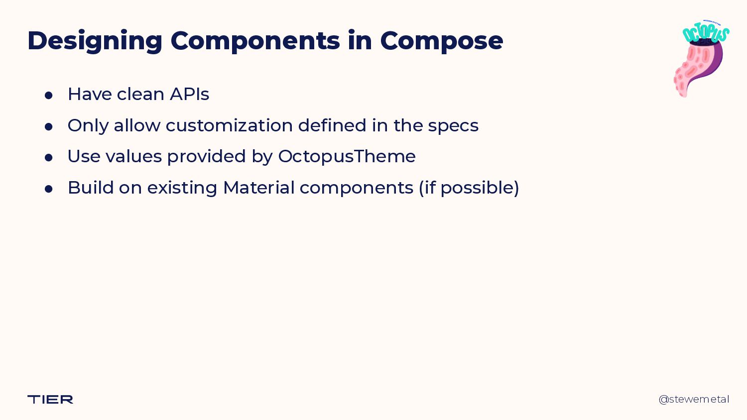
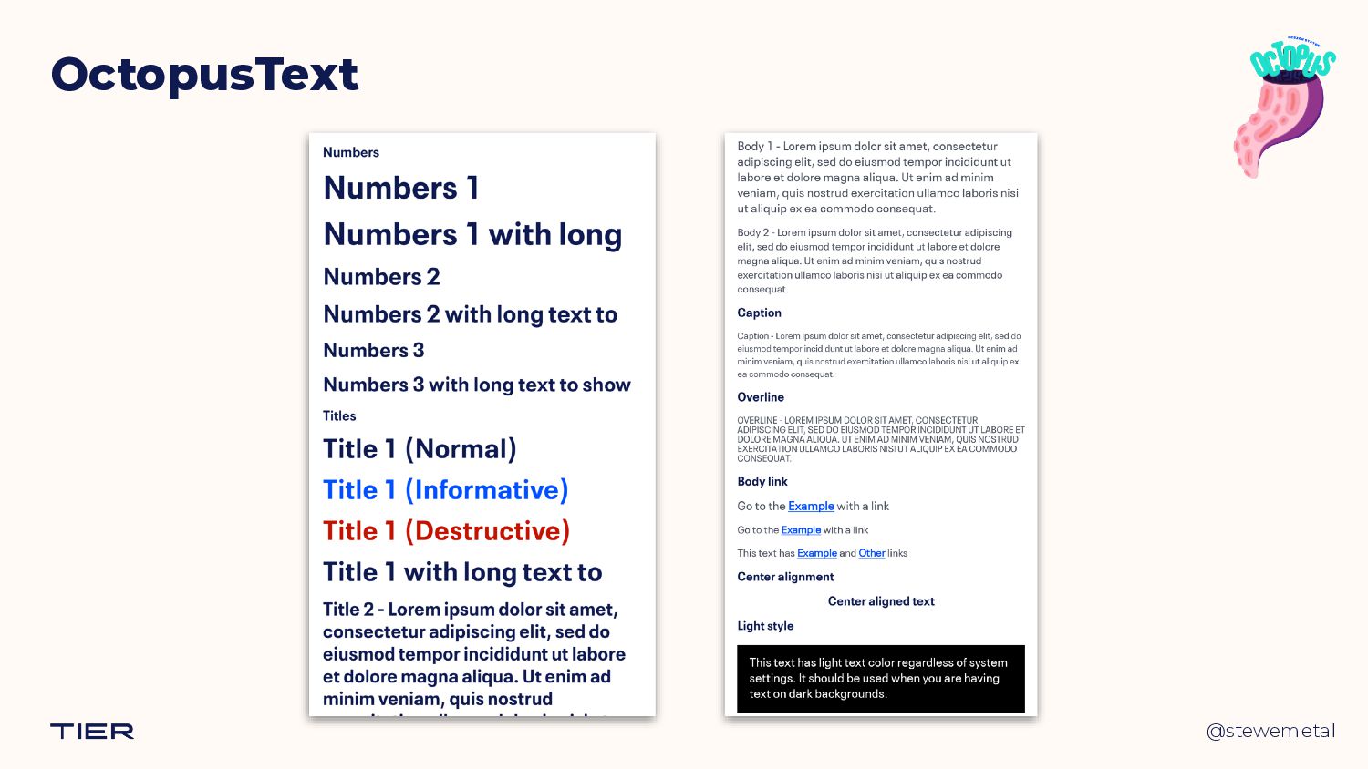
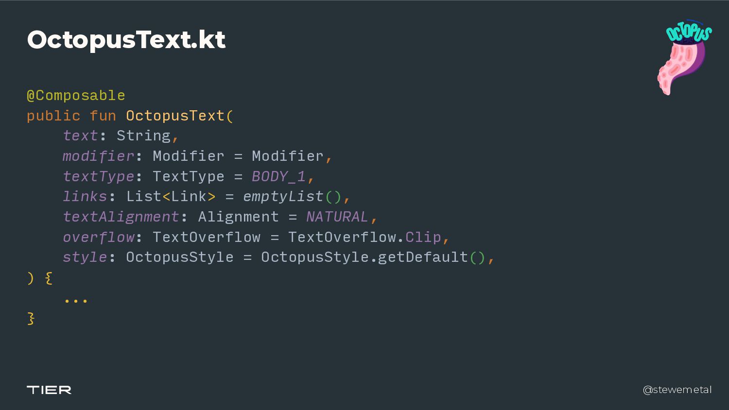
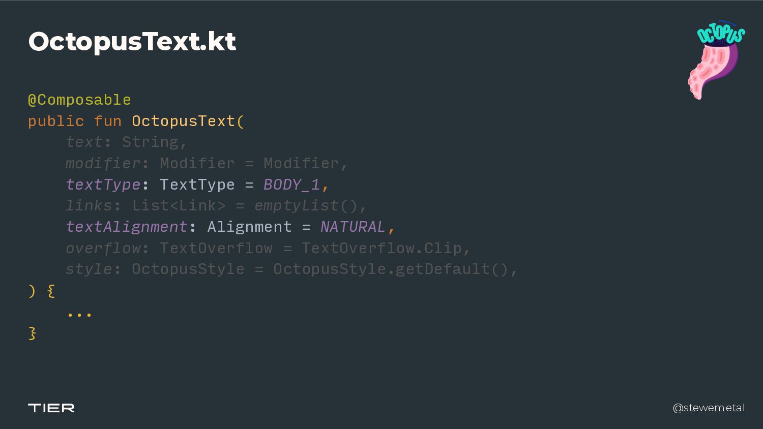
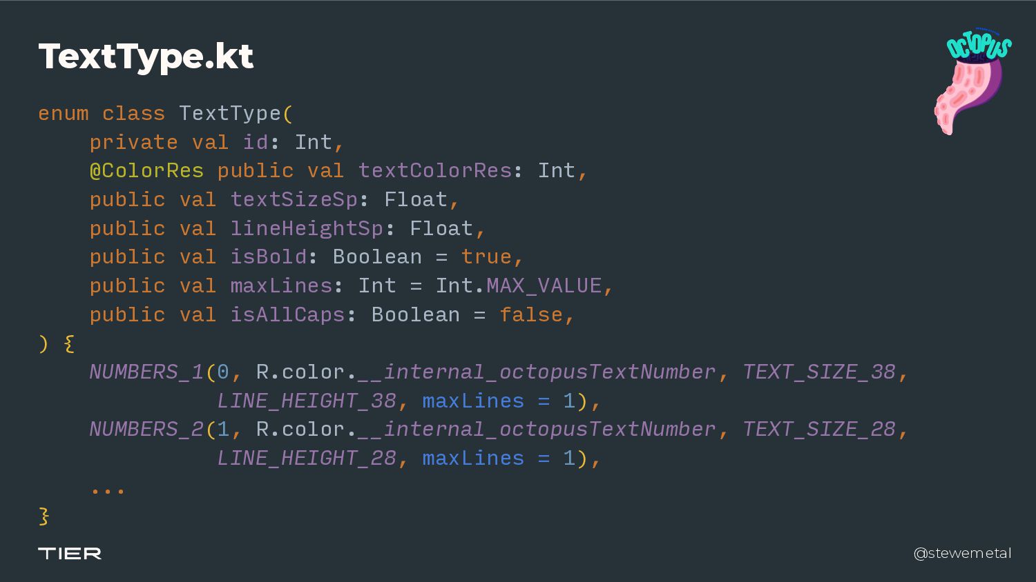
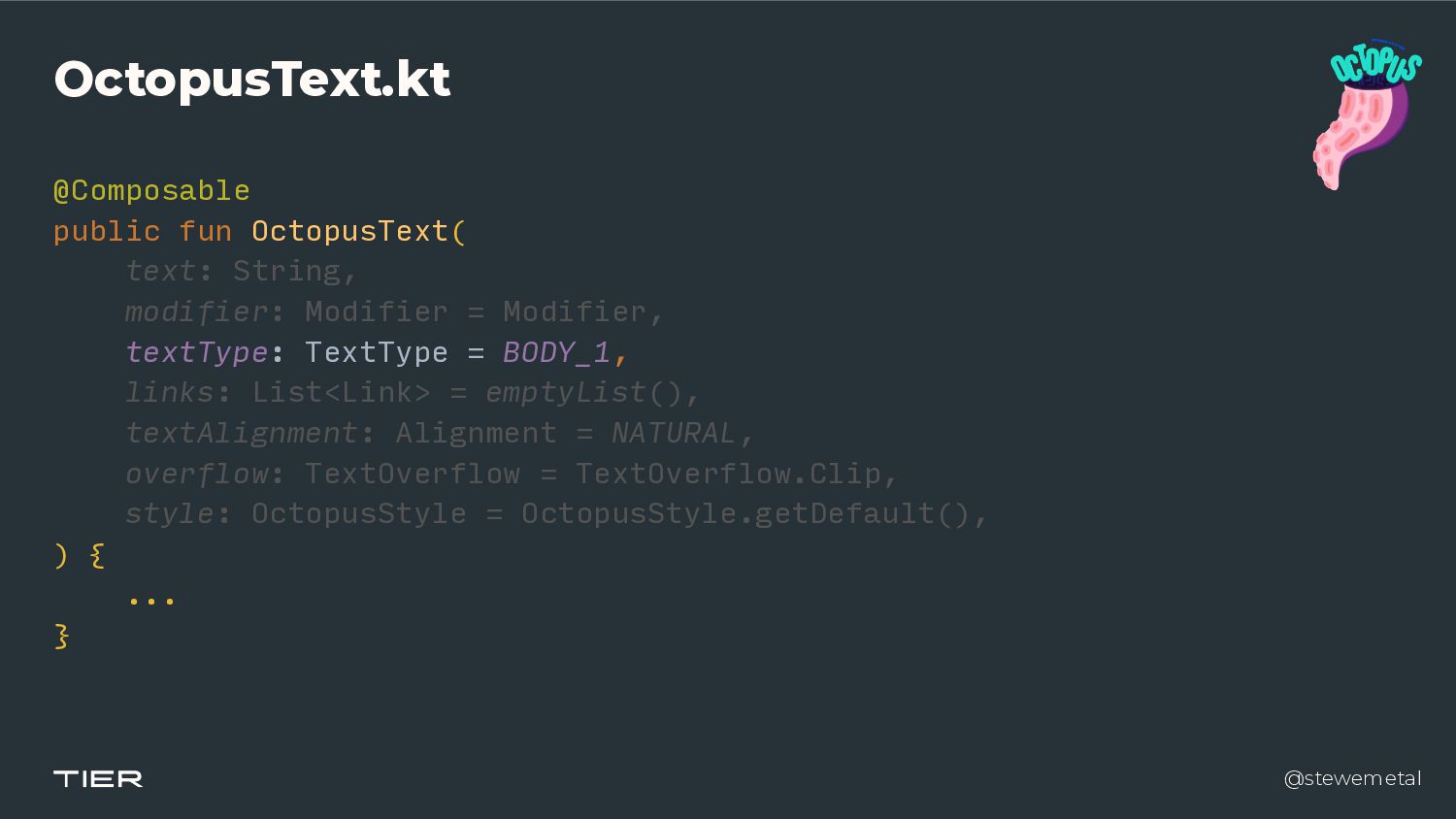
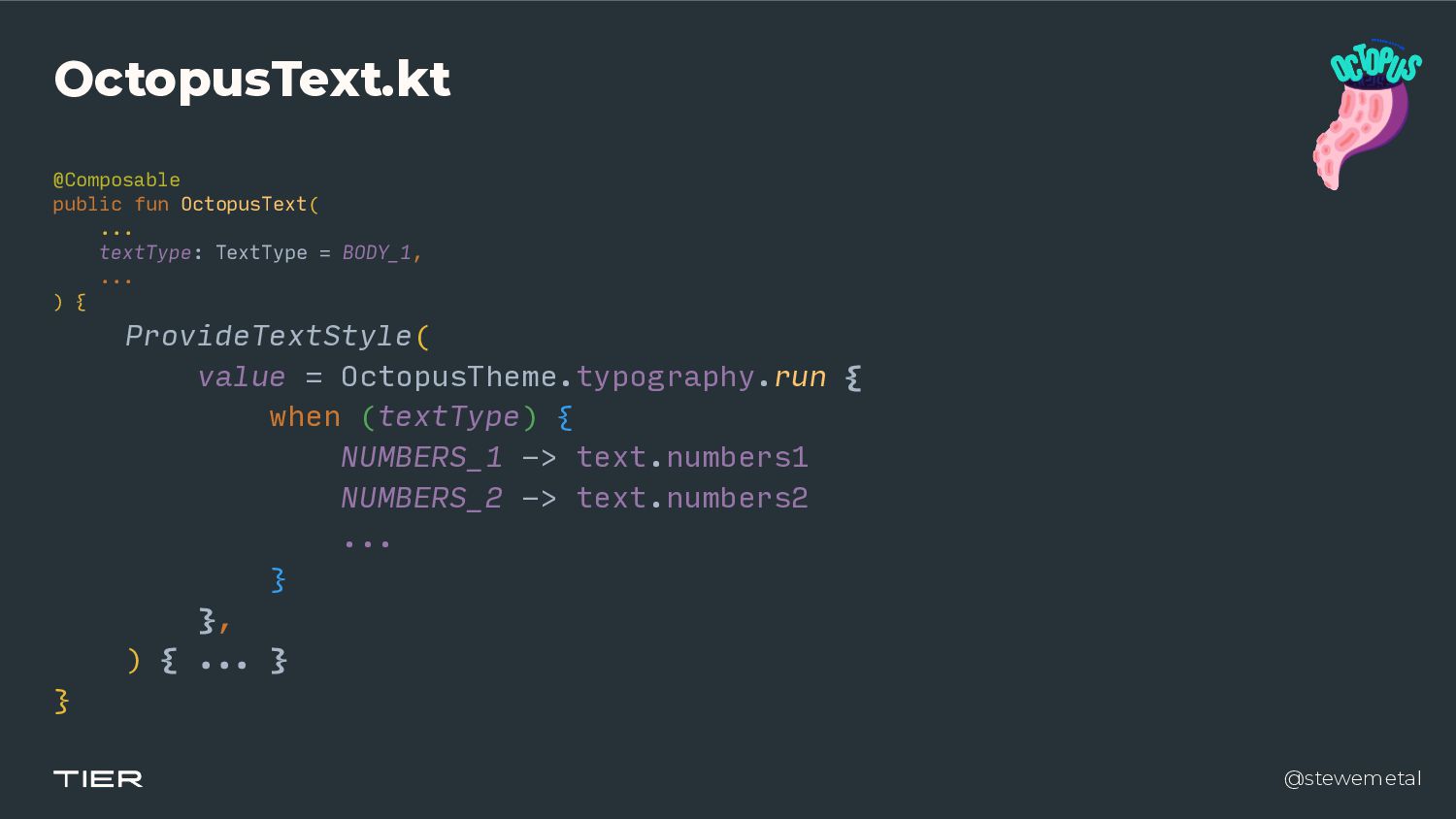
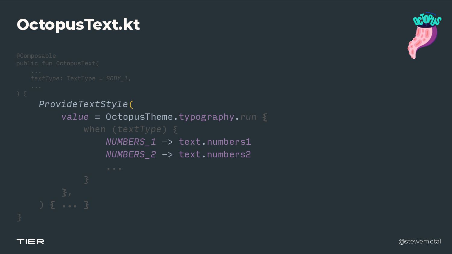
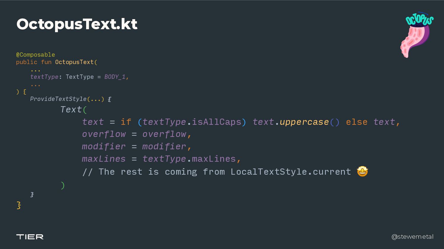
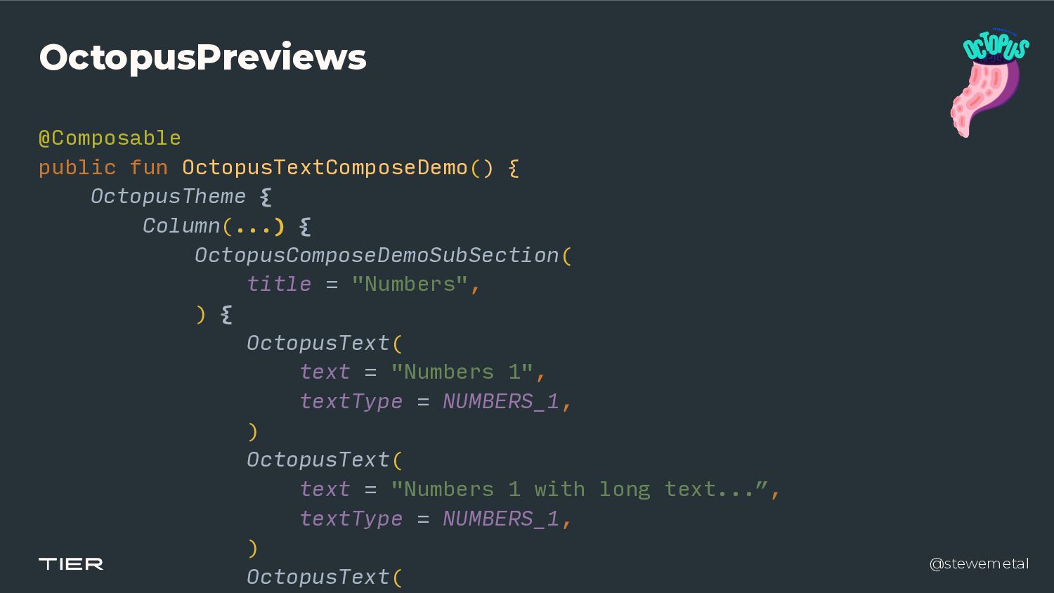
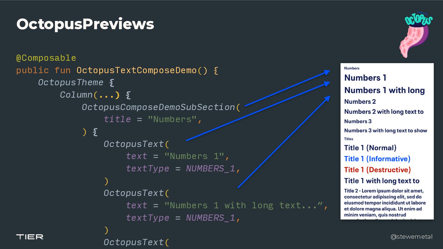
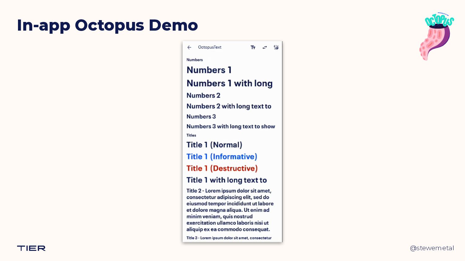
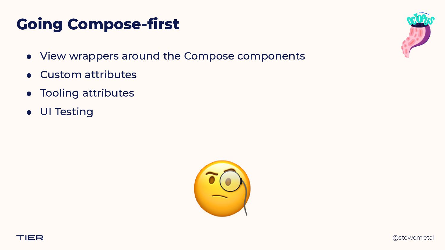
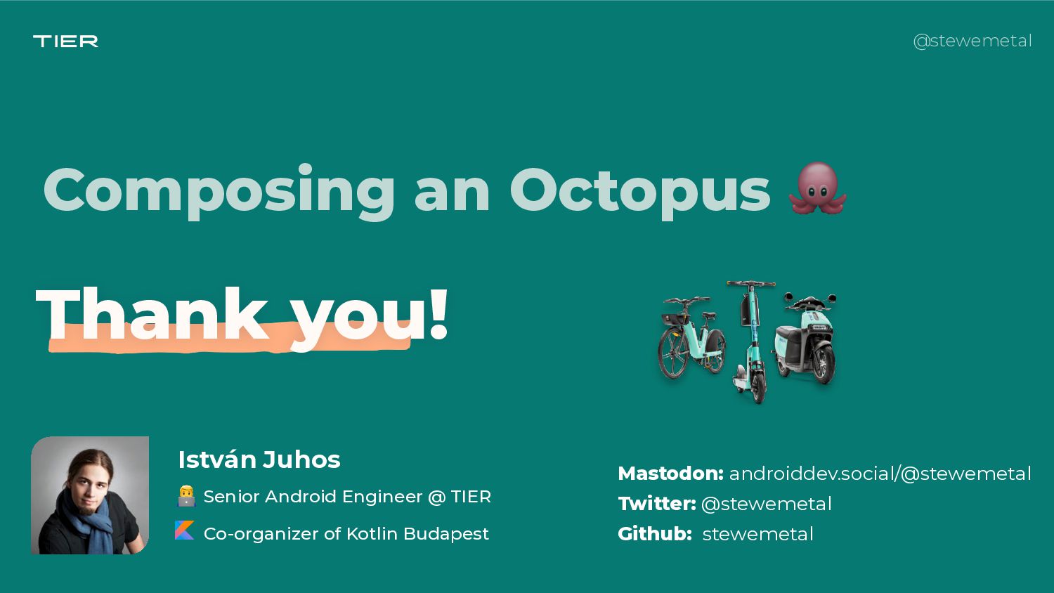
At TIER, we’re in the process of adopting Jetpack Compose into our quite large code base. One of the most significant milestones of this journey was to have our design system, Octopus, implemented in pure Compose UI. In this talk, I’ll present how we built Octopus Compose, and what we gained by reimplementing components instead of wrapping existing Views in AndroidView.

I gave this talk on the 2022 November edition of the Android Budapest Meetup on 2022.12.01.

István Juhos

December 01, 2022
Tweet

More Decks by István Juhos

Other Decks in Programming

Transcript

  1. @stewemetal
    👨💻 Senior Android Engineer @ TIER


    Co-organizer of Kotlin Budapest
    István Juhos
    Composing an Octopus 🐙

    View Slide

  2. @stewemetal
    Octopus?

    View Slide

  3. @stewemetal

    View Slide

  4. @stewemetal

    View Slide

  5. @stewemetal
    @akoskovacsme

    View Slide

  6. @stewemetal
    @akoskovacsme

    View Slide

  7. @stewemetal
    Octopus Design System - B.C.
    ● 100% Views with Data Binding and @BindingAdapters


    ● Good component APIs & docs


    ● Easy usage with View-based UI

    View Slide

  8. @stewemetal
    Octopus Design System - B.C.
    ● 100% Views with Data Binding and @BindingAdapters


    ● Good component APIs & docs


    ● Easy usage with View-based UI


    ● Not fun to maintain 😢
    OctopusButtonPrimary.kt


    R.layout.__internal_view_octopus_button


    R.styleable.OctopusButton


    R.drawable.__internal_octopus_button_background_primary


    @stewemetal

    View Slide

  9. @stewemetal
    Octopus Design System - B.C.
    ● 100% Views with Data Binding and @BindingAdapters


    ● Good component APIs & docs


    ● Easy usage with View-based UI


    ● Not fun to maintain 😢
    // We have to disable specific setters to prevent misuse of the view


    private var areSettersEnabled = false


    @stewemetal

    View Slide

  10. @stewemetal
    Octopus Design System - B.C.
    // Disable the setters if it's not an internal call


    /**


    * Calling this method will have no effect.


    */


    override fun setTextColor(color: Int) {


    if (areSettersEnabled || isInEditMode) {


    super.setTextColor(color)


    }


    }

    View Slide

  11. @stewemetal
    Octopus Design System - B.C.
    // This is a known bug in Android Studio Design Editor


    // https://issuetracker.google.com/issues/36942641


    if (isInEditMode) {


    setTypeface(


    typeface, if (textType.isBold) Typeface.BOLD else Typeface.NORMAL,


    )


    } else {


    val fontRes = if (textType.isBold) R.font.tier_text_bold


    else R.font.tier_text_regular


    typeface = ResourcesCompat.getFont(context, fontRes)


    }


    View Slide

  12. @stewemetal
    Octopus Design System
    What about Compose?
    🤔

    View Slide

  13. @stewemetal
    Octopus Design System
    ● Possible approaches for us
    @marcoGomier @stewemetal

    View Slide

  14. @stewemetal
    Octopus Design System
    ● Possible approaches for us
    Views + AndroidView
    @Composable


    fun OctopusButtonPrimary(


    text: String,


    onClick: () -> Unit,


    ) {


    AndroidView(


    factory = { context ->


    OctopusButtonPrimary(context)


    },


    update = { view ->


    ...


    },


    )


    }


    @stewemetal

    View Slide

  15. @stewemetal
    Octopus Design System
    ● Possible approaches for us
    Views + AndroidView
    @Composable


    fun OctopusButtonPrimary(


    text: String,


    onClick: () -> Unit,


    ) {


    AndroidView(


    factory = { context ->


    OctopusButtonPrimary(context)


    },


    update = { view ->


    ...


    },


    )


    }


    @stewemetal

    View Slide

  16. @stewemetal
    Octopus Design System
    ● Possible approaches for us
    Views + AndroidView
    @Composable


    fun OctopusButtonPrimary(


    text: String,


    onClick: () -> Unit,


    ) {


    AndroidView(


    factory = { context ->


    OctopusButtonPrimary(


    ContextThemeWrapper(


    context,


    R.style.Theme_Octopus,


    )


    )


    },


    update = { view ->


    ...


    },


    )


    }


    @stewemetal

    View Slide

  17. @stewemetal
    Octopus Design System
    ● Possible approaches for us
    Views + AndroidView
    @Composable


    fun OctopusButtonPrimary(


    text: String,


    onClick: () -> Unit,


    ) {


    AndroidView(


    factory = { context ->


    OctopusButtonPrimary(


    ContextThemeWrapper(


    context,


    R.style.Theme_Octopus,


    )


    ).apply {


    setText(text)


    setOnClickListener {


    onClick()


    }


    ...


    }


    },


    @stewemetal

    View Slide

  18. @stewemetal
    Octopus Design System
    ● Possible approaches for us
    Views + AndroidView + XMLs
    @Composable


    fun OctopusButtonPrimary(


    text: String,


    onClick: () -> Unit,


    ) {


    AndroidView(


    factory = { context ->


    OctopusButtonPrimary(


    ContextThemeWrapper(


    context,


    R.style.Theme_Octopus,


    )


    ).apply {


    setText(text)


    setOnClickListener {


    onClick()


    }


    ...


    }


    },


    @stewemetal

    View Slide

  19. @stewemetal
    Octopus Design System
    ● Possible approaches for us
    @Composable


    fun OctopusButtonPrimary(


    text: String,


    onClick: () -> Unit,


    ) {


    AndroidView(


    factory = { context ->


    OctopusButtonPrimary(


    ContextThemeWrapper(


    context,


    R.style.Theme_Octopus,


    )


    ).apply {


    setText(text)


    setOnClickListener {


    onClick()


    }


    ...


    }


    },


    @stewemetal
    Views + AndroidView + XMLs

    View Slide

  20. @stewemetal
    Octopus Design System
    ● Possible approaches for us
    @Composable


    public fun OctopusButtonPrimary(


    text: String,


    modifier: Modifier = Modifier,


    buttonSize: ButtonSize = NORMAL,


    enabled: Boolean = true,


    loading: Boolean = false,


    onClick: () -> Unit,


    ) {


    Box() {


    OctopusRippleTheme() {


    Button() {


    Text()


    }


    if (loading) {


    OctopusButtonLoader()


    }


    }


    }


    }


    Reimplement component
    s​

    in

    Compose
    @stewemetal

    View Slide

  21. @stewemetal
    Octopus Design System
    ● Possible approaches for us
    @Composable


    public fun OctopusButtonPrimary(


    text: String,


    modifier: Modifier = Modifier,


    buttonSize: ButtonSize = NORMAL,


    enabled: Boolean = true,


    loading: Boolean = false,


    onClick: () -> Unit,


    ) {


    Box() {


    OctopusRippleTheme() {


    Button() {


    Text()


    }


    if (loading) {


    OctopusButtonLoader()


    }


    }


    }


    }


    Reimplement component
    s​

    in

    Compose
    @stewemetal

    View Slide

  22. @stewemetal
    Octopus Design System
    ● Possible approaches for us
    Reimplement component
    s​

    in

    Compose
    @stewemetal
    @Composable


    public fun OctopusButtonPrimary(


    text: String,


    modifier: Modifier = Modifier,


    buttonSize: ButtonSize = NORMAL,


    enabled: Boolean = true,


    loading: Boolean = false,


    onClick: () -> Unit,


    ) {


    Box() {


    OctopusRippleTheme() {


    Button() {


    Text()


    }


    if (loading) {


    OctopusButtonLoader()


    }


    }


    }


    }


    View Slide

  23. @stewemetal
    Octopus Design System
    ● Possible approaches for us
    Reimplement component
    s​

    in

    Compose
    @stewemetal
    @Composable


    public fun OctopusButtonPrimary(


    text: String,


    modifier: Modifier = Modifier,


    buttonSize: ButtonSize = NORMAL,


    enabled: Boolean = true,


    loading: Boolean = false,


    onClick: () -> Unit,


    ) {


    Box() {


    OctopusRippleTheme() {


    Button() {


    Text()


    }


    if (loading) {


    OctopusButtonLoader()


    }


    }


    }


    }


    View Slide

  24. @stewemetal
    ● The benefits of pure Compose


    ● Easier to maintain


    ● No attachments to the legacy Views


    ● Easy for teams to adopt
    Octopus Design System
    🤩

    View Slide

  25. @stewemetal
    ● Downsides of our approach


    ● A second implementation to maintain


    ● Needs parity with the View components


    ● Some APIs are still experimental
    Octopus Design System
    🧐

    View Slide

  26. @stewemetal
    Octopus Design System

    View Slide

  27. @stewemetal
    Where should we start?
    Octopus Design System
    🧐

    View Slide

  28. @stewemetal
    Octopus Design System
    developer.android.com/jetpack/compose/designsystems

    View Slide

  29. @stewemetal
    Octopus Design System
    ● Three possible approaches


    ● Customize Material


    ● Extend Material


    ● Go fully-custom

    View Slide

  30. @stewemetal
    Octopus Design System
    ● Three possible approaches


    ● Customize Material


    ● Extend Material


    ● Go fully-custom

    View Slide

  31. @stewemetal
    Octopus Design System
    ● Three possible approaches


    ● Customize Material


    ● Extend Material


    ● Go fully-custom - but use Material components

    View Slide

  32. @stewemetal
    OctopusTheme

    View Slide

  33. @stewemetal
    OctopusTheme.kt
    @Composable


    public fun OctopusTheme(


    isInDarkMode: Boolean = isSystemInDarkTheme(),

    ...


    content: @Composable () -> Unit,


    ) {


    content()


    }


    View Slide

  34. @stewemetal
    @Composable


    public fun OctopusTheme(


    isInDarkMode: Boolean = isSystemInDarkTheme(),


    colors: OctopusColors = OctopusColors.build(isInDarkMode),


    typography: OctopusTypography = OctopusTypography.build(),


    shapes: OctopusShapes = OctopusShapes.build(),


    dimensions: OctopusDimensions = OctopusDimensions.build(),


    spacings: OctopusSpacings = OctopusSpacings(),


    content: @Composable () -> Unit,


    ) {


    content()


    }


    OctopusTheme.kt

    View Slide

  35. @stewemetal
    @Composable


    public fun OctopusTheme(


    isInDarkMode: Boolean = isSystemInDarkTheme(),


    colors: OctopusColors = OctopusColors.build(isInDarkMode),


    ...


    content: @Composable () -> Unit,


    ) {


    CompositionLocalProvider(


    LocalColors provides colors,


    ...


    ) {


    content()


    }


    }


    OctopusTheme.kt

    View Slide

  36. @stewemetal
    @Composable


    public fun OctopusTheme(


    isInDarkMode: Boolean = isSystemInDarkTheme(),


    colors: OctopusColors = OctopusColors.build(isInDarkMode),


    ...


    content: @Composable () -> Unit,


    ) {


    CompositionLocalProvider(


    LocalColors provides colors,


    ...


    ) {


    content()


    }


    }


    OctopusTheme.kt

    View Slide

  37. @stewemetal
    private val LocalColors = compositionLocalOf {


    error(

    "No colors provided! Make sure to wrap all Octopus components

    in an OctopusTheme."

    )


    }


    OctopusTheme.kt

    View Slide

  38. @stewemetal
    public object OctopusTheme {


    public val colors: OctopusColors


    @Composable


    @ReadOnlyComposable


    get() = LocalColors.current


    ...


    }
    OctopusTheme.kt

    View Slide

  39. @stewemetal
    OctopusTheme.kt
    developer.android.com/jetpack/compose/compositionlocal

    View Slide

  40. @stewemetal
    OctopusColors.kt
    data class OctopusColors(


    public val primaryColors: PrimaryColors,


    public val secondaryColors: SecondaryColors,


    public val functionalColors: FunctionalColors,


    public val neutralColors: NeutralColors,


    public val semanticColors: SemanticColors,


    ...


    )

    View Slide

  41. @stewemetal
    BasicColors.kt
    internal val green = Color(0xff067a72)


    internal val vehicleGreen = Color(0xff30e0cc)


    internal val blue = Color(0xff0e1a50)


    ...


    data class PrimaryColors internal constructor(


    public val green: Color = green,


    public val vehicleGreen: Color = vehicleGreen,


    public val blue: Color = blue,


    ...


    )

    View Slide

  42. @stewemetal
    OctopusTheme

    View Slide

  43. @stewemetal
    OctopusTheme

    View Slide

  44. @stewemetal
    Composable
    Components

    View Slide

  45. @stewemetal
    Designing Components in Compose
    goo.gle/compose-api-guidelines

    View Slide

  46. @stewemetal
    ● Have clean APIs


    ● Only allow customization defined in the specs


    ● Use values provided by OctopusTheme


    ● Build on existing Material components
    Designing Components in Compose

    View Slide

  47. @stewemetal
    ● Have clean APIs


    ● Only allow customization defined in the specs


    ● Use values provided by OctopusTheme


    ● Build on existing Material components (if possible)
    Designing Components in Compose

    View Slide

  48. @stewemetal
    OctopusText

    View Slide

  49. @stewemetal
    OctopusText.kt
    @Composable


    public fun OctopusText(


    text: String,


    modifier: Modifier = Modifier,


    textType: TextType = BODY_1,


    links: List = emptyList(),


    textAlignment: Alignment = NATURAL,


    overflow: TextOverflow = TextOverflow.Clip,


    style: OctopusStyle = OctopusStyle.getDefault(),


    ) {


    ...


    }

    View Slide

  50. @stewemetal
    OctopusText.kt
    @Composable


    public fun OctopusText(


    text: String,


    modifier: Modifier = Modifier,


    textType: TextType = BODY_1,


    links: List = emptyList(),


    textAlignment: Alignment = NATURAL,


    overflow: TextOverflow = TextOverflow.Clip,


    style: OctopusStyle = OctopusStyle.getDefault(),


    ) {


    ...


    }

    View Slide

  51. @stewemetal
    TextType.kt
    enum class TextType(


    private val id: Int,


    @ColorRes public val textColorRes: Int,


    public val textSizeSp: Float,


    public val lineHeightSp: Float,


    public val isBold: Boolean = true,


    public val maxLines: Int = Int.MAX_VALUE,


    public val isAllCaps: Boolean = false,


    ) {


    NUMBERS_1(0, R.color.__internal_octopusTextNumber, TEXT_SIZE_38,

    LINE_HEIGHT_38, maxLines = 1),


    NUMBERS_2(1, R.color.__internal_octopusTextNumber, TEXT_SIZE_28,

    LINE_HEIGHT_28, maxLines = 1),


    ...


    }

    View Slide

  52. @stewemetal
    OctopusText.kt
    @Composable


    public fun OctopusText(


    text: String,


    modifier: Modifier = Modifier,


    textType: TextType = BODY_1,


    links: List = emptyList(),


    textAlignment: Alignment = NATURAL,


    overflow: TextOverflow = TextOverflow.Clip,


    style: OctopusStyle = OctopusStyle.getDefault(),


    ) {


    ...


    }

    View Slide

  53. @stewemetal
    OctopusText.kt
    @Composable


    public fun OctopusText(


    text: String,


    modifier: Modifier = Modifier,


    textType: TextType = BODY_1,


    links: List = emptyList(),


    textAlignment: Alignment = NATURAL,


    overflow: TextOverflow = TextOverflow.Clip,


    style: OctopusStyle = OctopusStyle.getDefault(),


    ) {


    ...


    }

    View Slide

  54. @stewemetal
    OctopusText.kt
    @Composable


    public fun OctopusText(


    ...


    textType: TextType = BODY_1,


    ...


    ) {


    ProvideTextStyle(


    value = OctopusTheme.typography.run {


    when (textType) {


    NUMBERS_1 -> text.numbers1


    NUMBERS_2 -> text.numbers2


    ...


    }


    },


    ) { ... }


    }

    View Slide

  55. @stewemetal
    OctopusText.kt
    @Composable


    public fun OctopusText(


    ...


    textType: TextType = BODY_1,


    ...


    ) {


    ProvideTextStyle(


    value = OctopusTheme.typography.run {


    when (textType) {


    NUMBERS_1 -> text.numbers1


    NUMBERS_2 -> text.numbers2


    ...


    }


    },


    ) { ... }


    }

    View Slide

  56. @stewemetal
    OctopusText.kt
    @Composable


    public fun OctopusText(


    ...


    textType: TextType = BODY_1,


    ...


    ) {


    ProvideTextStyle(


    value = OctopusTheme.typography.run {


    when (textType) {


    NUMBERS_1 -> text.numbers1


    NUMBERS_2 -> text.numbers2


    ...


    }


    },


    ) { ... }


    }

    View Slide

  57. @stewemetal
    OctopusText.kt
    @Composable


    public fun OctopusText(


    ...


    textType: TextType = BODY_1,


    ...


    ) {


    ProvideTextStyle(...) {


    Text(


    text = if (textType.isAllCaps) text.uppercase() else text,


    overflow = overflow,


    modifier = modifier,


    maxLines = textType.maxLines,


    // The rest is coming from LocalTextStyle.current 🤩


    )


    }


    }

    View Slide

  58. @stewemetal
    Previews 🤩

    View Slide

  59. @stewemetal
    Previews
    ● At least light and dark variants


    ● Multi-preview
    🐬

    View Slide

  60. @stewemetal
    Previews
    ● At least light and dark variants


    ● Multi-preview

    View Slide

  61. @stewemetal
    OctopusPreviews
    @Preview(


    name = "1 - Light",


    showBackground = true,


    backgroundColor = 0xffffffff, // primaryBackgroundLight


    group = "Light/Dark",


    )


    @Preview(


    name = "2 - Dark",


    showBackground = true,


    uiMode = UI_MODE_NIGHT_YES,


    backgroundColor = 0xff060a1e, // primaryBackgroundDark


    group = "Light/Dark",


    )


    internal annotation class OctopusPreviewPrimaryBackground


    View Slide

  62. @stewemetal
    OctopusPreviews
    @OctopusPreviewPrimaryBackground


    @Composable


    private fun OctopusTextPreview() {


    Column(


    modifier = Modifier.verticalScroll(rememberScrollState()),


    ) {


    OctopusTextComposeDemo()


    }


    }


    View Slide

  63. @stewemetal
    OctopusPreviews
    @OctopusPreviewPrimaryBackground


    @Composable


    private fun OctopusTextPreview() {


    Column(


    modifier = Modifier.verticalScroll(rememberScrollState()),


    ) {


    OctopusTextComposeDemo()


    }


    }


    View Slide

  64. @stewemetal
    OctopusPreviews
    @OctopusPreviewPrimaryBackground


    @Composable


    private fun OctopusTextPreview() {


    Column(


    modifier = Modifier.verticalScroll(rememberScrollState()),


    ) {


    OctopusTextComposeDemo()


    }


    }


    View Slide

  65. @stewemetal
    OctopusPreviews
    @OctopusPreviewPrimaryBackground


    @Composable


    private fun OctopusTextPreview() {


    Column(


    modifier = Modifier.verticalScroll(rememberScrollState()),


    ) {


    OctopusTextComposeDemo()


    }


    }


    View Slide

  66. @stewemetal
    OctopusPreviews
    @Composable


    public fun OctopusTextComposeDemo() {


    OctopusTheme {


    Column(...) {


    OctopusComposeDemoSubSection(


    title = "Numbers",


    ) {


    OctopusText(


    text = "Numbers 1",


    textType = NUMBERS_1,


    )


    OctopusText(


    text = "Numbers 1 with long text...”,


    textType = NUMBERS_1,


    )


    OctopusText(


    View Slide

  67. @stewemetal
    OctopusPreviews
    @Composable


    public fun OctopusTextComposeDemo() {


    OctopusTheme {


    Column(...) {


    OctopusComposeDemoSubSection(


    title = "Numbers",


    ) {


    OctopusText(


    text = "Numbers 1",


    textType = NUMBERS_1,


    )


    OctopusText(


    text = "Numbers 1 with long text...”,


    textType = NUMBERS_1,


    )


    OctopusText(


    View Slide

  68. @stewemetal
    In-app
    Octopus Demo

    View Slide

  69. @stewemetal
    In-app Octopus Demo

    View Slide

  70. @stewemetal
    In-app Octopus Demo

    View Slide

  71. @stewemetal
    In-app Octopus Demo

    View Slide

  72. @stewemetal
    Going
    Compose-first

    View Slide

  73. @stewemetal
    Going Compose-first
    ● Compose implementation behind the Views - ComposeView


    ● Life with minimal XML, and more Kotlin ❤


    ● Eventually: Compose-only 😎

    View Slide

  74. @stewemetal
    ● View wrappers around the Compose components


    ● Custom attributes


    ● Tooling attributes


    ● UI Testing
    🧐
    Going Compose-first

    View Slide

  75. @stewemetal
    Wrapping up

    View Slide

  76. @stewemetal
    Octopus Compose

    in the wild

    View Slide

  77. @stewemetal
    Was it worth it?

    View Slide

  78. @stewemetal
    It dependsTM

    View Slide

  79. @stewemetal
    Conclusions
    ● Having a design system to convert to Compose is already a win


    ● Choose a path that makes sense for your project and timeline


    ● Consider interoperability


    ● Reuse what you can in Compose


    ● Zero ➡ Hero takes time
    We’re still here 😄

    View Slide

  80. @stewemetal
    ● https://developer.android.com/jetpack/compose/designsystems


    ● https://adambennett.dev/2020/12/migrating-your-design-system-to-jetpack-
    compose-part-1/


    ● https://www.droidcon.com/2022/06/28/custom-design-systems-in-compose/


    ● https://github.com/androidx/androidx/blob/androidx-main/compose/docs/
    compose-api-guidelines.md
    Resources

    View Slide

  81. @stewemetal
    ● https://kotlindevday.com/session/adopting-jetpack-compose-safely/
    Resources

    View Slide

  82. @stewemetal
    ● https://kotlindevday.com/session/adopting-jetpack-compose-safely/
    Resources

    View Slide

  83. @stewemetal
    Composing an Octopus 🐙
    István Juhos
    👨💻 Senior Android Engineer @ TIER


    Co-organizer of Kotlin Budapest

    Mastodon: androiddev.social/@stewemetal

    Twitter: @stewemetal

    Github: stewemetal

    Thank you!

    View Slide