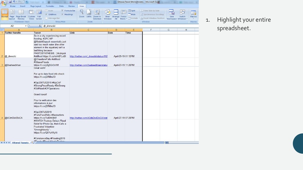
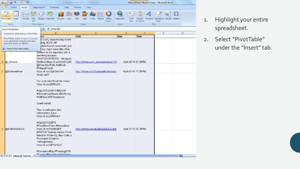
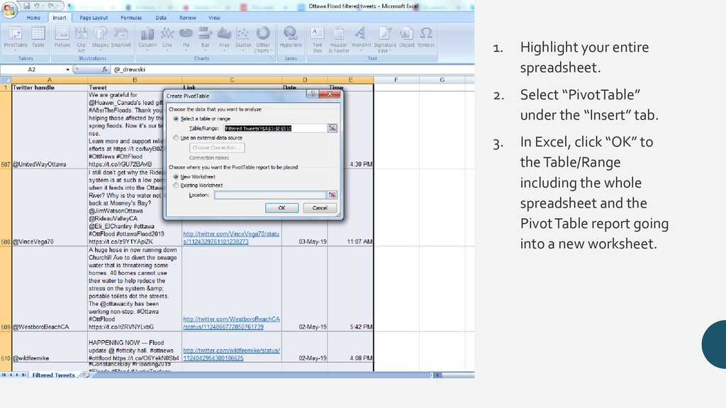
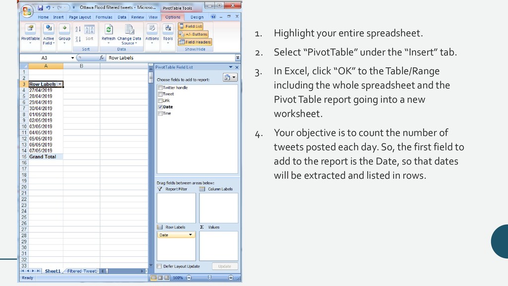
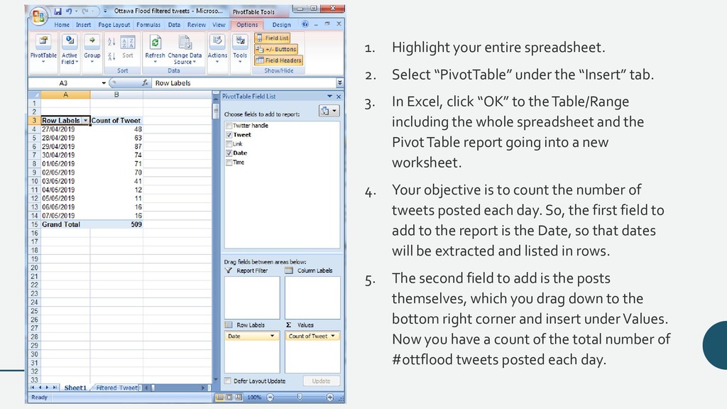
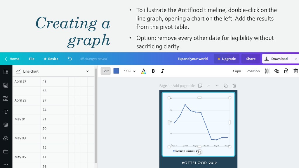
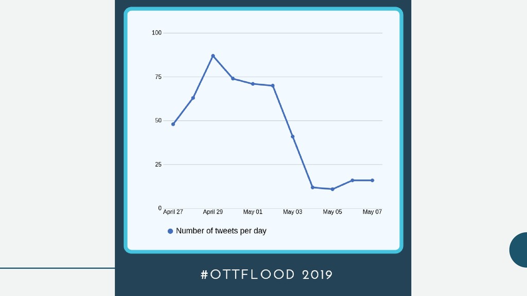
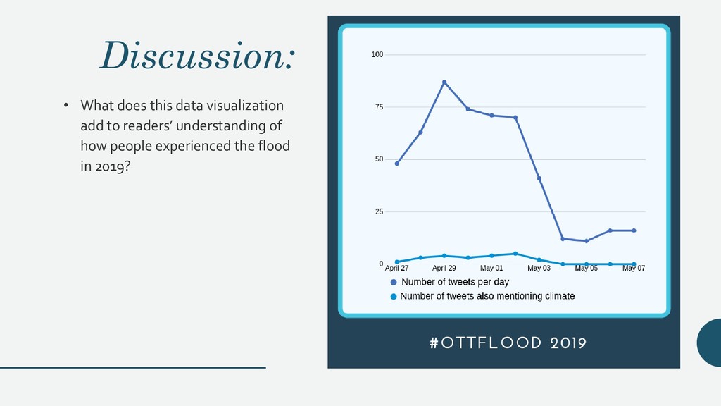
“Insert” tab. 3. In Excel, click “OK” to the Table/Range including the whole spreadsheet and the Pivot Table report going into a new worksheet. 4. Your objective is to count the number of tweets posted each day. So, the first field to add to the report is the Date, so that dates will be extracted and listed in rows. 5. The second field to add is the posts themselves, which you drag down to the bottom right corner and insert under Values. Now you have a count of the total number of #ottflood tweets posted each day.