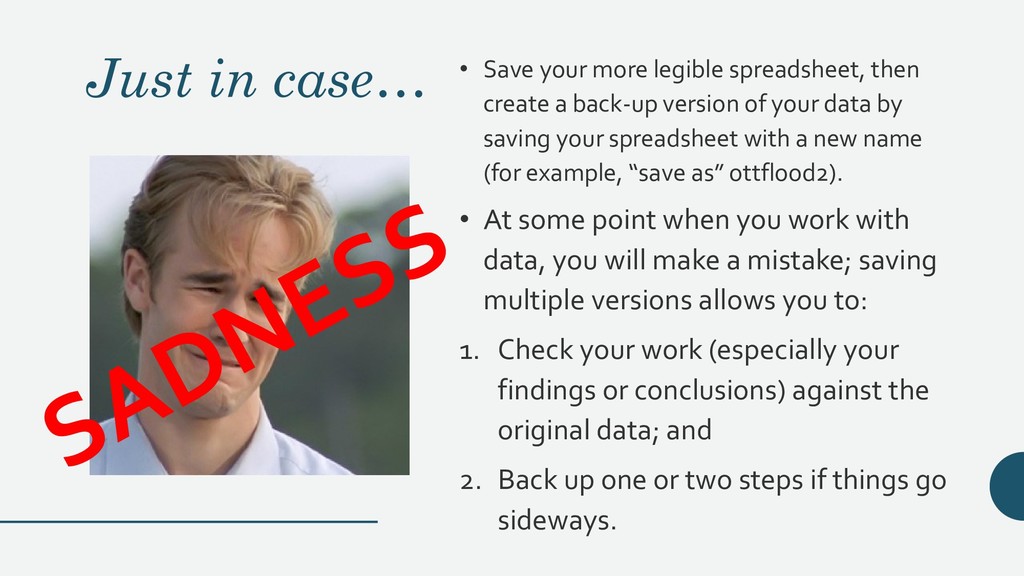
create a back-up version of your data by saving your spreadsheet with a new name (for example, “save as” ottflood2). • At some point when you work with data, you will make a mistake; saving multiple versions allows you to: 1. Check your work (especially your findings or conclusions) against the original data; and 2. Back up one or two steps if things go sideways.