Upgrade to Pro — share decks privately, control downloads, hide ads and more …

Introducing data visualization

Introducing data visualization

Trish Audette-Longo

May 14, 2019
Tweet

More Decks by Trish Audette-Longo

Other Decks in Education

Transcript

  1. Forms • Data visualizations can be interactive, for example by

    inviting your reader to filter different kinds of information in a graph, or zoom in on their own neighbourhood on a map. • An objective of an interactive data visualization is to allow people to find out more about what they are interested in – they can learn more about what is happening close to their home, how a trend works for their age group, etc.
  2. What are the characteristics of interactive visualizations? • They offer

    a (guided) way for readers to investigate the data set themselves.
  3. What are the characteristics of interactive visualizations? • They offer

    a (guided) way for readers to investigate the data set themselves. • They encourage the reader to see and make connections.
  4. What are the characteristics of interactive visualizations? • They offer

    a (guided) way for readers to investigate the data set themselves • They encourage the reader to see and make connections • They can offer readers opportunities to make a large amount of data digestible, local or personally relevant.
  5. What are the characteristics of interactive visualizations? • They offer

    a (guided) way for readers to investigate the data set themselves. • They encourage the reader to see and make connections. • They can offer readers opportunities to make a large amount of data digestible, local or personally relevant. • Mary Lynn Young, Alfred Hermida and Johanna Fulda (2018) discuss these and other characteristics of award-winning interactive data visualizations here.
  6. What are the characteristics of interactive visualizations? • They offer

    a (guided) way for readers to investigate the data set themselves. • They encourage the reader to see and make connections. • They can offer readers opportunities to make a large amount of data digestible, local or personally relevant. • Mary Lynn Young, Alfred Hermida and Johanna Fulda (2018) discuss these and other characteristics of award-winning interactive data visualizations here.
  7. Forms • Data visualizations can be interactive, for example by

    inviting your reader to filter different kinds of information in a graph, or zoom in on their own neighbourhood on a map. • They can also be static, snapshots of data that the reader cannot manipulate, embedded throughout an article to illustrate key points or shared via social media.
  8. Where does data come from? • Many news organizations create

    data visualizations based on data that has been made publicly available by governments or institutions. – As examples, "open data" or data sets released as a result of Access to Information requests.
  9. Discussion • What sources were used by Jacques Marcoux and

    Katie Nicholson to report "Deadly Force"?
  10. Where does data come from? • Many news organizations create

    data visualizations based on data that has been made publicly available by governments or institutions. – As examples, "open data" or data sets released as a result of Access to Information requests. • Today, we will work with a data set similar to something you could generate yourself by scraping posts from Twitter.
  11. Where does data come from? • Many news organizations create

    data visualizations based on data that has been made publicly available by governments or institutions. – As examples, "open data" or data sets released as a result of Access to Information requests. • Today, we will work with a data set similar to something you could generate yourself by scraping posts from Twitter. • At the end of class, you will also look at election results made available by a provincial government, in preparation for your next assignment.
  12. Where does data come from? • If you are interested

    in a critical assessment of where and how journalists have gotten and used data in the last decade, see research done in Quebec by Constance Tabary, Anne-Marie Provost and Alexandre Trottier (2016) here.
  13. The bottom line: • Where you get your data, and

    how you visualize it, depends on the question you are trying to answer.
  14. Data visualization is a journalism practice • News: The data

    you are revealing should be new to your audience – whether it's an “a-ha!” moment tucked into a sidebar or shared via Instagram, or the data visualization is the story itself.
  15. Data visualization is a journalism practice • News: The data

    you are revealing should be new to your audience – whether it's an “a-ha!” moment tucked into a sidebar or shared via Instagram, or the data visualization is the story itself. • Clarity: Whether an illustration or the crux of your story, your data visualization should also be able to stand on its own.
  16. • This graphic was included in a VICE story, “Even

    in Montreal, it’s becoming harder to find an apartment.” • According to the story, the source for this information was the Canada Mortgage and Housing Corporation. • What does this graphic reveal that narrating the numbers in your text would not?
  17. • This graphic was included in a VICE story, “Even

    in Montreal, it’s becoming harder to find an apartment.” • According to the story, the source for this information was the Canada Mortgage and Housing Corporation. • What additional problems arise when considering the second graphic in this story?
  18. Data visualization is a journalism practice • Transparency: Both your

    process of analysis and your finished product should be replicable. In other words, given the exact same data set and taking the same steps you did, someone following you should be able to draw the same conclusions and a similar visualization.
  19. Data visualization is a journalism practice • Transparency: Both your

    process of analysis and your finished product should be replicable. In other words, given the exact same data set and taking the same steps you did, someone following you should be able to draw the same conclusions and a similar visualization. • How to do it: 1. Make your sources of information available to your audience. 2. Consider making space to explain what you did.
  20. Data visualization is a journalism practice • Reporting: Don’t forget

    to do interviews! Interviews contextualize and ground your story. They also allow you to check your findings or conclusions when working across different sets of data.
  21. Data visualization is a journalism practice • Reporting: Don’t forget

    to do interviews! Interviews contextualize and ground your story. They also allow you to check your findings or conclusions when working across different sets of data. • Accountability:Your data journalism and data visualization can have an impact. Put your findings to institutions, policymakers and politicians – be ready to explain what you found and how, and ask them to respond.
  22. This week’s assigned readings • Jacques Marcoux and Katie Nicholson

    (2018). "Deadly Force: Fatal encounters with police in Canada 2000-2017." CBC News: https://newsinteractives.cbc.ca/longform-custom/deadly-force • Jacques Marcoux (April 4, 2018). "Deadly Force: How CBC analyzed details of hundreds of fatal encounters between Canadians, police." CBC News: https://www.cbc.ca/news/canada/manitoba/iteam/deadly-force-cbc-analysis- 1.4603696 • Kevin Quealy (February 13, 2019). "A fence, steel slats or 'whatever you want to call it': A detailed timeline of Trump's words about the wall." The New York Times: https://www.nytimes.com/interactive/2019/02/13/upshot/detailed-timeline- trumps-words-border-wall.html • Samantha Sunne (March 9, 2016). "The challenges and possible pitfalls of data journalism, and how you can avoid them." The American Press Institute: https://www.americanpressinstitute.org/publications/reports/strategy- studies/challenges-data-journalism/
  23. Other stories discussed in this lecture • Ash Abraham, Stephen

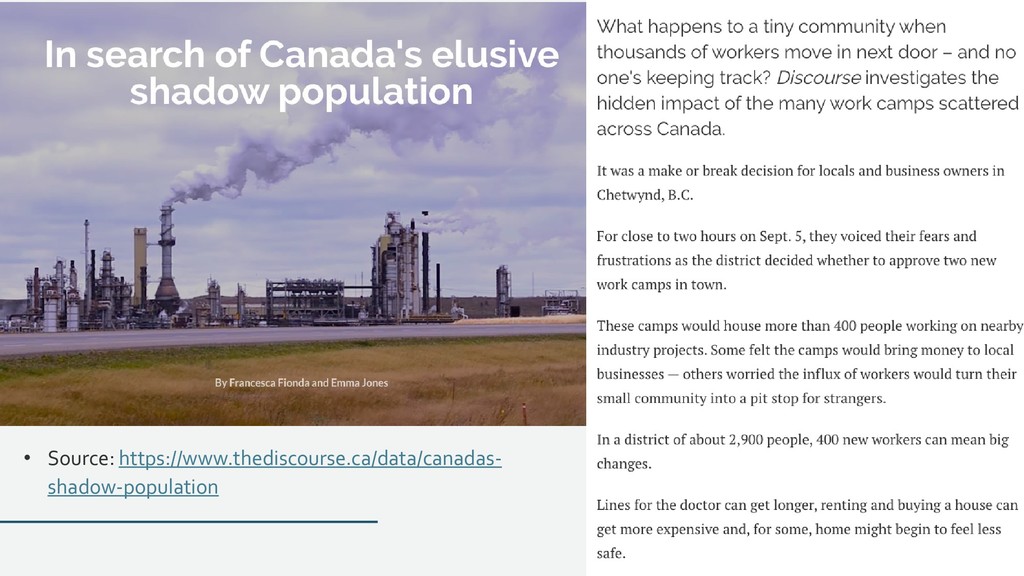
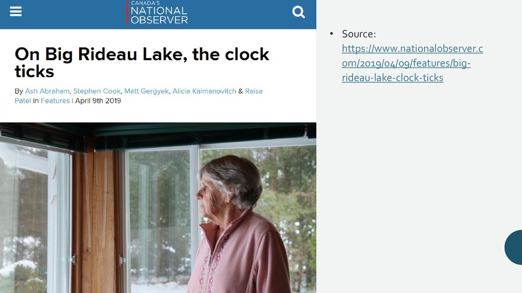
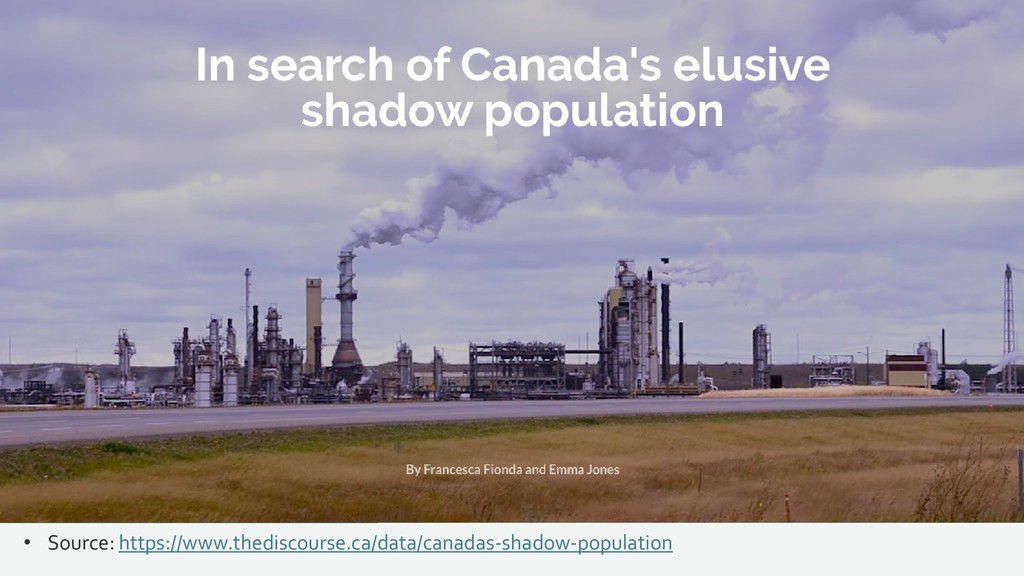
    Cook, Matt Gergyek, Alicia Kalmanovitch & Raisa Patel (April 9, 2019). “On Big Rideau Lake, the clock ticks.” National Observer: https://www.nationalobserver.com/2019/04/09/features/big-rideau-lake-clock- ticks • Francesca Fionda and Emma Jones (n.d.). “In search of Canada’s elusive shadow population.” The Discourse: https://www.thediscourse.ca/data/canadas-shadow- population • Tess Kalinowski (October 25, 2017). “Home ownership rates drop as more young Canadians opt to rent: census.” Toronto Star: https://www.thestar.com/news/gta/2017/10/25/home-ownership-rates-drop-as-more- young-canadians-opt-to-rent-census.html • Ariane Labrèche (April 2, 2019). “Even in Montreal, it’s becoming harder to find an apartment.” VICE: https://www.vice.com/en_ca/article/nexppq/even-in-montreal-its- becoming-harder-to-find-an-apartment • Sarah Leo (March 27, 2019). “Mistakes, we’ve drawn a few. Learning from our errors in data visualisation.” Medium: https://medium.economist.com/mistakes-weve-drawn- a-few-8cdd8a42d368
  24. Additional resources referenced in this lecture • Charlie Beckett (2008).

    SuperMedia: Saving Journalism So It Can Save the World. London: Blackwell Publishing. • Jeff Jarvis (2006). Networked journalism. Buzz Machine: https://buzzmachine.com/2006/07/05/networked-journalism/ • Constance Tabary, Anne-Marie Provost and Alexandre Trottier (2016). Data journalism’s actors, practices and skills: A case study from Quebec. Journalism 17(1): 66-84. https://journals.sagepub.com/doi/abs/10.1177/1464884915593245?journalCode=jo ua& • Mary Lynn Young, Alfred Hermida and Johanna Fulda (2018). What makes for great data journalism? Journalism Practice 12(1): 115-135. https://www.tandfonline.com/doi/abs/10.1080/17512786.2016.1270171?journalCod e=rjop20