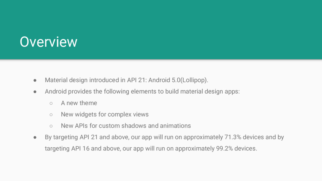
• Android provides the following elements to build material design apps: ◦ A new theme ◦ New widgets for complex views ◦ New APIs for custom shadows and animations • By targeting API 21 and above, our app will run on approximately 71.3% devices and by targeting API 16 and above, our app will run on approximately 99.2% devices.
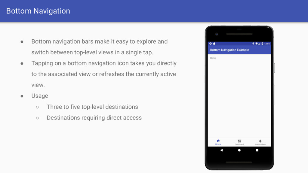
explore and switch between top-level views in a single tap. • Tapping on a bottom navigation icon takes you directly to the associated view or refreshes the currently active view. • Usage ◦ Three to five top-level destinations ◦ Destinations requiring direct access
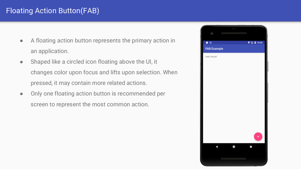
primary action in an application. • Shaped like a circled icon floating above the UI, it changes color upon focus and lifts upon selection. When pressed, it may contain more related actions. • Only one floating action button is recommended per screen to represent the most common action.
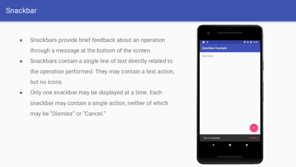
a message at the bottom of the screen. • Snackbars contain a single line of text directly related to the operation performed. They may contain a text action, but no icons. • Only one snackbar may be displayed at a time. Each snackbar may contain a single action, neither of which may be “Dismiss” or “Cancel.”
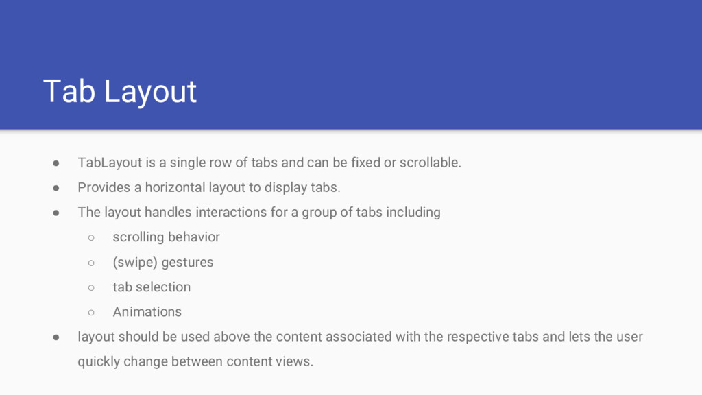
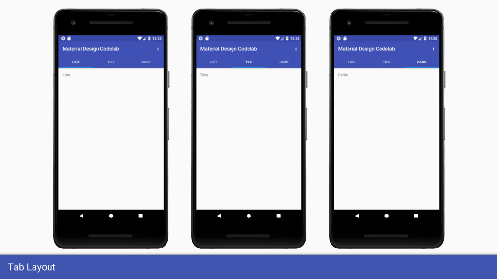
and can be fixed or scrollable. • Provides a horizontal layout to display tabs. • The layout handles interactions for a group of tabs including ◦ scrolling behavior ◦ (swipe) gestures ◦ tab selection ◦ Animations • layout should be used above the content associated with the respective tabs and lets the user quickly change between content views.
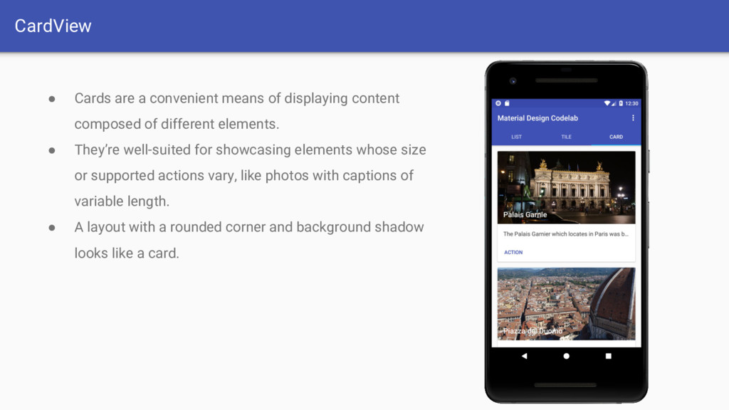
composed of different elements. • They’re well-suited for showcasing elements whose size or supported actions vary, like photos with captions of variable length. • A layout with a rounded corner and background shadow looks like a card.
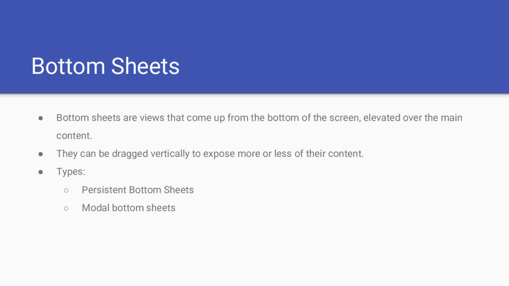
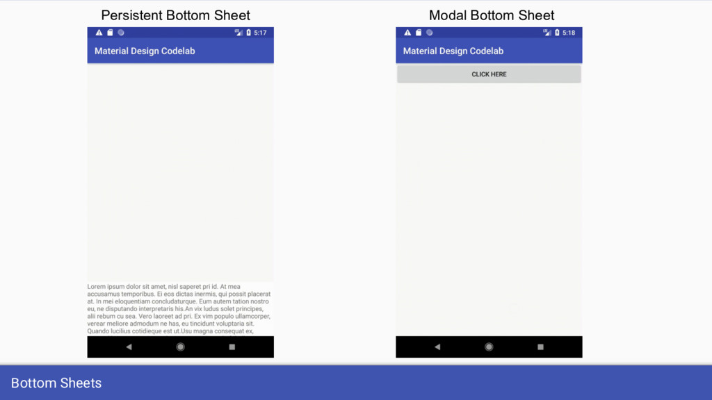
from the bottom of the screen, elevated over the main content. • They can be dragged vertically to expose more or less of their content. • Types: ◦ Persistent Bottom Sheets ◦ Modal bottom sheets
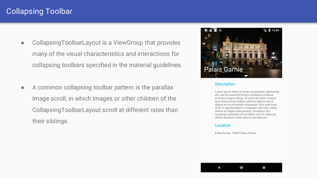
of the visual characteristics and interactions for collapsing toolbars specified in the material guidelines. • A common collapsing toolbar pattern is the parallax image scroll, in which images or other children of the CollapsingToolbarLayout scroll at different rates than their siblings.
material icons and import Scalable Vector Graphic (SVG) and Adobe Photoshop Document (PSD) files into project as vector drawable resources. • Android 4.4 (API level 20) and lower doesn't support vector drawables. • For backward-compatibility, Vector Asset Studio generates raster images of the vector drawable. • Android Support Library 23.2 or higher supports vector drawables for lower APIs.
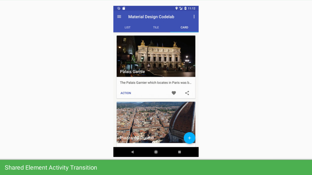
forces the human eye to focus on the content and its representation in the new activity instead of the actual activity frame sliding or fading which makes the experience a lot more seamless. Note: shared element transitions require Android 5.0 (API level 21) and above and will be ignored for any lower API versions. Be sure to check the version at runtime before using API 21 specific features.
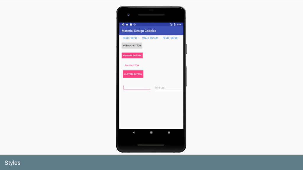
specify the look and format for a View or window. • A style can specify attributes such as height, padding, font color, font size, background color, and much more. • A style is defined in an XML resource that is separate from the XML that specifies the layout.
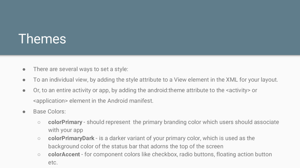
• To an individual view, by adding the style attribute to a View element in the XML for your layout. • Or, to an entire activity or app, by adding the android:theme attribute to the <activity> or <application> element in the Android manifest. • Base Colors: ◦ colorPrimary - should represent the primary branding color which users should associate with your app ◦ colorPrimaryDark - is a darker variant of your primary color, which is used as the background color of the status bar that adorns the top of the screen ◦ colorAccent - for component colors like checkbox, radio buttons, floating action button etc.
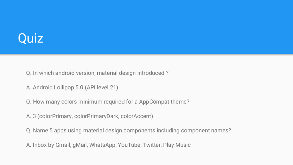
A. Android Lollipop 5.0 (API level 21) Q. How many colors minimum required for a AppCompat theme? A. 3 (colorPrimary, colorPrimaryDark, colorAccent) Q. Name 5 apps using material design components including component names? A. Inbox by Gmail, gMail, WhatsApp, YouTube, Twitter, Play Music
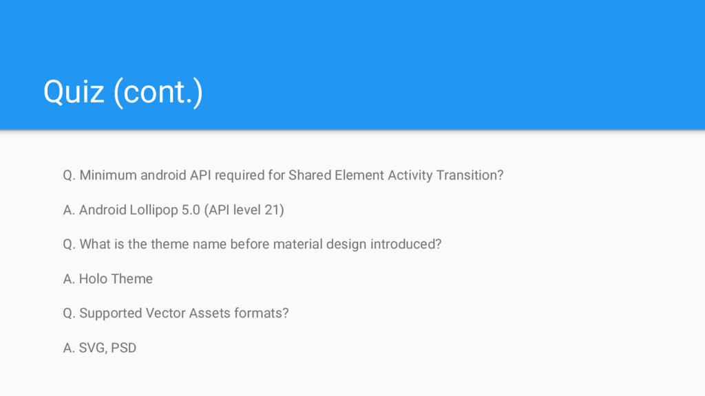
Activity Transition? A. Android Lollipop 5.0 (API level 21) Q. What is the theme name before material design introduced? A. Holo Theme Q. Supported Vector Assets formats? A. SVG, PSD
 technophilesrt
 cottpan
 tomoyanonymous
 oku053
 kotaminato
 yug1224
 shogogg
 panda728
.png) takahirom
takahirom
 slashnephy
 wakana0222
 monochromegane
 andpad
 baasie
 danielanewman
 sarafernandez
 jeffersonlam
 skoyamalab
 inesmontani
 destraynor
 ryanjones
 rkendrick25
 nonsquared
 helmedeiros