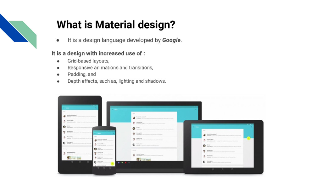
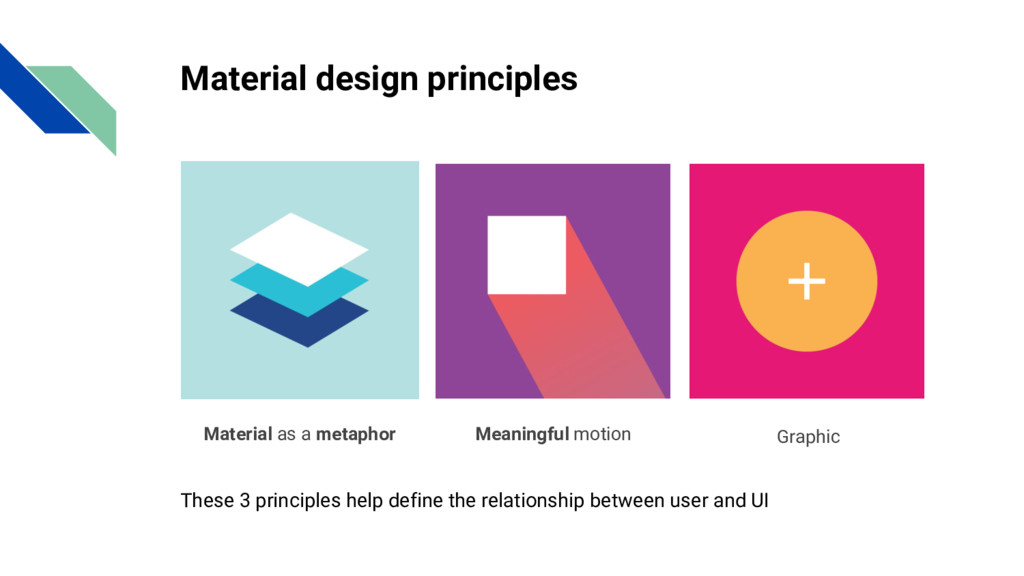
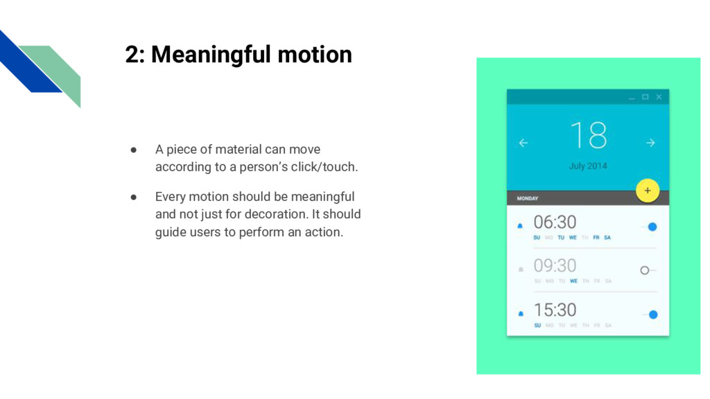
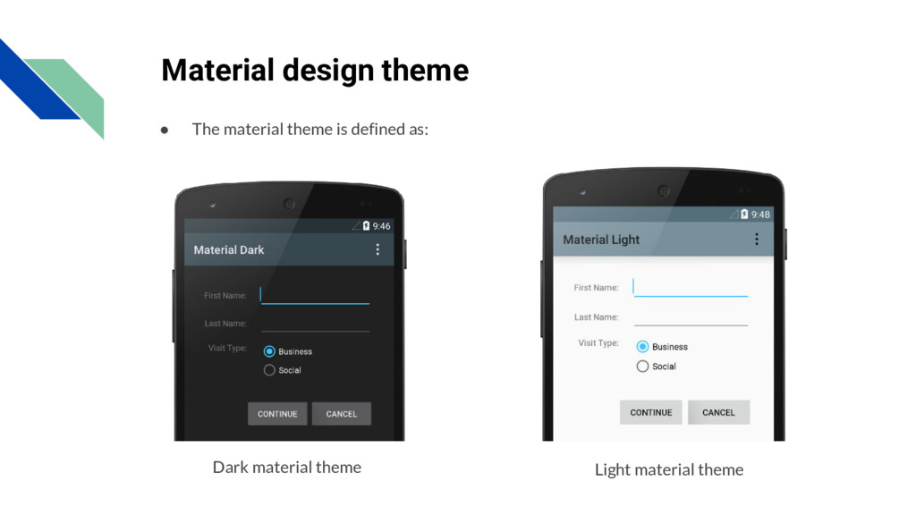
is Material design? It is a design with increased use of : • Grid-based layouts, • Responsive animations and transitions, • Padding, and • Depth effects, such as, lighting and shadows.
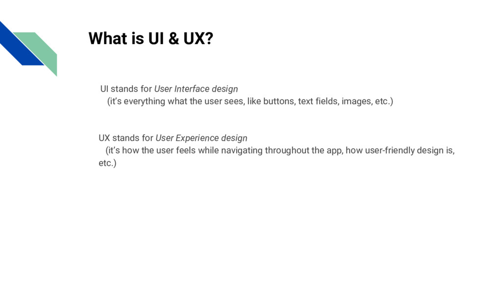
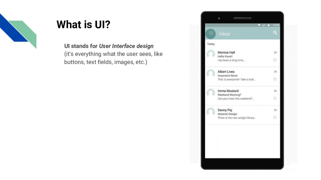
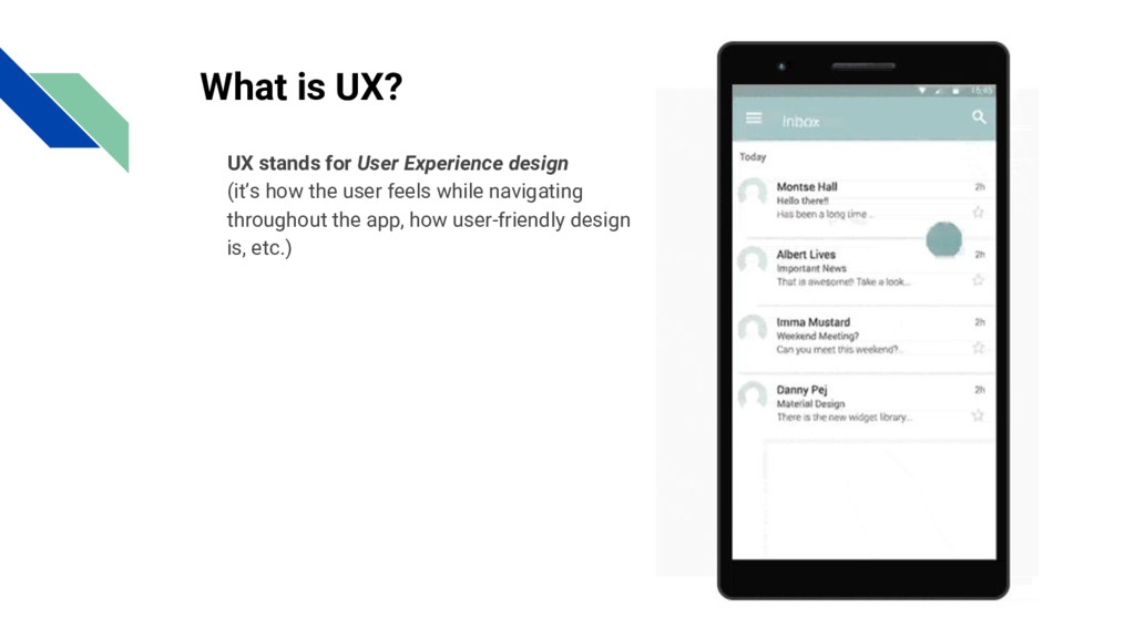
what the user sees, like buttons, text fields, images, etc.) What is UI & UX? • UX stands for User Experience design • (it’s how the user feels while navigating throughout the app, how user-friendly design is, etc.)
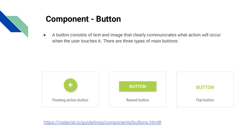
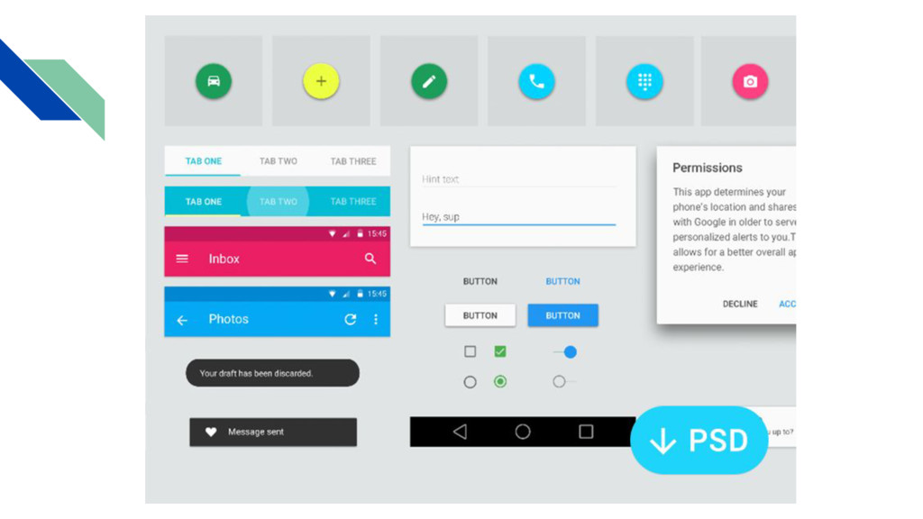
image that clearly communicates what action will occur when the user touches it. There are three types of main buttons: https://material.io/guidelines/components/buttons.html#
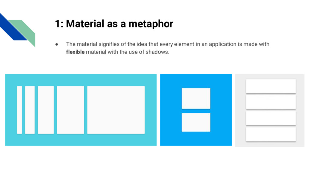
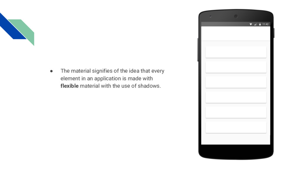
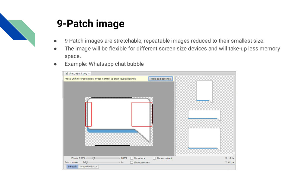
reduced to their smallest size. • The image will be flexible for different screen size devices and will take-up less memory space. • Example: Whatsapp chat bubble
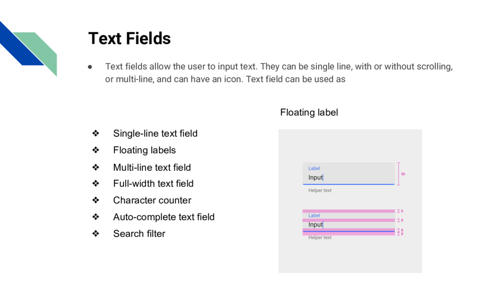
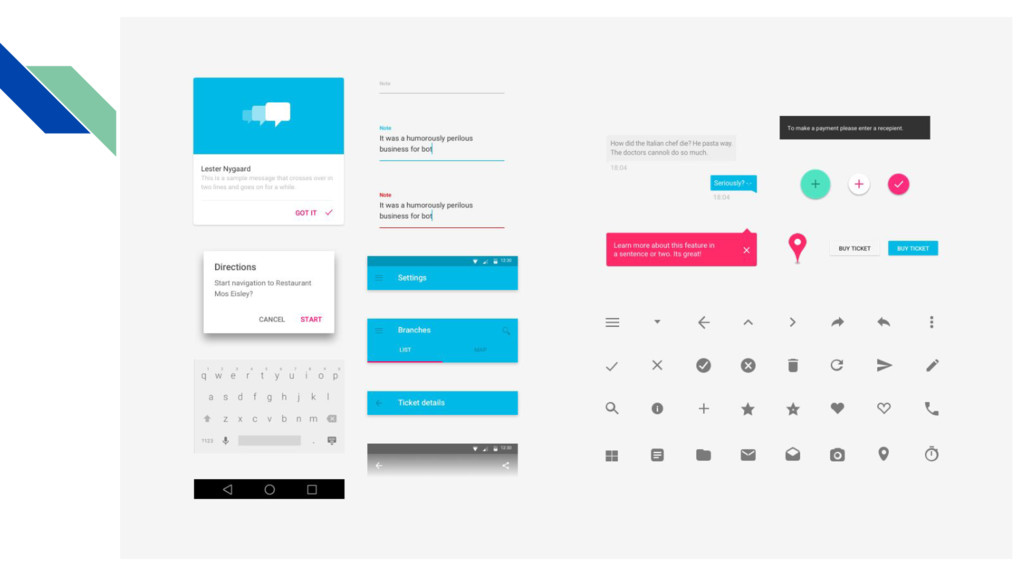
text. They can be single line, with or without scrolling, or multi-line, and can have an icon. Text field can be used as ❖ Single-line text field ❖ Floating labels ❖ Multi-line text field ❖ Full-width text field ❖ Character counter ❖ Auto-complete text field ❖ Search filter Floating label
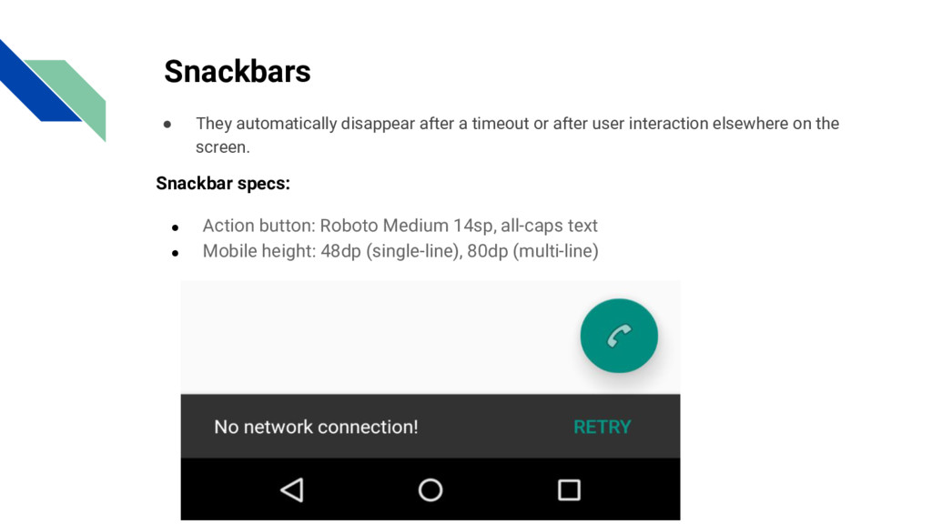
user interaction elsewhere on the screen. Snackbar specs: • Action button: Roboto Medium 14sp, all-caps text • Mobile height: 48dp (single-line), 80dp (multi-line)
 SiteGround - Reliable hosting with speed, security, and support you can count on.
 technophilesrt
 naoya
naoya
 uyuki234
 manfredsteyer
 panda728
 jsoizo
 supurazako
 kajitack
 tomoyk
 hayama17
 kishida
 pkshadeck
 philipschwarz
 michielstock
 chriscoyier
 caitiem20
 szymonslowik
 aleyda
 popppiees
 inesmontani
 speakerdeck
 davidcarrasco
 charlesmeaden
 akosma
 brettharned