This introductory session is for designers and developers looking to create their first mobile web experience. We will introduce you to many of the tools and tactics you need to create a usable mobile web experience.
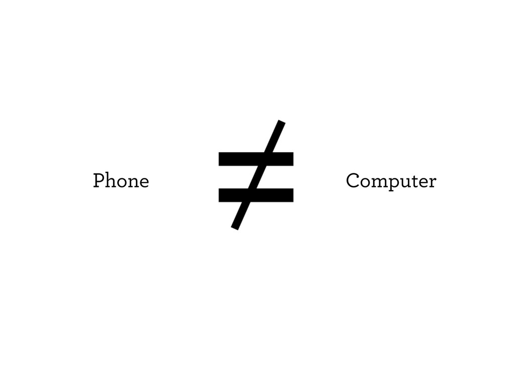
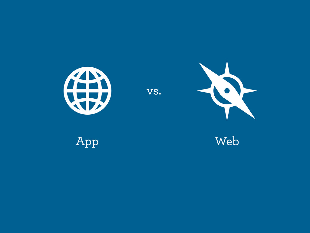
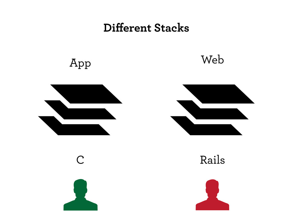
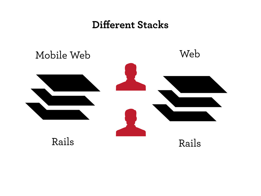
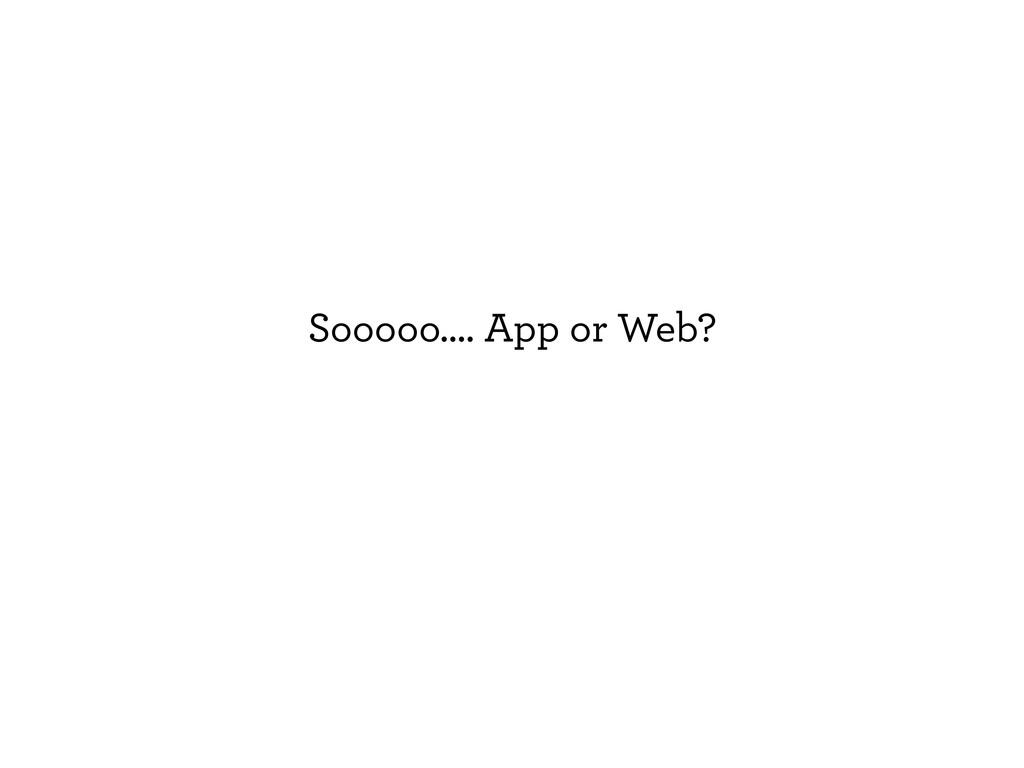
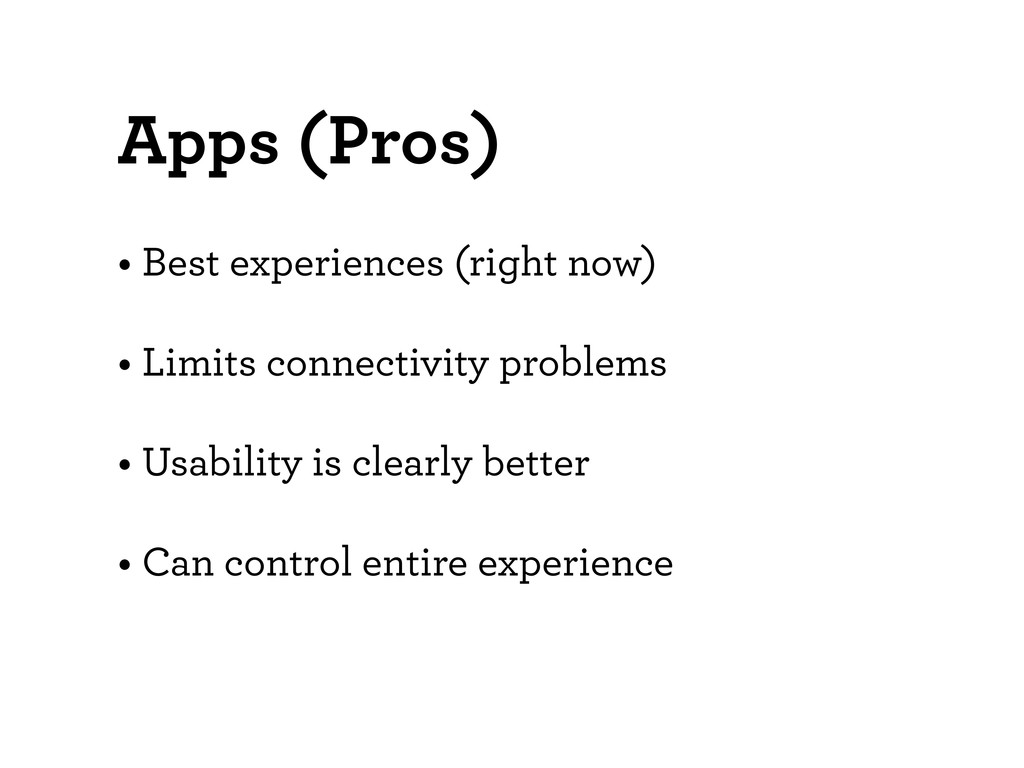
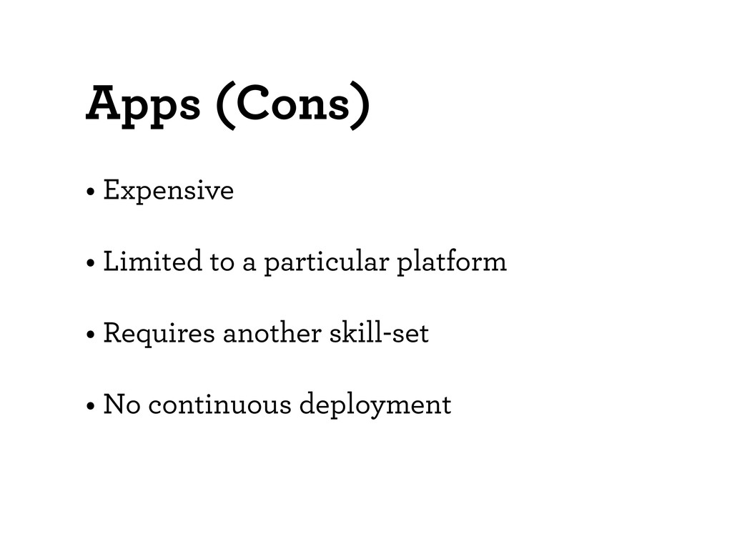
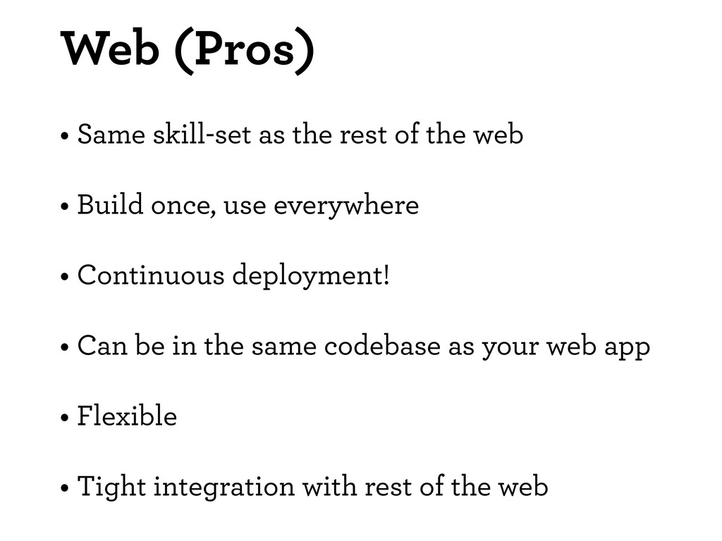
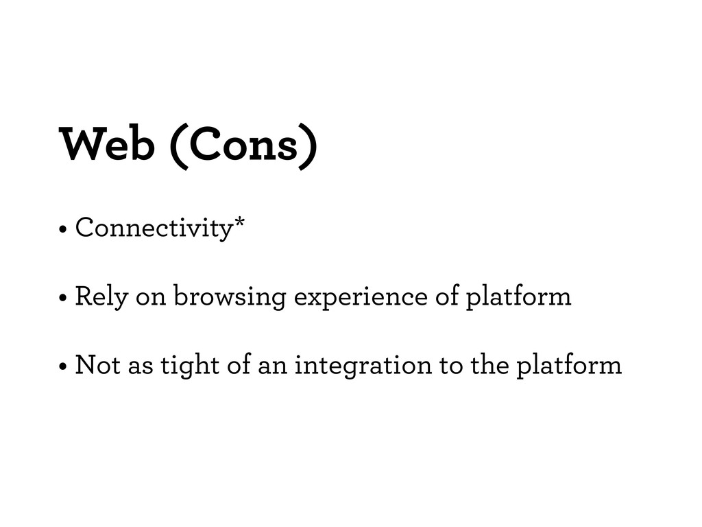
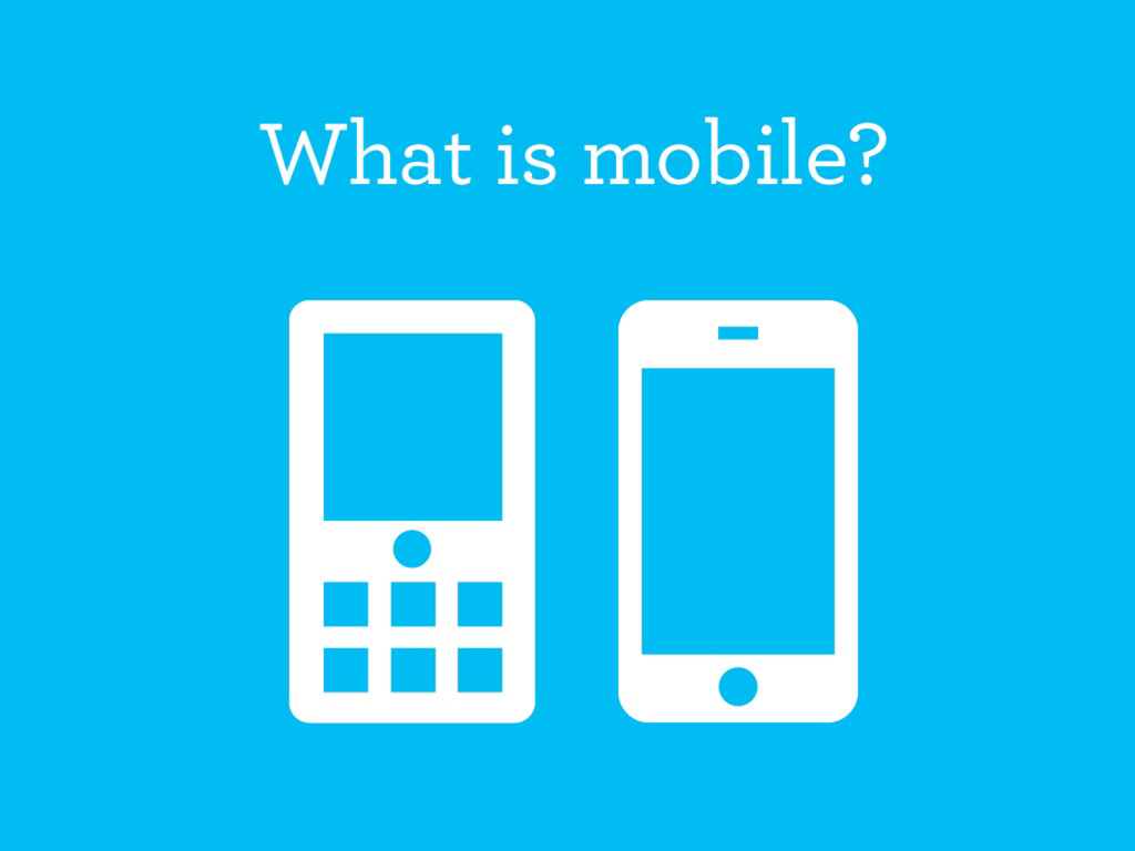
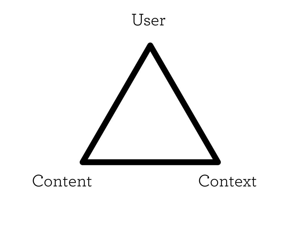
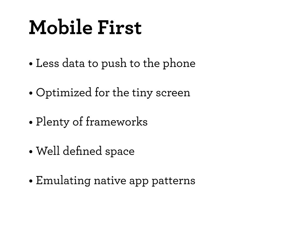
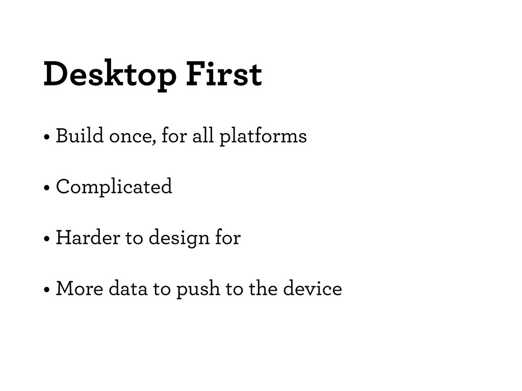
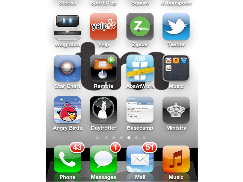
First we will start with outlining mobile web as a platform versus app creation. We will cover the basic considerations in creating a mobile web experience, user context, how human factors play into mobile designs, and mobile usability heuristics.
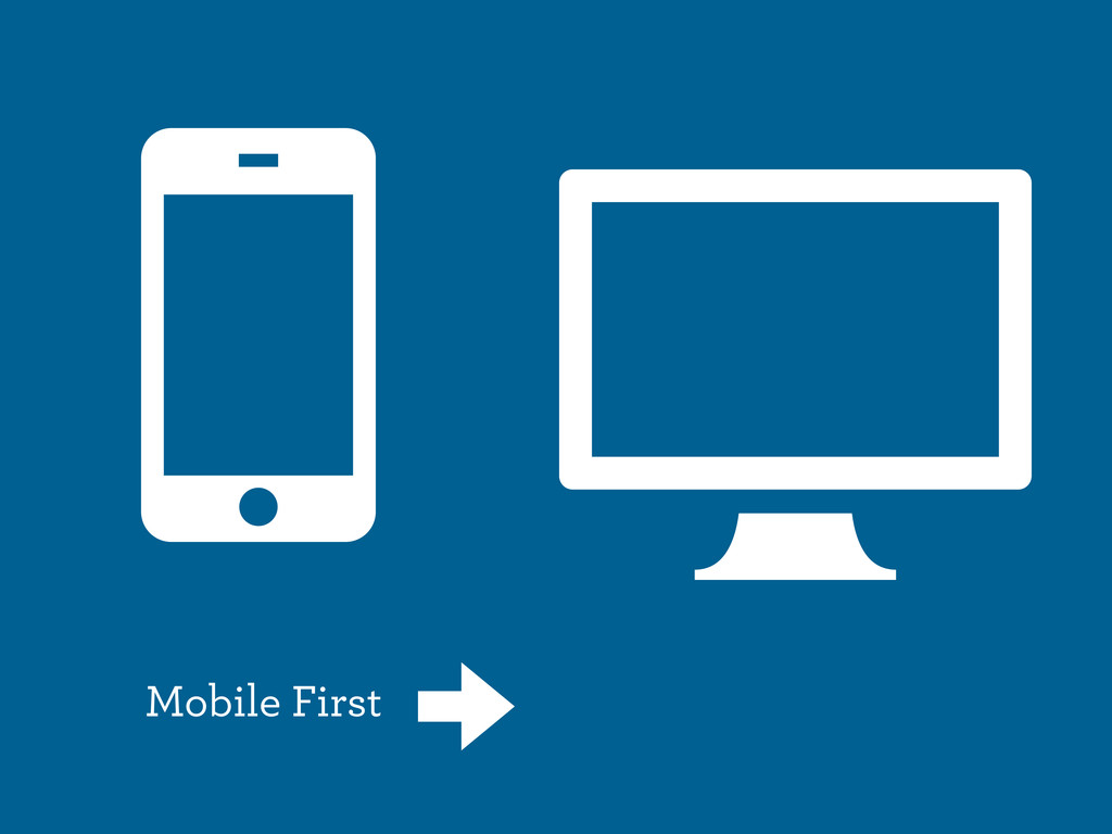
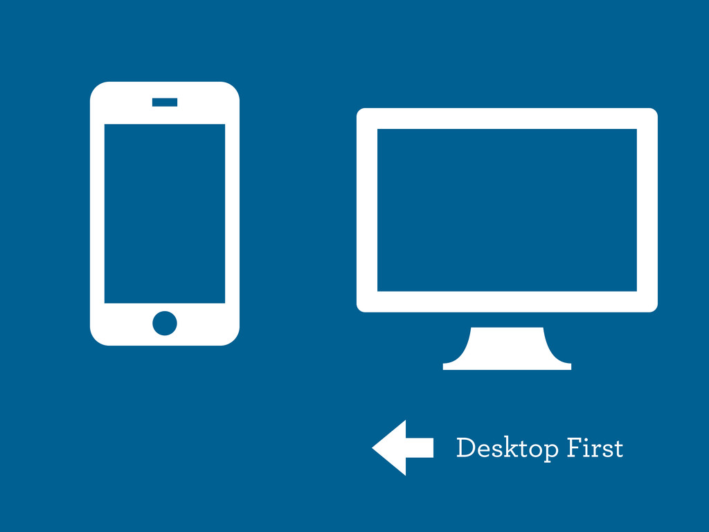
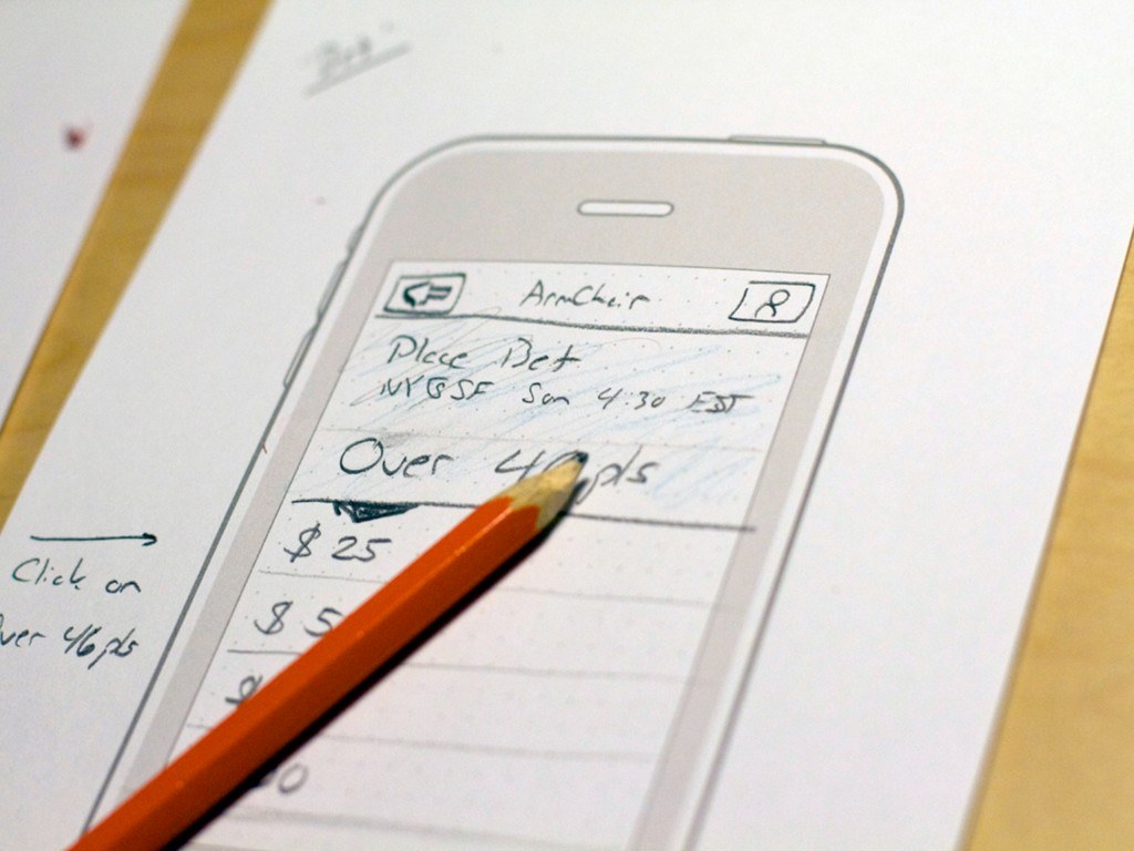
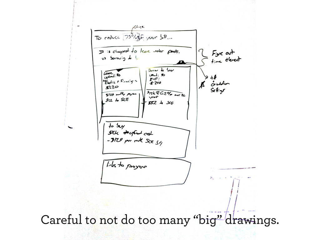
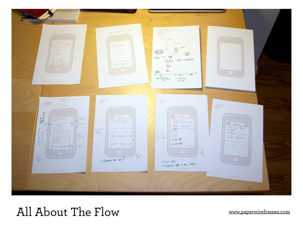
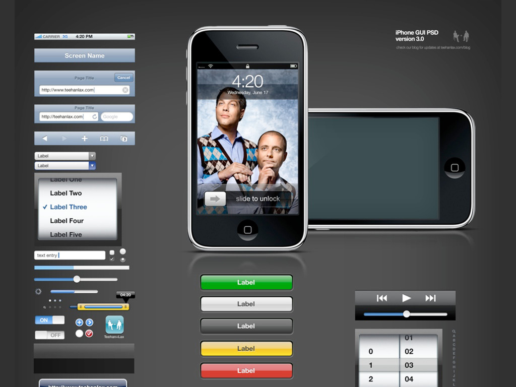
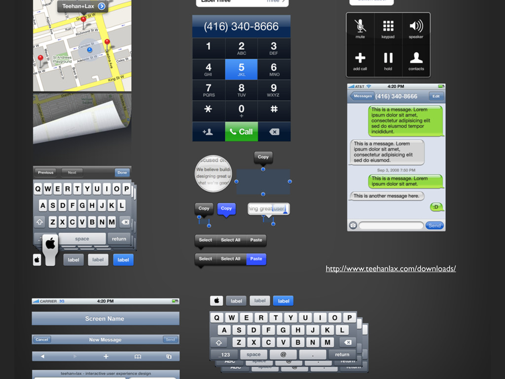
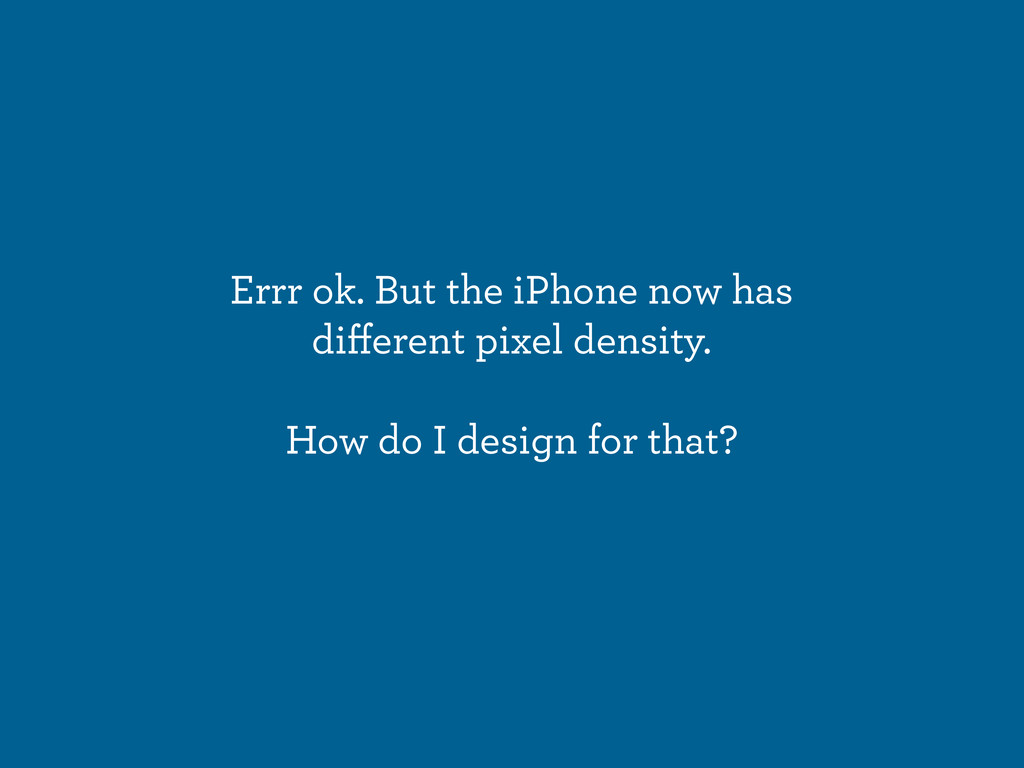
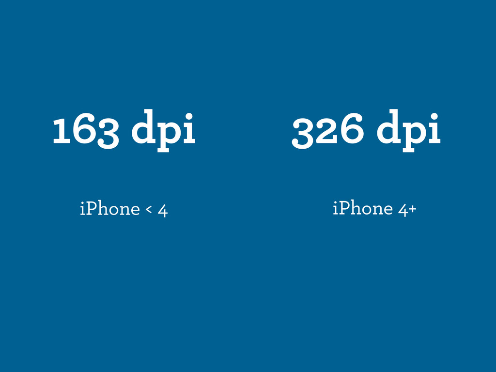
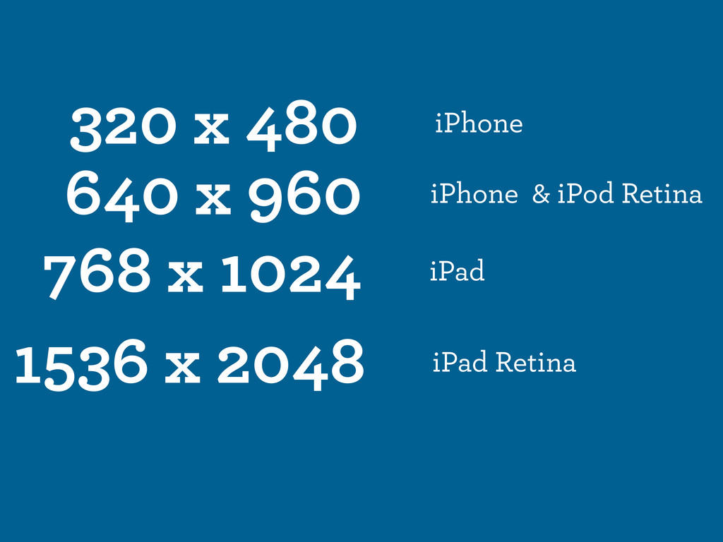
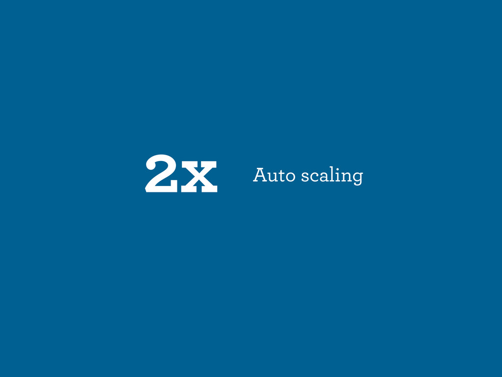
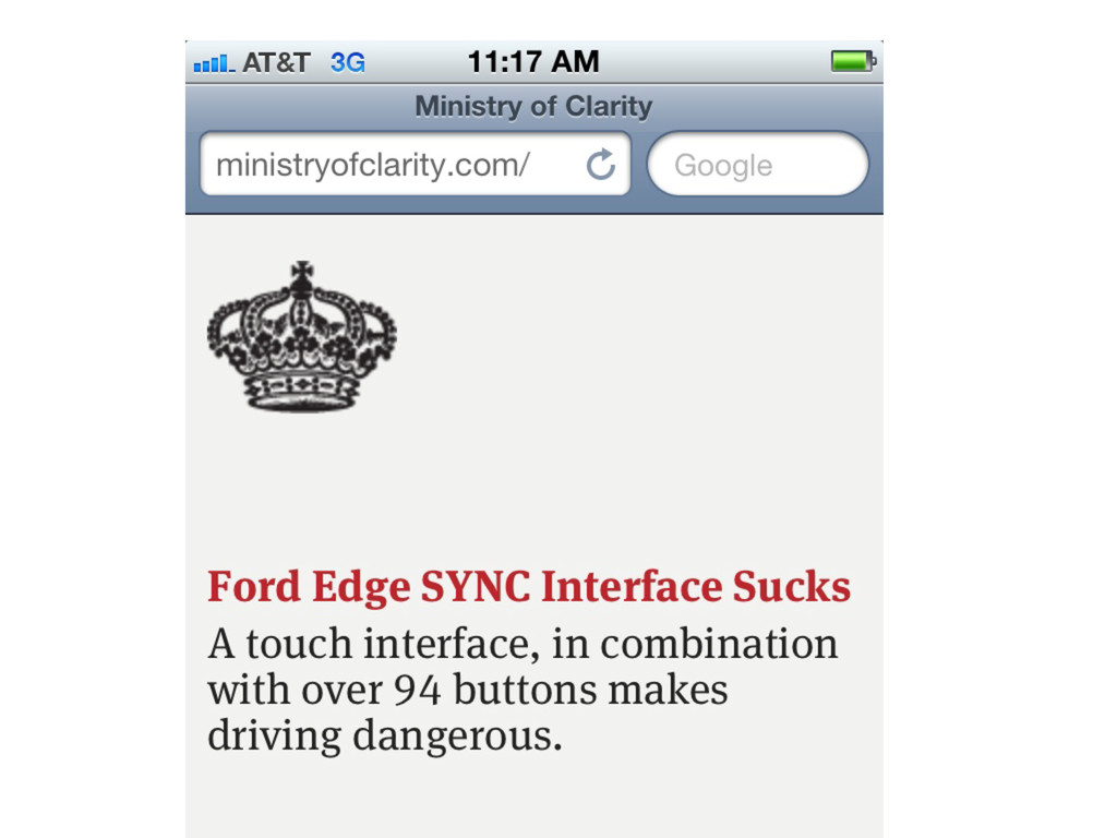
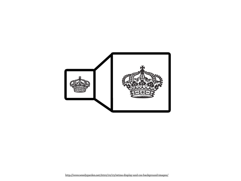
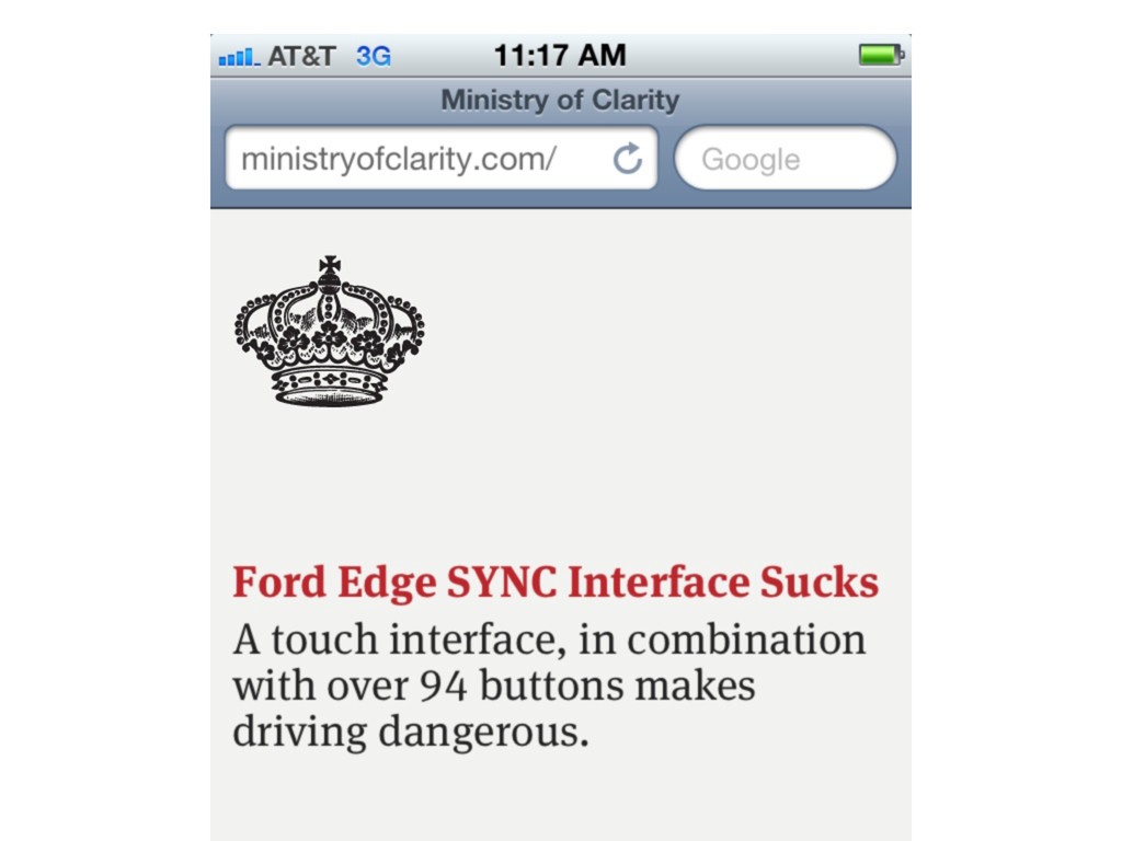
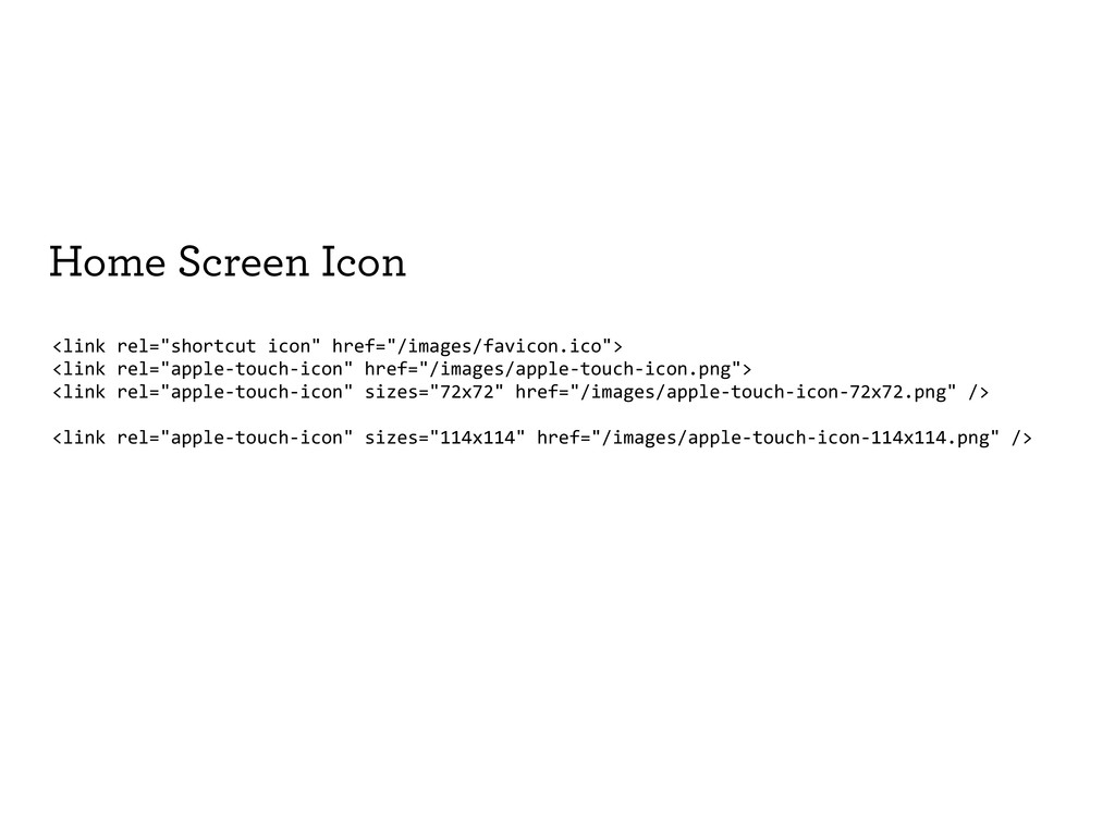
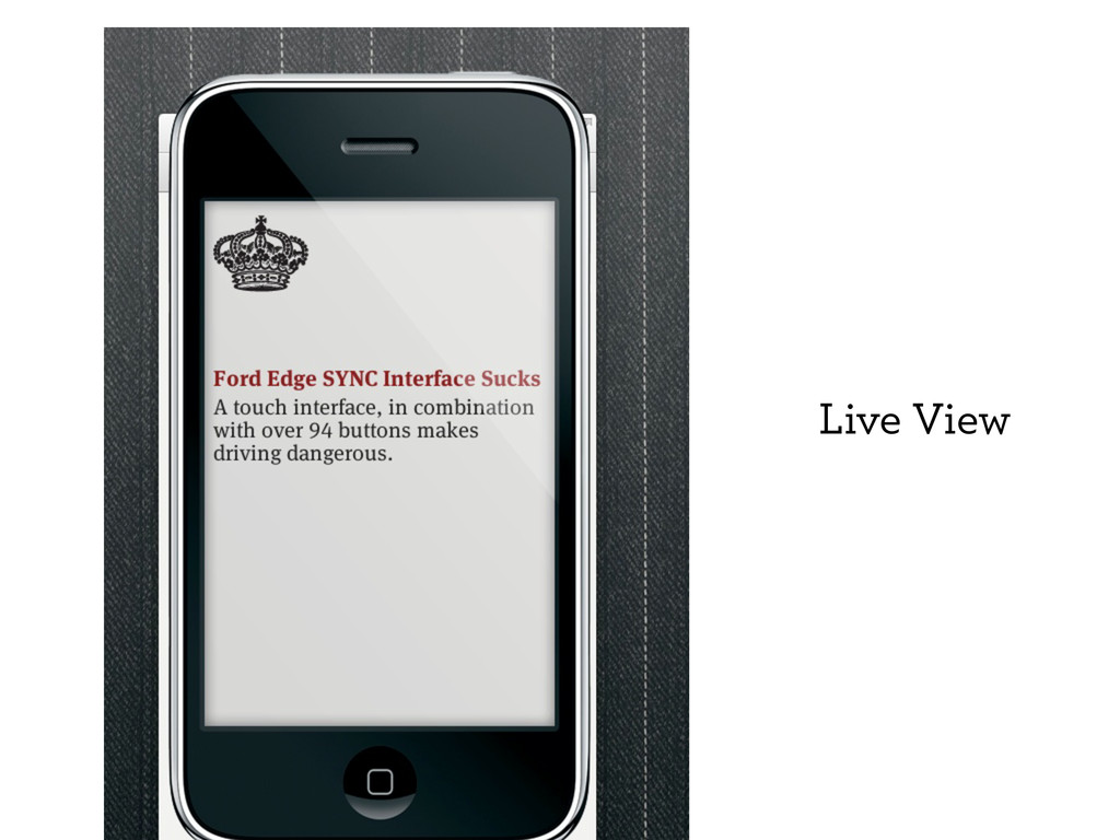
Next we will go over the methods and tools available to help you bring your mobile web experience from fragile ideas, to paper, to then to pushing pixels around in Photoshop. We will be sure to cover how to navigate all the different displays in mobile, their resolutions, and making sure to outline tactics to take advantage of the iPhone Retina display.
At the end we will have 20 minutes to go over any questions, or review designs from participants.
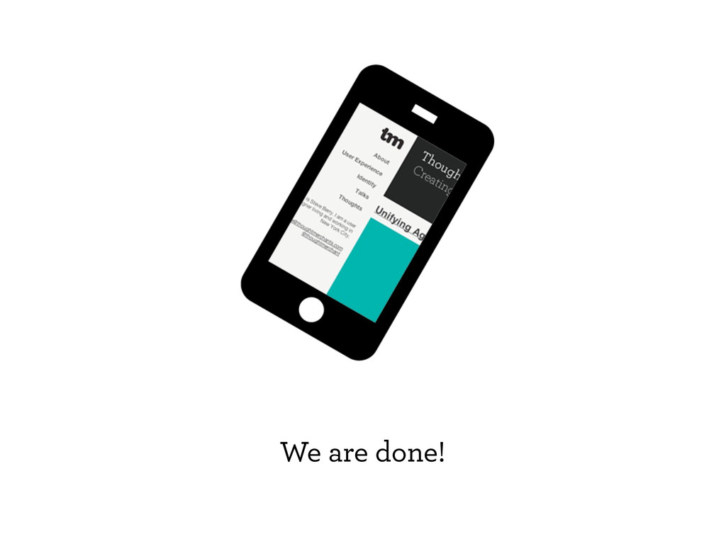
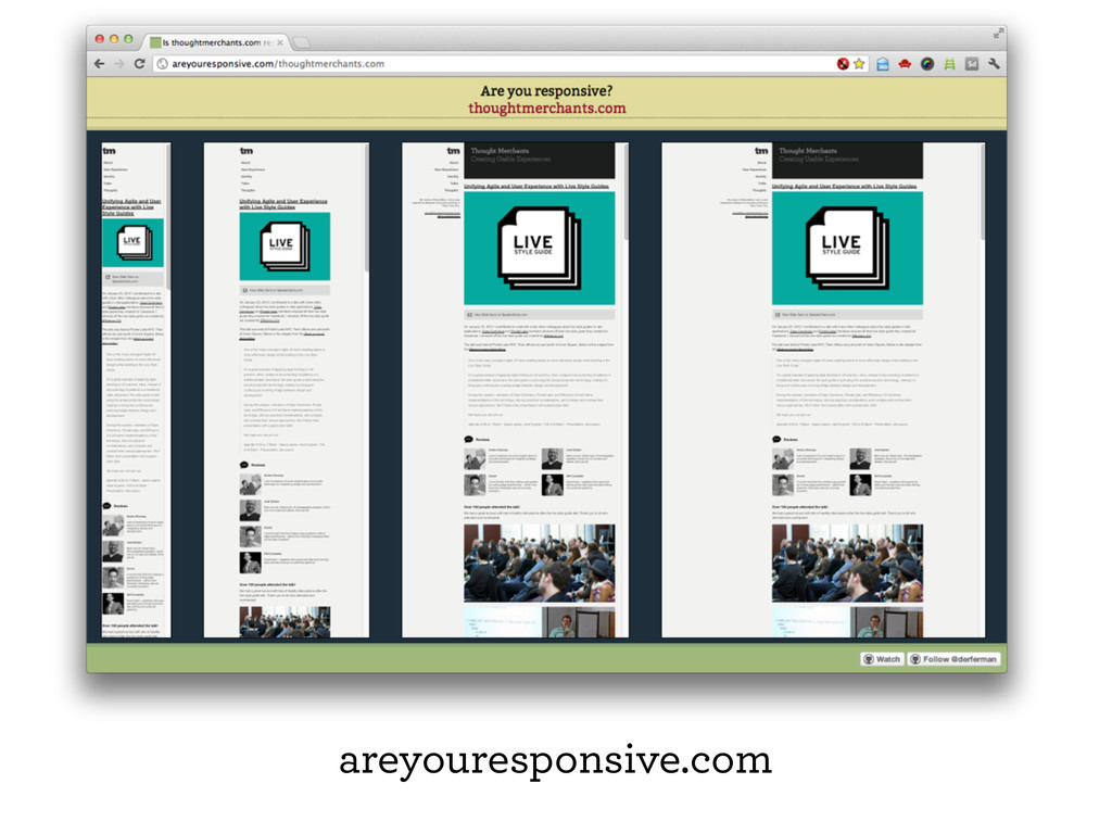
For more information about the author visit: www.thoughtmerchants.com
 thoughtmerchant
 ajstarks
 satosio
 aonomasahiro
 root_recruit
 kumanoayumi
.jpg) rwang05
rwang05
 kaikou
 chiilog
 spacemarket
 bebe
bebe
 lynteo
 kspace
 kneath
 soudai
 baasie
 smashingmag
 greggifford
 andyhume
 madoxten
 jonoalderson
 geoffreycrofte
 hannesfritz
 inesmontani
![Steve Berry [email protected] www.thoughtmerchants.com @thoughtmerchant Thanks!](https://files.speakerdeck.com/presentations/4f5a346f35ca69001f01d5d0/slide_80.jpg)