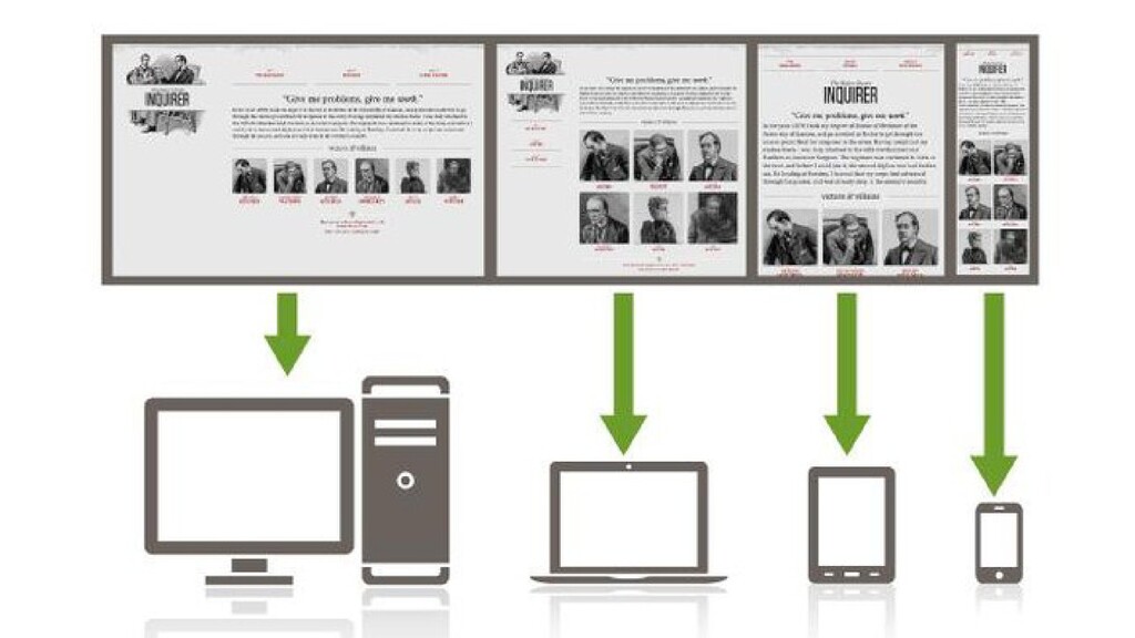
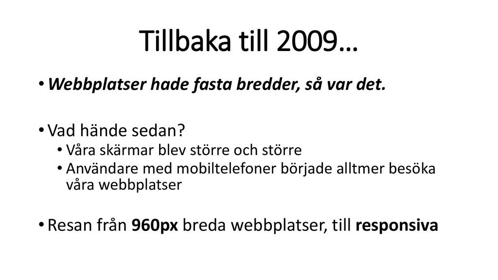
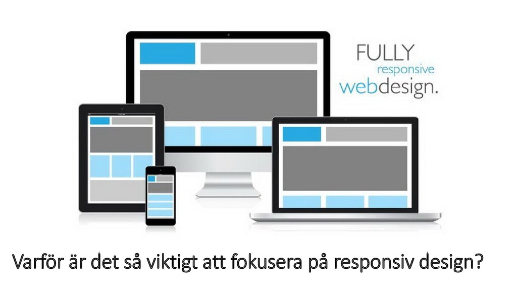
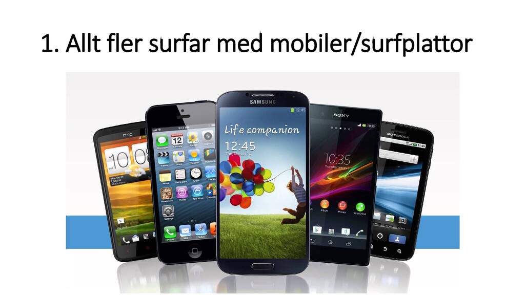
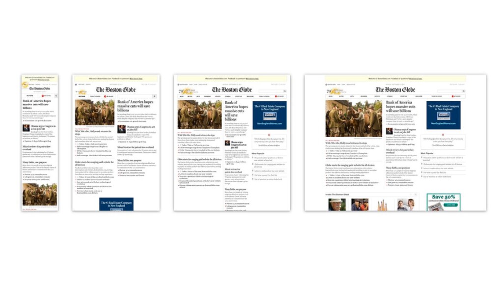
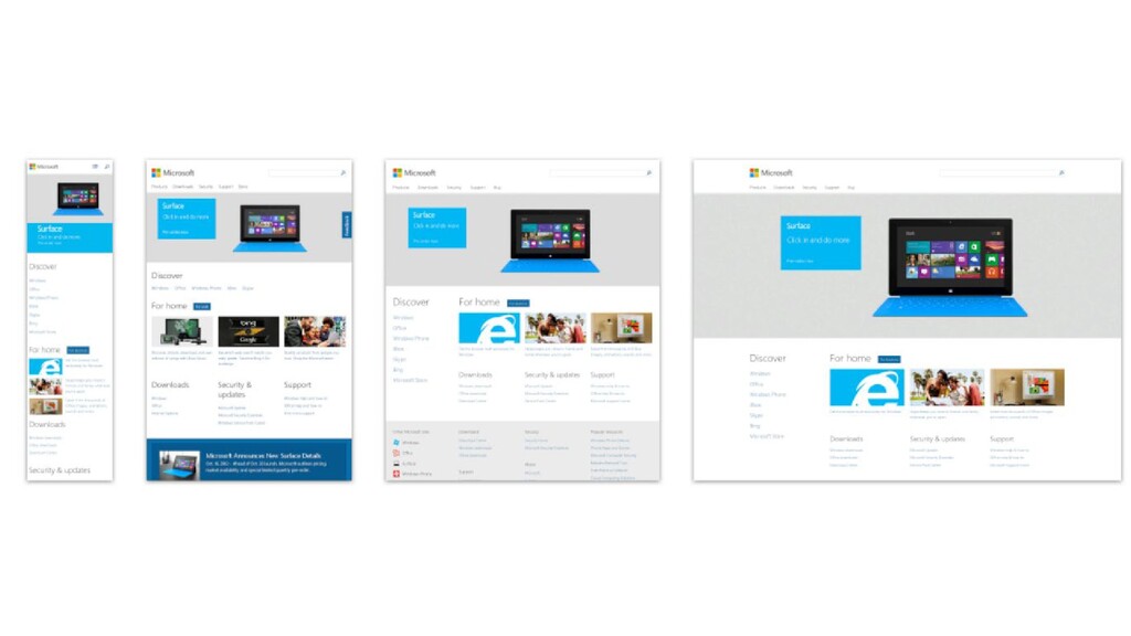
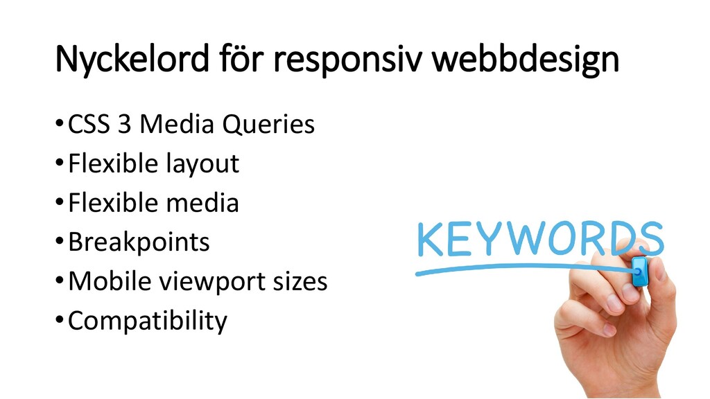
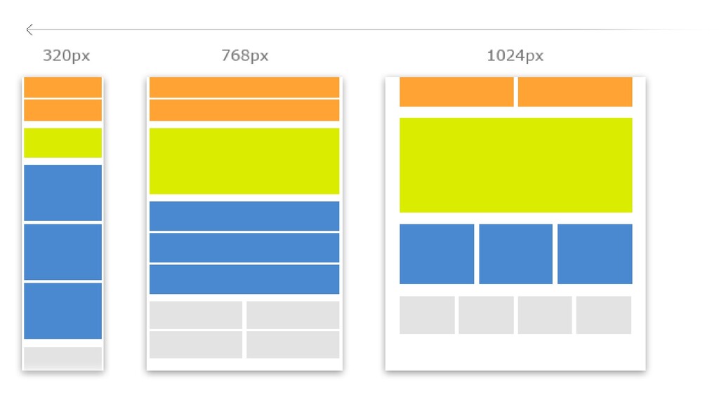
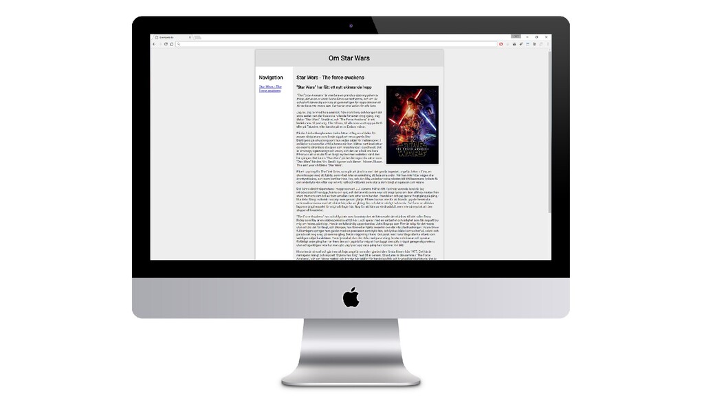
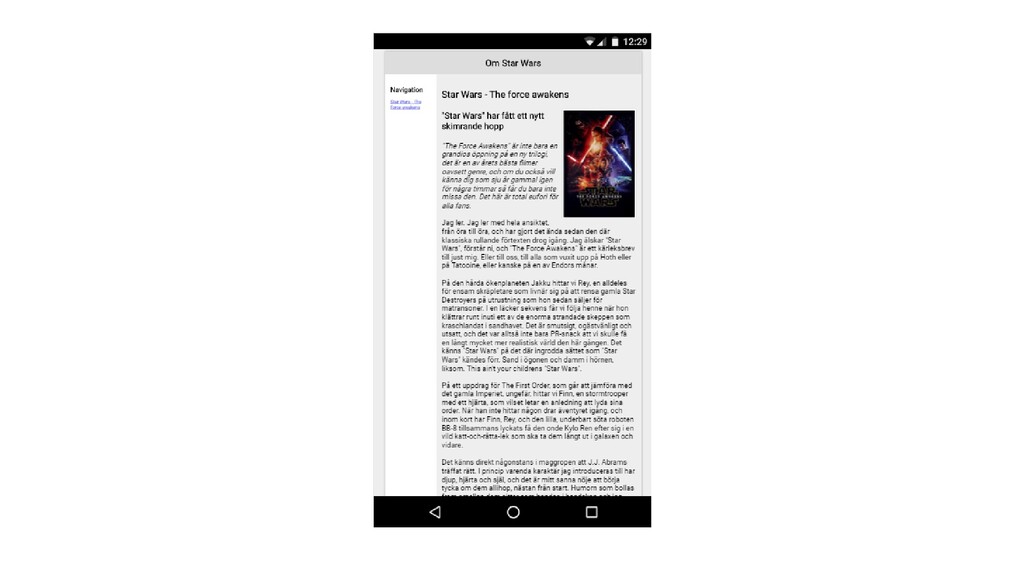
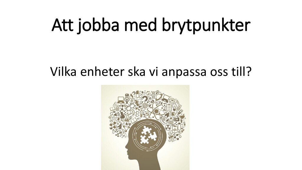
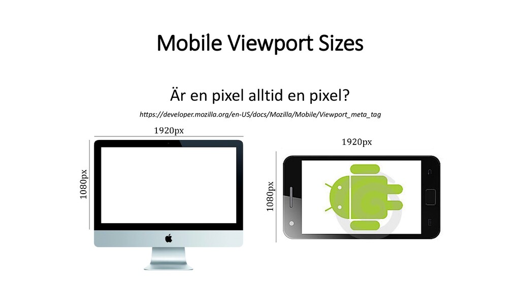
•Vad hände sedan? • Våra skärmar blev större och större • Användare med mobiltelefoner började alltmer besöka våra webbplatser •Resan från 960px breda webbplatser, till responsiva
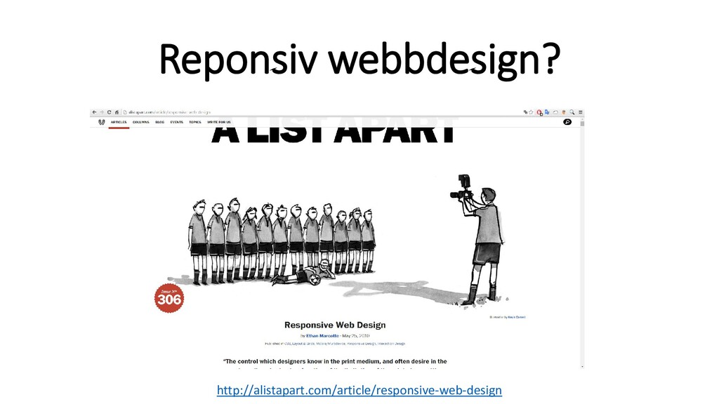
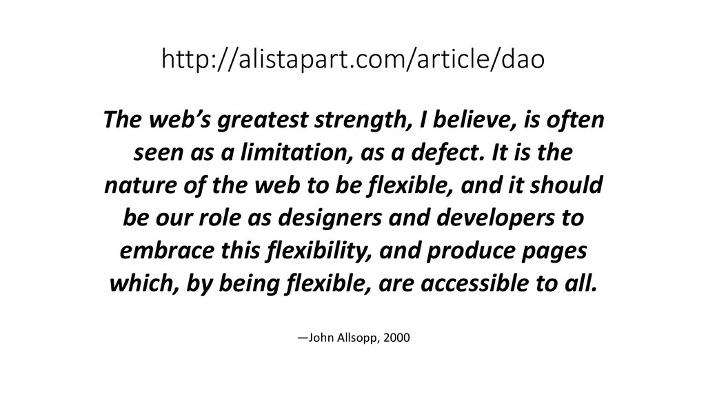
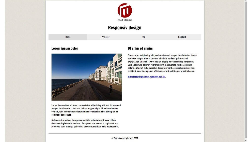
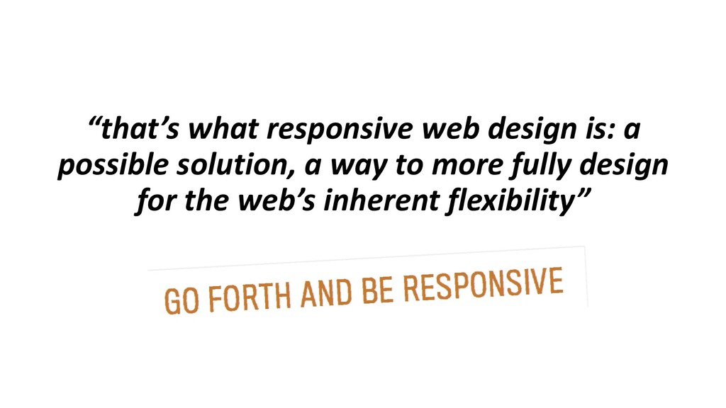
as a limitation, as a defect. It is the nature of the web to be flexible, and it should be our role as designers and developers to embrace this flexibility, and produce pages which, by being flexible, are accessible to all. —John Allsopp, 2000
 tibbelit
 signer
 yatabe
 georgeorge
 hidetoshikawaguchi
 uranoken
 akiraasano
 juanmartin2026
 cbtlibrary
 danishi
 masakat0
 aleyda
 jonyablonski
 jlugia
 szymonslowik
 panda_program
 marketingsoph
 tanoku
 skipperchong
 codingconduct
 holman
 destraynor