Upgrade to Pro — share decks privately, control downloads, hide ads and more …

鹿野さんに聞く!CSSの最新トレンド Ver.2026

鹿野さんに聞く!CSSの最新トレンド Ver.2026

鹿野さんに聞く!CSSの最新トレンド Ver.2026 - connpass https://findy.connpass.com/event/390152/
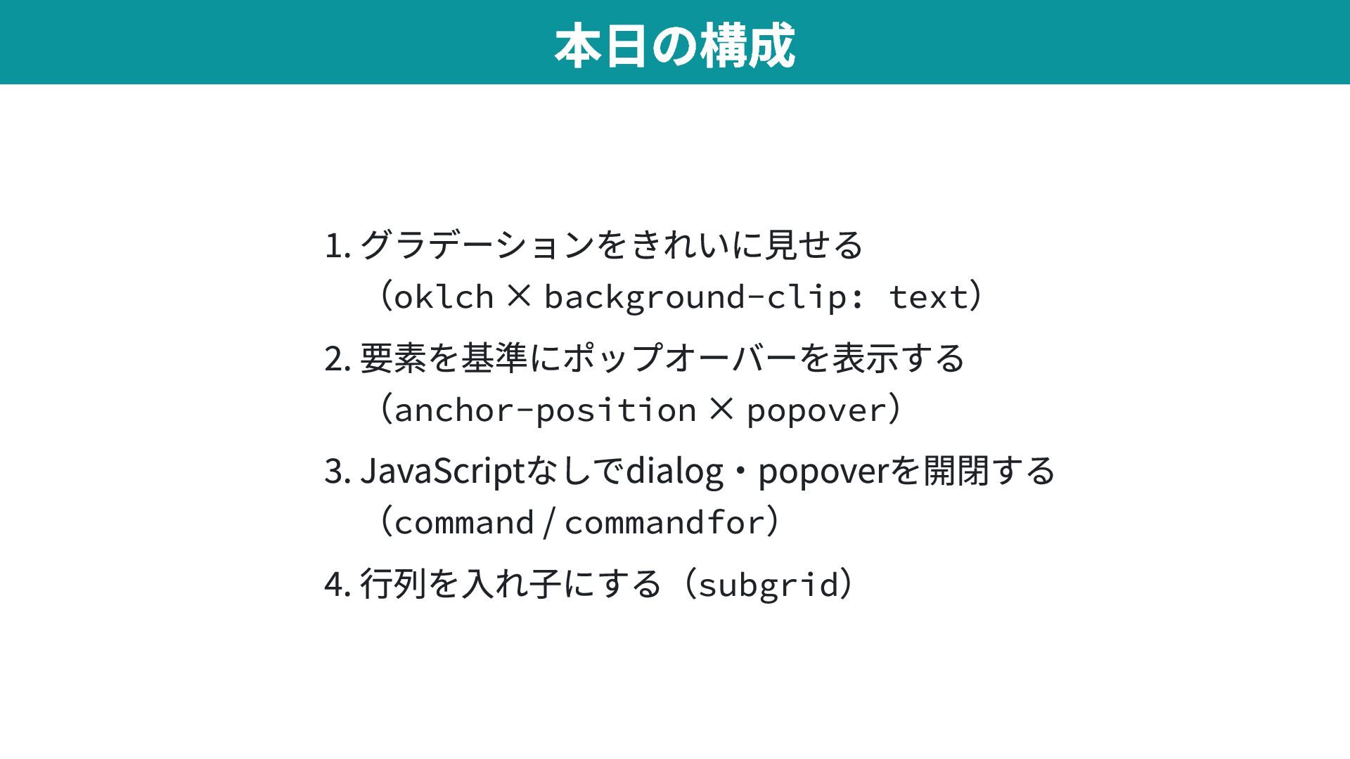
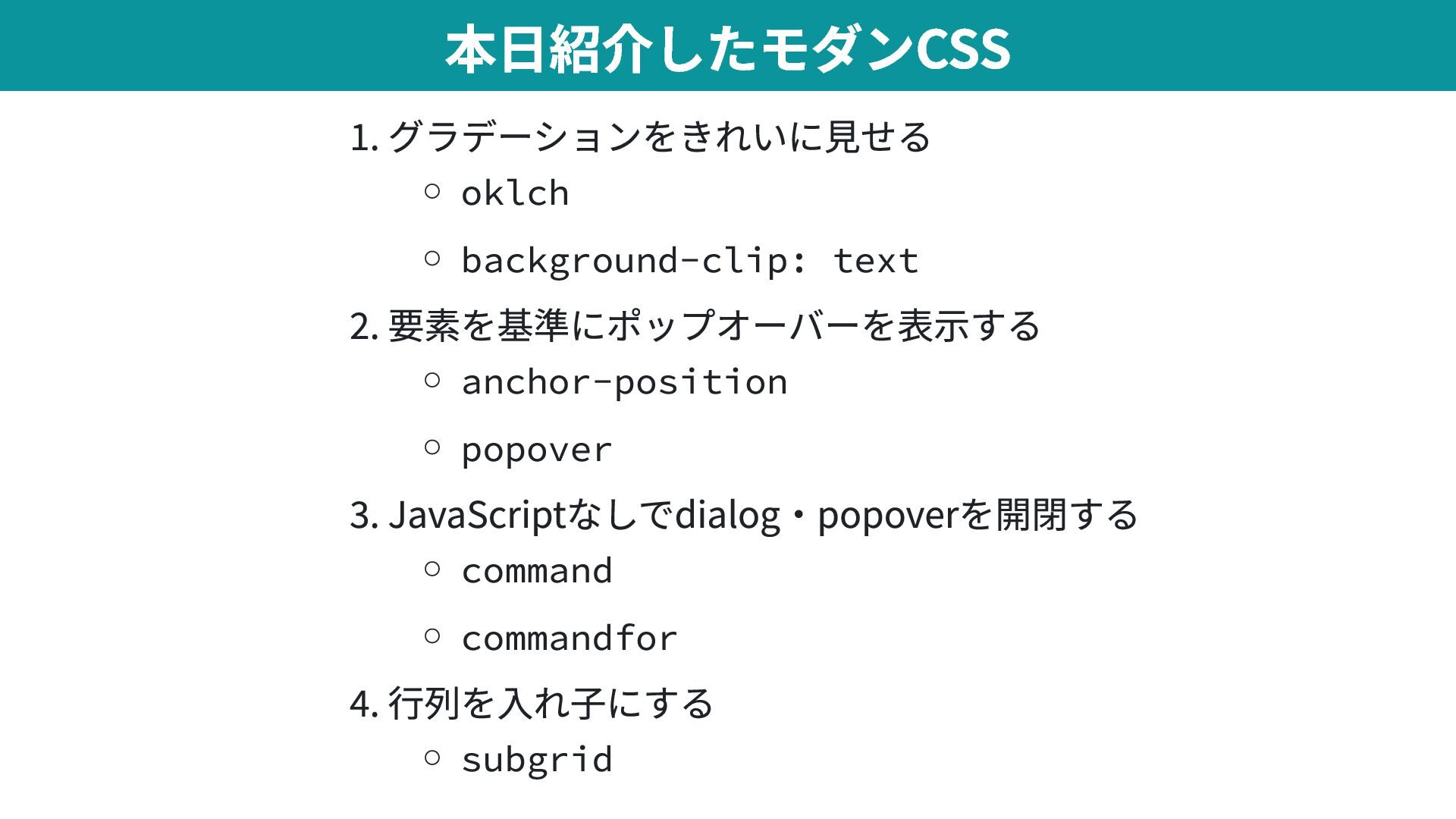
の登壇資料です

Avatar for tonkotsuboy_com

tonkotsuboy_com

May 13, 2026

More Decks by tonkotsuboy_com

Other Decks in Technology

Transcript

  1. 1. グラデーションをきれいに見せる (oklch × background-clip: text ) 2. 要素を基準にポップオーバーを表示する (anchor-position

    × popover ) 3. JavaScriptなしでdialog・popoverを開閉する (command / commandfor ) 4. 行列を入れ子にする(subgrid ) 本日の構成
  2. HTML・CSS・JavaScript等のブラウザサポートの情報 Newly available Chrome, Edge, Firefox, Safariのデスクトップ版・モバイル版 すべてで対応した機能 Widely available

    Newly available になってから 30ヶ月経過した機能 Limited availability 未対応のブラウザがある機能 ベースラインとは https://web.dev/baseline
  3. 2024 popover , @starting-style , text-wrap: balance , light-dark() ,

    scrollbar-gutter , backdrop-filter 2025 @scope , ビュートランジション, ::details-content , contenteditable="plaintext-only" 2026 contrast-color() , ::highlight , text-indent: each-line , shape() , rcap 2024-2026のHTML・CSSのベースラインの一部 https://web.dev/baseline/2026?hl=ja
  4. 背景をグラデーションにし、 background-clip:text で文字の形に切り抜く CSS .gradient-text { /* 背景グラデーション */ background:

    linear-gradient(-45deg, #2af598, #009efd); /* テキスト色を透明 */ color: transparent; /* 背景を文字の形で切り抜く */ background-clip: text; } 【イマドキ】 background-clip:text
  5. 人間の目に均等な色空間。 3 つの値で色を表す。 L(明度)— 明るさ C(彩度)— 鮮やかさ H(色相)— 色味(角度) oklch()

    で色指定にも使える CSS color: oklch(0.62 0.22 264) /* 青 */ color: oklch(0.72 0.22 330) /* ピンク */ OKLCHとは
  6. CSS /* Tailwind v4 のカラーパレット定義 */ --color-red-500: oklch(63.7% 0.237 25.331);

    --color-blue-500: oklch(62.3% 0.214 259.815); 採用理由: 広色域 — sRGB の限界を超え、より鮮やかな色を表現 グラデ補間が綺麗 — 中間色がくすまない(既定で OkLAB 補間) 知覚的均等性 — 50 〜 950 のスケールが等間隔に見える Tailwind CSS v4 が OKLCH を全面採用 https://tailwindcss.com/blog/tailwindcss-v4
  7. ブラウザ バージョン リリース日 Chrome / Edge 111 2023年3月 Safari 16.4

    2023年3月 Firefox 113 2023年5月 Baseline 2023 — Newly available oklch() のブラウザ対応状況 https://caniuse.com/css-color-mix
  8. JavaScript const button = document.querySelector('.trigger'); const popover = document.querySelector('.popover'); const

    close = () => popover.classList.remove('open'); button.addEventListener('click', () => popover.classList.toggle('open')); document.addEventListener('keydown', (e) => e.key === 'Escape' && close()); document.addEventListener('click', (e) => !popover.contains(e.target) && !button.contains(e.target) && close()); 【従来】 Popoverを作るのは大変だった
  9. position: fixed ウインドウの絶対位置で配置 要素を基準にできない JavaScript 煩雑 function updatePosition() { const

    rect = button.getBoundingClientRect(); popover.style.top = `${rect.bottom + 8}px`; popover.style.left = `${rect.left}px`; } 【従来】 ポップオーバーの位置指定手段が煩雑
  10. ポップオーバーをアンカー要素と紐づけ(position-anchor ) アンカーからの位置を指定(anchor または position-area ) HTML <div id="my-popover" popover

    class="popover">ポップオーバー</div> CSS .popover { position-anchor: --my-anchor; top: anchor(bottom); /* アンカーの下端 */ left: anchor(left); /* アンカーの左端 */ } 【イマドキ】CSS Anchor Positioningで位置指定②
  11. CSS .tip { position: absolute; position-anchor: --my-btn; position-area: bottom; /*

    はみ出したら反対側へ自動的に配置を試す */ position-try-fallbacks: flip-block, flip-inline; } flip-block :ブロック軸(縦)方向に反転 flip-inline :インライン軸(横)方向に反転 flip-start :対角軸で反転(block/inline 軸を入れ替え) position-try-fallbacks で画面端の自動回避
  12. ブラウザ バージョン リリース日 Chrome 125 2024年5月 Edge 125 2024年5月 Safari

    26 2025年9月 Firefox 147 2026年1月 Baseline 2026 — Newly available anchor-position のブラウザ対応状況 https://caniuse.com/css-anchor-positioning
  13. ブラウザ バージョン リリース日 Chrome / Edge 114 2023年5月 Safari 17.0

    2023年9月 Firefox 125 2024年4月 Baseline 2024 — Newly available Popover API のブラウザ対応状況 https://caniuse.com/mdn-html_global_attributes_popover
  14. popoverもdialogもcommand 属性とcommandfor 属性で制御 popover HTML <button commandfor="menu" command="toggle-popover">メニュー</button> <div id="menu"

    popover>...</div> dialog HTML <button commandfor="dlg" command="show-modal">開く</button> <dialog id="dlg">...</dialog> 【イマドキ】command + commandfor に統一
  15. popover 専用 command 値 用途 show-popover popover を開く hide-popover popover

    を閉じる toggle-popover popover をトグル <dialog> 専用 command 値 用途 show-modal dialog をモーダル表示 close dialog を閉じる request-close dialog に閉じる要求を送る command 属性で指定できる値
  16. CSS .dialog { display: none; opacity: 0; transition: 0.4s allow-discrete;

    } .dialog[open] { display: block; opacity: 1; @starting-style { opacity: 0; } } [open] 属性で 表示状態のスタイルを指定 表示時 @starting-style の効果で アニメーション 非表示時 allow-discrete の効果で アニメーション ※ 非表示アニメーションは Firefox以外対応 dialogの開閉アニメーション
  17. CSS .theme-menu { opacity: 0; transform: translateY(-4px); transition: 0.15s allow-discrete;

    } .theme-menu:popover-open { opacity: 1; transform: translateY(0); @starting-style { opacity: 0; transform: translateY(-4px); } } :popover-open 擬似クラスで 表示状態のスタイルを指定 表示時 @starting-style の効果で アニメーション 非表示時 allow-discrete の効果で アニメーション ※ 非表示アニメーションは Firefox以外対応 popoverの開閉アニメーション
  18. ブラウザ バージョン リリース日 Chrome / Edge 135 2025年4月 Firefox 144

    2025年10月 Safari 26.2 2025年12月 Baseline 2025 — Newly available Invoker Commands のブラウザ対応状況 https://caniuse.com/mdn-html_elements_button_command
  19. <a href="#" class="card"> <div class="thumb"> <img src="./画像.png" /> </div> <time

    class="date">2026年5月14日</time> <h3 class="title">鹿野さんに聞く!CSSの最新トレンド Ver.2026</h3> <div class="foot-row"> <button>参加申し込み</button> </div> </a> HTML
  20. CSS .grid { display: grid; grid-template-columns: repeat(2, 1fr); } .card

    { display: grid; grid-template-rows: subgrid; grid-row: span 4; } 2列の行列を作り、子を配置 タイトルの長さが違っても、サムネ・日付・タイトル・ボタンの行位置が揃う
  21. ブラウザ バージョン リリース日 Firefox 71 2019年12月 Safari 16.0 2022年9月 Chrome

    / Edge 117 2023年9月 Baseline 2023 — Newly available subgrid のブラウザ対応状況 https://caniuse.com/css-subgrid
  22. 1. グラデーションをきれいに見せる oklch background-clip: text 2. 要素を基準にポップオーバーを表示する anchor-position popover 3.

    JavaScriptなしでdialog・popoverを開閉する command commandfor 4. 行列を入れ子にする subgrid 本日紹介したモダンCSS