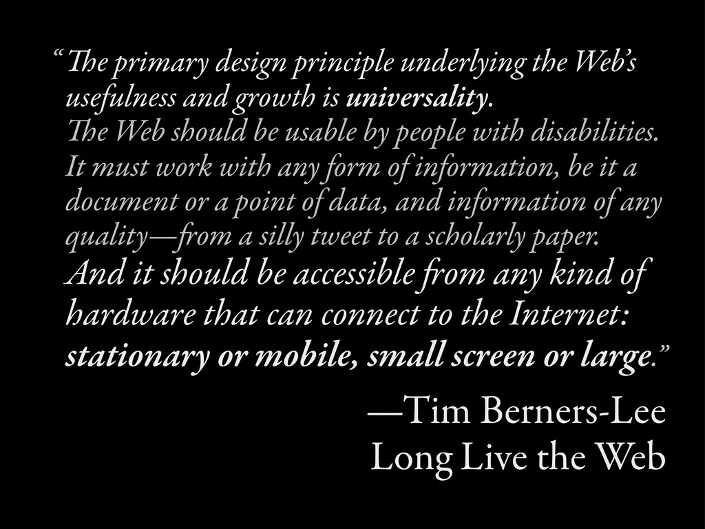
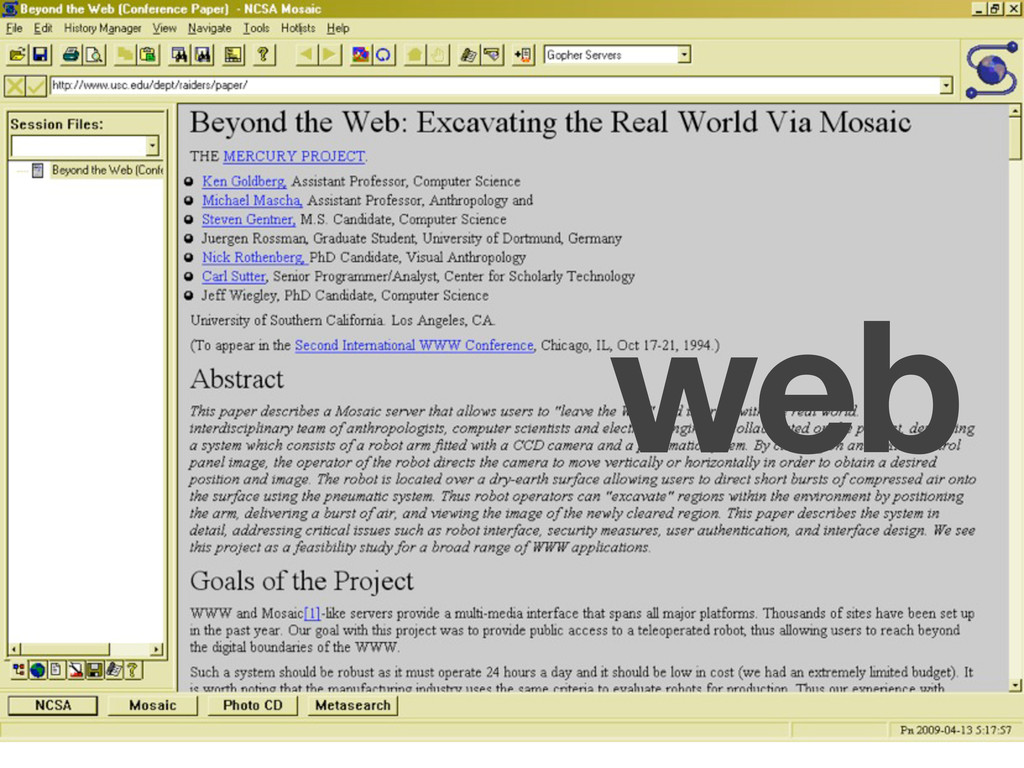
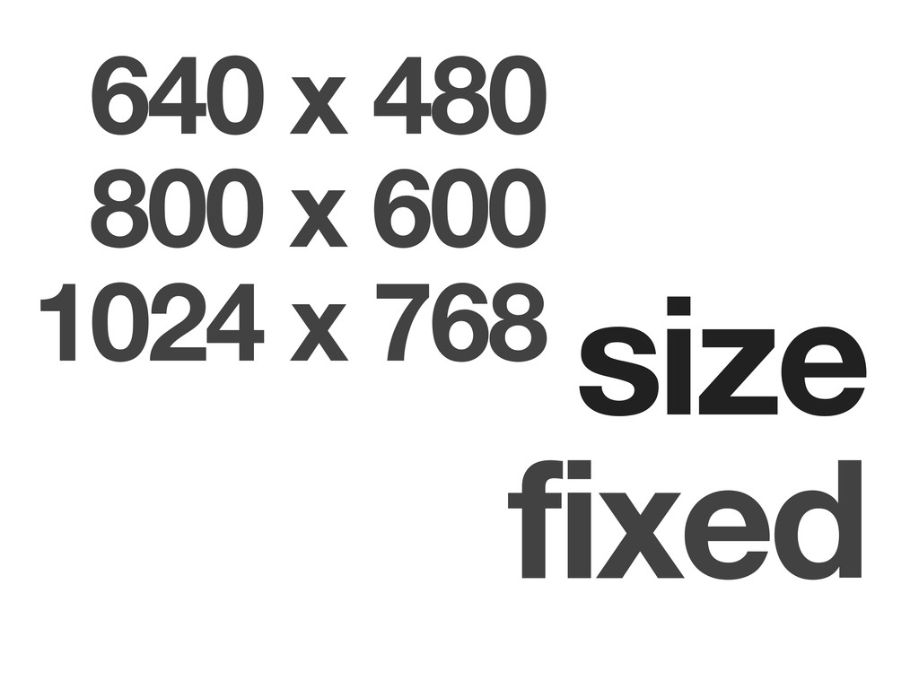
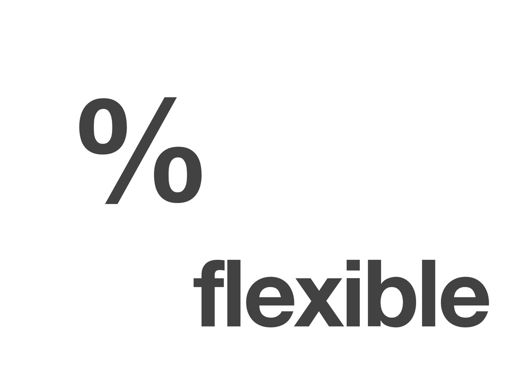
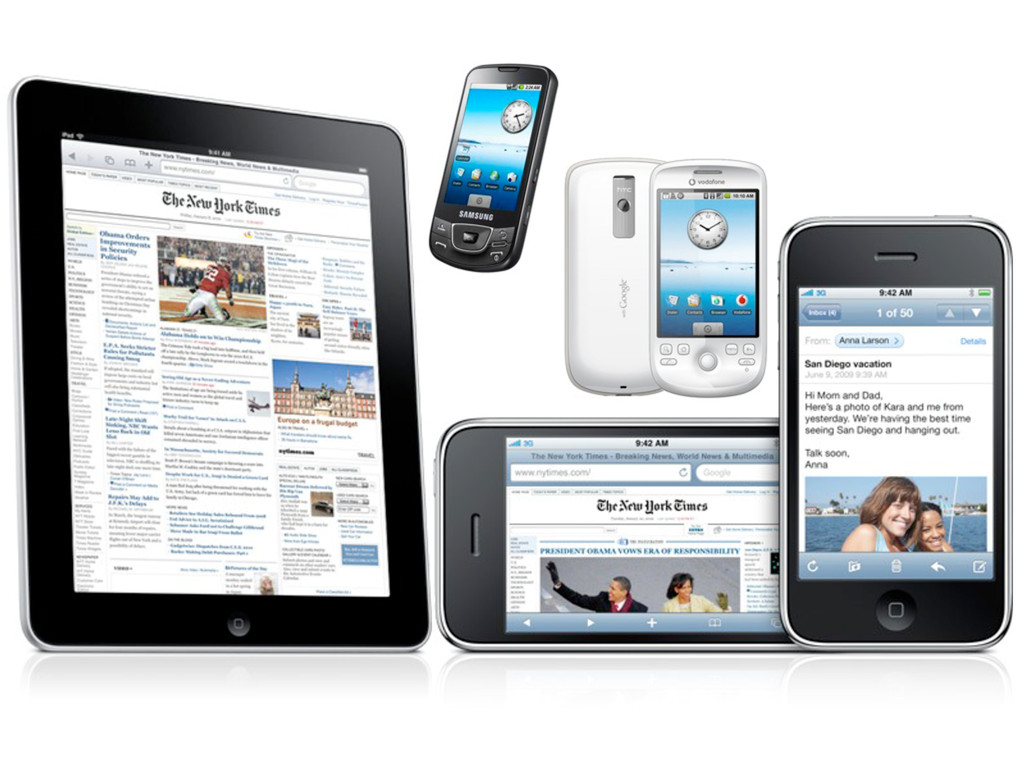
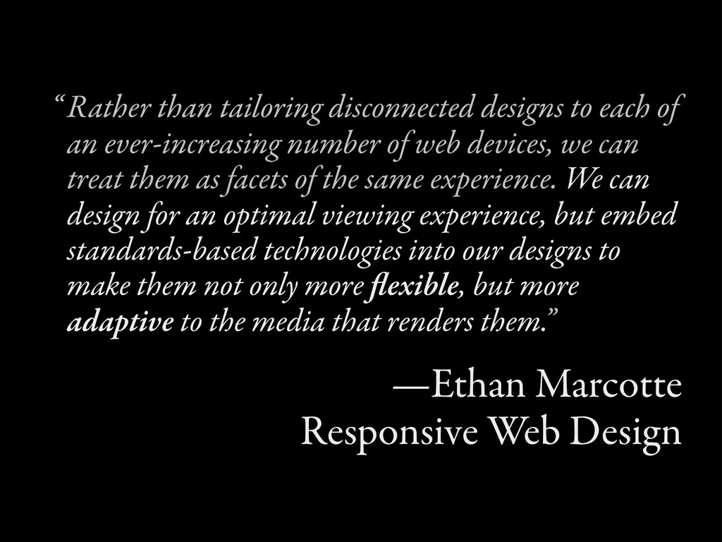
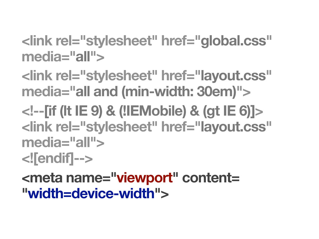
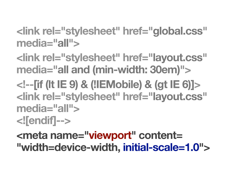
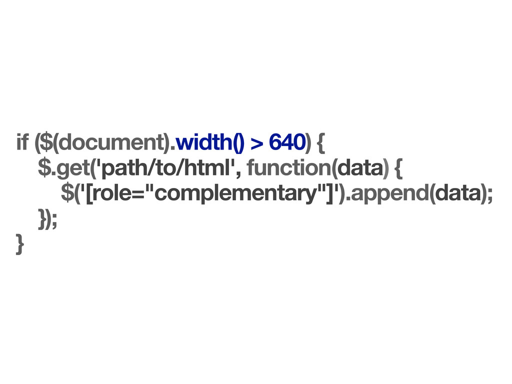
The range of devices accessing the web is increasing. We are faced with a choice in how we deal with this diversity. We can either fracture the web by designing a multitude of device-specific silos, or we can embrace the flexibility of the web and create experiences that can adapt to any device or browser.
 adactio
 videlvequio
 kitanosirokuma
 tararira
 kgsi
kgsi
 root_recruit
 kumanoayumi
 mhand01
 klemens
 kspace
 hicard
 abokadotyann
 rezaline
 tonyrice
 stephaniewalter
 carmenintech
 marktimemedia
 brettharned
 nmsamuel
 csswizardry
 reverentgeek
 codingconduct
 chrislema
 tamaranovitovic
 notwaldorf
![[role="main"] { ! width: 61.8034%; ! float: left; } [role="complementary"]](https://files.speakerdeck.com/presentations/4e92ff852deb29005100d9e6/slide_40.jpg)