Upgrade to Pro — share decks privately, control downloads, hide ads and more …

The specs behind the sex, mobile-friendly layout beyond the desktop

The specs behind the sex, mobile-friendly layout beyond the desktop

ponente brucel

Betabeers

May 13, 2012
Tweet

More Decks by Betabeers

Other Decks in Education

Transcript

  1. CSS 3 Media Queries • builds on CSS 2.1 Media

    Types concept • more granular control (not just screen, print...) http://www.w3.org/TR/css3-mediaqueries/
  2. CSS 3 Media Queries <link rel="stylesheet" ... media="screen and (max-width:480px)"

    href="..."> @import url("...") screen and (max-width:480px); @media screen and (max-width:480px) { // insert CSS rules here }
  3. Multiple expressions – and keyword @media screen and (min-width:180px) and

    (max- width:480px) { // screen device and width > 180px // and width < 480px }
  4. Multiple expressions – comma separated @media screen and (min-width:800px), print

    and (min-width:20em) { // screen device with width > 800px // or print device with width > 20em }
  5. Negative expressions – not keyword @media not screen and (min-width:800px)

    { // not applied to screen device // with width > 800px }
  6. Exclusive expressions – only keyword @media only screen and (min-width:800px)

    { // only applied to screen device // with width > 800px }
  7. Multiple media queries /* “The absence of a media query

    is the first media query” Bryan Rieger */ @media screen and (max-width:480px) { // screen device and width < 480px } @media screen and (max-width:980px) { // screen device and width < 980px } @media screen and (min-width:980px) { // screen device and width > 980px }
  8. viewport meta <meta name="viewport" content="width=device-width"> <meta name="viewport" content="width=320, initial- scale=2.3,user-scalable=no">

    http://developer.apple.com/safari/library/documentation/AppleApplications/Reference/SafariWebContent/UsingtheViewport/UsingtheViewport.html
  9. If you're using Media Queries: <meta name="viewport" content="width=device-width"> If you

    have an explicit width: <meta name="viewport" content="width=550">
  10. CSS Device Adaptation @viewport { width: 320px; zoom: 2.3; user-zoom:

    fixed; } www.w3.org/TR/css-device-adapt only works in Opera Mobile 11+ at the moment, with -o- prefix dev.opera.com/articles/view/an-introduction-to-meta-viewport-and-viewport
  11. Viewport properties width / min-width / max-width user-zoom height /

    min-height / max-height orientation zoom / min-zoom / max-zoom resolution
  12. <meta name="viewport" content="width=550,maximum- scale=1.0,target-densitydpi=device-dpi"> @media screen { @-o-viewport { /*

    undo meta viewport settings */ width: auto; max-zoom: auto; } } @media screen and (max-device-width: 550px) { @-o-viewport { /* 550px viewport on small screen devices */ width: 550px; } }
  13. <meta name="viewport" content="width=550,maximum- scale=1.0,target-densitydpi=device-dpi"> @media screen { @-o-viewport { /*

    undo meta viewport settings */ width: auto; max-zoom: auto; } } @media screen and (max-device-width: 550px) { @-o-viewport { /* 550px viewport on small screen devices */ width: 550px; } }
  14. matchMedia if (window.matchMedia("(min-width: 400px)").matches) { /* the view port is

    at least 400 pixels wide */ } else { /* the view port is less than 400 pixels wide */ } For IE9+ and Opera, polyfill github.com/paulirish/matchMedia.js/
  15. adaptive-images.com Add .htaccess and adaptive-images.php to your document- root folder.

    Add one line of JavaScript into the <head> of your site. Add your CSS Media Query values into $resolutions in the PHP file.
  16. Super WebKit-tastic CSS selector {background: image-set (url(foo-lowres.png) 1x, url(foo-highres.png) 2x)

    center;} selector {background: image-set (url(foo-lowres.png) 1x low-bandwidth, url(foo-highres.png) 2x high-bandwidth);} http://lists.w3.org/Archives/Public/www-style/2012Feb/1103.html
  17. .. extrapolate to HTML? <img src=foo-lowres.png set="foo-lowres.png 1x, foo-highres.png 2x"

    alt="blah"> "I'll post something to the whatwg thread referencing this proposal."
  18. Adaptive Image Element <picture> <source … media="(min-width:1000px)"> <source … media="(max-width:1000px)">

    </picture> www.brucelawson.co.uk/2011/notes-on-adaptive-images-yet-again/ http://www.w3.org/community/respimg/
  19. Note to people who weren't at the talk: following slides

    are strawman ideas for the next iteration of Media Queries (CSS 4) and are almost certainly to be completely different if they ever make it into the specification. (CSS 3 MQs became a "Proposed Recommendation", eg a "Standard" week of 23 April 2012, so very early days!)
  20. @media screen and (script) {...} @media screen and not (script)

    {…} http://lists.w3.org/Archives/Public/www-style/2012Jan/0034.html
  21. @media (paged) and (interactive:0) { // I am like a

    printer } @media (paged) and (interactive) { // I'm a projector, or like a Kindle } @media (paged) and (interactive) and (touch) { // I'm like a touch-screen Kindle }
  22. @media (touch) and (max-width: 480) { // looks like an

    smart phone } @media (touch) and (keyboard) and (min-width:600) { // looks like a touch-screen laptop }
  23. @media (remote) { // TV or set-top box? } @media

    (remote) and (hover) { // Wii? }
  24. @media (network: v-slow) {..} Florian: "It has been proposed. Most

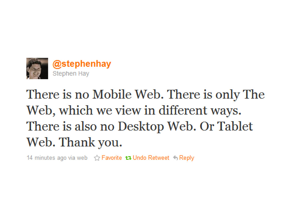
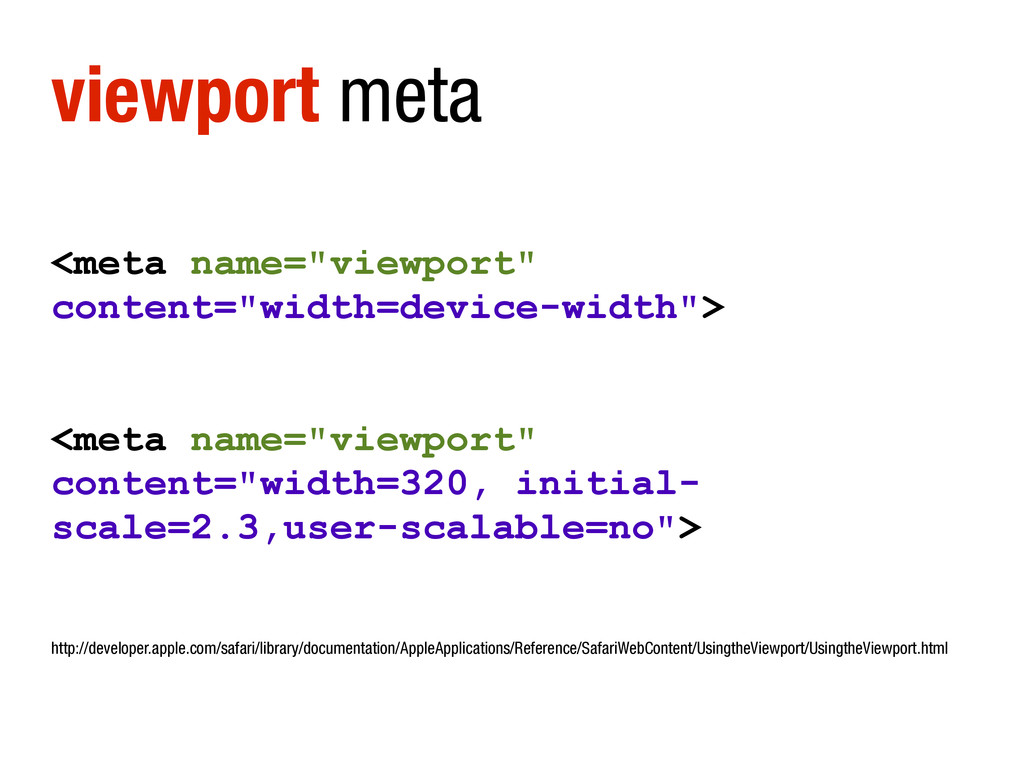
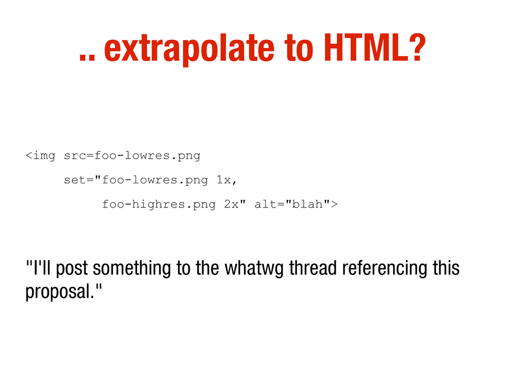
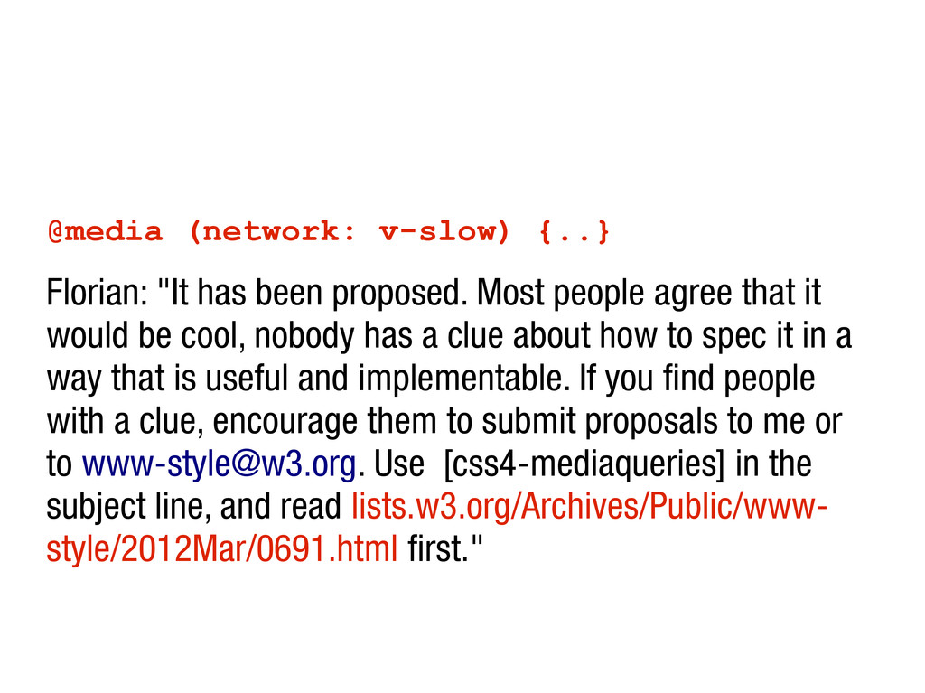
    people agree that it would be cool, nobody has a clue about how to spec it in a way that is useful and implementable. If you find people with a clue, encourage them to submit proposals to me or to [email protected]. Use [css4-mediaqueries] in the subject line, and read lists.w3.org/Archives/Public/www- style/2012Mar/0691.html first."