Share
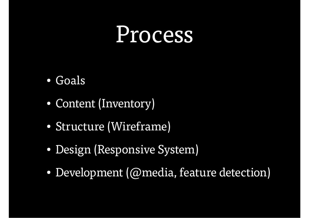
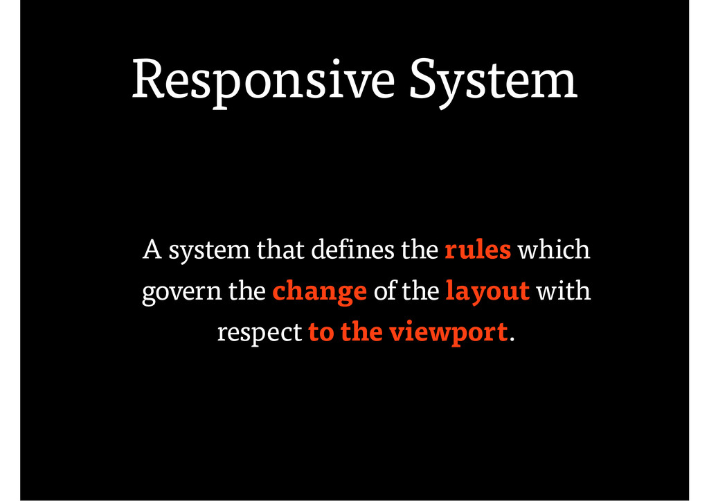
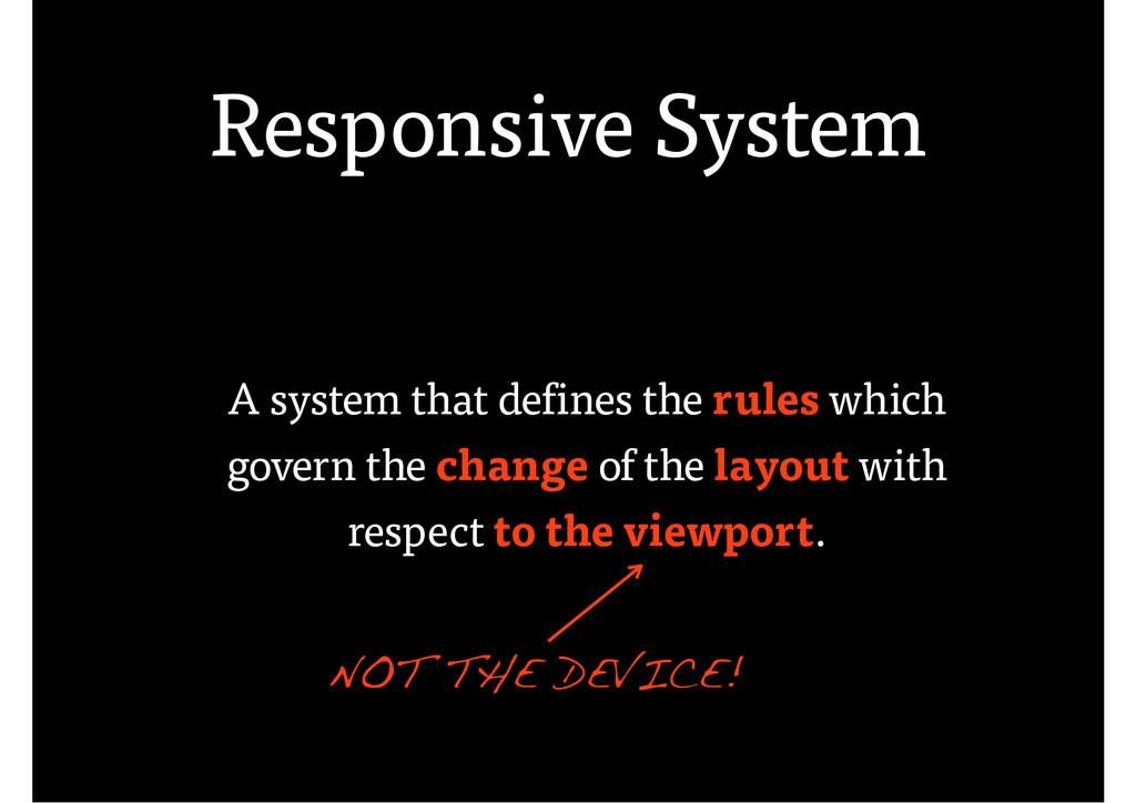
A presentation for Responsive Design & Development MiniConf in Ljubljana about responsive design breakpoints.
 friedcell
 a2k
a2k
 diverse
 saki822
 garyuten
 godlingkogami
 kitanosirokuma
 kspace
 klemens
 mhand01
 keita_yoshikawa
 aleyda
 jct
jct
 cassininazir
 baasie
 matthewcrist
 skipperchong
 iamctodd
 akademiya2063
 akosma
 varn
varn
 thoeni
 sonatard