Upgrade to Pro — share decks privately, control downloads, hide ads and more …

Markup For Mobile (And Other Devices)

Markup For Mobile (And Other Devices)

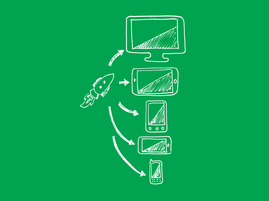
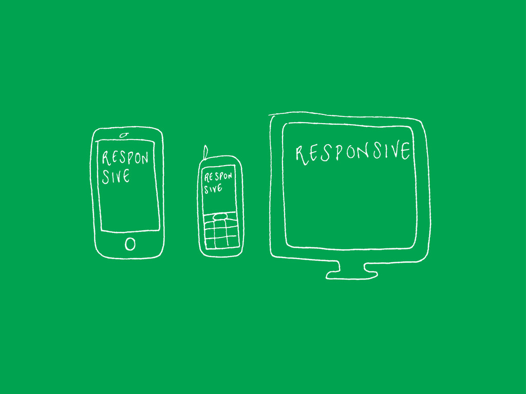
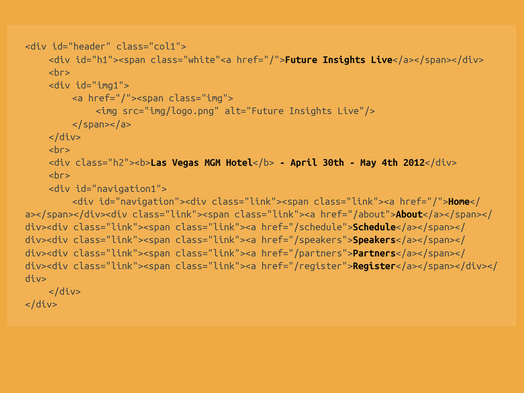
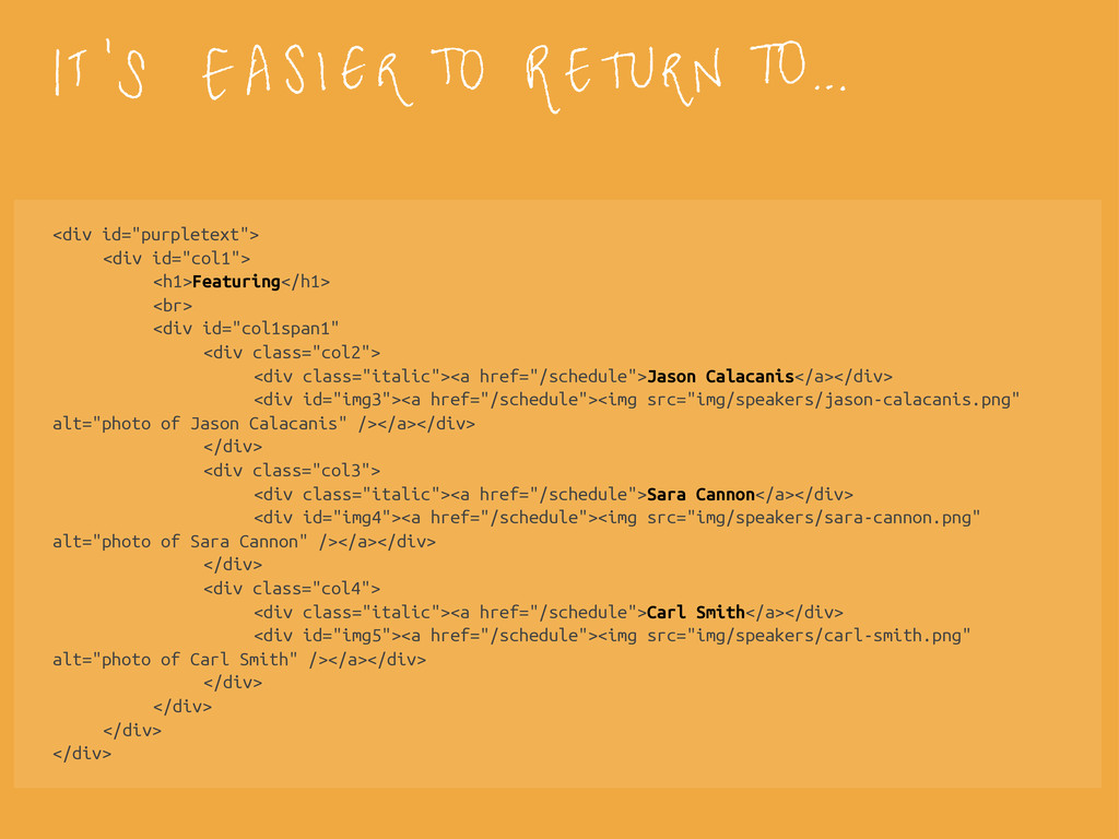
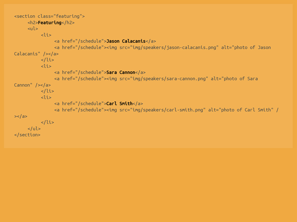
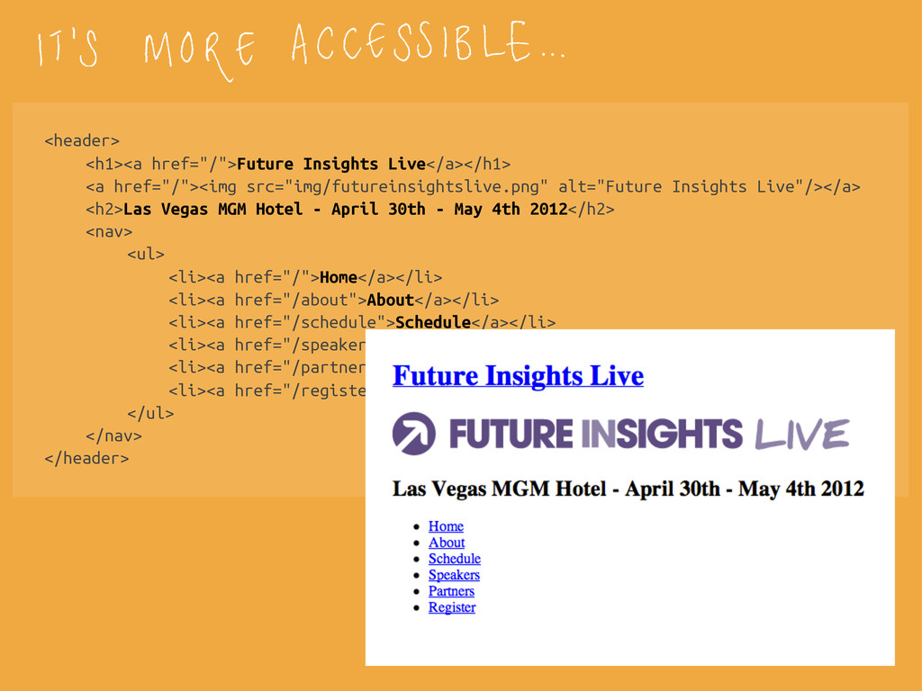
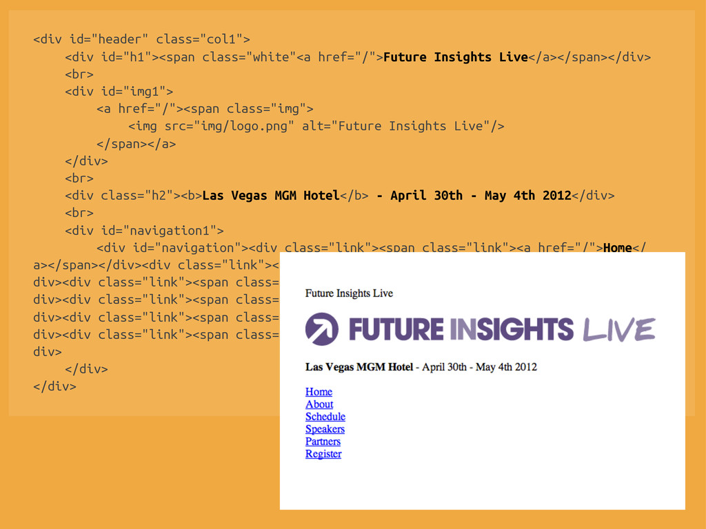
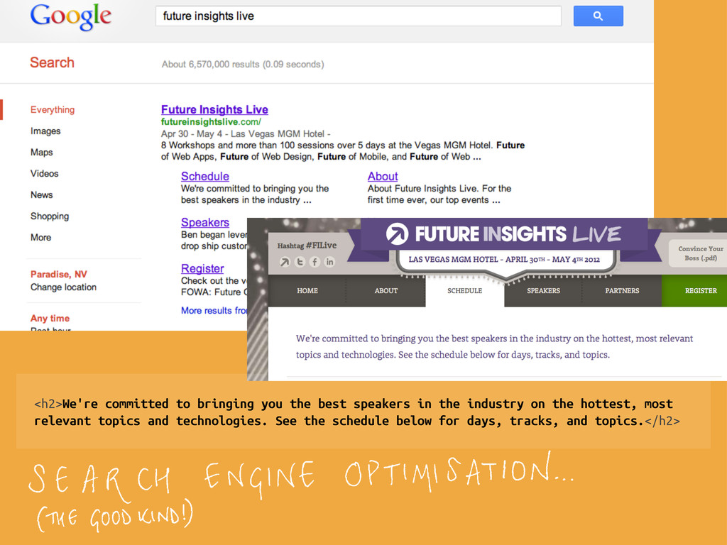
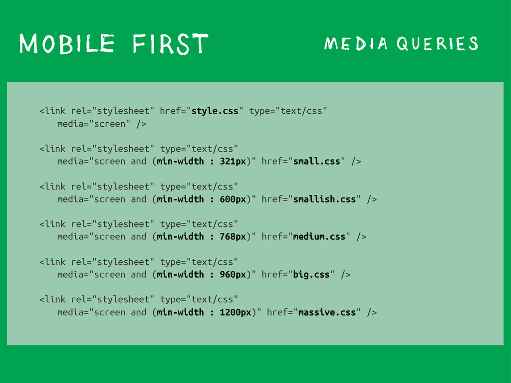
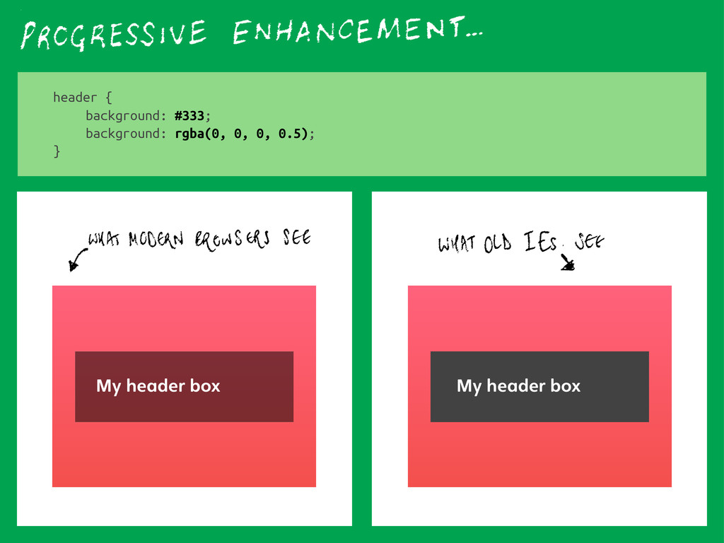
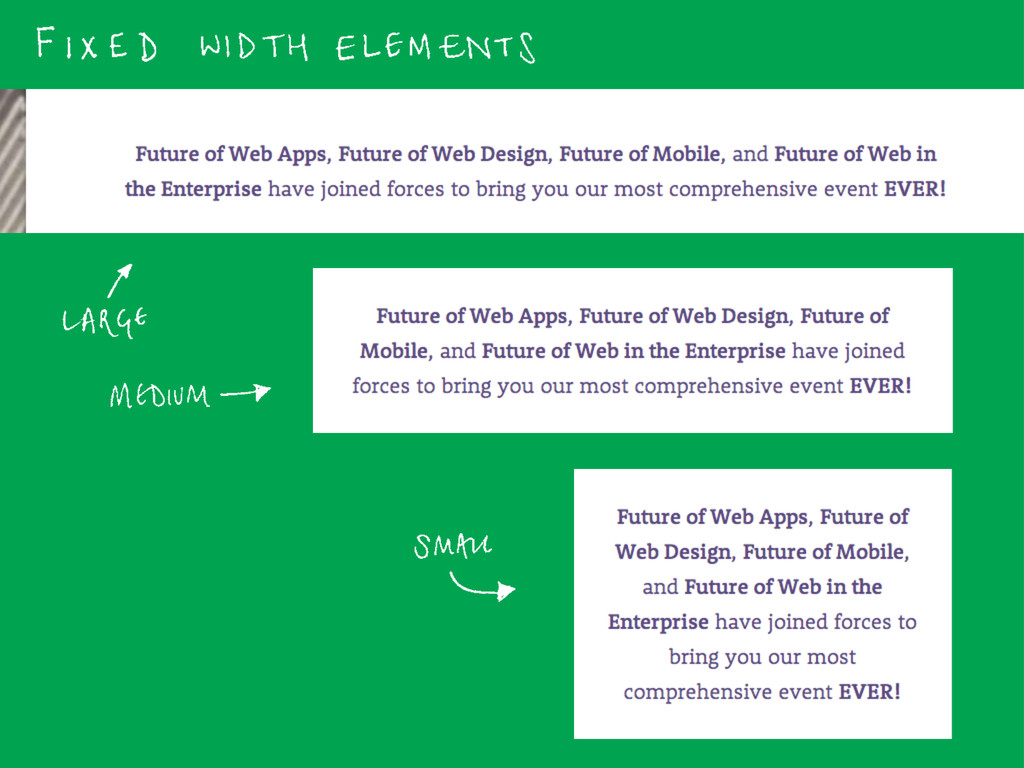
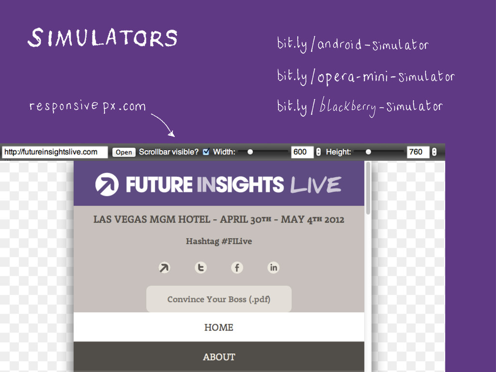
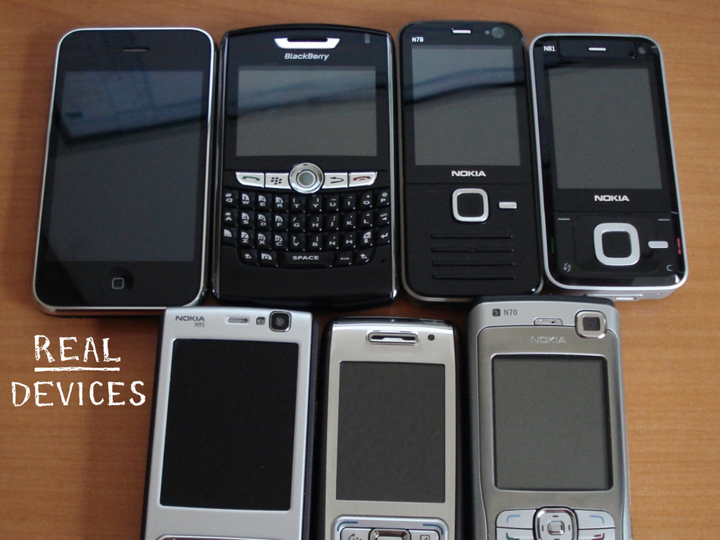
A talk about writing good HTML and CSS for the web on multiple devices, given at Future Insights Live in Las Vegas, May 2012.

Laura Kalbag

May 13, 2012
Tweet

More Decks by Laura Kalbag

Other Decks in Programming

Transcript

  1. <header class="vevent"> <h1 class="summary"><a href="/">Future Insights Live</a></h1> <a class="logo-link" href="/"><img

    src="img/future-insights-live.png" alt="Future Insights Live"/></a> <h2><strong class="location">Las Vegas MGM Hotel -</strong> <abbr class="dtstart" title="2012-04-30">April 30<sup>th</sup></abbr> - <abbr class="dtend" title="2012-05-04">May 4<sup>th</sup> 2012</abbr></h2> </header>
  2. <header> <h1><a href="/">Future Insights Live</a></h1> <a href="/"><img src="img/futureinsightslive.png" alt="Future Insights

    Live"/></a> <h2>Las Vegas MGM Hotel - April 30th - May 4th 2012</h2> <nav> <ul> <li><a href="/">Home</a></li> <li><a href="/about">About</a></li> <li><a href="/schedule">Schedule</a></li> <li><a href="/speakers">Speakers</a></li> <li><a href="/partners">Partners</a></li> <li><a href="/register">Register</a></li> </ul> </nav> </header>
  3. <div id="header" class="col1"> <div id="h1"><span class="white"<a href="/">Future Insights Live</a></span></div> <br>

    <div id="img1"> <a href="/"><span class="img"> <img src="img/logo.png" alt="Future Insights Live"/> </span></a> </div> <br> <div class="h2"><b>Las Vegas MGM Hotel</b> - April 30th - May 4th 2012</div> <br> <div id="navigation1"> <div id="navigation"><div class="link"><span class="link"><a href="/">Home</ a></span></div><div class="link"><span class="link"><a href="/about">About</a></span></ div><div class="link"><span class="link"><a href="/schedule">Schedule</a></span></ div><div class="link"><span class="link"><a href="/speakers">Speakers</a></span></ div><div class="link"><span class="link"><a href="/partners">Partners</a></span></ div><div class="link"><span class="link"><a href="/register">Register</a></span></div></ div> </div> </div>
  4. <div id="purpletext"> <div id="col1"> <h1>Featuring</h1> <br> <div id="col1span1" <div class="col2">

    <div class="italic"><a href="/schedule">Jason Calacanis</a></div> <div id="img3"><a href="/schedule"><img src="img/speakers/jason-calacanis.png" alt="photo of Jason Calacanis" /></a></div> </div> <div class="col3"> <div class="italic"><a href="/schedule">Sara Cannon</a></div> <div id="img4"><a href="/schedule"><img src="img/speakers/sara-cannon.png" alt="photo of Sara Cannon" /></a></div> </div> <div class="col4"> <div class="italic"><a href="/schedule">Carl Smith</a></div> <div id="img5"><a href="/schedule"><img src="img/speakers/carl-smith.png" alt="photo of Carl Smith" /></a></div> </div> </div> </div> </div>
  5. <section class="featuring"> <h2>Featuring</h2> <ul> <li> <a href="/schedule">Jason Calacanis</a> <a href="/schedule"><img

    src="img/speakers/jason-calacanis.png" alt="photo of Jason Calacanis" /></a> </li> <li> <a href="/schedule">Sara Cannon</a> <a href="/schedule"><img src="img/speakers/sara-cannon.png" alt="photo of Sara Cannon" /></a> </li> <li> <a href="/schedule">Carl Smith</a> <a href="/schedule"><img src="img/speakers/carl-smith.png" alt="photo of Carl Smith" / ></a> </li> </ul> </section>
  6. <header> <h1><a href="/">Future Insights Live</a></h1> <a href="/"><img src="img/futureinsightslive.png" alt="Future Insights

    Live"/></a> <h2>Las Vegas MGM Hotel - April 30th - May 4th 2012</h2> <nav> <ul> <li><a href="/">Home</a></li> <li><a href="/about">About</a></li> <li><a href="/schedule">Schedule</a></li> <li><a href="/speakers">Speakers</a></li> <li><a href="/partners">Partners</a></li> <li><a href="/register">Register</a></li> </ul> </nav> </header>
  7. <div id="header" class="col1"> <div id="h1"><span class="white"<a href="/">Future Insights Live</a></span></div> <br>

    <div id="img1"> <a href="/"><span class="img"> <img src="img/logo.png" alt="Future Insights Live"/> </span></a> </div> <br> <div class="h2"><b>Las Vegas MGM Hotel</b> - April 30th - May 4th 2012</div> <br> <div id="navigation1"> <div id="navigation"><div class="link"><span class="link"><a href="/">Home</ a></span></div><div class="link"><span class="link"><a href="/about">About</a></span></ div><div class="link"><span class="link"><a href="/schedule">Schedule</a></span></ div><div class="link"><span class="link"><a href="/speakers">Speakers</a></span></ div><div class="link"><span class="link"><a href="/partners">Partners</a></span></ div><div class="link"><span class="link"><a href="/register">Register</a></span></div></ div> </div> </div>
  8. <h2>We're committed to bringing you the best speakers in the

    industry on the hottest, most relevant topics and technologies. See the schedule below for days, tracks, and topics.</h2>
  9. <picture alt="Alt tag describing the image represented"> <source src="photo.jpg"/> <source

    src="[email protected]" media="-webkit-min-device-pixel-ratio:2, -moz-min-device-pixel-ratio:2, -o-min-device-pixel-ratio: 2/1, min-device-pixel-ratio:2"/> <img src="photo.jpg" /> </picture>
  10. header section.hashtag ul li.twitter a { background: url('circle-twitter.png') center center

    no-repeat; } html.svg header section.hashtag ul li.twitter a { background: url('circle-twitter.svg') center center no-repeat; }
  11. <link rel="stylesheet" href="style.css" type="text/css" media="screen" /> <link rel="stylesheet" type="text/css" media="screen

    and (min-width : 321px)" href="small.css" /> <link rel="stylesheet" type="text/css" media="screen and (min-width : 600px)" href="smallish.css" /> <link rel="stylesheet" type="text/css" media="screen and (min-width : 768px)" href="medium.css" /> <link rel="stylesheet" type="text/css" media="screen and (min-width : 960px)" href="big.css" /> <link rel="stylesheet" type="text/css" media="screen and (min-width : 1200px)" href="massive.css" />
  12. div.container { width: 100%; /* 960px / 960px = 1

    = 100% */ } div.target { margin: 20px auto; width: 52.0833333%; /* 500px / 960px = .520833333 = 52.0833333% */ }
  13. <link rel="stylesheet" href="style.css" type="text/css" media="screen" /> <link rel="stylesheet" type="text/css" media="screen

    and (min-width : 600px)" href="smallish.css" /> <link rel="stylesheet" type="text/css" media="screen and (min-width : 960px)" href="big.css" /> <!--[if lt IE 9]> <link rel="stylesheet" type="text/css" href="smallish.css" /> <link rel="stylesheet" type="text/css" href="big.css" /> <![endif]-->