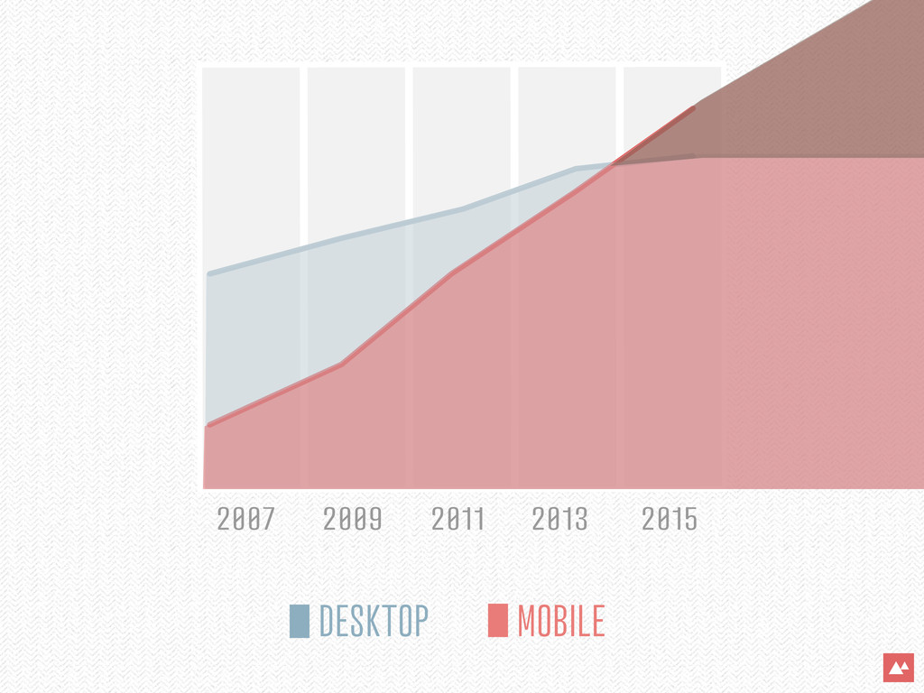
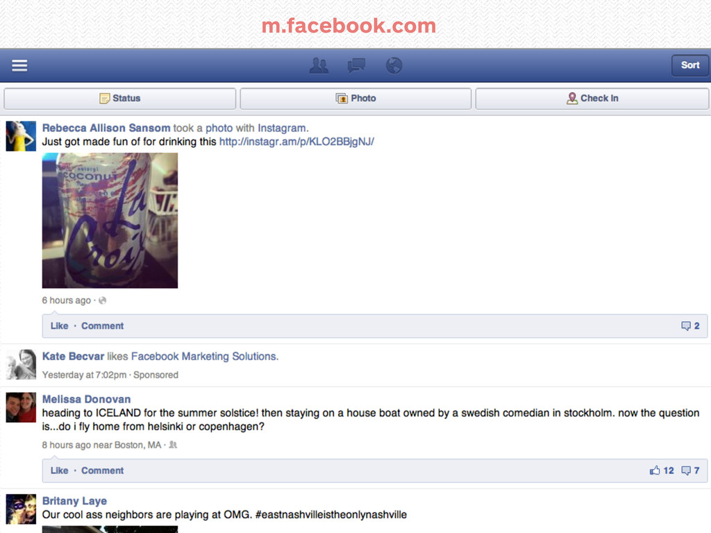
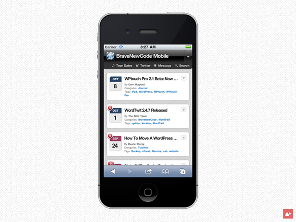
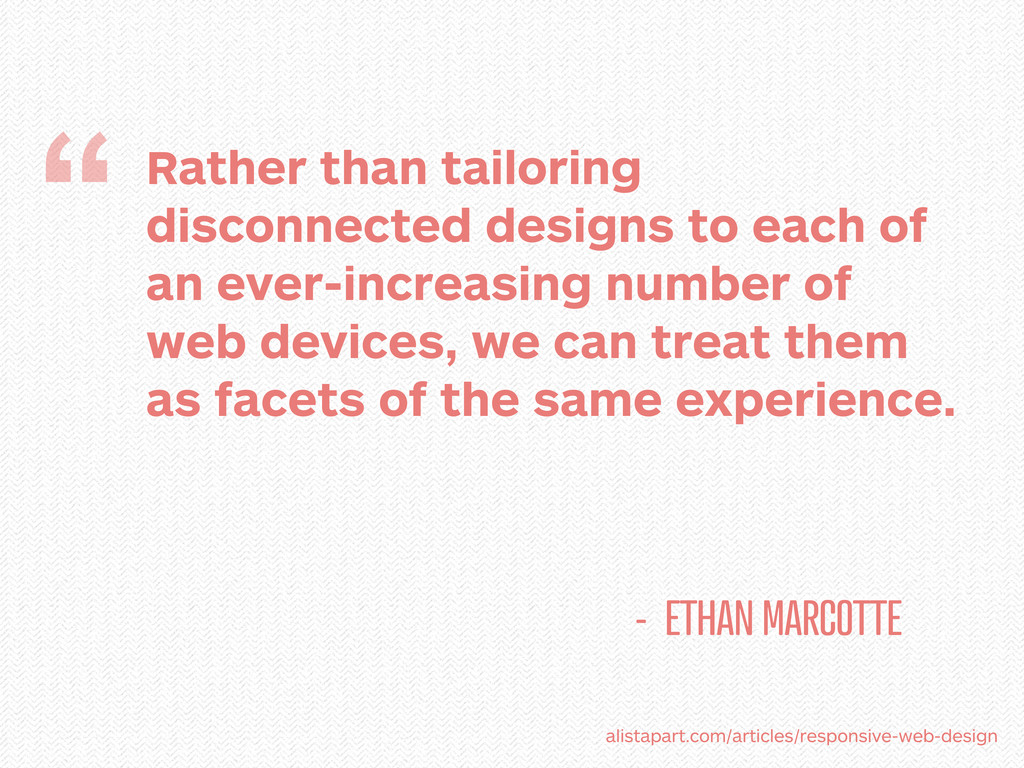
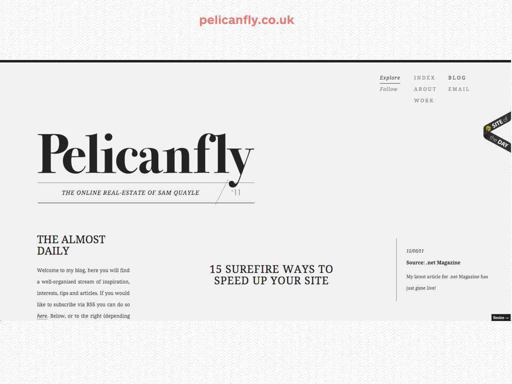
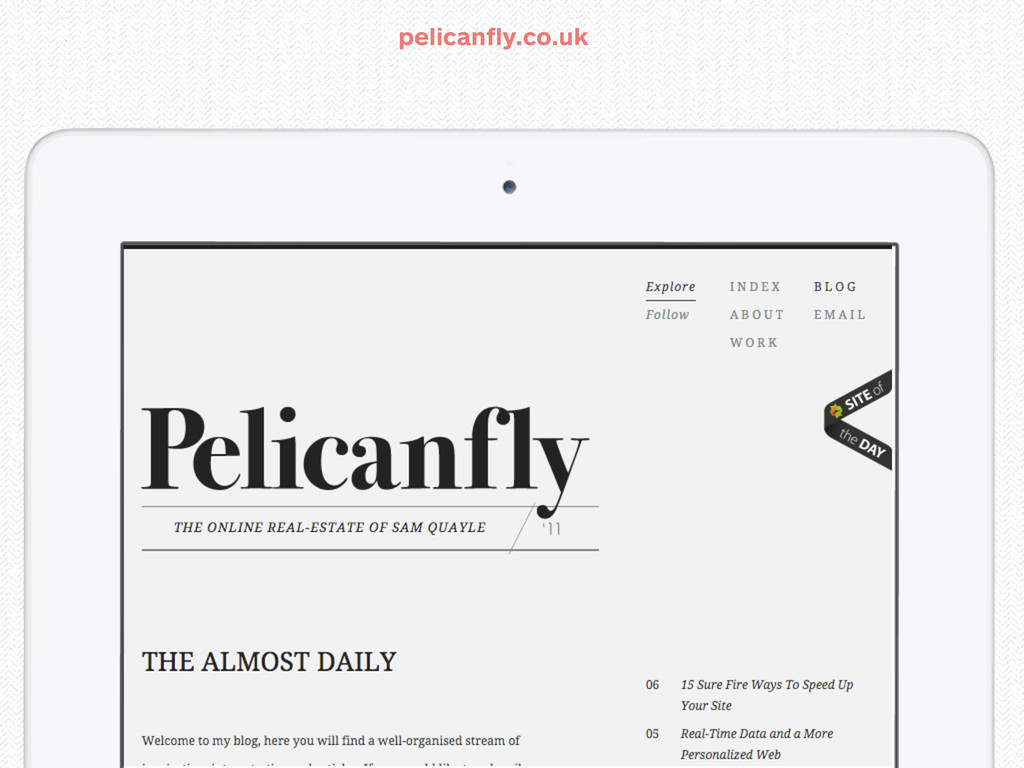
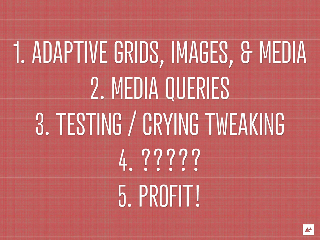
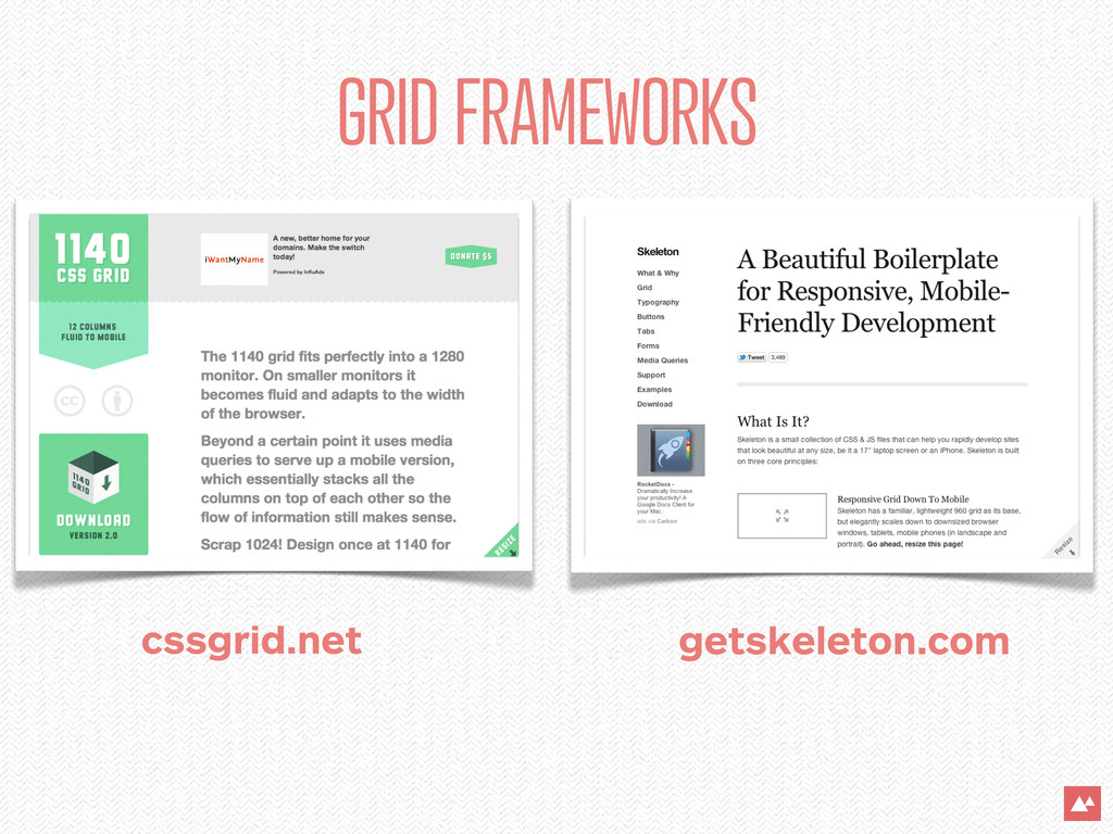
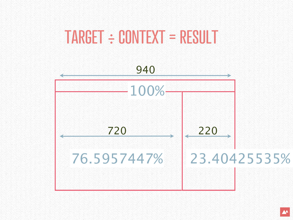
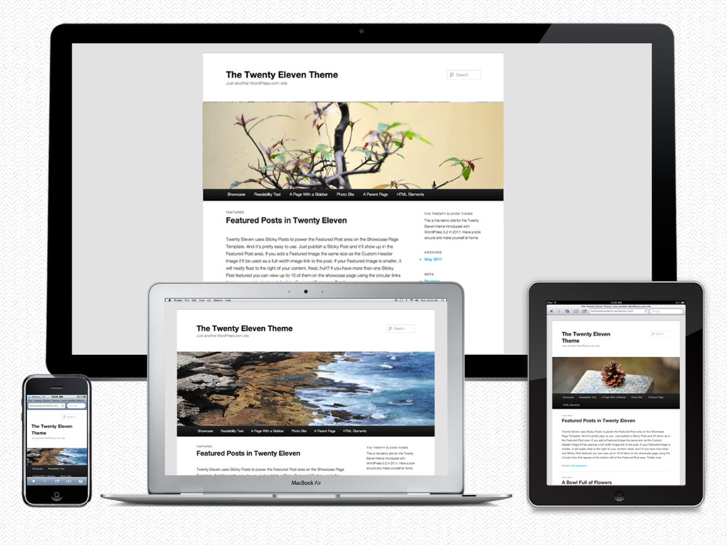
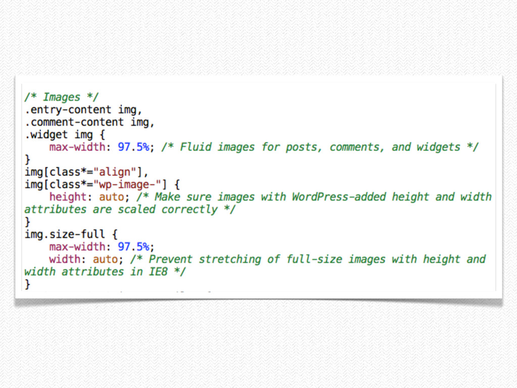
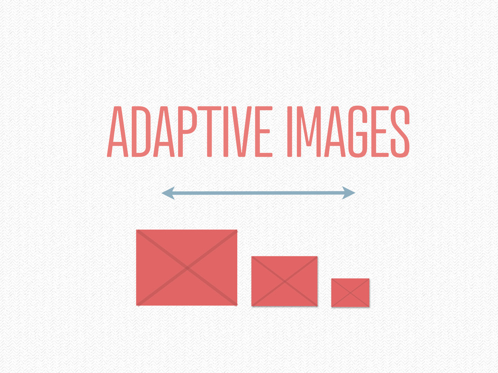
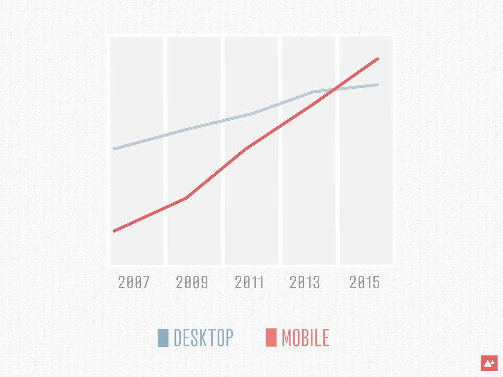
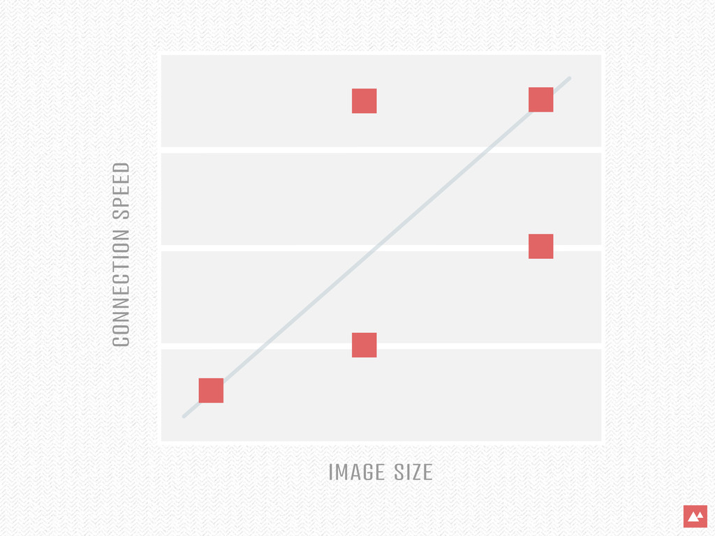
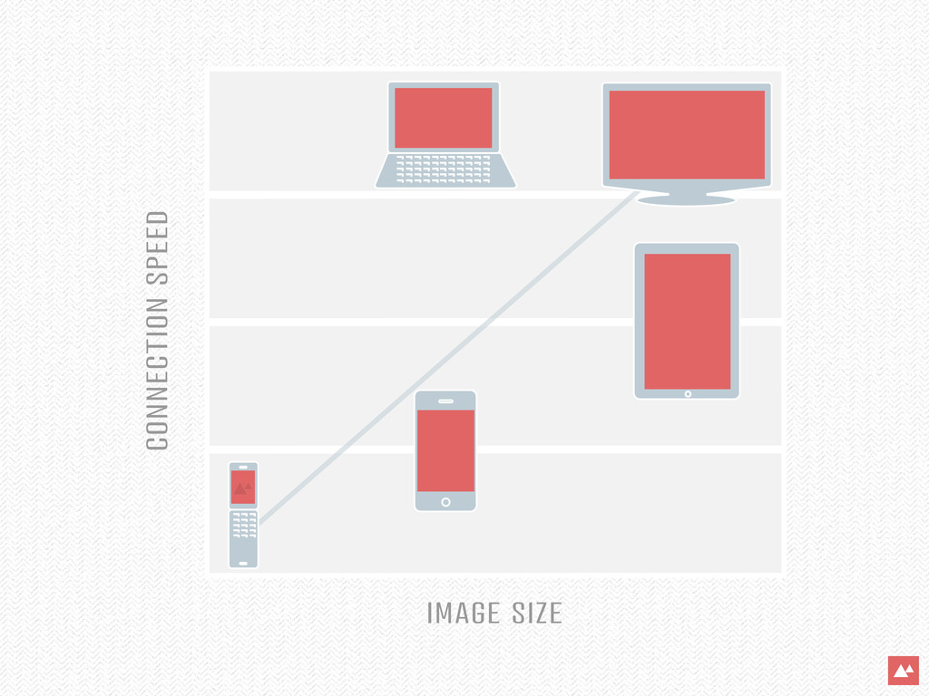
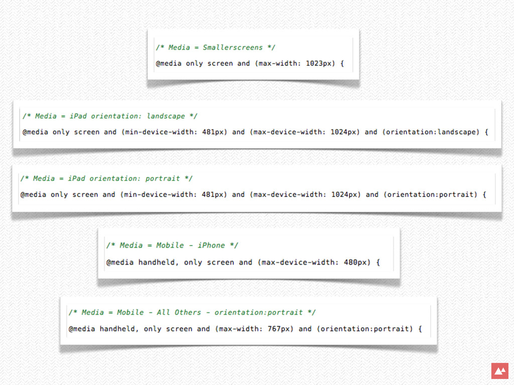
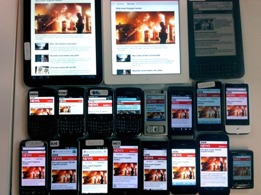
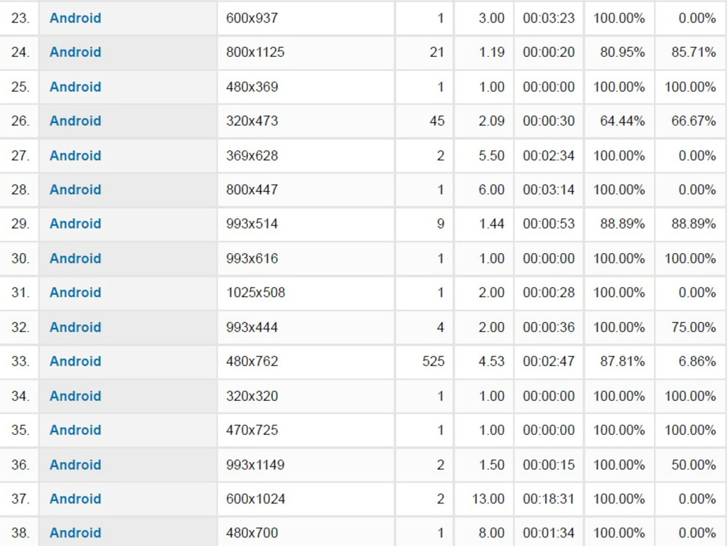
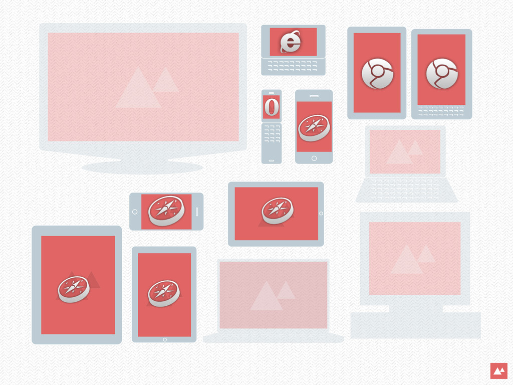
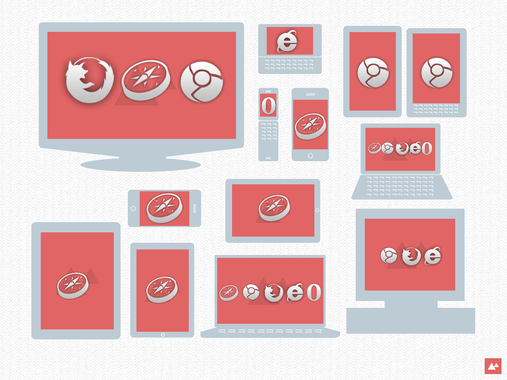
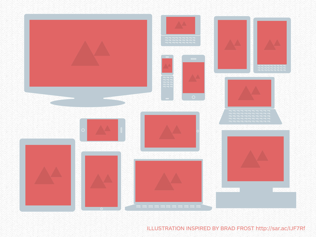
Websites are all about content. People can access your content many different ways and formats with mobile devices, iPads, phones, etc. The questions are: how can we maintain control over the display of our content and keep our brand consistent? How can we try to provide the best user experience on any platform? Enter Responsive Web Design. Many experts are not leaning on one static design but on structured content that adapts to its given environment. In this talk, we are going to take a look at responsive web design techniques out there including: progressive enhancement, flexible grids, media queries, flexible images & video, & other methods of implementation.
 saracannon
 happy_ferret153
 lynteo
 stmn
stmn
 takanorip
 sony
sony
 koyaman
 root_recruit
 diverse
 spring_aki
 mkasumi
 solmetts
 chorkaichan
 thoeni
 eileencodes
 elsirapls
 pwiseman
 addyosmani
 maggiecrowley
 greggifford
 techseoconnect
 stephaniewalter
 jlugia
 kimpetersen