Upgrade to Pro — share decks privately, control downloads, hide ads and more …

Winning proportions and frictionless navigation

Winning proportions and frictionless navigation

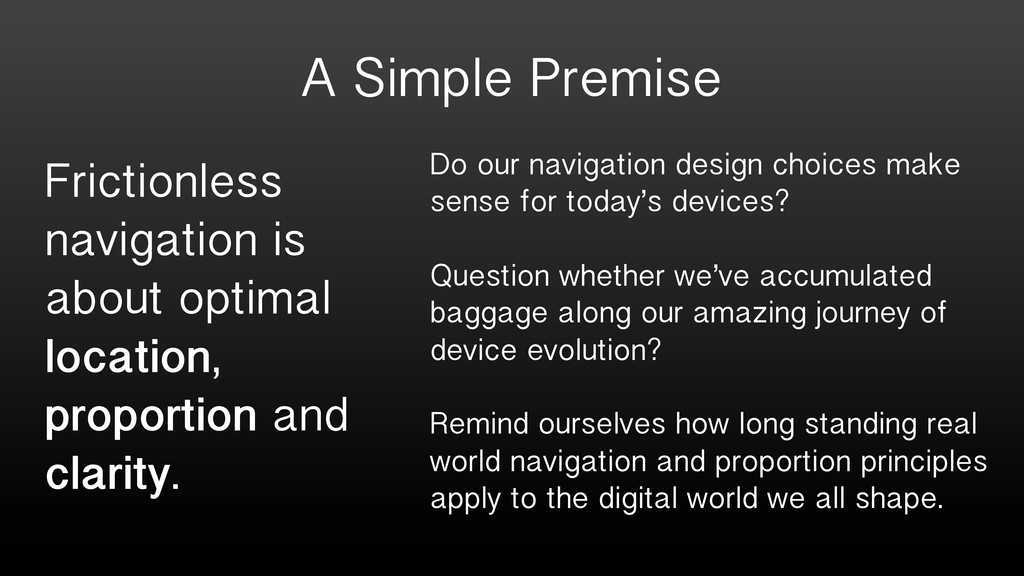
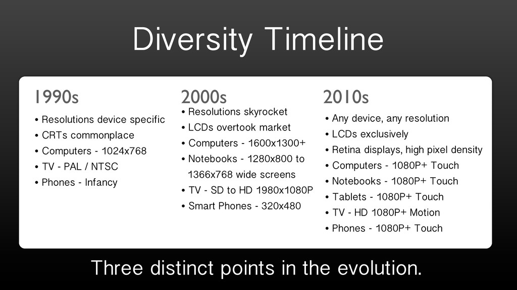
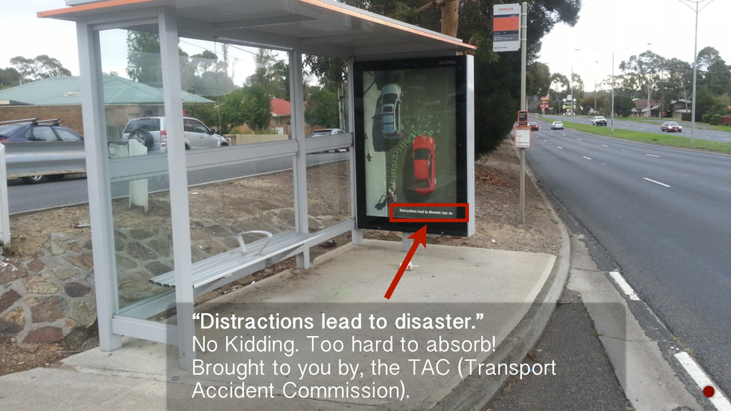
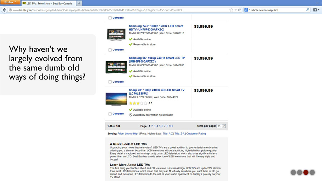
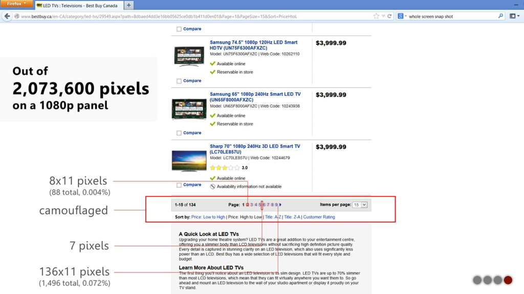
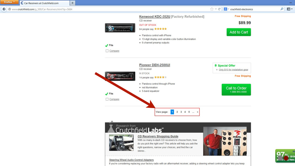
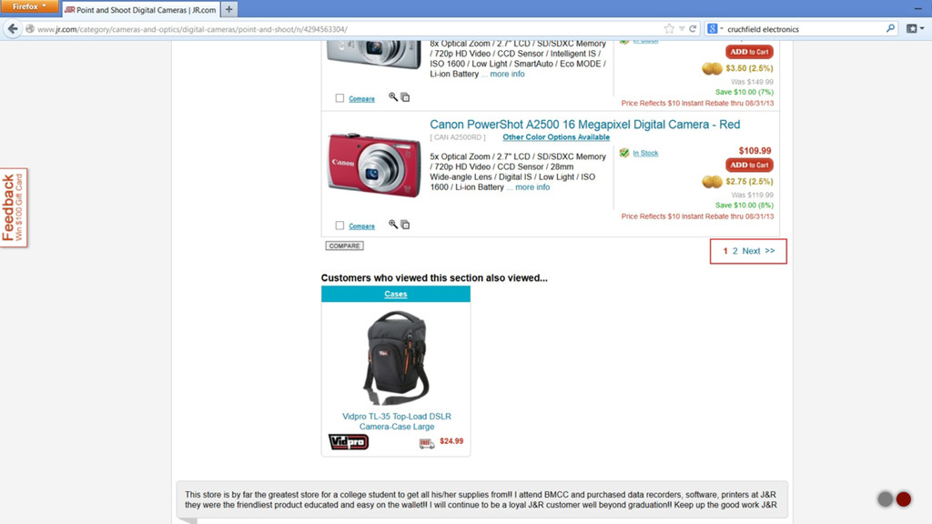
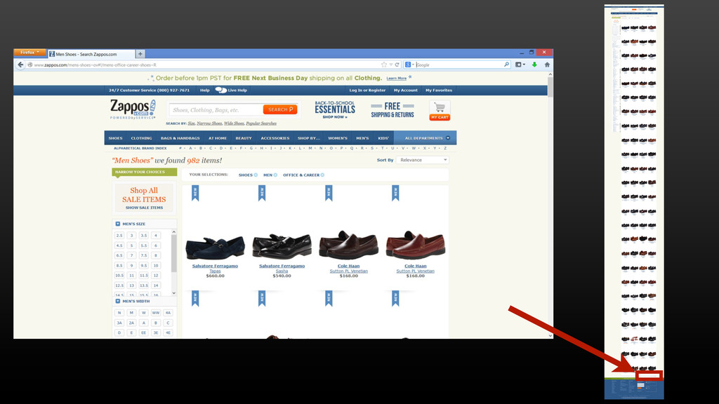
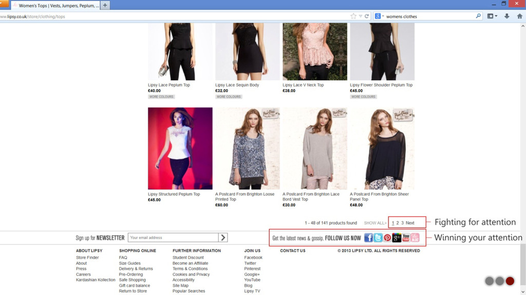
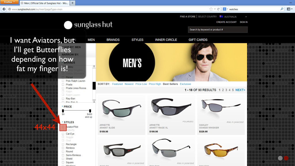
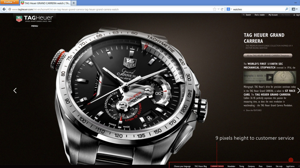
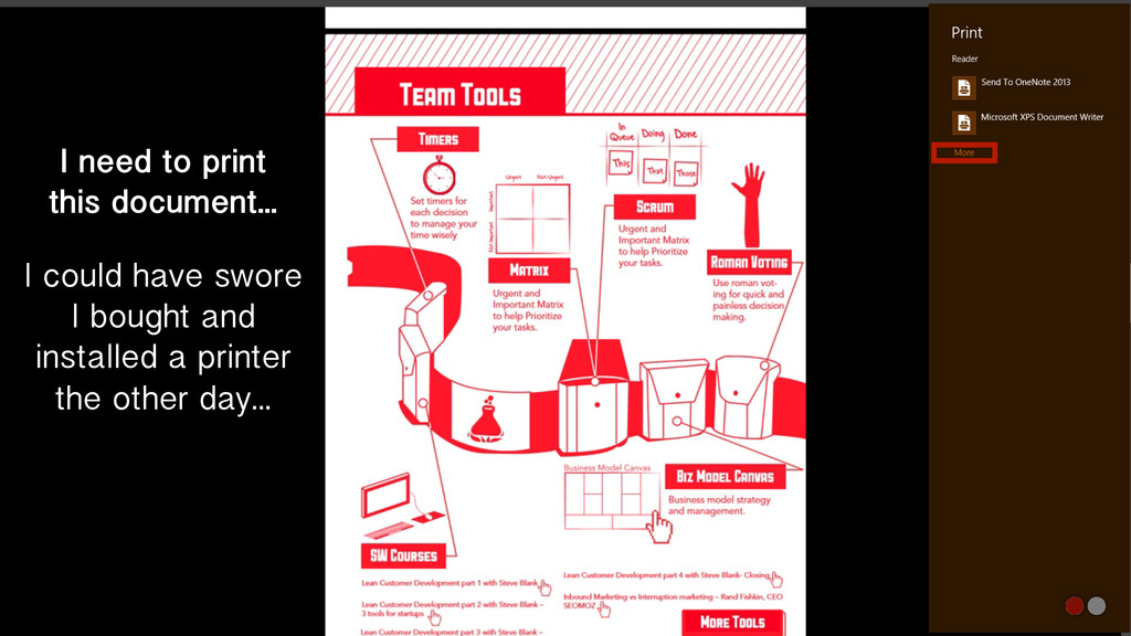
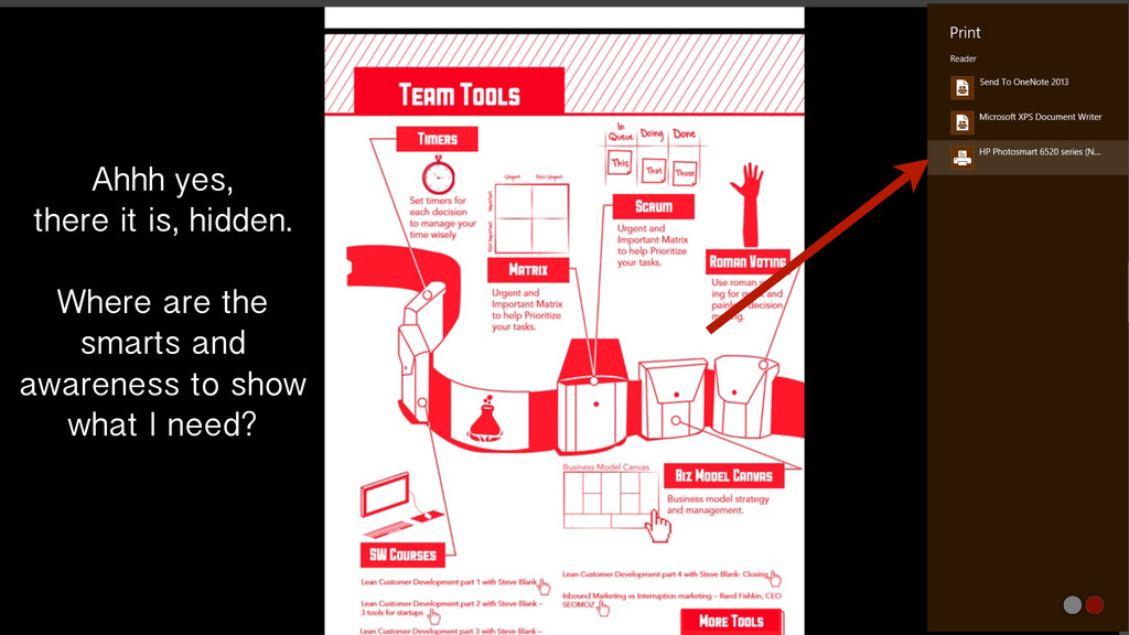
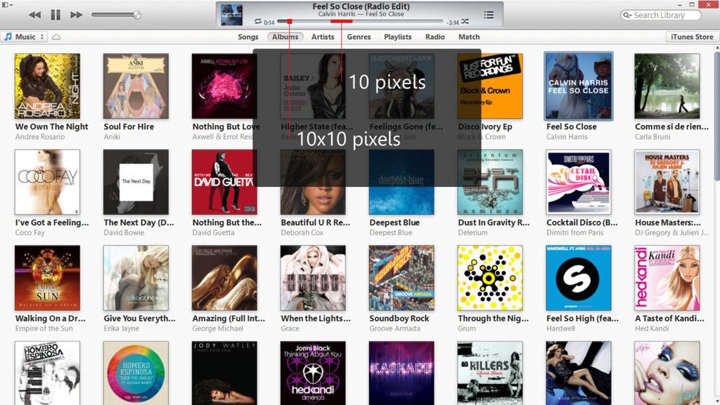
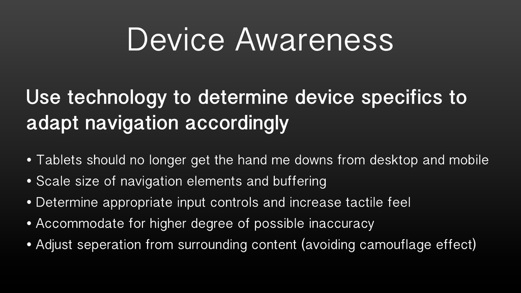
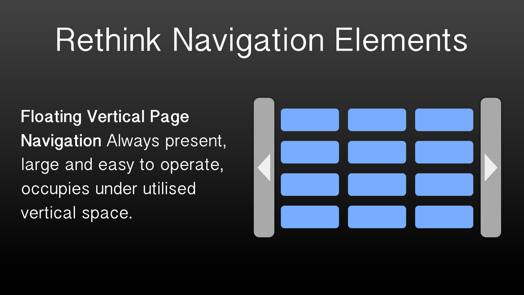
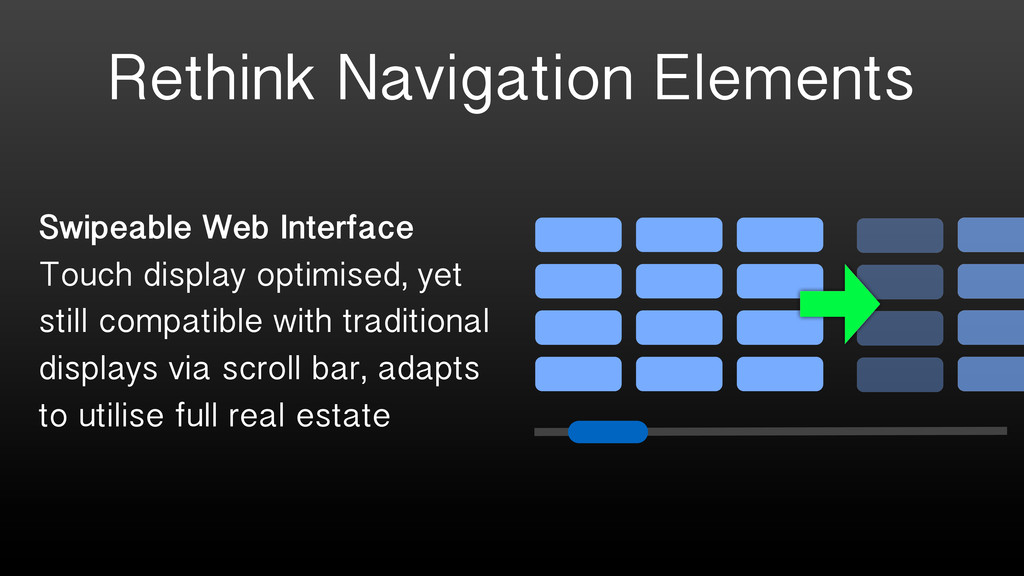
By Jon Deragon at UX Australia 2013. As the complexity of our digital world increases with tremendous variety in screen dimensions, resolutions, dots-per-inch and input methods, appropriate navigation design and use of proportion is more important than ever. Through better balancing of navigation element sizes, use of space, positioning, appropriate iconography and use of responsive design, a more frictionless user experience can be achieved for competitive edge.

uxaustralia

August 29, 2013
Tweet

More Decks by uxaustralia

Other Decks in Technology

Transcript

  1. Winning Proportions and Frictionless Navigation Jon Deragon Director of User

    Experience, Technocrat UX Australia 2013 Conference
  2. A Simple Premise Frictionless navigation is about optimal location, proportion

    and clarity. Do our navigation design choices make sense for today’s devices? Question whether we’ve accumulated baggage along our amazing journey of device evolution? Remind ourselves how long standing real world navigation and proportion principles apply to the digital world we all shape.
  3. Let’s Get Started... Rapid fire look over the next 17

    minutes at real world examples, digital examples symptomatic of legacy device baggage and some proposed solutions.
  4. Diversity Timeline 1990s 2000s 2010s • Resolutions device specific •

    CRTs commonplace • Computers - 1024x768 • TV - PAL / NTSC • Phones - Infancy • Resolutions skyrocket • LCDs overtook market • Computers - 1600x1300+ • Notebooks - 1280x800 to 1366x768 wide screens • TV - SD to HD 1980x1080P • Smart Phones - 320x480 • Any device, any resolution • LCDs exclusively • Retina displays, high pixel density • Computers - 1080P+ Touch • Notebooks - 1080P+ Touch • Tablets - 1080P+ Touch • TV - HD 1080P+ Motion • Phones - 1080P+ Touch Three distinct points in the evolution.
  5. Where We’re At = Samsung Galaxy S4 - 5” Screen

    In Palm of Your Hand Dell XPS 12 - 12” Screen Comfortably In Your Notebook Sleeve Samsung F8000 75” LED TV Sprawling Across Your Living Room Wall = They’re all 1980x1080 and touch or motion enabled!
  6. The Future? (pssstttt, it’s already here) LG Quad HD AH-IPS

    LCD 5.5inch 2560x1440 538ppi Smartphone Display Oculus Rift - Virtual Reality Reboot - 1080P+3D+Motion Tracking Take that, Lawnmower Man!
  7. Promote the positive: You have the potential to win a

    fortune Demote the negative: You have the potential to lose a fortune
  8. Promote the positive: Calcium, Vitamin B, what more could a

    balanced diet want? Demote the negative: Don’t worry about all the unpronounceable chemicals we’ve buried in microprint How can I justify this ridiculous purchase?
  9. Navigation to area’s largest mall and it misses proportion, location

    and clarity. Three strikes and it’s out! In the real world we expect large and easily locatable signage to instruct us where to go.
  10. “Distractions lead to disaster.” No Kidding. Too hard to absorb!

    Brought to you by, the TAC (Transport Accident Commission).
  11. Why? Maybe the product I want to buy is on

    page 2. Why demote and camouflage such critical navigation?
  12. I could have swore I bought and installed a printer

    the other day... I need to print this document...
  13. Ahhh yes, there it is, hidden. Where are the smarts

    and awareness to show what I need?
  14. Use technology to determine device specifics to adapt navigation accordingly

    • Tablets should no longer get the hand me downs from desktop and mobile • Scale size of navigation elements and buffering • Determine appropriate input controls and increase tactile feel • Accommodate for higher degree of possible inaccuracy • Adjust seperation from surrounding content (avoiding camouflage effect) Device Awareness
  15. Rethink Navigation Elements Floating Vertical Page Navigation Always present, large

    and easy to operate, occupies under utilised vertical space.
  16. Rethink Navigation Elements Swipeable Web Interface Touch display optimised, yet

    still compatible with traditional displays via scroll bar, adapts to utilise full real estate
  17. Rethink Navigation Elements User Selectable Navigation Why not allow user

    defined layout and controls via drop- down of pre-configured styles?
  18. Intelligence Around Content Automated Balancing Reveal and hide navigation and

    item selection based on recurrent usage, total objects and prioritise high worth items.
  19. Benefits? • Increased Conversion - Customers get to the products

    they’re seeking without impedance • Decreased Bounce Rates - Site becomes more accessible with less effort required • Improved Stickiness - Discovery and digestion of more content and desire to come back for more • Competitive Edge - Do what your competitors are still catching up on, gain a point of difference.
  20. Final Word It’s just too easy to adopt from previous

    generations, with a bit of rethinking and some application of technology we can reap the benefits of smarter navigation. Responsive design is great but ensuring the individual navigation elements within those designs intelligently adapt to devices and context is crucial.
  21. Many Thanks Jon Deragon Director of User Experience, Technocrat In-person

    Email LinkedIn Grab me during the conference [email protected] www.linkedin.com/in/jonderagon