Upgrade to Pro — share decks privately, control downloads, hide ads and more …

Increase Your Product Quality Through Accessibility

Increase Your Product Quality Through Accessibility

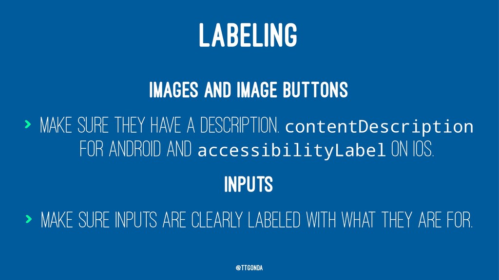
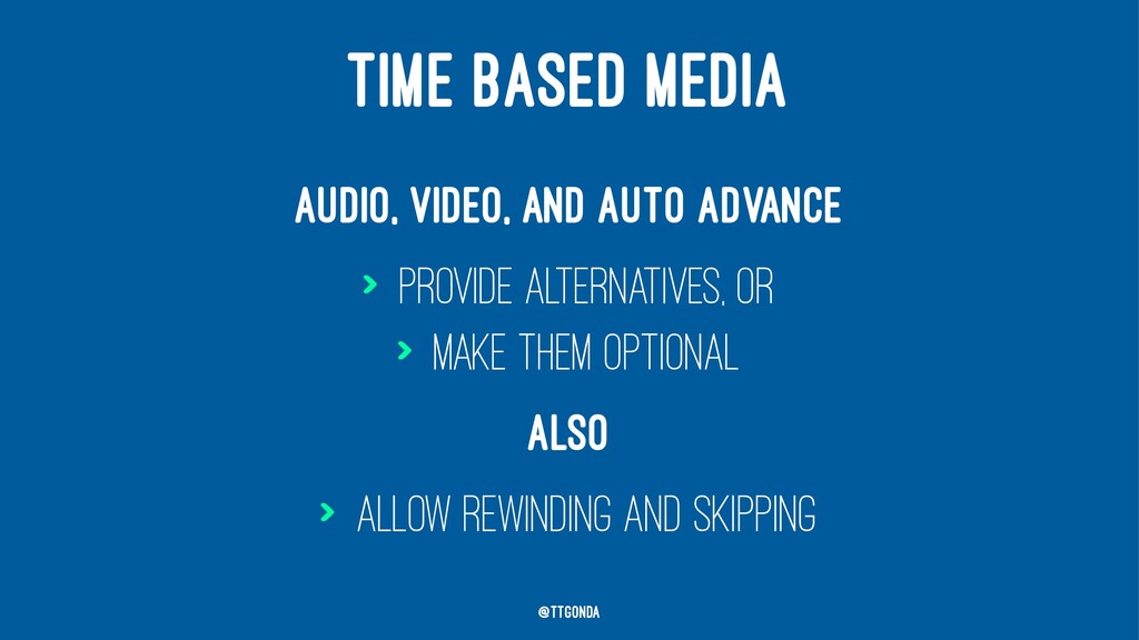
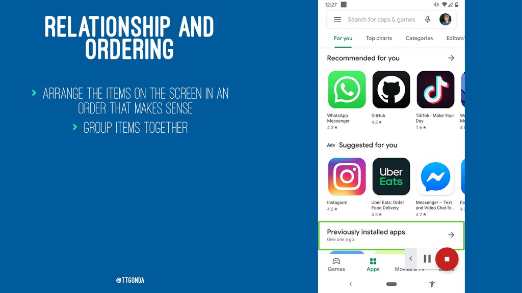
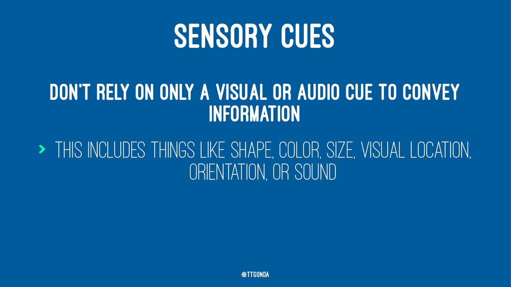
Making your app accessible for everyone is more than a “nice thing to do” It also increases the quality of your app. Products that keep accessibility in mind are more flexible and easier to use. It’s up to us to direct this step. In this talk, you’ll learn about some of the things you can do to make your app more accessible, and how it makes your product stronger. You’ll walk away with the tools you need to detect accessibility issues, increase the usability of your app, and prevent regressions.

Victoria Gonda

May 22, 2020
Tweet

More Decks by Victoria Gonda

Other Decks in Programming

Transcript

  1. MAKES A BETTER PRODUCT A PRODUCT THAT IS CREATED WITH

    ACCESSIBILITY IN MIND PROVIDES A BETTER EXPERIENCE FOR EVERYONE. @TTGonda
  2. WIDER AUDIENCE 1 IN 4 ADULTS IN THE US HAVE

    SOME TYPE OF DISABILITY @TTGonda
  3. TREAT YOUR USERS WITH CARE LET’S CHANGE THE NARRATIVE “HEROIC

    DISABLED PERSON OVERCOMES OBSTACLES” TO “SOCIETY IS INCLUSIVE, ALL CAN SUCCEED.” - HABEN GIRMA @TTGonda
  4. LABELING Images and image buttons > Make sure they have

    a description. contentDescription for Android and accessibilityLabel on iOS. Inputs > Make sure inputs are clearly labeled with what they are for. @TTGonda
  5. TIME BASED MEDIA Audio, video, and auto advance > Provide

    alternatives, or > Make them optional @TTGonda
  6. TIME BASED MEDIA Audio, video, and auto advance > Provide

    alternatives, or > Make them optional Also > Allow rewinding and skipping @TTGonda
  7. RELATIONSHIP AND ORDERING > Arrange the items on the screen

    in an order that makes sense > Group items together @TTGonda
  8. SENSORY CUES Don't rely on only a visual or audio

    cue to convey information > This includes things like shape, color, size, visual location, orientation, or sound @TTGonda
  9. ORIENTATION Allow both portrait and landscape > Yes, this might

    mean designing for both screen layouts @TTGonda
  10. COLOR Color contrast > Make sure you have adequate color

    contrast on words and buttons @TTGonda
  11. COLOR Color contrast > Make sure you have adequate color

    contrast on words and buttons Conveying information > Don't use color for the only visual means of conveying information @TTGonda
  12. FONT AND DISPLAY SIZE > Your app should still be

    usable with large sizes @TTGonda
  13. NAVIGATION > Can everything be reached using a screen reader?

    > Does the order make sense? > And is the meaning clear? @TTGonda
  14. TIMING Give users enough time to complete a task Allow

    extending time if needed, or don't put time limits at all @TTGonda
  15. GESTURES AND POINTERS Multi-touch gesture actions should be accessible via

    a single touch And you should be able to back out of single touch ones, too @TTGonda
  16. ROBUST "CONTENT MUST BE ROBUST ENOUGH THAT IT CAN BE

    INTERPRETED BY BY A WIDE VARIETY OF USER AGENTS, INCLUDING ASSISTIVE TECHNOLOGIES." @TTGonda
  17. WORD CLOUD: WHAT THINGS CAN YOU REMEMBER TO LOOK FOR

    TO KEEP YOUR APP ACCESSIBLE? @TTGonda