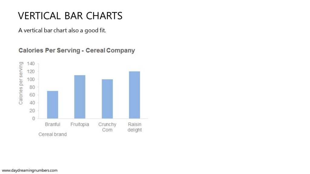
most commonly used charts. Let's assume you are a cereal company and you sell 6 brands of cereals. In this series we will see how to use Bar Charts to impress your boss, your customers and also to draw some cool insights from data. Your customers wonder how many calories are in per serving of your cereal brands. They obviously want to compare and pick their favorite cereal. You want to create a chart to show this data to your customers. So what should this chart do? www.daydreamingnumbers.com
you sell 6 brands of cereals. In this series we will see how to use Bar Charts to impress your boss, your customers and also to draw some cool insights from data. Your customers wonder how many calories are in per serving of your cereal brands. They obviously want to compare and pick their favorite cereal. You want to create a chart to show this data to your customers. So what should this chart do? The chart should show the number of calories per serving for each of the cereal brands. It should also allow comparison between individual brands. So let's start with a simple bar chart. www.daydreamingnumbers.com
you sell 6 brands of cereals. In this series we will see how to use Bar Charts to impress your boss, your customers and also to draw some cool insights from data. Your customers wonder how much calories are in per serving of your cereal brands. They obviously want to compare and pick their favorite cereal. You want to create a chart to show this data to your customers. So what should this chart do? The chart should show the number of calories per serving for each of the cereal brands. It should also allow comparison between individual brands. So let's start with a simple bar chart. If you are not sure which chart to use, start with a bar chart. Most of the time bar charts will be an excellent choice to visualize your dataset. www.daydreamingnumbers.com
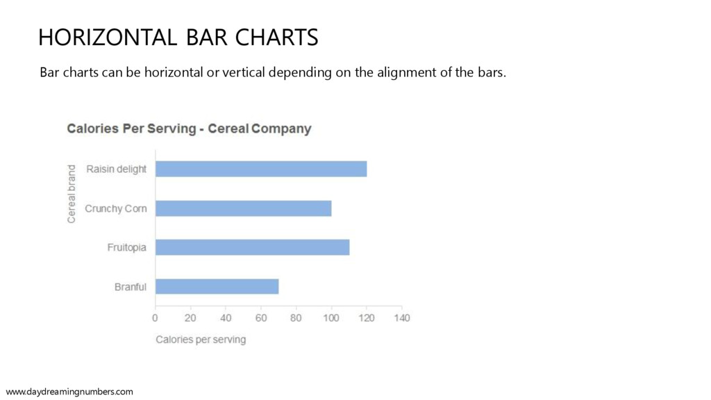
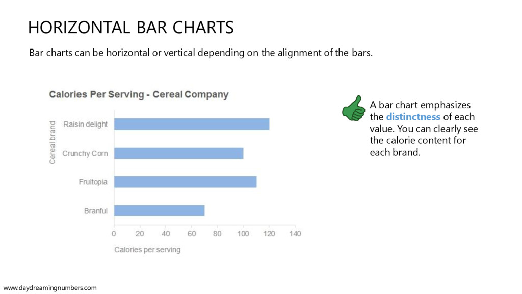
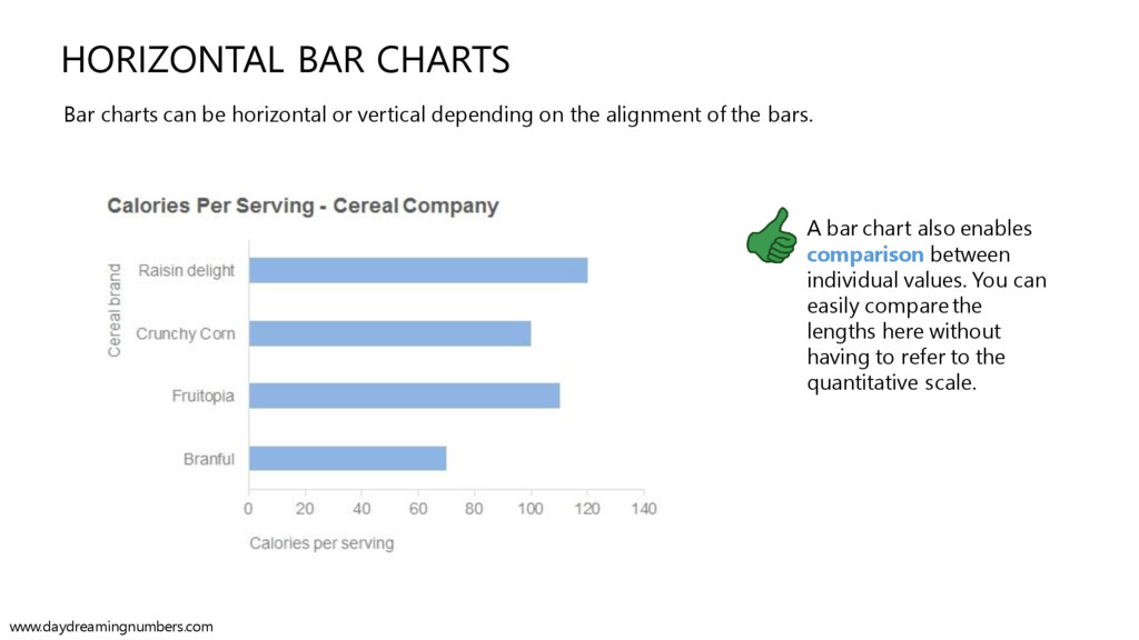
alignment of the bars. HORIZONTAL BAR CHARTS A bar chart emphasizes the distinctness of each value. You can clearly see the calorie content for each brand. www.daydreamingnumbers.com
alignment of the bars. HORIZONTAL BAR CHARTS A bar chart also enables comparison between individual values. You can easily compare the lengths here without having to refer to the quantitative scale. www.daydreamingnumbers.com
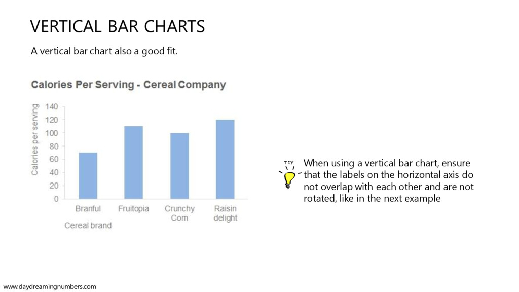
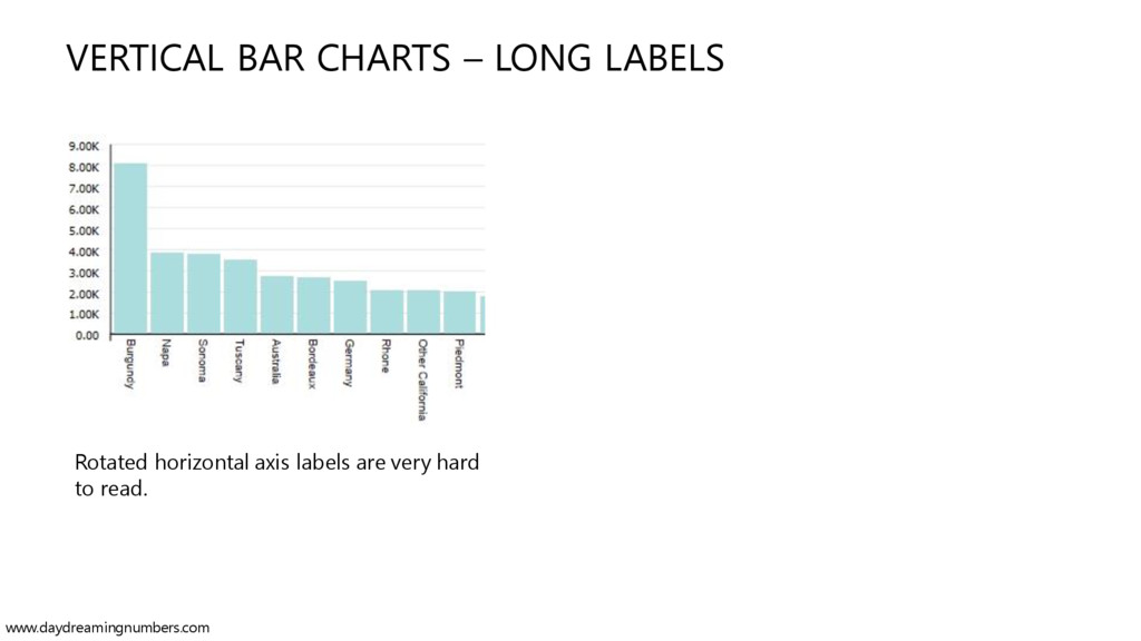
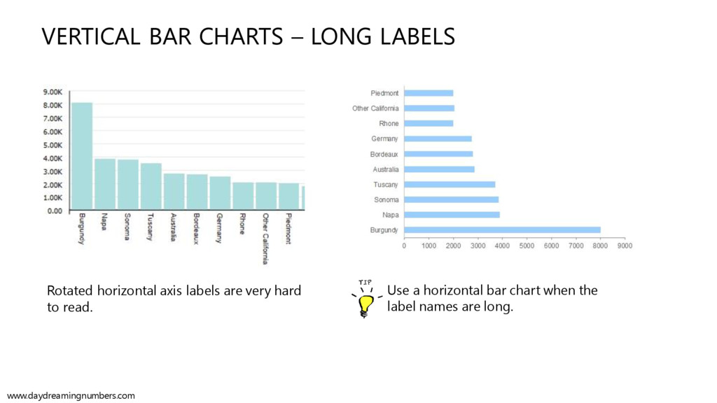
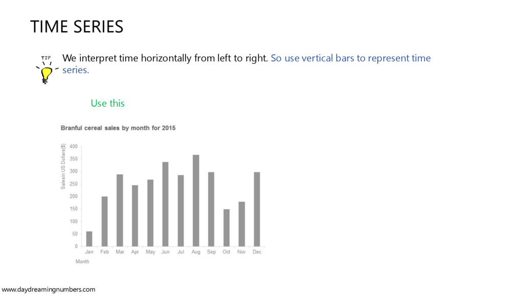
fit. When using a vertical bar chart, ensure that the labels on the horizontal axis do not overlap with each other and are not rotated, like in the next example www.daydreamingnumbers.com
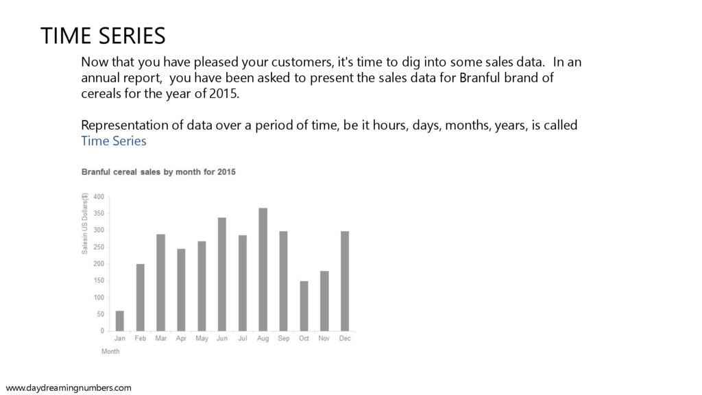
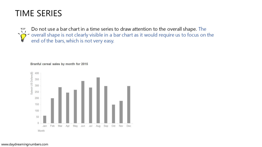
customers, it's time to dig into some sales data. In an annual report, you have been asked to present the sales data for Branful brand of cereals for the year of 2015. www.daydreamingnumbers.com
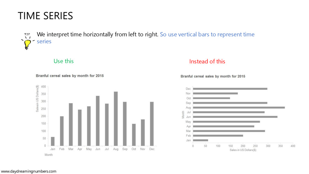
time to dig into some sales data. In an annual report, you have been asked to present the sales data for Branful brand of cereals for the year of 2015. Representation of data over a period of time, be it hours, days, months, years, is called Time Series www.daydreamingnumbers.com
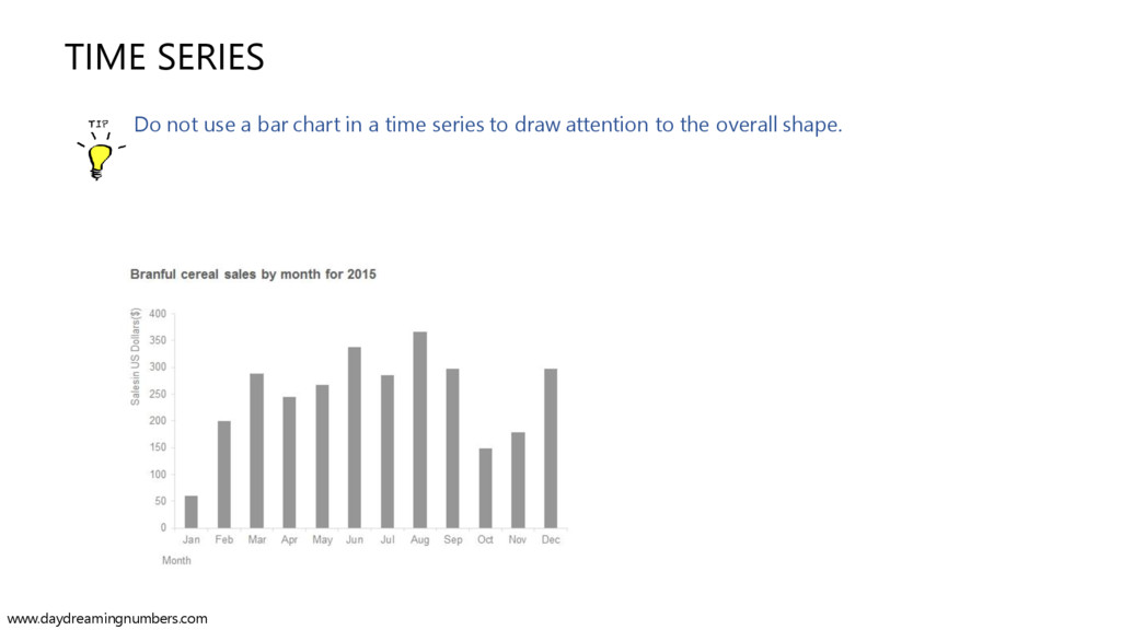
time series to draw attention to the overall shape. The overall shape is not clearly visible in a bar chart as it would require us to focus on the end of the bars, which is not very easy. www.daydreamingnumbers.com
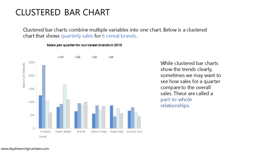
charts can be used for the simplest of visuals, they can also be used to show and compare multiple variables. Suppose your company wants to understand where and when to utilize the promotional budget based on the past quarterly sales. www.daydreamingnumbers.com
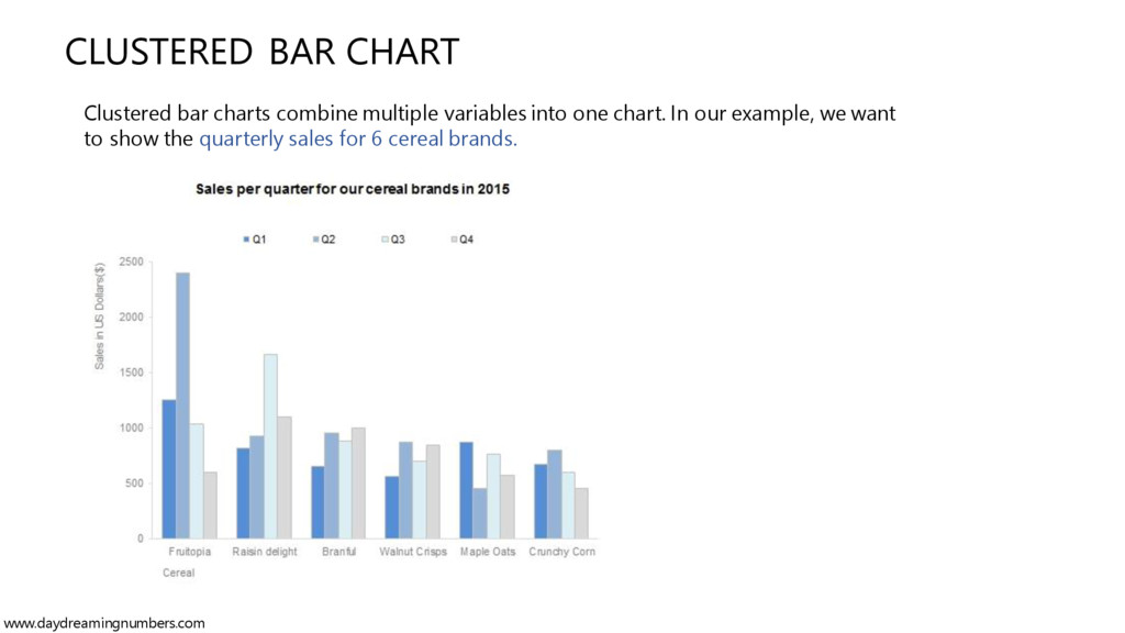
charts can be used for the simplest of visuals, they can also be used to show and compare multiple variables. Suppose your company wants to understand where and when to utilize the promotional budget. You set to work on the quarterly sales data for each cereal brand. There are multiple ways to visualize the quarterly sales data using bar charts. Let's start with the basic one, a clustered bar chart www.daydreamingnumbers.com
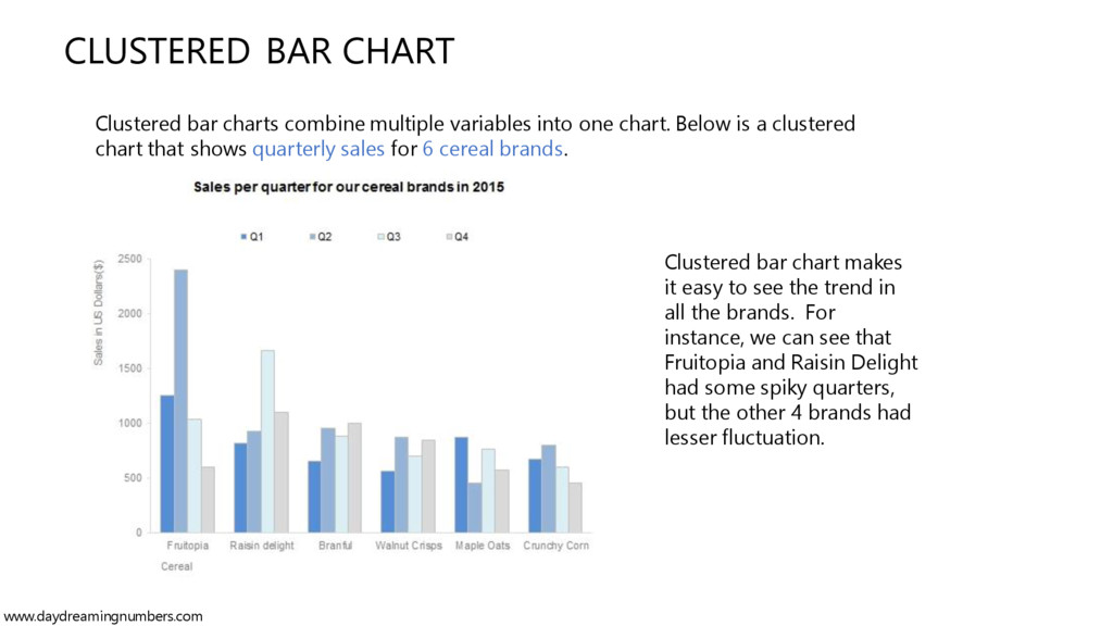
see the trend in all the brands. For instance, we can see that Fruitopia and Raisin Delight had some spiky quarters, but the other 4 brands had lesser fluctuation. Clustered bar charts combine multiple variables into one chart. Below is a clustered chart that shows quarterly sales for 6 cereal brands. www.daydreamingnumbers.com
clearly, sometimes we may want to see how sales for a quarter compare to the overall sales. These are called a part-to-whole relationships. Clustered bar charts combine multiple variables into one chart. Below is a clustered chart that shows quarterly sales for 6 cereal brands. www.daydreamingnumbers.com
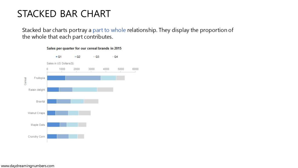
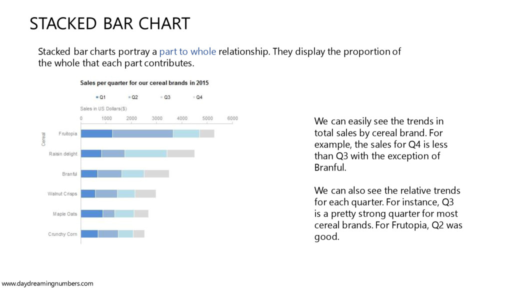
whole relationship. They display the proportion of the whole that each part contributes. We can easily see the trends in total sales by cereal brand. For example, the sales for Q4 is less than Q3 with the exception of Branful. We can also see the relative trends for each quarter. For instance, Q3 is a pretty strong quarter for most cereal brands. For Frutopia, Q2 was good. www.daydreamingnumbers.com
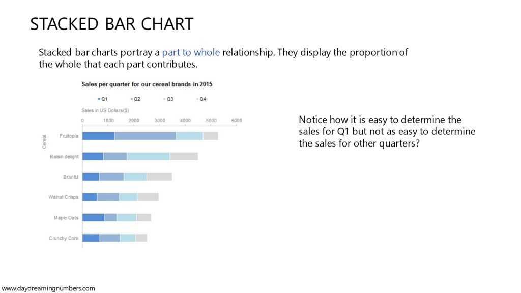
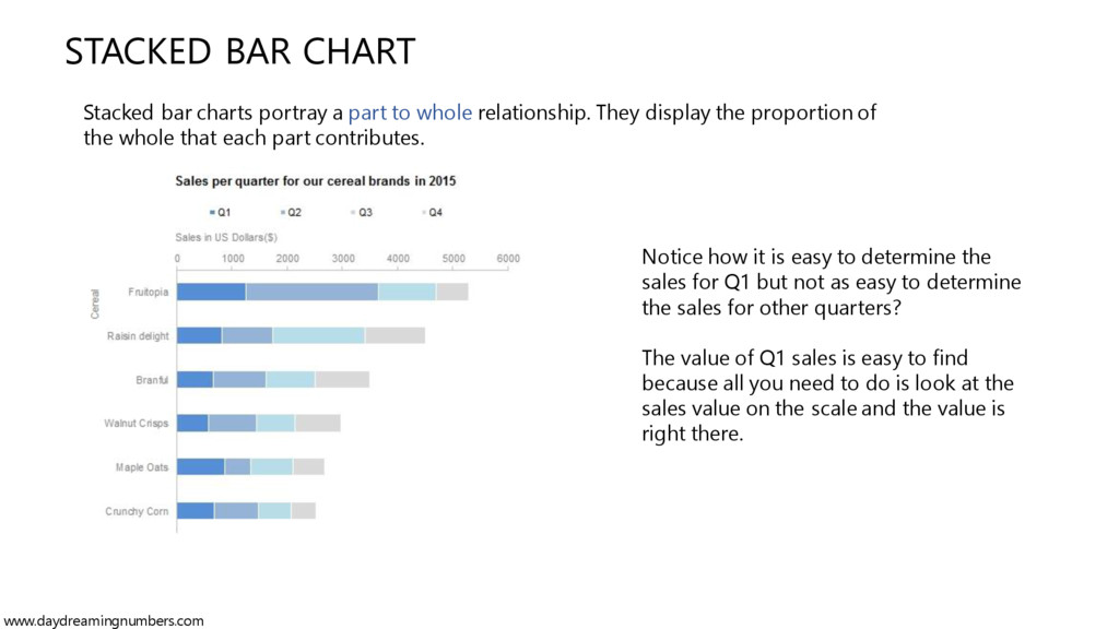
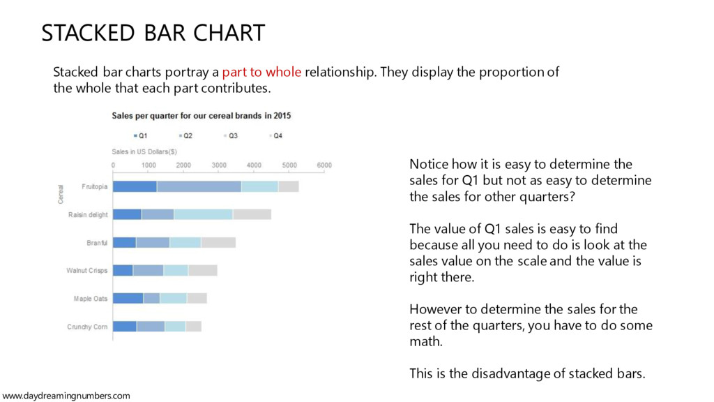
whole relationship. They display the proportion of the whole that each part contributes. Notice how it is easy to determine the sales for Q1 but not as easy to determine the sales for other quarters? www.daydreamingnumbers.com
whole relationship. They display the proportion of the whole that each part contributes. Notice how it is easy to determine the sales for Q1 but not as easy to determine the sales for other quarters? The value of Q1 sales is easy to find because all you need to do is look at the sales value on the scale and the value is right there. www.daydreamingnumbers.com
whole relationship. They display the proportion of the whole that each part contributes. Notice how it is easy to determine the sales for Q1 but not as easy to determine the sales for other quarters? The value of Q1 sales is easy to find because all you need to do is look at the sales value on the scale and the value is right there. However to determine the sales for the rest of the quarters, you have to do some math. This is the disadvantage of stacked bars. www.daydreamingnumbers.com
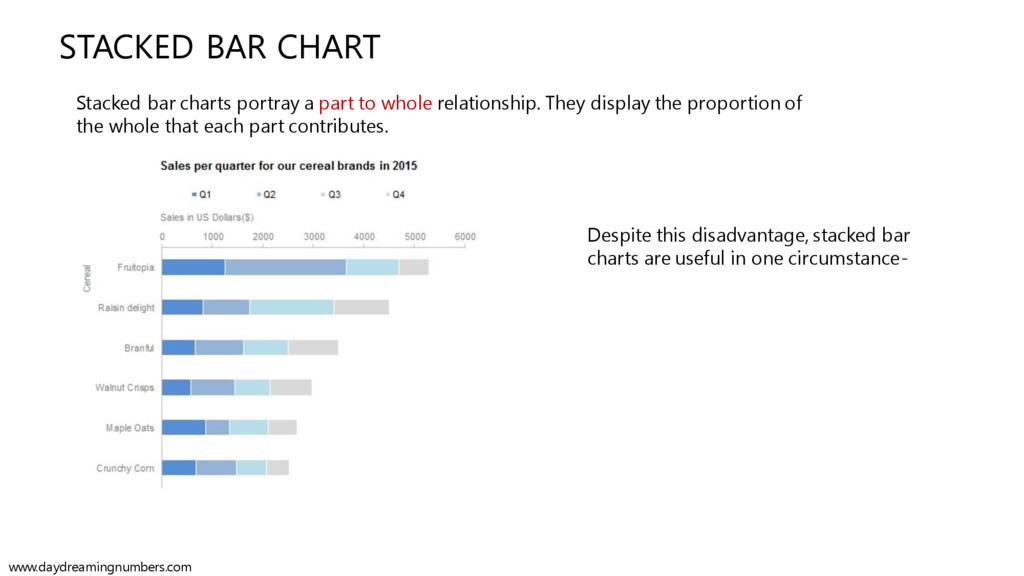
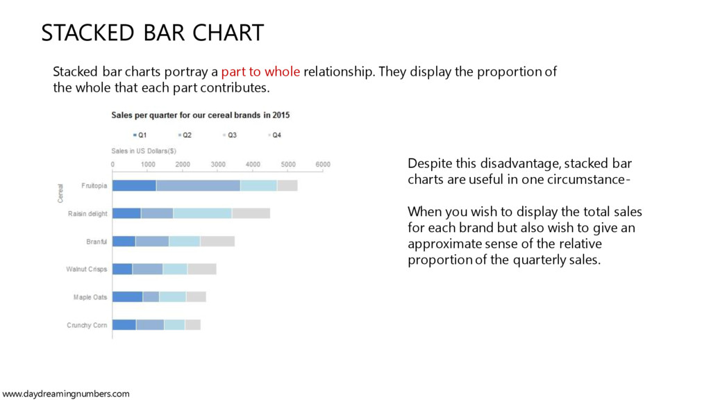
whole relationship. They display the proportion of the whole that each part contributes. Despite this disadvantage, stacked bar charts are useful in one circumstance- www.daydreamingnumbers.com
whole relationship. They display the proportion of the whole that each part contributes. Despite this disadvantage, stacked bar charts are useful in one circumstance- When you wish to display the total sales for each brand but also wish to give an approximate sense of the relative proportion of the quarterly sales. www.daydreamingnumbers.com
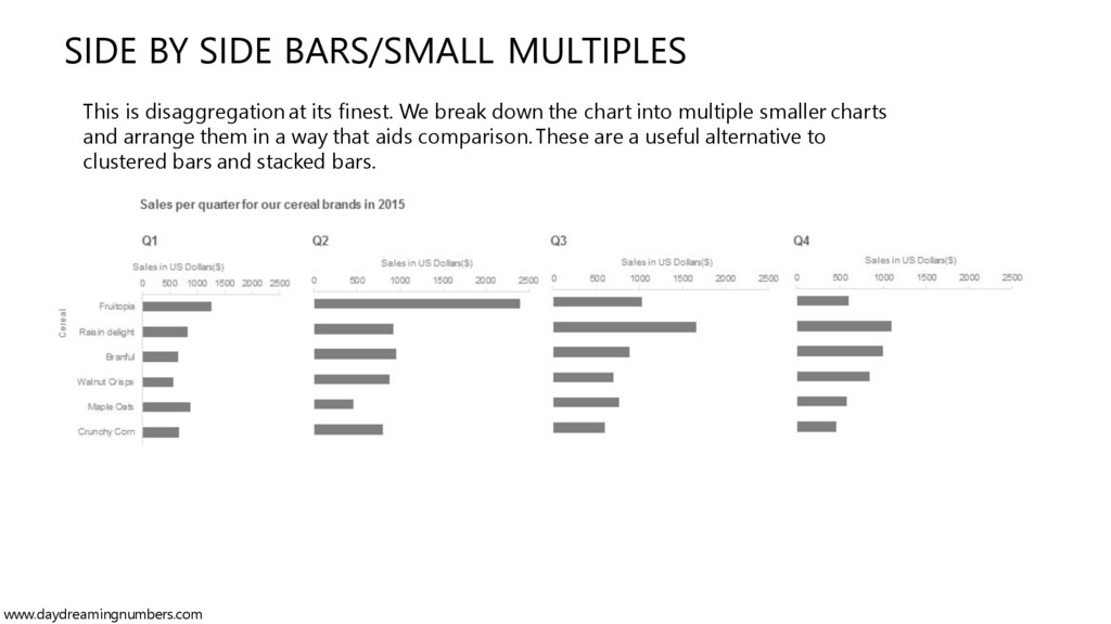
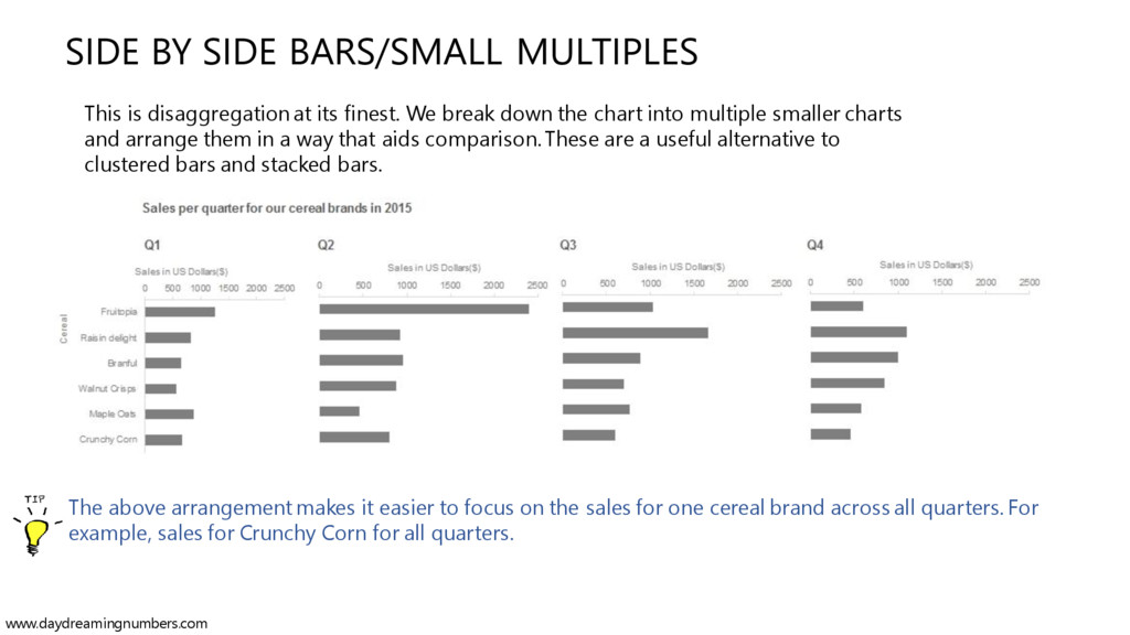
finest. We break down the chart into multiple smaller charts and arrange them in a way that aids comparison. These are a useful alternative to clustered bars and stacked bars. www.daydreamingnumbers.com
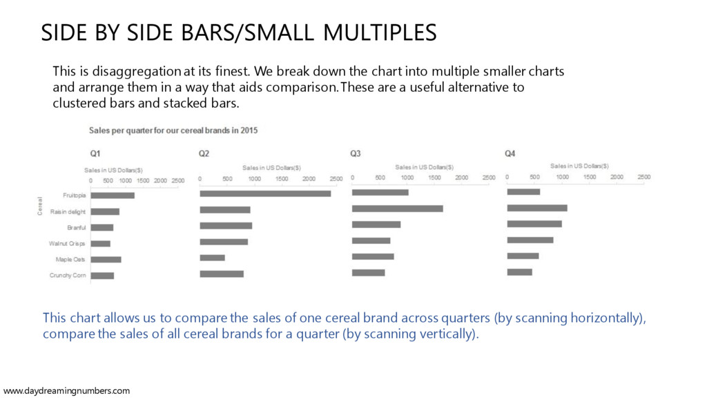
finest. We break down the chart into multiple smaller charts and arrange them in a way that aids comparison.These are a useful alternative to clustered bars and stacked bars. This chart allows us to compare the sales of one cereal brand across quarters (by scanning horizontally), compare the sales of all cereal brands for a quarter (by scanning vertically). www.daydreamingnumbers.com
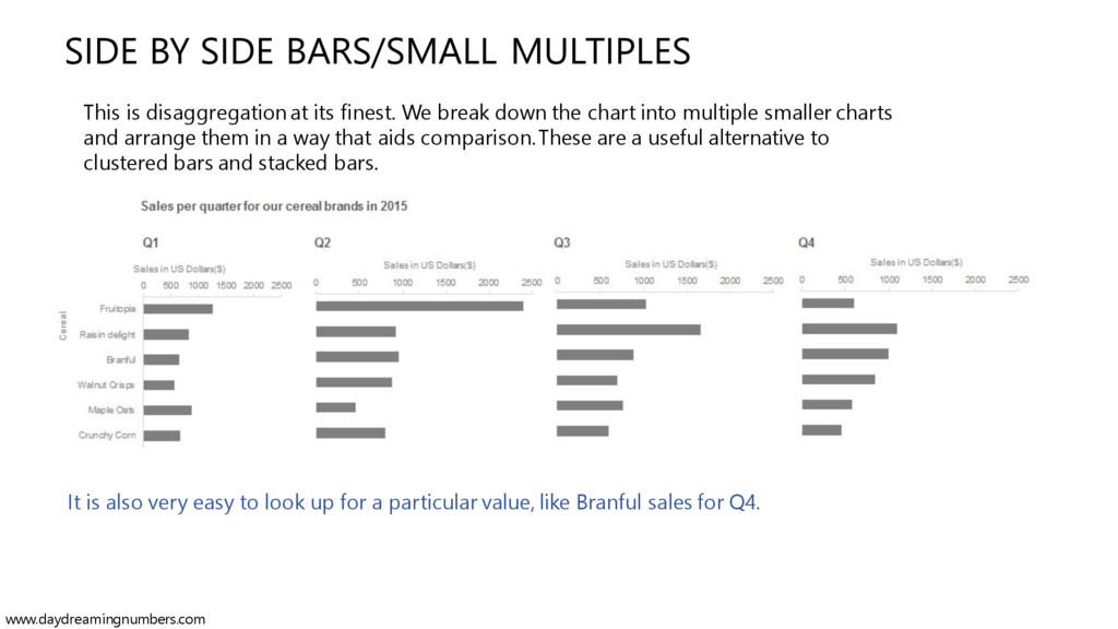
finest. We break down the chart into multiple smaller charts and arrange them in a way that aids comparison.These are a useful alternative to clustered bars and stacked bars. It is also very easy to look up for a particular value, like Branful sales for Q4. www.daydreamingnumbers.com
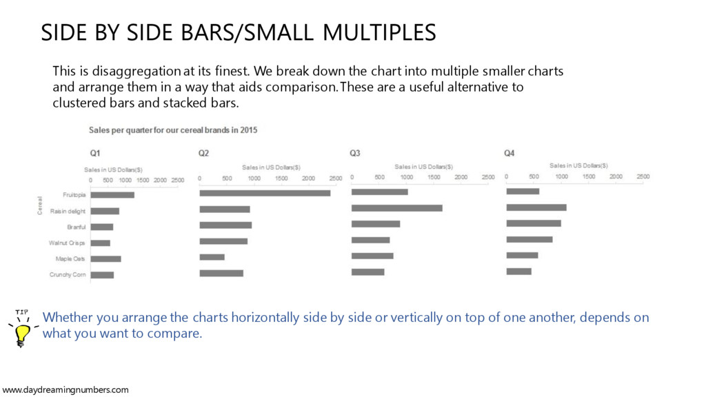
finest. We break down the chart into multiple smaller charts and arrange them in a way that aids comparison.These are a useful alternative to clustered bars and stacked bars. Whether you arrange the charts horizontally side by side or vertically on top of one another, depends on what you want to compare. www.daydreamingnumbers.com
finest. We break down the chart into multiple smaller charts and arrange them in a way that aids comparison. These are a useful alternative to clustered bars and stacked bars. The above arrangement makes it easier to focus on the sales for one cereal brand across all quarters. For example, sales for Crunchy Corn for all quarters. www.daydreamingnumbers.com
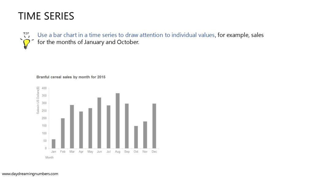
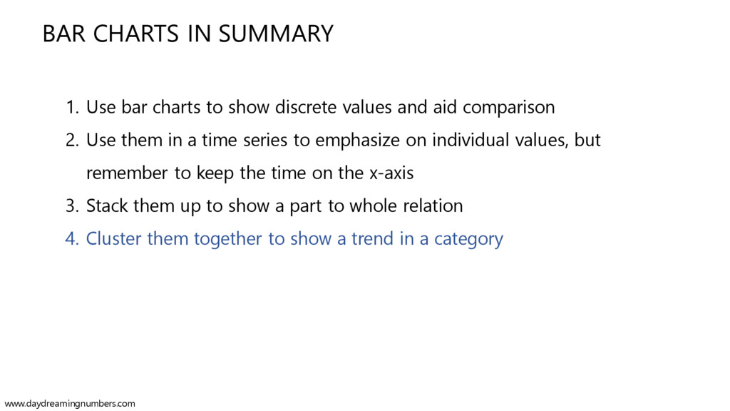
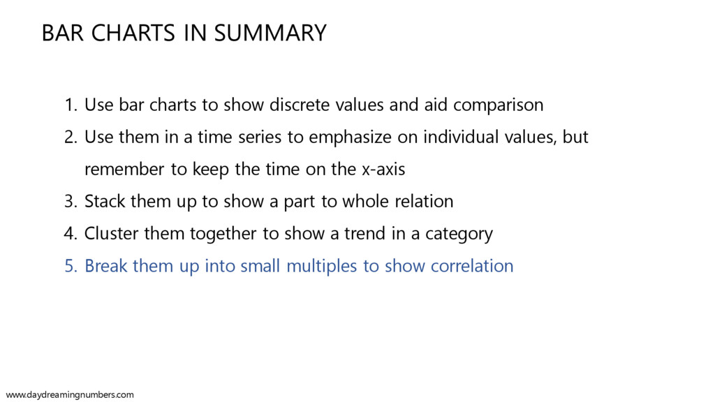
discrete values and aid comparison 2. Use them in a time series to emphasize on individual values, but remember to keep the time on the x-axis www.daydreamingnumbers.com
discrete values and aid comparison 2. Use them in a time series to emphasize on individual values, but remember to keep the time on the x-axis 3. Stack them up to show a part to whole relation www.daydreamingnumbers.com
discrete values and aid comparison 2. Use them in a time series to emphasize on individual values, but remember to keep the time on the x-axis 3. Stack them up to show a part to whole relation 4. Cluster them together to show a trend in a category www.daydreamingnumbers.com
discrete values and aid comparison 2. Use them in a time series to emphasize on individual values, but remember to keep the time on the x-axis 3. Stack them up to show a part to whole relation 4. Cluster them together to show a trend in a category 5. Break them up into small multiples to show correlation www.daydreamingnumbers.com