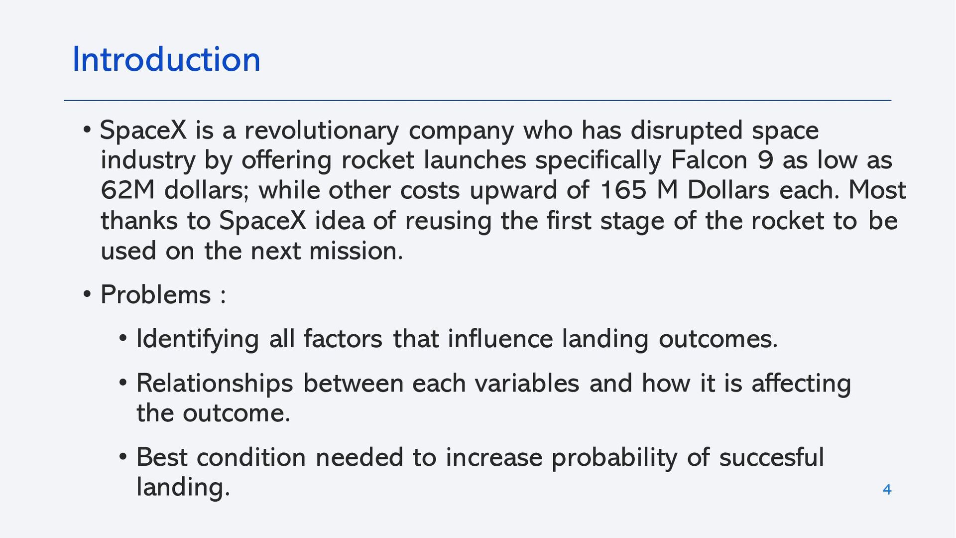
SpaceX is a revolutionary company who has disrupted space industry by offering rocket launches specifically Falcon 9 as low as 62M dollars; while other costs upward of 165 M Dollars each. Most thanks to SpaceX idea of reusing the first stage of the rocket to be used on the next mission.
• Problems :
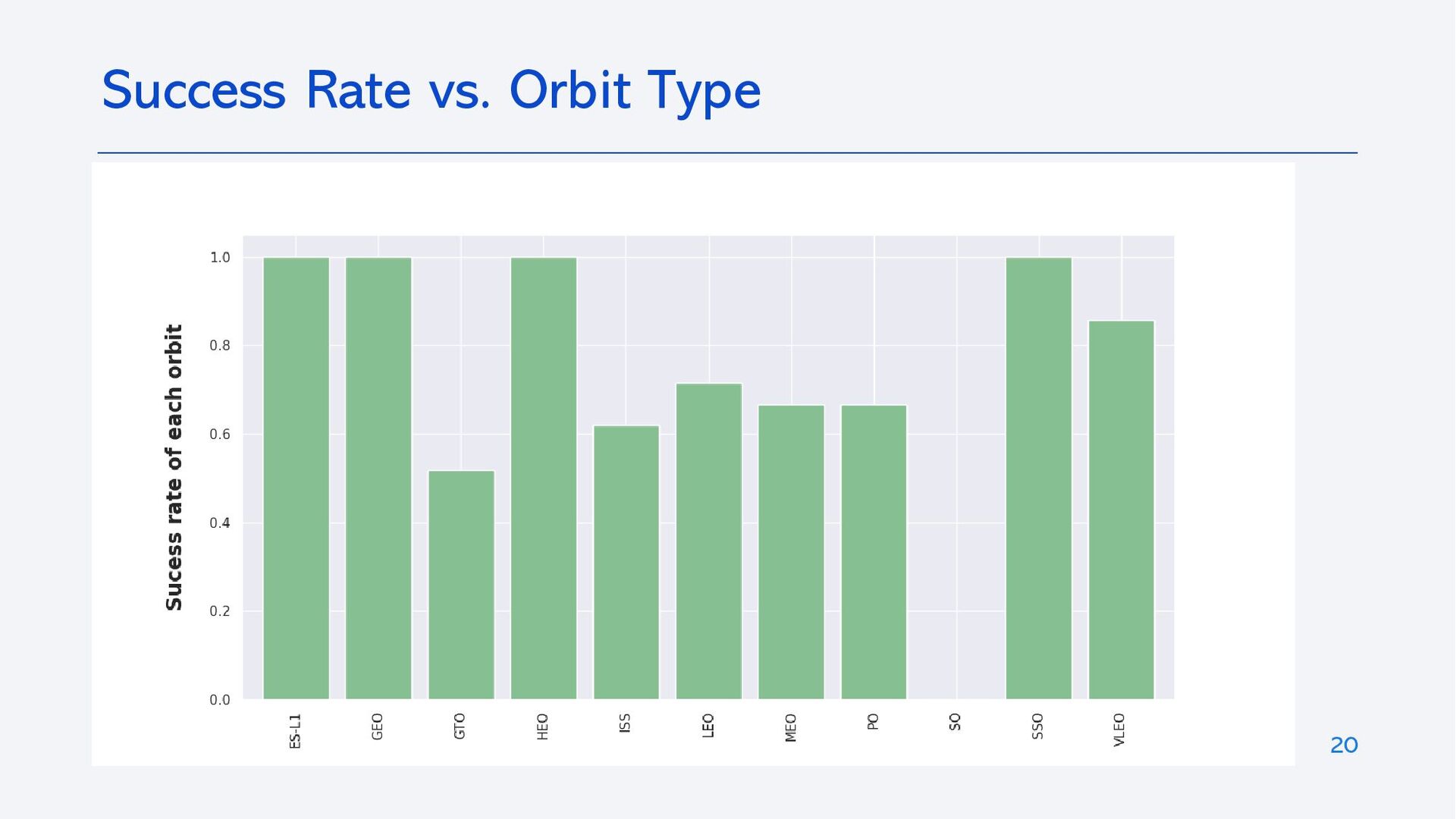
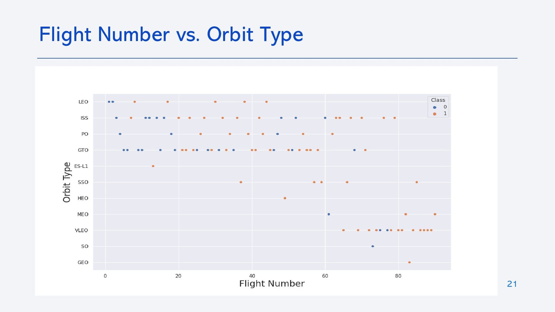
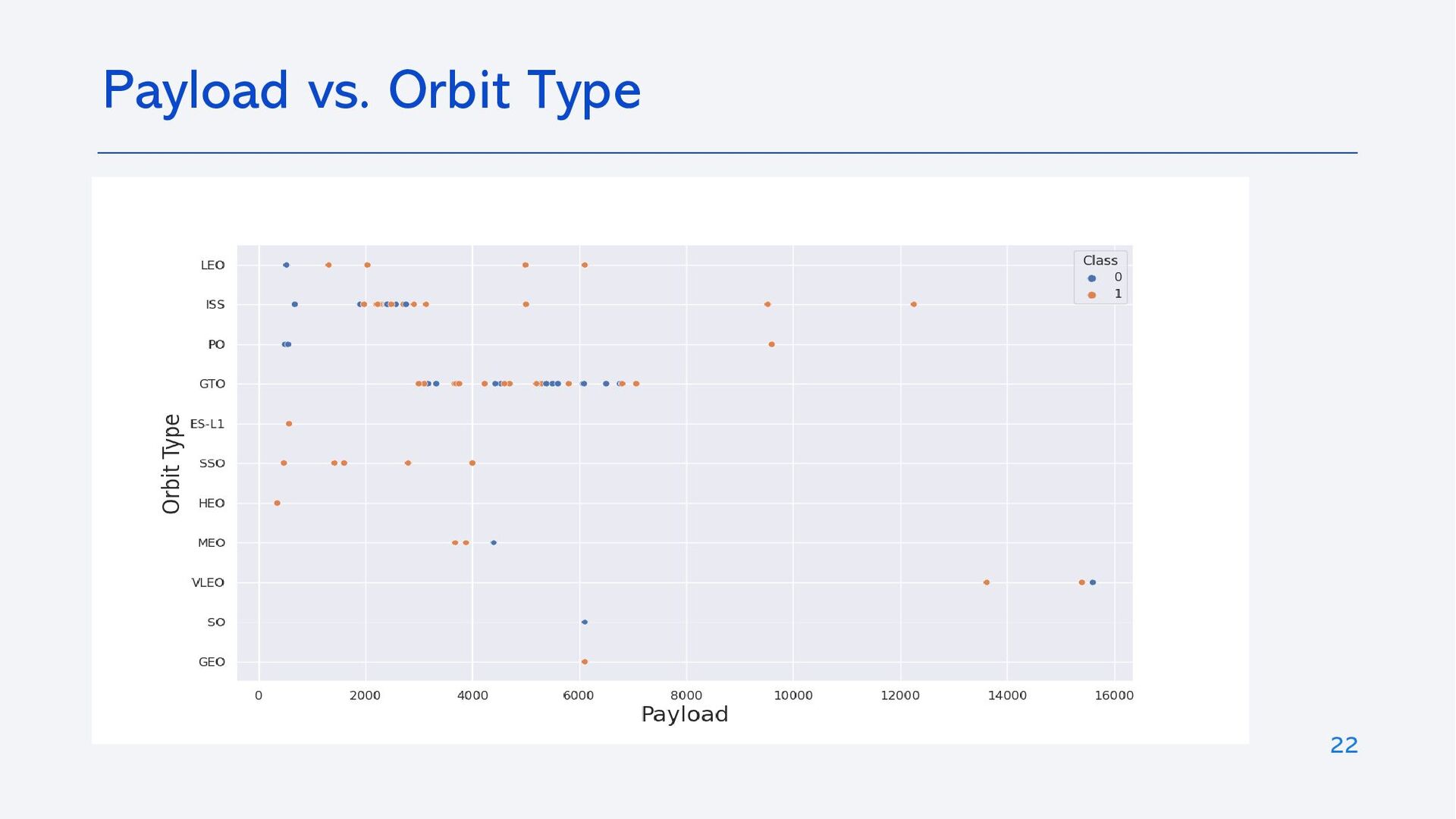
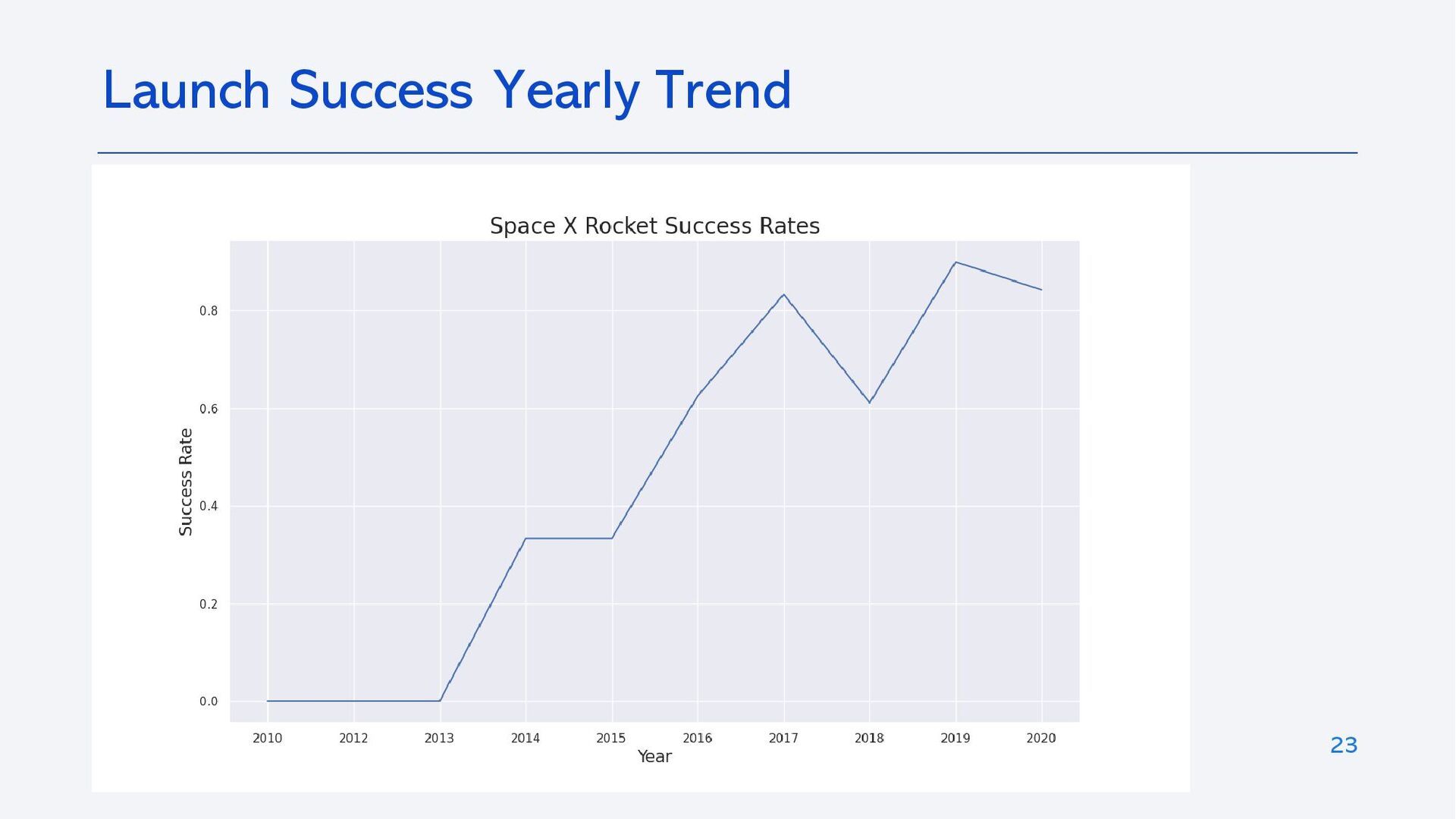
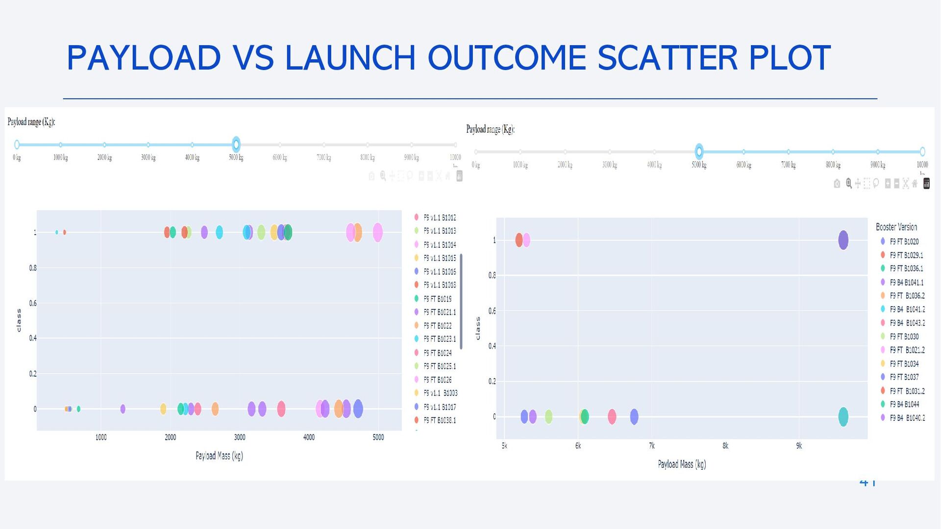
• Identifying all factors that influence landing outcomes.
• Relationships between each variables and how it is affecting the outcome.
• Best condition needed to increase probability of successful landing.