Upgrade to Pro — share decks privately, control downloads, hide ads and more …

Responsive Images

Responsive Images

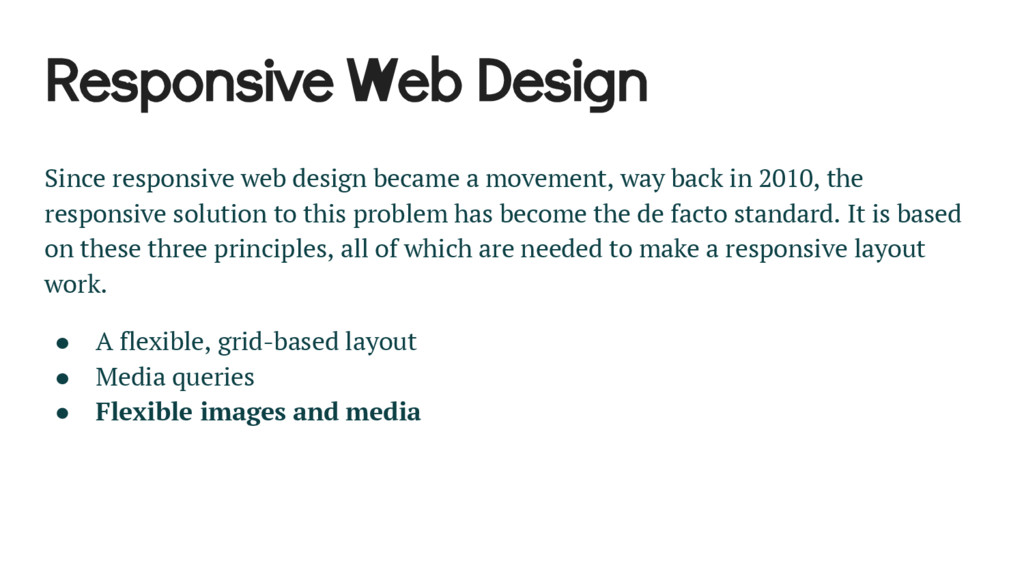
Responsive design has become a de facto standard in web development. It is based on three main ideas:

• A flexible, grid-based layout

• Media queries

• Flexible images and media

This talk will concentrate on the last point, flexible images and media.

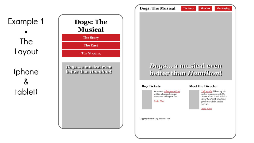
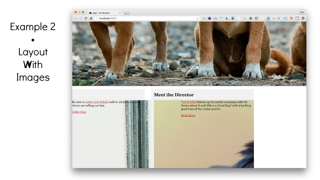
We will walk through progressively more sophisticated ways of handing images responsively, and we'll use an example site to illustrate the techniques.

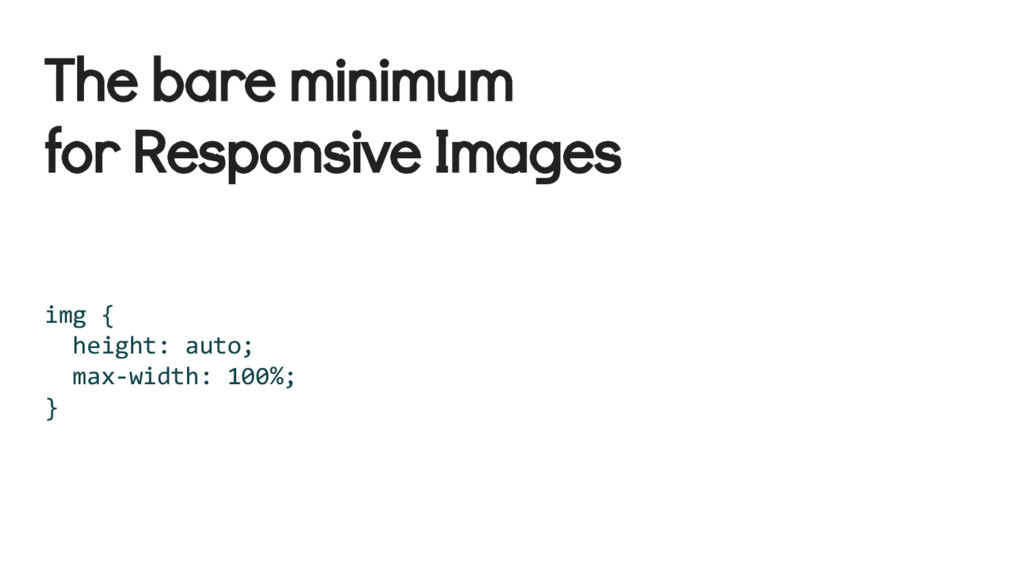
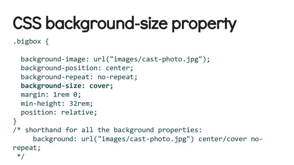
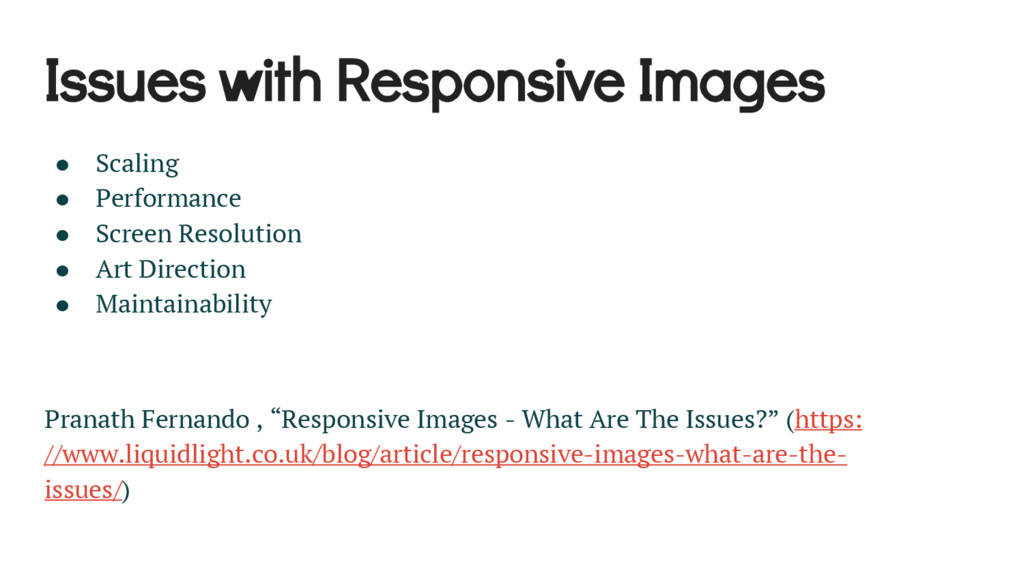
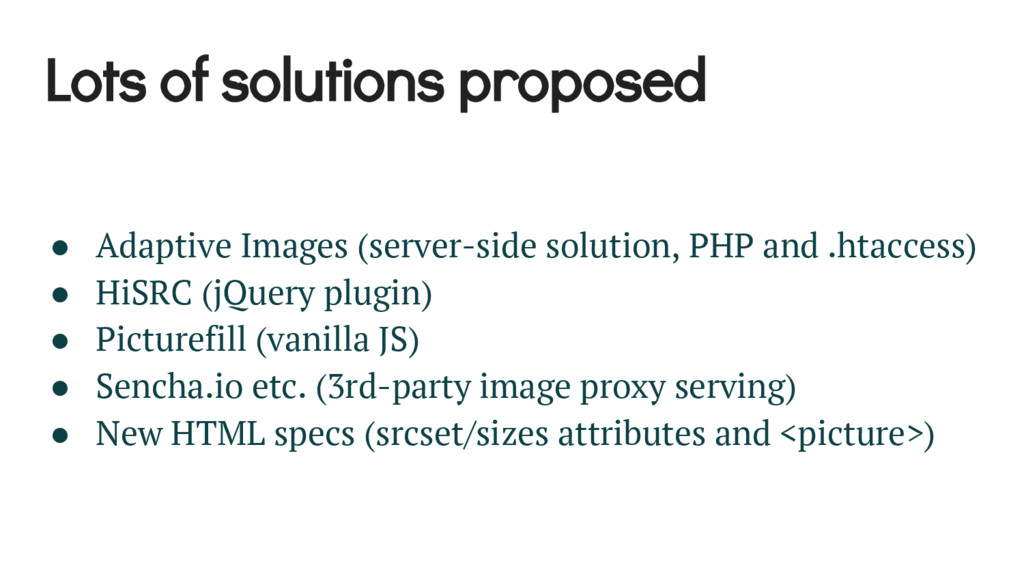
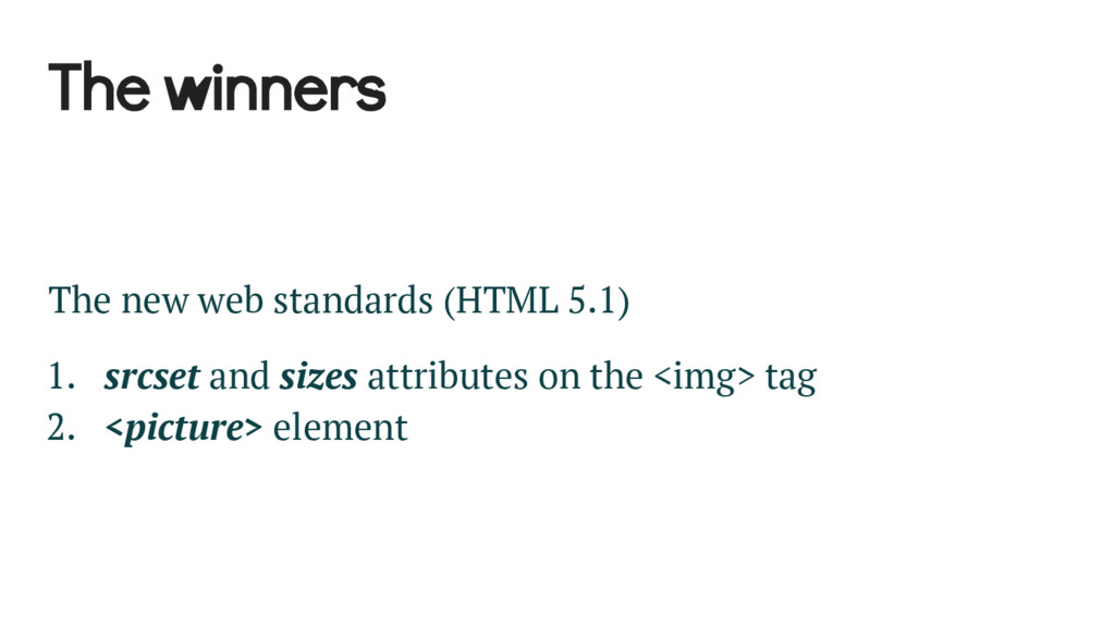
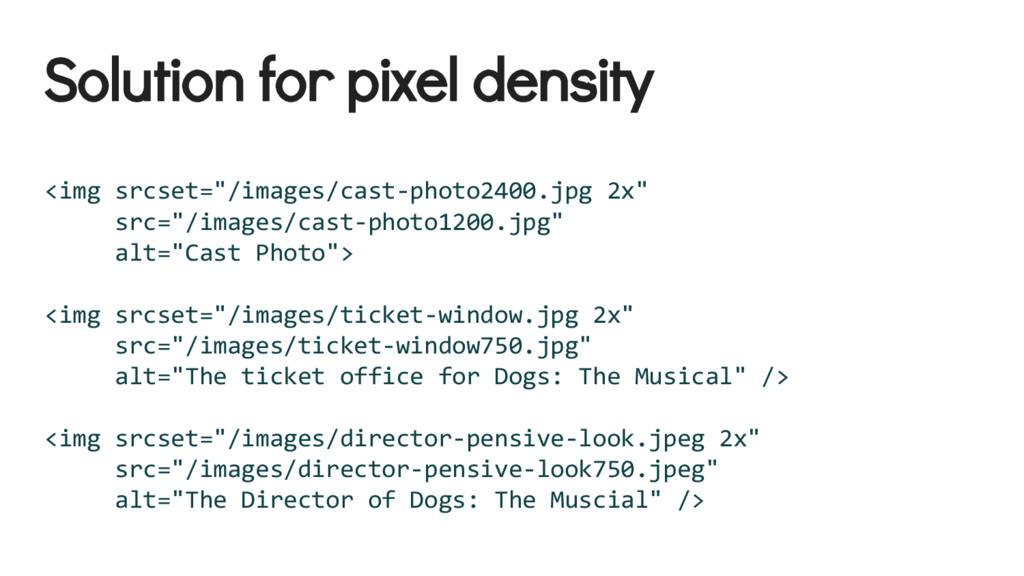
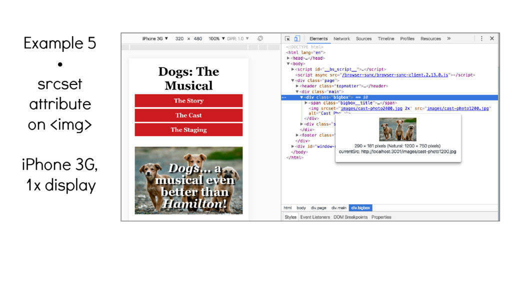
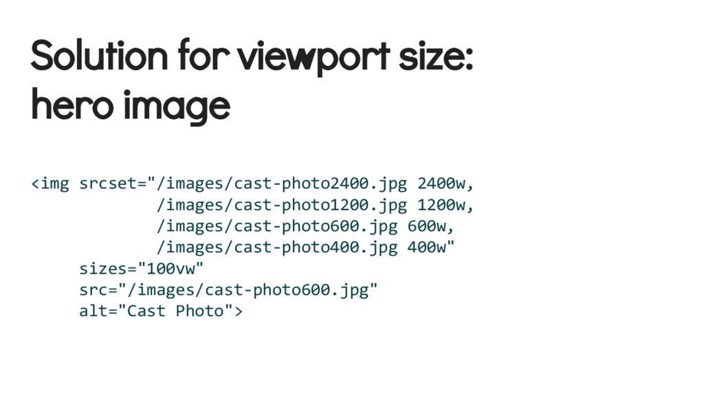
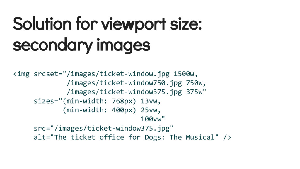
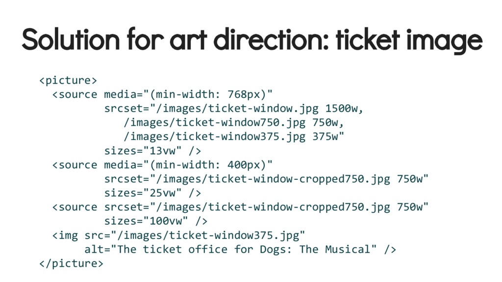
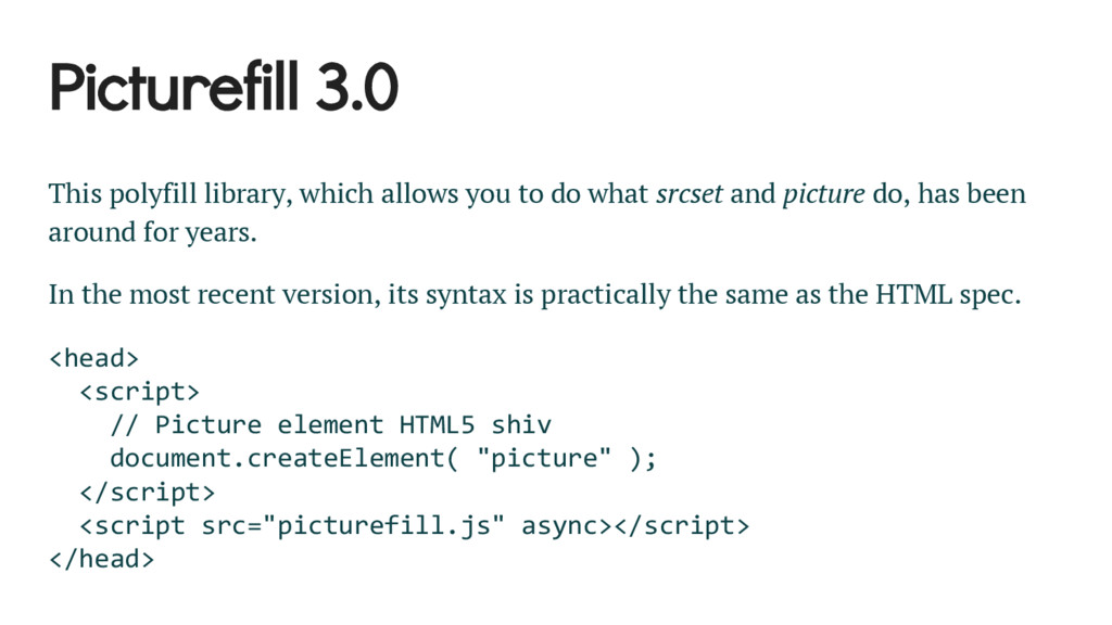
We’ll start with the basic CSS for responsive images. We will touch on responsive background images, and responsive video. Then, we’ll delve into some performance issues with responsive images, like serving more images than you need, or downloading images larger than they need to be. To overcome these problems, we’ll employ some shiny new HTML specifications, the srcset and sizes attributes, and the even newer element. We’ll conclude with a demonstration of the Picturefill polyfill, which will allow you to use the new HTML features even in browsers that don’t yet support them.

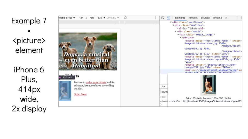
Come check out the show; it will be even better than Hamilton.

From a presentation to the Front-End Developers Meetup in Charlotte, NC, on July 28, 2016.

vjwilson

July 28, 2016
Tweet

More Decks by vjwilson

Other Decks in Technology

Transcript

  1. What are the dimensions of a web page? • 775

    wide…? • 960 wide…? • 1200 wide…? x forever tall
  2. A (The) way forward John Allsopp provided an answer to

    this over 15 years ago in the article “The Dao of Web Design”, but it took the iPhone to really sell the idea. The Way is shaped by use, But then the shape is lost. Do not hold fast to shapes But let sensation flow into the world As a river courses down to the sea. Tao Te Ching; 32 Shapes (http://alistapart.com/article/dao)
  3. Everything old is new again John Allsopp summed up his

    ideas in that article this way: The web’s greatest strength, I believe, is often seen as a limitation, as a defect. It is the nature of the web to be flexible, and it should be our role as designers and developers to embrace this flexibility, and produce pages which, by being flexible, are accessible to all. The journey begins by letting go of control, and becoming flexible. Sound familiar?
  4. Responsive Web Design Since responsive web design became a movement,

    way back in 2010, the responsive solution to this problem has become the de facto standard. It is based on these three principles, all of which are needed to make a responsive layout work. • A flexible, grid-based layout • Media queries • Flexible images and media
  5. The bare minimum for responsive images, video, etc. img, embed,

    object, video { height: auto; max-width: 100%; }
  6. CSS background-size property .bigbox { background-image: url("images/cast-photo.jpg"); background-position: center; background-repeat:

    no-repeat; background-size: cover; margin: 1rem 0; min-height: 32rem; position: relative; } /* shorthand for all the background properties: background: url("images/cast-photo.jpg") center/cover no- repeat; */
  7. Shhhhh… We’ve been cheating Those images I’ve been referencing in

    the src attributes are HUGE (1920x1200 for the big one, 1500x2000 for the smaller two)
  8. Worse, even the best of us will be tempted to

    do this... <img class="desktop-only" href="high-res-detail-shot-2520x1800. jpg" alt="" /> … @media screen and (max-width: 767px) { .desktop-only { display: none; } }
  9. Issues with Responsive Images • Scaling • Performance • Screen

    Resolution • Art Direction • Maintainability Pranath Fernando , “Responsive Images - What Are The Issues?” (https: //www.liquidlight.co.uk/blog/article/responsive-images-what-are-the- issues/)
  10. Scaling/Rez vs. Performance from Tom Ewer, “How to Create Retina

    Display Image Assets for Better Looking Websites”, https: //www.elegantthemes.com/blog/tips-tricks/how-to-create-retina-display-image-assets-for-better- looking-websites
  11. ScalingRez vs. Performance (cont’d) Soon, the browser will be making

    a lot of extra connections, and downloading a lot of extra kilobytes, for images that the user is never going to see.
  12. How much weight are we talking? What is staggering is

    just how massive the savings could be if these [tested] sites served appropriately sized images. At 360px wide, these 402 sites combine to serve 171.62MB of unnecessary weight to their visitors . That’s a whopping 72.2% of image weight that could be ditched by using a responsive image technique. Tim Kadlec, “Why We Need Responsive Images” https://timkadlec.com/2013/06/why-we-need-responsive-images/
  13. Maintainability Let’s say you have an average of one image

    per page on your site, and your has 10 pages. The solutions for scaling, resolution, performance, and art direction that we’re going to look at require at least one extra image file per image. That’s 10 extra files to process. Not too bad. Now, imagine your site has 100 pages, and you need 2 extra images files per image. Suddenly, you have 200 extra files to process. Now, imagine your site has 1000 pages, and you add 5 new pages a week...
  14. Lots of solutions proposed • Adaptive Images (server-side solution, PHP

    and .htaccess) • HiSRC (jQuery plugin) • Picturefill (vanilla JS) • Sencha.io etc. (3rd-party image proxy serving) • New HTML specs (srcset/sizes attributes and <picture>)
  15. The winners The new web standards (HTML 5.1) 1. srcset

    and sizes attributes on the <img> tag 2. <picture> element
  16. Before we implement Let’s set a maximum width for the

    content area. .page { margin: 1rem auto; max-width: 1200px; width: 90.588235294118%; }
  17. Solution for pixel density <img srcset="/images/cast-photo2400.jpg 2x" src="/images/cast-photo1200.jpg" alt="Cast Photo">

    <img srcset="/images/ticket-window.jpg 2x" src="/images/ticket-window750.jpg" alt="The ticket office for Dogs: The Musical" /> <img srcset="/images/director-pensive-look.jpeg 2x" src="/images/director-pensive-look750.jpeg" alt="The Director of Dogs: The Muscial" />
  18. Solution for viewport size: hero image <img srcset="/images/cast-photo2400.jpg 2400w, /images/cast-photo1200.jpg

    1200w, /images/cast-photo600.jpg 600w, /images/cast-photo400.jpg 400w" sizes="100vw" src="/images/cast-photo600.jpg" alt="Cast Photo">
  19. Solution for viewport size: secondary images <img srcset="/images/ticket-window.jpg 1500w, /images/ticket-window750.jpg

    750w, /images/ticket-window375.jpg 375w" sizes="(min-width: 768px) 13vw, (min-width: 400px) 25vw, 100vw" src="/images/ticket-window375.jpg" alt="The ticket office for Dogs: The Musical" />
  20. Art Direction from Chris Coyier, “Which responsive images solution should

    you use?”, https://css-tricks.com/which-responsive-images-solution-should-you-use/
  21. Solution for art direction: hero image <picture> <source media="(min-width: 768px)"

    srcset="/images/cast-photo2400.jpg 2400w, /images/cast-photo1200.jpg 1200w, /images/cast-photo600.jpg 600w" sizes="100vw" /> <source media="(min-width: 400px)" srcset="/images/cast-photo1200.jpg 1200w, /images/cast-photo600.jpg 600w, /images/cast-photo400.jpg 400w" sizes="100vw" /> <source srcset="/images/cast-photo-vertical-cropped750.jpg 750w, /images/cast-photo-vertical-cropped375.jpg 375w" sizes="100vw" /> <img src="/images/cast-photo400.jpg" alt="Cast Photo" /> </picture>
  22. Solution for art direction: ticket image <picture> <source media="(min-width: 768px)"

    srcset="/images/ticket-window.jpg 1500w, /images/ticket-window750.jpg 750w, /images/ticket-window375.jpg 375w" sizes="13vw" /> <source media="(min-width: 400px)" srcset="/images/ticket-window-cropped750.jpg 750w" sizes="25vw" /> <source srcset="/images/ticket-window-cropped750.jpg 750w" sizes="100vw" /> <img src="/images/ticket-window375.jpg" alt="The ticket office for Dogs: The Musical" /> </picture>
  23. Cool! I’m sold. What’s browser support like? • Chrome •

    Firefox • Safari • Android • Edge • IE (any version, even 11)
  24. Picturefill 3.0 This polyfill library, which allows you to do

    what srcset and picture do, has been around for years. In the most recent version, its syntax is practically the same as the HTML spec. <head> <script> // Picture element HTML5 shiv document.createElement( "picture" ); </script> <script src="picturefill.js" async></script> </head>
  25. But what about maintainability, Yogi? Server-side solutions, like Adaptive Images

    or 3rd-party services, reduce or eliminate any changes to your markup, and they will scale and cache your image files to appropriates sizes on-the-fly. However, they do not handle art direction. Adaptive Images requires PHP and does not work with CDNs.
  26. Maintainability and CMS’s Some CMS’s help automate this: • WordPress’s

    RICG Responsive Images plugin was merged into core WordPress 4.4. WordPress will automatically create different image file sizes and include srcset and sizes attributes for you. • Drupal has an older module to automate using Adaptive Images, and Drupal 8 has a built-in Picture module, which automates using Picturefill. (Backported as an optional module for Drupal 7) • For Rails, there is a Ruby gem called responsive-images that helps you automate using responsive images in your templates.
  27. Finally, remember this cool technique? <img class="desktop-only" href="high-res-detail-shot-2520x1800. jpg" alt=""

    /> … @media screen and (max-width: 767px) { .desktop-only { display: none; } }
  28. Mobile rules, desktop drools Using a mobile-first approach to design,

    you decide that you don’t need an image for a particular feature. Then, you switch to begin designing a desktop version of the layout. And there’s all this glorious extra space… just beckoning you to fill it with images...
  29. The easiest way to make an image responsive, is to

    never load it in the first place.
  30. Resources • Responsive Issues Community Group (http://ricg.io/) • WHATWG Spec

    for Embedded Content (https://html.spec.whatwg. org/multipage/embedded-content.html#embedded-content) • Picturefill, A Responsive Image Polyfill (http://scottjehl.github.io/picturefill/) • Chen Hui Jing, “Using Responsive Images (Now)” (http://alistapart. com/article/using-responsive-images-now) • Tim Wright, “Picturefill 2.0: Responsive Images And The Perfect Polyfill” (https://www.smashingmagazine.com/2014/05/picturefill-2-0-responsive- images-and-the-perfect-polyfill/) • John Allsopp, “A Dao of Web Design” (http://alistapart.com/article/dao)
  31. Books • Ethan Marcotte, Responsive Web Design (https://abookapart. com/products/responsive-web-design) •

    Scott Jehl, Responsible Responsive Design (https://abookapart. com/products/responsible-responsive-design) • Ethan Marcotte, Responsive Web Design: Patterns and Principles (https: //abookapart.com/products/responsive-design-patterns-principles)