Upgrade to Pro — share decks privately, control downloads, hide ads and more …

Cesar Tardaguila: Accessibility of the WordPress Mobile Apps WordPress

Cesar Tardaguila: Accessibility of the WordPress Mobile Apps WordPress

Speaker: Cesar Tardaguila
Accessibility of the WordPress Mobile Apps WordPress
網站與手機應用程式設計的無障礙使用探討

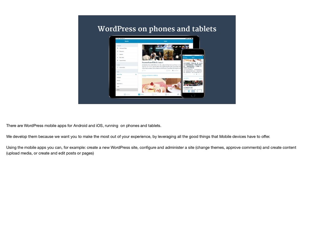
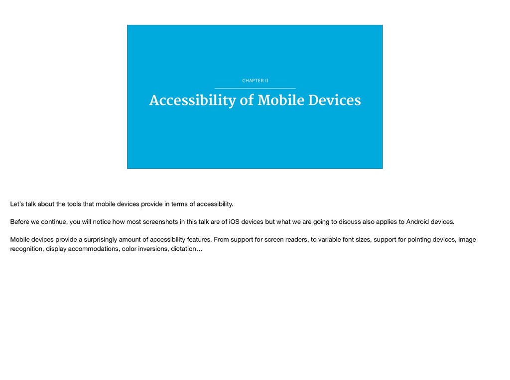
Mobile devices provide an extraordinary opportunity to deliver a superior mobile experience to every user. But still, we, the Mobile Team at Automattic, faced some interesting challenges when we tried to make the WordPress Mobile Apps more accessible. This talk, by one of the developers involved in overcoming some of those challenges, will review the accessibility tools both iOS and Android provide, and will contain first hand information on the way we develop and test the WordPress Mobile Apps, always making accessibility one of our highest priorities, to make sure that we provide the experience that our users expect.

WordCamp Taipei

October 21, 2018
Tweet

More Decks by WordCamp Taipei

Other Decks in Technology

Transcript

  1. Accessibility of the WordPress Mobile Apps César Tardáguila @ctarda Good

    morning everyone. Thank you for coming. thank you for being here today. Before we get started I would like to thank everybody involved in organising this Wordcamp, and in particular I would like to thank all the volunteers that are making this happen. My name is Cesar, I live in Hong Kong but I am from Spain and as you can see (or hear) I have a little bit of an accent. Also, I haven’t done something like this in about fifteen years, so please be patient with me. Today I am going to talk about accessibility, about mobile devices and about the WordPress mobile apps. The reason why I am going to talk about tall those things is because I work at Automattic, I am with the team what maintains the WordPress mobile apps, and I have been involved in making the WordPress mobile apps, in particular the iOS app, as accessible as possible.
  2. “ ” The Web Should Work for Everyone If there

    is one thing that I would like you to take from this talk is this. The web should work for everyone. Period. There is no reason why this should not be true, and there are tools for us software developers, to make sure that it can be true, in particular when working with mobile devices. So that is what we are going to talk about today:
  3. Today’s agenda • The WordPress mobile apps • Mobile devices

    and accessibility • The WordPress mobile apps and accessibility • First, we will talk about the WordPress mobile apps briefly. • Second, we will talk about some of the affordances that mobile devices provide in terms of accessibility • And last but not least, we will review how the WordPress apps try to leverage the capabilities of mobile devices in terms of accessibility.
  4. CHAPTER I The WordPress Mobile Apps Let’s get started by

    talking about the WordPress mobile apps
  5. WordPress on phones and tablets There are WordPress mobile apps

    for Android and iOS, running on phones and tablets. We develop them because we want you to make the most out of your experience, by leveraging all the good things that Mobile devices have to offer. Using the mobile apps you can, for example: create a new WordPress site, configure and administer a site (change themes, approve comments) and create content (upload media, or create and edit posts or pages)
  6. The Mobile Team The mobile apps are built by a

    team at Automattic, called Hogwarts. Like everybody else at Automattic, we work remotely, and we are spread around the globe. There are about 35 people working on the mobile apps. That includes not only WordPress, but the Woo apps, another maintaining Simplenote, and other Automattic products. The engineers are split almost 50-50 in between Android and iOS, most of us are not native English speakers, and as you can see in the map, although most folks are located in the Americas, we are split across multiple time zones. I like to think that there is someone working on the WordPress mobile apps 24 hours a day.
  7. Better Together. No Dead Ends • We want to provide

    the best possible user experience, leveraging the possibilities that mobile devices provide. • Two internal projects: Better Together No Dead Ends When working on WordPress in particular, we focus on user experience. For us, user experience means “the experience users of the WordPress apps will have when using the app” Our main focus is adding value, providing value to the end user. In order to do that we build stuff, release it, measure the way that stuff we just released is used, listen to feedback, and iterate over the stuff we released by integration the feedback we receive. Our work is split between two main ongoing projects, that we refer to internally as Better Together and No Dead Ends. Better Together is about making the mobile apps leverage everything that makes mobile devices great. I think of Better Together as the project that focuses on the best possible integration with the system (be it Android or iOS) Some of the features that we released as part of Better Together are RTL support, improved localisations, support for animated gifs, better sharing extension on iOS, support for Android Instant Apps, and our focus today: better accessibility. Again, it’s all about being good citizens. No Dead Ends is about making the apps robust and about improving the user experience. As part of No Dead Ends we have worked on round after round of fixings crashing bugs, on better empty states, or actionable errors.
  8. CHAPTER II Accessibility of Mobile Devices Let’s talk about the

    tools that mobile devices provide in terms of accessibility. Before we continue, you will notice how most screenshots in this talk are of iOS devices but what we are going to discuss also applies to Android devices. Mobile devices provide a surprisingly amount of accessibility features. From support for screen readers, to variable font sizes, support for pointing devices, image recognition, display accommodations, color inversions, dictation…
  9. More than just screen readers When thinking about accessibility, most

    of us think about screen readers. I have been guilty of that in the past, and working on the accessibility of the iOS app made realise how little I knew about the issue. But the list of tools and adaptations is too long to go through all of it in this talk. We have screen readers, we have control over transparency, we can reduce motion and animations, add shapes to buttons, increase the color contrast, modify the font sizes… We are going to focus on three features in particular: color, text size, and screen readers.
  10. Colour Color adaptations are something that is very important for

    me personally. There is general agreement that about 8% of men and 0.5% of women have a colour vision deficiency. There are 8 types of colour blindness, and mobile devices provide affordances for each and every one of them. But the most common mistake that we, the folks building mobile applications do, for lack of awareness, because we just don’t know, is to not have colour constant in mind. Insufficient contrast in a mobile app or website.makes content hard to read for everyone. Icons and text might easily blend with the background or with each other. Apple, in the Human Interface guidelines, recommend to strive for a minimum contrast ratio of 4.5 : 1, although 7 : 1 is preferred because it meets more stringent accessibility standards. Everyone benefits from more color contrast.
  11. Text size Let’s talk about text sizes. Every generation of

    mobile devices brings larger screen sizes. It is tempting to use that screen real state to throw more and more content into it. Now, we all in one way or another associate good or bad eyesight with age. When we are young, and have good eyesight, we all seem to think that we are going to be able to read small text forever. But let me tell you something from experience: that is not the case. And also, let me tell you something from experience, the combination of larger screen sizes with small text can make for a very unpleasant experience. Mobile devices provide support for users to decide how large they want their font to be. On iOS, that is called Dynamic Type, and on Android it is called Type Scale. Basically, all users have control over the size of the device’s text. On iOS in particular, users can also activate a special accessibility feature that provides some extra large font sizes.
  12. Screen Readers: Voice Over Screen readers are probably the first

    thing that comes to mind when we think about accessibility. In one sentence, screen readers provide a way for people for visual impairments to control a mobile device. But in reality, screen readers do much more than that. On iOS, the screen reader is called Voice Over, on Android it is called Talk Back. But the name does not really matte that much because both do more or less the same: provide a way for users to interact with the device without only via sound. Here is a short video to illustrate what Voice Over can do. Yes, these are Apple’s marketing materials, but this video proves a point: mobile devices can be used only via touch and voice.
  13. CHAPTER III Accessibility of the WordPress Apps Now that we

    have an overview of some of the things mobile devices can do to help with accessibility, it is time to review what we, the folks building and maintaining the WordPress mobile apps, have done to leverage those capabilities.
  14. Accessibility and developer tools In order to make sure that

    our apps are accessible, we rely on three tools. The first tool is within each and everyone of the developers that work on the mobile apps. When we write code, and when we review code written by our colleagues, we always check that what we built is accessible. But humans make mistakes, and in particular, humans that develop software make mistakes, so we rely also on tooling to help us make sure that we do the right thing. On WordPress Android, every time we commit code to the repository, an automated check (called a linter) checks the source code and makes sure that some ui elements like buttons or labels have been properly configured to support screen readers. On iOS, we haven’t found a way to do that automatically (yet), but we are exploring running a set of automated tests on the actual app, on an actual device that would also check that everything is setup correctly. Regularly, we also run tools on both platforms, that perform an accessibility audit. As part of the developer tools for iOS there is something called Accessibility Inspector, that allows us to run an audit on color contrast (here you can see a screenshot of a not very successful audit on the right hand side), and that also allows us to manually check that UI elements are properly configured for screen readers. On Android, there is a similar tool called Accessibility Scanner
  15. Color contrast When it comes to color contrast , the

    work starts with design. They make sure that the templates that handover to the developers have enough color contrast. Also, developers request regularly design reviews while we are working on a feature, so that designers can provide feedback early on. Part of that feedback will be related to color contrast. And, before committing the new feature to the main development branch, we run the accessibility audit tools again.
  16. Dynamic Type Supporting dynamic font sizes properly is very challenging.

    Basically, if we do our work well, we hand over control to the user over the layout, almost completely. So we have to build the UI in a way that stretches both horizontally and vertically to accommodate different font sizes. That requires, sometimes, to completely change the layout at runtime, without the user actually noticing that the layout has changed. Luckily, on both iOS and Android, the system notifies our app when users have changed their preferred font size, so that we can redo our layouts if necessary. That adds complexity to our code, and complexity, when it comes to building software, usually translates into longer development times. We consider that extra effort as totally worth it.
  17. Voice Over Providing good support for Voice Over on iOS

    and Talk Back on Android is probably what requires more dedicated work. Each ui element that we want to expose to Voice Over has to be annotated with three different tags. The first one is the accessibility label. That is a brief description of what the ui element does. For example, in the case of a button, that would be the action associated to it. In the case of a label, the text content of it. The second annotation would indicate what the element is. Is it a button, or a label? Can users expect an action to take place by interacting with that ui element? The third annotation is a “hint”. A hint is a longer form explanation of what the ui element does. To illustrate this with an example, a button label can be “More”, its trait would be “button” and its hint could be “Shows more options.” One thing that is interesting, is that in order for the screen readers to sound natural when reading a ui element’s accessibility tags, the label (the first of the three annotations” should not end with a period. However, the hint (the third annotation should end with a period. That way the screen reader can read all the information associated to the ui element with an intonation that makes it sound natural. Also, accessibility annotations can be localised.
  18. “ ” IOS HUMAN INTERFACE GUIDELINES, APPLE We do this

    because it is the right thing to do. Technology is most powerful when it empowers everyone. All we have talked about is just some of the things we do to make the WordPress apps good citizens, and to make the WordPress apps part of the goal we talked about at the beginning of this talk: “the web should work for everyone” However, quoting the Android and iOS accessibility guidelines: We do this because it is the right thing to do Technology is most powerful when it empowers everyone.
  19. WE ARE HIRING http://automattic.com/jobs If you want to be part

    of this effort, or if you just want to make the web a better place, Automattic is always hiring. I would encourage you to check our jobs page, and apply even if you don’t feel like you are totally qualified for the job. Because, in a way, none of us where qualified for the job until we started doing it.
  20. Thanks César Tardáguila @ctarda http://automattic.com/jobs Thanks again for being here,

    and thanks again to all the volunteers that have made with Wordcamp possible.