Upgrade to Pro — share decks privately, control downloads, hide ads and more …

Falling in Love with Flexbox

Sallie Goetsch
October 23, 2016

Falling in Love with Flexbox

WordCamp Sacramento 2016 Presentation. Learn about the cool things you can build using the CSS3 flexible box model, aka Flexbox.

Sallie Goetsch

October 23, 2016
Tweet

More Decks by Sallie Goetsch

Other Decks in Design

Transcript

  1. Sallie Goetsch • WordCamp Sacramento 2016
    Sallie Goetsch • WP Fangirl • wpfangirl.com

    View Slide

  2. SLIDES:
    https://speakerdeck.com/wpfangirl/falling-
    in-love-with-flexbox
    CODE: https://gist.github.com/wpfangirl/
    Sallie Goetsch • WP Fangirl • wpfangirl.com

    View Slide

  3. CSS Flexible Box Layout Module Level 1
    Sallie Goetsch • 
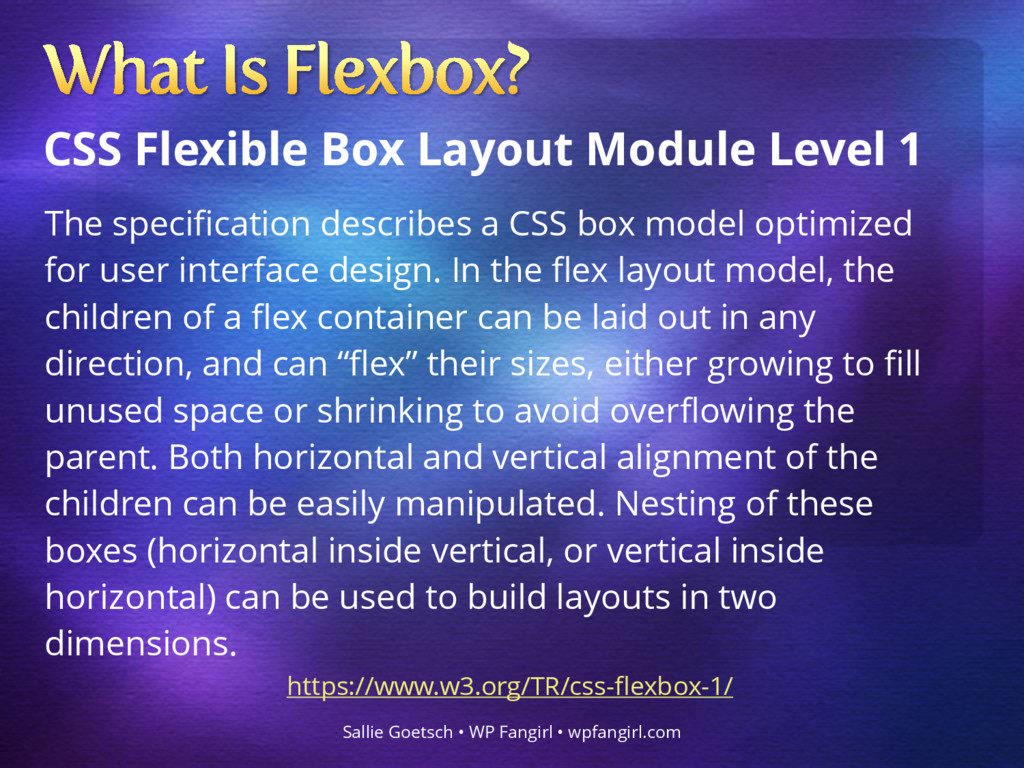
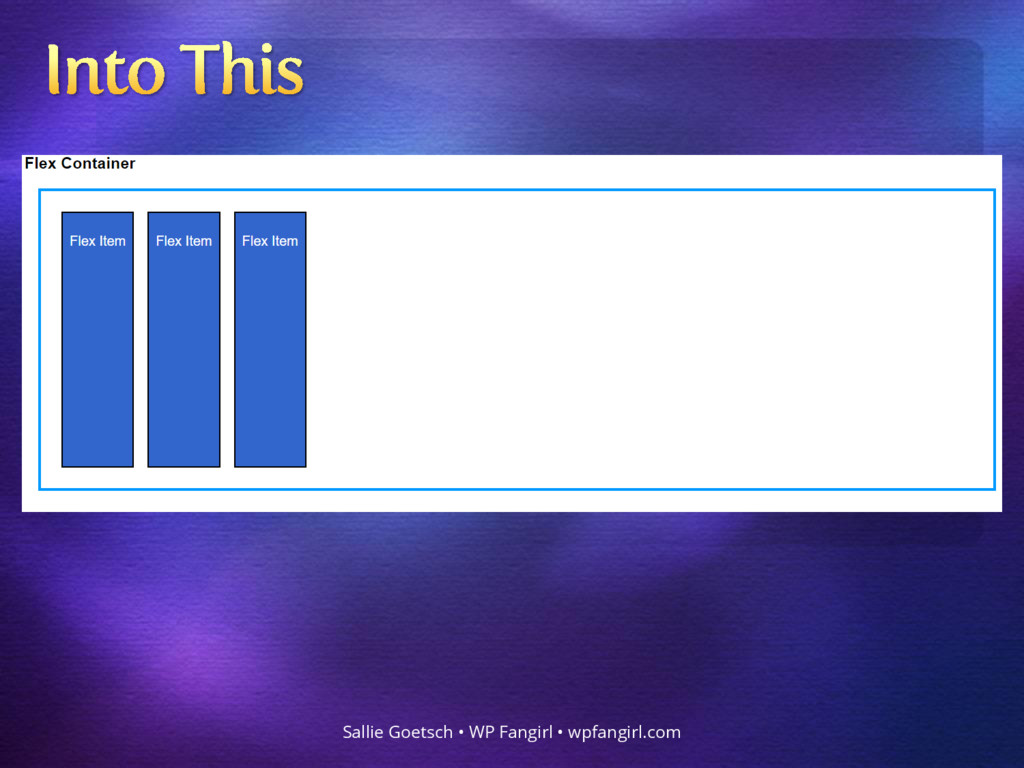
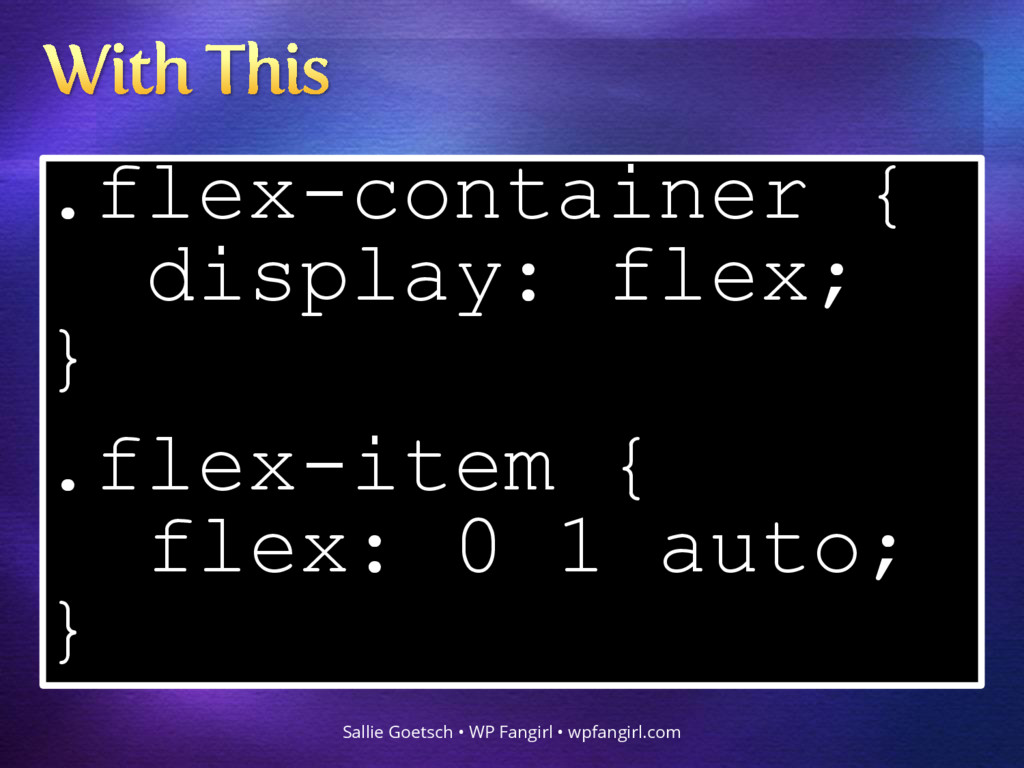
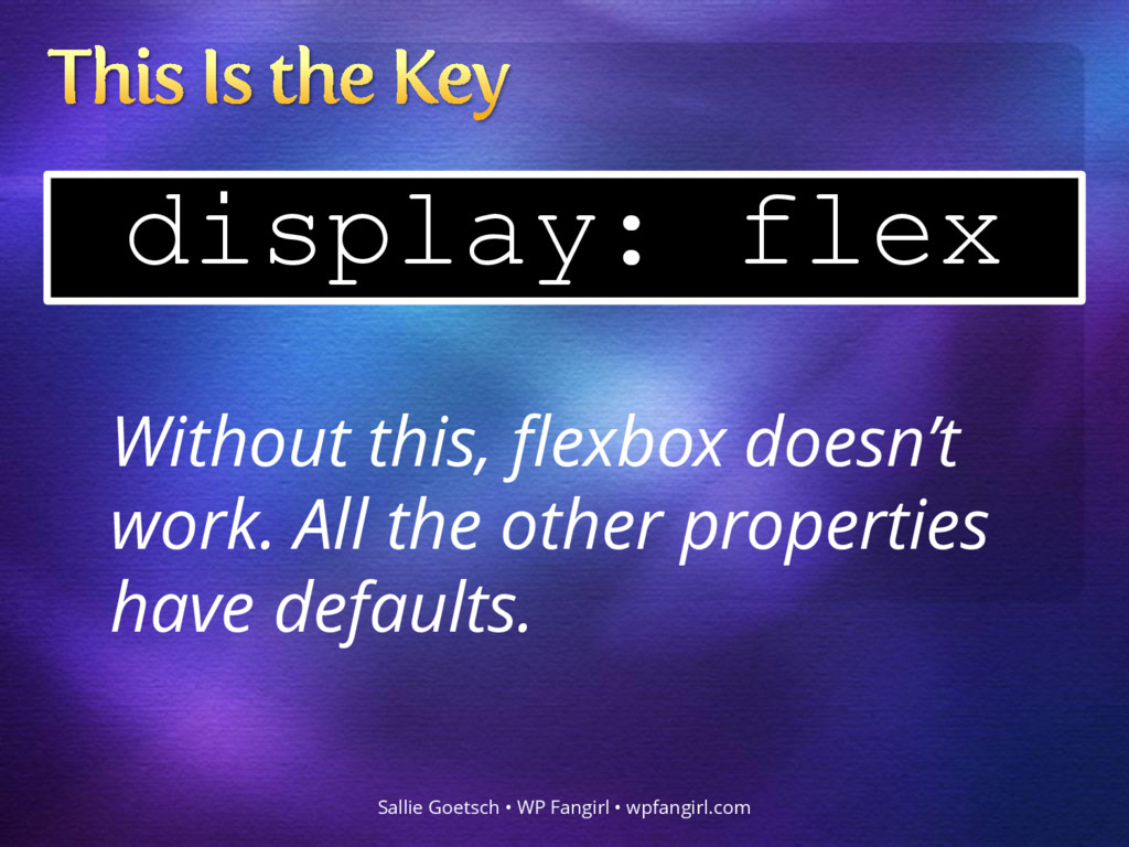
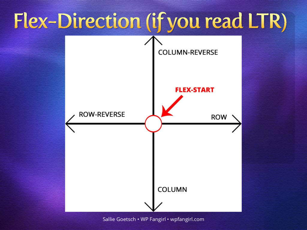
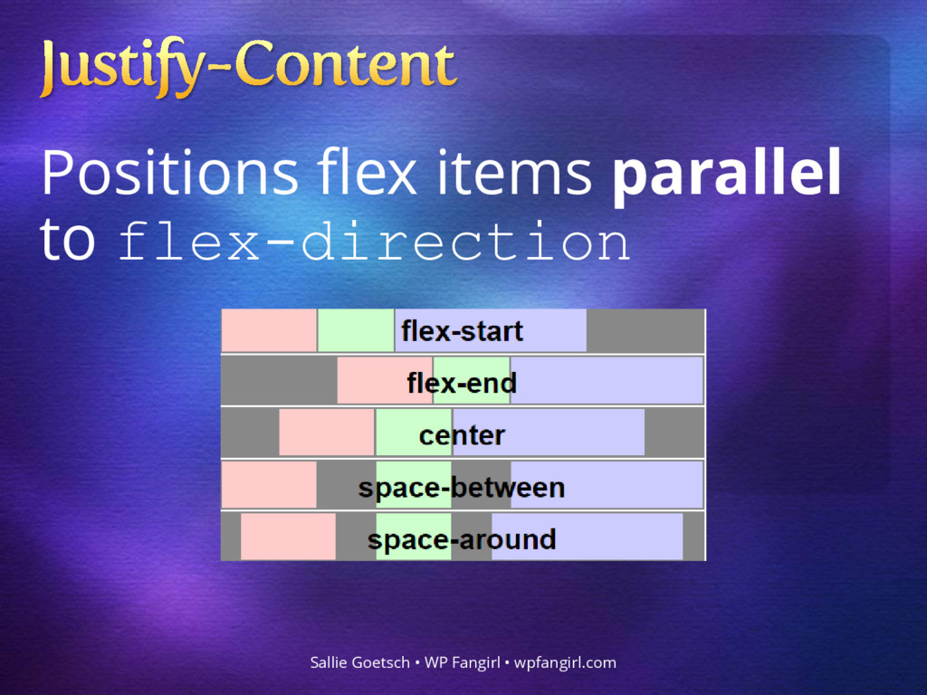
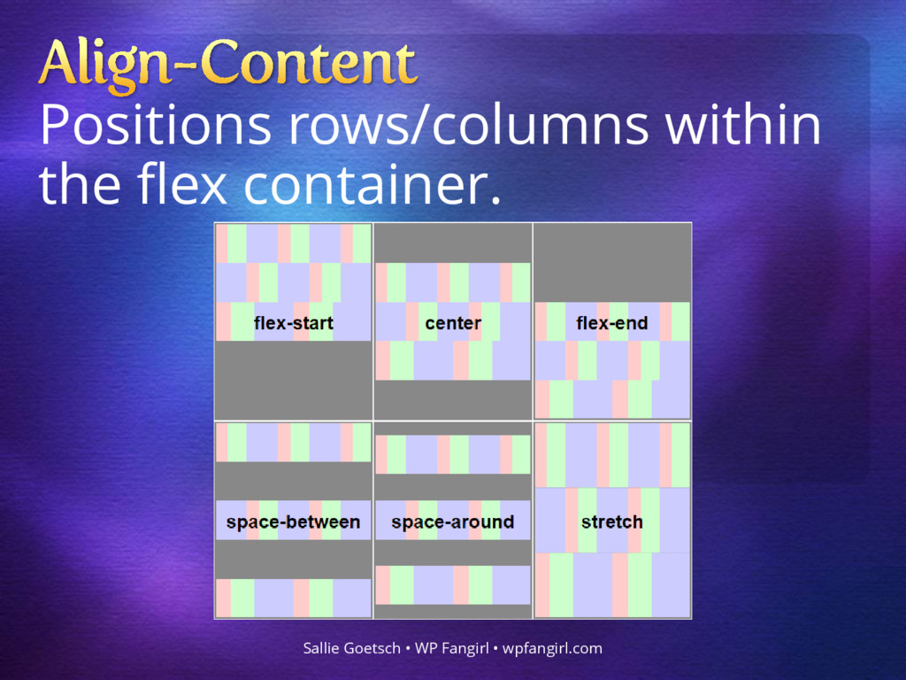
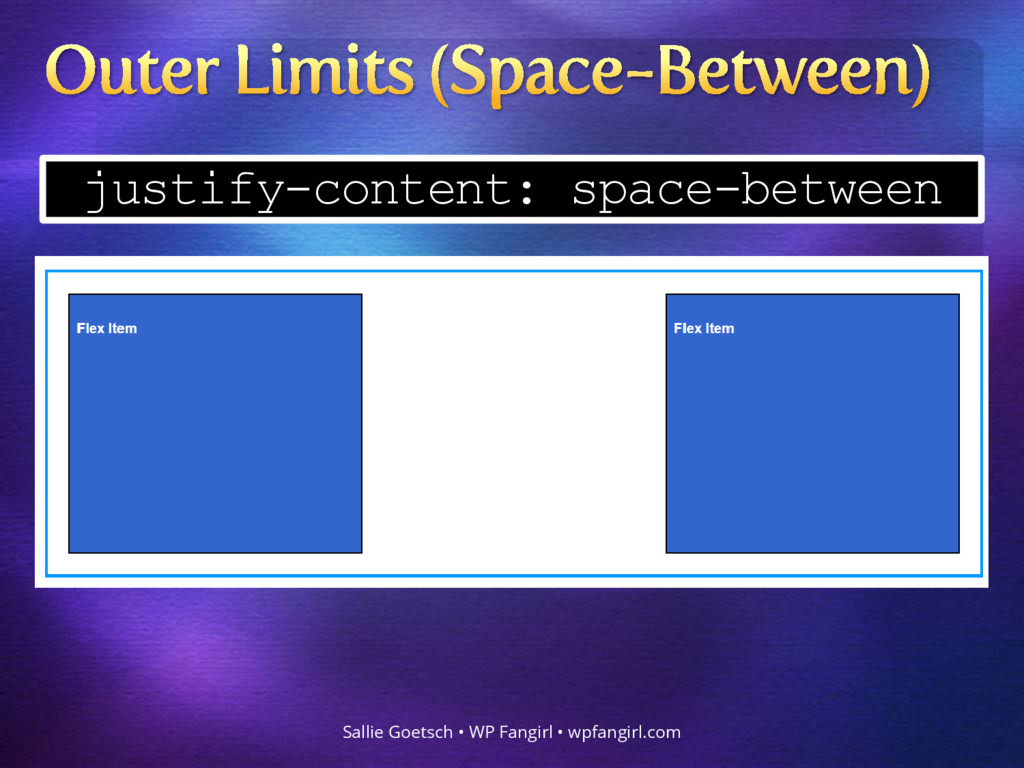
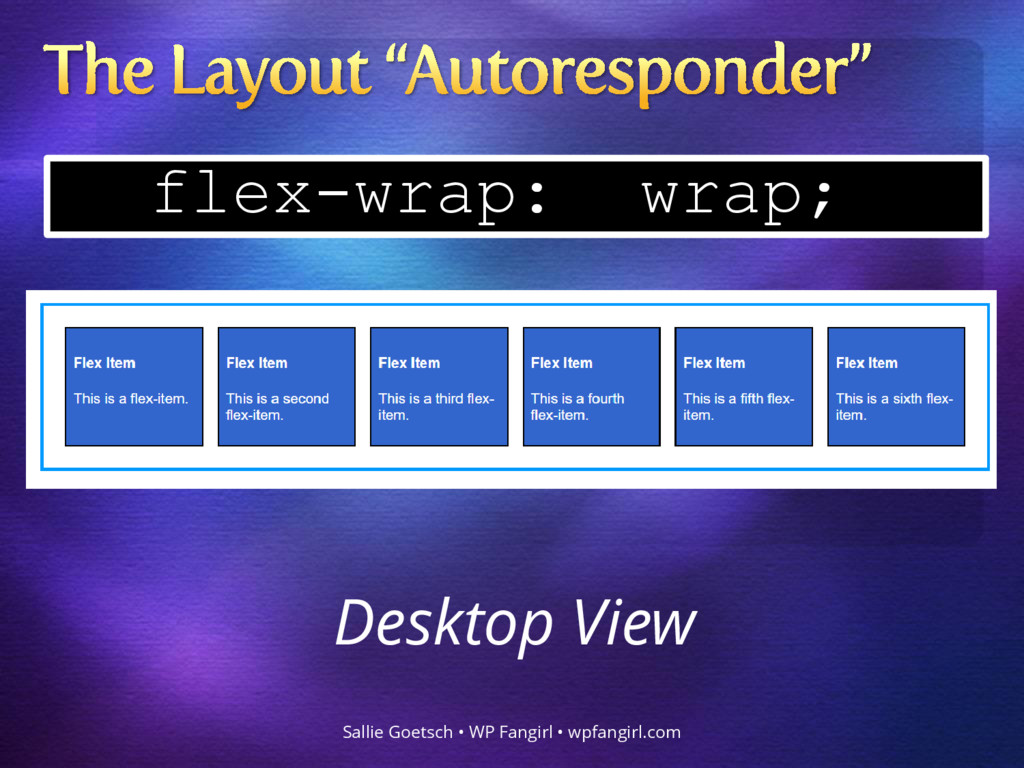
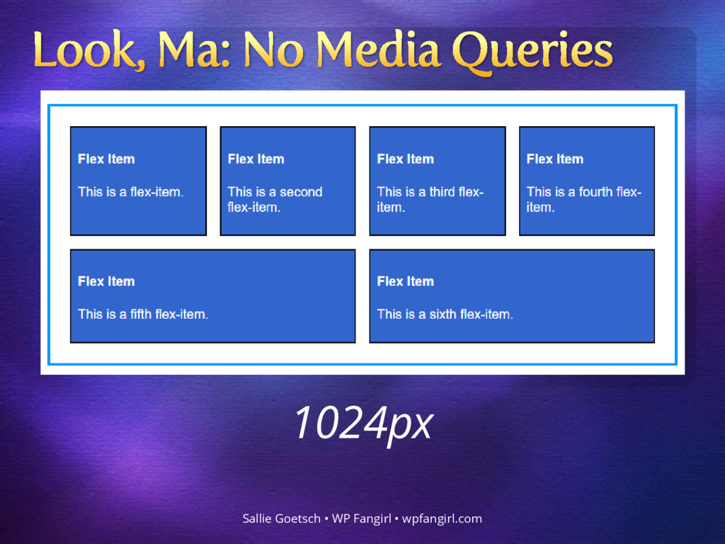
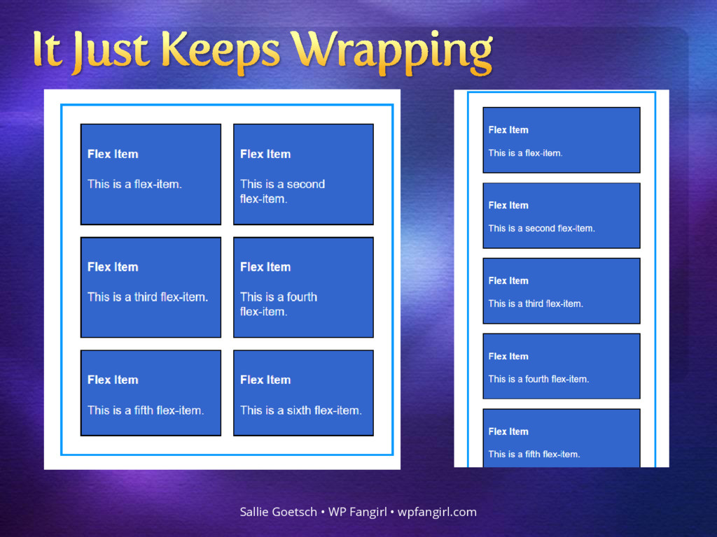
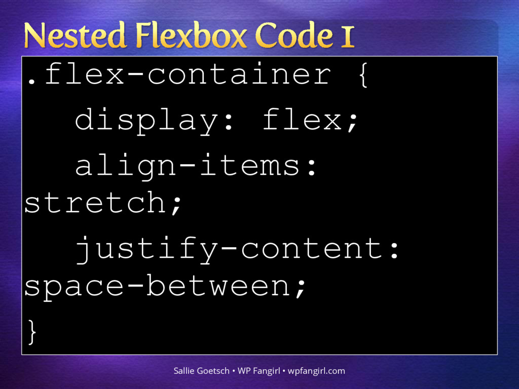
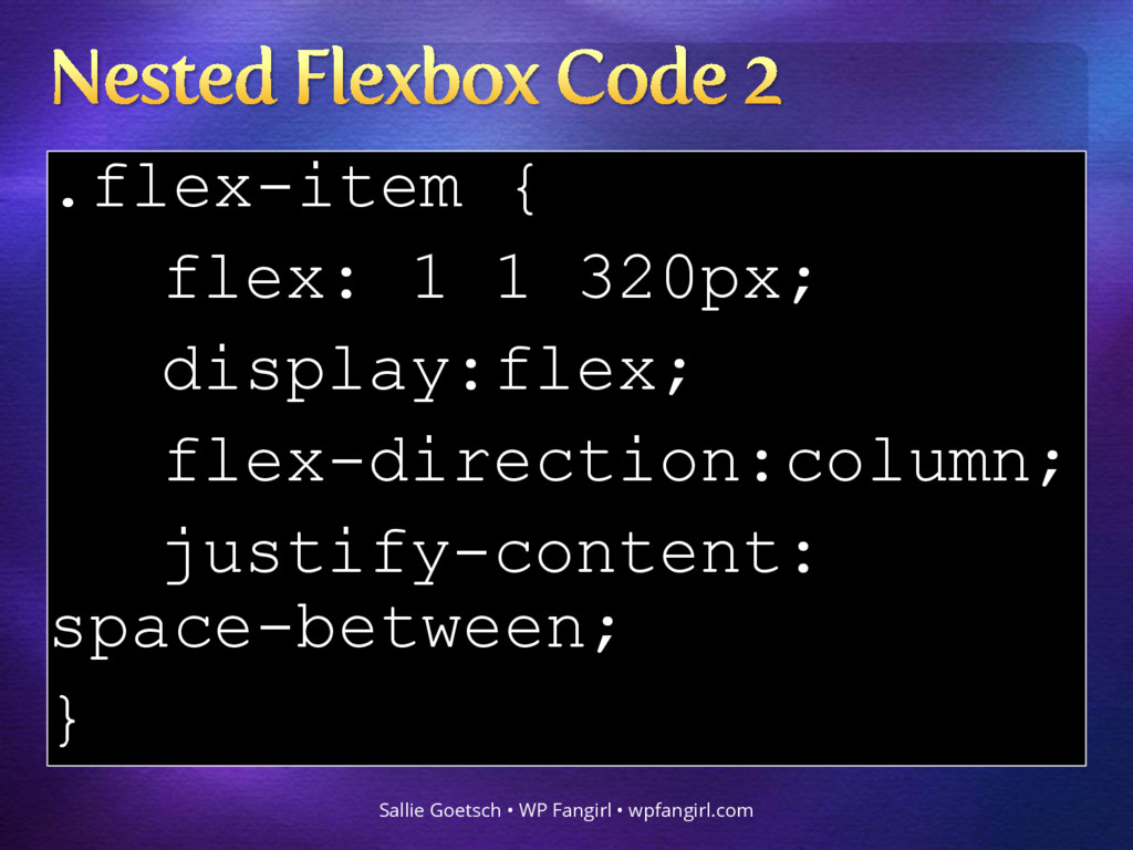
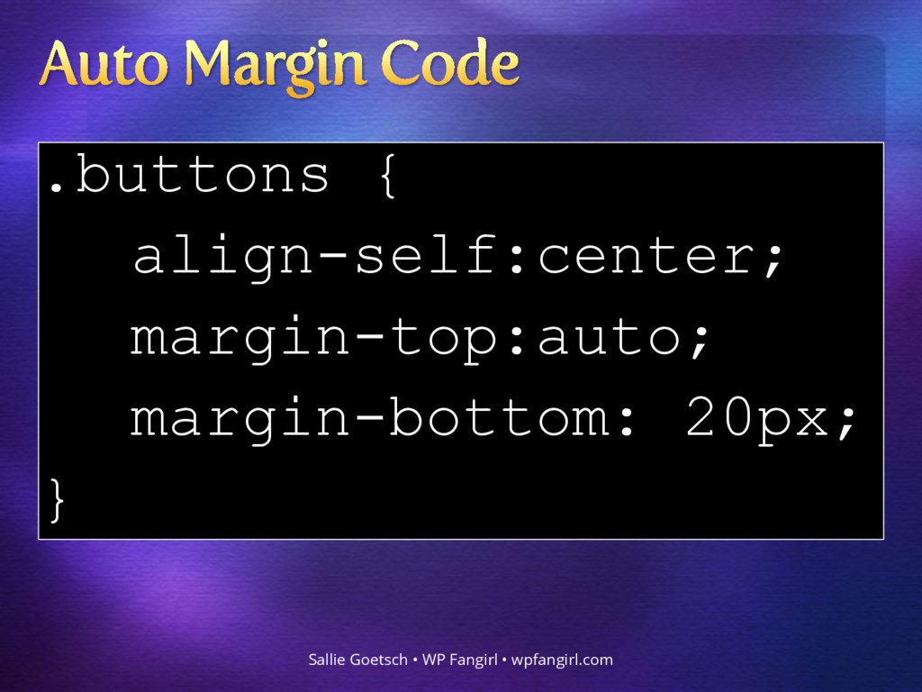
WP Fangirl • wpfangirl.com
    https://www.w3.org/TR/css-flexbox-1/
    The specification describes a CSS box model optimized
    for user interface design. In the flex layout model, the
    children of a flex container can be laid out in any
    direction, and can “flex” their sizes, either growing to fill
    unused space or shrinking to avoid overflowing the
    parent. Both horizontal and vertical alignment of the
    children can be easily manipulated. Nesting of these
    boxes (horizontal inside vertical, or vertical inside
    horizontal) can be used to build layouts in two
    dimensions.

    View Slide

  4. Sallie Goetsch • WP Fangirl • wpfangirl.com

    View Slide

  5. Flexbox makes your browser
    calculate how many items fit
    across the screen, how wide
    each one should be, and
    where to put them.
    Sallie Goetsch • WP Fangirl • wpfangirl.com

    View Slide

  6. Sallie Goetsch • WP Fangirl • wpfangirl.com

    View Slide

  7. Sallie Goetsch • WP Fangirl • wpfangirl.com

    View Slide

  8. .flex-container {
    display: flex;
    }
    .flex-item {
    flex: 0 1 auto;
    }
    Sallie Goetsch • WP Fangirl • wpfangirl.com

    View Slide

  9. Terminology & Defaults to Orient You
    Sallie Goetsch • WP Fangirl • wpfangirl.com

    View Slide

  10. The div immediately
    surrounding the items you
    want to flex.
    Sallie Goetsch • WP Fangirl • wpfangirl.com

    View Slide

  11. • display:flex
    • flex-direction
    • flex-wrap
    • align-content
    • align-items
    • justify-content
    Sallie Goetsch • WP Fangirl • wpfangirl.com

    View Slide

  12. display: flex
    Sallie Goetsch • WP Fangirl • wpfangirl.com
    Without this, flexbox doesn’t
    work. All the other properties
    have defaults.

    View Slide

  13. Sallie Goetsch • WP Fangirl • wpfangirl.com
    Origin

    View Slide

  14. Sallie Goetsch • WP Fangirl • wpfangirl.com

    View Slide

  15. • wrap Items will wrap into
    multiple rows when there are
    too many to fit on one line.
    • nowrap Items will shrink as
    far as possible. Content may
    overflow.
    Sallie Goetsch • WP Fangirl • wpfangirl.com

    View Slide

  16. Positions flex items parallel
    to flex-direction
    Sallie Goetsch • WP Fangirl • wpfangirl.com

    View Slide

  17. Positions items perpendicular
    to flex-direction.
    Sallie Goetsch • WP Fangirl • wpfangirl.com

    View Slide

  18. Positions rows/columns within
    the flex container.
    Sallie Goetsch • WP Fangirl • wpfangirl.com

    View Slide

  19. Any ‘in-flow’ child of a flex
    container, e.g. , ,

    Sallie Goetsch • WP Fangirl • wpfangirl.com

    View Slide

  20. • flex-grow
    • flex-shrink
    • flex-basis
    • order
    • align-self
    Sallie Goetsch • WP Fangirl • wpfangirl.com

    View Slide

  21. 0 Item does not grow
    1 Item grows at 1:1 with
    other items
    2 Item grows at 2:1 with
    other items
    Sallie Goetsch • WP Fangirl • wpfangirl.com

    View Slide

  22. 0 Item does not shrink
    1 Item shrinks at 1:1 with
    other items
    2 Item shrinks at 2:1 with
    other items
    Sallie Goetsch • WP Fangirl • wpfangirl.com

    View Slide

  23. flex: 0 1 auto;
    equals
    flex-grow: 0;
    flex-shrink: 1;
    flex-basis: auto;
    Sallie Goetsch • WP Fangirl • wpfangirl.com

    View Slide

  24. Flex-basis should be in
    pixels rather than % if you
    want your flex items to wrap.
    Sallie Goetsch • WP Fangirl • wpfangirl.com

    View Slide

  25. • Determines display order of
    items
    • Default is 0
    • Negative numbers come
    before positive numbers
    Sallie Goetsch • WP Fangirl • wpfangirl.com

    View Slide

  26. • Positions the individual item
    perpendicular to flex-
    direction, irrespective of the
    align-items property on the
    flex container.
    • Takes the same arguments as
    align-items
    Sallie Goetsch • WP Fangirl • wpfangirl.com

    View Slide

  27. Because that stuff we just
    saw is way too confusing.
    Sallie Goetsch • WP Fangirl • wpfangirl.com

    View Slide

  28. Sallie Goetsch • WP Fangirl • wpfangirl.com
    No transforms. No messing
    about with padding. Just flexbox.

    View Slide

  29. display: flex;
    align-items:
    center;
    justify-content:
    center;
    Sallie Goetsch • WP Fangirl • wpfangirl.com

    View Slide

  30. Sallie Goetsch • WP Fangirl • wpfangirl.com

    View Slide

  31. Sallie Goetsch • WP Fangirl • wpfangirl.com
    align-items: flex-start

    View Slide

  32. align-items: stretch
    Sallie Goetsch • WP Fangirl • wpfangirl.com

    View Slide

  33. justify-content: space-between
    Sallie Goetsch • WP Fangirl • wpfangirl.com

    View Slide

  34. flex-wrap: wrap;
    Sallie Goetsch • WP Fangirl • wpfangirl.com
    Desktop View

    View Slide

  35. Sallie Goetsch • WP Fangirl • wpfangirl.com
    1024px

    View Slide

  36. Sallie Goetsch • WP Fangirl • wpfangirl.com

    View Slide

  37. Sallie Goetsch • WP Fangirl • wpfangirl.com

    View Slide

  38. .flex-container {
    display: flex;
    flex-wrap: wrap;
    }
    .flex-item {
    flex: 1 1 150px;
    }
    Sallie Goetsch • WP Fangirl • wpfangirl.com

    View Slide

  39. Sallie Goetsch • WP Fangirl • wpfangirl.com

    View Slide

  40. Sallie Goetsch • WP Fangirl • wpfangirl.com

    View Slide

  41. Sallie Goetsch • WP Fangirl • wpfangirl.com

    View Slide

  42. .flex-container:nth-
    of-type(odd) .image
    { order: -1;}
    .flex-container:nth-
    of-type(even) .image
    { order: 1;}
    Sallie Goetsch • WP Fangirl • wpfangirl.com

    View Slide

  43. Sallie Goetsch • WP Fangirl • wpfangirl.com

    View Slide

  44. Sallie Goetsch • WP Fangirl • wpfangirl.com

    View Slide

  45. .flex-container {
    display: flex;
    align-items:
    stretch;
    justify-content:
    space-between;
    }
    Sallie Goetsch • WP Fangirl • wpfangirl.com

    View Slide

  46. .flex-item {
    flex: 1 1 320px;
    display:flex;
    flex-direction:column;
    justify-content:
    space-between;
    }
    Sallie Goetsch • WP Fangirl • wpfangirl.com

    View Slide

  47. .buttons {
    align-self:center;
    margin-top:auto;
    margin-bottom: 20px;
    }
    Sallie Goetsch • WP Fangirl • wpfangirl.com

    View Slide

  48. Sallie Goetsch • WP Fangirl • wpfangirl.com
    http://caniuse.com/#feat=flexbox

    View Slide

  49. Sallie Goetsch • WP Fangirl • wpfangirl.com
    https://github.com/jonathantneal/flexibility

    View Slide

  50. • A Complete Guide to Flexbox
    • Flexbox Froggy
    • Ultimate Flexbox Cheat Sheet
    • What the Flexbox?
    • Smashing Book 5:
    Real Life Responsive Web Design
    Sallie Goetsch • WP Fangirl • wpfangirl.com

    View Slide

  51. Sallie Goetsch • WP Fangirl • wpfangirl.com
    Email [email protected]
    Website https://wpfangirl.com
    Twitter @salliegoetsch
    GitHub https://github.com/wpfangirl
    SpeakerDeck https://speakerdeck.com/wpfangirl
    Meetup http://www.meetup.com/Eastbay-
    WordPress-Meetup/

    View Slide