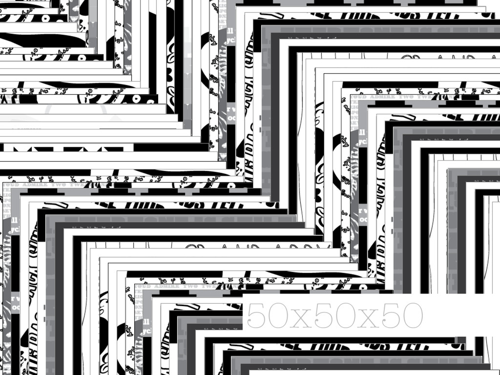
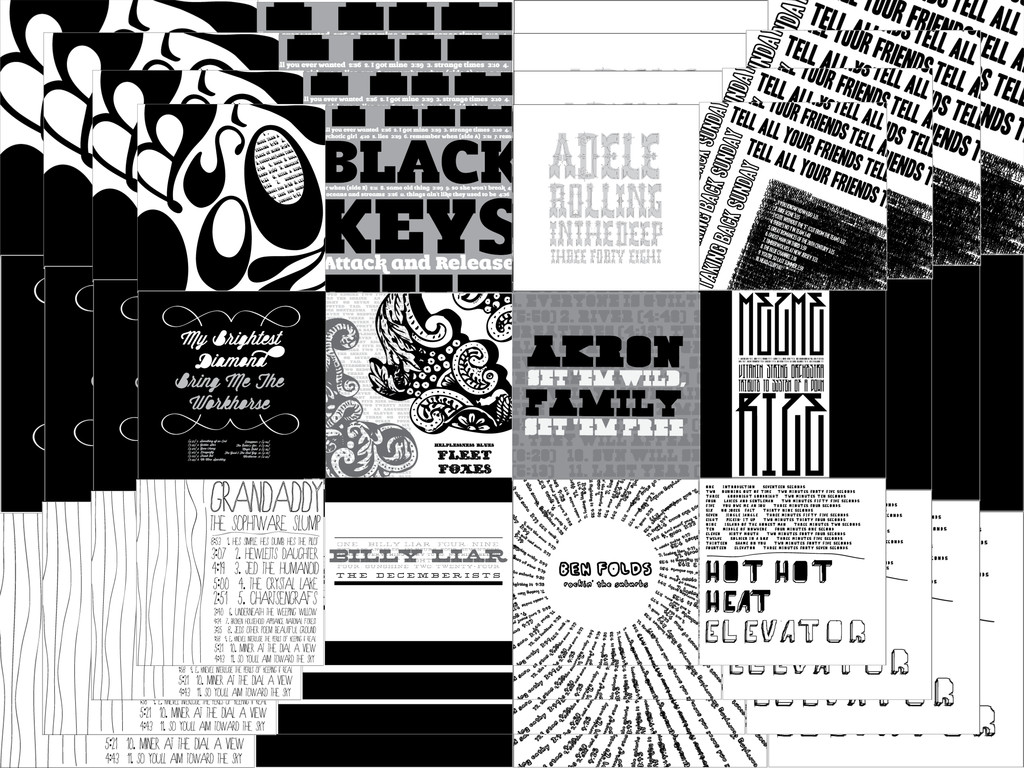
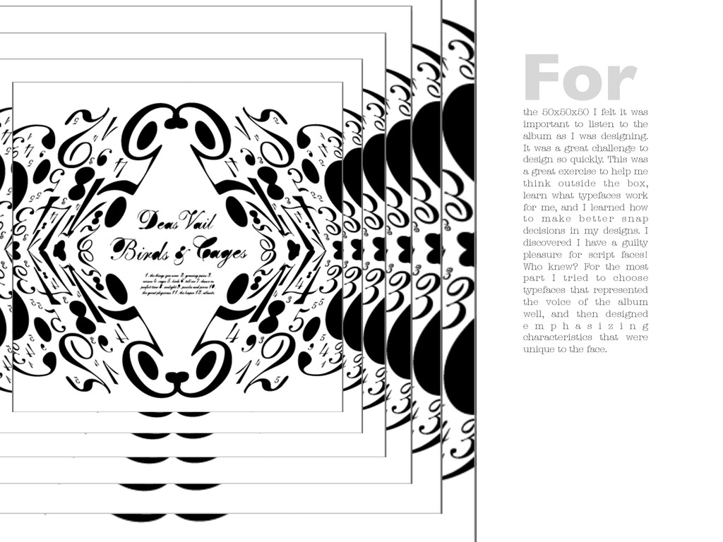
the album as I was designing. It was a great challenge to design so quickly. This was a great exercise to help me think outside the box, learn what typefaces work for me, and I learned how t o m a k e b e t t e r s n a p decisions in my designs. I discovered I have a guilty pleasure for script faces! Who knew? For the most part I tried to choose typefaces that represented the voice of the album well, and then designed e m p h a s i z i n g characteristics that were unique to the face. For
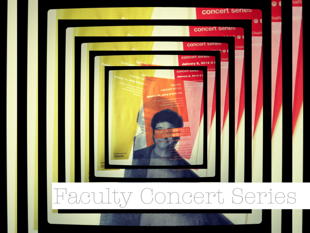
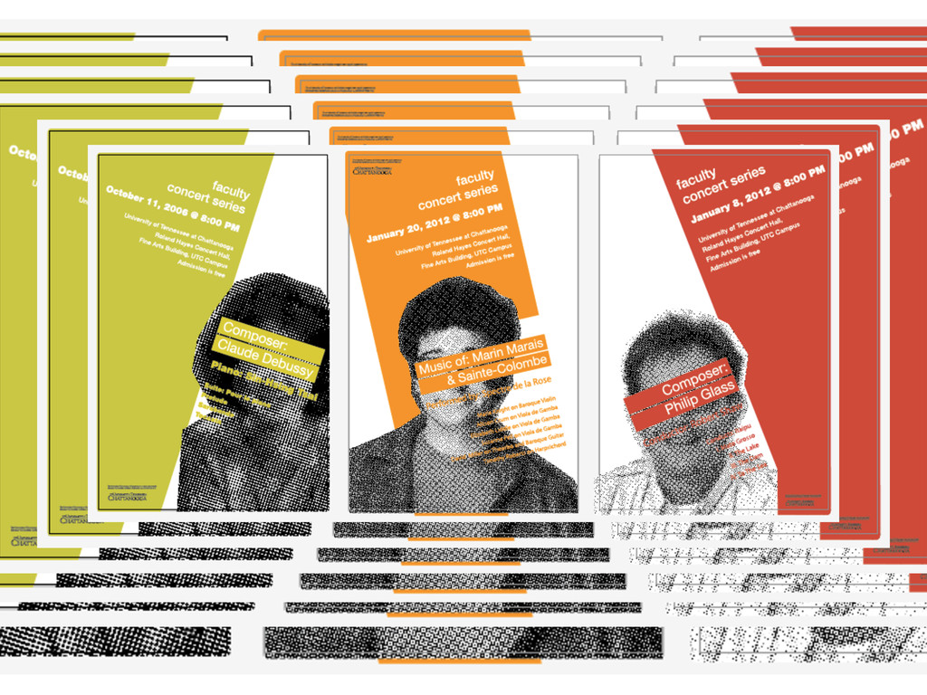
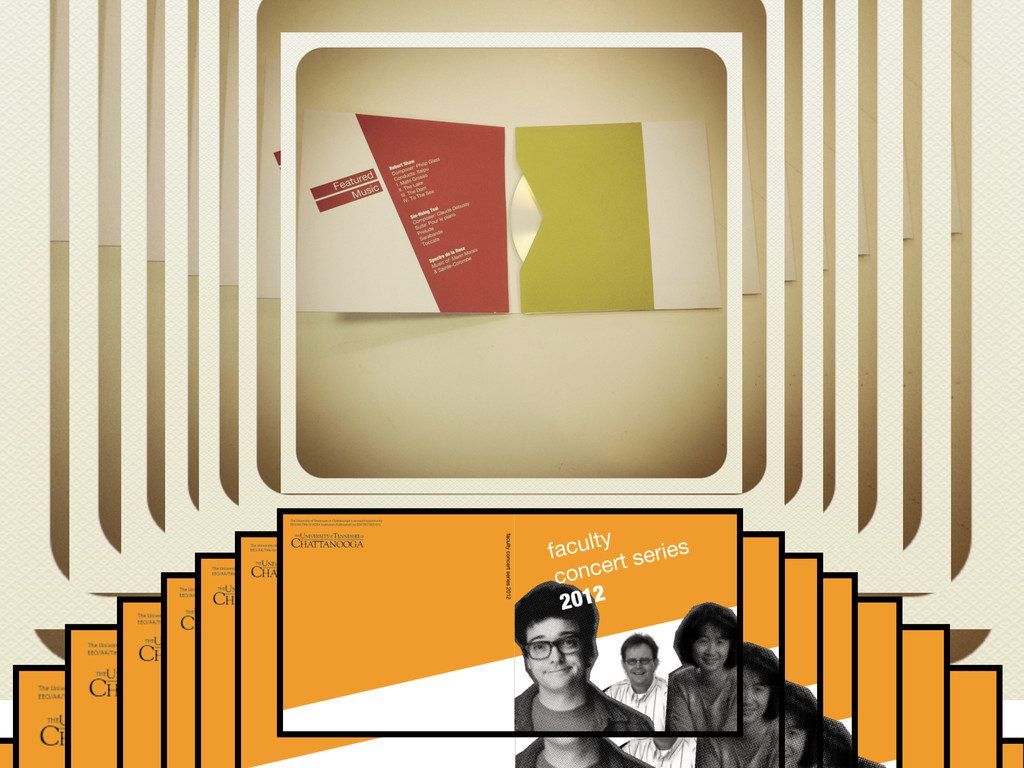
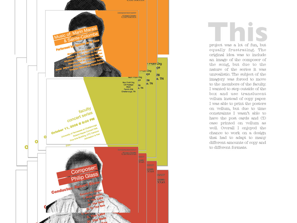
original idea was to include an image of the composer of the song, but due to the nature of the series it was unrealistic. The subject of the imagery was forced to move to the members of the faculty. I wanted to step outside of the box and use translucent vellum instead of copy paper. I was able to print the posters on vellum, but due to time constraints I wasn’t able to have the post cards and CD case printed on vellum as well. Overall I enjoyed the chance to work on a design that had to adapt to many different amounts of copy and to different formats. This
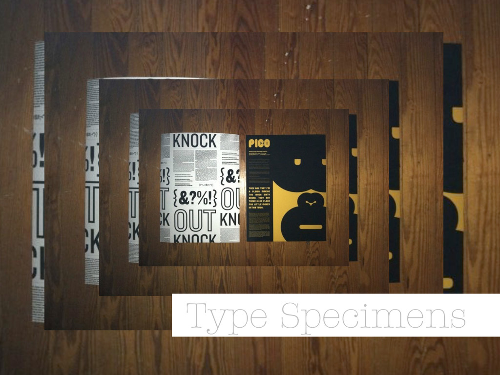
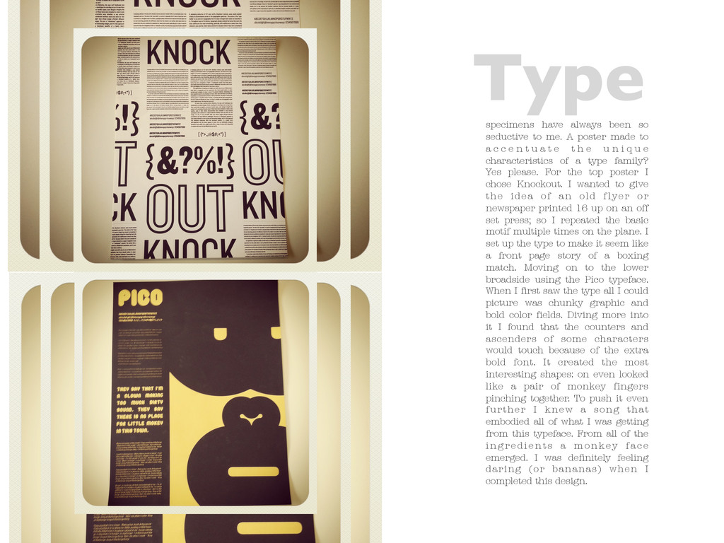
made to a c c e n t u a t e t h e u n i q u e characteristics of a type family? Yes please. For the top poster I chose Knockout. I wanted to give the idea of an old flyer or newspaper printed 16 up on an off set press; so I repeated the basic motif multiple times on the plane. I set up the type to make it seem like a front page story of a boxing match. Moving on to the lower broadside using the Pico typeface. When I first saw the type all I could picture was chunky graphic and bold color fields. Diving more into it I found that the counters and ascenders of some characters would touch because of the extra bold font. It created the most interesting shapes: on even looked like a pair of monkey fingers pinching together. To push it even further I knew a song that embodied all of what I was getting from this typeface. From all of the i n g re d i e n t s a m o n ke y f a c e emerged. I was definitely feeling daring (or bananas) when I completed this design. Type
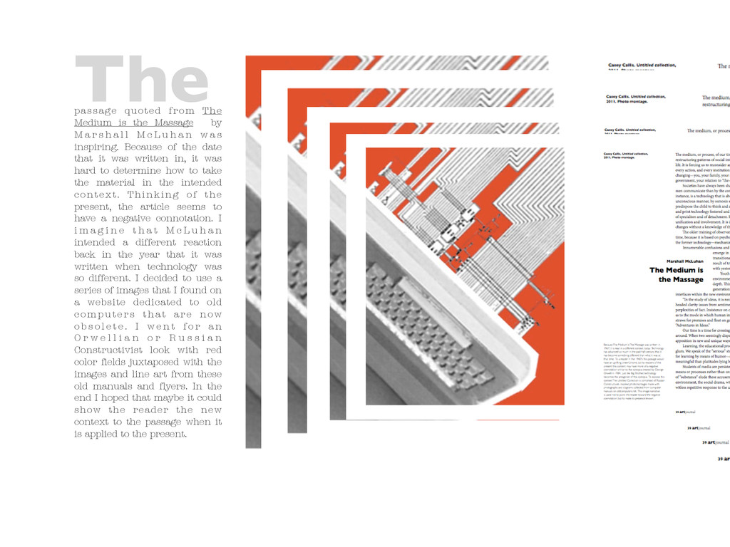
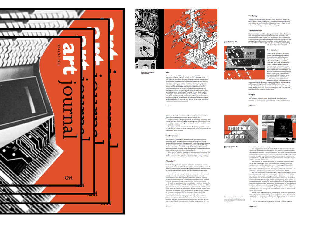
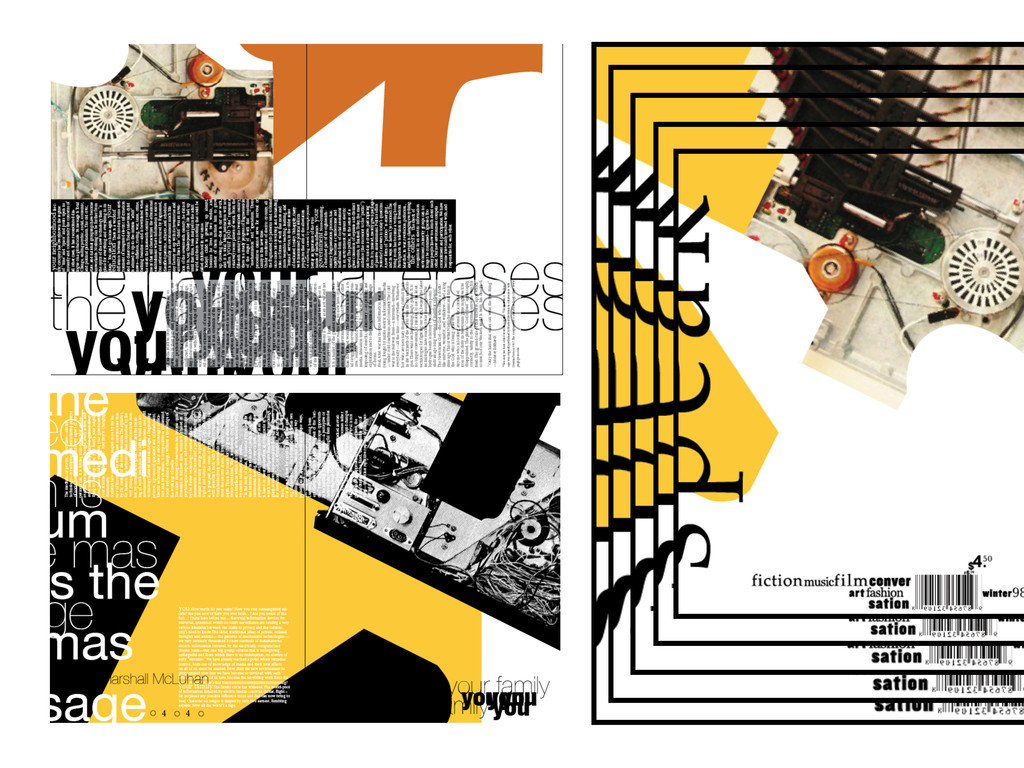
a r s h a l l M c L u h a n w a s inspiring. Because of the date that it was written in, it was hard to determine how to take the material in the intended context. Thinking of the present, the article seems to have a negative connotation. I i m a g i n e t h a t M c L u h a n intended a different reaction back in the year that it was written when technology was so different. I decided to use a series of images that I found on a website dedicated to old c o m p u t e r s t h a t a re n ow o b s o l e t e . I w e n t f o r a n O r w e l l i a n o r R u s s i a n Constructivist look with red color fields juxtaposed with the images and line art from these old manuals and flyers. In the end I hoped that maybe it could show the reader the new context to the passage when it is applied to the present. The
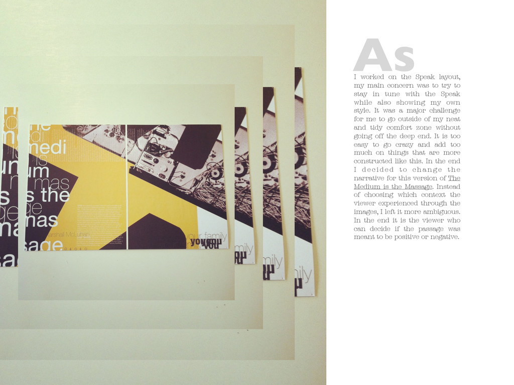
to try to stay in tune with the Speak while also showing my own style. It was a major challenge for me to go outside of my neat and tidy comfort zone without going off the deep end. It is too easy to go crazy and add too much on things that are more constructed like this. In the end I d e c i d e d t o c h a n g e t h e narrative for this version of The Medium is the Massage. Instead of choosing which context the viewer experienced through the images, I left it more ambiguous. In the end it is the viewer who can decide if the passage was meant to be positive or negative. As
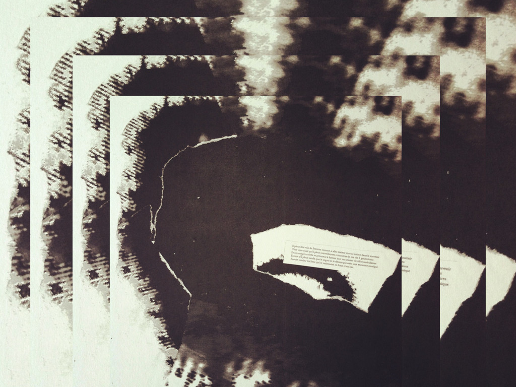
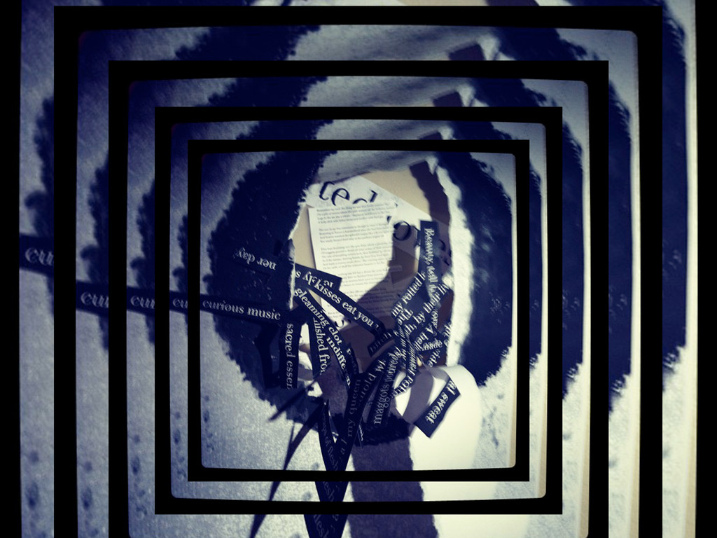
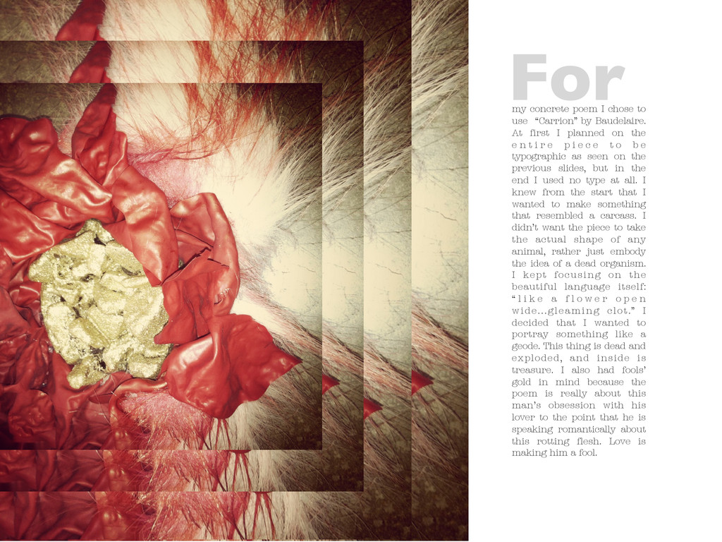
At first I planned on the e n t i r e p i e c e t o b e typographic as seen on the previous slides, but in the end I used no type at all. I knew from the start that I wanted to make something that resembled a carcass. I didn’t want the piece to take the actual shape of any animal, rather just embody the idea of a dead organism. I kept focusing on the beautiful language itself: “ l i k e a f l o w e r o p e n wide...gleaming clot.” I decided that I wanted to portray something like a geode. This thing is dead and exploded, and inside is treasure. I also had fools’ gold in mind because the poem is really about this man’s obsession with his lover to the point that he is speaking romantically about this rotting flesh. Love is making him a fool. For