Upgrade to Pro — share decks privately, control downloads, hide ads and more …

jQuery Mobile

ynonperek
October 11, 2011

jQuery Mobile

ynonperek

October 11, 2011
Tweet

More Decks by ynonperek

Other Decks in Programming

Transcript

  1. jQuery Mobile Dark Side Almost Final Dependent on jQuery Size:

    ~130k (before jQuery) jQM way or the highway Sunday, October 9, 2011
  2. Page Layout a page is just a div with data-role=”page”

    a jQM page has: header content footer Sunday, October 9, 2011
  3. Multi Page Layout Multiple pages can be specified in the

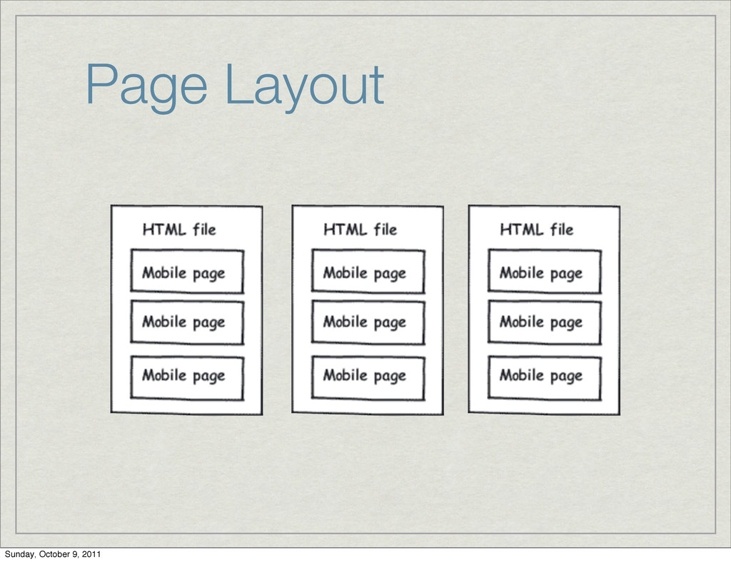
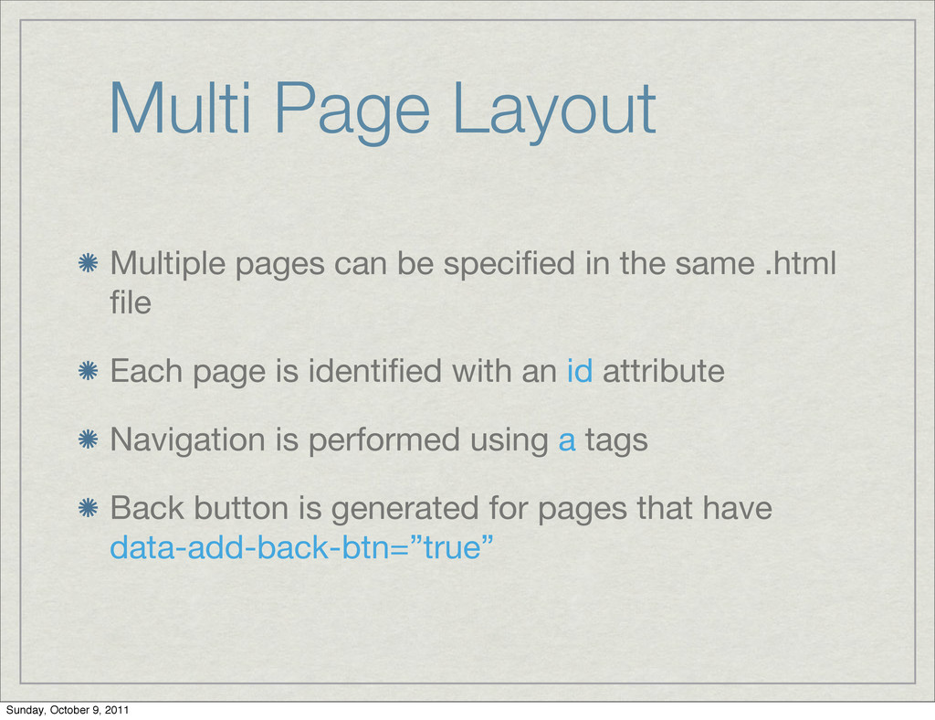
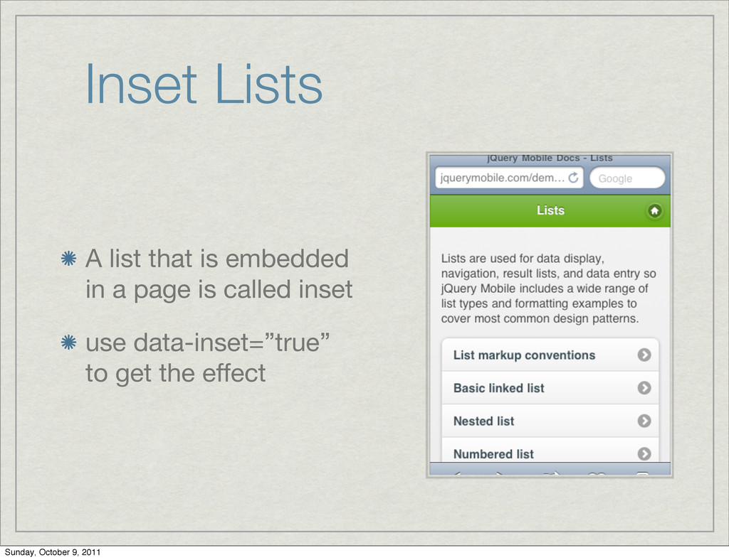
    same .html file Each page is identified with an id attribute Navigation is performed using a tags Back button is generated for pages that have data-add-back-btn=”true” Sunday, October 9, 2011
  4. Using transitions Transitions are determined via the data-transition attribute <p><a

    href="#about" data-transition="slideup">About this app</a></p> Sunday, October 9, 2011
  5. Page Transitions Effect Name Description slide slide right-to-left. This is

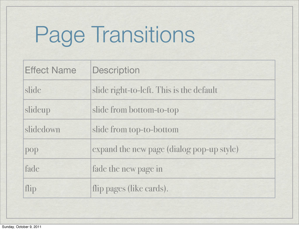
    the default slideup slide from bottom-to-top slidedown slide from top-to-bottom pop expand the new page (dialog pop-up style) fade fade the new page in flip flip pages (like cards). Sunday, October 9, 2011
  6. Exercise Write a mobile website with four pages. First page:

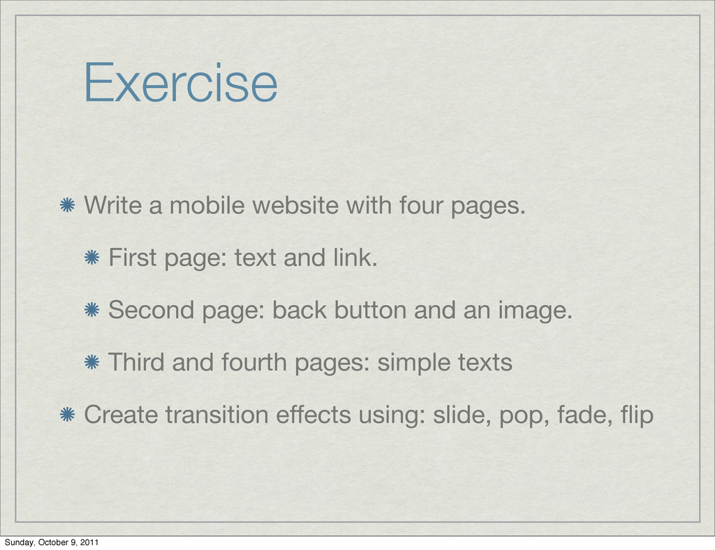
    text and link. Second page: back button and an image. Third and fourth pages: simple texts Create transition effects using: slide, pop, fade, flip Sunday, October 9, 2011
  7. jQM UI Controls jQM provides ready-made UI controls for our

    app that “look” native. This rich library includes: Toolbars Buttons Forms & Lists Sunday, October 9, 2011
  8. Toolbars We can add buttons to toolbars simply by writing

    them in the bar header bar can have 2 buttons Use inside header: <a href=”#” data-role=”button”>Add</a> Sunday, October 9, 2011
  9. Toolbars Footer can have as many buttons as you wish

    Add class=”ui-bar” to get padding Demo Sunday, October 9, 2011
  10. Toolbar Exercise Implement a mockup for a mail reader application

    Top toolbar button: Logout bottom toolbar buttons: Compose, delete, forward, reply. Sunday, October 9, 2011
  11. Buttons An anchor tag with data-role=”button” will look like a

    button Any normal form button will automatically be converted Sunday, October 9, 2011
  12. Button Icons arrow-l arrow-r arrow-u arrow-d delete plus minus check

    gear refresh forward back grid star alert info home search Sunday, October 9, 2011
  13. Inline Buttons Dialog buttons are usually placed side-by- side This

    is called inline, and achieved via data-inline=”true” Sunday, October 9, 2011
  14. Button Exercise Implement a jQM app with three buttons titled:

    red, blue and green App background color should change when a user presses a button Bonus: use gradients as background Sunday, October 9, 2011
  15. Basic List <ul data-role="listview" data-theme="g"> ! <li><a href="acura.html">Acura</a></li> ! <li><a

    href="audi.html">Audi</a></li> ! <li><a href="bmw.html">BMW</a></li> </ul> Sunday, October 9, 2011
  16. Numbered List <ol data-role="listview" data-theme="g"> ! <li><a href="acura.html">Acura</a></li> ! <li><a

    href="audi.html">Audi</a></li> ! <li><a href="bmw.html">BMW</a></li> </ol> Sunday, October 9, 2011
  17. Count Bubble List Wrap the number in an element with

    ui-li-count to get the “count bubble” <li> <a href=”#”>Inbox <span class=”ui-li-count”>12</span> </a> </li> Sunday, October 9, 2011
  18. Thumbnail Lists Insert an img tag as the first child

    in the anchor to get a thumbnail Image is automatically scaled by jQM Sunday, October 9, 2011
  19. Split List Having two links in the same item creates

    a split list Sunday, October 9, 2011
  20. Inset Lists A list that is embedded in a page

    is called inset use data-inset=”true” to get the effect Sunday, October 9, 2011
  21. Navigation Bars Navigation elements at the top or bottom of

    the page Sometimes referred as “tab bars” <div data-role="footer"> ! <div data-role="navbar"> ! ! <ul> ! ! ! <li><a href="#" class="ui-btn- active">One</a></li> ! ! ! <li><a href="#">Two</a> </li> ! ! </ul> ! </div><!-- /navbar --> </div><!-- /footer --> Sunday, October 9, 2011
  22. Top Nav Bar Put the above code in the header

    to get top nav bars They are recommended for mobile apps running inside the browser Sunday, October 9, 2011
  23. Bottom Nav Bar Put the above code in the footer

    to get bottom nav bar Recommended in standalone apps Sunday, October 9, 2011
  24. Tab Bars (ala iPhone) Use data-icon to get icons in

    the nav bars above the text Custom icons are also allowed Free iOS Style Icons: http://glyphish.com/ Sunday, October 9, 2011
  25. Icon Grids divs can be lines up in columns (or

    grid) <div class=”ui-grid-b”> <div class=”ui-block-a”> </div> <div class=”ui-block-b”> </div> <div class=”ui-block-c”> </div> </div> Sunday, October 9, 2011
  26. Exercise Implement the following App is 2 tabs: Home and

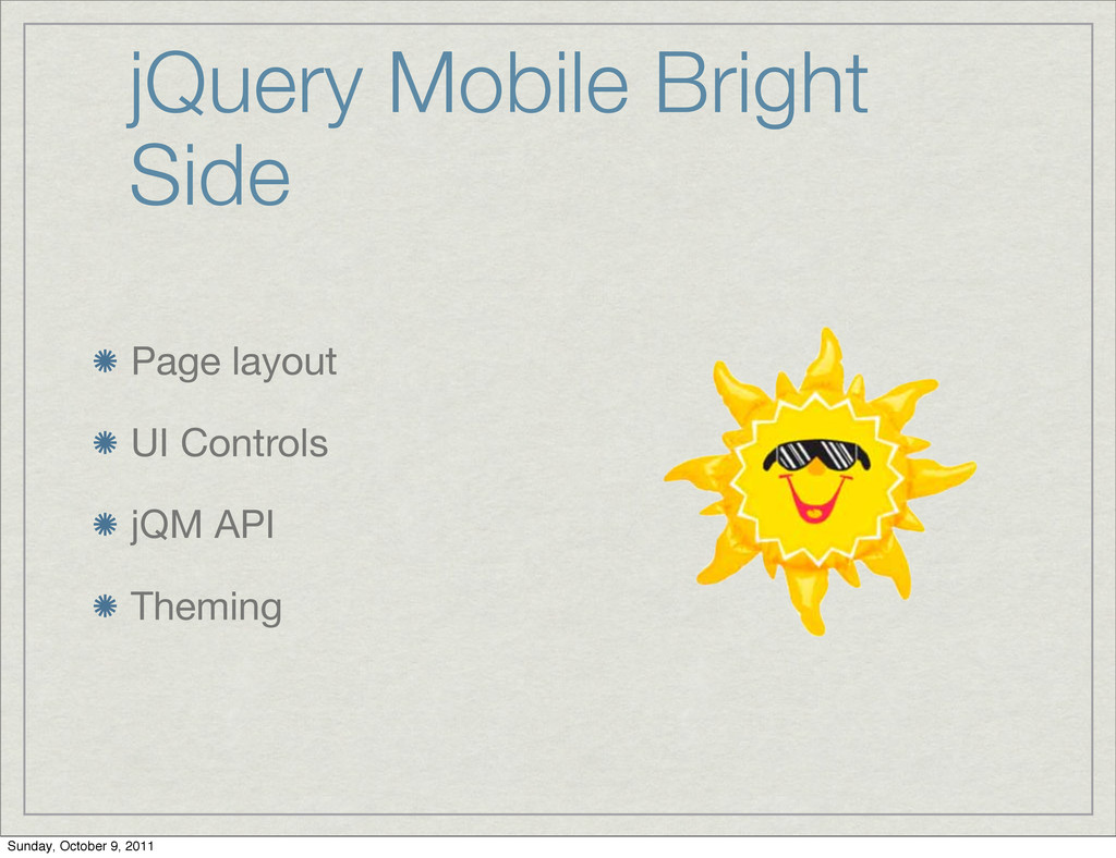
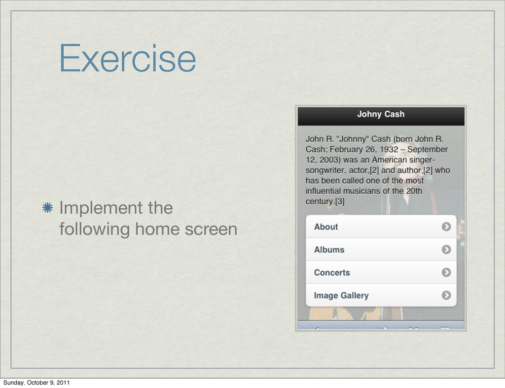
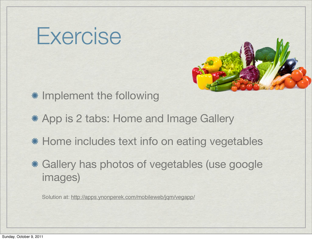
    Image Gallery Home includes text info on eating vegetables Gallery has photos of vegetables (use google images) Solution at: http://apps.ynonperek.com/mobileweb/jqm/vegapp/ Sunday, October 9, 2011
  27. Mobile Optimized Forms jQuery mobile provides a complete set of

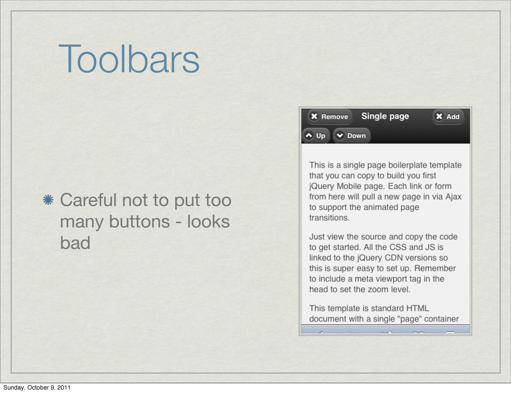
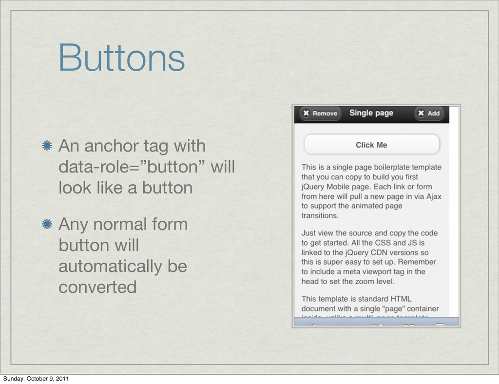
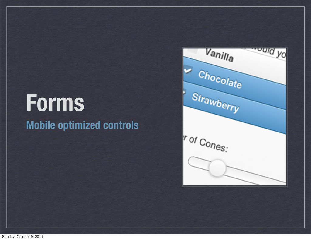
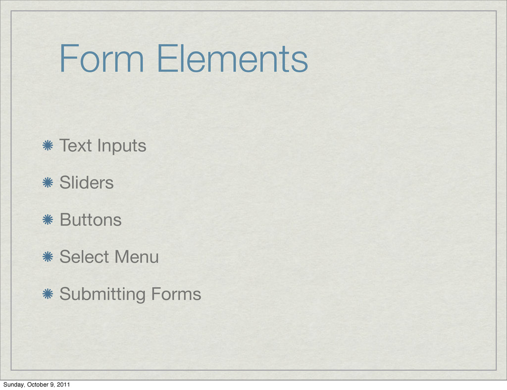
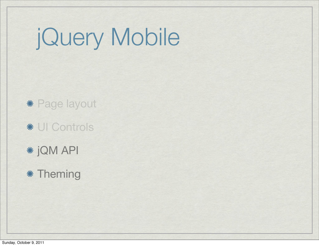
    finger friendly form elements Most form elements are automatically initialized by jQM Prevent auto initialization with data-role=”none” Sunday, October 9, 2011
  28. jQuery vs. Normal Wrap a labe/input pair in a div

    with data-role=”fieldcontain” to get the cool thin line Sunday, October 9, 2011
  29. Refresh Form controls can be set programmatically Must call “refresh”

    to refresh the ui Use $(‘#fld-radio’).checkboxradio(“refresh”); Sunday, October 9, 2011
  30. Text Inputs Available input types: text, password, number, email, url,

    tel, search textarea provides multi-line text triggers ‘create’ event on creation Sunday, October 9, 2011
  31. Slider input type=”range” creates a slider attributes: value, min, max

    refresh with .slider(‘refresh’); Sunday, October 9, 2011
  32. Buttons - Flip Switch <div data-role="fieldcontain"> ! <label for="slider">Select slider:</label>

    ! <select name="slider" id="slider" data-role="slider"> ! ! <option value="off">Off</option> ! ! <option value="on">On</option> ! </select> </div> Sunday, October 9, 2011
  33. Buttons - Radio <div data-role="fieldcontain"> <fieldset data-role="controlgroup"> ! <legend>Choose a

    pet:</legend> ! <input type="radio" id="radio-choice-1" value="choice-1" name=”pet” checked="checked" /> ! <label for="radio-choice-1">Cat</label> ! <input type="radio" id="radio-choice-2" value="choice-2" name=”pet” /> ! <label for="radio-choice-2">Dog</label> ! <input type="radio" id="radio-choice-3" value="choice-3" name=”pet” /> ! <label for="radio-choice-3">Hamster</label> ! <input type="radio" id="radio-choice-4" value="choice-4" name=”pet” /> ! <label for="radio-choice-4">Lizard</label> </fieldset> </div> Sunday, October 9, 2011
  34. Buttons - Radio Add data-type=”horizontal” to fieldset to get the

    horizontal radio buttons Refresh with .checkboxradio(‘refresh’); Sunday, October 9, 2011
  35. CheckBoxes <div data-role="fieldcontain"> <fieldset data-role="controlgroup"> <legend>Choose as many snacks as

    you like</legend> <input type="checkbox" name="checkbox-1" id="checkbox-1" /> <label for="checkbox-1">Cheetos</label> <input type="checkbox" name="checkbox-2" id="checkbox-2" /> <label for="checkbox-2">Doritos</label> <input type="checkbox" name="checkbox-3" id="checkbox-3" /> <label for="checkbox-3">Fritos</label> <input type="checkbox" name="checkbox-4" id="checkbox-4" /> <label for="checkbox-4">Sun Chips</label> </fieldset> </div> Sunday, October 9, 2011
  36. CheckBoxes Use data-role=”horizontal” for horizontal checkboxes Remember the outer div

    with data- role=”fieldcontain” so jQM can outline the field CheckBoxes & Radio Buttons both use a legend for the question text Sunday, October 9, 2011
  37. Submitting Forms AJAX is used to submit the forms No

    Ajax forms are created with data-ajax=false Sunday, October 9, 2011
  38. Forms Exercise Implement a 2 page registration from using jQM

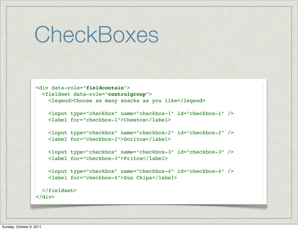
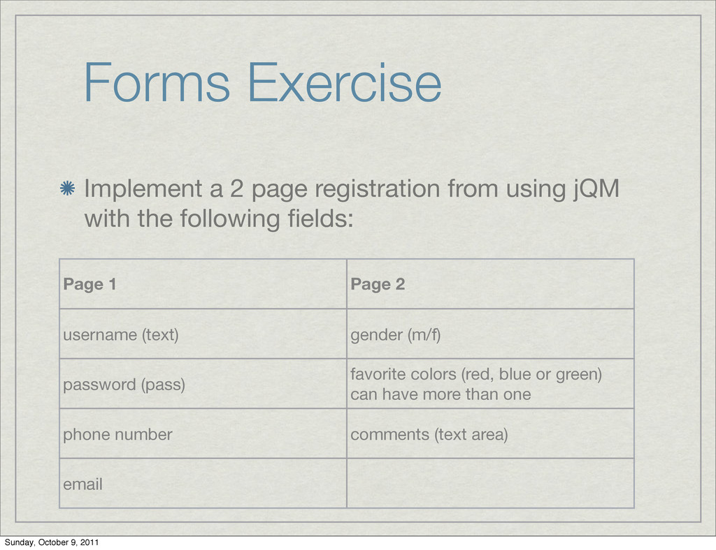
    with the following fields: Page 1 Page 2 username (text) gender (m/f) password (pass) favorite colors (red, blue or green) can have more than one phone number comments (text area) email Sunday, October 9, 2011
  39. The mobileinit Event bind to mobileinit event Note: this event

    triggers immediately upon loading jqm $(document).bind("mobileinit", function(){ //apply overrides here }); Sunday, October 9, 2011
  40. The mobileinit Event Overriding defaults is simply changing object attributes

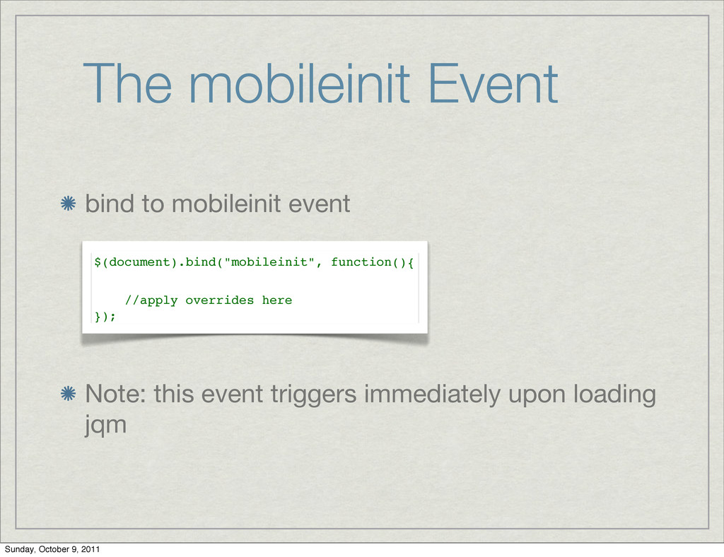
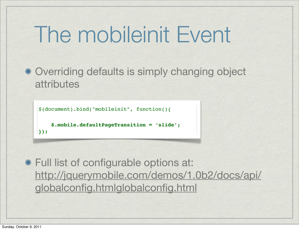
    Full list of configurable options at: http://jquerymobile.com/demos/1.0b2/docs/api/ globalconfig.htmlglobalconfig.html $(document).bind("mobileinit", function(){ $.mobile.defaultPageTransition = ‘slide’; }); Sunday, October 9, 2011
  41. jQM Events tap taphold swipe swipeleft swiperight orientationchange scrollstart scrollstop

    pageshow pagehide pagecreate pageinit Sunday, October 9, 2011
  42. Exercise (1) Implement a jQM app that has two pages

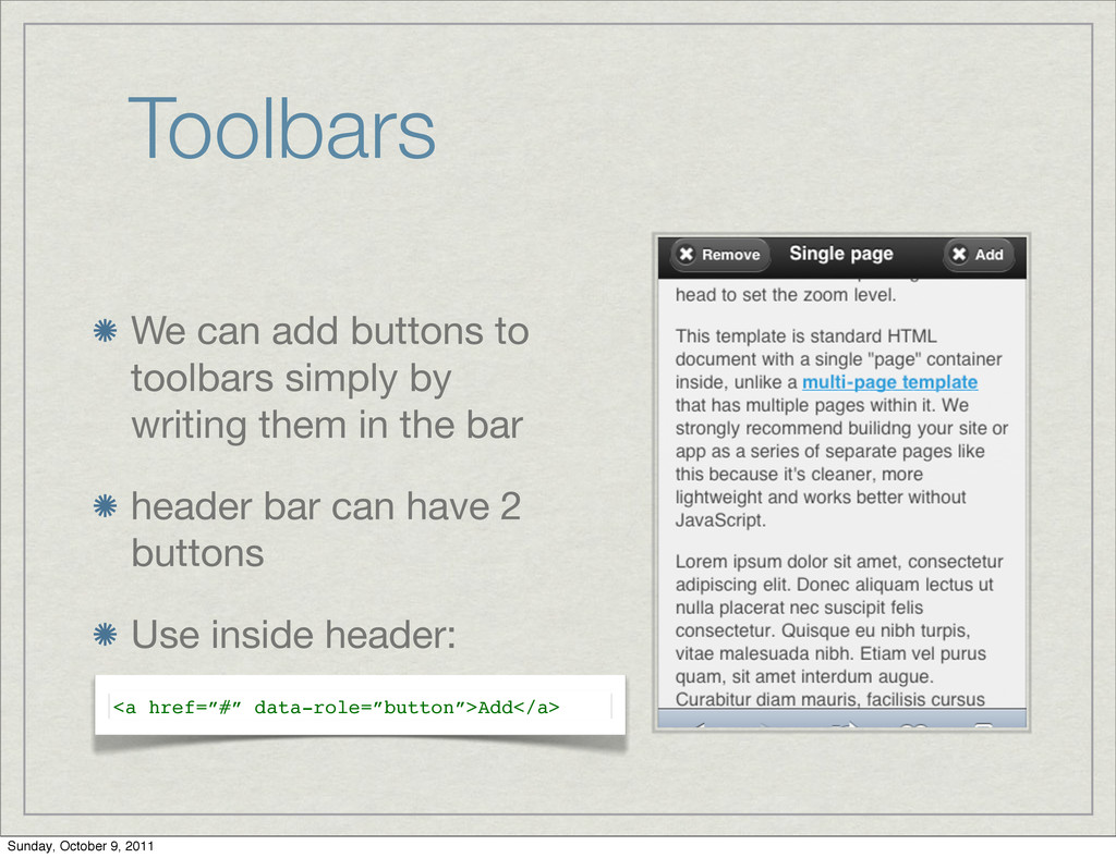
    First page keeps a combo box with values: slide, flip; and a “go” button When a user clicks “go”, app moves to the second page in the selected transition style Sunday, October 9, 2011
  43. Exercise (2) Implement a “switching cards” display - create 3

    divs and allow user to switch visible div by sliding left or right - Yahoo Style. Sunday, October 9, 2011
  44. jQM Themes The theme controls how elements look on the

    page Each theme has swatches for color play Default theme has 5 swatches marked a,b,c,d,e Sunday, October 9, 2011
  45. jQM Customize Theme To customize a theme: Edit jQM css

    Copy a swatch definitions as a new swatch Change the swatch letter Make your changes Sunday, October 9, 2011