Graduated from Jamia Millia Islamia, new Delhi in 2016 • Mentor- IEEE WIE Project Stand (Data Science Track) • Review Committee- GHC India (Data Science Track) • Volunteer- Women Who Code, Lean In India Links: • Github:https://github.com/sara-02 • Blog: https://themessier.wordpress.com • Linkedin: https://www.linkedin.com/in/sarahmasud
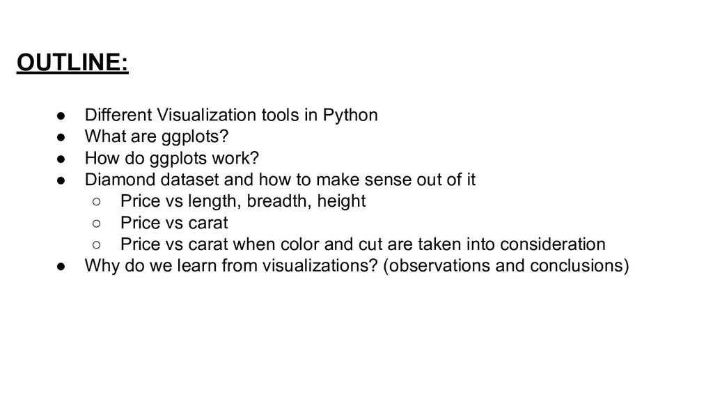
ggplots? • How do ggplots work? • Diamond dataset and how to make sense out of it ◦ Price vs length, breadth, height ◦ Price vs carat ◦ Price vs carat when color and cut are taken into consideration • Why do we learn from visualizations? (observations and conclusions)
easy interface to generate state of art visualizations. Written originally for R, its success enabled it be used for Python as well. COMPONENTS OF ggplot: • ggplot API- Used to implement the plots. • Data- Uses data as Data Frames as in pandas. • Aesthetics- How the axes and theme looks. • Layer- what information is annotated on top of basic plot.
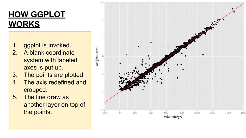
coordinate system with labeled axes is put up. 3. The points are plotted. 4. The axis redefined and cropped. 5. The line draw as another layer on top of the points.
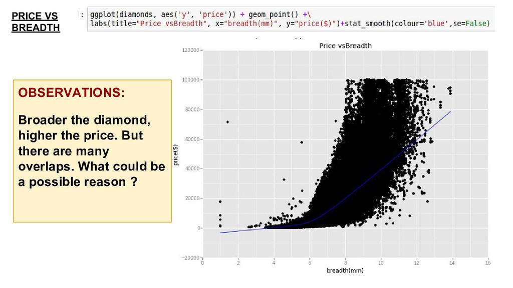
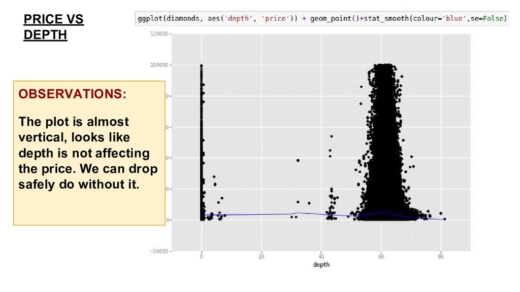
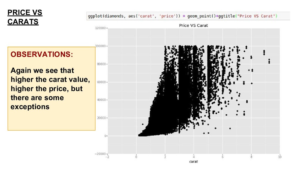
diamond (1 carat=0.2g) • Cut- Quality of cut • Color- Color of diamond (J-worst D-best) • Clarity- A measure of how clear the diamond is. • Cert- The level of certification granted. • x- Length in mm. • y- Breadth in mm. • z- Height in mm. • Measurement- Volume in terms of x*y*z. • Table- Width of top of diamond relative to widest point. • Depth- Numerically = (2*z) /(x+y)
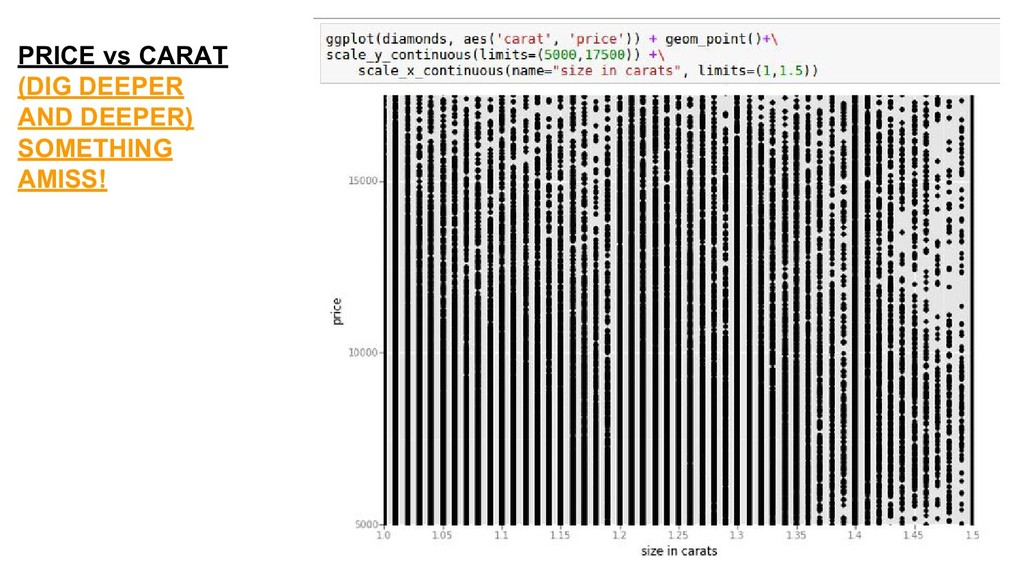
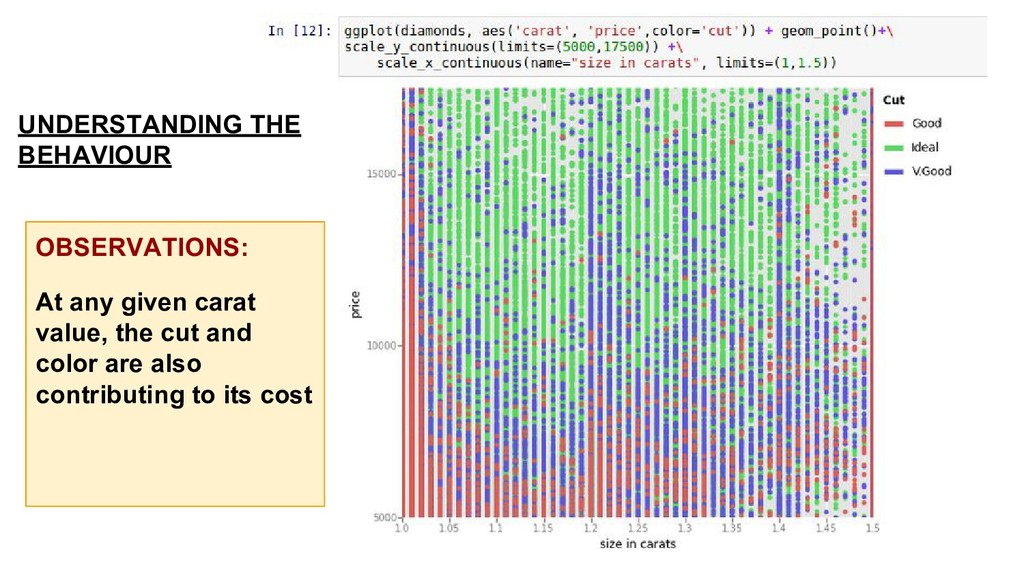
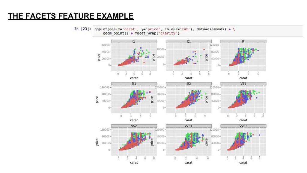
Yes, it does but there are exceptions Assumption: Better the cut quality, higher the price Result: Yes, for a given carat value cut quality changes price.