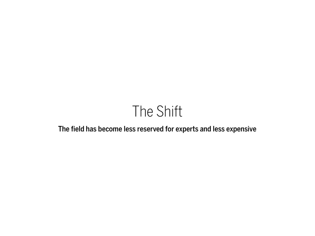
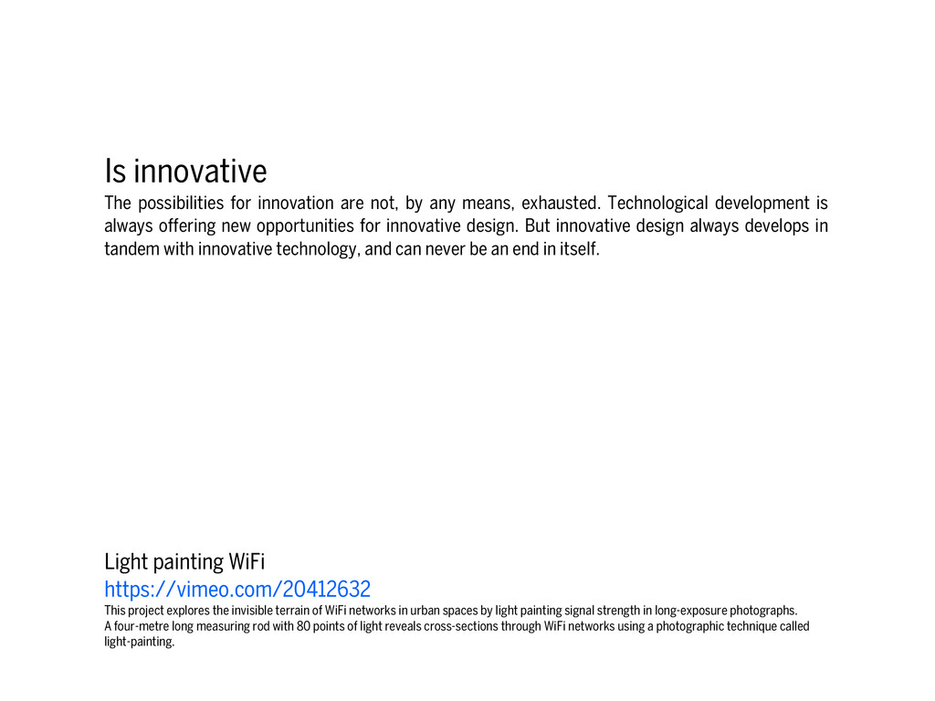
means, exhausted. Technological development is always offering new opportunities for innovative design. But innovative design always develops in tandem with innovative technology, and can never be an end in itself. Light painting WiFi https://vimeo.com/20412632 This project explores the invisible terrain of WiFi networks in urban spaces by light painting signal strength in long-exposure photographs. A four-metre long measuring rod with 80 points of light reveals cross-sections through WiFi networks using a photographic technique called light-painting.
used. It has to satisfy certain criteria, not only functional, but also psychological and aesthetic. Good design emphasizes the usefulness of a product whilst disregarding anything that could possibly detract from it. NYTimes - The Jobless Rate for People Like You http://www.nytimes.com/interactive
to its usefulness because products are used every day and have an effect on people and their well-being. Only well-executed objects can be beautiful. NYTimes - Usain Bolt vs. 116 years of Olympic sprinters http://www.nytimes.com/interactive/2012/08/05/sports/olympics/the-100- meter-dash-one-race-every-medalist-ever.html Based on the athletes’ average speeds, if every Olympic medalist raced each other, Usain Bolt (the London version) would win, with a wide distribution of Olympians behind him. Below, where each sprinter would be when Bolt finishes his race.
still, it can make the product clearly express its function by making use of the user's intuition. At best, it is self-explanatory. Angela Morelli - The Water We Eat http://www.angelamorelli.com/water/ An information journey on The Global Water Footprint of Humanity
are neither decorative objects nor works of art. Their design should therefore be both neutral and restrained, to leave room for the user's self- expression. Wind Map http://hint.fm/wind/ An invisible, ancient source of energy surrounds us—energy that powered the first explorations of the world, and that may be a key to the future. This map shows you the delicate tracery of wind flowing over the US.
antiquated. Unlike fashionable design, it lasts many years – even in today's throwaway society. Jason Davis - Prime Number Pattern http://www.jasondavies.com/primos/ For each natural number n, we draw a periodic curve starting from the origin, intersecting the x-axis at n and its multiples. The prime numbers are those that have been intersected by only two curves: the prime number itself and one.
or left to chance. Care and accuracy in the design process show respect towards the consumer. Jonathan Harris and Sep Kamvar - We Feel Fine http://www.wefeelfine.org/ An exploration of human emotion on a global scale. A program that scans all blogs every few minutes for sentences that contain the words that contain "I feel" or "I am feeling". Four years and 12 million feelings later, we decided to write a book on what we've found.
because it concentrates on the essential aspects, and the products are not burdened with non-essentials. Back to purity, back to simplicity. Ben Fry - Salary vs Performance http://benfry.com/salaryper/ What baseball teams are spending their money well, and how does it change over the course of the season?
powerful or valuable than it really is. It does not attempt to manipulate the consumer with promises that cannot be kept. “Making an evidence presentation is a moral act as well as an intellectual activity” Edward Tufte
number n, we draw a periodic curve starting from the origin, intersecting the x-axis at n and its multiples. The prime numbers are those that have been intersected by only two curves: the prime number itself and one. ! Chris Jordan - Running The Numbers http://www.chrisjordan.com/gallery/rtn/#skull-with-cigarette Depicts 200,000 packs of cigarettes, equal to the number of Americans who die from cigarette smoking every six months. Based on a painting by Van Gogh. ! Light painting WiFi https://vimeo.com/20412632 This project explores the invisible terrain of WiFi networks in urban spaces by light painting signal strength in long-exposure photographs. A four-metre long measuring rod with 80 points of light reveals cross-sections through WiFi networks using a photographic technique called light-painting. Beautiful Visualization Concept
energy surrounds us—energy that powered the first explorations of the world, and that may be a key to the future. This map shows you the delicate tracery of wind flowing over the US. ! NASA - Perpetual Ocean http://www.youtube.com/watch?v=CCmTY0PKGDs This visualization shows ocean surface currents around the world during the period from June 2005 through Decemeber 2007. The visualization does not include a narration or annotations; the goal was to use ocean flow data to create a simple, visceral experience. ! OpenStreetMap - A Year of Edits http://vimeo.com/2598878 An animation showing edits to the OpenStreetMap.org project during 2008. OpenStreetMap is a wiki-style map of the world and this animation displays a white flash each time a way is entered or updated. Some edits are a result of a physical local survey by a contributor with a GPS unit and taking notes, other edits are done remotely using aerial photography or out-of-copyright maps, and some are bulk imports of official data. ! Aaron Koblin - Flight Pattern http://www.aaronkoblin.com/work/flightpatterns/ THERE ARE ROADS IN THE SkY. We can’t see them, but they are there: distinct, sharply defined avenues, traversed by thousands of airplanes every day. As individ- ual observers we might never guess this was the case, but plotting the raw flight data shows us otherwise ! Garet Lloyd - A History of the World in 100 Seconds https://vimeo.com/19088241 Many Wikipedia articles are tagged with geographic coordinates. Many have references to historic events. Cross referencing these two subsets and plotting them year on year adds up to a dynamic visualization of Wikipedia's view of world history. Complexity
You http://www.nytimes.com/interactive ! Ben Fry - Salary vs Performance http://benfry.com/salaryper/ What baseball teams are spending their money well, and how does it change over the course of the season? ! Jonathan Harris and Sep Kamvar - We Feel Fine http://www.wefeelfine.org/ An exploration of human emotion on a global scale. A program that scans all blogs every few minutes for sentences that contain the words that contain "I feel" or "I am feeling". Four years and 12 million feelings later, we decided to write a book on what we've found. ! The Evolution Of the Web http://www.evolutionoftheweb.com/ Over time web technologies have evolved to give web developers the ability to create new generations of useful and immersive web experiences. Today's web is a result of the ongoing efforts of an open web community that helps define these web technologies, like HTML5, CSS3 and WebGL and ensure that they're supported in all web browsers. ! U.S. 2010 Census http://www.visualizing.org/visualizations/demographic-foam-us-census-2010 When you redraw U.S. county map, scaling the area of each county in proportion to its population while keeping adjacency, You can observe mixture of a few large megalopolis and many small counties in-between. ! Colours in Movie Poster since 1914 http://www.vijayp.ca/movies/new_page.html#nondetail Exploration
Olympic sprinters http://www.nytimes.com/interactive/2012/08/05/sports/olympics/the-100-meter-dash-one- race-every-medalist-ever.html Based on the athletes’ average speeds, if every Olympic medalist raced each other, Usain Bolt (the London version) would win, with a wide distribution of Olympians behind him. Below, where each sprinter would be when Bolt finishes his race. ! Jer Thorp - Just Landed https://vimeo.com/4587178 I'm also interested in visualizing information that isn't implicitly shared - but instead is inferred or suggested. This piece looks for tweets containing the phrases 'just landed in...' or 'just arrived in...'. Locations from these tweets are located using MetaCarta's Location Finder API. The home location for the traveling users are scraped from their Twitter pages. The system then plots these voyages over time. ! Fathom - GE Installation https://vimeo.com/36354487 It uses the data about the location and power output from 713 GE gas turbines during fifteen days. ! Angela Morelli - The Water We Eat http://www.angelamorelli.com/water/ An information journey on The Global Water Footprint of Humanity ! Evolution of the F1 Car https://vimeo.com/43233380 An animated timeline of all F1 seasons: 1950-2012 Presentation