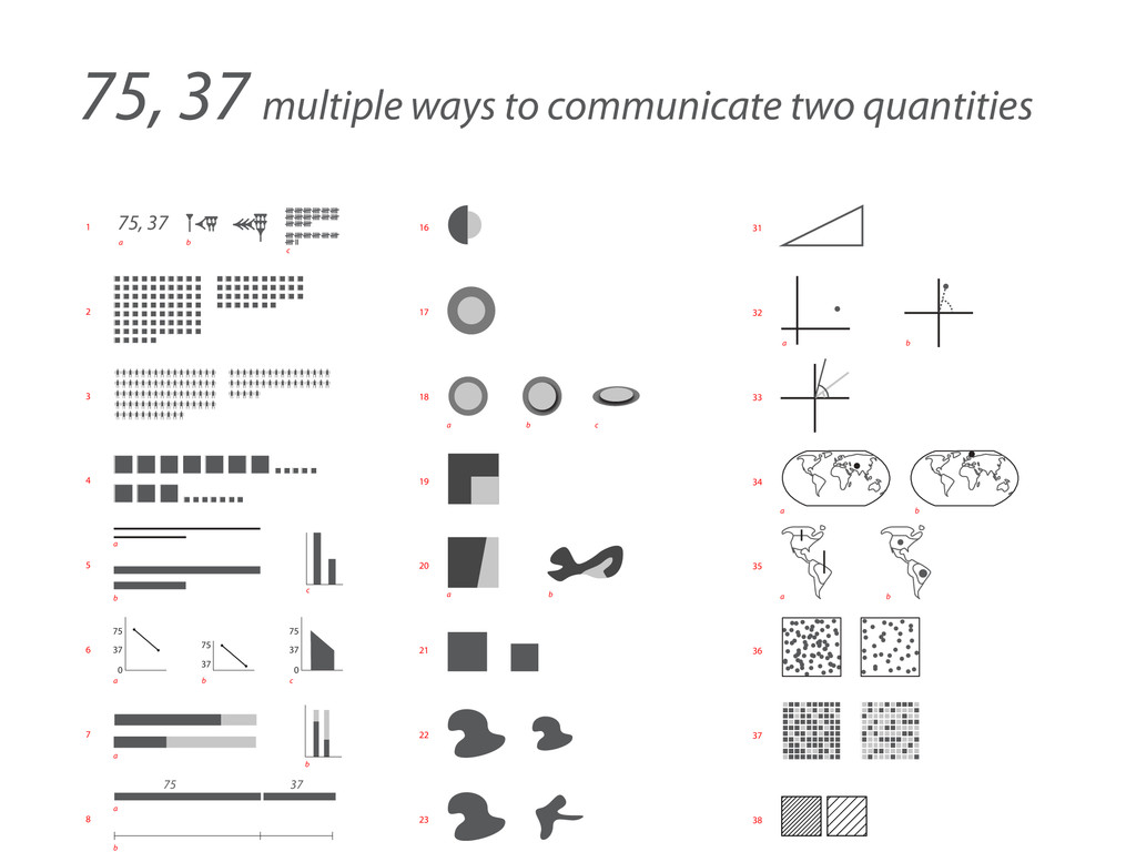
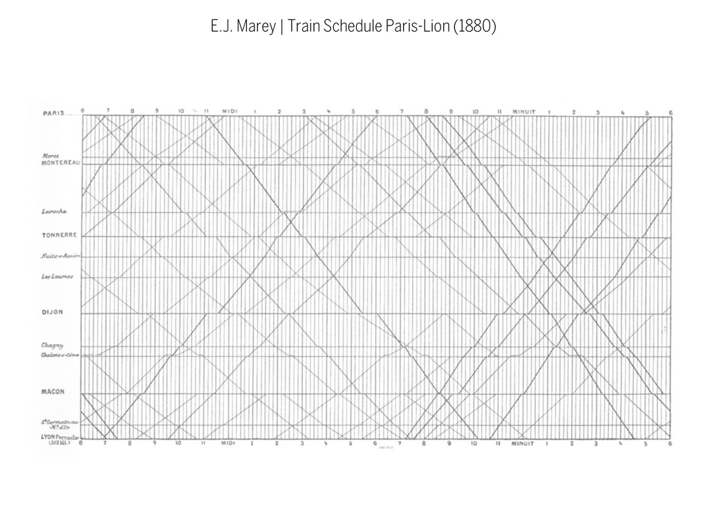
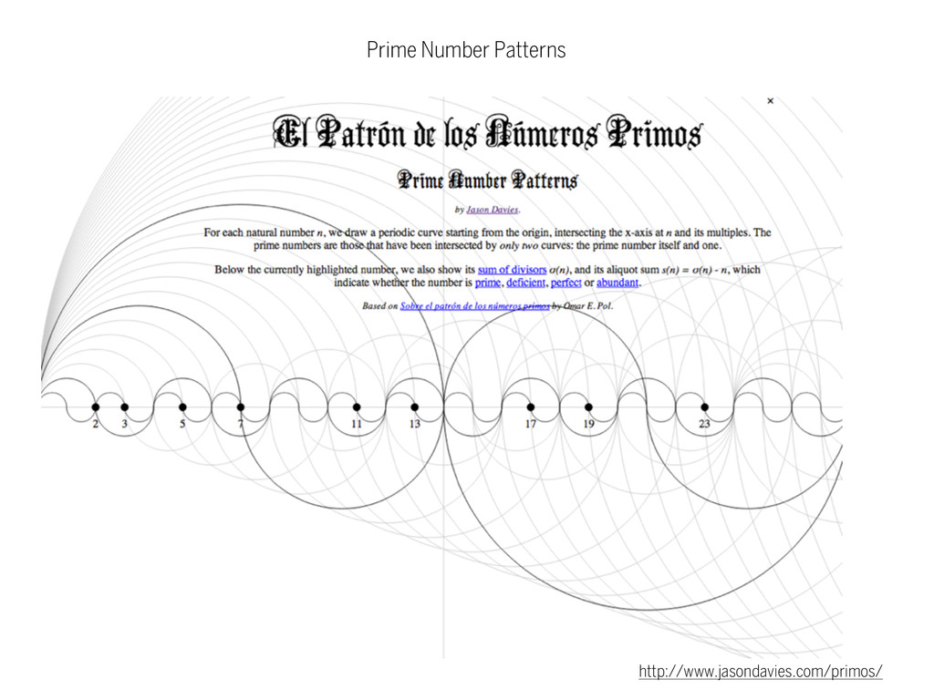
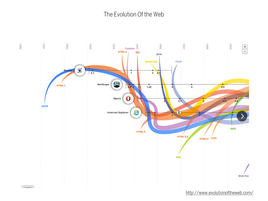
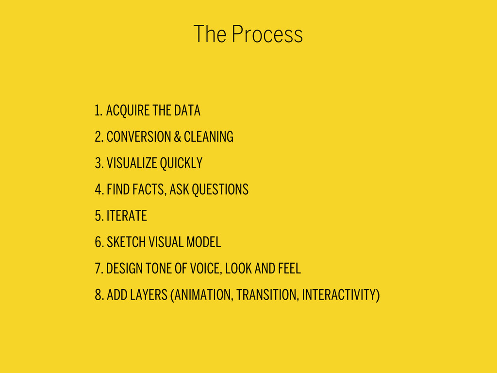
18 19 20 21 22 23 31 32 33 34 35 36 37 38 75, 37 multiple ways to communicate two quantities 75 37 37 75 0 37 75 0 37 75 a a a a b b b c a b a b a b a b a b c b c 75, 37 a b c
means, exhausted. Technological development is always offering new opportunities for innovative design. But innovative design always develops in tandem with innovative technology, and can never be an end in itself.
has to satisfy certain criteria, not only functional, but also psychological and aesthetic. Good design emphasizes the usefulness of a product whilst disregarding anything that could possibly detract from it.
are neither decorative objects nor works of art. Their design should therefore be both neutral and restrained, to leave room for the user's self- expression.
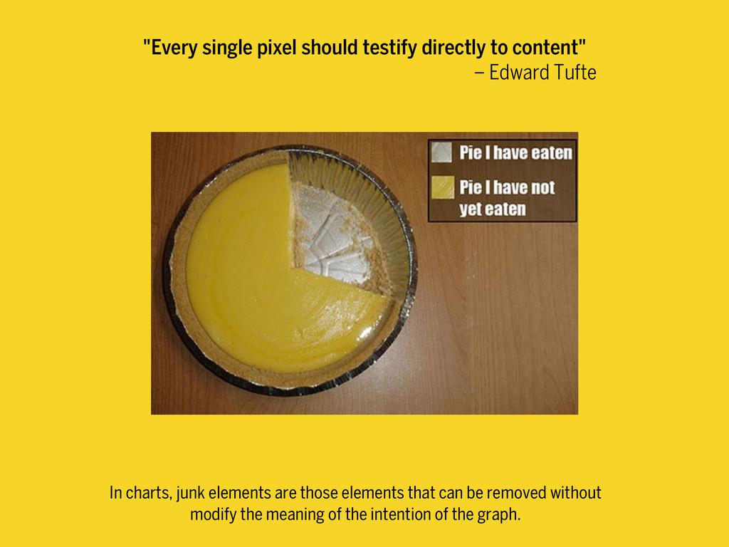
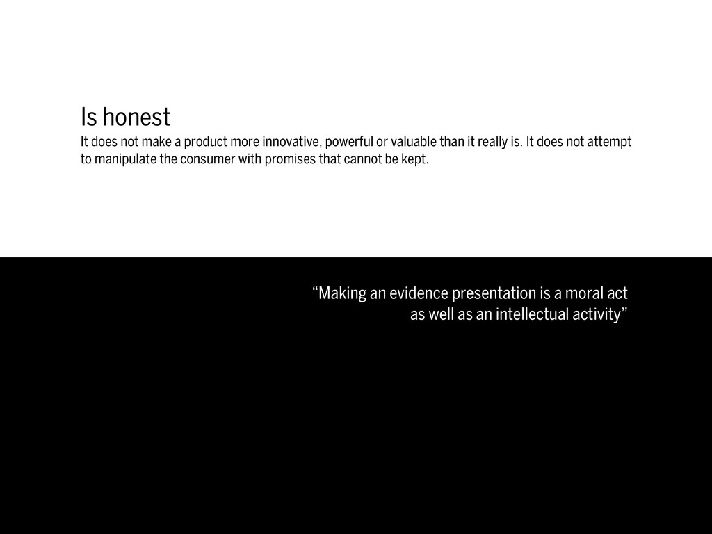
powerful or valuable than it really is. It does not attempt to manipulate the consumer with promises that cannot be kept. “Making an evidence presentation is a moral act as well as an intellectual activity” Edward Tufte
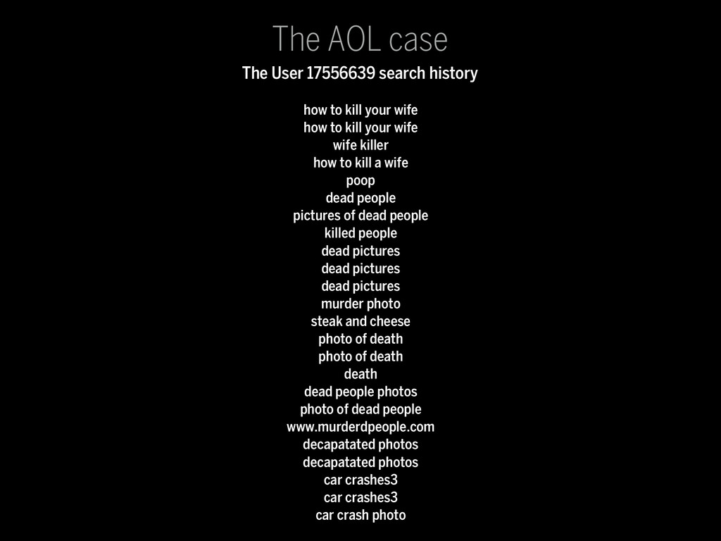
wife killer how to kill a wife poop dead people pictures of dead people killed people dead pictures dead pictures dead pictures murder photo steak and cheese photo of death photo of death death dead people photos photo of dead people www.murderdpeople.com decapatated photos decapatated photos car crashes3 car crashes3 car crash photo The AOL case The User 17556639 search history
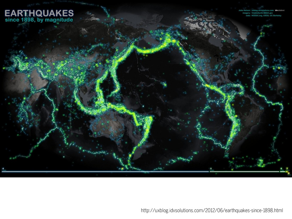
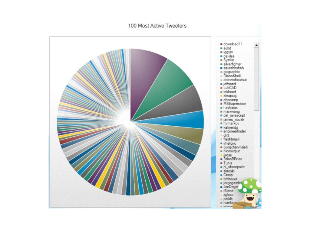
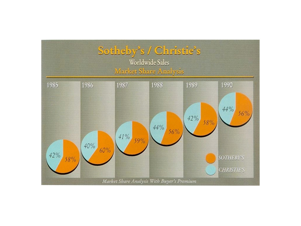
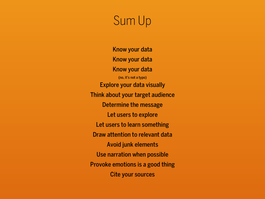
data (no, it’s not a typo) Explore your data visually Think about your target audience Determine the message Let users to explore Let users to learn something Draw attention to relevant data Avoid junk elements Use narration when possible Provoke emotions is a good thing Cite your sources
![Thanks Fabio Franchino - todo.to.it - May 2014 - [email protected]](https://files.speakerdeck.com/presentations/17544710b9270131407c0650dab55004/slide_122.jpg)