$30 off During Our Annual Pro Sale. View Details »

Interactive Data Visualisation

Amit Kapoor
July 29, 2017

Interactive Data Visualisation

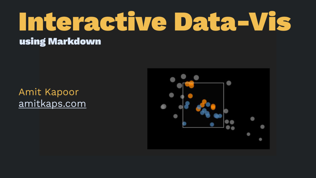
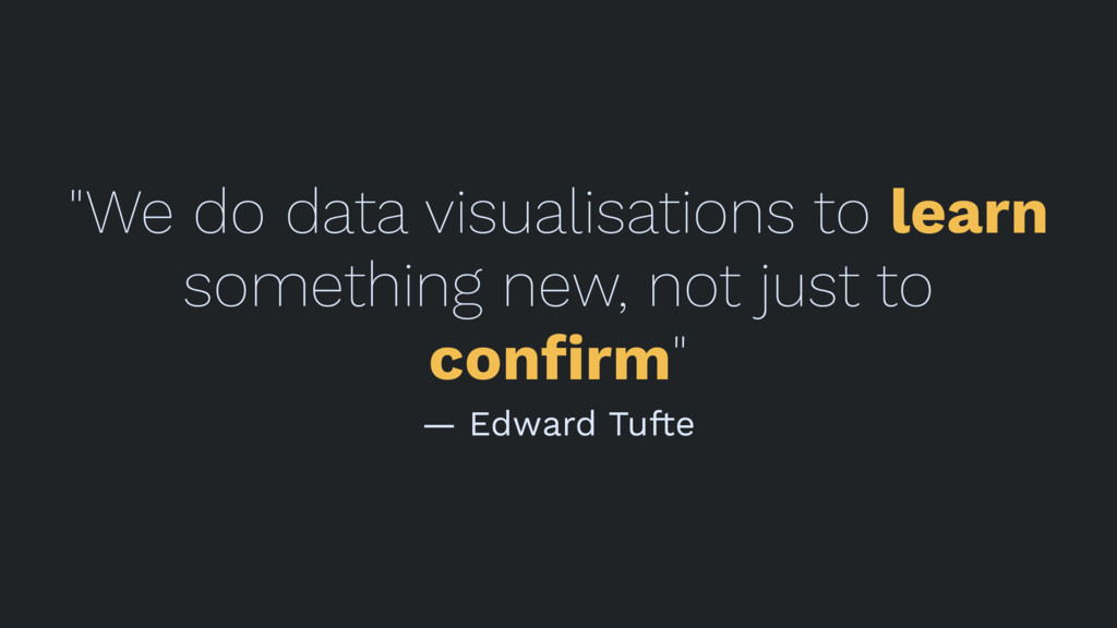
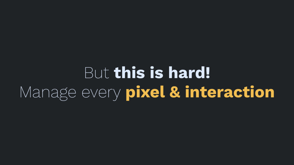
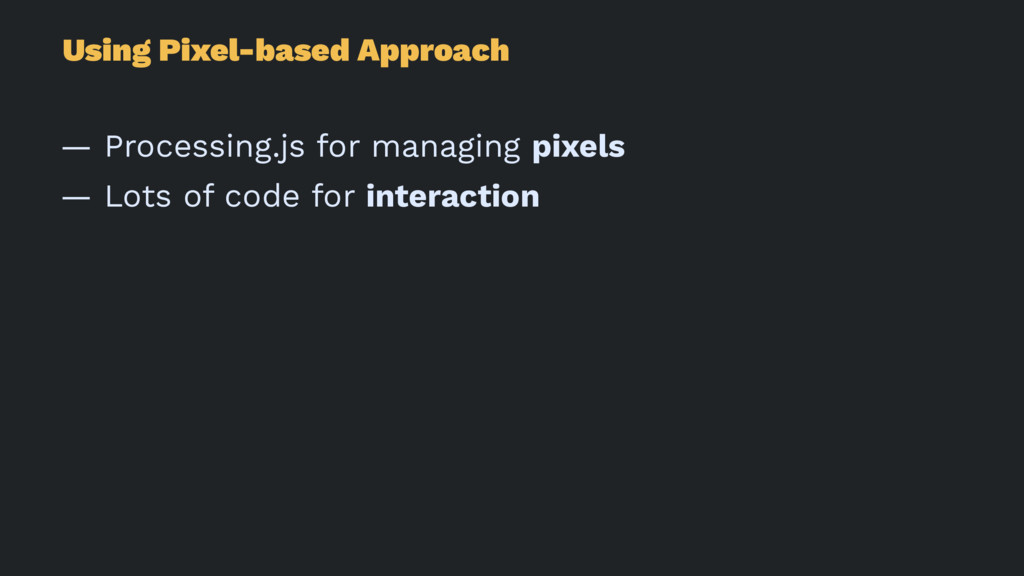
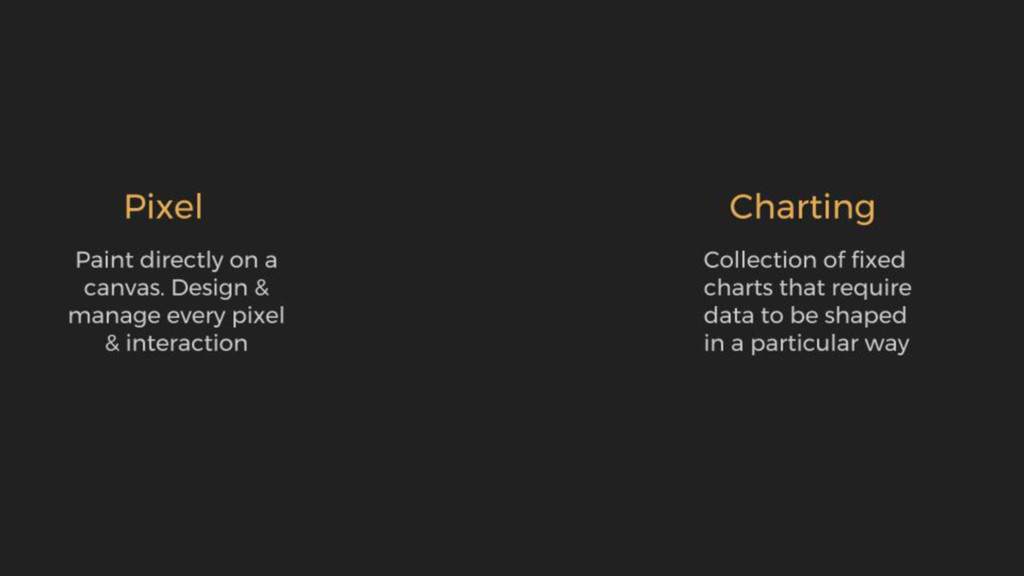
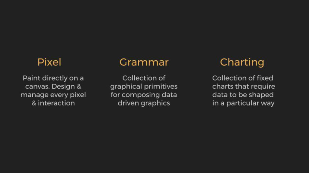
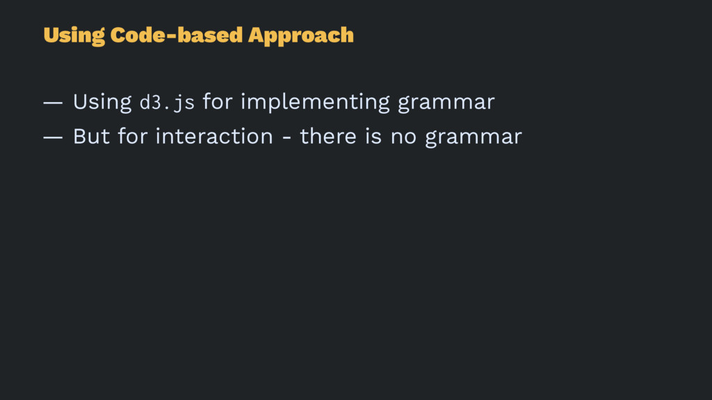
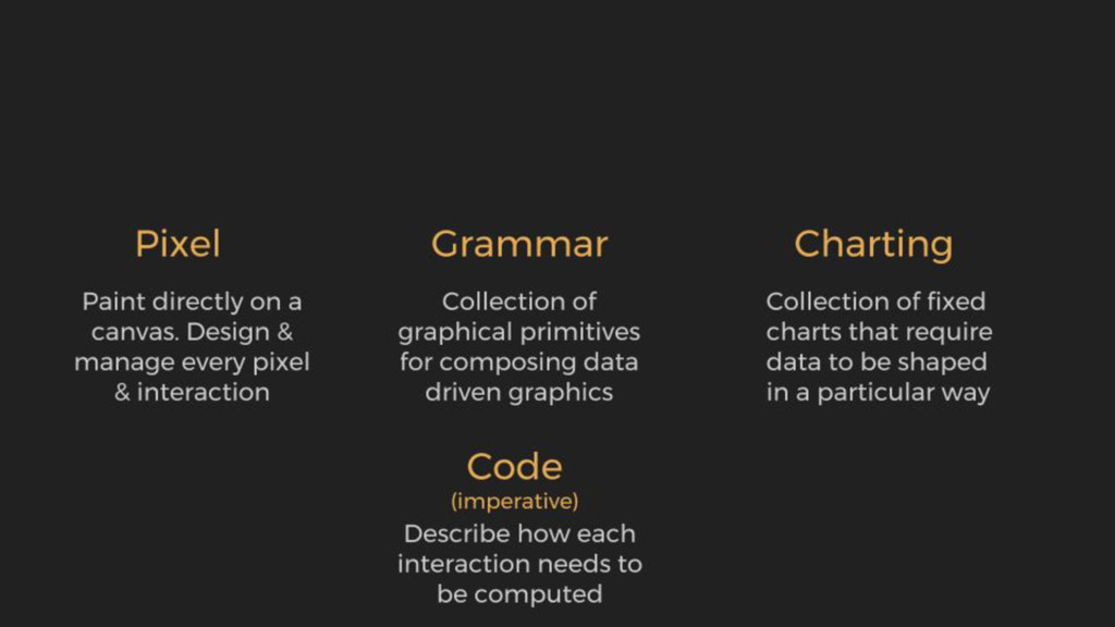
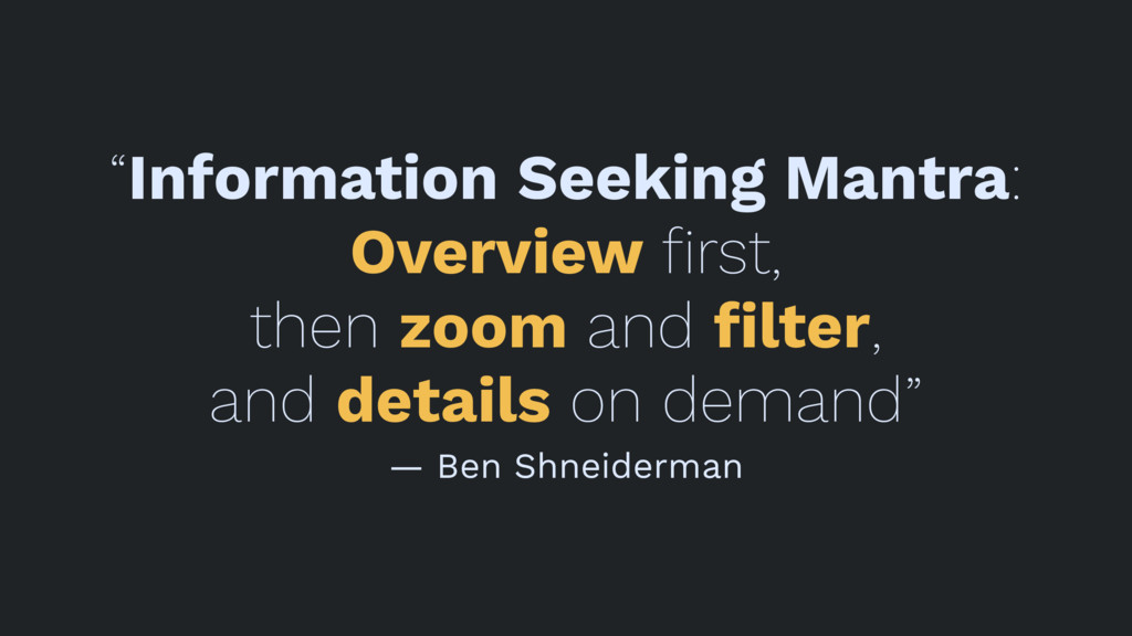
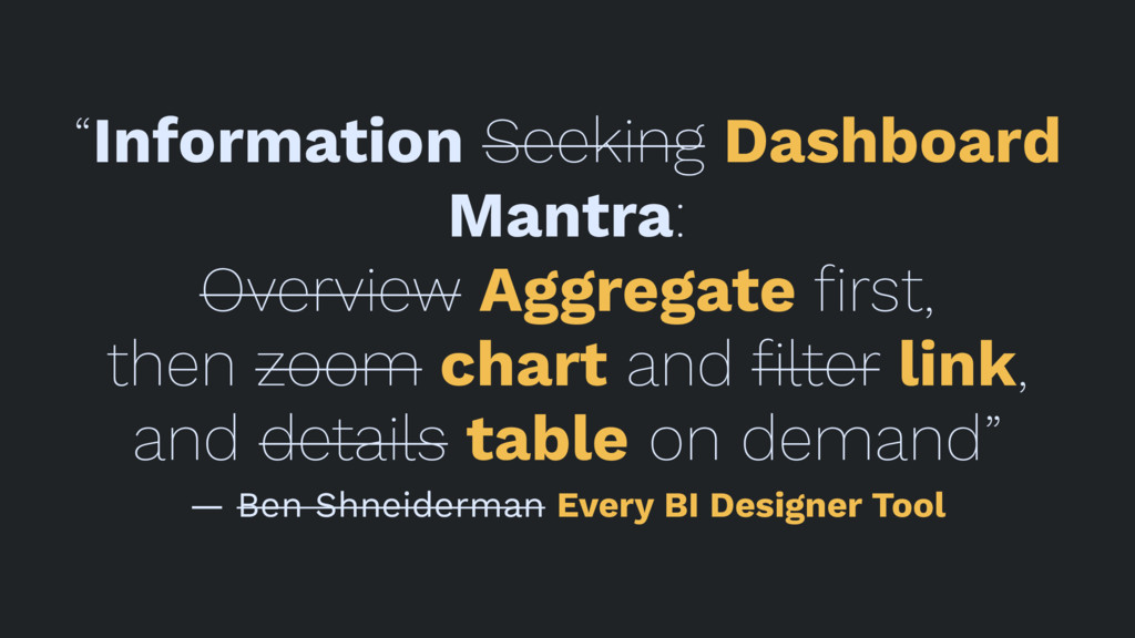
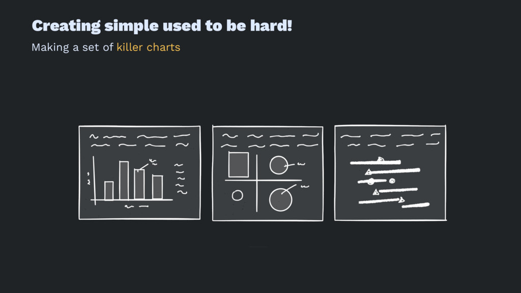
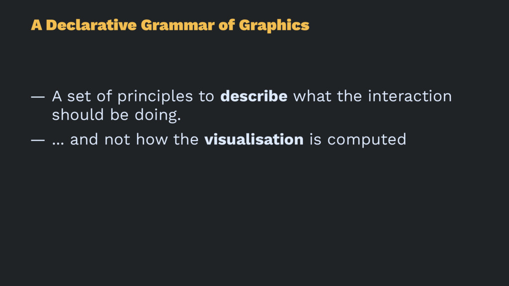
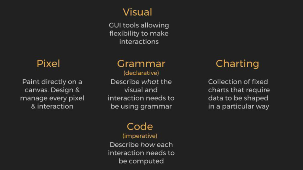
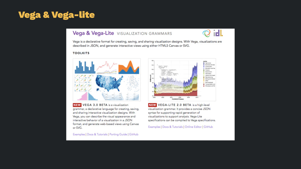
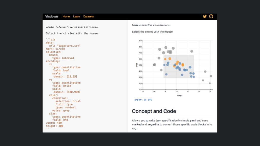
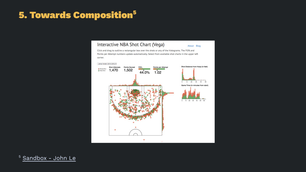
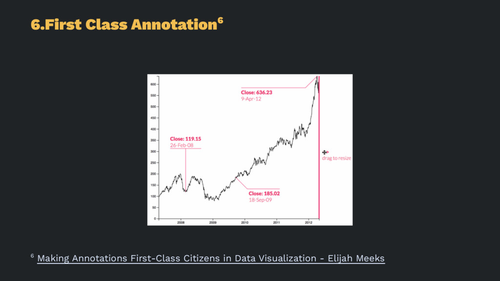
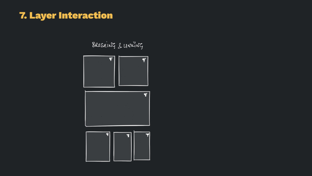
What if you could write an interactive data visualisation in the same easy declarative way that you can write markdown to create HTML pages. In this talk, I explain how using a declarative grammar based approach can dramatically speed up the creation of interactive visualisation. I will also talk about a small tool called Visdown, which is open source and created using the excellent vega data visualisation library. You only need to learn the grammar and principles of interactive graphics, and you can then start your own journey in crafting interactive dashboards.

Amit Kapoor

July 29, 2017
Tweet

More Decks by Amit Kapoor

Other Decks in Design

Transcript

  1. Interactive Data-Vis
    using Markdown
    Amit Kapoor
    amitkaps.com

    View Slide

  2. In the last decade...
    Create Killer Charts

    View Slide

  3. Using Charting-based Approach
    — Excel for charts
    — PowerPoint for interaction

    View Slide

  4. View Slide

  5. Then start of this decade...
    Let's make Interactive Vis

    View Slide

  6. ”The urge, starting out, is to copy.
    And that’s not a bad thing. Most of
    us only find our own voices after
    we’ve sounded like a lot of other
    people.”
    — Neil Gaiman

    View Slide

  7. View Slide

  8. View Slide

  9. View Slide

  10. "We do data visualisations to learn
    something new, not just to
    confirm"
    — Edward Tufte

    View Slide

  11. But this is hard!
    Manage every pixel & interaction

    View Slide

  12. Using Pixel-based Approach
    — Processing.js for managing pixels
    — Lots of code for interaction

    View Slide

  13. View Slide

  14. Just gave up - this is hard
    Let's got back to Static Vis!

    View Slide

  15. Then five years ago...
    Learnt the Grammar of Graphics

    View Slide

  16. View Slide

  17. Using Grammar-based Approach
    — Using ggplot for implementing grammar
    — Limited to static visualisation

    View Slide

  18. View Slide

  19. Then again last years...
    Let's try Interactive Vis again

    View Slide

  20. View Slide

  21. Using Code-based Approach
    — Using d3.js for implementing grammar
    — But for interaction - there is no grammar

    View Slide

  22. View Slide

  23. Still to hard for humans!
    Imperative: Describe how vis is
    computed

    View Slide

  24. In the last few months...
    Let's investigate GUI tools

    View Slide

  25. “We have a functional product,
    and we will put a dashboard on it”

    View Slide

  26. Using GUI-based Approach
    — Use the multiple dashboard tools available
    — Drag & drop and create interactive vis

    View Slide

  27. View Slide

  28. “Interactive Visualisations are a
    solved problem”

    View Slide

  29. This made me very uncomfortable
    — Is it all so simple?
    — Why do I rarely see good interactive dashboards?

    View Slide

  30. Why the glaring gap between
    Code-cra!ed and GUI-created
    interactive vis?

    View Slide

  31. “Information Seeking Mantra:
    Overview first,
    then zoom and filter,
    and details on demand”
    — Ben Shneiderman

    View Slide

  32. “Information Seeking Dashboard
    Mantra:
    Overview Aggregate first,
    then zoom chart and filter link,
    and details table on demand”
    — Ben Shneiderman Every BI Designer Tool

    View Slide

  33. Dashboard Design Approach
    — Load a data table

    View Slide

  34. Dashboard Design Approach
    — Load a data table
    — Create aggregate measures

    View Slide

  35. Dashboard Design Approach
    — Load a data table
    — Create aggregate measures
    — Make 1D or 2D charts

    View Slide

  36. Dashboard Design Approach
    — Load a data table
    — Create aggregate measures
    — Make 1D or 2D charts
    — Put them in a block layout

    View Slide

  37. Dashboard Design Approach
    — Load a data table
    — Create aggregate measures
    — Make 1D or 2D charts
    — Put them in a block layout
    — Link them with a few filters

    View Slide

  38. BI Dashboard Design Approach
    — Load a data table
    — Create aggregate measures
    — Make 1D or 2D charts
    — Put them in a block layout
    — Link them with a few filters
    — Add a table list for details

    View Slide

  39. Now this is too easy!
    — Task Layer: Unlock data using a Dashboard

    View Slide

  40. Now this is too easy!
    — Task Layer: Unlock data using a Dashboard
    — Data Layer: Columnar data storage

    View Slide

  41. Now this is too easy!
    — Task Layer: Unlock data using a Dashboard
    — Data Layer: Columnar data storage
    — Visual Layer: Reusable charts in blocks

    View Slide

  42. Now this is too easy!
    — Task Layer: Unlock data using a Dashboard
    — Data Layer: Columnar data storage
    — Visual Layer: Reusable charts in blocks
    — Annotation Layer: Just the basics

    View Slide

  43. Now this is too easy!
    — Task Layer: Unlock data using a Dashboard
    — Data Layer: Columnar data storage
    — Visual Layer: Reusable charts in blocks
    — Annotation Layer: Just the basics
    — Interaction Layer: Brushing and Linking

    View Slide

  44. Creating simple used to be hard!
    Making a set of killer charts

    View Slide

  45. "There is a difference between
    simple and easy. Do not confuse
    the two. The simpler the thing is
    to understand, often the more
    difficult it is to do."

    View Slide

  46. “Age of GUI driven Interactive
    Charto-mania”

    View Slide

  47. GUI Dashboard driving Design
    UpSide
    - Increased visual analytics
    - Better simple charts
    - Improved aesthetic
    - Modular and Scalable design

    View Slide

  48. GUI Dashboard driving Design
    DownSide
    - Over-indexed on Singular Design Pattern
    - Shape of data is lost
    - Insight and Narrative is missing
    - Impersonal and Dry

    View Slide

  49. “How to make it easier to do
    interactive data visualisation?”

    View Slide

  50. "We need Declarative Grammar
    of Interactive Graphics

    View Slide

  51. A Declarative Grammar of Graphics
    — A set of principles to describe what the interaction
    should be doing.
    — ... and not how the visualisation is computed

    View Slide

  52. View Slide

  53. Vega & Vega-lite

    View Slide

  54. Visdown
    h!p://visdown.com

    View Slide

  55. View Slide

  56. Declarative Interactive Design
    1. Amplify Cognition
    2. Think Datum First
    3. Show Single & All
    4. Visualise Uncertainty
    5. Towards Compositions
    6. First Class Annotation
    7. Layer Interactions

    View Slide

  57. 1. Amplify Cognition

    View Slide

  58. 1. Amplify Cognition

    View Slide

  59. 1. Amplify Cognition

    View Slide

  60. 1. Amplify Cognition1
    1 Up and Down the Ladder of Abstraction - Bret Victor

    View Slide

  61. 2. Think Datum First

    View Slide

  62. 2. Think Datum First2
    2 The Architecture of a Data Visualisation - Giorgio Luipi

    View Slide

  63. 3. Show Single & All

    View Slide

  64. 3. Show Single & All

    View Slide

  65. 3. Show Single & All3
    3 Responsive Data Visualisation - Nick Rabinowitz

    View Slide

  66. 4. Visualise Uncertainty

    View Slide

  67. 4. Visualise Uncertainty

    View Slide

  68. 4. Visualise Uncertainty4
    4 Visualising uncertainty about the future - David Spiegelhalter, Mike Pearson, Ian Short

    View Slide

  69. 5. Towards Composition

    View Slide

  70. 5. Towards Composition

    View Slide

  71. 5. Towards Composition5
    5 Sandbox - John Le

    View Slide

  72. 6.First Class Annotation

    View Slide

  73. 6.First Class Annotation6
    6 Making Annotations First-Class Citizens in Data Visualization - Elijah Meeks

    View Slide

  74. 7. Layer Interaction

    View Slide

  75. 7. Layer Interaction

    View Slide

  76. 7. Layer Interaction7
    7 Vega - Airport Connection

    View Slide

  77. Upside Declarative Interactive Design
    1. Build a mental model
    2. Understand the single story
    3. Have a micro and macro picture
    4. Know that data and model are uncertain
    5. See the picture as a whole
    6. Have a narrative to see
    7. Move between layers of abstraction

    View Slide

  78. Principles of Interactive Data Vis
    1. Amplify Cognition
    2. Think Datum First
    3. Show Single & All
    4. Visualise Uncertainty
    5. Towards Compositions
    6. First Class Annotation
    7. Layer Interactions

    View Slide

  79. One human life, closely observed,
    is everyone’s life. In the particular is
    the universal.
    — Roger Ebert

    View Slide

  80. Interactive Data-Vis
    using Markdown
    Amit Kapoor
    amitkaps.com

    View Slide