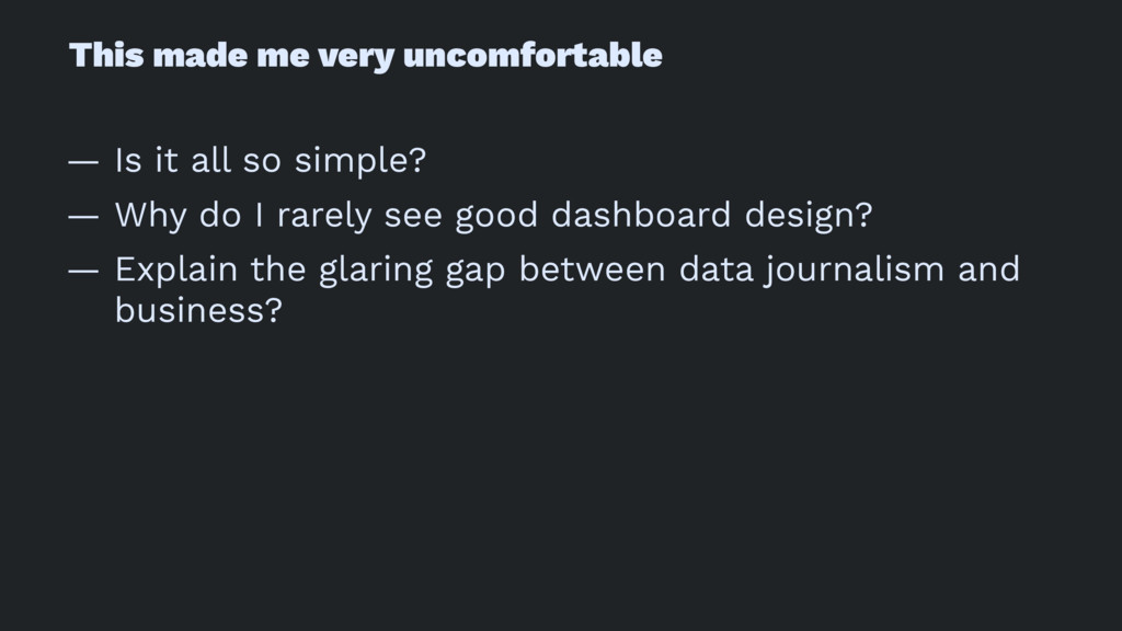
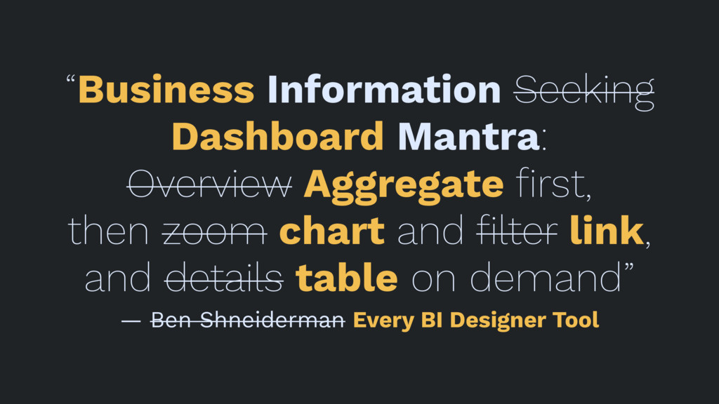
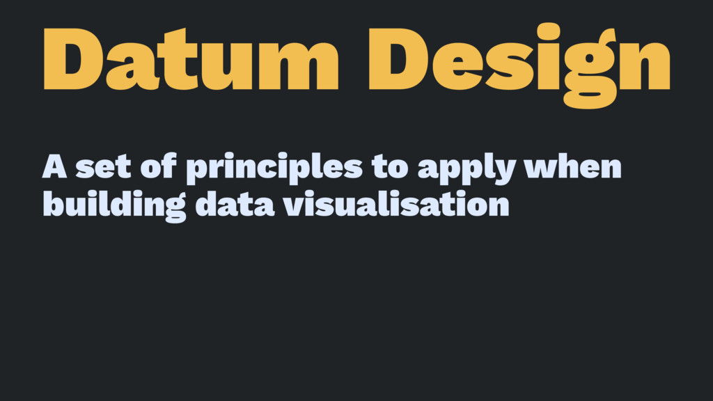
Business data dashboards have gone through renaissance in the last five years with enhanced interactivity and easier tools to create them. However, most dashboard designed today are either at the 'pretty KPI decoration' end or at the 'detailed data explorers' end of the spectrum. They both fail to provide the level of insight communication, that we all see from purposeful designed visualisations in data journalism. This talks aims to understand the missing ingredients in current business dashboard design and aims to start a discussion on how we could rethink data visualisation for them. In the talk, I will explore a few guiding principles that could help us do this.
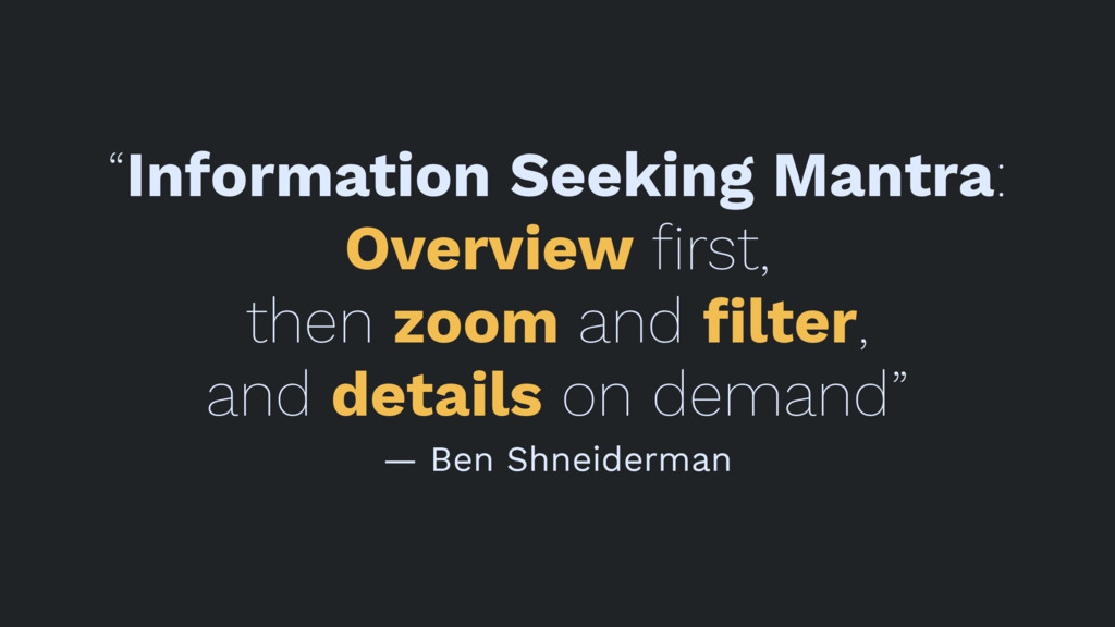
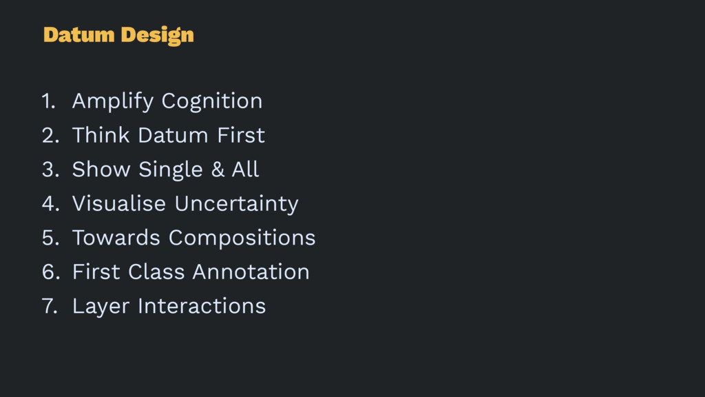
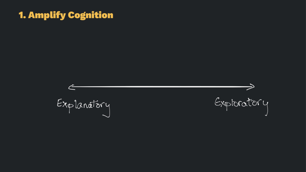
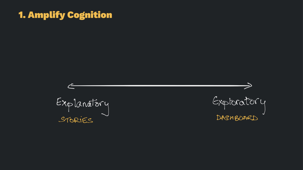
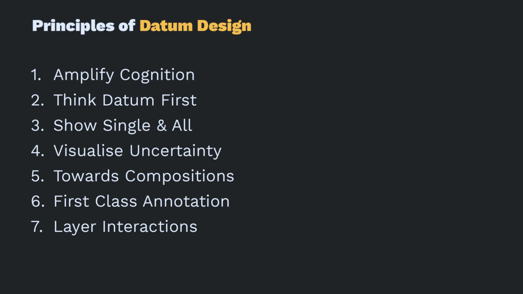
1. Amplify Cognition
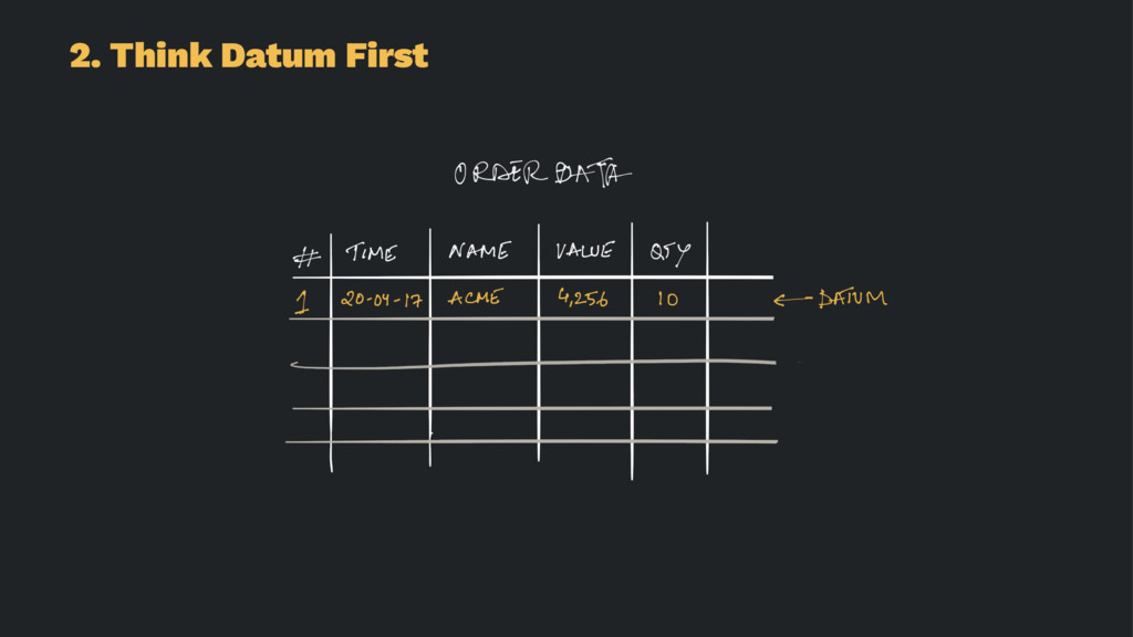
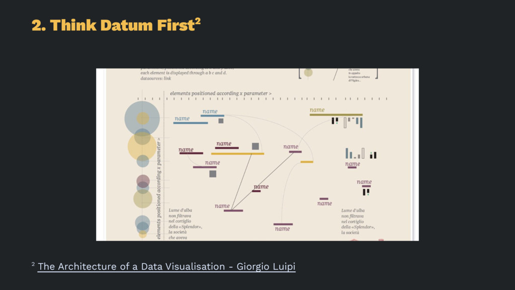
2. Think Datum First
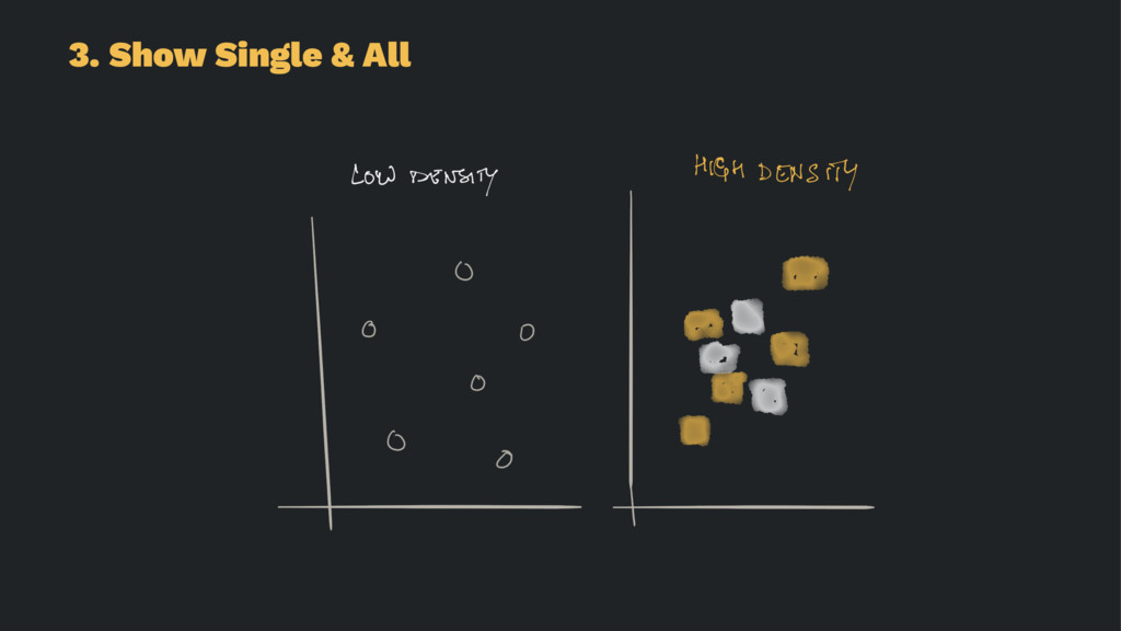
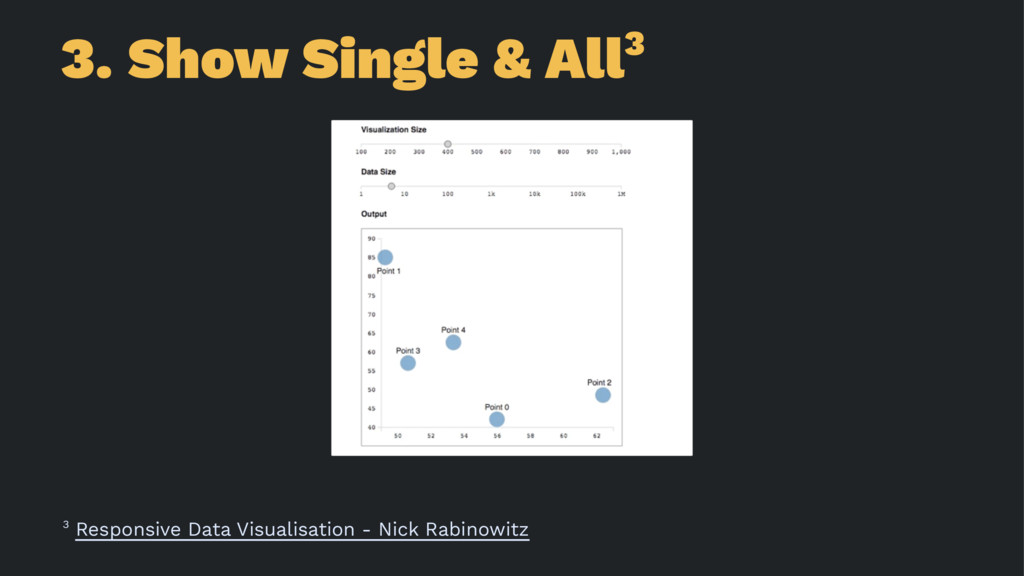
3. Show Single & All
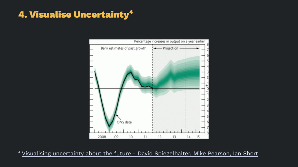
4. Visualise Uncertainty
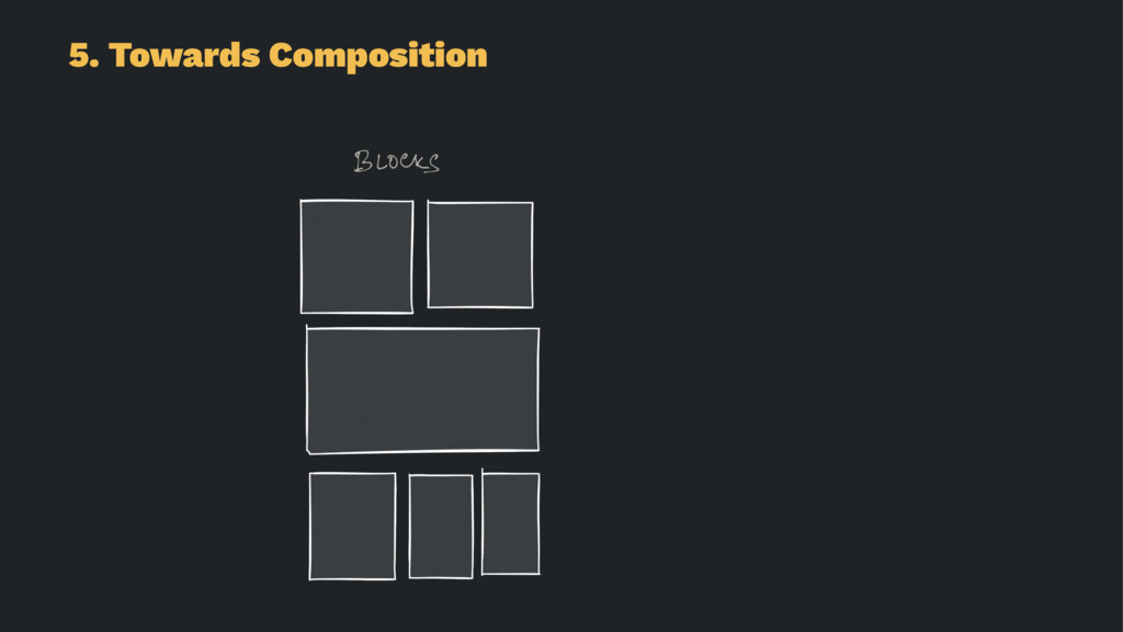
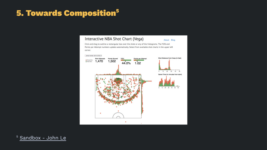
5. Towards Compositions
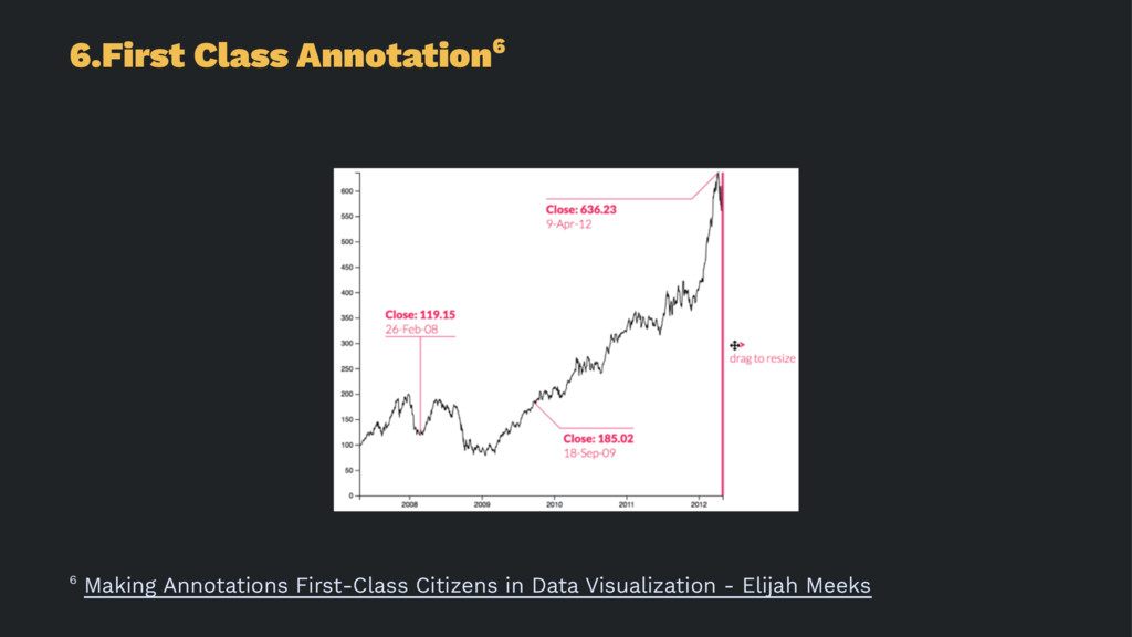
6. First Class Annotation
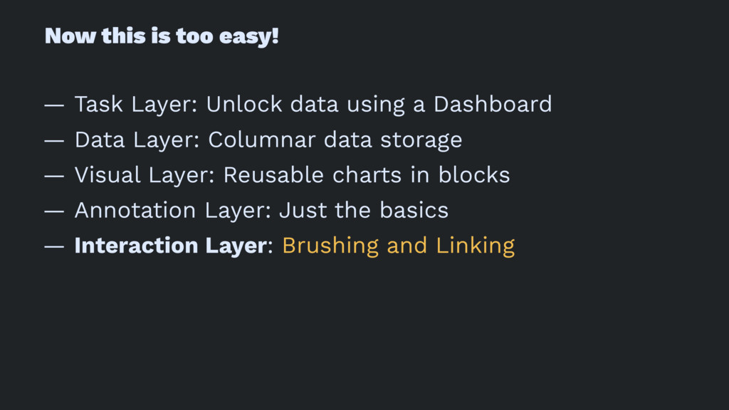
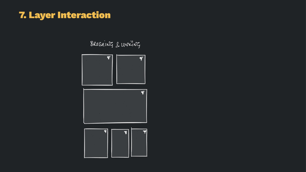
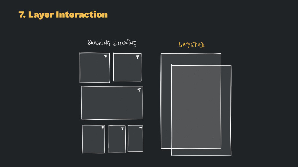
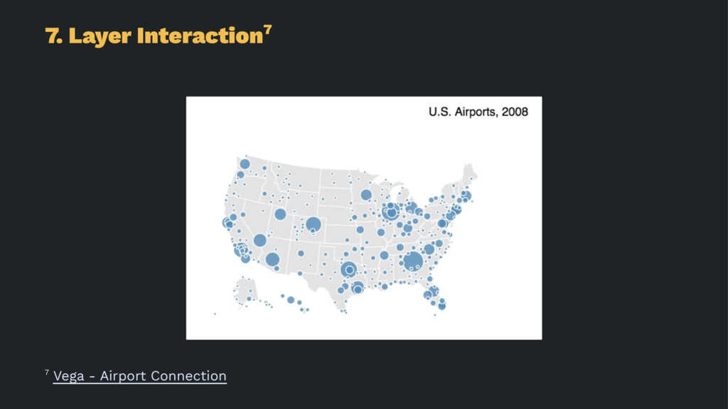
7. Layer Interactions