Upgrade to Pro — share decks privately, control downloads, hide ads and more …

Architectural Design for Interactive Visualization

Architectural Design for Interactive Visualization

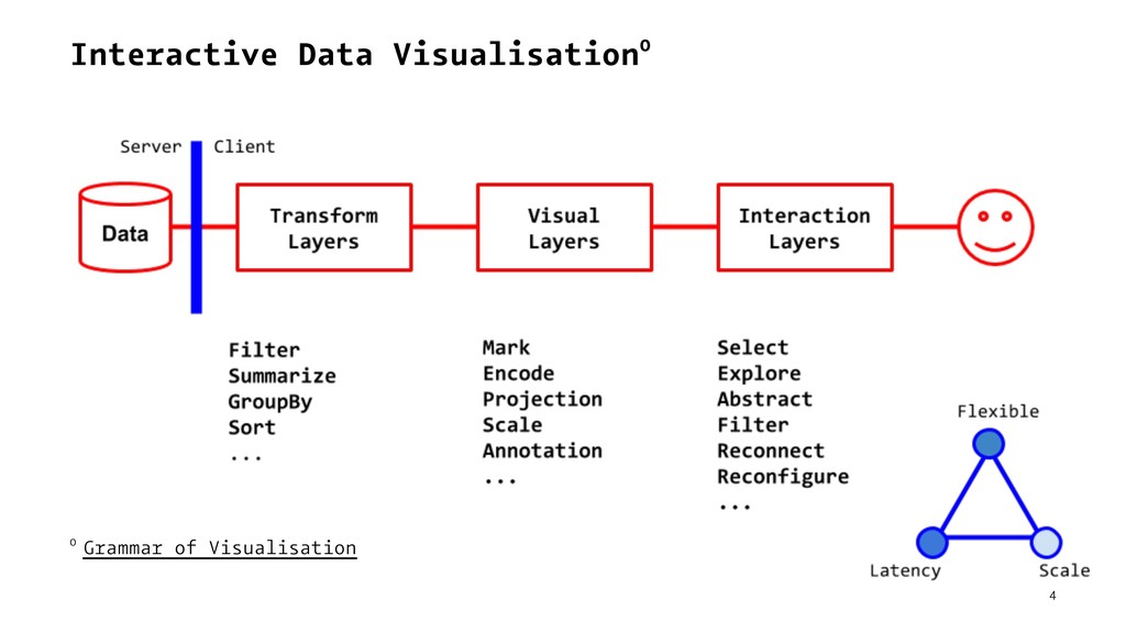
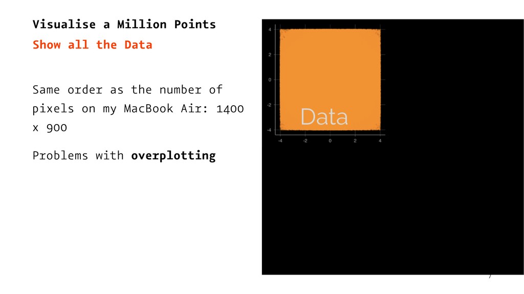
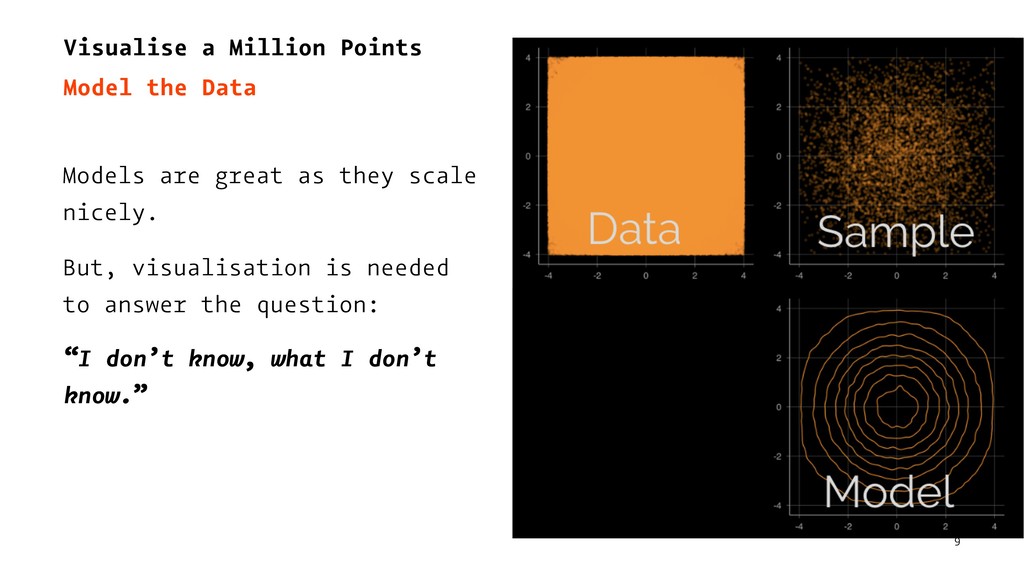
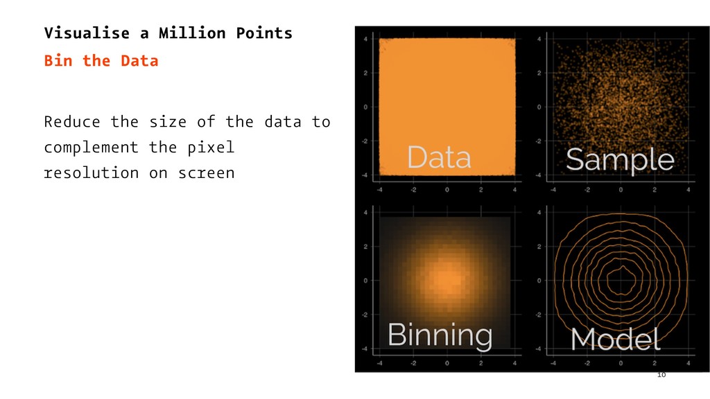
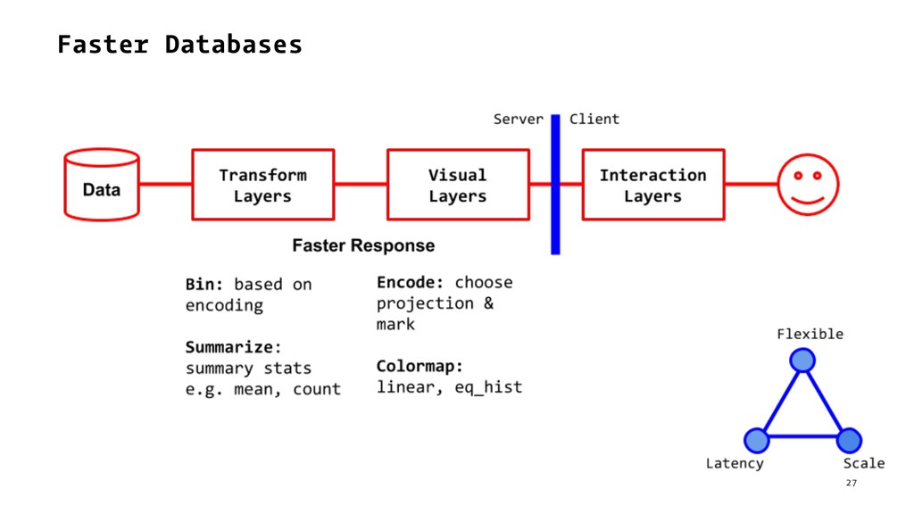
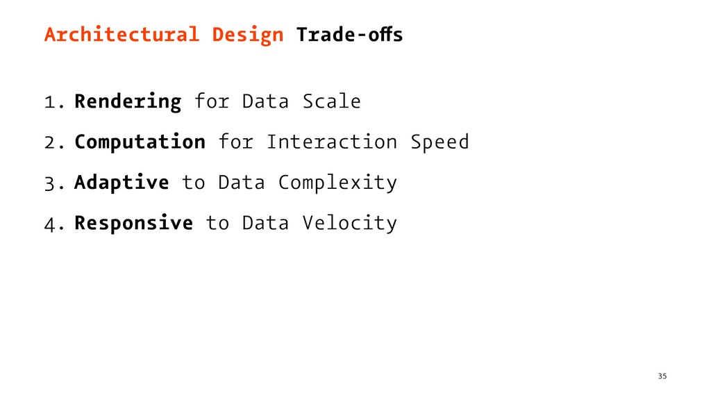
Visualisation for data science requires an interactive visualisation setup which works at scale. In this talk, we will explore the key architectural design considerations for such a system and illustrate using examples the four key tradeoffs in this design space - rendering for data scale, computation for interaction speed, adaptive to data complexity and responsive to data velocity.

Amit Kapoor

May 23, 2018
Tweet

More Decks by Amit Kapoor

Other Decks in Technology

Transcript

  1. Architecture Design
    for Interactive Visualisation
    Amit Kapoor
    amitkaps.com
    Bargava Subramanian
    bargava.com
    1

    View Slide

  2. Exemplar
    2

    View Slide

  3. Layers of Abstraction
    — Raw Data
    — Transform Layer
    — Visual Layer
    — Interaction Layer
    3

    View Slide

  4. Interactive Data Visualisation0
    0 Grammar of Visualisation
    4

    View Slide

  5. Architectural Design Trade-offs
    1. Rendering for Data Scale
    2. Computation for Interaction Speed
    3. Adaptive to Data Complexity
    4. Responsive to Data Velocity
    5

    View Slide

  6. 1. Rendering for Data Scale
    "How do you render interactive visualization when
    there are millions or billions of data points?"
    6

    View Slide

  7. Visualise a Million Points
    Show all the Data
    Same order as the number of
    pixels on my MacBook Air: 1400
    x 900
    Problems with overplotting
    7

    View Slide

  8. Visualise a Million Points
    Sample the Data
    Sampling can be effective (with
    overweighting unusual values)
    Require multiple plots or
    careful tuning parameters
    8

    View Slide

  9. Visualise a Million Points
    Model the Data
    Models are great as they scale
    nicely.
    But, visualisation is needed
    to answer the question:
    “I don’t know, what I don’t
    know.”
    9

    View Slide

  10. Visualise a Million Points
    Bin the Data
    Reduce the size of the data to
    complement the pixel
    resolution on screen
    10

    View Slide

  11. “Visualising data at scale
    is the process of creating
    generalized histograms”
    11

    View Slide

  12. Layers of Visualisation
    12

    View Slide

  13. Rendering: How many data points?
    — SVG: ~10^3
    — Canvas: ~10^4
    — Web.gl: ~10^6
    13

    View Slide

  14. Web.gl based Rendering: Deck.gl1
    1 UK Road Accident Data using deck.gl
    14

    View Slide

  15. Bin and Web.gl Rendering
    15

    View Slide

  16. Visualise more than Million Points
    Bin-Summarize-Smooth
    Shift the transfer of data from raw data to binned-
    summarised-smoothed data
    16

    View Slide

  17. BigVis: Bin-Summarize-Smooth-Visualise
    17

    View Slide

  18. Why not sent an image of the Data: DataShader3
    3 DataShader: Turn largest data to image, accurately
    18

    View Slide

  19. DataShader: Encode-Bin-Summarise-ColorMap
    19

    View Slide

  20. 2. Computation for Interaction Speed
    "How do you reduce the latency of the query at the
    interaction layer, so that the user can interact
    with the visualisation?"
    20

    View Slide

  21. Aggregation & In-Memory Cubes e.g imMems4
    4 ImMems Demo
    21

    View Slide

  22. In-memory Cubes
    22

    View Slide

  23. Approximate Query Processing e.g. VerdictDB5
    5 Speed Comparison: AQP is 50x+ faster
    23

    View Slide

  24. Approximate Query Processing
    24

    View Slide

  25. Challenges in Visualise Uncertainty 6
    6
    25

    View Slide

  26. Faster Databases e.g. MapD7
    7 TweetMap Demo by MapD
    26

    View Slide

  27. Faster Databases
    27

    View Slide

  28. 3. Adaptive to Data Complexity
    Choosing a good visualisation design for a singular
    dataset is possible after a few experiments and
    iteration.
    But how do you ensure that the visualisation will
    adapt to the variety, volume and edge cases in the
    real data?
    28

    View Slide

  29. Responsive Visualisation to Space & Data8
    8 Responsive Data Visualisation - Nick Rabinowitz
    29

    View Slide

  30. Handling High Cardinality e.g. Facet-Dive9
    9 FacetDive from PAIR Research
    30

    View Slide

  31. Handling High Cardinality e.g. DataComb10
    10 Datacomb: Interactive Table Plot
    31

    View Slide

  32. Dimension Reduction e.g. Embedding Projector11
    11 Embedding Projector
    32

    View Slide

  33. 4. Responsive to Data Velocity
    "How do you trade-offs between real-time vs. near
    real-time data and its impact on refreshing
    visualization"
    33

    View Slide

  34. Optimizing for near real-time visual refreshes
    34

    View Slide

  35. Architectural Design Trade-offs
    1. Rendering for Data Scale
    2. Computation for Interaction Speed
    3. Adaptive to Data Complexity
    4. Responsive to Data Velocity
    35

    View Slide

  36. Architecture Design
    for Interactive Visualisation
    Amit Kapoor
    amitkaps.com
    Bargava Subramanian
    bargava.com
    36

    View Slide