Upgrade to Pro — share decks privately, control downloads, hide ads and more …

Keeping It Real - UX for Interactive Marketers

Keeping It Real - UX for Interactive Marketers

Interactive Strategies 12 Conference

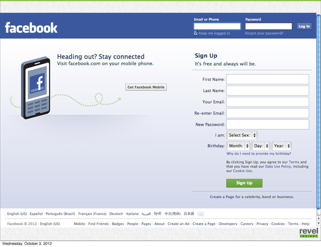
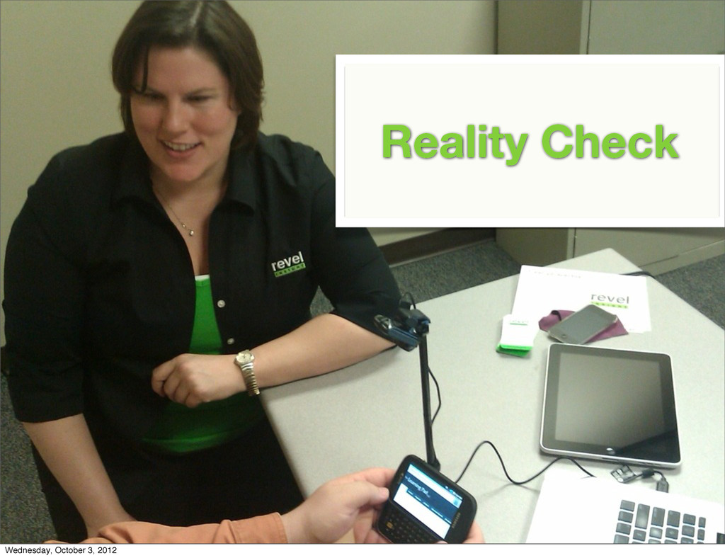
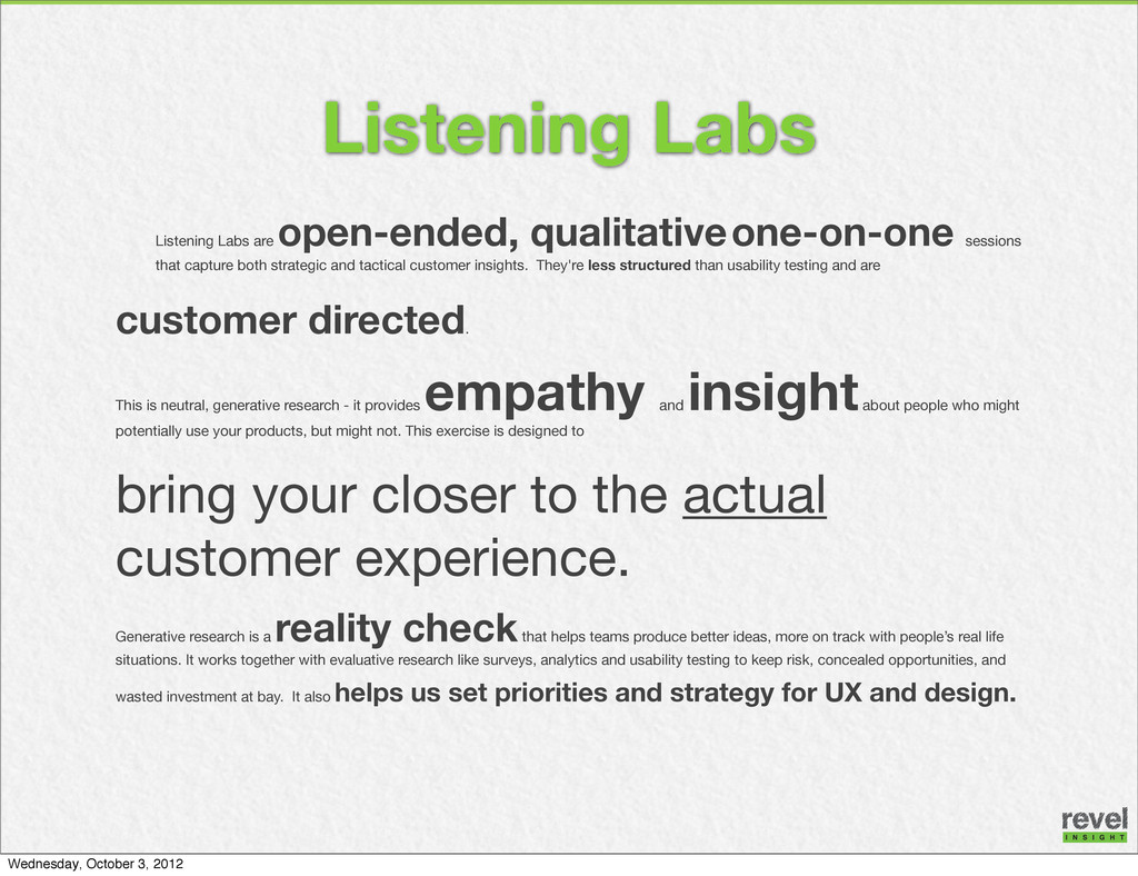
As a marketer, your work revolves around market segments, online performance and business results. Now get closer to your customers with this reality check about UX. Based on actual customer research, this presentation will help get you out of your cubicle and closer to your customers.

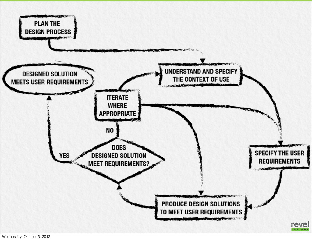
*Background on the disciplines involved
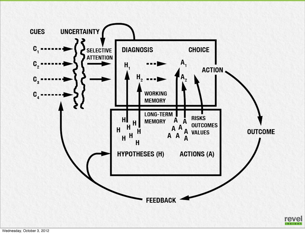
*Discussion of cognitive process
*Findings from real world UX research relevant to your marketing work

Annette Priest

October 03, 2012
Tweet

More Decks by Annette Priest

Other Decks in Business

Transcript

  1. “Design is not a short- term fix. It’s a long

    term engagement that requires you to think about how design affects everything that touches the consumer -- from product to packaging to marketing to take home experience.” — Yves Behar Wednesday, October 3, 2012
  2. Listening Labs are open-ended, qualitative one-on-one sessions that capture both

    strategic and tactical customer insights. They're less structured than usability testing and are customer directed. This is neutral, generative research - it provides empathy and insight about people who might potentially use your products, but might not. This exercise is designed to bring your closer to the actual customer experience. Generative research is a reality check that helps teams produce better ideas, more on track with people’s real life situations. It works together with evaluative research like surveys, analytics and usability testing to keep risk, concealed opportunities, and wasted investment at bay. It also helps us set priorities and strategy for UX and design. Listening Labs Wednesday, October 3, 2012
  3. Tablets WANTED: • Links to the full site ensure users

    can get to what they need • Take advantage of the screen size for rich visuals - images and video. • Don’t skimp on screen real estate for clickable targets Wednesday, October 3, 2012
  4. Stuff Users Say “It didn’t have what I was looking

    for – it was limited.” “There’s nothing to click on if I wanted to learn more about it, only ‘back’.” “Just brought up a little paragraph and that was it. Not as good as on the computer. Less information.” “Easy to get there but not much to offer.” “I want to be able to find anything… and you can’t search so I can’t find what I’m interested in.” Source: Revel Insight Wednesday, October 3, 2012
  5. Stuff Users Say “When it says downloads on my phone

    I expect I have to have flash player and stuff like that” – iPhone user “It’s telling me I can’t look at it because I don’t have Flash! This is hard.” “Pictures are too small when it comes up. Zooming in is difficult. I just want to be able to pop up full screen.” “I don’t want to download that, my phone only has so much space… and I have a lot of pictures.” “Doesn’t work. I was curious, now I’m disappointed.” Source: Revel Insight Wednesday, October 3, 2012
  6. • Anticipate needs based on context • Prioritize - selectively

    include content • Reduce text entry • Size buttons for fingers and place them for thumbs • Provide space between links to make them more selectable with fingers • Prevent errors - keep opposing or critical functions away from each other • Avoid popups • Don’t lock people in - if your design isn’t responsive, then link to full site Best Practices for Mobile UX @AnnettePriest #ISpsych12 #RealUX Wednesday, October 3, 2012
  7. When It Works “It’s a lot less info they’re asking

    for than website, this is easier because they’re asking for less info.” “This is more of what I expected, brought me to a mobile page that loads quickly.” “Definitely seems like someone has formatted this – nice. It’s very hard for navigation when not like that. It’s easy to read. Good.” @AnnettePriest #ISpsych12 #RealUX Wednesday, October 3, 2012
  8. What We Saw • People are skeptical of marketing content

    from manufacturers. Expect the manufacturer will only tell the good things about a product, not an accurate reflection of reality. • Mobile is for research and comparison. • They rely on user ratings and reviews from third party sources and realize that not all of those reviews may be accurate / true. • Users arrive at various pages within the site based on the search terms they enter into google. They dip into the site to get the information that they need and then move on to the next item. • Internal search needs improvement. • Several users ended up on shop page or product but couldn’t find a way to get to more information about the product. @AnnettePriest #ISpsych12 #RealUX Wednesday, October 3, 2012
  9. What We Saw Users need a reason WHY they should

    buy • ...written the way the way a human being would speak to them • “How does it benefit me?” • Wants to feel good about decision @AnnettePriest #ISpsych12 #RealUX Wednesday, October 3, 2012
  10. What We Saw Communication is a problem • Too much

    jargon • Labeling doesn’t match user expectations • Need plain language, conversational tone Visuals are critical • Users are driven by imagery • MUST have meaningful link between imagery and content @AnnettePriest #ISpsych12 #RealUX Wednesday, October 3, 2012
  11. What We Saw Better, easier comparisons are needed • Which

    family is right for you? • Which product within the family is right for you? • Compare function - compare choices to each other • Avoid overwhelming with choice by limiting to low number and using extra care with layout @AnnettePriest #ISpsych12 #RealUX Wednesday, October 3, 2012
  12. Questions to Ask Tool Timeframe WHERE are people clicking? Web

    Analytics (A/B Testing) Varies But WHY are they clicking where they’re clicking… What is visually engaging on this page? Where will people look on this page? predictive eye tracking Minutes to Hours What What are people aware of and not aware of? 5-Second Test Real People Days to Weeks How do people think about information? How should information be grouped or organized Card Sort Real People Days to Weeks Where are people getting lost in navigation? Reverse Card Sort Real People e Days to Weeks Ask the Right Questions Use the Right Tool for UX Need more info? Email [email protected] Wednesday, October 3, 2012