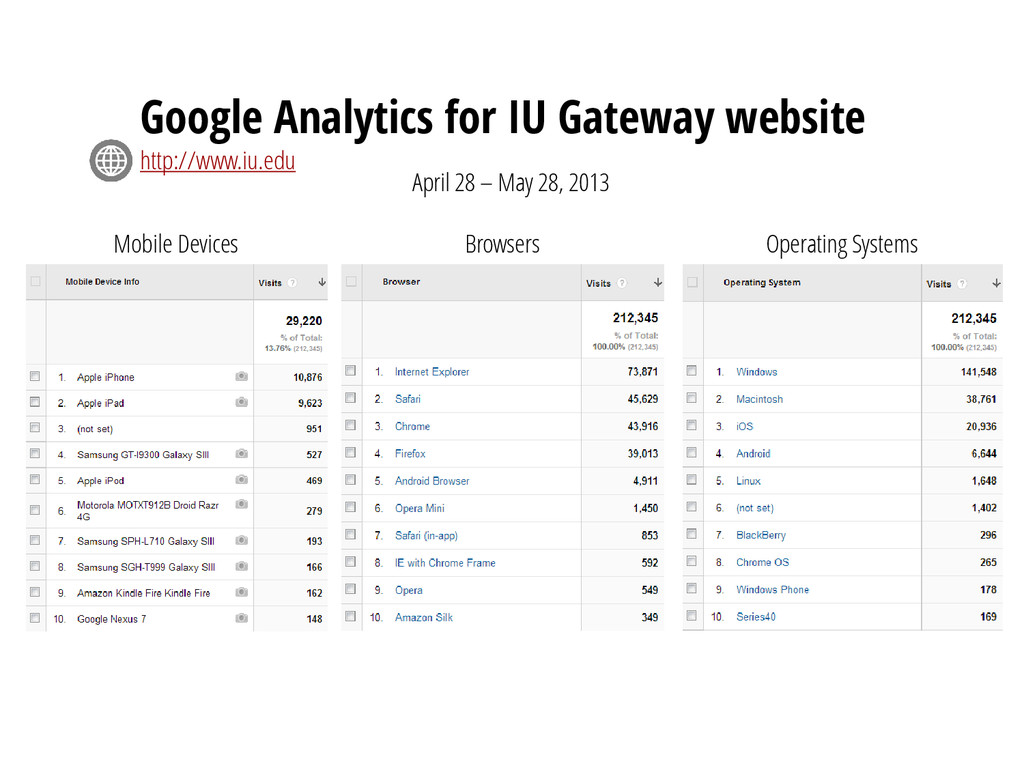
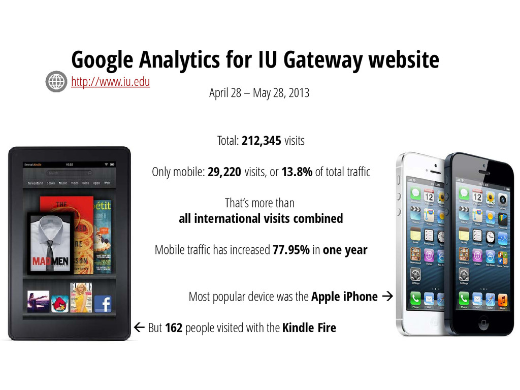
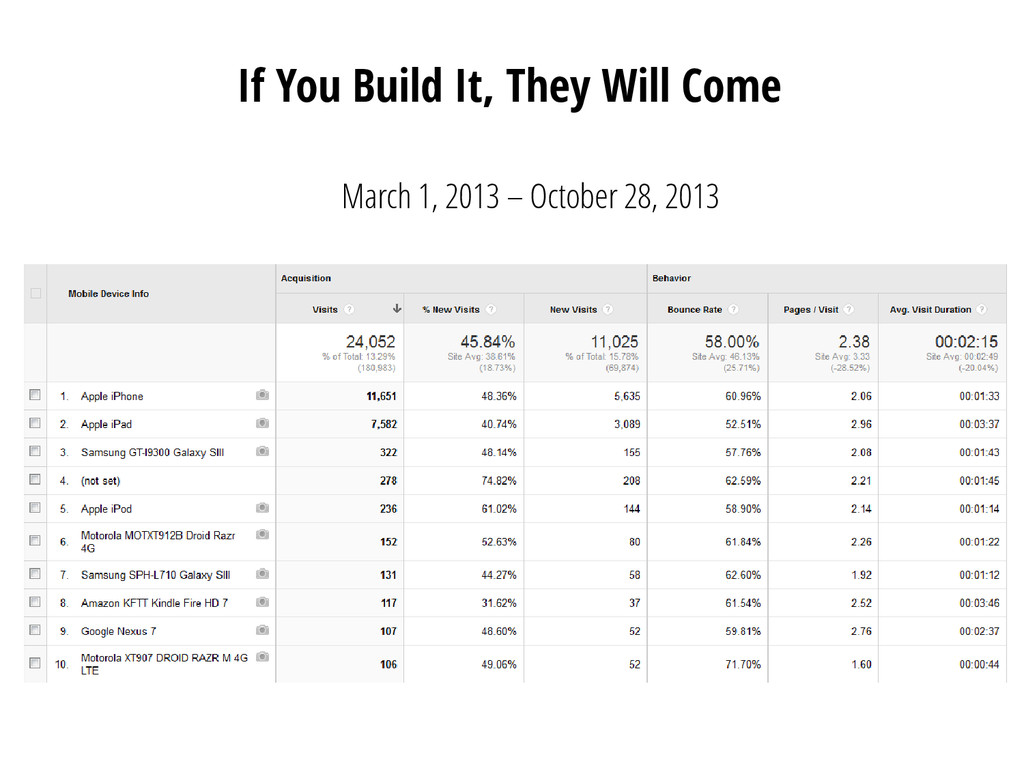
total traffic That’s more than all international visits combined Mobile traffic has increased 77.95% in one year Most popular device was the Apple iPhone But 162 people visited with the Kindle Fire Google Analytics for IU Gateway website http://www.iu.edu April 28 – May 28, 2013
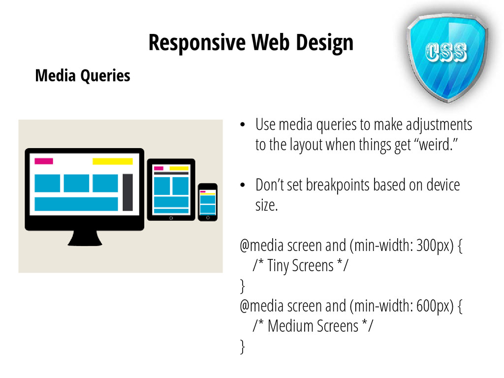
the layout when things get “weird.” • Don’t set breakpoints based on device size. @media screen and (min-width: 300px) { /* Tiny Screens */ } @media screen and (min-width: 600px) { /* Medium Screens */ } Responsive Web Design
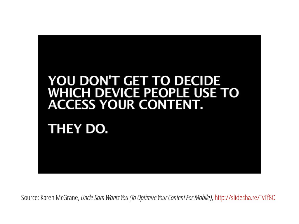
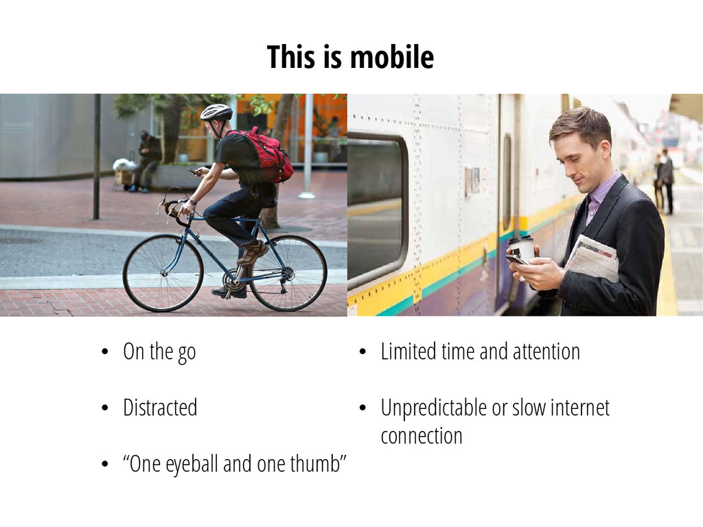
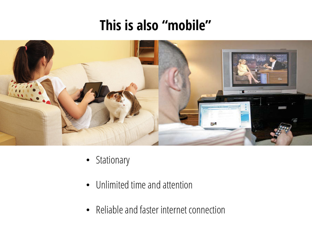
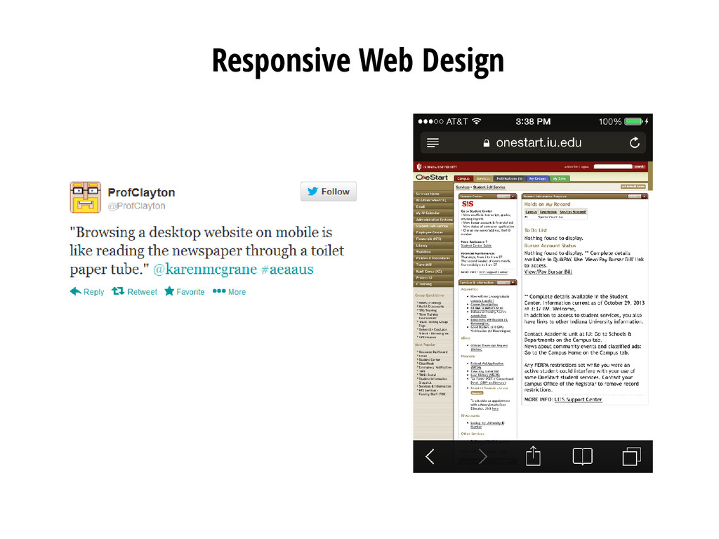
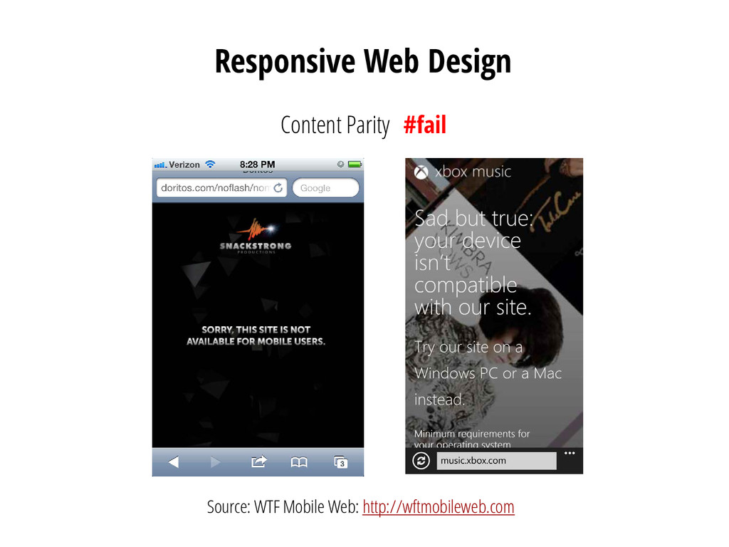
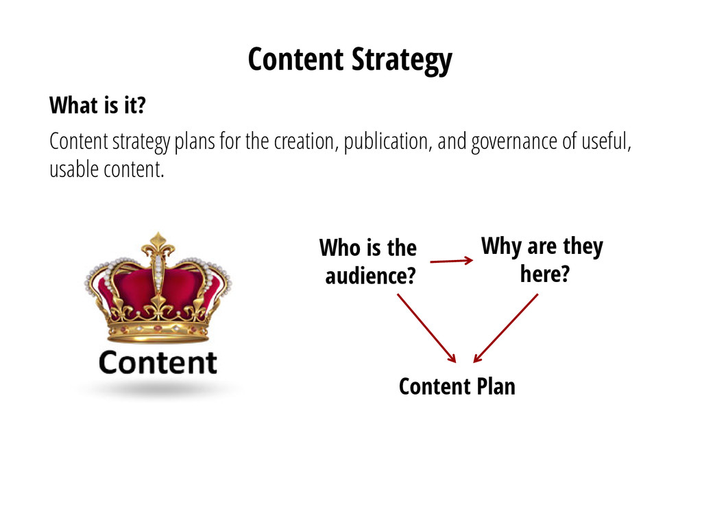
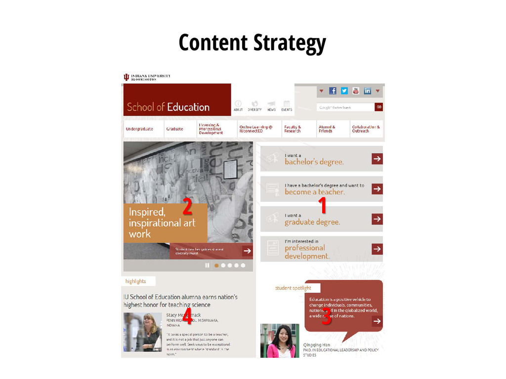
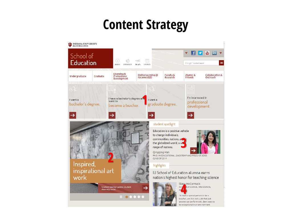
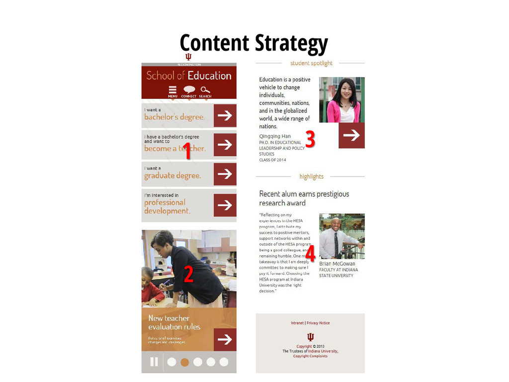
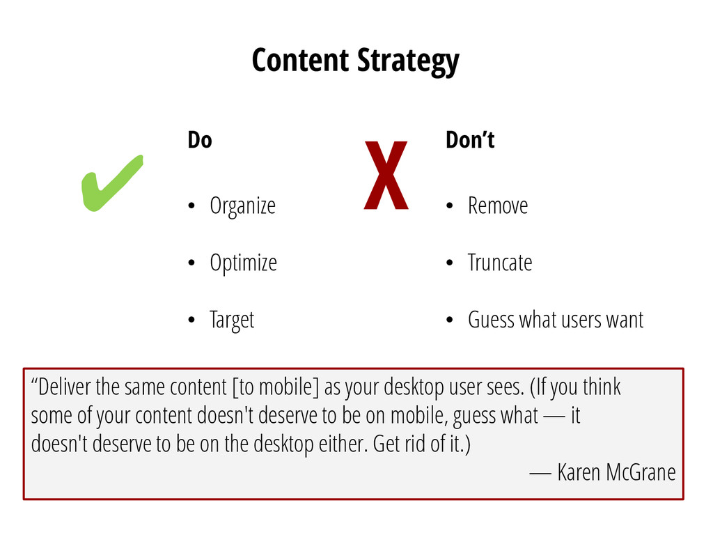
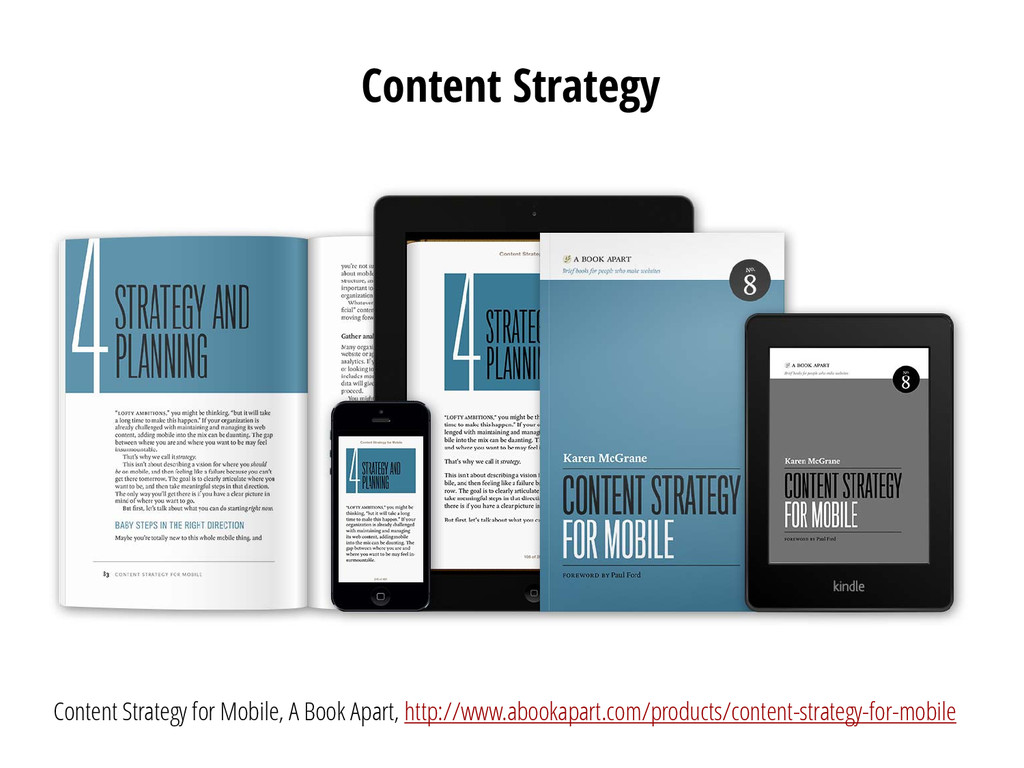
• Remove • Truncate • Guess what users want ✔ X “Deliver the same content [to mobile] as your desktop user sees. (If you think some of your content doesn't deserve to be on mobile, guess what — it doesn't deserve to be on the desktop either. Get rid of it.) — Karen McGrane
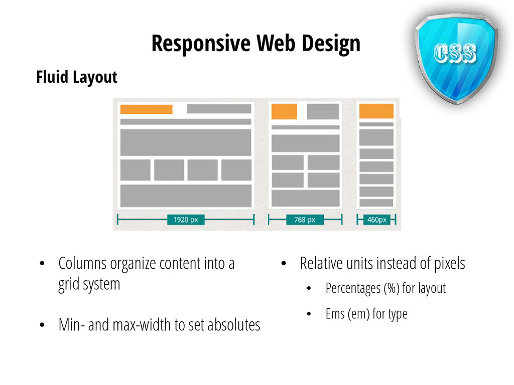
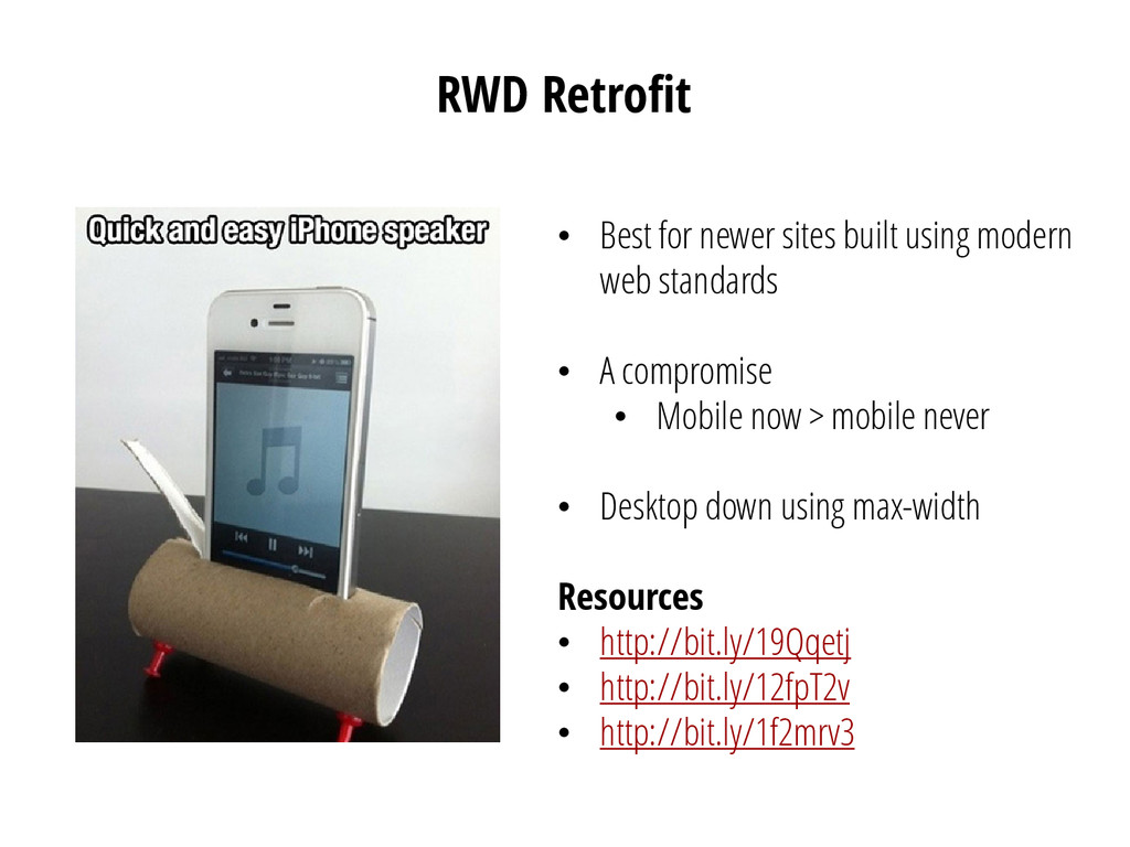
web standards • A compromise • Mobile now > mobile never • Desktop down using max-width Resources • http://bit.ly/19Qqetj • http://bit.ly/12fpT2v • http://bit.ly/1f2mrv3
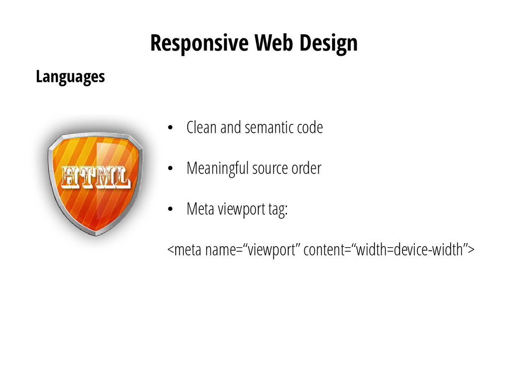
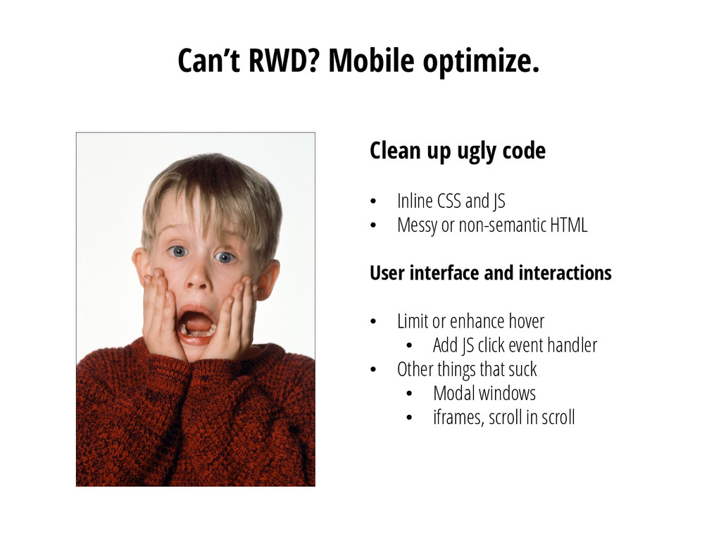
CSS and JS • Messy or non-semantic HTML User interface and interactions • Limit or enhance hover • Add JS click event handler • Other things that suck • Modal windows • iframes, scroll in scroll
 cmusudakeisuke
 lycorptech_jp
 caddi_eng
 mayumihirano
 cybozuinsideout
 glidenote
 matumoto
 rakus_dev
 oikon48
 tomokusaba
 sms_tech
 nrslib
 sergeychernyshev
 tamaranovitovic
 tenderlove
 stephenakadiri
 watany
 swwweet
 axbom
axbom
 aleyda
 lcolladotor
 wayneb77
 andyhume
 rmw
rmw
![Contact Ashley Callahan [email protected] RWD Listserv [email protected] Thank you!](https://files.speakerdeck.com/presentations/96d8c390c09801300df36658d0894ac1/slide_60.jpg)