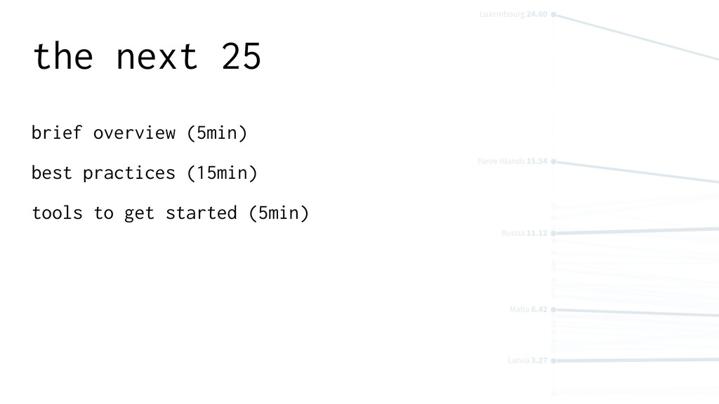
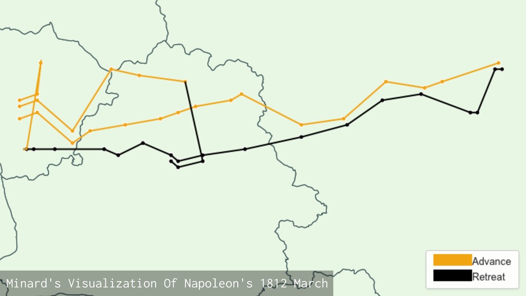
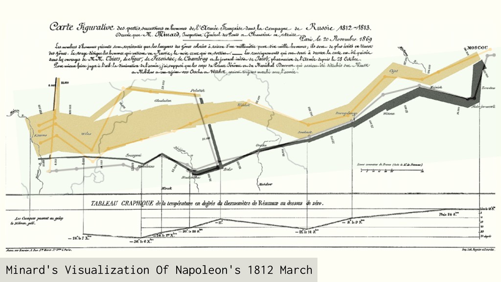
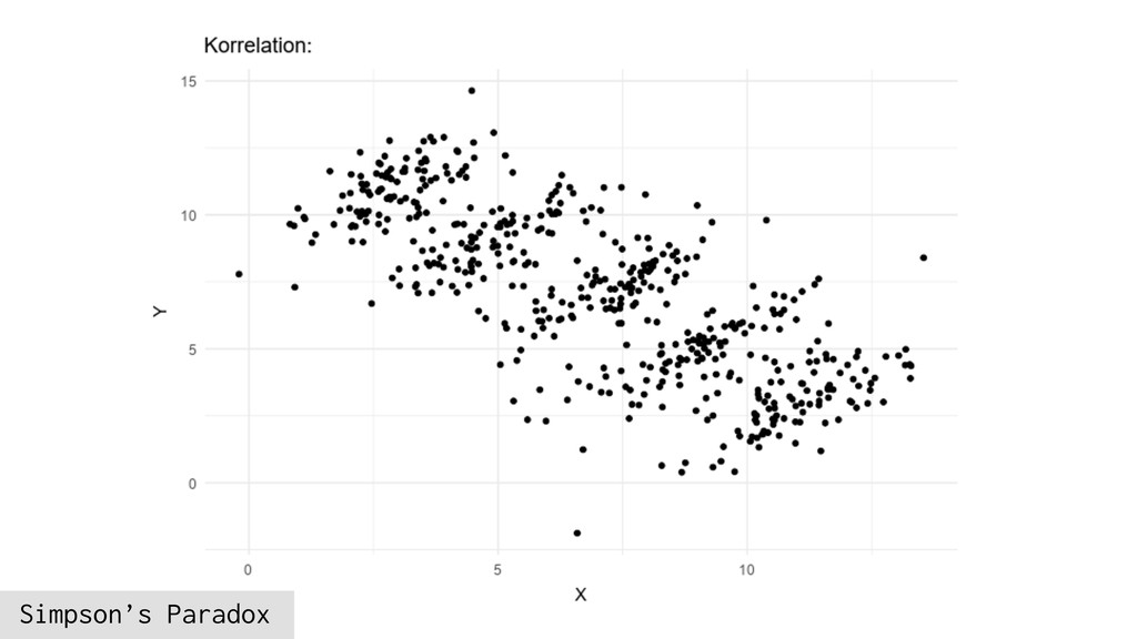
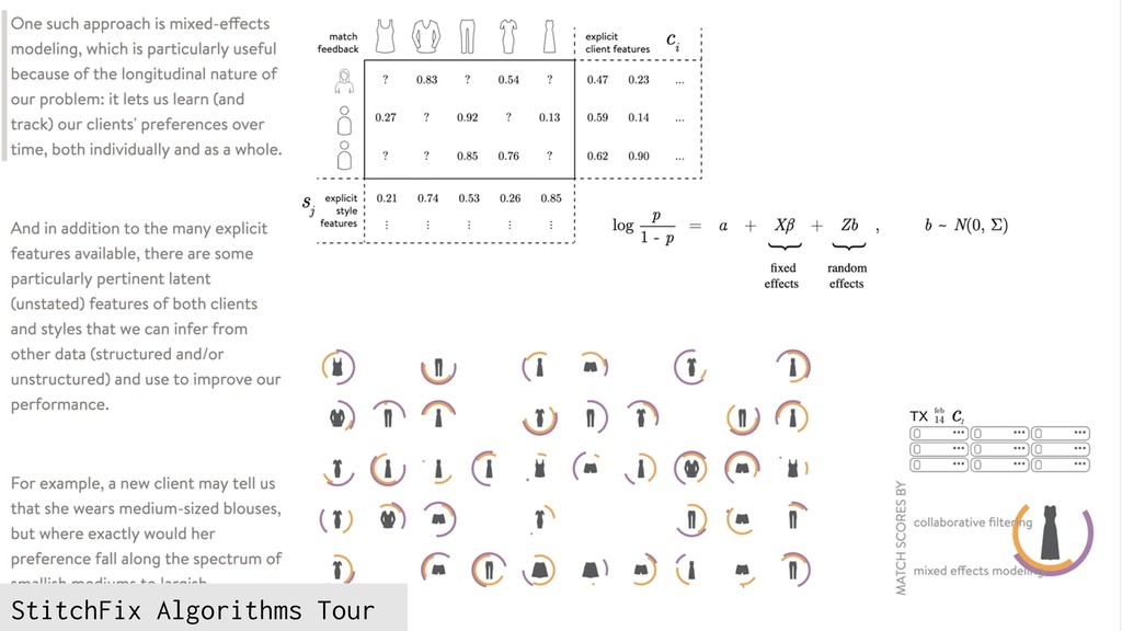
Big Data, IoT and now Machine Learning give us more data than ever before. We can find significant trends, influence the direction of a company, predict customer behaviors or even just guess if a photo is a cat or a dog. But what do you do with all of this data? We’ll walk through a few examples of both really good and really bad data visualizations, examine some data visualization practices that are still relevant today and discuss how animation, inclusive design and UX are shaping modern datavis.